Lessons
Day 1
1Class Introduction
09:10 2The Design Flow Basics
18:27 3The Designer as Co-Creators
06:48 4Get to Know Your Material
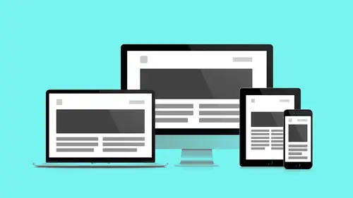
17:07 5Responsive Vocab: Floats, Flows, & Images
11:58 6Mobile First: Working Small
09:46 7Future Friendly: Embrace Unpredictability
14:17Collaborating with Your Clients
13:52 9Prioritize Your Users
39:42 10Best Practices for Defining Success
08:58 11Intro to Scrum
04:24 12User Stories & Epics
35:53 13Content Basics
27:40 14Defining the Visual Language
22:31 15Starting with Type
35:31 16Starting with Grids
15:40 17Gutcheck & The Product Brief
22:03 18Working With Developers
12:33 19Communicating with Developers
16:25 20Finding a Common Language with Developers
06:28 21Code Literacy
04:37 22Sitemap & Wireframe Basics
33:48 23Prototyping Basics
12:02 24HTML Prototypes
13:28 25Code Literacy & Developer Tools
11:46 26Developer Lingo
07:23 27Interface Personality & Behavior Galleries
17:27 28Designing for Performance
18:19 29Progressive Enhancements
07:00 30Designing a System: Discovery to Pattern Library
12:25 31Workflow Examples
20:25 32Applying the Style Guide to the Pattern Library
09:08 33Alternative Workflow
23:04 34Alternative Workflow Part 2
21:52 35Tech Requirements
21:53 36Retrofitting an Existing Site
12:15 37Project Cupcake: Building a Site from Scratch
24:08Day 2
Lesson Info
Designing for Performance
We have the Product Brief PDF. Can one of you guys talk about, briefly, what it is? Yeah, so, earlier in a previous session, we were really kind of looking at the discovery process. What's all this stuff that we're trying to learn? From goals, users, success criteria... How do we kind of, put it in a home? So the Product Brief is a tool that we use at Favorite Medium, that essentially becomes this lightweight way to capture all that information. It's this living document, although our example is kind of an in-progress PDF. But ideally you're doing this as a living document that you share with your client, and you keep it as this kind of tool that everyone can reference. Perfect, thank you so much for that. I think you're ready for us, Jesse? Yeah, and the cool part that we'll see before the end of all these segments is that everything that we're doing in the product brief... We keep mentioning this thing in the room called the Pattern Library, that's where we're headed today. So,...
by the end of these sessions we're gonna see what the HTML flexible responsive version of all that stuff is. Where does all our research go? How do we share it with everybody? But before we get there to adding animation, we have another asset to sort of catalog. We have another level of fidelity that we're adding to our whole site. So, let's step back and let's take a sober look at this. How do we make sure that we design for performance and how do we make sure that we're thinking of the user first and the content first. "To ensure high performance, we must reassess the ways "we deliver our assets, reduce the weight and number "of those assets, and remove potential points "of failures that block access to your content." Scott Jehl, Book Apart, wrote a book called Responsibly Responsive. Which I thought was really cool. 'Cause again, we're adding all of this stuff, but that's all just an additive process. At what point do we like... Does it teeter over? I thought that Lara Hogan provided a sort of more sobering, to the point version of this by saying, basically, "Users expect your site to load in two seconds." Okay? So, after three seconds, 40% of people are taking off. So, it doesn't really matter how many bells and whistles you have, if they're not there in three seconds, you just lost your people. So... How we got here. We're getting here, but by thinking mobile first, we've already set ourselves up for success. By thinking future-friendly we set ourselves up for success. We're already familiar, or have talked about this idea of progressive enhancement. Design for the core component, the core piece of content, and layer decisions on top of that. Andy and I were talking earlier. The very idea of CSS, a mobile first is based on this concept of the Cascade from CSS. It's the C in CSS. Style Sheets I get, cool. The Cascade means, most basic principle first, nice-to-haves added on top of that. And so, you're never undoing your decisions. You're adding those things, again, with media queries in such a way where you're building that thing over time. So, you're using the Cascade, the fundamental idea of CSS, which is most important stuff first, nice-to-haves sort of built in later. And we're also working with developers, and so all of this idea of performance... We're setting ourselves up to be able to sort of, participate where we are now. So, "Performance is part of the user experience." So it's not just about overclocking, it's not, "Alright, I'm gonna put my URL "into this thing, I got two seconds, "sweet, I'm outta here." It's perceived performance, there are things you can do to give the user something to do while something else happens. It's not just beating the clock. This is an experience issue. So, what is Designing for Performance? Designing for Performance is speed, obviously. Compatibility, what devices are we making sure that we work with. Progressive Enhancement, finally. This idea that we're building core content first, and we're building on top of that. So again, page size, some numbers for us. The average web page two years ago... 828 kilobytes. You can see the shadow growing, right? Boom. The average page, top 10 sites... 1.2, that's 1.2 megabytes, that is twice the size. So, all these new images that we're adding, our sites are growing, and they're growing quickly. Next up, what does that affect? Obviously, load time. The user expectation of two seconds from before, anybody wanna guess? (inhales loudly) That shadow's looking big! Top 2000 sites... 10 seconds, oooh! People took off, they're gone. They're on Tinder, that thing's fast. So, where is the culprit, or where can we start, at least? You know, there's a lot of things involved here. You're gonna work with a developer who's gonna have some really helpful suggestions. But as the designer, the finger is usually gonna get pointed to you, when it comes to things like images. And so, this is an actual graph representing from http://archive.org, representing average assets in those 10 second load times. That big blue pie slice, those are your images. There are some things that we can do right off the bat, as designers, to prepare our assets to make the life of our developers a lot easier. So, let's start with some simple vocabularies to make we're on the same page. JPEGs, popular format, it uses lossy compression. So, it's good because it's good for complex images, photographs, everybody's pretty familiar with JPEG. The bad side of it is the more we take advantage of that compression, as you can see in this bottom image, we start to get artifacts. Right, this is a lossy compression format, so there's a price to pay. Next up, GIFs. Not as used industry-wide but still have a place. They're a lossless format, so they're good for high-contrast graphics, like logos and things. You can see what starts to happen with photographs. We start to get out of the box, we have a limited color palette. Things are gonna get grainy really fast. It used to be the only option we had for transparency, overlaying stuff. But even the transparency with GIFs, there is a limited color palette so, around the edges we would get these artifacts and these sort of blocky edges and stuff. So, finally, the one to rule them all, right? PNGs, yes, they're awesome, they're lossless. Just like GIFs, they support high-detailed images. Transparency is smooth, again, our work here is done. We can go home now, that's it. But, you see the page sizes? Yeah, you pay for all that good stuff. Sizes keep going up, so what can we do? There's a couple things we can do. We can use tools for compression that don't sacrifice image quality, but are just getting rid of some stuff that we don't need in the image. Lot of graphics applications add metadata, date fields, camera source, where it was taken, geo location. I don't need that on my photo. I don't know how to take it out, it just came with it. So, to do simple experiments, you can use compressor.io to sort of see the proof that these things do work. For larger-scale projects, I suggest this application, ImageOptim. It runs locally, you can batch process lots of stuff. It really shows you your savings. Again, you're not losing quality, you're just sort of getting rid of stuff that you don't need. And again, it works for PNGs and JPEGs. If you kind of are in doubt about how much is too much, what's the goal? For if you have a comp or a URL that you're using as a guideline that was provided by a developer, you can run that URL through a website like Insights from Google. And it'll actually tell you the savings that you kinda wanna look for. So, when you use a compression tool, Google's gonna help you out and give you symmetrics you so you can actually use to apply as you prepare your images. So, what does the future look like? The future looks bright, it's gonna be cool! We're gonna have all this new stuff. One of those things is the Picture Element. It's a new HTML5 element, it's coming our way soon, and it's gonna allow us to have multiple resolutions and only load big images when we need them. So, how does it work? Works like this. Everybody here familiar with the standard image-source tag, right? Image, source, points to a URL, brings us an image. The picture element allows us to dictate multiple sources based on break points. It all happens here, it doesn't happen in the CSS file. It actually happens in line in the mark-up. This is great because, it loads its mobile first. It loads the smallest, most compact one first. This is progressively-minded. Loads the smallest one first and only if, only if I can use it, then, give me the larger one. So, again, no external JavaScript required. This is built into HTML, or will be. Until such time, I would get with your developer on a specific project, and I would have a chat. 'Cause there are different ways of dealing with this now. This weird word called polyfill. Polyfill was this piece of voodoo that the developer does to make tomorrow happen now. Right, and there's plenty of ways they can do that. But talk to them, let them figure out the how, and they'll tell you the process with which you can have tomorrow's functionality. So, next up... We have, Image Sprites, just really quickly wanna talk about, this is another form of image that we used to use in these gooies. Is anybody here uses Image Sprites in the past before to build a thing? Cool. That's good. So, these used to be all the buttons, all the little icons in my interface. I used to compile them into these massive PNG, GIF files, and then I had some CSS that said, "Go left 50 pixels, and down "200 pixels, and find that thing. "Go right 300 pixels, and down "400 pixels and find that thing". So, it was based on this grid-logic, but one file, so it was efficient. It was really the smartest solution that we had at the time. The good news is we don't have to use them anymore. We have readily accessible technology like Font Icons, and the service, IcoMoon, that allow us to call in custom graphics and SVGs and PSDs, and sort of flow them into our interface. Again, IcoMoon, I highly recommend people taking a look at it and experimenting in your interface. And again, Font Icons are, again, readily accessible. The workflow to get this to work, we don't have time to go into today, but super easy, as far as these solutions are concerned. But, we have a caveat, errrr... The real world. Mmm, daggonit. So, what happens when we run our font-face rule? The saving grace, that sort of gives us Font Icons through Can I Use It? So, caniuseit.com is a great resource that I would use. Again, double check functionality and features, before you implement them in your designs. It gives us the real numbers. 300 million devices not served. So, the cool thing with font, fancy font-faces, is we have a fallback. Progressively-minded, even all the work that we do around choosing a font-face. If that rule doesn't load, we still can load a standard web font. But icons don't have that same luxury. When they fail, you get a big, black square. You get an X, and so that's not good. That's not gonna work, that's not an ideal user experience. But there's this other thing, this other cool thing, called SVG, which has been around for a while. We talked earlier with some of the students in the class. SVG is a vector-based file that is output from a program like Illustrator. The small file sizes it compresses really well, it scales infinitely. I can make a really big one, I can make a really small one. And I don't have to make those decisions at the time of output. I output one file, and I can worry about that in CSS-land, and the developer can help me resize it. But I don't have to make 50, I just need one. Looks great on Retina, again, keep zooming in. It never loses its edges, it never bits out. Design-control, with CSS, I can fill this thing with colors. I can take detail out, I can add detail to it. These are, they're graphics in code. So, again, a quick point about Raster vs. Vectors setback. Rasters are pixels on a grid, I'm laying little color bricks, I'm building my image. Each one of those color bricks costs me a kilobyte fraction, a bitcoin... Of bandwidth. Now Vectors' different, those are points connected by lines. Some simple math, and it never loses resolution. I don't have to build all those bricks. Buckminster Fuller would be so very proud. So, SVG tools, so we have these smaller font size. It's really cool, it doesn't lose resolution. It sounds like, perfect, our perfect new best friend. There are more and more SVG resources coming online. Nounproject.com has a desktop utility that actually lets you copy and paste right into your graphics application. There's subscription service, there's a free demo. I would highly recommend using it to test it out. But these resources like Font Icons are becoming more and more accessible. The same tool that we use to create our Font Icons, we don't have to leave it. We can still use it, it's another option. You can outport as SVG. The workflow's a little bit different, so I suggest you get with your developer to make sure they're aware of the switch from Font Icons to SVG. They may have worked with Font Icons in the past, have a workflow in place for that, so I highly recommend making sure they know what you're doing and why you're doing it. And they'll work with you to make sure they can understand the workflow that you feel is ideal on the visual asset side of things. And it's more than Jesse's little Icons. Andy shared with me this resource, which is really great. Because they have media queries in them, you could nest media queries in SVGs. You start your icon here and you can slowly add elements to them. They're your icon, your branding itself can be responsive. Like the artwork, like the thing. It's kinda cool, did you wanna... Yeah, I mean just to think about that. We've been talking so much about, kind of modular systems. It even goes into, say, your logo design, right? And how you might wanna approach that. You're now creating a system that's being used in different context. That's really exciting, and it gives you an opportunity as a designer, to think through that system, even when it comes to brand identity. Just knowing this is possible, I just wanna allow for your creative muscles to sort of move around, like, "Oh, I don't have one option". Again, progressive enhancement doesn't mean it takes away choices, but it actually gives us additional choices. Now I'd imagine as you're developing more modern brands anyway, you might be thinking that way. Because say you're like, "Okay, I'm doing this "new logo for a client and what is the logo "gonna look like as the little Twitter icon, "or on the little Facebook thing". So, you're probably already having to think of that level of structure, but now what we can do, is say, on a website, implement that full experience, just using media queries.
Class Materials
Bonus Materials with RSVP
Bonus Materials with Purchase
Ratings and Reviews
CityGirl
I've already taken several web design classes, but there were still some details that I found confusing. Andy and Jesse did a great job of explaining things like; programming languages and how they interact to form the structure of a site, work flow responsibilities between team members and the blurry lines between them; and agile methodologies applied to work flow. They used case studies to illustrate how this all happens, where variations crop up, and how to address them. If you're new to web design, or just want to understand the functions of other team members, this is a great real world look at the whole process. I haven't found this in any other class, either on-line or local. Andy and Jesse are both very experienced working designers with current knowledge. They're very responsive to questions and seem to really enjoy teaching. Having two instructors is a great benefit because you get double the perspective, knowledge, etc.
Junko Bridston
I worked with Andy when he was a Creative Director at Funny Garbage, a design studio in New York City. I found him to be knowledgeable, articulate, and lovely to work with. I learned so much from him at the beginning of my career. In response to a previous comment: it seems silly to dismiss this class because Andy wears t-shirts with his blazers. If you think leaders only wear suits and ties, then maybe this class isn't for you. But if you want to learn from someone with loads of experience and a friendly manner, I really recommend it. You won’t be disappointed.
Jesah Segal
From A to Z, this class methodically covers everything you need to know to create a website from scratch. Great class. The teachers are great too.
Student Work
Related Classes
Branding