Lessons
Day 1
1Class Introduction
09:10 2The Design Flow Basics
18:27 3The Designer as Co-Creators
06:48 4Get to Know Your Material
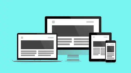
17:07 5Responsive Vocab: Floats, Flows, & Images
11:58 6Mobile First: Working Small
09:46 7Future Friendly: Embrace Unpredictability
14:17Collaborating with Your Clients
13:52 9Prioritize Your Users
39:42 10Best Practices for Defining Success
08:58 11Intro to Scrum
04:24 12User Stories & Epics
35:53 13Content Basics
27:40 14Defining the Visual Language
22:31 15Starting with Type
35:31 16Starting with Grids
15:40 17Gutcheck & The Product Brief
22:03 18Working With Developers
12:33 19Communicating with Developers
16:25 20Finding a Common Language with Developers
06:28 21Code Literacy
04:37 22Sitemap & Wireframe Basics
33:48 23Prototyping Basics
12:02 24HTML Prototypes
13:28 25Code Literacy & Developer Tools
11:46 26Developer Lingo
07:23 27Interface Personality & Behavior Galleries
17:27 28Designing for Performance
18:19 29Progressive Enhancements
07:00 30Designing a System: Discovery to Pattern Library
12:25 31Workflow Examples
20:25 32Applying the Style Guide to the Pattern Library
09:08 33Alternative Workflow
23:04 34Alternative Workflow Part 2
21:52 35Tech Requirements
21:53 36Retrofitting an Existing Site
12:15 37Project Cupcake: Building a Site from Scratch
24:08Day 2
Lesson Info
Defining the Visual Language
You know, I came from a visual design background, and some of you may have as well, so hopefully this will be an area that you're a little more comfortable with. So what we want to be able to do is figure out light weight ways to help define the visual language. And I think the key is really before we start drawing, to make sure that we're headed in the right direction. You know, and I think this is so important. It's very tempting to want to just start to dive in, right? And just start to kind of get into Photoshop or sketch, or whatever the tool is that you're most comfortable to kind of play and experiment and kind of go and just start to create something. But you need to kind of take a moment back. And so what we wanna do is kind of look at some quick exercises that you'll be able to do with your client to get that feedback, so you can start to have a discussion about what that right kind of direction is. There's a bunch of different questions that are really important to kind of t...
hink about and to ask your client. First is just do they have a creative or art director on the team? They're gonna be kind of your counterpart. Some clients may, some may not. If they do, then you're gonna try to mirror them and tease out what's important and where their heads are at, and kind of make sure that you become an ally with them because you're not trying to upstage them. You're really trying to work with them and just make sure that likely you're gonna wanna make them look good. You're gonna wanna see if there's a style guide or brand guide to follow, you know. They go by a lot of different names depending on how long the client or company has been around. Some might have a very thorough one, some may not have one at all, but it would be foolish to not ask that question and understand where they're at. And if they do, what is the expectation? Follow the current style, evolve, it, or completely refresh? What is it they're after? So understanding that is gonna help test the spectrum of where you should go. This doesn't necessarily mean that you're just gonna follow exactly what it is that they're asking for. So if they say no, just follow the current style you still may wanna kinda push it a little bit, but at least now you know kind of where their heads are at. Have your client start to identify any visual inspiration points. Usually when I do that, I'll actually put those back into the product brief, which is something that we'll talk about a little later. But that's a great way just to understand that a likely being inspired by certain things that they're seeing, so just ask them. What is it that you find refreshing, what is it that you think represents your brand a bit, and you kind of imagine your look evolving that way. Are there any other organizational materials that are worth looking at? So maybe it's powerpoint presentations, maybe it's brochures or other printed pieces, you know, Maybe this is something that depending on where you're coming at from a designer, you're actually very familiar with because you may have worked on them, you may have helped create brochures for them or something like that. So understand that if there's other materials to gain that kind of insight from. And does the digital experience provide an opportunity to evolve the brand, or should the non-digital materials lead? What is the one that's leading here? Because if you are asked to push things or change things then you're gonna create that separation or that evolution. So you know it's an opportunity to discuss that and just be very clear. So there's a couple different exercises that I want to go through. Now, before we get into defining anything visual, a lot of times I like to do an exercise that's really just getting them to talk and use words. So one of the exercises I use is called the microscope exercise. And so I use this as a way to define the brand attributes or core values of that company. And so this is really easy. Something that you can do again remotely. It's a fun exercise, you know. Instead of drawing a big pyramid, instead you're drawing a big circle, you know. Keep it all about simple shapes. I was hoping the circle was gonna show up. The circle would show up. If we did this one in the same way, it would have been a big circle, exactly. That's very cool. So imagine you're kind of looking at this. And this is like a view of a microscope and it's at 100 power. So what you're gonna wanna do is get all your stakeholders in a room. So imagine it's the ministry of space team like you guys. And we're just gonna start to kind of shoot out all these different words of who we are, right? What are the words that we want to associate with the ministry of space. Affordable, inspiring, trustworthy, forward-thinking, right? Now a lot of these are going to be obvious. You're gonna be like "trustworthy? Of course?" And forward-thinking, right? And so again, you're gonna kind of keep going through them, but keep at it a little bit and just start to get this pool of words. It's gonna be really important because you're gonna start to notice that some of them are gonna be more important than others. So just start to capture that. And you can kind of again do this as a google doc where you're working remotely. Or just kind of draw a big circle and just start to write them all in. It becomes pretty fun to do as well. Now the next thing, what you're gonna wanna do is do the opposite. What are all the words that fall outside of the view of this microscope, right? You definitely don't want to be associated with those words. Boring, old-fashioned, pushy, cheap, you know? All these kind of ones that are really making sure they wanna distance themselves or make sure they're not associated with that. Now this isn't to say that a company isn't associated with those words. It's just that they don't wanna be associated, so there's a difference between how people actually perceive a company versus what your stakeholders may want to be perceived as. But that's really the idea. Get them to talk. And again, very collaborative. Kinda gets all the stakeholders talking together, and they're kind of building a little comradery amongst themselves. So then what I like to do is I kind of like to pretend that we're zooming in on the microscope, right? We've gone from 100 to 10 power. We're kind of much more focused. Now what you're gonna wanna do is have each stakeholder say choose the top three, right? They're gonna pick top three, they can like write them down on a post-it or whatever. And then you're gonna start to collect them and synthesize and you're gonna see what are the overlapping words. What are the ones that really bubble to the top and are most important to your team? So now very quickly within this exercise, we're starting to get some of the vocabulary we can use to start to describe how the clients want to see themselves. So inspiring, affordable, innovative, flexible, effective. These are all very much and so it's not only about the words that they've chosen, but they've also then had to make a choice about the ones that they've eliminated. So great, it's all about conversation. It's all about teasing out why they did something, and why they didn't. And sometimes you'll be a little surprised at the results. So this is a very simple exercise. You can put the results into the product brief. And it just starts to create that vocabulary. So now let's talk about how to define the visual language. We have these words, and that's gonna then lead to this next step. So of course one of the most common words, or excuse me, common techniques, that we're probably most familiar with is moodboards. I still use them occasionally. A lot of times I actually find these are even more overkill than I need. They take a little longer than I might want to. But if you're gonna do moodboards then there's a couple things I think are really helpful. For one, don't call them like moodboard 1, moodboard 2, moodboard 3, you know. Give them a name that's a little more personable and reflects kind of the overall thinking behind that particular board. Technical, wonder, educate, right? It's gonna make it much easier for the team to talk through and be like "oh I really like this thing on wonder" or something like that. As opposed to "I think it was number 3." So give them a name. And then also put down maybe some different attributes underneath, right? What are some of the words that you would describe that kind of help fill out some of the ways that you would look at this mood board. When I do moodboards too, the other thing is I like to kind of mix it up. So I won't just wanna say like find just websites, right? I might throw a piece of furniture in there. Throw in an architectural space, throw in a toy, you know. Throw in things that aesthetically get that vibe across, but also throw in interface stuff as well because you wanna make sure that there's some particulars but don't feel like it has to be just websites you're looking at, just one type of thing. Really kind of blend it a little bit. Sometimes it might just be a photograph. It's all about again creating that mood. You can see these words underneath on a horizontal line play off of each other. So if you're establishing teamwork, what is the associated word under wonder? It's fantasy. Again, in the other ones are formal. Lines relates to gradients, relates to flat. Sharp relates to angular, relates to round. It's how they play off of each other. They might not be the first word you associate with that mood, but if you put a word down for one, you gotta find a complementary contrasting word for another. Again, it's giving your designs and your moods some topography, some depth, and some distance. Exactly. So very quick, we're probably most familiar with these. Now where do you put those moodboards? So one of the tools that I like to use a lot is called Redpen.io. This is a really great, simple tool. It does one thing, and one thing really well, which is allows you to throw a jpeg or a png up, and allows you to comment on top of it. So you could still use something like Envision for this but Envision is kind of, the way I look at it is, something like Envision I use for things that I want to be around a little longer, right? Redpen is really great for those quick conversations that you wanna have that you can kind of again do this remotely and be like "okay I got some feedback." "Boom, what do you think of this?" It's also great if you're making just a quick client change that you just wanna throw that to them. And you're like "here, here's the redpen link." After a while, depending on the version that you have of redpen, because it's a kind of different pay model, they sometimes get archived and they disappear. And that's okay because if you look at this as just this lightweight, quick tool to gather feedback then that's all you're trying to do with it. And it becomes really, really effective. Now another way to explore the visual language, is with something called style tiles. Have you guys heard of that term before? Okay. So style tiles were developed by this designer from Twitter named Samantha Warren. And they're kind of a really great way to go and establish some of the key elements that you might use for your website. And they're really ultimately about just that level of communication. So the thinking here is if say style tiles... We look at style tiles if moodboards, right, are too vague and mockups are too precise, then style tiles are kind of like right in the middle. You're trying to make it almost like a moodboard feel but you're not saying "oh this is generic." "Here's some stuff I found." You're saying like "No, no, no, these are your colors." "This is how I'm imagining your type." "This is how I'm imagining some of your elements." So you can see this is an example of one that Samantha provides on the site. And it just kind of has a lot of the fundamentals there. So it's about conversation. And I think that's what's really key about this. This isn't going to completely solve all the nuances of what that design language looks like but it's gonna now very quickly allow for a way to talk to your client and be like "is this feeling right?" So something really to consider. Now I can find that sometimes style tiles can be a little abstract. It's like here it is, they get that board, and they're like "is this my site?" "What am I looking at here?" So one of the things that you can do is you can kind of... You've probably already identified a site that they may have listed as inspiration, right? So they've mentioned "oh I really like this site and I like that site." Well work backwards, right? So go and create a style tile that is for a site that they've already acknowledged. So that way before you show any of your style tiles, show them one for a site that they've identified as an inspiration point and so now you're helping them bridge that gap a little bit. You're now giving them the way that they can understand how a style tile could potentially lead to a final site. In just very broad stroke terms. So again, it's just making sure, taking out some of that abstraction. The other thing that I'll like to do too is if I'm gonna do them then I'll usually try to put in some specific components, like maybe a component that's really important. Maybe there's a calendar aspect or something like that. So here's an example of one that I created where I had some of the key typography. So what's my headers, what's my subhead, what's my body? What are some possible colors? Some sample buttons that might be useful. Maybe some icon styles, just to talk about that. Icons, if there's any on the site, that can become this big, giant, blown out process, but now you're testing that immediately, right up front, like "hey, does this feel right?" Are these types of things feeling good? We have our adjectives, right? So we've just learned those things from our potential microscope exercise we can kind of tuck those in there and make sure does this feel open? Does it feel iconic, you know? Are those words that are feeling right for something like this? Potentially some image examples or illustration examples. So it's trying to get out of the conceptual with other moodboards and being like here's a specific example for you. And then potentially a component that might be really important. And then if you did a couple of them, because keep in mind, you're not gonna just do one. You're gonna do two, or three, or four to just quickly show them and be like "does this feel right? Does that feel right?" So it can be a really great thing. What I love about these and how I organize my style tiles is a similar fashion from like lowest base resolution to most complex. You can see how as Andy moves down the page it gets more concrete. He starts again with just general feel stuff. And then as he moves down it gets more concrete and it actually starts to represent an actual web object. But again, I think, for me creatively, I work faster in that top area and begin to see variance, and it takes me some time before I get into this component area. Exactly. I really like the way this is laid out. Yeah and what's good about these is that again it's all about the conversation, right? Now I must admit, when I first heard about these, I read a lot of the blog posts and stuff where it's like "the photoshop killer" No longer are you gonna need a high fidelity comp, and I found personally that's not the case. I still like to create a couple key high fidelity comps, because to me this is still even a little abstract, right? If I have a wire frame, well how much color do I use of those little squares? How much am I applying of this? What are the other elements that are missing? And also it's void of content which makes it feel a little abstract. So I know that if it feels a little abstract for me, it's likely going to feel abstract for my developers who are now gonna try to take something like this and try to apply it and also is going to feel a little abstract to the client. So I think ultimately it depends on a little bit about how you want to use it. And that's kind of what's great. I love the kind of web design community because what's so awesome is everyone is contributing these different ideas about how to solve these different problems, right? And so you can take what worked with you, dovetail it with your team, and potentially your client. We're talking a little bit about how savvy your client is. If your client is really savvy and they're pretty familiar. Maybe they have an established style. Then maybe you can use something like this and start to go and design right in a browser. What I think is great about a lot of these new deliverable formats that Andy and I are showing and that are available as bonus material is that they all sort of just happened. Nobody planned a style tile out. Somebody was trying to solve the problem of communicating a design system to a client. And they did this and they got success with it, so they did it again, and then it became a thing. Again, they don't come out of the oven fully baked. Like they're a process of following success, seeing what works, and then offering it up to your peers. Samantha Warren didn't have to publish this. She could have kept this in-house and just worked this way, but she, a lot of designers are frustrated with older methods and are pushing out their success stories and they're becoming adopted by all of us which is cool. Exactly. So here's just a quick one that we started creating for our ministry of space. Trying to get some of the photos, some of the type. Now again, likely what we'd have really done if this was a full blown out project we would've created multiple, right? And we've kind of shown some of the nuances and then we would've have conversations with you to be like what feels... What is kind of right? What are we leveraging and starting to establish that visual language in a very quick, easy, light way. Now there's also another way that I'd like to explore, and this is where we're gonna do a little bit of an exercise. And this is something called the 20 second gut check. So, here we go. I have a friend, Kevin Sharon, and I believe he was the first one to introduce me with this idea and I've taken with it and really love it. Because it's such an easy way to have that conversation. Just a great way to quickly throw out a bunch of stuff to the client, get some feedback, and continue to talk. This is how it works. I'm gonna show you guys a total of 6 slides. In reality, it's usually about say 12, 16, 18. It really depends on how many we wanna show. I usually feel like 16 is probably max. 12 feels often like that right spot. I'm gonna show you one example per slide, and then you're gonna have 20 seconds per example to look at it, and record your response. Now you're gonna record it in a very simple way. You're gonna say either you dislike it, you like it, or it's like "eh" not really doing much for you, could go either way. And then there's a little box underneath that I want you to fill out a little information about why. Finally what we're gonna do is we're gonna have a discussion to understand why you chose what you did. Now one of the key things that's really important is just to make sure that the types of examples you show are somewhat reflective of the content. So for example, if I'm trying to do a news site then it doesn't make sense for me to show all these examples of these simple, beautiful, minimalist, one page sites for products. Because the content is so different, that once I start to get that content in there, it's going to naturally make it feel different. So try to look and think of the content within the experience that you're designing to try to find appropriate things and you're trying to also build this spectrum. So for those of you that aren't here, this is the sheet that I gave them. And again, we're only doing six, but we go a little longer normally. So are you guys ready? Okay, stakeholders, ministry of space, here you guys go. So here's the first one. So remember the idea is just to write like it, eh, don't like it, and then a little bit about why. Now normally since Jessie is kind of more of the agency, I wouldn't have him do it. (laughter) It would just be for... This is the first time I'm seeing these so I kinda, I'm opinionated. (laughter) Where are these images from? What are these sources that you're demonstrating right now? So they're from a variety of places. I purposely don't ever put where they're from during the exercise because I don't want people to focus on that, right? Once you start putting the location, we're gonna change again, once you start putting any other information, then they start to look into that and maybe they're familiar with the brands, maybe they're familiar with that kind of stuff, so you wanna keep it as vague as possible so they focus on the right stuff. Oh, good to know. Dan Mall, who's a really influential designer, does a version of this exercise where he actually put your company's logo on these screens. So he takes your brand, but will put it directly on another website. Just throw it right on there. That way you could see it in contrast, and see the two together, and then again have a visceral reaction. So it's a play or a change up of a similar thing. Exactly. A really great way to take it even a step further. Yeah. There should be one more after this. Again, the idea is you don't want people spending too much time. Because then they're gonna start to look at a little more about the interface, can imagine how it's working and stuff like that, and it's really just that gut check kind of feeling. That kind of fresh outlook. Exactly.
Class Materials
Bonus Materials with RSVP
Bonus Materials with Purchase
Ratings and Reviews
CityGirl
I've already taken several web design classes, but there were still some details that I found confusing. Andy and Jesse did a great job of explaining things like; programming languages and how they interact to form the structure of a site, work flow responsibilities between team members and the blurry lines between them; and agile methodologies applied to work flow. They used case studies to illustrate how this all happens, where variations crop up, and how to address them. If you're new to web design, or just want to understand the functions of other team members, this is a great real world look at the whole process. I haven't found this in any other class, either on-line or local. Andy and Jesse are both very experienced working designers with current knowledge. They're very responsive to questions and seem to really enjoy teaching. Having two instructors is a great benefit because you get double the perspective, knowledge, etc.
Junko Bridston
I worked with Andy when he was a Creative Director at Funny Garbage, a design studio in New York City. I found him to be knowledgeable, articulate, and lovely to work with. I learned so much from him at the beginning of my career. In response to a previous comment: it seems silly to dismiss this class because Andy wears t-shirts with his blazers. If you think leaders only wear suits and ties, then maybe this class isn't for you. But if you want to learn from someone with loads of experience and a friendly manner, I really recommend it. You won’t be disappointed.
Jesah Segal
From A to Z, this class methodically covers everything you need to know to create a website from scratch. Great class. The teachers are great too.
Student Work
Related Classes
Branding