Lessons
Day 1
1Class Introduction
09:10 2The Design Flow Basics
18:27 3The Designer as Co-Creators
06:48 4Get to Know Your Material
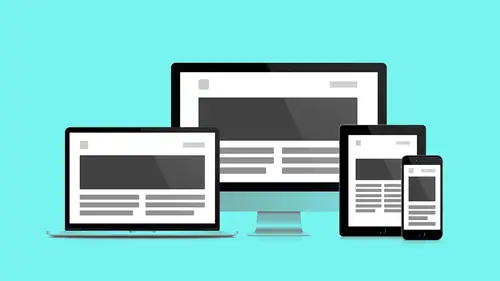
17:07 5Responsive Vocab: Floats, Flows, & Images
11:58 6Mobile First: Working Small
09:46 7Future Friendly: Embrace Unpredictability
14:17Collaborating with Your Clients
13:52 9Prioritize Your Users
39:42 10Best Practices for Defining Success
08:58 11Intro to Scrum
04:24 12User Stories & Epics
35:53 13Content Basics
27:40 14Defining the Visual Language
22:31 15Starting with Type
35:31 16Starting with Grids
15:40 17Gutcheck & The Product Brief
22:03 18Working With Developers
12:33 19Communicating with Developers
16:25 20Finding a Common Language with Developers
06:28 21Code Literacy
04:37 22Sitemap & Wireframe Basics
33:48 23Prototyping Basics
12:02 24HTML Prototypes
13:28 25Code Literacy & Developer Tools
11:46 26Developer Lingo
07:23 27Interface Personality & Behavior Galleries
17:27 28Designing for Performance
18:19 29Progressive Enhancements
07:00 30Designing a System: Discovery to Pattern Library
12:25 31Workflow Examples
20:25 32Applying the Style Guide to the Pattern Library
09:08 33Alternative Workflow
23:04 34Alternative Workflow Part 2
21:52 35Tech Requirements
21:53 36Retrofitting an Existing Site
12:15 37Project Cupcake: Building a Site from Scratch
24:08Day 2
Lesson Info
Alternative Workflow Part 2
Here's another scenario that's very likely. You're a designer. You have a developer that you're working with, but you know what? They're not going to be able to go and bust out any kind of responsive wireframes. We're not gonna be able to get into a browser quite as quickly as we want. You're still going to try to get a browser as quickly as you can, but you're not going to be able to have, say, the responsive wireframes lead because you have to show something to a client very quickly. They're asking for something. So, how does that work? What's different there? I think the first is that a lot of this stuff would still be very similar. We're still going to create a product brief. We're still going to start to capture those user stories. We still then want to have wireframes, we need to have the wireframes. Visual language is still gonna be the same. We're gonna do some comp design, but it's gonna be a little different because it's gonna start from scratch. We're still gonna create a co...
mponent guide out of that, we're still gonna explore a behavior gallery, and we're still going to have a pattern library. So all those things will very much continue to be in place. So wireframes, here it is. We definitely need them. Now they're very, very critical, and what I'm talking about wireframes again these are the static wireframes. We don't have those HTML wireframes anymore, but we still need that, we still need that sitemap, we still want to be thinking about the high-level content reference wireframes, all that kind of stuff still needs to be in place. We still also wanna try as much as possible to get real sample content into those wireframes, so the wireframes are then indicating again that hierarchy, that structure. They're not design, they're not pretty. One thing I just wanted to mention, when it comes to Balsamic, which is the tool that we use, there's two versions, two styles of Balsamic. There's this sketch style that you can use where it looks like drawings, and then there's more of a clean wireframe style. I always prefer to use the wireframe style because I like to keep things a little cleaner. It's a preference, same with the typography. So they have a default Balsamic sans, I think it is, that's kind of like a comic sans type of typeface that comes as the default, but now you can use with the newest, latest version of Balsamic, all types of typefaces, but keep it simple. Again, use the aerial, use helvetica, don't try to over-design them because that's not the point of them, but I still have a little bit of a problem using something like Balsamic sans, because I'm like, "Oh, god, it hurts." I think it's hilarious. It is hilarious, but there's time for fun-- Sometimes I want to put a little cartoon characters off in the corners, it's just sort of lighthearted. The intent behind it is that so you purposely look at them, saying, "This is a sketch, this isn't for real." And that makes a lot of sense. The thinking there is spot-on, I just think that I still like to have it a little cleaner. I like to think that the logic is, "I want to look at these as little as possible. "Okay, okay, I get it. "Okay, I got to avert my eyes, oh my gosh." These all get too attached to it, making it look, yeah. So, now you have these wireframes. You're going to go into designing some type of high-fidelity comp. Right from the start, talk to your developer about what grid to use. Have that conversation. This is where we talk. It's not just about grids are being used to help and form and keep us designers organized as we've seen, as Jesse's explained, there's a direct mapping to being able to call those specific columns to help create our templates and our pages. So we want to respect that. If we deviate from that or come up with something different, then all of a sudden, whatever the developer is using may not match what your designs are, and now, no matter what, they're not going to be able to get to what you designed without starting to change a lot of stuff. And, they likely will be able to match it, but now you've created unnecessary efficiency, just because there wasn't communication there. So, if we were to go into Photoshop Comps, now you can go and create a new guide layout, and then you can start to setup those guides. What is the column structure you want? Just start to build it based on that conversation from the developer. So you can use some of the tools that Jesse was talking about and figure out what that grid is, and then essentially recreate it as a Photoshop file. Now you have a structure, really awesome. Could do the same thing in sketch. So this is a tool that I was mentioning a little bit before. So Sketch is an alternative to Photoshop. It does some really cool things. One of the things that's important to note is whereas Photoshop is primarily pixel-based, Sketch is vector-based. So in some ways acts a little like Photoshop, it tries to do some of the same things, but it's more of a vector-based program. It's just my, "Thank you, sir," first-time caller. The theory is that Photoshop was designed for photography the same way that Floats. We've talked about Floats like they're a new CSS grid systems coming online that are designed to do specific things. Photoshop, it's great, but it's designed as a photo metaphor. This isn't photograph we're making, manipulating. This is a flexible page layout, sketch, reset some of its logic specific to that environment, so I think that's why it's shifting and changing. And as you're starting with, say, Sketch, you can start with a template that will give you basically a small, medium, and large type of breakpoint. And one of the things that's different between Photoshop and Sketch is essentially Photoshop, every page, or whatnot, is gonna be its own file. So if you wanted to have a mobile or small version, a medium version, and a large version, that's three Photoshop files, whereas Sketch you can have all of those different canvases on one page, so you can see them all together. You're seeing the system a little more in context to each other, which can be just very helpful, just to be able to play back and forth. So you can start with that template, and then you can apply those grids to those individual pages, which is really great. So, besides starting from scratch, there's also another great way, which is download a template. So go to the interwebs, do a Google search, you're gonna come up with a lot of different options. So do "responsive design, PSD Template," "Responsive Design Sketch Template." You're gonna start to see these things that people have already set up. Make sure, of course, that your developer is cool with the one that you're using, but now you're going to have something that's already in place, and you can very quickly build on. And I would say with a lot of these things, so much of the stuff that we're talking about, you often don't have to build from scratch, even when you're doing wireframes. If you are in a lot of these programs, and it depends on which one you're in, there's a lot of other ones to do wireframes other than say, Balsamic, do a search for, "UI stencil kit" for the program that you're using. Now, there's certain types of things. I know a lot of people that will do wireframes in something like Illustrator, they'll do something wireframes in all kinds of programs, Balsamic, Omnigraph, all those, quite a few different out there. When it comes to something like Illustrator, I actually don't recommend doing wireframes in Illustrator, because for me as a designer, I try to make them too perfect. It's you can tell when something's off. But it's your workflow, this is me and my choice, and for you, it's like figuring out, well if you're really fast in it, and you're okay with just moving stuff around, totally go for it. And I think if you were to do a search for say, "Stencil kit illustrator wireframes," you're going to start to find some stuff that people have created. There's a lot of very quick ways to get up to speed. And so you can go to, say, a place like here, 1200pxgrid.com, and you can enter in, say, "Column with number of columns, gutter width." It's gonna give you the example of what it's going to look like. And now you can download a Photoshop file, you can download a CSS file, you can download an Illustrator file. So just like this, you can say, "Hey, what was that thing that you were doing "in that program? Okay. "Let me go and try to recreate it in here, "and then I can have a file to work off of." Pretty cool stuff. Other frameworks, we'll have one, this is a different one. So, Jesse talked a little bit about Bootstrap, Foundation, Gumby's another one. You can go down and within this, basically they have different files that you can also dive in to. So, really great, if you just click right here with the UI kit and templates, you're going to be able to get some of those files as well. So much stuff out there. Here's a 12 Column Bootstrap PSD. Boom, you got a lot of stuff to work on there already. And this is not just a nice grid to get you going on, again, this all has meaning for how the CSS is gonna map to those columns. How does it tell the way the layers are saved, it's organized in the naming structures, sort of similar to what you guys were talking about earlier? You mean the layers within a file like this? Yeah, within the Photoshop. So the Photoshop is going to be pretty empty, right? Because the only thing it's going to contain is going to be the grid structure itself, so you're gonna take that and use that almost as a background layer, to then build on top of, and still start with header, body, footer. Boom you got those in place, and now you can build from there. Yeah, usually they're a masking layer and some guides-- It's usually pretty simple, yeah. Yeah, real basic. Yeah. So what would make it particular to Bootstrap versus some other program? Likely, it'd be probably some of the calm widths. Some of the measurements would be a little different. That's likely going to be a-- They're fairly minor, but they're enough to just cause frustration. Yeah, it's how the margins the are calculated pretty much, and how many columns. Think everybody, Foundation supports any number of columns, Bootstrap must also at this point also do the same thing, but they're these fairly standard sets, like 12 and 16. So they're just packaged up slightly differently. So just the more accurate you can get, just by that conversation, why not start with the same one? it wouldn't be the end of the world, be like, "Now I've used Bootstrap and we're doing Foundation," (mimics head exploding) "start over." That's not going to be the situation. Yeah, things are going to translate a little different than you expected. So, design the extremes. Now I'm just designing those key ones. I'm not trying to do tablet or medium, really just trying go and design those two extreme points. That gives me enough information. And hopefully that's enough information for my client to get an idea of how this experience is going to be. And, up front, early, talk to them about that, make sure that they're not expecting to be like, "So when am I seeing the watch? "And I don't see tablet yet? Where's that?" It's all about communication with your client so they are getting those expectations met. So you can see how that translates. So, when we did start with this build from scratch, we did it in Photoshop, and we started with a modular scale, the one we used was the Major Second. So this is the one that gave us our starting point. Within that we're then able to create this consistent modular scale between the two different points. And one note on that. You'll notice that he has a lot of variation there, and he's not using every one. If you go back to the previous slide. Yes, that's a good point, yeah. He's not using every one of those. He's picking the ones, but they exist within the same family, but he's not committed to saying, "Oh I gotta have how many H's? "That's like 12 H's." I only need to use the ones that represent the level of contrast that I need. So maybe it's like, "I wanna use this one, "maybe that one for sub," and may be like, "Some of that." This is more just giving you a range of options, but yeah, this isn't trying to be like, "I've hit all the notes." I have to use them all in order for them to make sense. So here it is, yeah we have the consistent scale. So the one thing that I was feeling when I was looking at this, I was like, "I like the way it feels on mobile," mobile first, started there, "but what feels a little wrong to me is the large view." That title feels a little too small, maybe. Like that H1 eventually would become an H1, but that title maybe just isn't doing what it needs. So what we do is we updated the scale itself, so when we get to the desktop breakpoints, we're basically saying, for the H1, "Let's increase that." We're gonna tweak it a little bit. Now that doesn't mean you need to tweak everything. This is where you're looking and adjusting. This is where web has really become a craft, because we now have control. We have the ability to manipulate and get into some of those nuances, and just play a little bit more. So just want to go through a couple quick tips. The first we've talked about this a lot, just organize your layers again. So you can see here, header, body footer, boom, start there. That's where you start, every file. First thing you do when you get into Photoshop, create header, body, footer. Good, right? Then you're going to start to dive in and add more stuff. Same with Sketch. Now Sketch you might want to organize it a little bit different. But the key is organization. Name your layers, so besides just the top ones, there's something that's really awesome about the latest versions of Photoshop. So if you name your layers based on the name of the layers themselves, you can export the graphic directly from that file. So if I want to call this MOS_logo.png or .svg, then, boom, you can hit Generate, which is the button you're going to look for, and then all of sudden now you're going to start to see all the assets that you need. And even more specifically, especially with things like SVG graphics, you're going to just take advantage of smart objects. I'm not sure if you guys are familiar with smart objects, but essentially if you have a smart object, you're taking a vector piece of artwork and you are bringing into Photoshop, you can respect and keep the scalability, the vector attributes in place so to speak, so that way you can keep scaling it, and that way when you export the SVG, it's going to just respect that you don't have to turn it into a PNG. Really awesome stuff. The other thing that you can do is if your images are large enough, then you can export at different resolutions. So if you need basically retina photos, then you can export at the different sizes right there. Now you may not want to, because again, now you're talking about the same photo that's basically being exported at different sizes, you'll likely want more control. So this isn't saying that you have to do it that way, and this also may not be the best way to optimize, but this is one way to start to generate some assets, and just another technique to move from something that's about creating a comp to making production-ready assets. The other thing that's really helpful is to use vector shapes in Photoshop. So if I needed a shape or something like that, I'd always just drag a marquee, fill it, yes, done. And the process that is a little more tricky but better is to use actual shapes, because now we have an object, we don't just have a fill, we have something that is also scalable, so if you're using these vector shapes, they're all scalable elements. When you are making backgrounds, depending on the image itself, keep in mind that what you're seeing in your canvas on Photoshop, well that's not the browser, we're still not in a browser yet. So what you need to do is just imagine that you may need more space on the sides, you may need to consider that in the art direction. And where I've come up with problems with this is I'll have a photo, and I'm like, "Oh, it works perfectly from here to here, "but the problem is is that I have a little extra stuff "on the side here, but it ends right there on the edge "and there's no extra margin on that right side." So inevitably, when it gets put into the browser, it always feels shifted, and there's not extra room within that photo to really give it that margin it needs to sit centered the way you want it, and to have that cover experience. So, just something to consider that when you have your files and your mocking that stuff up, you need to account for more image than what you might see in your Photoshop file. There are two ways that I've found to play with this idea. You can either A, add gradients to the ends of your image and transparent that out, so it fades into a solid color, or talk to your development guy who can actually do that for you, give that a max width and allow for a gradient fade programmatically, help assist with some of that stuff. This is still a really good guideline, but there are always edge cases, and again, there's more options. Yeah, that's a good point, because really this is the problem, the solution is to either have a bigger photo, or to figure out how you can gradation it out into a color, or choose a different photo, but knowing that that's going to be the case, and so then all of sudden you're going to be surprised when you're looking at in the build, and you're going to be like, "That's not my comp. What happened?" Well, that's probably what happened. Now the last I just want to make is to, again reiterate, make breakpoint specific images, the butler makes his final appearance. He does not want to be just squished in the phone. He want to be seen as the hero, and so just make sure that you give the cat the proper due. Otherwise he's looking at you. So we've been talking a lot about performance this whole time, and a lot of it was again in images, but there's another area that really deserves a little respect and consideration from a designer's perspective, which is thoughts. Thoughts get heavy, and you may be inclined to use a lot of them. So as designers, we need to be mindful of not only the variety of typefaces, but also the number of weights that we're using. So, I want to pull this up. So roboto was the typeface that we used for Ministry of Space, and what you can see here-- Fullscreen that real quick. Yeah, see if we... There we go. So we can see here is that start to see some of the different weights and styles that are available, which is quite, quite a few, so to download all of these would make things very heavy. On the right here, and this is again for Google font, they show page load, they want you to be very mindful. With every single choice, there is a tax, so to speak, that you're paying. So as we start to add these, you'll be like, "Well I definitely need bold, "I mean, I have to have a bold, and I need medium. "Light italic was a really awesome one for quotes, "I needed the light, the thin was really something "that my client requested," and I keep going up. Well I'm just going to add them all now. And so if I start to get all of them here, roboto is actually a pretty light typeface, all things considered. You can kind of see, now we're starting to really add that weight. And so, with something like this, if you're going to use Google fonts, this is a great way to check yourself, and be like, "Do I really need bold 700 italic? "Is that something that I have to have?" Maybe you don't. Allows you to play, again, more of that role into that consideration. You can additionally hide those fonts behind breakpoints too if you really want to shield them and keep them as a progressive enhancement. But yeah, less font files is definitely, definitely better. Which is hard pill to swallow. That's fun.
Class Materials
Bonus Materials with RSVP
Bonus Materials with Purchase
Ratings and Reviews
CityGirl
I've already taken several web design classes, but there were still some details that I found confusing. Andy and Jesse did a great job of explaining things like; programming languages and how they interact to form the structure of a site, work flow responsibilities between team members and the blurry lines between them; and agile methodologies applied to work flow. They used case studies to illustrate how this all happens, where variations crop up, and how to address them. If you're new to web design, or just want to understand the functions of other team members, this is a great real world look at the whole process. I haven't found this in any other class, either on-line or local. Andy and Jesse are both very experienced working designers with current knowledge. They're very responsive to questions and seem to really enjoy teaching. Having two instructors is a great benefit because you get double the perspective, knowledge, etc.
Junko Bridston
I worked with Andy when he was a Creative Director at Funny Garbage, a design studio in New York City. I found him to be knowledgeable, articulate, and lovely to work with. I learned so much from him at the beginning of my career. In response to a previous comment: it seems silly to dismiss this class because Andy wears t-shirts with his blazers. If you think leaders only wear suits and ties, then maybe this class isn't for you. But if you want to learn from someone with loads of experience and a friendly manner, I really recommend it. You won’t be disappointed.
Jesah Segal
From A to Z, this class methodically covers everything you need to know to create a website from scratch. Great class. The teachers are great too.
Student Work
Related Classes
Branding