Lesson Info
19. Lettering By Hand: Watercolor
Lessons
So You Think You Can't Design Custom Lettering?
36:31 2How to Treat Art as a Job
05:16 3Setup & Automate a Project
05:52 4Dive in to the Creative: Brainstorming & Thumbnail Sketches
05:00 5How To Gain Inspiration
04:05 6How to Find a Motivator
16:03 7Manipulate Existing Fonts
19:51 8Manipulate Existing Fonts: Embellishing
12:15Manipulate Existing Fonts: Adding a Drop Shadow
08:16 10Illustrate Original Letterforms
16:21 11Illustrate Original Letterforms: From Sketch to Illustrator
08:32 12Illustrate Original Letterforms: Create Simple Shapes
11:39 13Illustrate Original Letterforms: Discover the Pathfinder Palette
35:04 14Illustrate Original Letterforms: Use the Offset Path Tool
09:58 15Lettering By Hand
04:38 16Lettering By Hand: Flare Tip Pen
18:31 17Lettering By Hand: Sharpie
11:57 18Lettering By Hand: Brush Pens
18:08 19Lettering By Hand: Watercolor
10:49 20Lettering By Hand: Working in Illustrator
15:44 21Final Words of Advice
03:43Lesson Info
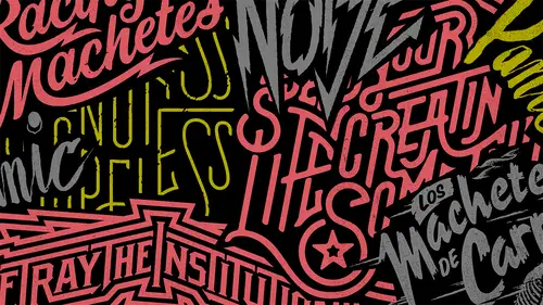
Lettering By Hand: Watercolor
I think water color first I have to explain this isn't going to be one of those light soft water color type of paintings like I know when you think of watercolor and if you think of a painting it's like a lot of passed out colors are like I don't know like a field or like a landscape or something like there's a lot of there's, a lot of color that's not what I'm using this tool for amusing that's the same way we're using all the other ones so I only use the black so you can go ahead with me if you have everything you need. Um because she's my paper towel on um water you guys know how to use watercolors, so the principles of this are very similar to the brush pin. Uh, but there is a capacity that you can't really do this with a brush and you're gonna find the water versus pigment relationship. And how do you get that right? Um, so anyway, I got a word. Can we get a word from online? Anyone put any requested here on the earlier request? About shaky, shaky, right? Okay, toast too shaky. No...
w again, even more than the brush pin, we could get a very, very, very thick line, but I would say go a little slower with this and different watercolors react different ways, so some seem to have a little more elasticity in them. Some are a little more dry. Um, if that makes sense, but you can also use, um, the interior, you know, with watercolor, you can go back over what you've done and change it. If an area got too sick inside, then change it. There's definitely a trend going on as far as water colors go with, um, really quickly done capital with lower case? Um, it's definitely like, you know, I find a lot of fashion forward stuff is, uh, you know, calls for that sort of thing or it's really appropriate for that again. If you can help it, try not to let him touch articular brush that you only like to use when you're working with water colors or no, I usually use this a thinner one. The bigger ones just seem very difficult to manage, and I don't work on big enough paper too. Um, use big russia's and really part of the reason I use smaller papers that I can put it in the scanner. Last thing I want to do it just do all this stuff on big paper that I can't get through the scanner, I don't know if they make skinner is bigger than that, but, um well these scanners are like one hundred dollars scanner so I'd rather just use these little scanners in tow have to buy a big expensive one that daily resigning is gonna have big paper and this stuff diesel sketchbooks just sit on a shelf right beside my desk and um I fill him up all day every day just about just about every project that ideo um starts inside of those and it's really cool like for like for instance the blink when I to logo is in one of my sketchbooks and now it's everywhere with them so what's cool about this is that we're getting different um you know, dark and light levels inside of the letters so we can figure out ways to pull that out even more once we get inside photoshopped now for your water coming don't just flip it over um yeah I don't know if we have time to do another one but patricia says fantasy fantasy okay okay so I'll do curse of a fantasy you know the other thing too something I dio is what I think of fantasy I think about the most typical way it would be shone and I don't do that so my first the first well it's not going to let my first instinct I just think of what the most typical way of doing it is and then I want to try a new approach to it unless one the lights and darks kind of start with uh you know, kind of happy really and I think that's kind of cool because this story there kind of makes you think of the person who did it who did it anyway and kind of inject your humanity into it I think it goes a lot longer than you think it does because we'll tend teo look at it as imperfection from imperfections and things we did wrong uh everyone else looks at it as someone else's personality that isn't them and I think it's important to know that because, um perfection is not the goal it never is. Um the goal is honesty and what works for the project fantasy there's a way that I would never ever draw it but there you go, fantasy and here just for the sake of this I got a little more water now and start dabbling in here and let this the water just sort of like take this stuff somewhere and um again and it will give it kind of a cool story may not fit but I mean it is destructive I say destructive like that I mean pointing a return but this also starts making something like a dream something like that that's that's fitting all right so that's watercolor you guys get it and there's a lot of different ways for you, teo, you know use these tools and mean as many fonts is there are there are more ways that you can do this stuff by hand so it's infinite the different styles that we can do with these tools but from here um I think we need to get into the computer so I can put all this stuff in context and we can you know talk about how this stuff is actually going to get be able to be used and manipulated inside illustrator which is you know the point of everything I've been shown you so far real quick let me take a look at some of the stuff you guys have done shake fancy and macho and he underlined macho here and it's important to see it's important to see all of the things that happen in that little underline of macho he got a bunch of cool texture and that texture is usable um later on just like I said with his brush pens stuff um these air little elements that get dug it um it would be used later this fantasy is so cool because it looks sharp and it looks like a dark crystal or something like that and oh this one's really cool so so what it looks like she did that she kind of went back over top of the thing she did originally so some of these lines got repeated with a um with, you know, less pigment so that one's really cool yeah, the shake again. She's got all these different thicknesses. I mean, this is always different. Light and dark levels inside this so there's, just the story. And she got some really cool texture here around the ass and all that stuff is stuff you just can't plan, and you can't really design that stuff. It's not very easy to do that sort of thing inside. Photoshopped her fantasy is a whole lot better than mine. So this is a title for a disney movie right here. So, yeah, she definitely got it and there's a whole story going along with everything. She got a ton of texture here, the way the brush hit the paper, there's a ton, a ton of stuff going on around them. And he took and move the brush around and it's cool when you keep going, when you're just out of ink and you see what happens after that so hee, all these little underlying this stuff, he got so many texture out. So the teeth of the paper helped him to get all those all those little lines on that texture out of it.
Class Materials
Bonus Materials with Purchase
Ratings and Reviews
Md. Monayem Hossain
This course is a great introduction to hand-drawn typography. The lessons are clear, beginner-friendly, and encourage creativity. Practical exercises help improve technique, and the tips on spacing and composition are very useful. Perfect for anyone looking to learn custom lettering!
a Creativelive Student
This was a great class to watch. Extremely informative and fun. It's great to see someone so passionate about they work.
Eric
A great class that inspires a lot of confidence and shows off some very simple yet effective techniques to create great lettering.