Lessons
Types of Logos & Wordmark Classifications
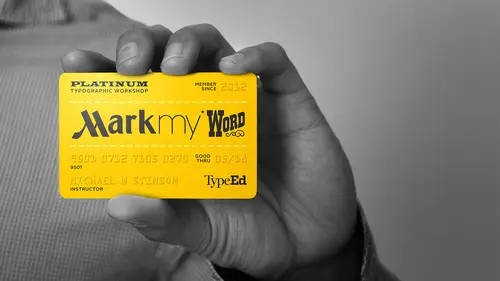
12:22 2Assignment 1: Analyze the Mark
29:22 3Assignment 1: Concepting a Wordmark
39:49 4Assignment 1: Sketching Letterforms
30:27 5Assignment 1: Sketching Continued
39:00 6Assignment 1: Finalizing for Digitizing
24:58 7Assignment 1: Digitizing Sketches
35:34 8Assignment 1: Critique
06:59Lesson Info
Assignment 1: Concepting a Wordmark
Are you getting down something here that I see I see scrolling down getting down in the eu's yeah, only a few millions or difficult yeah, yeah I mean that's a good point actually are there any letters that you look for that may be easier that kind of give up more ideas? Are there some letters that you just kind of stay away from that don't bring together so many ideas for me in this exercise in the time we have, I'd be looking at also um how pure the care the characters of the typeface is like if I'm looking at I was just going through here and looking at, uh whether I would want to mess with something of perfection like tiffany, which is could be difficult if I have something that's completely custom like this, it might be less of a challenge because these air kind of altered characters right? And I can there's more personality and then, uh I'm not saying there's less personality in the in the tiffany one but it's it's more of a classic and pure and everything is a lot more subtle to ...
see what's happening what they did to the character forms, right? If there was anything at all but um, in changing this since it's so pure you know, I'm looking at tiffany and cummings got to f and it's in small capped right um the tea and the sea or both capitalized but everything else is in cops as well so that the characteristics here to me of this mark are the tea and the sea the two f's and the ampersand and the the way the characters air arranged um and the count of the characters so if I would actually put um tiffany and cars let's say I get all the way across the brand mark and then I have a couple more change characters, right? So when we read we we kind of pick up speed as we go through the word so to change it drastically and could make sense but then again, the idea is not that strong so that's really what's going through my mind here but then on top of that, these air such pure character forms don't really want to try to mess with creating an r in there that I need r s yeah, so at that point I'm going to go for me personally, I'm going to go okay, what classification is this type fees narrow it down to what typeface it actually maybe to study to make an orange and ass now, while we're on tiffany and co, I just I'm curious to know a little bit more about how the ampersand in any sort of punctuation how does that change your thought process when you go through these for me it's it's if I'm going toe re conceptualize this the and tristan to me it would have to stay in the spot it's in yeah and if I change this see um it's got to be subtle I may now that let's say just one idea that your answer my head everything is online now yeah including a classic you know brand like this so just changing the sea to a g and removing the punctuation uh could be enough to make this idea work right for this exercise because if you turned anything else part of that it's going to really you know ok they really changed a lot so that's what I'm thinking when I see this this exercise through this brand mark like the press right? I was looking at as well and I'm sure there's tons of ideas here but you know, uh being in l a we know this mark well, so but again it's one of those things where this is a of you read it you're reading it vertically but that is distinct because it has all that negative space to the right of it. So you put a full word in there and now we've got space issues um also do I do I really want to change the first two words at all um and if I start to think if I was on this game show that less where would definitely be wrong because I'm not gonna get so um so that concept might work because I'm leaving the first three words intact and all the only thing I have teo the putting wrong in there I still have the same character count right? So that kind of works this idea kind of works is the way I'm seeing it yeah and it's funny that you bring up that change because you say you know you're not good at games no how much does that personality play into all of these were marks you always kind of have that in the back of your head where there's a personal thing from your personality that plays into that that's what I try to you know me personally as I do but that's what I want the students to do too because, um it's going to make it fun for them in doing this and also uh it brings their own personality into the work and everything so great he has some of these could be quite funny if if you really put your personal experiences in here with a lot of these brands I don't know I personally I golf but I've never seen this mark as taylor mint I've seen it does a lawyer made myself oh yeah uh I got my mind visually kind of skips the tea um and I understand why they did it but I've not sure what I would do with this one personally what well one idea is this that I'm not a very good golfer so might be taylor missed because you have to be pretty precise and off to hit the green right so that might be an idea from paris to you guys know quite a bit of these brands right I was like you're not just hitting like one or two that you know right decent okay and a lot of times what brand marks like this too that's a lot of explosion that you have to do like just this one this is from my childhood I played baseball spalding is I believe they make gloves baseball gloves and and other sporting equipment but you have to also um demonstrate in that mark or get some kind of hit and that's the way I learned doing identities isthe do you have to give some kind of hint of what the company does at all times falling so the study here if you see a kind of ah similarity here this brand and this brand what's the similarities here the hate in the middle all captains pollution right flowers out so the question is do I need that if I have some kind of physical brand sports or anything ever lost is the same way don't figure out if you know that brandon boxing so that they pitted me have sports branding is you gotta have those two arcs that's another thing I think about this exercise when I've had to do this professionally with brands you know michael, I think now it could be a good time to check in with our students here I see some people look like they're feeling pretty good why don't we just go down? We'll start over there with lex first let us know where you're at so far show off what you've been working on we'll be sure favorite idea that I've had so far is turning calloway and caddyshack fellow cash that's outstanding um kurds, which I think is like a gym for one thing I would change into curses because I hate going to the gym she his words? Well, isn't it not pleased to be there? Um let's see l being toe l boot it's because you know them is a outdoor shoe company. Um, another favorite is power bar into power bar because I'm just very good, you know, sorry. Power by three so what's, your favorite was working for you. I like I like the callie one because I actually also really like the typography of it. So I think the fund do you know what? That one with the typefaces? Um well, we're gonna calorie. We're looking to callaway, right? Yeah, let's bring that up on the screen here if we can so hee I mean I don't know it kind of that's considered black letter at all yeah very much to form a bloc yeah that's great do you have can ok I have a leave alleviate I also have advil for alleviate because they both are painkillers facebook fake book very have marriott marriage prada pricey revlon rouge the price is right take the prize home and vogue vein was very good but how about the rest of you you need any favorites in there for cannes yeah three d this is your chance to get some feedback a group here yeah yeah but I liked like marriott it's pretty good I mean how many weddings I didn't marry on quite a few I think I feel like the letters between those two words work pretty well yeah because you have the first four now the first five ride to we're creating two new letters because he would have to do a lot of like work tio create the g though yeah yeah but that's the challenge let's see can we get that up on the screen here as we talk about it yet let's just see if because it may help to spur some ideas if and people at home can check it out too and they're so the distinct again to me the distinctness of this is is the m the two r's in the tease and it's lower case but you don't have the dot on the eye right? So really you'd have yeah we need an energy so that's one of those things is to story g single story g which one two story correct yeah and that's the whole thing too about this watch does just to get you to think about the type itself more right excellent. Those are all great ideas great idea so far my looking kind of quite team in years so how about you okay I have um I like the best buy local what and I got black friday for that um and then caesar's palace caesar salad um kamel caramel there'll be interesting charles schwab khan saab um I forgot what this witness ok anyways um craftsman into crafty women um oh mr coffee into more caffeine the price is right the pricing right they might not work and then um legs I don't really know what that is but um I get leggings okay yeah, I like caesar salad and I can tell just from where I'm saying that you actually drawn a lot of these out yeah forget so that helps you kind of in the creative process rather than just writing it you're actually sketching yeah, very nice people visualize right away yeah that's good there was one in there uh did the price is right is the pricing right? Yeah price it right you know there's another one you had in there they've got a big laugh which was that let's get reaction crap on me okay? Because you know it was great. So which one? Oh, um mr coffee yeah, that might know where khan I was thinking of moving that oh, next to the end no dot oh, gosh, I see what you mean. Yeah, good. Do you thought of that right now is trying to think how that worked and then then was caesar's palace, right? Caesar salad? Is that all your e? I guess if you're in a hurry yeah that's such a distinct market. So a d any ideas of where you get it? What? Some hints that a d there yeah, yeah. Reforming this right maybe could work it's kind of interesting because they are on the p like are rounded, but the seas season s is all still have sharp edges. Yeah, those are sure I mean the ease almost like like arrows and that sense you sure? Do you think they made those choices? Because obviously this is custom it's because any letter with a closed bull has to read as that letter otherwise looked confused with like this the scene that's like all of them are curved, but I think if you were actually to flush out the whole alphabet with this it would become quite difficult to make sure you can distinguish each character from the other you're going to find out with designing your own type faces a lot too if you if you have something really just distinguishable like this like as a display face um because a lot of companies are going to ask you now it is to design their own typefaces getting requested more and more that's one of the studies you have two dio this is pretty difficult it's challenging it's good so you take you to go with this one her which one you going I don't know you know ok you um e I think my favorite that's a bummer um kamel to cancer okay um I also have chilies to calories um kalam's yeah I think of that hot lava cake thiss calories callaway to chip away um that would be me e I'm nowhere I'm nowhere near the green yeah I also had caesar salad which is funny excellent braun to brain and they kind of have the same day the same number of letters so it will be interesting um both to base because that's all I want to hear really his base um very good close the sound equipment yeah yeah um these advil toe an vilks that's what I had it feels like um that's very good always tall wings but probably going to do that and yeah that's what you see extract you guys the chilliest one stood out to me that would probably oh yeah, because what's happening here is that what's the link between the each nail yeah what's that called yeah just happens to be on the bottom I don't know if there are any ligatures that's a question on the bottom of you could do is in the top um you guessed so what's going to happen when you put the open between their this is gonna be difficult swing here it's actually probably going to come over to this this I hear what you're to do it right yeah so that's pretty challenging so to me with this marc again it would have to be something where I'm not changing those first four characters I'd be doing it up off that which I don't even know what were you could put in there you could you could do to relax you could take the l down to the are in calories I guess well don't you could yeah cure examples from the chat room okay topping coming up with the virginia creeper says I've always referred to vogue as vague it was an old fashioned school joke on mad panda says bowflex the fitness equipment to know flex because that seems like a fitness machine that is doomed to collect dust after a while right? My dad owns one of those is collecting dust it definitely indeed ok, so some of the ones that I have had here um so I was looking at amazon and we're thinking of amazing because again it keeps the whole you know, uh three quarters of the market tact and I have to get in you know, energy in there um and then american excess for express let's see here said this would move over right? We all know what that means in excess um for american idol I put american idiots they're in for let's see what else do I have here? Cracker jack I have a cracker junk just curious as you go through these does anything jump up out jump out at you as a possible challenge? It was something like cracker jack just as we went through our students here just curious to know I mean, you having done this for a long time do you still see challenges when you look at each of these? Oh, absolutely. And it comes down again. I was talking about tiffany coming really it's those pure character forms um that I would have a you know, a definite reserve about changing it all because they're so pure like braun even reas braun solution changing the u two and I but I showed this again me personally, I mean, it seems like an easy solution, but it's going to alter a lot just in that area so what happens is if you have complete symmetry here, right? But that I doesn't have this with so now I'm going to be off so I'm going can I do I add sarah's to the you know so I'm going well that's going to be a super big challenge for me also for me chris is um if I have something like I had a great idea she said oh I think it's she saito japanese term r word right? I just thought if she said yes or no she said I d'oh I don't know if that works or not but I thought of that where we switch this out to need and then I have to put in a here which would be she said and then move the idea over it's one more just lengthen but again for this one yeah talking about challenges again those characters air so pure I would be a little nervous and trying to find the correct character if I had to invent it right that's that's the thing for me whereas cracker jack it is I believe done by hand a long time ago probably cleaned up now but um when you have some imperfections in here an instant kiss inconsistencies that gives you a little bit more room of like the ben and jerry's a little bit more room but uh getting it to get past that initial glance you know s o just that's amore these cracker junk I have the next fixed like I was talking about one of my students one did an awesome one which was the only one that I thought worked where you did where they did change the first character I couldn't believe it worked but it was such a great idea I just thought of it I don't know if you guys know this brand product he uh changed it to drama so um but again it's not it's not that big of a already had the d so you're your eyes are looking at things coming in upper left see you might skip it right away that's when we had that and critique that it was it was very well done um I've got los angeles crimes for los angeles times um and then pottery barn I haven't here as pottery bank because they give us so many catalogs they must have a lot of money right? What do you guys prefer? Which one works? Which one am I doing? I also have one that's been thought of in the past of goldman sachs, right? Because it did I put that in here I don't know yeah we did. This has been changed a lot we've had goldman sucks we've had goldman sachs with k what kind of a thing? This is a really beautiful ah word mark if you guys really look at this what what's going on here with the type and he just asked for a quick this is a great one to look at for you guys is this both his customized right? Because, um these would typically have sarah's based on the nature of you know, the typeface and in has hints of sarah ifs right? It's very needed. So you're going to see like when we get to our next exercise you're gonna be ableto customize the type a little bit more too work with a new existing symbol. This is kind of those things that you do with your parks we look at this centers themselves if you know the type you know really well a senator's always go by the the capital so these would normally be up above the g so that is that some of the text me techniques see how low this age is. It's really low. And so this is some of the techniques used what brand marks those little subtle changes uh by altering, you know, heights of a centers and dissenters cz technique we learned a long time ago. Okay, so now that we all have our away, do we pick mine? Crackerjack hee hee hee was funny, so it's a toss up. Okay, I want to share a couple of more from our room. As people you're thinking about your final choice, we have some that came in santa says lay's potato chips change that toe lazy uh, kennedy says jared the jewelers from jared too jealous and angelina says neiman marcus in neiman markup so yeah, people are having some great ideas that if you know neiman marcus that's a beautiful marcas well know that really tall compress script it's really nice well let's see, we've got our concepts and now it's a matter of just point us up so we can let's see if I'm doing amazon I'm going to open up the file you know I just try to get it as big as I can on the page alter the page and um you know, flip it around so it's eleven by getting half but it's no wait wait here area I want to start a new page so yeah once you if you can get it on too regular letter sheeting illustrator like this and uh you know, try to resize it towards his biggest you can get it on a page where you can get those characters drawn efficiently usually want to work in his biggest you can and we'll print it out and then we'll start sketching because I my job's days get in I energy in there so my first house to tell you how I'm going to go about this is as for me personally um I know a few typefaces that these is kind of lived like meta, but I'm not sure and so the first thing I'm gonna do is look through that classification we're meta is and see if I can find anything of what's happening with the eyes and the ji's in those typefaces and I'll look at all eyes and jews and see what's happening in conjunction with two story a's and see how they match up because I know in metas it kind of flares out like this so that's a hit to me of how I would go about, you know, putting the extra characters in here yeah, you would find a typeface that you think it sort of looks like and then figure out effects like humanist or geometric and look att those types of typefaces tio inform the letter you're creating yeah because if you're if since this custom here and this is just because the solution that I'm doing is, uh, contemporary right sand saref um I don't know how customized it is I assume it's a little bit because got rounded corners, so I think it's modified some and really I'm just playing detective here and that's what you guys were going to do to and so I'm just taking you through much thought process on this particular brand. So on your own if you have a black letter, um I don't know if you're going to be able to since there's so many black players have to find out which one works, so you're going to take the other option of taking the characteristics of what makes those characters look like an energy or whatever and pull them apart to see what was going to make a d or a p that kind of thing but if it was me again if I had let's see you have jose cuervo or which one was it on can tell away so I would start looking at scripts just to see how how their what their characteristics are it's similar to callaway and then see how they're jia's and all the characters that I need and how they're built and then knowing that I'm going to pull the pieces from the imb original mark and try to make it like that gee, that I'm looking at uh just as an exercise and we had a question come up here and we don't get too down the road with typefaces but kyle ghani had a good question here that was voted on he wants to know are there any tools available to recognize typefaces if we don't know what they are the only one that I know of? I think there's a couple but on my funds dotcom to have what the font okay um it works for the most part it will get you in the direction, but it doesn't necessarily always get the pimp it's not a pinpoint solution for sure because what it doesn't recognize certain characters is sticks of the characters that you upload and then tries to piece them together that way so it doesn't just give you one option a lot right now that's the only one that I've seen again I tried tio recognize typefaces through classification and characteristic that's just from the old photo type shit setting days yeah, I think that's something that that's a skill that you build over time is come better at it you look a lot of time, you know and it's much harder now for everyone because they're so yeah it's not he's crazy, but that's why I tried to my students to get them to learn classifications because it's ah, again classifications of type is kind of like I explained to my my students like it's, like uh, uh, music pop country you know, they all have their distinctions and if you think of type that way, it really helps out and knowing so for that anomaly like radio head just like where do you put those guys? You know, uh, whatever great can't classify but a lot of there's a lot of typefaces like that too. A question here from tien harvey. Now for this example, you have one word amazon that you're changing. Two amazing betty anne harvey wants to know how much does lyrical rhyming play a part in the success of a mark that has multiple work and they use an example here the price is right the rice is fried as one there do you find it easier to just zero in on one word or sometimes the easier if you have a couple of words you can rhyme together yeah no I've never heard of actually a lot of my students haven't tried the romney thing but I think that's a valid valid solution again I personally I've talked to says trying to make it as it work as a personal connection also in a typographic you know alteration that's subtle where those two things have to work together but linguistically I think there are many think or two I think that's it that's an interesting slam I think that's great great yeah should I be concerned about if I'm doing the chilies to calories concerned about the little chili pepper resolutely and that should it be something that stays the same or like find something else conceptually that goes with calorie let's see well, chile's is again it's plural right? So start with, uh the grammar if we will if you will s oh we're going to do cholesterol calories, those calories or I could do something else too, but you know calories wouldn't be yeah plural, right? I wouldn't have an apostrophe is that correct? The posture fee for chile is is it it's possessive things that's it so you could make calories, possessive colors air. Definitely possessing. So that makes sense to me, right? Yeah. No matter for this exercise, since we're you know, we, uh, a limited time. I wouldn't. If you have, uh, a little symbol involved with your word mark. Just leave it intact. No, it's. This exercise is built around, um, trying to get to intimately know, specialized characters. Negative spacing turning? No, uh, the subtleties of brand marketing. You know, um, if it's got a visual symbol in like that, yeah, if it was me doing this, I would just move it to the appropriate spot between the inn and us. And yeah, I'll do that. That's a great question. Anybody else have a mr? Coffee has won. Lex uses it, doesn't have a symbol. What about you earlier? What did you end up with thinking? Well, caffeine. Mr coffee or you are doing so killed what was yours. You get into the mira eso you don't have, so I have one. But it's it's not moving at all. So, um, yeah, I should have mentioned that earlier. I guess those are good questions doing more questions on curious as you're getting into your example here with amazon and amazing is this a situation are are you going to add that g to make it amazing or is going to be amazing with keep the same letter there do you try to keep it to the same number of letters or do ugo yeah but I mean you could do either way but then I would probably have to try to make a an apostrophe that's true right uh I could do both you guys say um well it's asked what do you guys think should you amaze in amazing really so my question is for you again this is a baseline and excite this worn smooth box now you're not gonna have it you're gonna have something up here so you're gonna have this top bottom thing going on that's just something that that was initially what ran through my mind so yeah it's those little subtle ways do I wantto actually because it is going to indicate a huge change whereas adding a g one might not be a cz much that's just and again it is no right or wrong here it's just a matter of you know what we want to d'oh but I can do both issue looks like how's that we'll see I thought it might be ok because this this arrow that's going from the age of dizzy I mean it's really pointing up here anyway like your eyes going to go like that so it may work I don't know in my mind the g would make a all heavy on the bottom but that's true that that's a good point isn't it yes no that's a very good point this is really well done mark the way to do this month by chance francisco maybe the chat room knows second hotel were always good for that kind of thing that was also I have a question here that came up just curious to get your take on that so if you create something like this well what is the next step I know we're gonna be going through these exercises but we had a question from woodland who says can you legally change a brand name and then do something like mickey shirts out of them or re purposes in a way that once you've created this do you need to sort of keep it as your own personal? This is for exercise okay this we have toe keep her eye on the prize kind of a thing for what we're here for this is to learn how to customized letter forms in a way if it's necessary especially for a brown mark and all the characteristics and the details that are involved a cz designers for me over the years is giving me headaches and challenges is to really work on those skills here that's what this class is about from a typographic standpoint okay the idea just this connection here is a really important detail it gets the motion going for this narrow street from the type if it was straight you would have a disconnect there. Those tiny details and brand marks are what make them special and special is what you want in a brand like the story behind it, right? So when you're doing this with type it's imperative that you watch those details is the brands you know seoul and personalities hanging on it that's why the type in this this case is really important executed? Well, this actually ties into a great question we just had from avery lane photography they want to know could you use the arrow point as inspiration for the apostrophe here if you did amazing is that something where if there's only one mark like that? Is it ok to add it at another one kind of as an apostrophe? Or does that sort of ruin the feel of it? It may be it may be a bit redundant. Yeah, because this thing is so special right as a symbol within the brand mark um if we if we put it up here again and it looks like we've tried to connect it, it may be actually competing with and I think it loses a lot of value when it's not connecting crazy, you know, another way to look at this and analyze it is that the bulk of this whole mark is a typeface right? So the elements that we have percentage wise or what would you say sixty forty or seventy thirty? Yeah, so that percentage of making the posture fee from the type and looked like type what makes sense? Because now you're working with the bulk of the type will it possibly should maybe just be the classic of whatever you know element is here in the time. Any other amazon questions from from you guys here? I think everybody is eager to get going on their own designs here look at that excellent already sketching a t o yeah, so from here for me, I'm going to I'm going to print this out in lace and tissue on top and just start doing my drafting thing of sketching, establishing because these characters especially if you've done brand marks before I try to work in this manner just as another little simple hint I always have my designers, the office when we're working is to always keep the original down here and to keep it small because what you're going to do once you do you're your brand mark and it's finished, you're going to do the same thing because you always want to see how your spacing closes down and if it needs to be, uh altered in a way because, um what I find I used to do as a young designers is make the mistake of when I worked at this large size that close all the characters in and then when it shrinks down it's just like one blob block because the you know, the colonel closes down so it's important that you you always keep perspective on the large and small to keep an eye on our your counters are, you counters closing down is your kernan closing down, and you want to keep the same pace and rhythm that they've already set up beautifully here intact, okay, that's one of the things when I do, we're by from scratch is I mean, I'll spend we just on the current, especially if it's a customer characters to make sure it's right show a bunch of people that can everything so that's, what I'll be doing here, so print these out, start some sketches and now's a good time for people who are following along at home. You guys should go out and print out your word marcas. Well, if you've been following along here, if you've picked one that you really like as we had to break, go ahead printed out and then come back for our next segment as we go to the next step and we start sketching, you don't want to fall behind, so if you're doing this that's the time to print it out and come back and we'll be able to sketch through and continue going with this exercise. So in any final words from you, michael, as we head to the break here, no, look, everybody and let's. See if we get rolling on these ideas.
Class Materials
bonus material with purchase
bonus material with enrollment
Ratings and Reviews
kathleenc
Great class. It's nice to see your sketching/thinking process. Love seeing the tracing paper and ruler.
user-b4d49e
Thank you so much for the amazing course. Learned a lot of stuff even as a beginner.
a Creativelive Student
Great course, thanks very much!
Student Work
Related Classes
Branding