Directions and Brainstorming
Lesson 11 from: Logo Design for Your Small BusinessMatthew Jervis
Directions and Brainstorming
Lesson 11 from: Logo Design for Your Small BusinessMatthew Jervis
Lessons
Course Introduction
03:56 2What is a Logo and What Makes it Successful
02:14 3What Kind of Logos are There?
03:38 4Logo Creation Considerations
04:56 5Creating Your Logo: Ideation & Research
15:02 6Creating Your Logo: Brainstorming, Sketching, & Typography
31:29 7Color & Logo Refinement
30:19 8Logo Review and Finalization
24:35Lesson Info
Directions and Brainstorming
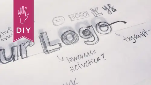
After you're doing all this stuff, how many directions were you able to pull out of these brainstorming sketches? You kind of knew you wanted mountains, but... Yeah, I mean like I think we used the sketches as the opportunity to explore directions before jumping on the computer. So you can see there's really rough sketches. One is this idea of the viewfinder of the camera and the mountains behind it and then a sun behind the mountains. So that's already three things. So me, as a designer, it's all about putting everything on the page, but stripping away the unneeded. So, at the end of the day, we ended up using just the mountains, but there was an idea of playing with the sun or a sunset and then with his name, he... I was trying to talk him into not having the word photography underneath because my idea was like your name is your name and on the page, they're gonna see your photos. So, if you think about it in context, do you need to indicate that you're a photographer, that it's ph...
otography that you do? But that's what he wanted, which I think is great. You know, I'll do whatever you need. And in that case, I think you can drop the word photography as he becomes super famous, right? So maybe the logo becomes something else over time. Like, I believe that logos change over time. Sure, yeah. So, he'll probably drop the word photography after awhile. At some point, yeah. But again it was always this thing of I want an image and text. I did try to talk him into just text because I love typography, but you'll see later on down the line, the image comes more into play on social platforms. So you did... So you went ahead and did the whole word mark with the symbol with the idea that maybe you could use them separately. Separately, yeah, because I think logos... Branding experts will say never alter your logo, but I think that nowadays, there's so many different places your logo needs to live that it has to change. Or if not change, be able to be modular. Right, it has to be modular. It has to be adaptive. So we knew we wanted the mountains. The signature and the monogram stuff was just too busy so we took the idea of the mountains and then I played with different typography. He originally, I think you guys remember had that weird script font that like, you know, if you're gonna do something like that, do you handwriting or your signature. But again, that was too busy with the mountains. So, I like to just set different typefaces or so I'll pull down my font menu and I'll try a few different things like Garamond, Clarendon, Avenir, those are all typefaces that we tried. And I also tried uppercase versus lowercase. He felt that the lowercase felt more friendly, which I tend to agree and plus the word photography comes into play and that's all uppercase. And why did you choose the uppercase for photography versus the lowercase for the... Well, you know, it's interesting. As soon as you put it in context... So, if you look here, this is the next round, but you can see the word photography. It doesn't have... It's all a square because it's all uppercase versus if you look here, the word photography, the bottom of the P hangs down or the top of the H hangs up. So those are called ascenders and descenders. They go up above and below. So, in lowercase words, they sort of go like this, whereas if it's all uppercase, it's in a square. So when you're working on your logo, try it all uppercase if you're working with typography and it'll feel much cleaner because it just forms a square. And it also is readable in smaller sizes too. Yes, definitely. And I played around with like the spacing between the letters. When you have a logo that involves type, make sure your type is perfect and that you try everything with it. Perfect, nothing less. Perfect, I mean, it's only a few words or one word so make sure it's perfect. Yeah. Yeah. Nice. So, directions. Yeah, so these are your directions. So now I see you have... You kept with the sort of the in the focus the frame piece there. Yeah, the framing, the viewfinder piece, he didn't want to let go of it. He was like, "It has to have this and this and this," you know so I was like okay. But at the very end, you can see I talked him out of that. I convinced him that simplifying was the way to go. I think this is... I think that hits upon something that I find really interesting, you know, that relationship that you have with a client because I think one of the things that you don't get when you do that sort of crowd sourced online sort of call, you don't get to set up that relationship. And I think one of the things that you, having sort of the stuff that we talked about in the class, all that work, all that diligence, and sort of internal sort of answering all those questions and coming up with a lot of your own research and then you come to a designer, you're sort of on par with the designer. You're not sort of help me, I need this. You know, you're like I know exactly what I want. I know where my direction is. And then all of a sudden, that designer, if you hire one, it's like a partnership. Oh, totally. And I think that's when the real electricity is really gonna happen. You're really gonna, yeah. And he had great, clear ideas of what he wanted and I was like I'm just here to execute it and help you and I'll also give you some information along the way that might make you want to change your mind.
Class Materials
Bonus Materials with Purchase
Ratings and Reviews
patricia villamil
I want to thank Matthew for a great insight into designing a logo. I am not an artist, have no creative experience in the digital or marketing or banding world, and because of this class, I actually designed a logo! I want to open a small kids art studio for classes in my neighborhood and I was looking to design my own logo to use in a Wordpress site and small scale branding/marketing and some building signage, and thanks to Matthew's easy and sensible approach to design, i was able to it. I def. recommend this class.
Lacey Heward
Loved all the prep work info and how that translates into a great logo design. The class was easy to follow, the instructor answered some great questions, and it was a great overview of how to create a logo.
a Creativelive Student
Great intro to logo design. Matthew outlined some great steps to take to kick off my logo creation process. I think I'll be able to save a lot of time and money working with a pro for final design as I'll be able to come to them with a more clear idea of what I'm looking for.
Student Work
Related Classes
Branding