Deliverables/Formats
Lesson 14 from: Logo Design for Your Small BusinessMatthew Jervis
Deliverables/Formats
Lesson 14 from: Logo Design for Your Small BusinessMatthew Jervis
Lessons
Course Introduction
03:56 2What is a Logo and What Makes it Successful
02:14 3What Kind of Logos are There?
03:38 4Logo Creation Considerations
04:56 5Creating Your Logo: Ideation & Research
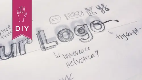
15:02 6Creating Your Logo: Brainstorming, Sketching, & Typography
31:29 7Color & Logo Refinement
30:19 8Logo Review and Finalization
24:35Lesson Info
Deliverables/Formats
So then the final, I delivered two final versions of the logo, and I figured that this would cover everything. So there's that horizontal version for his website-- Oh here you go. So it operates as a top banner, and then a stacked version where everything is nice and together. I always prefer a stacked version 'cause it feels locked up. You've got image and text locked together. For me, the banner version feels a little bit more spread apart and it feels more like a picture and text than a locked up logo. But that was a use case where that sort of format is needed. So just being flexible with your elements but always making sure that separately they, like, once you separate them, you're still not altering the text in any way, or the mountains. Those are always gonna be the same. It's just the positioning of them together or apart might change. So um, for final deliverables, there was the stacked I created, the horizontal version for the top of his site and then the locked up versio...
n for prints, and for any other use cases. And then when we went to the social icon, I thought that we could just use the mountains and the locked up words as is, but I realized square is kind of a weird shape. Yeah. So keep in mind that for your social icons, I mean that's a big part of your presence these days. So he's got a lot of, like a large Facebook following as well as Instagram, and those two sizes are actually the same. And he was using his old logo in those environments, as is? (affirmative muttering) They weren't modular, his old logo was not modular? No, you know what he was also using, and this is big for photographers. Instead of your logo you can also use one of your photographs, and that works really well. Um, but for him he's still establishing and building up his brand, so we wanna try to keep the logo Consistent. in as many places as possible. Yeah. Um, so for the square, being okay with having the white space at the top really worked, and then once you put it in context, like this is a shot from Facebook. Facebook actually puts the text in there for you so you don't wanna have a version of your logo that has text in it, or at least the same text. Yeah that's really good to take into consideration. If there's already gonna be somewhat of a service, how can you make yours work with what they're gonna do anyway. Yep. Yeah. And there's a URL here. It's just one of the many places where you can create your social graphics from one logo format, and so that'll resize it for you. And it actually shows you all of the different sizes. So like it goes from Twitter to Google Plus, and you know everything in between. Gives you the dimensions. Yeah, so there's online tools for that information that make it really easy. Very cool. Um, and then another deliverable that was really important to him was the watermark, being a photographer. Yes. So, now he hadn't already, I mean, as far as the social stuff, he hadn't had anything designed specifically for that? No. And, but, I mean as a photographer he must have had a watermark before. What was he using? Nothing? He was using his name. Oh okay. Large in the middle of the photograph, slanted a little bit, and slightly transparent. So I think like probably the worst iteration, though, of a watermark. Because um, again, beautiful photographs but then this sort of sloppy thing placed right over the top in the middle. And so we sort of asked a lot of other photographers and, you know it really depends on the use case. So, you know, editorial versus outdoor. You know, there's all these different types of photographs. For him at this stage in his career, it really works as a branding element and almost an advertisement, so it's always on the photos, but it doesn't disrupt the viewing of the photo. Or the composition. Yeah, exactly. So really keeping it low key in the lower left or lower right hand corner depending on the composition is where he placed it. And he doesn't do any other watermarking in a photo other than that little placement. Interesting. I think, yeah, it's interesting. You see different watermarks online 'cause people fear that-- That go across the whole-- Things are gonna get stolen. Right. And I think people are more mature in their usage of the internet now and they realize that like, if you put it out there it could get stolen but you know, it's gonna be a certain resolution. You'd have to crop out his name. Right. So we basically-- Along with a bunch of the picture. Yeah, we basically used his logo as the watermark, and I gave him a version that had a transparent background, right, so it was exported as a transparent PNG. PNG, yep. And then in Photoshop you can invert the colors, so the original color of his logo, as I mentioned, is 80% black. So just reversing that and creating a light version and a dark version to be used as a watermark. And we see both of those here. Exactly. So some of his images are darker and you would wanna put the white watermark on there, and some are lighter. So making sure you have those two versions is important. And again, transparent backgrounds, PNG format works great. I think all of the files that I delivered to him at the end of the day were PNG except for the ones for print. And what did you give him for print? Uh, I gave him, actually, together we created a PDF of the printed materials. But you could again still use a PNG, 'cause it's a crisp format. So even if I just gave him one logo file that was a PNG, he could go and use it across many different ways. Do whatever. Making sure that the background is transparent. Um, now, okay so all of the things that you used, I know you had mentioned favicons. Yes. What's the design, I mean that's a super small element. Did you have to do any redesign for that to-- And again-- Work, be readable? At the very beginning of this process, I looked at the mountains and I would've said that is a square, you know, but it really was very far off from a square. So, I guess probably a good question would be to ask first and foremost, is it important that your logo be viewed in a certain way on social media and on the favicon? So maybe you should go towards creating it in a square to start. But I didn't do that. Like, for the favicon, you don't have to have it work in a square. I mean, it works best at 70 by 70. Yeah. But again, just this idea of the usages, think about it from the very first moment in time. Yeah. The favicon was not that important to him. Social media was not as important as his website. That was his number one thing. So we created the logo just sort of starting with that in mind, and then all these other issues came up after the fact, but we were able to accommodate. Because again, this is a pretty flexible mark, those mountains. So the favicon is just a really small icon that appears in the browser window, and the best ones are like Pinterest or Amazon. Those are pretty recognizable. His is the mountains, again we took that because that's sort of becoming his stamp. His thing. And it's a very small file with the extension .ico. You can again Google that and they have things that convert other formats into a .ico. And I guess the .ico is a Microsoft thing, so in order for it to appear on Safari it has to be that format. It has to be, that recognizes it. But they're fun 'cause a lot of people don't know what a favicon is and you can be like, oh, I have a favicon. There's a lot of websites now that will create one on the fly for you. I know Squarespace does that where you can drop in a, drag an image in and it'll create the favicon for you. But it is now becoming one of those deliverables that, you know, we have to think about that we didn't think about, you know, even a couple years ago. Exactly. Cool, and yeah I think the way you talk about knowing what you're gonna use things for in the beginning helps you to make some decisions that you're not gonna end up, you know, hating by the time you're doing your final deliverables because, oh you never told me you wanted to use it that way. Oh. Okay this isn't gonna work for that. Okay now we have to do a whole new redesign. I mean five years ago an Instagram version wasn't a thing. Every time I work with somebody, especially like, he was very photographer specific so I learned a bunch of stuff that I hadn't know. I was like, oh okay, that's interesting. Because I was like, what about Twitter? He's like, I don't really use Twitter, I just use Instagram. Right. I was like, oh visual, that makes sense.
Class Materials
Bonus Materials with Purchase
Ratings and Reviews
Lacey Heward
Loved all the prep work info and how that translates into a great logo design. The class was easy to follow, the instructor answered some great questions, and it was a great overview of how to create a logo.
patricia villamil
I want to thank Matthew for a great insight into designing a logo. I am not an artist, have no creative experience in the digital or marketing or banding world, and because of this class, I actually designed a logo! I want to open a small kids art studio for classes in my neighborhood and I was looking to design my own logo to use in a Wordpress site and small scale branding/marketing and some building signage, and thanks to Matthew's easy and sensible approach to design, i was able to it. I def. recommend this class.
a Creativelive Student
Great intro to logo design. Matthew outlined some great steps to take to kick off my logo creation process. I think I'll be able to save a lot of time and money working with a pro for final design as I'll be able to come to them with a more clear idea of what I'm looking for.
Student Work
Related Classes
Branding