Lesson Info
4. External Editing Preferences
Lessons
Class Introduction
03:19 2Lightroom Fundamentals
06:17 3Round Tripping
10:33 4External Editing Preferences
13:38 5Edit in Photoshop Options
15:33 6Open as Smart Object in Photoshop
11:06 7Linked Smart Objects
11:44 8Open as Layers in Photoshop
05:00Lesson Info
External Editing Preferences
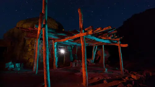
Now let's take a look at the external editing preferences in light room to make sure it's set up just the way we want to. And we'll also take a look at Photoshop Preferences. When I start hearing light room and I choose photo edit in edit in Photoshop, it will open my file. But if I started with raw file, it won't be able to save anything back into that file because the raw file is the raw data that came from a camera. So let's say I open this image. Maybe I did a little retouching. I got rid of a red light up here and maybe a little building on the horizon. And there's a bright star like light on the far right. And so maybe I choose to use something like the healing brush to remove it. It doesn't matter if I use layers or not. It cannot save those changes back into the original raw file. So when I'm done, if I simply close the image into save notice that it doesn't ask me which file format should be used, it just saves the image. If I return over here to light room, you'll find that I...
can see the resulting image here, and I can see that it's a tiff file. Well, there's a setting and light room that determines which file format will be used and to get to it. I come up here to my light room menu and I choose preferences. This will be fun under the edit menu of your windows. In there, there are a bunch of tabs at the top. I want to choose the tab called External Editing, and these settings right here determine what's used when you open a raw file into Photoshop up here. If you just want to know what settings to use, and you don't want to have to really think about the technical details, then feel free to copy what I have plugged in right now because these are the settings that I use, and I think they're pretty good settings for most people. If, on the other hand, you want to know a little bit more about what these things mean, let's dive in the top choice determines which file format you'll end up with either Photoshop or tiff, and there is no quality difference whatsoever between those two. They can both save all the layers that you create, and so you could just flip a coin. And if heads show up, choose tiff. And if sales choose Photoshop, it wouldn't really matter much. But I personally use Tiff for good reason, and that is Photoshop File format has a limit and how big a file it can save and the maximum of two gigabytes tiff. On the other hand, its maximum is four gigabytes now. You might think he'd never run into that maximum. But I run into it regularly because I combined literally hundreds of images together into a single Photoshop file. And when I do, I can easily bump into the limit. I can even bump into that limit of a tiff file. And if I ever do, then when I'm in Photoshop, I'll get an error message that just says, Hey, this file is too big to save as a tiff, and then I go to the file menu. I choose Save as, and I use another file format called PSB or Photoshop large. Actually, I think it's called large document, uh, file format, and that will allow me to save just about an unlimited size file But those files aren't all that compatible with other software. They do work with light room, though, so that's what I use when I go above the limited tiff below that is color space, and with these choices behind the scenes, you end up in RGB mode. When you get to Photoshop in these choices, here determine the exact colours of red, green and blue that your image will be made out of behind the scenes. The lower the choices in this menu, the mellower the versions of red, green and blue that will be used. The higher the choices in this menu, the more vivid the colors of red, green and blue that your image will be made up. The more vivid they are, the more vivid colors you can make within your document. So if you use 100% red, it's more vivid with this choice than have used 100% red with this one. So let's talk about which one you might want to use and how to think about him. Just about every image you've seen on the Internet at least 80% of them are an S RGB mode. The S stands for standard, and that's the standard for the Internet. The problem with S. R G B is if you have a color printer anywhere, your color printer can most likely print colors that are more vivid than what you could make. If you make your image out of SRG. Be the same is true for many monitors. They can display colors that are more vivid than what you could make here. So why limit the range of colors you can make in your picture just for this? We'll use s RGB when we export our images. If we know that they're going to end up on the Internet, then we want to use that. But only when exporting. We don't need to choose it Here. Display P three is representing the colours of red, green and blue that Apple uses on their displays, like their IPhones, IPads and their max. And so that's going to give you a wider range of colors because it's slightly more vivid than S RGB. But again, I don't think it's the most ideal choice to use for most people because a lot of printers are capable of printing colors that are more vivid than what you could make in that format. Then comes Adobe RGB. That is what I consider to be the best choice for most people, because it will allow you to get really close to the maximum vividness your printer is capable of reproducing. You're also going to be really close to the maximum your monitor is able to display, and it's hard to get in trouble using that mode. The one above it, though, is easy to get in trouble. It can create colors that are so vivid that no display can actually accurately display that color. Instead, when you tell it to make a color that vivid, it has to display it mellower, so it's not giving you a true image of what's in your file. The same is true with every printer. You can create lots of colours that can't be printed accurately. Instead, they're only gonna print mellower versions more like the colours you'd get if you're an Adobe RGB. But pro photo Margie B is a good choice, but only for those that are very knowledgeable about color and want to get the utmost out of all their devices and don't mind really working hard to do that, then you're welcome to use this choice, and I do on occasion. But I think most people are served best by Adobe RGB. Below that, we have bit depth. You have the choice of eight or 16 bits. What this controls is how smooth the transition will be between black and white in an image. If you have the choice of eight bids, you get just over 250 brightness levels between black and white. If you choose 16 bit, you're going to get as many brightness levels as your camera captured in. Most cameras can capture at least 4000 brightness levels. Some can even go higher than that. Now. Every image you've seen on the Internet has been eight bit for the most part, And so if you ever see images and they look great on the Internet, know that eight bits is a perfectly fine choice to use. Your image will look good 16 bit when you choose it. You will most likely not see any visual difference in your picture whatsoever, but you will see a difference if you make a radical change in brightness or a radical change in color or you attempt to do retouching across an area that should have a very smooth, gradual transition, like in a blue sky. Then this can give you smoother results when you're completely done adjusting the image and you export it to give it to somebody else, you can just export eight bits, and then you end up with a smaller file. Now, why wouldn't everybody choose 16 bit if it's going to make my adjustments look better? Well, 16 bit images are twice as large as eight bit, and that's before you had any layers. As you add layers and other features in Photoshop, the difference becomes even more pronounced. But for me, I think it's worth it to use 16 bit, especially if you do a lot of retouching in skies. Below that, we have a choice called Resolution, and it determines how large the little squares that make up your image will be when you print them. And the default setting of 2 40 is a pretty darn good setting for most things. If you have a good reason to deviate, feel free to some people, choose to increase it to 300 but you should know if you go a lot lower than 2 40. Your image might appear to be pixelated, where you can see the individual squares that make up your picture. And if you go a lot higher than about 300 then any sharpening you apply to your picture is going to be a lot less effective because sharpening usually only takes up one or less of a pixel in width. And as you make those pixels smaller and smaller, it's harder and harder to see the effect of sharpening finally below that we have compression. This choice will only be available if you've chosen tiff up here at the top. If you choose Photoshop, it'll just disappear. And with this, this applies lossless compression, which means it does not degrade the quality of your picture whatsoever. But it does slow down the process of saving and opening your images. So if you want things to be speedy, then set it to none, just knowing that your files are going to be bigger because there's no compression. And if you don't mind things being a little bit slower and you'd rather have smaller files on your hard drive, then set it to zip. I use it myself. Then let's skip down here near the bottom. You're going to find a choice called Stack with original. If you turn that on, any time you create a secondary file. Like when I opened that picture of the Sydney Opera House and it was a raw file to start with and then we ended up with a tiff, it would stack those two images together so that we'd only see one. That would be the end result, and there'll be a number up in the corner of it. Here, I can stack the two that we have so you can see what it would look like. I'll just go up to the photo menu, go to stacking and say, Group into stack. It would have done that for me. So now I would see just the end result, and I'd have to click on the number in the upper left corner to expand the stack. And now I can see the original raw file as well, or click the number again to collapse it back down. That's a personal preference of what you like, but in your preferences. This checkbox is what determines if that's done automatically for you or not, I prefer to not have them stacked, but you might like it. Then down here, this determines what the file name will be of a secondary file. And by default, Photoshop is just going to add a dash and then the word edit to the end of your file name. If for some reason you would rather have it have a different name than that, maybe you want to dash and then have the words layered file. Well, then, right down here, you can create a template. Just go to this menu, choose edit, and up here is where you determine the file name. Here. It says it's going to use the original file name. And then up here, you can type whatever you want it so I can say layered. Mhm, something like that if I wanted to. But I like the just dash at it. I'm used to it. So I'm gonna click Cancel, because I don't think I need to change it. So now we set up light rooms preferences. And now let's switch over to Photoshop and make sure it's set up for this. I'm going to go to the Photoshop menu and choose preferences. This would be found under the edit menu. If I was in Windows and I'm gonna come down to file handling in file handling, there's just two things that I like to change. The first is this one asked before saving layered tiff Fat's in general. That won't apply if you started the process by opening an image from light room because it assumes if you have light rooms, preferences set up to save tiff files that it shouldn't warn you all the time. But if you created a brand new file in Photoshop by going to the file menu and choosing new and then you went to save it, if you chose Tiff, it would warn you if you had layers in your file. I do that just about every day, so I like to turn that off. But then down here is the most important setting. You see where it says maximize PSD and PSB file compatibility. Well, if you remember when I talked about how images work, where when you save as a tiff or Photoshop file that will actually save two versions of your picture inside of one file, it'll save the individual layers and it will save a flattened version. Well, this is what determines if that flattened version is saved When using Photoshop file format, The default is to ask. I want to set it to always because it's required in order to have the image compatible with light room, because light room doesn't understand layers. And that's going to give it a version that doesn't have layers, so light room will be able to work with it. Next, we're going to explore the edit in Photoshop options. Those are the choices you get any time you open a non raw file, and it asks you to choose between three options.
Class Materials
Bonus Materials with Purchase
Ratings and Reviews
Carl Grooms
Fantastic, clear explanations of these features. i have a much better understanding of how to go back and forth between LR and PS. Thank you Ben. this is must watch class for anyone that uses LR and PS