Lesson Info
19. Background Lighting for Portable Silhouettes
Lessons
Class Introduction: Lighting 301
04:54 2Two-Light Stacks for Portraits with Depth, Pt. 1
36:01 3Two-Light Stacks for Portraits with Depth, Pt. 2
08:31 4Two-Light Front and Back Classic
22:25 5Two-Light Environmental Backlighting
19:38 6Double-Diffused Main with Added Rim Edging
27:38 7Dramatic Light with Wide Vs. Closed Apertures
17:27 8Two-Light Pin for Two Subjects
21:46Two-Light Pin with Ambient Shutter Drag
24:19 10Hollywood Two-Light for Subjects
21:44 11Double Backlight for Environmental Portraits
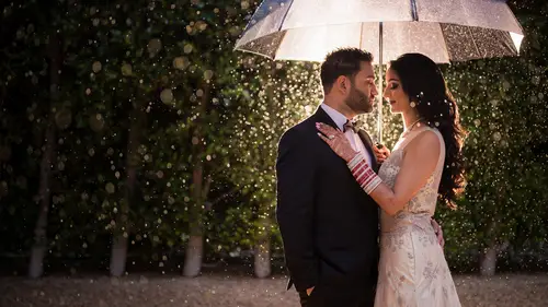
14:00 12Backlighting Rain & Particles
28:32 13Double Backlight with SFX Flare Midday
11:41 14Shooting Through the Foreground
09:29 15Three-Point Starburst Lighting Setup, Pt. 1
20:42 16Three-Point Starburst Lighting Setup, Pt. 2
09:44 17How Gels Manipulate Ambient Light
17:41 18Three Favorite Gels for Ambient Light Manipulation
18:15 19Background Lighting for Portable Silhouettes
16:07 20Three-Point Lighting within a Portable Silhouette
18:58 21Background Light Compositing
18:49 22Wrapping Background Light
13:15 23Lighting and Framing within a Shadow
36:19 24Nighttime Vs. Day in a Single Exposure
17:53 25Flashed Double Exposure - Adding Scene Elements
17:31 26Flashed Double Exposure - Layered Vs. Clean Textures
28:47Lesson Info
Background Lighting for Portable Silhouettes
in this video, we're going to be building on a lighting technique that we helped to popularize back in lighting, too, as well as on incredible engagements on Creative Live. And this is the background silhouette. This is essentially where you turn the flashes backwards to light the background to create essentially a portable silhouette. Anywhere you go. Now, I want this in here one, because you can use to lights. Although I'll be honest. One light will totally work for this. But two lights if you do want a little bit of extra light in the background, or you want to kind of have even lighting behind the subjects, but also because we're going to be taking this technique and doing a few more kind of advanced tutorials for lighting. Three. So this is a little bit of a recap in a refresher on the technique as we build in, and we're also going to do some fun stuff and post and show you how a really cool mural and seen like this can look with this technique applied, let's go ahead and jump int...
o the video. So what I'm gonna do is actually adjust my frame and then guys, what you're gonna do is come a little bit this way more right there. Perfect. Perfect. So that way, that line kind of drops directly down into them. I like a little bit of, like, separation of the body. I think it's gonna be really cute as a silhouette shot. So let's go ahead and place the light behind each of their shoulders now, making sure that they're hidden from my angle. Mhm. Perfect. That was perfect. A little bit more right there. And aim them both towards this center V and up a little bit. There you go. Okay. That's adorable. Okay, Look at each other. Guys. I love the playing around, okay? I have my cinema in in frame on this. There you go. BC take a small step towards Taylor right there. Give me that laugh and play. I love that. That's fantastic. Yeah. Okay, so there's a window right here, But keep mind that I could probably actually Photoshop that out and have an entire background. It's just that mural very easily. There's one other thing I want to do. I want to throw up a yellow on there so we can get a nice warmth and let kind of the whole background dropped to a more warm or a more blue kind of tone. We can do this in post, but honestly, it's just easier to do it while we have them right here. So let me get an ambient shot of this too, so I can show you guys what it looks like. Perfect. You got those gels. So while she's setting that up, I'm gonna go ahead and switch over to tungsten light. Mhm. You got them both on nice. Okay, guys, look toward each other again. Give me a little play. A little joking around. Cute. Taylor leaned back from a little bit right there. Relax the hands and the arms down a little bit. There you go. Smile. I love that. And then lean across for a little peck. Lean across the little kiss. Perfect. Relax. Super cute. Let's dive into post with this image. We have to exercise files that we've included. I'm going to go ahead and actually work on the kissing shot, namely, because I like both these shots, but I find her shoulder a little bit too tense and awkward in this shot. I find this one to be a little more natural. She's kind of going up on tippy toes. Uh, all right, So what we're gonna do is jump in the develop module first. Freaking bc. Look at this. BC left is his coffee mug in the shot. This ain't game of Thrones. This ain't dangerous. Storm bringer, Starbucks. Carla, do you get what I'm doing? By the time this is released, everybody will know what I'm talking about. Okay, so let's go ahead and begin work on this image. So I'm gonna go ahead and brighten up the image a bit. I'm gonna reveal some of the shadows as well, and then I'm gonna add a little bit of blacks to this. That's not black. This is blacks, okay? And then we're also going to pump in a bit more clarity just to give this a little bit of mm. All right, now, let's warm the image a little bit. I think this would be fun. So we did put your We put cto gels on this one. Hello? Remember that. You remember that he's shaking his head like no, but he remembered that. So if I take a white balance reading off the white of this wall. You'll see how you know that puts us at a very neutral tone. If I take it on this side, it puts us at a very warm kind of tone. I already processed this version as a neutral shot, so we actually have that and I might show you the after later. But for now, I kind of like this look as a dramatic shot, too. So sorry, I a warm shot. So let's actually process it here. I'm gonna go ahead and add in a radio burn as well to pull into this light effect that we've already added in Let's leave this summer around negative 0.7. So we have, like, the kind of dark background that sort of leads into them. And I might see if we flatten out just a little bit of blacks a little bit by adding a bit of blacks, adding a little bit more shadows without getting see if I go up too high, I kind of get this weird hdr effect. I don't really want that. I just want some highlights on their skin tones, which I'm getting right about here, bringing the exposure up just a little bit. That looks really nice. So at this point, I'm going to take this into Photoshop, control your command e to jump into Photoshop, and let's go ahead and do some finishing touches for the image. I'm gonna press tab to bring my sides back. And because I'm gangster, I'm gonna just give because I'm I'm a PHP gangster. Mhm because I'm a gangster. I'm not gonna I'm not going to merge. My I'm not going to create a new layer. I'm gonna destructively edit this photograph. Mhm. Thank you. No gangster. I'm gangster. The same trick that we're doing before the same trick. All we're gonna do here is just remove the nearest Hungarian Starbucks from the image. And I'm also going to kind of fix a little bit of the other stuff that I see on the ground that might be a little bit distracting. The fun part in this is I mentioned in the tutorial how we can actually very easily remove this window and essentially make the entire wall texture. I'm gonna show you how to do that. So what I'm gonna do is actually use a selection tool, and I can use my rectangular marquee actually, to just select this area of this kind of wall art. Okay, now, with that selected, I'm gonna press control Jr Command J. And it's gonna jump that selection to a new layer. Now, I'm gonna move that layer up to the top where it's going to cover up the window itself. So let's go ahead and go ahead. Go ahead and put this in the right place. Um, right about layer, right? It's roughly in the correct spot. And you might be like, Well, it kind of just looks like you duplicated the bottom and paces up here. It sure does. So we're going to do a couple of things to kind of blend that a little bit better. The first thing is, with this layer still selected, I can press control T and I can go up to edit and then transform, and I can actually just flip this horizontally so it reverses it. And immediately that single adjustment. What's as long as you don't undo it, Mother, You know what, Carlo? Don't even control t command T Let's go and go back and transform. Flip horizontal. This is about the time of the course where we start getting a little loopy, let's press enter. So that adjustment already kind of fixes a lot of that. We don't kind of notice the way that it's repeating nearly as much. It's already kind of working a lot better, but there are a couple of things that I want to do. So one I want to fix the mask a little bit to. I also want to tweak the brightness and levels so it kind of blends a little bit better. So let's do that. Let's actually start by adding in a mask and let's go ahead and zoom in and paint black to basically conceal that layer where we sort of want the background to show through. Make sure your flows at 100% and this is where I kind of just want. I want to see the these things kind of like overlap, almost like you know, it's the artist's intention to kind of create what we see here Now, right here you can start seeing the window frame actually appearing, so I'm not gonna paint that off there, but I am going to paint a tiny little bit like over here just to kind of soften and kind of smooth this edge a little bit. Almost create some, like, sort of imperfections in the way that the mural is kind of drawn. Let's go ahead and do the same thing on this side where now we're painting over to reveal this underlying texture. I'm blowing it off this corner. Okay, so this is actually looking pretty convincing now. And now if I want to, I can add a curves adjustment layer. So all we're gonna do is we're gonna clip this mass to basically the lower layer. So let's go ahead and create a clipping mask. So now my adjustment should just apply to that layer underneath. Okay? By the way, we got there by right clicking and then just went to Where is that little guy? You say it. You saw it just a second ago. Make clipping mask. It was there. All right. I think if we click on a different layer will pop back up. Yeah, uh, create clipping mask. Okay, so now that's already done. Whatever adjustments we make to this and I'm pretty sure it's all to they're all control G or option command G or option shift But like I said, I screwed it up. Nope, It is option community. There we go. Treat us Start that takeover. No, let's keep it because I'm not perfect. It's not perfect. Nobody is alright. So all I'm going to do now is pull the curve layer up. So we kind of have a better blend between everything around it. Okay, so right about here is the right brightness, and we can kind of tweak the shadows as well and kind of get into the right spot. And I kind of like my shadows around here. The highlight point. I'm going to pull down just a little bit, kind of get everything to sort of gray a little bit, and we get a really nice blend now. Okay, So if I turn that on and off, you can kind of see how it how it falls in. And if we want to tweak it a little bit, we can also just adjust the opacity. So if we kind of adjust the opacity up and down, we get a really nice blend. So with that done now, all I'm gonna do is create a new merge layer option Command shift E or control command shift E. And now we're gonna go ahead and remove some of these items via a simple, content aware fill. So shift backspace content aware, and let's allow it to kind of fill and see if it can't give us a slightly better sort of transitional edge here. It's actually not bad artists intention right there. When this artist sees this, they're gonna be like, That was not my intention. Oops. Yep. That looks perfect. Uh, I I pressed, actually delete instead of shift delete. All right. Now, if you want to take out this layer here, um, you totally can. But honestly, it almost looks like just like a different level of building wall. And it looks like it fits the scene pretty easily and pretty well, so I might just leave that in there. So the last couple of things that I do want to remove, though, is the stand itself. So let's go ahead and press s to bring up our clone stamp and let's just remove the stand out. I'm gonna go ahead and just sample from down there and just knock that guy out. It's very easy. We have repeating textures over here. So there's not really a a purpose or point to worrying too much about this. I'm just gonna copy and kind of drop everything in. Okay, If we notice a difference in color, we can always go back and we can do a little content aware fill. Okay, So with that, we made quick work of our stand. Everything looks decent. It looks good. If you guys wanted to fix a little bit of the any other blemishes that you notice that are kind of like a little bit distracting, you can zoom in, say, for example, this one we tried a minute ago to do content where, Phil on this. Honestly, if that doesn't work, it's just easier to go ahead and just do a a healing brush. So go ahead and press shift J until you get over to the patch tool and with the patch tool, you're just gonna patch and sample from a neighboring vicinity, our neighboring area. Let's do the same thing for this guy. Pull it over to here, kind of line up those lines. That looks nice. Okay. Now, from this level is where I would do just a standard healing brush tool and I would remove anything else. That's kind of like distracting, like if I find, like, you know, I want the pain to be a little more even in certain areas and I want to move some of the marks. Then I would go ahead and do this without zooming in so much, because if you zoom in a lot, you're honestly just going to be doing a little bit of too much retouching doing over retouching, because everything is going to look as if it's a problem. But it's really not. It's just the stuff that's big and distracting from this view. Are the things that I want to mix? I say Nix a lot, don't I? Carlo? One of my favorite words. Okay, I messed that one up. Alright? Notice a couple of bright areas on the ground. Yeah, that's good. I'm gonna let you guys kind of go at your own pace on this and go to your heart's content. Honestly, I think I'm about good right here. Remove just some of these splatters from directly behind. Everything else is fine. So now let's go ahead and take a look at the final before and the after. I also want to show you guys, um the difference between, like, kind of doing a cool variant of this and more warm variant of this and you guys can kind of pick, which you like better. All right, so let's go back to our originals. Oops, that's not the right shoot. There we go. Let's go to the scene. Okay, So within this scene, we have this two different versions right here that you guys can take a look at. This is going to be that cool down version where we've kind of left. We used a radial filter to kind of exaggerate the cooling off effect of the CTO gel. So we have the c T. O s. But we also use the radio field kind of amplify a little bit. This is the warm version, and here you can see that we have pasted over that window with a bit of extra texture and kind of pulled in. So it looks like the whole thing is made from that single mural. And I honestly, really like that. I think that's a change that's easy to do. And it's worth adding in there again. You guys can blend out that line if you don't want it in there. But honestly, it looks it looks fine the way it is. So hopefully you guys like that tutorial, and that gives you a bit of ideas because we're going to take this technique and we're going to push it forward and do some more lighting over the top of it. So let's do that and keep going the next videos.
Class Materials
Bonus Materials with Purchase
Ratings and Reviews
Jackie Stewart
Lighting 301 is excellent! I learned so many new techniques throughout the class. Pye Jirsa is brilliant at explaining new lighting techniques in such an easy to understand way and his mastery of Lightroom is amazing!!! Loved the class and can't wait til implement the things I learned!!!!
Doug Rogers
This is a great course! I learned a great deal about lighting and editing in PS/LR. Pye is a great communicator and I appreciate his wry sense of humor. Note, this video was before AI, so that is not covered.
Dani
I love the Lighting (101-201-301) courses; I have finally understood the concept of lighting and how it works. I have been referring to my notes and go back to all the courses with ease. One of the best courses I have done for myself and my biz; I am so impressed with my work and the lighting I can create.