Lesson Info
7. Color Grading
Lessons
Lesson Info
Color Grading
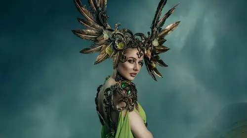
1 All righty, let's do some color grading. 2 So there's a ton of different ways to do color grading. 3 Everyone online, like everything else, have a million 4 different ways to do this 5 and the way that they like to do it. 6 Now, I have been in kind 7 of an Adobe Camera Raw color grading thing for a while now 8 and I kinda love it. 9 So I'm gonna show you relatively quickly how I do that. 10 So first things first, I do like 11 to desaturate the image just a tiny little bit. 12 So it's a little half circle again. 13 And I tend to drop the saturation, 14 just the slightest little bit 15 because I do push a lot of color into this, 16 in Adobe Camera Raw. 17 I'm gonna show you how I do that. 18 So I'm gonna do alt control shift E, 19 and I'm gonna put these guys here into a group, 20 I'll call them Elements. 21 So this is our merge layer. 22 So we're gonna call this ACR. 23 I'm gonna right click this and I'm gonna convert it 24 to a smart object. 25 Now I recommend if you don't have lik...
e a pretty robust 26 computer, like if you're using 16 gigs of Ram 27 or less on your system, skip the, 28 skip the Convert to Smart Object step. 29 It's just gonna log your, like bog your computer down. 30 It's not gonna make it fun to use. 31 But if you're using like 32 gigs of RAM and up 32 and you've got a pretty decent 33 graphics card, you should be fine. 34 Photoshop is very, very ram heavy, 35 which is why I always recommend 36 to anyone who's getting a new system, at least 32 gigs 37 of Ram, at minimum 16, especially for the newer versions 38 of Photoshop, are not gonna handle it. 39 So we have now a smart object. 40 Well, what is a smart object? 41 Basically this means that we can continue 42 to change everything going forward. 43 So nothing is really going to be super permanent, 44 even though straight up, everything, 45 I mean we can just delete the layer and start over. 46 If we do a color grade and we're like, this is really great. 47 And then you go to sleep and you wake up in the morning, 48 you're like, this is horrible, 49 you can just delete the smart object layer 50 or the flattened layer and start over. 51 Now, alt control shift E merges all 52 of your work up into a flat layer above. 53 So if I wanted to make changes underneath here 54 and I was like, oh, I missed a spot for doing, you know, 55 like a little part of her makeup 56 or something, you would have to delete this layer 57 and work on the stuff underneath. 58 So this is basically like you're at a save point. 59 You like how everything's looking so far 60 and you're wanting to take the next step. 61 So this is our Adobe Camera Raw layer. 62 So Command + Shift + A or Control + Shift + A 63 is gonna pop you into Adobe Camera Raw 64 and ACR has gone through some updates since this version. 65 I am running a 2019 version of Photoshop right now. 66 It's really good, it's super stable. 67 I am perpetually like two-ish seasons behind on 68 Photoshop because I love, I wanna be able 69 to turn on my computer and I want it to work. 70 And being, getting the first version 71 of a new release, oftentimes, 72 I mean it just comes with bugs. 73 It's just the nature of these things. 74 They're super complicated programs, 75 a lot of people are working on them. 76 So we have all of these things. 77 So if you've ever used Lightroom, 78 this is super familiar to you. 79 This is all basically the same stuff. 80 So we have like exposure, contrast, highlights, shadows, 81 black, whites, texture, clarity, 82 dehaze, fiber, and saturation. 83 We have curves adjustments 84 where like they are super specific to a certain area, zero. 85 We have sharpening, masking, luminance, color luminance, 86 and then hue saturation, luminance, of course, split toning, 87 which is super handy. 88 These kinds of effects here like lens 89 corrections and stuff like that. 90 Getting rid of fringing, 91 adding some vignetting if we wanted to. 92 Although I don't usually recommend doing much vignetting 93 in ACR because it's nicer to do if you choose 94 to add vignettes in your images. 95 I like to do them on their own layer all on their own. 96 So here I mostly like to play with the colors. 97 Now the cool thing is, is that if you have a ton of work in 98 ACR or in Lightroom, 99 you can save color profiles that you like. 100 And so I have saved a ton of these over the years 101 and I love them. 102 And so what I'll do is I just give them like a random number 103 and then I save it 104 and I'm like, oh yeah, this is great, 105 this looks totally awesome. 106 And you know, then I'll go in and customize later. 107 So if I look at this and I'm like, oh yeah, 108 this is way too blue, 109 but if I warm this up a little bit 110 and add a little bit of magenta, 111 see how these changes are super sudden. 112 And I was literally just playing around, 113 like drop the exposure super far and the contrast 114 and then increase the shadows and blacks. 115 I was just like pushing sliders. 116 And one day I was like, this looks amazing 117 for this one single image. 118 And it hasn't worked for anything else since. 119 But these settings, if I adjust the temperature 120 and tint, all of a sudden it starts to work again. 121 So how this was made, 122 so here's like the clarity slide texture. 123 This is just like bringing up all the, 124 the shadows and everything. 125 This is the curves. 126 I mean obviously yes, I could just like bring this down 127 and then I could bring this up 128 and I could bring this down if I wanted to, right? 129 So there's, there's tons, there's so many different ways 130 to kind of like skin this cat I suppose 131 to use a relatively harsh term, 132 but I just really like 133 how it warmed up working. 134 It's, it's very pretty, I just enjoy how it works. 135 So whenever I do color grading, I always tell people 136 that I just push sliders until it sucks less. 137 And this preset is a really good example 138 of I was just pushing sliders 139 until I thought it sucked less. 140 Sharpening is super high. 141 I always add a little bit of color luminance to my images. 142 I shoot a Canon 5D Mark III 143 and they're not known for being 144 super amazing in the shadows. 145 They do get a fair bit of color noise. 146 So I noticed it for years 147 and then I realized that there was this color noise 148 reduction slider and all of a sudden like, poof, 149 a bunch of my problems were solved. 150 So then here's the hue saturation, luminance sliders, 151 which is where a ton of the power comes from. 152 From the preset that I made. 153 Cora, no, hey, self scratch on the couch. 154 Sorry, my cat is impatient. 155 Okay, so hue saturation luminance. 156 So obviously the thing I love about using Adobe Camera Raw 157 is that there is an orange channel. 158 An orange channel is the channel for the skin tone. 159 And so I love being able to manipulate that independently. 160 Here's all the yellows in the image. 161 I obviously don't wanna push it too far 162 one way or the other. 163 The greens, maybe I wanna drop the greens just a tiny bit. 164 Because here this is, it's bright, 165 it's pulling her away from the image again. 166 Again, I don't really wanna do that. 167 I don't mind a little bit of luminance in the aquas. 168 Let's see what the blues are doing. 169 We can drop that a tiny little bit. 170 And then saturation. 171 Let's move this back up again a little bit. 172 So now this is really starting to look really, really nice 173 and there's just something about coloring this in ACR 174 that I really like that I can't, I haven't figured out how 175 to, how to achieve this whole look in just using curves 176 and color balance and hue saturation and sliders 177 as individual layers. 178 I haven't quite sorted that yet. 179 I used to color grade that way using just hue saturation, 180 color balance, et cetera. 181 And of course using LETs, which are amazingly powerful. 182 But there's something about this that I just really enjoy. 183 So let's play with the hue a little bit. 184 I don't want to make her skin jaundice, 185 so we'll add a little bit of red to that. 186 Let's see what happens here. 187 Now, I don't want this to be, 188 I obviously don't wanna push the yellows into here 189 because like it's destroying the skin again 190 and it's making everything look a little bit weird. 191 Again, this is a fantasy piece, so we really could push it 192 as far as we wanted to either way. 193 But for my personal taste, I don't usually like 194 to push the yellows too far. 195 Greens, I could give her a nice yellow dress if I wanted to, 196 or like a really bright, but I like somewhere in the middle. 197 Again, I, whenever you're working with designers, 198 especially when it comes to fantasy stuff, you really want 199 to have a clear dialogue with them. 200 Are you okay if I change the color of the fabric? 201 Are you okay if I change different parts of the costuming 202 that you built or are you not? 203 That dialogue really can kind of help, you know, 204 a really excellent working relationship 205 between you and the designer. 206 So in this case here, I would like to keep this as close 207 to reality as possible so that she has something 208 that she can share going forward 209 with her own social media and marketing. 210 So now hues, with the aquas, I don't want that color. 211 That's no good. 212 So again, somewhere in the middle is kind 213 of looking okay, that's not good. 214 That's too far, somewhere in the middle. 215 And we don't really have a lot of purple 216 and magenta going on this image. 217 Now there is split toning in this that I made. 218 So let's see here. 219 So this is on the highlights 220 and I don't really want to add a 221 bunch of blue to the highlights. 222 If I push this here, I don't want reds. 223 So what if we do like nice yellow highlights? 224 Ooh, red shadows, yellow highlights and red shadows. 225 That's actually not bad. 226 But let's see what happens. 227 We push this around, 228 See, I don't mind this, 229 but let's turn the saturation down a little bit 230 and we can push the balance as well, right? 231 So we can play with this 232 and we can have, you know, 233 a more far more yellows in this image 234 or a whole bunch of more blues. 235 And when you're making your own artwork with this, 236 it's really going to, you're gonna figure out 237 what your own taste is. 238 And for years I was working with blue tones 239 and like desaturated blues and purples and stuff. 240 It took me a long time of like dedicated practice 241 to really understand working with warm yellow tones. 242 And now I really like them 243 and they're in my artwork all the time. 244 So let's see here. 245 I'm kind of digging this. 246 I like how it's looking. 247 I'm not really worried about vignette 248 or distortion, obviously, eh, turn the green down. 249 So yeah, this is a little bit of how it's looking right now. 250 Maybe I'll up the vibrance a little bit. 251 Yeah, that's looking not too bad. 252 So now let's pretend that you made a color grade 253 that you super loved, right? 254 So you've pushed a bunch of sliders around 255 and you're like, yes, this looks awesome. 256 I love this. 257 So how do you save that color grade? 258 So I'm just gonna go here and then you go Save Settings. 259 And then basically what comes up is this little window here 260 with all of these 261 and it's like, which parts of these adjustments do 262 you wanna save, right? 263 You know, so maybe you like everything that you adjusted, 264 but maybe you don't want the sharpening 265 or luminesce adjustments to effect this save 266 because maybe you wanna change it 267 to something else in the future, you would just uncheck 268 sharpening or anything else in here that you want. 269 Luminance, noise reduction, color, noise reduction, yeah. 270 And so I would just go Save 271 and then I would just call this one here, Fairy Dust. 272 So it's basically just like a keyword for me 273 to remember roughly what this is gonna look like. 274 But the reality is I also have like hundreds 275 and hundreds of color presets that I've made 276 and I basically have to scroll 277 through them each time anyways, so I'm gonna hit Okay. 278 And so see now here what pops up 279 as we have these camera raw, these smart filters here, 280 which is looking pretty cool. 281 So the nice thing is that if you decide 282 that you wanna change anything in the future, 283 you can double click here on your camera raw filter. 284 And this is gonna kick you back into Adobe Camera Raw 285 with all of your settings saved. 286 Now if you don't have a smart object layer, 287 so I'm just going to merge everything up here. 288 So alt control shift E. 289 Here, there is no smart filters, camera raw filter, 290 adjustment here that you can see. 291 So there's nothing there. 292 So if we go control shift A into this, 293 all of the settings are reset. 294 So that is one of the things, the downsides 295 of not using a smart object layer, 296 but it does make your file sizes way bigger if you are 297 using smart objects. 298 So that's definitely something to consider. 299 So let's take a quick look here. 300 Now one thing I've always tried to be mindful of, 301 especially when I'm adding a fair bit 302 of warmth into an image that I wanna make sure I don't make 303 the teeth or the eyes a little bit too yellow. 304 So I'm just gonna grab a hue saturation layer 305 and I'm gonna drop the saturation 306 just a tiny little bit zero 307 and then I'm going to invert it. 308 So I'm gonna hide this effect on the whole image 309 because where I want this to be, 310 so invert is Ctrl I on the mask. 311 So control I, white, black. 312 And so we have a black layer, so I'm gonna paint with white 313 and I'm just ever so gently gonna pull out some of 314 the yellow in the teeth and the eyes. 315 And I just like to be careful with that, that's all. 316 It's like this tiny little detail. 317 I noticed it when I was printing some 318 of my work like a few years ago where I was like, oh man, 319 I totally missed the ball on this. 320 The eyes look a little bit too yellow. 321 So I just use a little bit of desaturation 322 on these layers and it's literally not much 323 because there should still be like some yellow 324 saturation in the eyes. 325 You don't wanna make them pure white 326 because there is a warmth to the image. 327 So there should absolutely be some color there. 328 Do, do, do, do, do. 329 All right, let's take a look at this thing. 330 So this is looking pretty good. 331 So this is our before and this is our after. 332 It's not bad, it's not bad at all. 333 So I am gonna do something quick here. 334 So this is the thing, 335 if you ever wanna make friends on the internet, 336 post a before and after job of a liquefy thing. 337 So one thing that I noticed, 338 and this happens a lot with fantasy costuming 339 because there's so much fabric 340 and so much material, 341 it can make the body look bulkier than it 342 is in real life. 343 Corsets obviously don't have that effect, 344 but it really happens with heavy costuming that 345 bodies don't look the way that they normally do. 346 And so oftentimes what I will do is I will use liquefy very 347 gently to make the person more accurately representative of 348 how they look in real life. 349 So I'm just gonna grab the marquee tool, 350 which is letter M on the keyboard 351 or up here in the far right hand corner, rectangular mark, 352 rectangular marquee tool. 353 And the thing that I'm noticing is her neck here. 354 So she has a very slender neck normally, she is, 355 she's very tall. 356 Sorry my cat, 357 she's very tall and she has this like this beautiful like 358 stature and, but this costume has a large neck piece 359 around the front, so like a front collar. 360 And so what's happening here 361 is we see this like thickness here in her neck 362 that normally wouldn't exist. 363 Now I can't liquefy this part of her 364 because I would be modifying her chin. 365 It could go in and very carefully stamp this a little bit. 366 I also could just do a quick liquefy 367 and just like nudge in the back 368 of her neck just a tiny little bit. 369 So that's what I'm gonna do now. 370 And that is Filter, Liquefy, or shift control X. 371 Let's pull this over here. 372 Okay, so pressure, I leave my pressure at 10. 373 So the reason why, so if we have this at a high pressure, 374 look at what happens to the pixels, right? 375 It gets really distorted super fast 376 and it's a mess. 377 I find for my Mark III anyways, 378 the sweet spot is about a pressure of 10. 379 So I'm going to zoom out here a little bit 380 and I don't want to push this too far 381 because I don't want her to look not the way she does. 382 I just want to represent her to how she looks in real life. 383 And anybody who says cameras don't add pounds 384 or don't distort your body hasn't been doing photography 385 for very long because it absolutely can and does. 386 And then you add styling on top of that 387 and it's a total mess. 388 So here's before and after 389 and I think it just like, just 390 slightly pulls it in a little bit. 391 It also kind of like adds this little 392 bit of hunch to her back. 393 And I kind of like it, you know, she's like this, 394 this Valkyrie, this total badass. 395 I'm gonna create a new layer here 396 and I'm just gonna call this color 397 and I'm just gonna experiment with, I'm on my brush tool, 398 I'm sampling color 399 and I just wanna see about adding the tiniest little bit 400 of color to the bottom here. 401 That's looking pretty nice. 402 I really, really like this. 403 I don't really know how much more I would change on it 404 without like really committing like a lot of time. 405 But yeah, this is kind of how I build like, you know, 406 an introduction to how I build the fantasy composites. 407 Obviously the styling is a super important aspect to it. 408 Finding great cast, whatever they wanna look like. 409 If you're finding someone who looks like, like a dwarf, 410 you know, with like the big long hair and the crazy beard, 411 or if you're wanting someone who looks like a little bit 412 like an imp, you know, 413 and maybe they have like really long fingers 414 and like oversized eyes that you can, you know, liquefy 415 and make them look even bigger. 416 You know, it's, it's definitely how good 417 of a subject you can get in camera first can really help 418 sell the fantasy composite that you're wanting to do more. 419 So I wanted to do something with castles and everything, 420 but castles are super licensed 421 and there's no way that I can get a license 422 to do a castle tutorial unfortunately. 423 So we have to deal with what we have here. 424 And I love this stuff, right? 425 You know this, this really, she feels like a character 426 that when I think about the fairy pools 427 and the stories that get told there about the kind of, 428 the kind of Faye in the area, 429 she looks like she could belong in that world. 430 And having been to Scotland 431 and photographed my own back plates, which is what I do 432 for like 95% of my work is I do try 433 to photograph all my own back plates. 434 You know, it really helps kind of like ground the concept 435 for me.
Class Materials
Bonus Materials with Purchase
Ratings and Reviews
a Creativelive Student
An excellent workthrough of Renee's compositing process. Thoroughly recommended, with lots of really specific, pragmatic and useful tips, along with pointers on style and considerations for working with artists, models and the whole team - Great!
Alvin Lipscomb
She is awesome, This is a great lesson using Photoshop. Seeing the different brushes she used on her mask was an eye-opener and will definitely use for working on a mask's layer. Right there is a reason to watch this lesson. 🔥 Do yourself a favor and watch this lesson.
pat cash
love her I got all her workshops - she is intense and inspiring