Lesson Info
10. Color Grading
Lessons
Introduction
00:59 2Lighting and Concept
02:07 3Cropping
02:38 4Bringing in the New Background
02:44 5Masking
32:02 6Creating Depth
07:27 7Painting Wet Rain on Costuming
28:45 8Creating Rain Drops
15:06Lesson Info
Color Grading
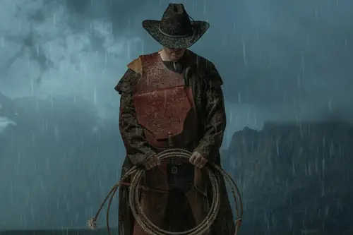
So now I get to do the fun stuff, which is color grading. Uh, this is definitely where I like to lock in everything that I have, because the way that I have been enjoying color grading for the last couple of years is using adobe camera raw. Now, how we're going to do that is we are going to go out of control shift e or command Shift E, which is basically palming the entire left side of your keyboard and it loads. There we go. So basically, what this is doing, this is taking all of your work, emerging it up into one layer. So this is definitely inherently a destructive workflow. This is a all the people who love nondestructive workflows. This is one of them, actually. You know what I just noticed? Get rid of that. There's a spot on his lip there that's bugging me. I got up and I walked away, and I came back and took a look at this. So definitely when you're working on your images, it does not hurt to take some time away from the shot itself and see if there's anything that catches your ...
eye. The ultimate thing is strangely enough when you're working on images and you feel stuck is take a nap, which doesn't sound like great advice. But if you're working on something and it's not coming together, go crash out for 20 minutes and then come back to it with, like, a fresh brain. Super Super Super Handy. So anyways, now that spot is off the lip. All control, shift your command shift E. If you're a Mac user control shift air Command shift, they will open up the double camera Right now. Here's the thing. If you have a computer that is super hard core and has like 32 gigs of Ram at least and SSD drives and stuff, then there's a step that you can do before this. Now, if you're running 16, gigs of RAM or less on your computer, ignore this next step because it's just gonna it's gonna be too much for your computer. So we're gonna right click here, and we're gonna convert this to a smart object. Sorry, objects are awesome because they retain all the information. So basically what's going to happen is when we go into double camera, back and forth, all that data is gonna be saved there. If this is not saved that this is just like a flattened layer and we go into a CR maker. Adjustments, come back out. If we try to open that file back up again, all the adjustments are gonna be set to zero. So I'm gonna show you what that means. So right now we have converted this to a smart object which is going to increase our file size exponentially. Control shift, Air Command shift A is gonna get us into Adobe Kamerad. Now, let's just say for kicks and grins we do this, which I don't think it's a good idea. By the way, we're just going to pretend that we did that. We're going to go. Okay, so now this is going to render out and see here. It's gonna say smart, smart filters, camera, raw filter. So we can double click camera, raw fielder, and it's going to open us back up and it's gonna see all of these adjustments here, which is super super handy because the nice thing here, um uh is that we can basically, like, put everything back to default. Okay, so the nice thing there is that we can put everything back to our camera. Raw defaults. Right. So this puts everything back to zero, which is exactly what we had when we opened it up. So we can go. Okay. And then we're back to our original image. Of what? This Look, please, turn this on and off. Now, if we had merged all of this up into a layer like this, so I'm just gonna make an extra one go control or command shift A into a CR. That's we crank this out a bunch. Do drop those and go. Okay, now, what's gonna happen is if we There's no smart filter camera buttons underneath here. So we're going to go control, shift a go back in and everything is still going to be set back to zero. So that is the benefit of using a smart object. He said If you have a smart object, we can always happen to the camera filter and adjust the settings. If you don't have a robust computer, skip it. Just commit to what those layers are going to be. So we're going to double click on camera filter because we were already in there and the reason why I like color grading like this a lot lately is because I've started making these huge collections of color grading presets basically, and I love them and I love how they look. Now this one here comes to mind because this image, the precept that this was originally made for, was made for an image that was shot on location. These are huge black rocks and a woman, and she has, like, bright red hair. And I basically wanted the rocks to look more blue and her red hair to pop out. So that's what you're seeing Here is what the saddlebag is getting this really nice red and the yellows. And then there's like, crunchy, crunchy blue. It's too strong for this, but I think that this is going to give us, like, a really nice Um, I think this is going to give us, like, a really nice color grade once we get this all going here. So I'm basically playing with here. Yeah, for it is pretty good. Um, so I basically want to really play with this. So this contrast here it's definitely a little bit too much on the contrast train. My blacks are super dark. So, um, see, here we can just pull up some of this. It's only a little bit mostly going to leave the rest of this alone, um, to hear to their whites a tiny bit. Let's go to our tone curve. There we go. So now this is a bit too bright. Basically, this is like a balancing act. Um, it's just this process that I built up over the years that I kind of just, like, play with and it kind of just works for me, you know? Um, just kind of like noodling around with this. Getting this where I like it. Mm. See? Still a little bit dark. Let's push that up. Just a tiny bit more how we're doing on our highlights here. It looks good. It looks good. Okay, So I'm gonna make sure that I go through all my stages here, all the steps. Um, so this is basically the curves. Of course. We're very familiar with the curves, um, texture, clarity, etcetera, etcetera. Let's push the clarity up a tiny bit. Um, texture, I don't really play much with, To be honest, like I might add, like one or two to it because we kind of want this to look a little bit like a graphic novel. It's gonna look a little bit surreal, and it's clearly a composite. But at the same time, I want this to look like as realistic as I can, Um, you see here that's good to our sharpening. Okay, so this is obviously, like, way too sharp. There's a little bit too much here going on, so let's knock this down a little bit. Um, I do like to increase the luminous little bit, especially so one of the things that happened here is that the the left side of our image here of our subject is quite a bit darker. Uh, and when we put those screen layers over top, what can happen as we get this, like color noise in the shadows? And so I started pushing up the color slider in the noise reduction, and it just, like, handled a bunch of those problems that I was having that was making me absolutely bonkers. So yeah, and you can play with masking if you want. I don't always. We hold hold right, and right now it's sharpening the entire image but we can pull it down. So it's only affecting like certain parts of the shot and so on and so forth. But I definitely handle, like the more particular fine point sharpening afterwards. So I guess I double sharpened in some ways. So, uh, now let's go to our hue, saturation luminant sliders. The reason why I love it will become a rougher color. Grading is that they have an Orange Channel orange channels, often the skin tones. And this image here, at least of our subject, has a fair amount of orange in it. Um, so yeah, so let's just see here like Hugh. I'm probably not going to play with very much like Maybe we can turn this down a little bit because basically, like, this is our blues here, right? So this is kind of like a purple blue, and it's kind of getting more like of a greenish cyan in color. Let's try that around there. Um, I mean purple and a gentle We don't really have any in this image. So now hue saturation. Let's see how we're looking here. So just by pushing up these saturation here, this is starting to look like a lot better. So I'm going to increase the saturation a little bit on the Reds. Which, of course, is our, um, saddlebag and so on and so forth. Orange is I'm going to increase that a little bit as well. So because I love what What is happening here with the rest of the image with the skin on the hands and parts of the jacket. Oh, let's see here, yellow and turn you down a little bit. Just a teeny little bit green. We can have a little bit of green in here. Oh, I love this. So this is like, I'm kind of really enjoying this this shade here, this is really looking nice. Um, so if I push the saturation of the blues here too much so then this image becomes hyper saturated and it's a little too much, so let's knock that down a little bit. Uh, do do do do kind of digging that kind of digging that leave that alone ruminants See here. I don't need to drop the limits quite so far because that's a that's a saddlebag. Right, So making a minus three drop the luminous a little bit on the oranges. Mm, Not too bad there again. Not bad there. Mm. Yeah. Let's see what we want to do with this. Now, this is like, this is this is a huge adjustment here with the aqua is right So the equals can look, um, quite strong. So I don't necessarily want this to be like it's sunny over there because one of the things that I am hiding, and a lot of times when you're doing compositing, if you don't, If you shoot something and you don't really know what the background is gonna be here, you find a background, and you're like, Oh, what can I put with this? Um, so there is technically a light source back here, and I'm trying to hide that because they're technically was a son back there. But if I dropped the luminant on the aqua is a little bit and then it just looks like different Ripley cloud textures and so on and so forth. Uh, but let's increase this a little bit. Look, not too bad. Not too bad. Not too bad. And I mean purple. That doesn't matter. Okay, so this is our split toning here. This is where it's going? Um, this is affecting the highlights only. So this is if there was no affect whatsoever. Um, but I have just, like, a little bit of it on the highlight here, so I could put a little bit of this into the shadows if I wanted to, but I don't I don't really like how it looks. Um, So split toning is basically like splitting the 20 between the highlights and the shadows, and it's super powerful. And there's lots of really, really, really nice stuff you can do with it. But for this image, I think would leave it alone. Obviously not doing any lens correction stuff. Um, I don't really care about doing much of grain adjustments and so on and so forth. These guys here, straight up, I never play with this. I should I imagine there's a lot in there to learn. Now, if we find that we like this color grade and we're happy with it, what we can do is we can save this. So I'm just gonna No, no, I don't want to. Just that That was a mistake. Let me see. Mm. Here we go. Okay. So let's say we like this so we can go here this little, like, stack of pancakes, and we can go save settings. And so now what we can do is this little window here is gonna pop up. We can select which parts of these things that we want saved. Then we go save, and then I tend to, like, just give it a random number, and then I will say cowboy. And now it just kind of, like earmarks it for me. Like, who did I make this for? What did I make this for? And I'm just gonna go, Okay, so this is going to render, and this is gonna be our before and after so I can look at this on and off and try to decide, you know, like, is there anything that I'm liking? Is there anything that I'm not liking? And the cool thing is, because we save this color grade, um, if I decide that there's something under here that I don't like, like right in here in the middle of the hoop of the lawsuit, there's, like, just a little too many raindrops, so I'm just gonna grab a layer mask, make sure I'm painting with black Reset that X because some of these there's just too much going on down there. Do do do do your next their mask. Get rid of some of those. Mm Here. Okay, turn my flow down a little bit. Bring back just a couple of them now because the reason why I didn't really notice that before and like I was saying, is when we do these color adjustments, especially in a CR sometimes some of these things become obvious and it's like, Oh, my goodness, we totally missed something obvious. So here, what I'll do is I will just merge everything back up, right, Click, convert to smart object. And because we have this saved, it's gonna be really easy to apply the same color grade again once it's done rendering and too smart. Okay, control or command shift. A gonna go to here to our save stuff, and we're gonna scroll down to this one here, which is our cowboy, and we're gonna hit. Okay, that's looking way better. I definitely like that a lot more. It's a lot less distracting. So it's before and after just pulling eyes where we don't really need them to go Um, yeah. So that, in a nutshell, is how I like to do my color grading and how I like to do it really quickly and how I like to save the process. So I used to do everything here with, like, you saturation adjustments and everything else. And then I found that when I was needing to duplicate the color grade a whole bunch of times, I was just having to have one PSB file open that had the previous Justin's in and just like copying them over, which is fine. But if I do the minute I became a raw, then I can just save it and then basically just run the color profile again, which is really, really easy. So yeah, color grading
Class Materials
Bonus Materials with Purchase
Ratings and Reviews
Steve Vick
Great hands-on course. I love Renee's straight forward approach. This is the tool, this is what we are going doing with it and here's how to use it. For me it is the fastest and most practical way to learn. No fluff, no long-winded stories... just doing! In some of the other courses I viewed, I find myself skipping ahead waiting for them to get to the point. But this course has a great pace. I will certainly look for more from this teacher. Thank you.
Lukas Ujma
Greater, nice work! Semply and clever.
a Creativelive Student
I've been compositing for a few years, but masking a subject always presents its challenges. Renée gave a series of tips that were very helpful, including information about how to use the "burn" tool to enhance a mask. That's something I'd never done before. Can't wait to try it! The part of the lesson that explained how to make the subject look as though his clothes had been in the rain was also an eye-opener. The method is simple, but the results are outstanding. I had tried making my subjects look as though they had been rained on, but it never looked real. Now I know how to fix that!