Lessons
Class Introduction
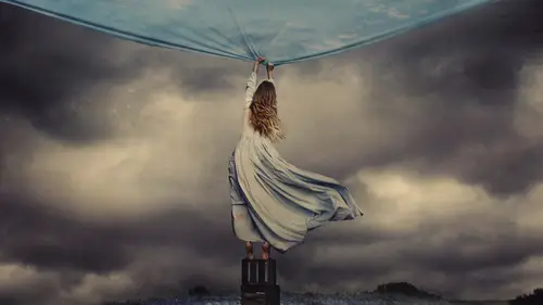
02:34 2How to Use Bedsheets as Backdrops
05:37 3Effectively Use Color Theory
06:07 4Set Design and Prop Placement
05:02 5Shoot Props and Self-Portraits for Composites
13:41 6Composite in Photoshop®: Selection and Shadows
33:25 7Composite in Photoshop®: Lighting and Color Adjustments
19:43Lesson Info
Effectively Use Color Theory
We're moving into talking about color theory, and I've brought in some dresses to do that. Color theory is really how we see color in relation to everything else going on in an image. So if we break down an image, we hae lots of different components, like lighting, wardrobe, time period, set, location, things like that. But in my opinion, color is one of the most important things that we can think about, whether it's on set with set design or in editing, which is equally important, in my opinion, or at least in what I do. So I've brought in these clothes, and these clothes are indicative of the colors that I would be working with whenever I create a set. This is really important when we talk about creating backdrops and creating images that are full of life even though you might not have a lot to work with. So the first thing I want to point out is that dresses such as this, or even this blue one, are going to be a lot nicer to work with when it comes to changing color of things on you...
r set. I don't know about you, but I don't have a ton of money. Not even a lot of money, even, less than a ton. So I don't have the luxury of buying every single color dress that I want. It's just not possible. I would have the whole entire rainbow if I could have that, but I can't. So instead I have dresses like this. I don't like this color dress. It's not a color that really speaks to me. I just realized I'm wearing this color, but nonetheless, it is not a color that I love. So I'm probably not going to use this exact color in an image of mine. Instead what I'm going to do is use this dress in whatever image I want, and recognize that the bolder the color, the more easily I can change the color of the dress in Photoshop. So when I'm thinking of color theory, I'm not only thinking of what matches what, and how can we bring that to the set, but also what can we do later to change colors? That's really important when you're able to take images into editing, because editing color can be your best friend when it comes to bringing out emotion and story in an image. So color theory has to do with a lot of different components. Let's just break it down into a couple of them. One is, first of all, how you see color on set or in Photoshop. So that's the bold color of a dress or an object or a background that you have in your image. And that's simple. We all understand that. But what I like to do with a bold color is to pair it with almost no color at all. So instead of having multiple bold color in an image, like blue, green, yellow, things like that, I like to have one main color, be it red or blue, green, and then have all neutral colors surrounding it. To me, that allows the image to really stand out as having a color signature. You have one main, bold color, and then everything else supports that color. That's a big part of color theory is understanding when other colors are going to detract from the one that's most important, or when it's going to support that color. So then how do you choose that color? How do you know which one is the right one to use in a certain situation? That can be really simple, because, let's take this dress and imagine that we've put it in Photoshop, and it is just a beautiful rich, bold red color instead of this muckier maroon color. So this is a really bright, red dress. What emotion would that have for you? How would you feel toward that color? If I were to say, "What do you associate with the color red?" You might say love, passion, Valentine's Day, things like that. I would say blood and death, because that's me. You might not be like that, and that's okay, too. So we have different associations with color. Those associations give our images and other people's images meaning and story. So if you can think about color in terms of what color evokes what emotion or story, it becomes much easier to choose the color, the exact color, that should go in your image. But, let's say, that your not interested in just having one main color. You can also think about color in terms of contrasting. So maybe you'll pair blue with red, and that's okay to do, of course. Anything is okay, because there are no real rules in photography, there's just what might reach your audience best and what won't. So if you have contrasting colors in an image, it's important to recognize what colors actually contrast on a color wheel, meaning that they might actually pair well together, if you find the right variation, and what will look just sort of muddied, a little bit, when you pair them together. My personal favorite thing to do is to create monochromatic images, where you have one main color going over the whole entire thing. So I will often take my images and put an overall blue color on top, giving the illusion that it's early morning, or some color like that. But the other thing I love to do is to create a color signature for my work. The way that I do that is by thinking about color in terms of light. If you go outside at sunset, the light is going to have a certain color, no matter what, it's going to be yellow, versus noon, when it's going to be blue. So if you think about light as having an inherent color, you can start to think about your images in terms of highlights and shadows. When you apply color to a highlight and a shadow versus a midtone, you're gong to start to give your light color instead of just your overall image and everything within that image, and that can be super-impactful. So when I'm thinking about color, I'm first and foremost asking, "What is the emotion?" and "What is the story?" Once I have that answer, I can really dictate exactly what color theory I should use. Should it be one main, bold color, a monochromatic image, something with contrasting colors, or am I going to think about color in terms of light?
Ratings and Reviews
Heather Lynn
I really liked this class. There are so many ways to accomplish the look and feel that you want. It's nice to see the variety of ways people use their own processes and pick and choose what works best for you. Great job Brooke. You related very well, and were very thorough with the steps your explained.
Max Safaryan
Great course with useful content and excellent delivery - Brooke is very informative, pragmatic and efficient. Well worth it!