Defining The Glossary Of Design Terms
Lesson 2 from: How to Create Marketing Materials for Small BusinessesErica Gamet
Defining The Glossary Of Design Terms
Lesson 2 from: How to Create Marketing Materials for Small BusinessesErica Gamet
Lesson Info
2. Defining The Glossary Of Design Terms
Lessons
Class Introduction
04:25 2Defining The Glossary Of Design Terms
26:26 3Adobe In Design Demo Update Your Current Materials
08:44 4Adobe In Design Demo Business Card Part One
39:08 5Adobe In Design Demo Business System Materials
23:55 6How To Procure Free And Low Cost Stock Images
11:51 7Adobe In Design Demo Postcard
16:16 8Object Styles For Continuity
07:40Lesson Info
Defining The Glossary Of Design Terms
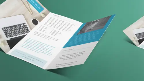
So this is actually one of the included, the giveaways that came with the class and so we have the glossary of design and print terms and what you will notice is that on here, I used, it's very well thought out, worded. I'm gonna talk to you in the talk that we actually talked you know 'cause who uses, what's the word I use? I used parlance, who uses parlance in everyday parlance right? Who does that? I have a writer, so anyway, what I'm gonna talk about, so don't worry about looking at the definitions that are up here. That's later, so you can go, oh yeah, that's that thing she talked about. But some of the things that we need to be aware of when we set up our document are things like bleed. So a bleed, and I have, I don't know if you guys probably can't see, I'm gonna use this one. We're gonna look at this in just a while, this is a business card we're gonna make and it's really hard to see, but basically you see a big field of blue. And what it is, that card, when it gets cut down, ...
that blue is gonna come all the way to the edge of the paper. Now, if I had this page and I wanted the blue to come all the way to the edge of the entire sheet of paper, I can't print to the entire edge of the paper. Whether you're going digitally in the print, or, sorry, in the copier or digital printer, or you're going offset press, which is traditional printing. Some way, that device has to grab that sheet of paper, and also if you have ink going off it, it will like, bleed off to the backside or the ink will come over to the other side. So we can't do that, so what we have to do is print on a larger sheet of paper and then cut it down. Trim it back down. And so what the bleed does is we make sure everything goes beyond what those crop marks are, what the edge of that paper is, and we have to make sure that our design goes past that. So think of a brochure or, let's say a postcard. You got a postcard, and the image comes all the way to the edge, right, when you look at it. You don't have white around it, it comes all the way to the edge. What they did is they laid it on the sheet of paper, six by four or whatever size we have for our postcard, and we made sure the image came past where it needed to be, and then we came back and chopped it. And so not only do you need to set your document up for that, you need to make sure your images are large enough and that the stuff on the outside is not very important either, 'cause that's gonna get trimmed. And keep in mind, when things go to a machine, whether it's a printing press or a copier or a cutter, things move. So you can't be super precise and put something super important right at the edge there. So that's bleed. And there's a long explanation for that, but a lot of the people don't think about having that extra room. And then margin is sort of like that, margin is the space between the edge of the paper and where all your information sits. So there's kind of this gap around the outside. Now, even if you have a bleed, you still have a margin, because any text that sits on there, even though you're gonna bleed it, you're gonna cut it. You don't want your text very close to the edge, 'cause again, things move, things go through crooked, things go through off center a little bit, and then it's going to be very noticeable the closer your stuff is to the edge of the page how inaccurate your machinery was when it went through, and it's going to happen. Trim is just the edge of the printed piece's edge, right, the surface. So it's just where we cut it. So we'll put crop marks on there, which is another term down below, just jump down to that crop marks, it's just printed marks that are on there that indicate where things need to cut. Now if you're doing an eight and a half by 11 sheet of paper in the US, is that the A4 in Europe? I always forget the European sizes, A4. And so if you do that, you're letter-sized. If you do that, then obviously you don't need crop marks, it's just going to run on that sheet of paper. It's when you have something smaller, you need to have the crop marks. Gutter, this term gets used a lot. Gutter, and also, in InDesign, they use the term gap, and it's kind of two of the same, two sides of the same coin. The gutter is a space between items. Now, it could just be a gutter between columns of images, or it could be the space between columns of text, and it also can be spaces between individual items on a page. For instance, if I were to set up 10 business cards, or let's do eight business cards on a letter-sized sheet, and they have a bleed, well, I can't necessarily butt them up against each other, because I need to make sure that there's like, let's say it's a photo background of this business card. I need to make sure there's a space around it all for all that trimming, and that's a lot of trimming. But between each of those cards, I also have to have a gutter, so that I have room for that extra bleed as well. Because again, no machinery is so accurate that we can cut right where it needs to and not have the part of the card above it show on the card below it, you know, if that makes sense, hopefully. And the live area is known as the safe area. So it's just where everything lives that we're going to have. Everything that's gonna show up on the card lives in the live area. And when we look in a later lesson, in the last lesson, we're gonna look at some online printing services as well and so we're gonna look at when you bring something to a local printer versus when you go online. And on the online stuff, a lot of these terms are going to be there, and they're not necessarily going to explain what they are. They're just gonna tell you where the live area is but they're not gonna explain what that is, necessarily. A key line, I don't hear key line used very much any more. It's an older printing term. It's basically a stroke around an image, a line around an image, and most of the software uses the term stroke instead of key line, but you might hear the term key line. Again, sometimes when you go to local printers, they're using printing terminology. Designers also have some of their own terminology. I also find that advertising has a whole nother set of jargon, and sometimes we're saying the same thing but we're saying it differently and we don't realize we're talking about the same thing, so keep that in mind as well. A guide is something that we will be using all the time in InDesign. You need to line things up. I don't like things that are just eyeballed, and neither do printers, and neither do, you know, the machinery that you put it through. If you just eyeball it and think it looks all right, and then you go to print it and cut it and things aren't lined up evenly, it's going to be very, very obvious. Now, the great thing is there's guides that have been in the software packages forever, and a newer thing, it's probably not that new now, it's maybe eight, 10 years old now, but smart guides is the next item on there. And the smart guides line things up not according to the page, but according to other items that are on that page. So they appear and disappear as you move things closer to each other. So if I've got an item on this page, I can throw another item on the page next to it and it will tell me when those two things are lined up next to each other. So that kind of gives you that nice middle ground between making sure everything's always lined up with guides and eyeballing it. So it lets you eyeball it, but it still is kinda saying hey, you should move this over. And so that to me is like the happy medium between those two worlds. We talked about crop marks already. Portrait and landscape, you'll hear this a lot. This is the orientation of a page. Is it tall, which is portrait, or is it wide, which is landscape? I happen to say tall and wide a lot, even though it will say portrait and landscape on there. The nice thing is always every time you choose that option there's a little icon that shows you, tall, wide, so if you can't remember, it's there. Font, this is a good one. So I put that it's a collection of type used to display a specific type face, the physical item that delivers it, such as a .otf file. Often used interchangeably with typeface. If there are any designers listening, typophiles listening, I can just hear them screaming out, like, you know, just tortured souls, because I just said it's often interchangeable. Yes and no. This is the biggest thing that will get you in trouble. I say, don't worry about it. Everybody knows that when you say a font, if you say, what font did you use? You know, you're talking about the typeface, what you used to display what it is. The font is actually the software file or in the old days the actual type on wood, you know, the lead type, or in the old computer disks or whatever. But they are really used interchangeably, so I wouldn't really worry about it too much. But you know, font, everybody knows what a font is. Typeface, typeface is actually the group or collection of the actual fonts, so with a particular style. So Helvetica New, it is a font, or a typeface. The file that you used to deliver that. Helveticanew.otf, that's your font file. Again, don't worry about it. You know, we all know what we're talking about, and then that's kind of how you weed out the people that just have too much time on your hands. And I shouldn't say that, 'cause so many of my friends are typophiles, and I'm not. I can't tell you what font something is, I just, I don't care, shhh. All right, so kerning. This is something we'll talk about when we get into laying out some items as well. Kerning is the letter space, I'm sorry, the spacing between letter pairs. So how two letters interact with each other on a page. Now you think, this is so much to learn and worry about. I'm gonna show you a couple of things that just make it easy to make it look better, the kerning look better, without worrying, how did these two fit together? So the kerning just basically says, oh, this letter and this letter, let's say we have a V and an A, and that's always a really good example. Because you think about what a V looks like and an A, and each letter in that font takes up this amount of space. So if it just lays it out, that's how it's gonna put it. But then you look at the V and the A and you think, well, those kinda would make a nice little pair pushed closer together, 'cause they kinda nest together a little better. That's what kerning is, it looks at, and there's an optical setting and an automatic setting in InDesign which says, oh, I know it's supposed to sit over here, but wouldn't they look nicer if they moved this close together? So that's what kerning is, and sometimes you wanna change that, 'cause sometimes the fonts, especially if you're not using professional fonts, which you should be using, and we are gonna talk about fonts as well. But if you don't use some of those, some of them just sorta look odd. Like they just don't look like they fit together really well, and there's little tricks to move those together, but that's kerning. Or if someone says, tighten up the kerning, now you'll know what that means. And tracking is sort of like that, except it's the spacing between all letters throughout a selected bit of text. So I don't know if you've ever seen where people just space out the tracking and the spacing between, which normally is not a thing you wanna tweak too much, but it might be in, like, a logo. Like, let's say you just had a logo and it was just your name, or a Smith and Associates, you might want Smith tracked out so that it fits right above And Associates, so that it makes like a nice square layout. And so in a logo, that's totally fine. We don't wanna do that in, like, if we're writing paragraphs of text, but we can do it in a logo as well. So we play with the tracking, and the tracking more so than the kerning. Kerning is like I said, each individual pair, tracking is the overall look. Justified, this is justified text, or fully justified. So when you have your left and your right margin of text is square all the way down. Usually the last line is left justified, pushed to the side. But in InDesign you have options for what to do with that last line. You also have left justified text, which is used a lot, or known as ragged right. So the right end just ends wherever it ends. Now, the advantages to being left justified is that you don't have a lot of hyphenated words some people are very picky about their hyphenation, too many hyphenations look really bad. And so but when you do justified text, you either have to have more hyphenations or more white space in between words. Not all the way across all the letters, just the big, what we call rivers of white. When we've got too many chunks of white and you just look and it looks like it's just this river of white going through your text. Throw it to the left. If you don't have to have justified text, and that's really kind of outdated, I wanna say, a lot of that, a lot of the right and left justified, fully justified text is a little old-fashioned. Baseline is the invisible line on which all your type sits. So all your lowercase letters sit on this line. And the reason the baseline is important is because that's actually how a lot of the text is indicated where it sits in a text frame, so you're trying to move where something is and you don't want to move the frame, necessarily, you can play, you move the baseline. You can move type off the baseline. Think of like, for instance, a trademark symbol. A trademark symbol, even though there is a specialized symbol for that, but if you were manually creating one, you would make the TM smaller and then you would raise it up off the baseline. So instead of it sitting along, where the bottom of the T and the M sits at the bottom of whatever the word is it's trademarking, it would move up off the baseline. So just keep that in mind, there's kind of this invisible line that it sits on. Leading, that's not leading, that's leading. That is basically line spacing. But that is the professional term for that is leading. And so, a lot of programs will say line spacing. Leading is what we use in InDesign, it just indicates how much space between each line of text. Open type, and I didn't list all the font types. Open type is kind of the newer one, the one we want to use a lot. It's a font file type. It allows you, for a lot of specialized type issues that we can use inside that font, and also it's cross-platform and that kind of was the big sell when it came out is that I could have this font file, this .otf file, and I could give it to somebody who was on a Windows file, or a Windows machine. I couldn't give it to them, technically. They could have the same file, if they used it to lay it out on a Windows machine, and then I had the same exact font on my machine, we wouldn't get that text reflow that we used to get all the time when we went from a Mac to a PC and back and forth, and so that's what, if you go to buy fonts, most of them now come in open type fonts, and all the Adobe typekit ones are OTF fonts. But if you get the chance to buy a font and you've got a choice between true type, which is a .ttf file, and anything else that's out there, postscript file, choose the OTF file, and just generally speaking that's your better option. Swatch, so these are the little colors of, you know, everybody knows what a swatch is. You go to the paint store, right, and you pick up all the little color swatches and all that. That's what we have in InDesign, we have in Illustrator, we have these little squares of color that show us what color it is we're going to add to whatever it is we're choosing. So that's a swatch. And part of that is fill and stroke, so when we're working with an object, we have the fill, or the interior of the object, and we have the stroke, or that key line. And each one is able to have colors and other attributes added to it separately, so fill and stroke. And the next two sort of play off each other as well, transparency and opacity. This is another one of those two sides of the same coin. They're actually sometimes used interchangeably, especially in illustrator, they use opacity most of the time, or transparency most of the time, and then they throw in the term opacity. And it's basically transparency is being able to show everything that's behind it, and there's a lot of issues to be aware of with that because of the way transparency works. So transparency on a screen when we're designing it is great, it's fine, because what does it do? It shows light and is able to shine through what's behind. Something sits on something else and is transparent, we can see that object below coming through. That's great when we're sitting on a screen that's made out of light. When we go to put it on paper, and now we've got ink or toner, you can't have transparent ink or toner. So it has to work really hard to give the appearance of being transparent, and that's where some issues can happen. So that's why transparency, it's great to look at and put onscreen, but you need to make sure, again, can the output that you're dealing with handle it? You know, if you're going to a print shop and they've got some really old equipment, you throw them that, your transparency might be big blocks of black text, or blocks, in the old days when we first started with InDesign when it had transparency, it was great, it showed it fine on the screen, but nobody could print it. All your drop shadows came out as solid black boxes, because the machinery went... I dunno, that's beautiful, I can't print that. I don't know what's going on. And so that's what we ended up with. So just keep that in mind, that using those transparency options can cause problems. Not so much any more, almost everybody's going digital. Of course, if you're outputting to digital, it's not a problem, shouldn't be a problem. Can still be a problem, but just keep that in mind. And then opacity is just sorta the flip side of that, how opaque or solid is that object? So just keep in mind that certain things will say transparency, and that's the menu you go to, and then when you open it, it's the opacity slider. So it's, you know, how far to one side or the other, transparent to opaque. Half tone and duo tone we don't usually use much, I mean, I don't really worry about so much any more. That's when we're doing a lot of print and we want to put a photo and instead of having just, you know if you Xerox copy a photo, you get black and white, right? This gives you that continues tone, all the shades of gray, that's what half tone is. And a duo tone is where we add in another color to that, there's tri tones as well, so maybe before printing two color on a printing press we would do, like, let's say it's blue and black, we're gonna do a blue and black photo that melds those two colors together instead of just the continuous shades of gray, we get gray and blue together as well. But color, let's talk a little bit about color. This is a consideration we need to keep in mind. So you may hear me use the term color gamut. I know my last name's Gamet, this is a different kind of gamut. Which always makes me laugh when I say it. And this is also how most people spell my name, is G-A-M-U-T, that's not how it's spelled. But a color gamut is a range of colors, the range of colors that you have in a particular color mode. So we've got two that we we work with basically, I've listed three. RGB, CMYK, and LAB, or lab color. And LAB we're not gonna worry about at all, but it's kinda cool because it actually is the color mode that can show all perceivable colors, and even what they call imaginary colors. Like, colors that we can't even comprehend or tell the difference between, but they're all there. But nobody uses it. So I mean, not nobody, it's actually, you know, it's the better one because no matter what device it's on it's always going to look the same, whereas the two that we will deal with the most, RGB, which is red green blue, and CMYK, which is cyan, magenta, yellow, and the K stands for black, well, it actually stands for key, I think is what it is. Basically cyan, magenta, yellow is the opposite of red, green, blue. But we like, if we put all the colors of cyan, magenta, and yellow together, what do you get? Brown, a really dark brown. But we like black, right, we want our shadows black and things like that, so we add that black to kind of give it that fuller color. So when we're working on a device, we're laying things out or we're going digitally, we're gonna make a PDF for viewing, that's red green blue. So if it's shown on a device that uses light to make the color, it's red green blue. That has a wider color gamut or spectrum that it can handle. So red green blue has this great spectrum of color. You get those nice bright fluorescent, you want a nice orange, a bright vibrant orange, and you put it on the screen and it looks great. When we go to print that, whether it's on a digital press in toner or putting it on an offset press and using ink, or any kind of substrate, we have to convert that to cyan, magenta, and yellow, because you can't print in red, green, blue. There are some printer devices that say they print in RGB. What they mean is they wanna get the information in RGB and do the transformation inside that printer, but nothing actually prints in red, green, blue. That's light. So when we go to print that, what happens with that bright orange that looks great on screen, it transfers to this other color gamut, which is narrower. And so it says I can't reproduce that wonderful bright color that you wanted, here's something that looks kinda like it, or not at all like it. So we get these shifts. So the reason that that's super important is again, where is this going at the end of the day? Because one of the first things that we're gonna look at when we start an InDesign file is we're going to, it's going to ask us what color space are we working in? So we need to be able to tell it. If we know we're only going to digital, we're going to start in RGB and we're gonna stay in RGB. If we know we're going to print, we're gonna put it in CMYK, although we might work in RGB with a lot of our documents, and when we go to export that as a PDF for print, it will do the conversion for us. But by telling it that we're setting it up in CMYK, if we do something that's outside of that CMYK gamut, it's gonna give us a little warning and it's gonna say that orange is not gonna print like you expect it to print. So it's always gonna be telling us that's not gonna happen. Grayscale is, obviously, it's the different shades of gray. So we can work in, if we're doing a black and white output and that's all we're doing, is we're just paying for black and white, we're putting it on a press, well, you only wanna pay for one color of ink. Well, you have all those shades of gray to work with. So you can work with grayscale images, things like that. And spot color is used in offset printing, and I'm gonna assume most people are probably going digital printing. Most people are not paying for that, I dunno, it's changing, you know, printing's just done this change. I think everything's becoming very niche, which I like. It's not going away. Anybody here who hears print is dead, please just let them know. Let them know, not with your fist, just let them know. But spot color is used when you can't only, when you're putting it on a press, and you don't wanna pay for four-color printing or CMYK printing or process printing, which is the other term for it, where you're gonna print in all four colors. That's expensive, to do that on an offset, traditional press, because you've gotta run it through the machine four times or do four plates or whatever, but there's a lot of color, a lot of work involved. So you might do, you want some color, but you don't want to pay for that. You might do spot color. So you might do black, and a Pantone color. So you might hear Pantone a lot, you might also hear the term PMS. That is not what we're talking about, we're talking about Pantone matching system. And so that is the Pantone color. So when you do spot color, I might again, going back to that black and blue example, I might say, okay, I want two colors. I'm gonna pay for black and blue, I've got a black plate and a blue plate. And then I've got all the shades of black that I can work with, so all the gray, and I can also have shades of that blue as well. But what happens is they're putting black ink on the press and they're opening a jar of Pantone blue, and putting it on the press. So that's what you have to work with is that color, you don't have all the colors that you can get when you create a CMYK photograph, for example. So hopefully, does that make sense a little bit, with the color? It'll make more sense as we work with it, but that, the biggest thing to take away from that is knowing where it's going, knowing what you can afford, 'cause you think, oh, I'm gonna print it four color, but I actually want to print it 'cause I'm gonna put it on some specialized paper, maybe some foil and all that. That's fine, it's totally doable. It's gonna cost a lot of money to do that, just be aware of that. But you'll end up with some beautiful stuff. But also working in four color, whether it's four color on a press or four color digitally, then you kinda aren't limited by, I mean, you're limited by colors, you can't get those really bright colors, but you're not limited to only blue and black, those aren't your only colors. That's what you get with spot color, kinda limited with that. So we talked a little bit about this, the offset printing versus digital printing. So offset is basically, we're gonna put it on a printing press, and that works by rollers and blankets and all these great things. It basically takes the image, you gotta make a plate, it makes the image, transfers it to what's called a blanket, so it comes of off of there, the image is there, and then it rolls it onto the paper as opposed to like, letter press or the old, where you do one sheet at a time and you're actually pressing the image onto it. So although I pretty much call anything that's done in the traditional method, now I call that offset press. It's probably not the exact right terminology, but I just mean traditional printing versus digital printing, which could be just a high-speed copier, it could also be things like the Indigo press, and that is something that's an option you might look at when you're talking to a printer, is that it's digital, so you don't have all the different ink that needs to be put on there. But it goes right from the computer to the output device, but it actually prints in ink, not toner. So it's actual ink, but it does it all digitally. So that's just a, that's a specific press, the Indigo press, there are other ones out there. But that's one that I'm most familiar with. And then process, or four-color process. That is four-color printing. That's the one I said can be expensive because you've gotta put it through a four-color press that can either handle all four colors at one time or you've gotta run it through the press four separate times, so that's expensive as well. So those are kind of some of the printing terms Any questions on any of the terms that are there? I know it's a lot of terms to throw at you, don't feel like you need to know them. That's why you have the cheat sheet with you. But I want you to be able to speak the speak, you know, talk the talk when you're talking with people, because I'm gonna let you in on a secret. Printers like to throw terms at you and kinda make your head spin so that you just let them do the work, I think, is a lot of it. My background's in printing, and it's actually been almost 30 years, so maybe I just wanted to sound younger in my bio, or it's an old bio, I'm not sure, but it's been 28 years that I've been in printing and so I know how the game is played, and sometimes, or sometimes they don't think, maybe they don't know what I'm talking about, you know? Because it's just one of those things, it's jargon that you know and so this way when they say, oh, do you want a bleed? You'll know that bleed, not only what you need to set up, but keep in mind, if you're gonna bleed off an eight and a half by 11 paper, you've gotta go to nine by 12 paper to print it on. That's gonna cost you more money, most likely. Things like the Indigo press can actually handle the nine by 12 and it's not more, but just keep that in mind. They'll be like, do you want a bleed? Sure, I want a bleed, or you design it all with a bleed, and then you get there and realize, oh. 'cause when you got the quote, you didn't tell them there was a bleed. Now there's a bleed, and you just added $150 bucks' worth of paper just so they can trim that all back off and end it in the trash, right, so you need to know these things. So don't feel like you need to know all of them now, but it's things to think about, and I think the color thing is probably the most important. Know where it's going, know what device it's going on, and then you'll know what to design for and you can be thinking about that. Because there's nothing worse than coming up with these great colors that look awesome on screen but when you go to print them, they're all this kind of all this dull, like, I love the autumn colors, but if I was expecting bright spring colors and I suddenly had autumn colors, I'd be upset, right? So those are the terms on there.
Class Materials
Bonus Materials with Purchase
Ratings and Reviews
Laure Donteville
How lucky to attend this class in person!!!! So worth it and it was exactly what I needed to have the right tools and give me the confidence to jump start my business. I can't wait to finally put together my ideas to create my business cards and send my very first postcards to reach my future clients. Thank you Erica for such a funny and interesting class on things that usually feel so overwhelming. Yes, you can be a designer!!!!
Cynthia Dauterstedt
Erica is just awesome - did several of her courses and she has a great style, is funny and explains very well the basics and beyond what "Design Dummies" like me need to know to get the stuff done they don't have money to pay an expert for. Good Job, worth each penny!
julie haskett
She said at the beginning that her purpose was to make us confident enough to use Adobe In Design and she absolutely did. Perfect class, perfect instructor. Really enjoyed this and lots of info absorbed. Can't wait to put it in action.