Adobe In Design Demo Tri-Fold Part Two
Lesson 11 from: How to Create Marketing Materials for Small BusinessesErica Gamet
Adobe In Design Demo Tri-Fold Part Two
Lesson 11 from: How to Create Marketing Materials for Small BusinessesErica Gamet
Lessons
Class Introduction
04:25 2Defining The Glossary Of Design Terms
26:26 3Adobe In Design Demo Update Your Current Materials
08:44 4Adobe In Design Demo Business Card Part One
39:08 5Adobe In Design Demo Business System Materials
23:55 6How To Procure Free And Low Cost Stock Images
11:51 7Adobe In Design Demo Postcard
16:16 8Object Styles For Continuity
07:40Lesson Info
Adobe In Design Demo Tri-Fold Part Two
Let's say we do wanna change the fonts and we wanna use our Typekit fonts. So I'm gonna go ahead and just decide I wanna go shopping for some new fonts. I don't like this font. I'm bored with this font. We need something new and exciting. So if we're using the Creative Cloud, which I assume most people are if you're using InDesign. Most people don't just buy the one application, because you are allowed to buy either one singly or you buy the whole suite. And if you buy one it's usually Photoshop, so I'm assuming most people have the Creative Cloud subscription. With that you get what's called Typekit, access to these fonts. So I wanna go ahead and add a new font, so I'm gonna go up. Actually, I can either go out to the website individually, typekit.com, or I can access it through our little Creative Cloud symbol. That might be here, it might not be. You might actually have to go to your applications folder and launch it, and it might ask you do you wanna put it up in the menu bar? So i...
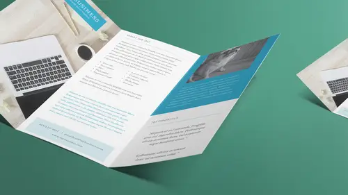
t might be up there automatically. And I'm gonna go under assets and under fonts. And I have one font right now that is synced, that's it. So the other fonts that I have are either on my system or synced through some font management software. But in this case, I wanna go out to Typekit and check it out. So let's go ahead and say sync fronts from Typekit. Actually let's go to manage fonts, and it's gonna bring me out to the website. So I've got a couple of my fonts here. Actually yeah, there we go. So there's the only font that I'm syncing is Adobe Caslon Pro. This goes out and shows me what fonts are synced to my account. But I wanna go shopping for fonts, so let's click on fonts up here. And I decide that I wanna have a different look. Right now in my document I have sans serif fonts. Pretty modern. Let's say I just wanna go a little bit, I don't know, more whimsical or something like that. I can choose from all these different types of fonts. I have sans serif, serif, slab serif, script, blackletter, mono, hand, and decorative. Let's just see what's under decorative. Let's click on that. And I can check this out. This is kinda cool, I kinda like that. This is kinda nice. I don't know why that's decorative and not under sans serif. Well yeah, it's kinda different. So I can just scroll through and check these out. So now unfortunately it makes you scroll through a lot of pages. This is page one of 19. (sighs) There's a lot of scrolling and a lot of say next page, next page. Let's actually choose, I don't know, this guy's kinda cool. Let's go here. I just click on it once and then it'll show me the different faces that I have available in that font as well. So there's a lot. They look really different 'cause there's a whole cursive family as well, and flared, sans regular, so there's a lot available. I can sync each one individually. What I'm look for when I go to sync, to print, is I'm looking for the fonts down here. I've got two options. This is a synced font, or what we used to call print fonts, and then these are our web fonts. So I wanna make sure that I have the cloud with the little arrow to it for when I'm working in print documents. That needs to be an option. If it's not, I cant' use it. I won't even be able to access it in InDesign. So I can choose which one I want. Let's go ahead and choose this first one here. And I'll just say sync, and maybe I'll grab the italic with it while I'm at it. And I can go ahead and just jump back into InDesign and we should have those available to use pretty quickly. Hopefully, we'll see. There we are. There's the two that we just downloaded. Let's do regular, I guess. All right, so it's a little smaller. Obviously we'd need to change that. We need to also make sure that's paragraph style. A-ha, there was one called small quote. Now I can either change that and call it small quote new or something like that, or I can change in the definition, like we've been doing, but I'd also have to make sure that I don't have any other fonts or styles based on that style as well. All right, so I need to check on that. But in case, I'm just gonna go ahead and change this to it. I just wanna show you how to get out to Typekit. So Typekit's nice, and then if I have synced those fonts and I unsync them later and I go the open up this document and I have a problem, or if you've downloaded these templates and you don't have those fonts synced, then you might get an error when you open it that fonts are missing. And it'll look something like this. I'll actually open up. Once you're in a document, you can open up find font. It's actually under the type menu, down here under find font. And that shows you all the fonts that are used in a document and you can sync them from there if they're Typekit fonts. And it will let you know. The sync will not be available if you click on one and click sync, well, it won't let me here because it's already been synced. But you can click on it and then sync will be one of your options if you're able to sync that font that's there. And actually, yeah, sync isn't even showing up so there's no errors at all. It's telling me no missing fonts. So if there was one missing, I'd have a little exclamation point next to it and it will tell me I can sync it. When I click on that, it should go out to your Typekit font and bring it in. Sometimes they don't update right away. Sometimes you gotta quit InDesign, sometimes you just wait a couple minutes (laughs) and they show up. Lately I've notice that it's working really quickly. You saw how quickly we find it and brought that in. So again, that's Typekit and that's how we bring in those fonts there. So let's look at that. Let's look at some more type styles really quickly. I know I keep just honing in on styles, but I'm gonna tell you that once we start working on all these different layouts, having the styles and being able to share the styles amongst the files are great, and also just within the brochure itself. So for instance, we've got these headers. And like I said, I don't know if we have any other ones called small quote. I think we do, actually. Actually, small quote might have been based on large quote. That's based on header large. So sometimes you get these cascading styles and you gotta be careful of that, 'cause when you change on everything will do it. So I try and think it out ahead of time. I wouldn't just base it on there 'cause it looks kinda like it. It's more of a do those things need to tie together? So like a header and a subhead and a sub-subhead maybe do all need to look kind of alike so I might put those together. But just because this tagline over here looks a lot like this header but maybe just different in size, I wouldn't necessarily link those up because I might want my tagline to stay my tagline even if I change my header. So again, it's always trying to think of what to do with the styles and how to link them together. Like for instance you might have an author, or I'm sorry, a book title and an author and then the text of that, and you might want those all linked together so when one changes, everything ripples down and changes as well. But you might photo captions which look entirely different. My photo captions rarely are based on any other style, because they're kinda just their own thing. I might have a Serif font for all my text and then my captions are done in a sans serif and I want them to stay in sans serif no matter what. So again, just think about how that flows through. But what you might get a lot of are different body text styles. So actually we have, I believe this is body. So this is body copy, and that's generally what I start with when I start thinking of styles. I think what's the thing that's going to be there the most? Well, if I have a lot of text I usually call that body copy. And so I start with that as my base style and then I base everything else on it. And believe me, I don't sit and think all this out ahead of time. Lest you think I'm that organized, (audience laughs) I am not. I do it on the fly, but that's why I love InDesign. You go oh, I changed my mind. That's not what I want it to look like at all. Redefine the style. I spend my day redefining the style. I think of something and I throw it out there. I'm like that looks good until two minutes later when it doesn't, you know? (audience laughs) And I go oh, redefine that style. No, I really want it to look like this. Redefine the style. But I'm still keeping it consistent and I am still giving myself less work to do even though it sounds like it's more. But then when it comes to add 18 different paragraphs later on and I know I don't have to keep doing that, or I'm gonna create a whole new brochure and then I can just use that same style over and over again. It's definitely worth it. So in this case, I've got body text. Well this text is also body text. If you notice it says body plus something, plus what? Well I can tell you what plus there. There's a bullet there. See, sometimes when I roll over it doesn't actually show me what the extra is, so that's all right. I'll just have to figure it out for myself. So sometimes I click on this and I just look up and see what else do we have that might be defined differently. Okay, this thing popped up. That's the bulleted list. So it says okay, it's body text but you also have bulleted list. And now I can double check that. I can come over here and I can hold down the option or the alt key and click on that name, or click on the bar, not on the name but on the bar itself, and it will get rid of that override. So that's exactly what it did. It put it right back like this and now I think well, that's not what I want it to look like at all. I did like the bulleted so I'm gonna say undo. You notice I got this extra space there all of a sudden as well. That's because in body text one of the things that we have in the paragraph is this here. This is space after. So I've got almost 2/10ths of an inch after each paragraph. So when I hit return from a paragraph when I'm doing body text, let's say I wanted a new paragraph here. I hit return. There's suddenly all that extra space. That's built into that style and that's because we don't wanna do those extra returns. We don't wanna put an extra hard return in there ourselves because if it ends up on a new page or a new column and you've got that extra space and it moves to the next column, then that extra space is sitting there. What you wanna do is say extra space before or after, and then it's contextual. If there are two paragraphs next to each other, it adds that space. If there aren't, it goes away. So it's magic, it's a magic space. So add the magic space. I'm gonna actually delete this. I'm gonna just put those back. So we have one here. So what happens to this? So I say okay, this is body text but I added a bulleted list. Let's actually look at that. Bulletin numbering live at the far right over here in the panel menu, so it's this control panel at the top, its menu. So I'm gonna come down to bullets and numbering and all I'm gonna do is choose bullets. So I'm gonna say it's bullets instead, or we could do numbering instead. Let's turn on preview. We can do numbering as well, and it's only doing one 'cause that's the only place that I had that particular, where I had my cursor, and I could always then update that style. That's called body list. It could be listed with numbers instead. So I just change that. Instead of bullets we changed it to numbers. And so I say okay, I really like that. I want that to be based on body text up there. I want a whole new style. So again it's body plus all the stuff I just did to it. I went ahead and there is no space after in this one, so I took the space after out and I added the numbered list. That's basically the same, everything else is the same, but I could also make this bold. All right, so I'm deciding that the list needs to look like. I don't have a bold available. All right, I'll make it italic. Didn't have that available, again, in that font it wouldn't let me hit bold because it knows that I don't have that font loaded. So I look at that, I go okay, I like that. So it's body plus, oh there's my overrides. So my indent is changed because with the numbering that's there it automatically put some left indents and the tabs and things like that. So it's got some extra spacing, no space afterwards, and it's also a numbered list. So I come down here, option or alt + click. It's based on body and I'll call this numbered list and say okay. So every time you make an override to it, if it's a style you're gonna use again, make a new style. There is no sense in assigned a body's text style or any style and then doing those overrides over and over and over again. The whole point is to make it consistent. So styles make sense so far? Okay, cool. So what I'm gonna do is I'm just gonna grab this, select all those. Again, I don't need to have the entire paragraph selected. If I'm selecting multiple paragraphs, I need to have a certain amount somewhat of each paragraph selected. So I have to have that. I'm gonna close this, Libraries. Libraries is very insistent. Creative Cloud Libraries, it just keeps popping open all the time. Anytime you do anything, you got a new style, it thinks you wanna add that now? How 'bout now? You wanna add that now? (audience laughs) No, I don't wanna add that right now. Maybe later. So I'm gonna come over here and I'm gonna say that that is numbered list. I'm just gonna click on that and all of that changes. It's all numbered and again, if I decide that's not enough spacing, select a little text. Maybe we add a teeny tiny amount of space here. Maybe we put, I don't know, two points or something like that, add a little bit of space, and I redefine that style and it just keeps changing. But again, if I go back to body text and I decide suddenly body text needs to be, let's make it something really ugly like Comic Sans just to make a point, just to make sure you're all paying attention. (audience laughs) And I say that the body text is now Comic Sans. Everything changes. Now you notice there's no italic, so obviously even though the italic is defined it just ignores it. So again, I change it in one place and look what else changed over here. This changed, too, but this text looks different than this text, looks different than this text. I'm actually gonna undo that. I don't really want Comic Sans. So what I did over here, this is body text but it's centered. So as soon as I've assigned something like body text and then centered the text, automatically I know I need to make a new style. So again, you saw how easy it was to change that font, change it in one place and it changes almost everywhere. Sometimes I have to write down on a piece of paper what things are connected to what because sometimes there's so much backtracking, so I sometimes just make a little flowchart of what styles are based on what styles. And I know it's kind of a pain to have to do, but it makes it so much more worth it when we make a little change at the end. So that's probably enough of styles, otherwise I'll just keep going and going. We'll never get to the other stuff that I wanna get to. So does that make sense, how we've laid things out, what goes in here? So obviously this is a lot more information in the tri-fold brochure. Keep the outside two panels as the things that you go yes, that's what I draw 'em in with, that is what gets them to open it up. So then you've got this here. Well this is just more cute puppies, so now you're thinking I'm gonna go inside. There'll be even more pup, oh, it's just text. (audience laughs) Well, I guess I'll read it. I'm here, right? (laughs) So again, how are we bringing them in? How are we engaging our clients and how are we getting them to look at what we need to? Draw 'em in with puppies. That's what I always says. All right, so that's kind of what you put inside a tri-fold brochure, a lot of information. Here we've got what we do. We've got that same what we do. We even have that pretty much on the postcard. I'd say that's the same information from the postcard to the one-sheet to the tri-fold brochure. That's your core, who you are and why they need to have a relationship with you, because some people will only read that first paragraph. And the services offered, I like to call this the TL;DR version. You know what TL;DR is? Everybody know that? Ever seen TL;DR on the internet? It's T-L, semicolon, D-R, too long, didn't read. That's what that stands for. So it's the too long, didn't read. I didn't have time to read all your stuff. I just like bullet points. Bullet points are good. These bullet points might be exactly what you said in the paragraph above, but this is the TL;DR version of that. It's just like I just wanna look at that and go do you offer the one thing I need? No, all right, in the trash. Well, I'll keep these puppies on the fridge. (audience laughs) (laughs) Right? And again, the puppies, just sell 'em with that. Sell 'em with the message here, because even if they're thinking I don't need this right now, like oh I need this one thing. It's the only thing I ever need from a pet service or whatever, but puppies are really cute. I'm gonna keep 'em on the fridge. I'm gonna stick 'em on the fridge, so your thing is still there and it's still the thing that draws 'em in or makes 'em not exactly be able to put 'em in the recycle bin yet. Oh, but oh, he's so cute, you know? (woman murmurs) What's that? It's a puppy looking at you. There's a puppy like, please don't throw me in the recycling bin. So put that up there, but then they're gonna have that information, or if you're smart, you go in on the backside with your contact information as well. Again, you're just re-iterating that message to people. All right, so we've got our mission here, we've got some testimonies. Basically kinda the same stuff we had on the one-sheet, but it's just drawn out a little more, just bringing in a little bit more information, 'cause the people that are gonna read or take your tri-fold brochure are already interested in what you have to say. This is where you can really just explain who you are. So anyway, that's what we put in there. Then we need to do something with this file. We've got it laid out. We're beautiful, look at us. We're designers. Look what we're doing already, right? We know how to do styles, we know how to bring them in from on document to the other. So when I go to do another brochure, maybe it's not even a tri-fold brochure, I know how to bring in the styles, right? We go into styles and we say import styles and bring in the ones we want. So at least we're starting from the same sort of place that we have here. We might have done a template. A template, though, is for when the layout is the same. If I'm doing a one-sheet or just some other type of brochure, I'm not gonna open the tri-fold brochure to start with. I'm gonna bring in each of those items separately. In fact, if I have a new document, I'm just gonna do a new document. It's eight and a half by 11. I can bring in not only those styles, I can choose paragraph or character styles. Gets me the same thing that says load all text styles, so I can bring in both. And I say okay, so from that tri-fold brochure, that's what I wanna bring in. I can bring in all of 'em. Good, I have all that. It's a good place to start. Maybe I would just bring in body. I don't bring in all of them if it's a whole different type of document, but then also I can come over here to swatches and I can do the same thing. I can load swatches from that same tri-fold brochure or whatever has all the colors that I need so I can bring that in as well. So now I've got extra ones. Now, I had the same colors to start with. I don't think I added, 'cause I got rid of that lime color. I undid that. So if I had done that, though, all these new swatches would also come in. I also keep a sheet that's just a graphic standards file. That is just a standard document that sits alone and has every color I used for that client. Now for you, if it's your own materials, you might not need it, but you might wanna be like how did I mix that color? Remember that one, I did yellow on there. What was that color? Where was that? Well if you had it in one sheet called these are my colors, or these are all my standards, and have it there, then you could bring it in from that document each time. So then that way you know that you've mixed your CMYK colors the same, they're exactly the same mix of colors that you had before. So I do that all the time.
Class Materials
Bonus Materials with Purchase
Ratings and Reviews
Laure Donteville
How lucky to attend this class in person!!!! So worth it and it was exactly what I needed to have the right tools and give me the confidence to jump start my business. I can't wait to finally put together my ideas to create my business cards and send my very first postcards to reach my future clients. Thank you Erica for such a funny and interesting class on things that usually feel so overwhelming. Yes, you can be a designer!!!!
Cynthia Dauterstedt
Erica is just awesome - did several of her courses and she has a great style, is funny and explains very well the basics and beyond what "Design Dummies" like me need to know to get the stuff done they don't have money to pay an expert for. Good Job, worth each penny!
julie haskett
She said at the beginning that her purpose was to make us confident enough to use Adobe In Design and she absolutely did. Perfect class, perfect instructor. Really enjoyed this and lots of info absorbed. Can't wait to put it in action.