Retouching Hibiki Bottle: Label and Adding Back Plate
Lesson 29 from: How to Be a Commercial PhotographerRob Grimm, Gary Martin, Aaron Nace
Retouching Hibiki Bottle: Label and Adding Back Plate
Lesson 29 from: How to Be a Commercial PhotographerRob Grimm, Gary Martin, Aaron Nace
Lesson Info
29. Retouching Hibiki Bottle: Label and Adding Back Plate
Lessons
Day 1
1Photo Shoot for Duratran Backplate
09:13 2Class Introduction
26:47 3Roles in Commercial Photography
33:41 4Breaking into Commercial Photography
23:46 5Establishing Your Brand
16:40 6The Commercial Industry
09:15 7Anatomy of a Photo Shoot
30:08Photo Rep Interview - Lesley Zahara
24:23 9Shoot: Hibiki Whisky Part 1
29:14 10Shoot: Hibiki Whisky Part 2
36:55 11Shoot: Hibiki Whisky Details
23:52 12Shoot: Glass and Fake Ice Part 1
31:25 13Shoot: Glass and Fake Ice Part 2
21:21 14Building your Portfolio
27:39 15Marketing
15:38 16Search Engine Optimization
35:28 17Equipment Overview
37:23 18Working with a Creative Director - w/ Pat Olds
27:26 19Shoot: Beer Bottle Ad
36:27 20Shoot: Beer Bottle Diffusion Trick
27:32 21Shoot: Beer Bottle Star Flare
22:08 22Shoot: Beer Bottle Icy Effect
21:46 23Shoot: Beer Bottle Reflecter Cards
27:06 24Shoot: Beer Glasses
38:01 25Retouching Meeting With Aaron Nace
19:27 26Retouching Hibiki Bottle: Neck
31:42 27Retouching Hibiki Bottle: Label & Sides
30:28 28Retouching Hibiki Bottle: Glass & Bottle
32:28 29Retouching Hibiki Bottle: Label and Adding Back Plate
44:59 30Retouching Beer Ad: Meeting and Set Up
34:41 31Retouching Beer Ad: Adding Glasses
17:39 32Retouching Beer Ad: Beer Body
26:45 33Retouching Beer Ad: Beer Glasses Finishing
38:47 34Retouching Beer Ad: Flares
26:31Day 2
Day 3
Lesson Info
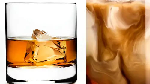
Retouching Hibiki Bottle: Label and Adding Back Plate
rotate that label for me. Of course we can rotate label. Yeah, that's what you want to do, It t Oh, yeah. Sometimes it's gonna be like a play between when you actually do these things, but we can go ahead, right? You're gonna have to flatten somewhere. Merchant layers going exactly to do that, we're gonna have to basically flatten everything back out, which is not a huge deal, because you can always then mask in just the part that you actually want to do. But we're gonna go ahead and do that. So for that, I'm gonna create a new layer and then make a stamp physical layer on that we're gonna bring in our rulers and then drop down a couple of guides and it's just really helps you to see, you know, where everything is that in relation to itself. And you can see that you know, this labeled is in fact coming up quite a bit there on the left side. So there are a lot of ways to do this. I'm gonna go ahead and create a duplicate layer again. Just just kind of see, I'm kind of one of the easier ...
ways to do. This would be to make a selection right around your bottle, right? Click and go to transform. There we go free transform. And then you can also go after you hit command to your transform. You can go in here to the warp dialogue and you can actually warp this liquefy tool, which I'm sure a lot of you guys know is another good tool. The reason I like the warp tool sometimes is it It's quite a bit more global. Actually, it works on a larger scale, so the effects tend to be a little bit, um they tend to come across like, a little bit more natural because you are working on such a large scale. We can see, like, you know, something like that and on see, we'll just kind of bring this in to see where that is as well. It's pretty sweet. We're still looking a little bit. Caddy want us there a little. That's okay. So for that, let's go ahead and pop into the look Fine dialogue shift. Command X is gonna be your liquefied dialogue going is look, if I gonna mess with the text way are going to on purpose mix mess with the text. So this is this is a little bit tough, but you kind of have Teoh. It helps actually zoom out some of the time here. The text does have a little bit of a warp to it. So what I want to do is I want to choose a nice large brush size here and bring my density down and also my pressure down a little bit. So we're just gonna, like, push and pull this a little bit. Have a This is one of those cases where it's it's totally possible to just make things much worse. So really trying to keep that in mind and you want to be relatively careful what you're doing. But you can see I just, like, clicked and pulled and pushed things just a very small movements. A tiny bit. But we'll be able to see here just before and after. Wow. So there we were four, and that's the after. It just looks better. It looks just better, much better. It's a little bit more clean, so basically that's a gold man. Just make things look bad. It's almost like you meant to do that. Well, you know, sometimes I get lucky contact. Not so much like you're making the bottle dance right there. So we changed with the transform tool. We changed the shape of the label, which helps out. And then we just go ahead, bring this back in. We change the shape of the label. You bring that back in just a tiny bit. And then with the liquefied tool, we went ahead, And, uh, you know, we changed the text that was in there. There we go. So now what we're gonna do, because we have that copy, is I don't need this to be visible in the entire layer, so I'm gonna put a layer mask on this, and then we can just decide to make this change visible just on the label. So I'm not necessarily affected. Were just a little bottle. Exactly. There's no need to and Well, not only is there no need to cause a problem? Yeah, we shouldn't, um I'm just using just a quick mask. You're to see to identify. Make sure you get it yet. Exactly. There we go. So that's a nice little chef. Thank you, man. That makes me happy. Much, much better. It's amazing what, like a tiny difference like that. It makes a huge difference that when someone's caddy want us like that, it completely throws off the entire caddy. One, the city. Can you walk it? Can you want? Take this scene with Kati? One possibility is to carry one. Possibly we go. I think doing this stuff just kind of requires being a bit of a kid. Teoh can take yourself too seriously. No, you can't sippy cup. As he says this, he drinks. So what do we think about this? This is a pretty good starting place. I think it's a really good starting points for you kidding? Great. So we have our starting place going into the background. I do? Yeah. Cutting these things out, IHS, it's gonna be really the best way to do it is with the pencil over the break. I went ahead and cut out our bottle already with the pencil. Just It just takes a little bit of time, and we're kind of like a little bit of crunch. No big thing. So we'll just go ahead and make a stand visible there. So this thing stand visible, there is just basically everything we've done already on on one single layer. So what I'm gonna go ahead and do is I'm gonna command click on this path that already made for the bottle. We just made this over the break. You as we will see. Let's just load that intimate layer mask now. So basically what we have, you can't really tell because the same layers are under it. But if I will just show you kind of how these work the layer mask on this now, I could just paying whatever I want in the bottle is going to stand up now. I left the reflection in there because it really doesn't matter what's going on with reflection, because I'm actually gonna wind up fading that in with everything onto the news or onto the new surface. So the bottles completely cut out. I already did make a path to cut out the glass as well, but then we changed it. But then we moved the glass. So we got a couple options here. We could actually go back here and we can move our path as well. This might not wind up working, but we can do that. So if I go to here and then I hit command T We can actually move the path itself. So let's go ahead and let's get that right about there. And then I'll just alter the to the edges. Yeah, exactly. So let's go back to our pencil. You could just hit p for the pen tool, go back here and grab any of these points and kind of play around them. So if you guys were curious on using the pen tool there is, it's a It's a really, really great swollen pat who was just here is like I can't you know, I can't even think. Imagine some people saying they don't use the Pento because it is such an important tool. Um, you know here in a photo shop, so it's definitely worth learning. It does take a little bit of time to kind of master, but it's it's Ah, it's a tool that's worth faster. I think the pen tool is the tool that art directors use more than anything for sure, and the reason is because they are comping stuff up there, taking images from four or five different places and putting them all together so they're constantly using the pencil to grab this. Grab that. Grab that and put it all together in one com. There we go. Okay, so now we're going to go ahead and command. Click that and then load this into the layer masters by hitting command I in the layer mask as well. So then this should be now in front of in front of that as well. So does that make sense? What? I just did just basically cut those back house to May does to you everybody else? Yes, Perfect. So now that we have are retouched bottles and there in the foreground, all we have to do is go over here to the background plates that we have already kind of created, and we're just gonna pop some pop them back in. So we have a couple options. We can go ahead and take this file and put it in the backdrop. Or we could just take the backdrop, put it in our layered file, which in this case, is Stephanie what we want. So, uh, I'm gonna just go ahead and group these two and a shift click, and then drive them back together. We'll just pop these in there? Never go. We're done. It's just Nice job, Erin. Thank you so much. Love it. Finds gonna love it. Alright. What? Actually closer to done. An amazing. So what we're gonna do is go ahead and lower the capacity there in our goal Here is there is a bottle already in here. You guys already shot this on location, which is really nice because it's gonna give us placements and everything like that. That ball scale and the scale. Exactly. So we do want a little big. It's just a tiny bit big. We have a couple options here. In this case, we have the option to If we'd like to just scale up the background, we can do that. Keep in mind. That's the quality is going to lower as you do this. But it you know, it's totally up to you guys at this point what you want to do. If you want to scale up the background just a little bit or if you want to scale the bottle down sometimes you can make a difference difference because I definitely don't want to degrade the quality of the background too much. I think it's a What's the resolution on it? To begin with, This is the background. It's 44 inches. A 300 dp I It's the one that we printed out. Yeah, so we can go ahead and bring the bottle a little bit smaller. Andi, that's totally you know, that's just gonna be a question of, you know, is this Is this what we want out of this image? Do we want the bottle to be that small in the image? And if you know in that I don't know, Due to tell you truth, I might want to blow it up a little bit, A little tiny. We could blow it up, We could crop it in. We could do you quite a things. Let's just kind of split the difference. What you say? Yeah. So once it hit the backdrop Happy complex. Yeah, let's just put a little backdrop up to something right about there. Here we go. Can you get that in a nice place? And then we can go ahead and get this about the right size as well. So kind of scale. These together I'm just lowering the opacity of one of these layers and hit command t go ahead and change or transform point under right about there. And just why did you do that? Good question. So if the bottles right here and I hit command T and I'm just like making its follow like this, you got a great ahead. Like remove it and then it's still not the right side. So I'm gonna make it bigger again. I gotta move it again. But if I find a place that is actually gonna match up with these two things like, let's say I just match up the top corners of each of these bottles Hit command t bring my control point right to that place where they actually match. So you're matching one edge, and then you're allowing that to be your rule. Exactly. So instead of scaling it and, uh, moving little case, that's a hot tip. But I've never done that before, and that's going to save me a lot of time. Really? Yeah. Uh, the other great tip is to hold down instead of just hit command T. Everyone knows that if you hold on shift, it'll constraining proportions. You hold on shift. End option. It'll transform just about the point. Really? What you want to do is hit command. T bring your control point up to the place that matches between the two. Hold down shift, end option, and that's gonna let you look at. That's brilliant. Yeah, this makes it a little bit easier. Yeah, here we go. So instead of trying to be, like, six things, you know, mess with it all together, it's kind of like, brings it all together for you. All right, so that we have And it's just your bottle right over top of the other bottle is nice. And you can see the tops of the glass and the top of the whiskey. They are cut out. Relatively nice. Already close. Pretty close. That's actually pretty impressive. That what we had on location almost managers identically matches. Really? Well, Awesome. So I'm gonna say one. That's that's not a bad set of eyes that we have when you think about. We shot this on location a couple of weeks ago on 35 millimeter DSLR format. Came came here two weeks later in the studio. We're setting it back up, trying to match our angle. We're shooting it with a medium format camera matching the the Lens millimeter. We did a pretty good job. You have to get Aaron in a place where he's really not gonna have to skew. He's not gonna have to mess with this stuff. Yeah, you guys did a really, really great job. It's almost like this is not all the background, though. Where's my blurry bartenders? Yeah, this is the bad. That's what work. Yeah. So we've got two different versions of the background. One with the bottle in the 2nd 1 without without the bottle. So you're lining it up on the one with the bottle first. Okay, but now I'm up to speed with you. Exactly. Then we make this invisible. Now it's coming. It's gonna come down to, like, matching this. So it really doesn't look like it's there. No. Now they don't match without question. The bottle is much warmer than the background. The background is definitely definitely way too bright, particularly walling back where the window is. That's got to come down without question. And the tone of the background is gonna have to shift a little bit, too. It's gonna have to get a lot more amber mawr, you know, nighttime feel. I'm seeing a lot of green come in. Like even in the hair on the Burnett in front and the blonde. Everything's with certain look really green in an emissions permit. Crane. I will say, though, that shooting through the Dura Trans is really nice because, like that blue that's in the guy's shirt there, Look at that. It's coming through the bottle, which is that's no accident, brother. I'm not, you know, telling everyone. Thought this was very intentional. This is why we do that made it so much easier for Aaron. Yeah, and it makes it just looks a lot more really. It's the really anything you would get without using the dura trends. So basically, from here on out, we want to match these in tone in terms of color and luminosity and things like that. They're a couple tricks that I use when it comes to matching things like luminosity. The first trick that I would recommend doing is grabbing adjustment layer. We're just gonna go toe to our Channel mixer and I would change this. We're gonna pop on monochrome. So this is just a just turning the image black and white doesn't mess with our color channels. This is really great starting place when you guys actually want to work with you That does this match as faras luminosity is concerned. We talked earlier about learning color and absolutely millions of colors. If if you don't look at color anymore, just changing this black and white you're not really worried about all those colors You can match luminosity and then after you're done with just working on, is it too light or too dark? Then you can go ahead and think these things match ready. No matter. Backgrounds wave right, backgrounds way bright, this layer, we can go ahead and get rid of because this is absolutely that's the one that looks like that. So we're gonna go ahead and get rid of that. So to do this and we can get rid of this other one, which is just the larger version of this that's the giant bottled took over to Tokyo Godzilla bottle. All right, so we're gonna go ahead and label this bottle, and I'm gonna just label that as background there, and we've already taken care of all those or I can get rid of my notes here. and we've still got this. At this point, we could pretty much get rid of that riddle. Just we go ahead and you can. I mean, it would still have to you. It doesn't make the file size any really any bigger. It's up to you. Uh, yeah, let's go ahead and get rid of it. So at this point, we just want to match the luminosity. So I'm going to do is create a curves adjustment above my background. But keep in mind, this lives above everything. So we really don't have to do a ton of masking here because all the masking is already taken care of. So this car is just They were just going to click it and bring it down. And this is I mean, it's like a lot of things. It's just look at it doesn't look right. Does it look wrong? You know, it's also gonna be one of those things where it overall, you want to kind of get that global change to be in the right place, but it's going to start to plug people up and make them dark. So we're gonna want to go back in and probably pain a little bit back out on that, right? Exactly. Exactly. So that to me is that started getting much better. You want to get your black levels to get relatively close to what they were. Exactly. And to do that, you can kind of compare your shadow levels here if you want to get a little bit more detailed than this, like if you want to get a little bit more accurate, what I'll do is pop over top of that, a threshold adjustment layer. This is something that most people have no reason for using. But when it comes to compositing, it's really nice. As I can compare relative light levels in relative dark levels from the background plate you're in there, you definitely get into the right spot. Yeah, yeah, so we can see, like with with this layer not in there, we can see how the darks become visible in the whiskey bottle and in the glass before any of the darks before any of the blacks in the background. So without this in there, that's gonna lower in the background. They, your black levels from your composite and you're like white levels from the composite just don't match. So with this threshold, we can We can do the same. We can see that the even right here. There's a lot of highlight coming through here and not a ton of highlight here on the bottle. So we want to add a little bit more highlight on the bottle. And for that, what we can do is go into this curves adjustment layer. We can use this blend if that we were using. And I'm gonna hold, alter option and allow this layer to not come through there on my highlights or what I can do. Let's do that as well. Is here on my adjustment layer. Gonna grab occurred adjustment layer. Let this the bottle. I could bring my white doubles up. So not only did we bring the black couples down in the background, we brought a light levels up balance balance on the balance. I totally realize that. That was a lot for me to say in a short period time, but hopefully I since e basically okay, they could rewatch it will know what you're doing way, rewatch. Uh, yeah, Basically, we're just matching light levels in dark levels. Just making sure that those are right. So that gets It's part of the way there. But keep in mind, we're still in. Uh, we're still in Here we go. We're still in black and white at this point. Just changes a little bit more. We're still in black and white at this point, So this doesn't necessarily That means that our colors, they're gonna be better. But let's just look at that before and after waken see it, it starts to actually look like it should, Even though we're still at this point just dealing with who are changes that we've made in the black and white adjustment layer, you can see that I would always recommend starting with luminosity. It's just a really good place to start with. Once you're white, black, it's if you're white and black levels are off, you have no chance of getting it writing color. So start off with your luminosity and then you can get it writing color. But if your if your light levels are off, there's just you cannot get your color right. There's gonna be something off. You won't be able to tell what it is, so I would always recommend starting with that. Um all right, the next thing we're gonna do, I'm gonna hold down, shift and click on this layer mask. And I can kind of see some of the background coming in and what I want to do instead of trying to get my layer mask to be quote unquote perfect here. This area that that's the reason why you can see this. What? My layer mask looks like I wasn't too concerned with making the layer mask that good on the bottom because we're actually gonna fade that it. So we're going to click on this layer mask and then just kind of paint with white on the layer mask. Just allow that to faded, and it should just look like the countertop. If I need to bring that down and brightness, I can totally do that. And if I need to bring some texture, I can do that, too. But having that faded in just makes a lot more sense than trying to, like, cut that out. Really, The top area is important because that's, you know, I don't want that to fade it because we need the actual backdrop to be visible there. But on the bottom here. We can actually have this fade in pretty easily. And then this texture that's already there on the backdrop weaken. Then at that back over top military guys had to be that just a second. All right, How do we think on the how do we think we're looking out? As far as the color goes, I think the background is still way too green. There's not enough warmth in it. And I'm feeling like the bottle is now the bottle in the glass or not too warm and just they they're still in opposition, you know? Perfect. Yeah, I would completely agree. So we're going in here in our channels, and I'm just kind of like working with these color channels, get things to match a little bit. I mean, we do have a pretty warm liquid, which is warming things up, but also keep in mind that we want our background to be relatively warm. We can get kind of decided that's too much. Might be a little too much at this point, but just to adjustments, layers brings us from that which doesn't match at all to that which is quite a bit better. I think we could use a little. This is a little bit cool to me. Appear at the top just because if the color of the room is that warm, that's gonna be then reflected there in the bottle as well. So I'm just gonna bring a little bit of warmth there, especially to the top of that. There we go. We kind of see that before on the after their It just kind of reflects the warmth in that room a little bit. All right, Saturation. Seems like we could pull that down just a little bit on the background. Kind of like draw a little bit more attention to the glass itself. And then I know you guys wanted to kind of do a little bit of a hidden getting as well. I still want to push that background particularly back while I want to push it down a little bit. It's just too much. Yeah, Yeah, I figured we could do that and been yet at the same time. So that's basically we've got Layer. That's kind of bringing everything a little bit darker, just made a nice selection kind of around or whiskey, and then we can just add a nice blur to that selection, which is going to give us that like it's gonna Adam. And yet, as well as pushed the background a little bit far further down at the same time, there we go and we can see that's kind of pushing the saturation as well. So we're gonna need a lower or saturation down just a tiny bit. Because again, that shift, I like what it's doing to the room. I don't like what it's doing to the people, to the people. Okay, so we want to ask it out from the people that I think we have to, because they're just they're just becoming his really dark blobby shapes. Globular, I don't want globular people. The blob. Yeah, we can even mask you don't. And you have a question, Theo. Robin. When, uh, you're looking at these edits, is there a point for your shadows that you're taking into account that you want to try to stay as faras a number on 02 55 scale or something? You're blacks, other anything that shouldn't be pure black that you're watching, Preston. Nothing. You don't want to leave anything in zero and you don't leave anything to 55 because that is going to create problem down the road. When they go to print, it means that there's gonna be, ah, whole. If there's nothing there, there's gonna be a hole where there's not a single drop ink. You don't want that, and you don't want there to be so much ink that it's just being poured on the press. So you definitely have to be careful that that is not something that I usually sit there and watch the numbers. When we've got the numbers coming out of the camera. We know that we're not in zero. We know that we're not at 2 55 are re touches that we were with. They know this. So you know, that is something that is without question. Second nature. You know, you can't give some give a file that's got holes and you can't give a file that's totally plugged up. Do you, uh, end up going after you the file back from a re toucher and doing any finishing color correction or anything like that Pretty dialed in. Usually that's the retouching is doing all that stuff. I mean, I really rely on them to do that. And in most cases, I think Rita Cher's no color better than I do without question colors. Tough color is really, really tough. So I definitely rely on the expertise of the re toucher. And a lot of times, you know, when you when you turn these over to the production house or the agency's in house production team, they're really going to be looking all that stuff anyway. And they know, because the images are going to be used in very different ways, and the way they print it for an outdoor billboard is gonna be very different than how they printed on a dura Tran. That's going to be for a bus shelter, which is also going to be very different and how it's going to be turned into a glossy magazine ad versus a newspaper ad. And with all those different mediums, they also have different sizes. Some of them might be, you know, outdoors gonna be a really long horizontal. The stuff in the magazine. They may do 1/4 page or they may do a sliver one a sliver. So there is so much that's gonna happen with the files and in the post production. So long as we know we're delivering files that are good, the image quality is there. We haven't given too many holes. We haven't plugged anything up is a pure black. The rest of it is really up to them. I mean, you think about how many changes these images they're gonna go through when we deliver him, because they're used in so many different ways and the printing process for we've got a wild turkey thing that is up right now on the side of the building that Gary was staying in a couple of days ago. Um, the way that that was printed for the outdoor, you know, side of the building is completely different from how it's going to be printed in the magazine and the magazine, The ad agency or the production house knows how to handle all that and get the files in that right place. Another common. Just add that something that's common that we do. Aaron will send us a high red stiff and will actually print it out if we're working with an agency that's in town or out of town. Well, actually, FedEx it overnight because you know what they're looking at on the screen. We want to make sure that what we printed out is what they want. So we'll actually FedEx had overnight. They'll make changes. Either snap a photo of that Senate back our email that back to us and then we'll really back there. That's a really valid point we, you know, with approval process. Now everything happens at literally the speed of light, with email and everything going around. You know, I could be in ST Louis working on Project, and Aaron is working on the retouching in Chicago with the client is actually in New York. So you know, this thing is going all over the place. You can only trust J pegs so much because everybody is looking at a different monitor. So we will very often pull a proof FedEx it and they can look at it and they can give us changes based on that. Working remotely gets a little dicey way. Do it all the time because we have to. Clients schedules don't always allow for them to travel to us, but we when we do that, we make really strong stipulations. When I'm looking at something when we say Don't judge it for color. And don't judge it for exposure because and half the time there is an account exact that's also looking at it. And the number one there on a PC or number two They're on a BlackBerry and they're judging color, and they're judging composition. Our exposure on a BlackBerry. That's the last thing in the world you want when a lot of times we just say to people, Look, judge this on Leon composition. Look at it as a sketch because the color that you're seeing is gonna be off now. Invariably they'll call up. It looks like the images pink. Yeah, that's why we said a judge it for color because you're looking at it on a PC or on, you know, on a BlackBerry. So definitely add that into your budget. If you are anticipating needing toe overnight something to a client that's out of town because that those costs can add up quickly toe for 500 bucks. Yeah, we had a line items for FedEx, messengers and proofs, you know? All right. Sorry. I'm just kind of like No, it's I'm digging what you're doing all right. You're like the speedy Gonzalez of but about Well, we got We got a lot to do, you know, There was a lot to do. I'll just I'll go through and explain everything, like in just a second after I kind of, like, brought it all together so much better. But basically, yeah, everything that we're doing here up into this point is color matching and light matching. So just making sure. Let me just make all those invisible so you guys can see this before Holy cow. I think that's what we started with a second ago, and that's what we ended with. It's exactly what I would have done, Aaron. Thanks for so that on there as well as what's going on here in our bottle. So those those two things. So let's just bring that visible and then this visible and you'll be able to see what I mean. This is I'm just using curves and hue saturation and just not incredibly complex here, but you can see what a real difference it does make with the overall image on, uh, here, you can still, you know, on top everything. Add contrast your background image if you'd like to do that as well, which in this case might be, might be a little bit nice. It totally depends on the aesthetic of you know what your clients looking for. That's why sometimes working with, you know, Rob World will do a couple of perversions like, Do you want the pudgy version you want the like soft version Do you want? You want me to add? A lot of times, what we'll do is, you know, especially in something like this will go through and we'll do some finishing touches like we'll add some like blues into the shadows. Um, you know, to give it kind of like that, like old, kind of like antique look, so you can do a lot of like, you know, coloring to the image over top when it's completely done to give it a completely different look, you know? And then let's say that we want to add a little bit more, you know? Yeah, I like. I like the blue. The blue definitely also helps. Give it that night time deep shadow feel. And then sometimes it all do is just go in here and like add a little bit of like blur, which doesn't make any sense. It'll But you see a lot, especially in, like fashion ads, or they're just kind of like do this sort of thing right over the top of everything. And it just kind of like, pauses everything back together, and then it can help that really draw your attention to a specific place on the image. If that's what you're looking for, there are a lot of really great things you could do another thing here, like a finishing technique. I never got a finishing technique that you can use. Um, and this is something that I would like to do quite often, actually is I'll go through and I'll make like a stab visible layer, which just kind of, like selects everything out from the background itself. And then you can go through and go down to, like, select color range, select out your brights. In this case, we'll just change your preview to gray scale. Here we go. So that selecting out just the brights of the image itself and I'm gonna hit command. Janey, copy those onto a new layer. So on a layer, I have just our highlights we changes from normal down to screen, which is gonna It's gonna pop the highlights up a little bit. And if I want to, you can add a like a little bit of a glow. Let's see right about there or you can change us back down overlay. So just a little bit about glow. I kind of like the globe on the highlights. And the reason I'm doing this, you know, here at the end is because it's it's adding that glow to the bottle as well as to the background. So any time you have an effect like that that you can add to both the bottle in the background of the same time, you're gonna come up with something that's really nice because it's basically going to be a much more true composite thing. You know that what you have before, so I'm just a little effect like this is going to help the composite Adiga even more digging everything that you are. You going into the glass? Yeah, I'm gonna I was gonna go here and just add a little bit of the background. Yeah, I feel like that. Particular that right edge of the glass It's too cool. It's way too cool and it doesn't fit in. So here what I'm gonna do, we need to blend that bottle and yeah, back into the background here. I totally agree. So here are layer. Mask is it's a little bit too tight. You can see like the resolutions just a little bit too tight, like it's it's too sharp. So I'm gonna add a little bit of a blur to the edge of that layer mask itself, which is, actually, you know, just like match the You can see the preview here before and after. It's a subtle difference, but it's gonna help just match what's going on. Maybe refine the edge by sucking it in a little bit. It's interesting when you think about images a lot times you want. You wanna have them really sharp. When I'm shooting this stuff, I'm looking for it to be tack sharp. But at the same time, when you're going in compositing, it's amazing that you actually want a little bit of blur, particularly on the edges, so that they bleed together. If you've got something that's really cut out and super razor sharp against the background, they feel like they're not together at all, so we wind up kind of blurring us together. Just a little bit of blur can go a long way to helping two images that were shot separately. It helps them Mary. Yeah, it really does. It makes a big, big difference, adding that blur. So here I'm just kind of like warming up the edges because, yeah, they look how blue that right edge of the table. It was way too, even, you know, down here. And because we did warm up the background so much now this is it's a product of what we did to the background. So this isn't something that we could have done. You know, it's a product of multiple things. It's a product of being on a different location with the different camera, a different satellites versus being in studio with four that yet another camera and another satellites there a lot of different factors that are going on that air, creating these subtle shifts, and when you look at it as parts, when you're looking at the background image alone, it's looking pretty good when you're looking at the foreground. Images of the bottle and the cocktails together. They're looking good. It's when you marry those two together that you start to see the differences and how you've got to blend those differences and bring him. Bring him into the same range. Yeah, totally. It's all about, you know, finding a nice balance between everything. Um, okay. And then the last thing I'd love to do here that still feels a little bizarre isn't too bright. Yeah, it's like there's just this little great hit, a gray street I almost want. Oh, you know what it is. Quick that off. No, the cocktail, it's That's the window. It's just part of it. Yeah, it's just in there. I want to get rid of it and have just the surface of the bar. If we could close. Damn! So the window in the background was creating a little vertical line that was getting it kind of gray and foggy just to the right of that cocktail. And it was really bugging me. Yeah, angry. That's called there. It's really I think it's really important as your retouching when you make moves. It's really good a good idea to click the layers on and off and just kind of double triple quadruple check the movement that you made because you'll continue to see things. And then one other thing is we've got our layer mess. That looks really nice here, you know, especially here over the top of bottles. So if I want a little bit more of the glass to show through a little bit of background, I don't want to go in here and start painting black on this layabouts like, I don't want to do that because if I wanted to undo it, I do this. And then I just destroyed my layer mask. So since I have this proved, what I'm gonna do instead is just put a layer mask on this entire group and then I can go through and just like a really slight flow, just like, let a little bit of that light in from the background. You can see how, like it's just a whole and a tiny bit of light from looking that are so sexy Makes me crazy. Just just gonna let it. You know who's gonna go crazy for this? Mr Brian Cleaver, Executive creative director, which we should make a J pagan send it to him today. Today? Yeah, he's gonna be all happy. Look at that. There we go. Now that glass really feels like it's a part of that scene. It is blended in it. It's reflecting what's there even though it wasn't really there, which is, you know, it's brilliant. Yeah, that's really nice. And then on top of all that, I'm just going through Mormon, That up just a tiny bit because it is, um, it's bringing him, but it is a little bit too. You can see the blue in it again. A really great I trained in color seeing this. So, guys, as we're wrapping this section up, we still aren't done with this image whatsoever. We still have to make because we don't have the creative director here. We still have to make a J. P a copy of this. Email that to him. We're gonna get some feedback. He's gonna draw some notes on it. He's gonna email back to us on Aaron's gonna make those changes after they put their input in So and not only that, we have the vertical version two due to which really is not gonna be a huge deal in terms of switching out because you're now all the hard part's done the decisions about what to do with how to do it. He's done that so he could replicate it with the vertical background. Studio 12 Smiles had said earlier. Such talent, great tips love the working relationship between Robb, Gary and Aaron. Real time example of what Rob has repeatedly emphasized each day of the importance of relationships with clients and other team members makes our work fun. Good. That was one that was the number. One thing we wanted to show people in all of this commercial in a workshop is that this is a team effort, and it's all based on relationships. We do not do this alone. It's it's a group effort. I mean, kudos to rob, because technically, you're the boss of this workshop in of this crew and not Come on, Gary, come on. And not once have I ever felt during this workshop that you weren't equals, that you weren't all equals and that you weren't a team. I never felt like you have told anyone what to do or you're just You're so good at that and that's such a hard thing todo. I think that for me, I recognize a couple things. At the end of the day, I'm responsible for the creation of these images, but I'm assembling a team around me that has a lot of talent. I don't know Photoshopped the way Aaron does. I don't know computers and D I t ing the way Gary does. So again, it's about assembling the right team and allowing them to be successful. That's in turn, if I if I let people do the best job, they can't. They're gonna make me more successful at the end of the day. So that is really the key, your attitude towards the whole project. Just that's what makes it a success. A tall trickles down and goes, I don't know. I'm just really We're one big, happy family. The fact that he allows no pants Thursday is absolutely remarkable, and I'm grateful for no pants Thursday. Wait reason. I come into work on Thursday. We have Calvin coin suit Wednesday and no pants Thursday that we won't even talk about Friday. I gotta say, before we ever started working together, way met us, You know, first time we met to see how things are gonna go. Then we met his friends and then we met his better friends. And we probably spent 56 hours just hanging out before we ever worked together. I think that really made a difference to just making sure those personalities did fit together because we like to joke around. And that's so it was nice to be able to spend some, like, real time together before the work actually started. I just gotta sit here. Look at this. This is fantastical. Aaron, can you? Just before and after it started and where it has ended. Yeah, sure. So before and after us faras our backgrounds before after. All right, well, let's go all the way down to go all the way to the very base. That's where the bottle started. Onda. We added this. Each of these steps changed the bottle considerably, and then we went ahead and threw the background on, but the background look like that, and the bottle looked like they just don't fit that they don't fit at all. So the background was a matter of working with light, letting that shadows come in working with each of these layers popping up those highlights again to match both the highlights and shadows working with color. Bring all that back in working with shadows there and then adding the color back to bottle itself and then working with a little bit of color there at the end. And, uh, yeah, it all started with working there in black and white, and you guys should see it really didn't take that long. Maybe for you when you know what the hell you're doing. It didn't take your teaching style. Aaron is so captivating, too. I mean, it's easy to kind of tune this stuff out, and we're just like hanging on the edge of our seats. Wow. So that's really impressive to you. And teaching is impressive. Very cool. Let's just including first question up is for Aaron from Albi LV asking since retouching time and the number of revisions you have to do our bit unpredictable. How do you actually quote for it in your estimate? That's a really good question. Usually I'll give a range, I'll say. I think this is gonna take me between 5 to 10 hours, which will cost between exit next. If you want the closer to the five hours. Here's what you should probably give me. This is like good. Include one revision. If it's gonna be closer, the 10 hours, This is what it's gonna look like. So I can kind of, you know, let that our clients know, especially when I'm working with a client I've worked with over number. I'm relatively selective about my clients. I I really only have have a handful have five clients, basically because it's, you know, I want people like Rob is gonna give me something really cool that I can work on, and it's gonna be a really great relationship. So with that, like as time kind of developed, you just kind of know. And like Rob was saying earlier, he doesn't give me just any random job. It's just like I want the one that Erin could do and then because I charge a little bit more than some of the other retouch is out there. And then for anything else you know, a little bit more simple, you just go with. I think I might add to that that question and to Tony's earlier question. If Aaron's gonna give me a range, I'm gonna take the high side and I'm gonna add 10%. And the reason why I'm going to do that is because of the client themselves, because I know that they're gonna be changes. Keep in mind a lot. A lot of the brand managers and the end clients don't have a really great understanding of creative, and sometimes it takes them seeing different options in order for them to make a decision on what's right. It can be very difficult for them just to know. So I'll take his number and I'm going to go on the high side. I'm probably gonna add 10% and that's gonna go in my estimate. So that's gonna be our starting point. Now, that doesn't mean that that's what it's actually gonna cost. And if he saves me money, I'm gonna I'm gonna pass that saving onto the client. I'm not gonna inflate it, Um, and go with that higher number That okay? Another question from M. Bose from Germany. Yeah, and ambo says, Can Aaron elaborate on retouching An eight bit versus 16 bit they go on to say is 16 bit the current status quo in the retouching industry to preserve the most amount of details and do photo shops, algorithms or layer modes, etcetera. Transfer 1212 16 Editing or are there things to watch out? Great question. I think as long as your machine can handle it, bit is the way to go. I don't I don't know many clients who, honestly, at the end of the day can tell the difference whether something was edited in a bitter 16. But usually, if something has to be pushed really, really far, all working 16 bit. But ah, lot of is up to the photographer. I mean, Rob shoots everything pretty much how it should be done anyway. It's not like I'm pushing exposure color way to one side or the other, so it it's pretty. It's usually fine for that final size alone. It's you know, you're talking maybe 100 megabytes for a file versus 10 gigabytes per file, and I've definitely worked on files that are really, really large. But it's it's just a really, like a balance between how faster computer is like on this MacBook Pro that I'm on. There is no there's no reason why I would ever edit in 16 bit the computers. Just Yeah, I work at home with a brand new Mac with gigs of Ram and like whatever it's the most, it's the good one. It's like a lightning. I don't know about computers a whole lot. It was just the good one. I just clicked on the bottom option for all but the most expensive. And it's sweaty chicken. I'll tell you on even that I don't I don't edit in 16 bit that much. It's just it's a it's really hard of the machine. And at the end of the day, unless you're really, really pushing something, it doesn't make that big difference. So they're different philosophies on. There are re touches that want to work in 16 bit, mainly production houses. I want to work in 16 bit, and other reductions will say it's gonna wind up in a bit anyway, if I need to have a larger file, I'd rather go to the original and exported at 150% export it larger and work in eight bit than work in 16 bit and then have to convert it later. E. I think this is one of those ongoing arguments where there really isn't a good answer. There is a personal preference
Class Materials
Bonus Materials with Purchase
Free Bonus Materials
Ratings and Reviews
Totoo G
I have gratefully been watching this tutorial for free online, and as always CreativeLIVE has done an awesome job in bringing one of the best instructors of the trade and his creative team to help us improve and enjoy a higher level of understanding and performance in the skills we would like to achieve. I am humbled as always and ever so grateful. I would love to purchase the course myself, but since I live abroad, it is practically impossible, I hope those who can, would. I would just like to add one of the most interesting things I have learnt from this course is the careful attention these guys are paying to minute details and the amount of patience it takes to achieve their goals in each project. Stay inspiring, Totoo in China
Ivan
Outstanding course! I'm a former creative director, now photographer full time and have had the unique experience working with studio photographers for commercial products in the past. This course is right on and very close to my experiences, and now that I'm behind the camera, it's nice to see some of those trade secrets revealed. Commercial work is fussy and you often have to sweat the details, but the results can be astonishing and rewarding. Rob and Gary do an excellent job explaining the ins and outs, without any pretention or hold-back on secrets. Something that's always annoyed me in the past, photographers never liked revealing their process. It's great fun watching Rob and Gary work a shoot, and Aaron Nace is beyond amazing in his retouching skills. I don't expect to break into this field, but I wanted to learn how things are done, for my own personal projects. I particularly enjoyed learning how they get the look of ice, ice crystals, and frost on the sides of glass bottles. I purchased several items from Trengrove, as they suggested. Their acrylic products are not cheap, but the quality is amazing and I'm very pleased and looking forward to experimenting. Thanks to all at Creative Live, RGG studios and Aaron Nace for this presentation.
Doors of Imagination Photography
This course is outstanding. I would consider it an advanced level. Having a good understanding of the technical aspects of photography and lighting is recommended. Rob Grimm takes you into two real product shoots. These were not canned demonstrations, but the real thing including working to get the lighting setup just right. The postproduction section with Aaron Nace was enlightening. This does require a good preliminary understanding of Photoshop. It was amazing to watch them build the final images for the client in real time. This is by far my favorite course to date.
Student Work
Related Classes
Commercial