Retouching Beer Ad: Beer Body
Lesson 32 from: How to Be a Commercial PhotographerRob Grimm, Gary Martin, Aaron Nace
Retouching Beer Ad: Beer Body
Lesson 32 from: How to Be a Commercial PhotographerRob Grimm, Gary Martin, Aaron Nace
Lesson Info
32. Retouching Beer Ad: Beer Body
Lessons
Day 1
1Photo Shoot for Duratran Backplate
09:13 2Class Introduction
26:47 3Roles in Commercial Photography
33:41 4Breaking into Commercial Photography
23:46 5Establishing Your Brand
16:40 6The Commercial Industry
09:15 7Anatomy of a Photo Shoot
30:08Photo Rep Interview - Lesley Zahara
24:23 9Shoot: Hibiki Whisky Part 1
29:14 10Shoot: Hibiki Whisky Part 2
36:55 11Shoot: Hibiki Whisky Details
23:52 12Shoot: Glass and Fake Ice Part 1
31:25 13Shoot: Glass and Fake Ice Part 2
21:21 14Building your Portfolio
27:39 15Marketing
15:38 16Search Engine Optimization
35:28 17Equipment Overview
37:23 18Working with a Creative Director - w/ Pat Olds
27:26 19Shoot: Beer Bottle Ad
36:27 20Shoot: Beer Bottle Diffusion Trick
27:32 21Shoot: Beer Bottle Star Flare
22:08 22Shoot: Beer Bottle Icy Effect
21:46 23Shoot: Beer Bottle Reflecter Cards
27:06 24Shoot: Beer Glasses
38:01 25Retouching Meeting With Aaron Nace
19:27 26Retouching Hibiki Bottle: Neck
31:42 27Retouching Hibiki Bottle: Label & Sides
30:28 28Retouching Hibiki Bottle: Glass & Bottle
32:28 29Retouching Hibiki Bottle: Label and Adding Back Plate
44:59 30Retouching Beer Ad: Meeting and Set Up
34:41 31Retouching Beer Ad: Adding Glasses
17:39 32Retouching Beer Ad: Beer Body
26:45 33Retouching Beer Ad: Beer Glasses Finishing
38:47 34Retouching Beer Ad: Flares
26:31Day 2
Day 3
Lesson Info
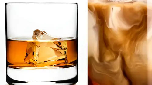
Retouching Beer Ad: Beer Body
I don't want a pencil these these glasses out there they're kind of bugging bugging so we're going to start off let's just go ahead and start off with this last left last mental there's you know, a lot of people will say things like you don't need to learn the pen tool or they don't use that often I would say a za retouch of the pencil is just it's an incredibly important tool so I'm really not even that hard to use a lot of I think there's a misconception around the pen to a being like you know, this is something that is very difficult but my opinion it's not that bad so we just gotta go and show you guys how gentle words I'm gonna pull this in and basically a one of you uh kind of cut out this left side of the glass so I'm gonna start up here I'd like to ease into my curves rather than just starting here on the glass and bring in like this you kind of it intends like notch in so all I usually kind of like easy in like this so you can kind of see it's just it's gonna like come and cur...
ved out in there um click and drag just right here I'm holding on the command key to kind of pull that in there and then right here at the very bottom so if you're clicking in creating a tana points with the pencil you're probably doing it in an inefficient manner you can see I just I just cut off the left side of the bottle with one point three points, three points on dh then you don't even have to finish it up you could just right click in here go to make selection feather that by I don't know one point yeah, something like this point five feather that selection and then just feel that with black on your couple later masses here and then you're done so for everyone who's like penn tool thanks forever it doesn't forever that took about a half a second. Yeah, and it's I mean, this election is absolutely perfect it's actually higher quality than the camera will output so yeah, penta lt's not that bad don't don't don't be here don't be a hater was everyone like mental sucks? I mean it's just like it doesn't start don't you think it's not hard to do so what do you talking about? Uh, yeah, so that's that's the left class already taken care of. We'll do the same thing with the right glasses. Well, so yeah, basically, same thing and I'm just kind of I'm painting it visible here so I can actually get you a beverage to see exactly, so I've got a a bit of a better edge to see, but basically we're gonna do the same thing and I can take care of the top is well, now the top just in case we do have it's a little bit of, uh there's a little bit of foam up there yeah, I'll show you guys like a pretty cool advanced way to do that we're not all right so let's take care of the side in a in a similar manner here it's just going to kind of come down here and here we go bring that out there and you could just hold out of control command to kind of bring those points where you want them to go there we go don't bring that up there and basically your goal with the pencil is to create the's pen shapes create simple curves like there's a simple a simple current goes in one direction, so it's just goes from here to here a complex her goes in one direction and then can go in another direction as well. So you're cool with the pencil for the most part is to find the simple curves that exist in in the objects already like this on the side of laptop it's a simple crib goes from a straight down to this curb so you could put a point here and a point here and take care of that simple curve so you'll have a straight line, simple curve, straight line, same here, really, with this class it's at the very top, it's a very simple curve from here to about here, it just goes in that direction, and then when it starts to curve in the other direction, we've got another point, and then it starts to curve in the other direction. We've got another point as well. So creating a bunch of points along here doesn't make any sense because you could define this entire from here to here with just one point. It's just one simple curve that goes to another simple curve that goes to another simple car. Then we'll just write go click right in here, go to make selection again and here in the glass will just fill that with black on that lamb ask filled with black on that land mass caswell so it was that easy, right? Yeah, perfect. Um and you could take care of the top as well in the same with the same manner. But I'm going to show you guys something that's actually, even a little bit cooler. We're gonna load a custom brush and then I'm gonna load that up is it the bubble we gotta sparkle, rush, bubble bubble we're going we're going to make something pretty cool I don't know if I've ever done this before so we'll see what it looks like it might be horrible but basically I want to build a brush that's going to link load in some variability just like that's what we've got in the brush there so we're going to go into our brush menu I'm going to turn on our size dinner prepare minimum size down our angle jitter up I'm sorry I'm doing this really fast to uh basically I want to do something that's gonna look like the edge of our poor right? So instead of having like, a very clean it's like you guys could see that's a very clean hedge we'll make it make sense for the side of glass here's gonna bump along in this case we want something that's going to look a little bit like this but I still want this to be relatively well defined uh so what I'm doing is I'm creating a brush that's going to actually have that edge to it okay? So it's showing you the previous shows you which is cool so you know, you know roughly what what a quick you know, stroke with that brush is gonna look like exactly which is so nice uh the next thing we can do it I'll just do like a little a little sample here you khun create any pen path you want you can go to your path, right clicking to say stroke path and you can actually stroke with that brush that you just made oh, that's cool. So you construct with that brush hit, okay? And now we can see we have a perfect pan path. It's just click off there. We have a perfect path, but instead of you know, being to find like that too that's totally also it's not bad right now, it's awesome! I love it. Yeah, so we're basically going to do the same thing here on dh you can do it on your layer masks as well, which is a little bit um it was pretty cool. I think so we're going to bring this and actually this is one more thing that I should show you guys because it's really cool um on a new layer if you wanted to build in pressure sensitivity, you could do that to you, khun right, click here. Goto stroke path and you, khun buildin simulate pressure hit okay there and it will start off small get big and small it's depending on how your brush settings are are in your actual file there, but in this case, what we're going to do is just start off here on the left you kind of go all the way right here and if I can take care of the majority that path and one that's good if you can't you can always grab this side of it too all right there you go okay, so we've got that's basically our path there and what I want to do is write click and we'll just say stroke this path and we'll just stroke it with that brush so I'm just going to the same thing again just like building a little bit more strength on that there we go she's double it I'll just doubled it exactly now we're going to click off our path and this is on a new layer but what's really cool is we can actually taken command click and turn that into a selection and then load that is black on both these layers and then what we got is a top that's pretty well defined who it is fading off in the edge on the edge and that's a product of this brush let me just go on and I'm going to turn this transfer off and then it won't actually fade off all right? We're gonna go back to our past I'm goingto click here go back to the slayer can do that again all right stroke path and now it's not fading off all right so it really depends on how you guys build your brushes which is pretty cool it's uh I said earlier that I used custom russians all the time they're just a fun thing to do and now you can just grab like a regular lasso tool or in fact you could just use a trailer you could grab the same pen path, huh and just finish it off up here there you go, go down to make selection so we have one edge of our pen pen path the bottom edge and then with that selection just filled up so you've got a really nice well dad is pretty damn impressive ledge on the top it's impressive and weaken building our own harry ability so if you want larger bubbles oh I would have to do is make a larger brush smaller bubbles uh smaller brush not bad, right? No it's sick and unbelievable sick and unbelief suppressive dude and just like I really didn't have to do this guys but just like when rob's doing lens flares in camera I do this stuff with my client because they're like oh, I can be oh so it's a it's a little bit of that too, but also it is it that probably is the best way to do it but it's also kind of a cool way to be like yeah and you can do this? Um yeah so you can see that didn't really take that long we've got we've got our bottles the class is cut out I would do that on the other side used that same you know that's going to do it on the other side well when you look at that you know that hat is a little bit jaggi it's well but to jaggi which I don't think that's good it's not a smooth uh feeling you're gonna call me up on me like you do that thing that thing remember that thing you did on creative ally we're just you're a woman you don't mind I'm gonna fray click and we're gonna call this uh double top brush you call these things but everyone that'll just save it in case we wanted to do this again but we're gonna grab you want to come down a little bit of well yeah it's all it's all too high it's just a little bit up above the grip of the lip of the glass too much all right what do you think about there is a good place to start yeah yeah okay perfect so what we're gonna do is that's our that's our path there you want to make sure you're on a new layer here because it will when you stroke this path it's going to actually put it on a layer and if you're on you know one of your other layers it's kind of eve affected that you've affected their we're going right to click go down here to stroke path again kind of build that in there let's bring this out there just a little bit more all right? And you're on the layer we're just gonna hate command a and delete all right let's just make a new layer so I brought that out a little bit more because it was kind of cutting classes chunking out yeah, alright stroke path there we go. That looks pretty good. So now we just turn that into a selection and then but the black here on that layer and on that later and then if I want to just go back to my paths we'll just click here on our last point there kind of finishing off out there makes it we'll just make that a selection and then here we'll just, uh let's get rid of it and we got the same thing on the other glass now recall blowing my mind was awesome. Yeah. That's that's pretty rocking. Um yeah, right on. Well, it's I make up little challenges for myself photoshopped like that it's why not write? Sure. All right, uh, so now what we're looking for is still I think this could come the haze down it's nothing it's gotta go it's got to come back, we need to bring some of that tone back just like that the front I would have questions I think let's go ahead into change a little bit out and then I can and then you can manipulate it from there yeah, we can manipulate it from there but I think this is going to help out a little bit then I can just bring in some of the color just using occurred adjustment later or something like that okay that's ok yeah I mean it's getting a little too dark up in there questions yeah your right a little too dark let's just let's focus on let's add a little bit more in there and then I can do the rest with curse is that okay? Yeah that's good perfect. All right, so I am uh I'm also at the same time trying to make sure because originally I thought we were going cut this bottom section off there thiss the surface I figured we were just going to cut it off but I'm just cleaning everything up now that I know it well I definitely want to darken it up significantly you know I mean there's no question that uh you know, probably off it's way off uh yeah that's no problem. I'll just make it a little bit cleaner, all right? So we're already looking quite a bit better really than we were a minute ago um where would you like to start the left side of the right side? I'd start with the four girls start with the foreground okay great. So let's go ahead and take care of this class maybe this is um this will be a really interesting challenge because it's we wantto kind of match what's going on here to the head yeah, I took what I tell you what I actually like the way this is going up here now we've got a good concentration of bubbles and it gets a little tighter and then it comes up heads that feels pretty good to me in terms of the way it should flow. Okay without question I mean we've got a that we want up scratching gold card in the background so that's got to be cleaned up that'll be cleaned up let's try change this from normal down here to lighten see now that's just not yeah we do want we do want that head okay, so one thing is if we've got in this case this file or this is from one layer and the head is from a different layer so I have to be able to brighten up this layer that's actually on top of everything you know and he would remember what I can use to just affect this layer wait clipping mask yes, exactly reclaiming that's way got a lot of finances before that but uh he's going with the finance there's none of that right there all wrong that's the way to save a lot of wrong answers uh well there's a lot of stuff to learn in photoshopping a lot of weird names that don't apply to anything else in life so but a clipping bath is what we want to use because we want to be able to just write in this layer you remember when I just painted different colors and then had them only visible on the other layers that's what we're gonna do here so I'm gonna make occurs just one layer option command gt clip that and then we could just make this a bit brighter and it's only in effect that head layer there is uh right yeah it's a little too bright spring the darks and so we were a little bit more concepts we're losing the tone in there bring it, bring it back a little bit, okay, which brings up another good point we're losing the tone in the top part like in the top of the head is we want to bring that a little bit darker but weaken bring in another clipping mask here there we go another curves adjustment layer, which is gonna help us match just the bottom part which I'll then use a layer mask to help bring that into all right and at this point I'm just doing like a really large pate so what's nice about this is I'm not I'm not using the mask here I'm using a mask on love on a cruise just earlier that's tied to this layer so now I can come in here and work on this layer mask and fayed this inner out as we need to to just really come in and completely effect so now I'm not necessarily worried about doesn't work light in dark wise I'm I'm already I'm taking care of the light level mice you know with this clipping mask and I'm just worried about is it actually blending in case of bubbles so how's it looking now much better is there anything else you'd like to see change about that no it's definitely not so different over here yeah so it's pretty cool I mean clipping mass they really really can give you quite a bit of um let's just think this block here in there they really can give you quite a bit of power when it comes to blending things in so I would say like when when you weren't working on blending in flower shop like masks on the layer themselves is like that's half that'll get you half of the way there but really using adjustment layers in clipping them to the layers um that's that's going to get you a lot farther than just trying to like mask all the way up to the edge because generally you just get some like really kind of funky results if you're just doing that that's probably that transition area just a little bit you know what? I don't know that I would brighten it up. Yeah, that guy up there is just, uh, that's a good candidate for a clone stamp to leer. All right. And we're just gonna sample current below there. What? I don't know that I'd brighten up under the head, I think. Then it's starting to go counter intuitive to me. I like I like it to be a little bit darker. Like it would, you know, it's underneath so it would block the light effectively weeks since the blackout. Yeah, and it just it needs to have a little shading there. Do you want to add some shading in? Yeah, I think it could go a little bit darker. Really? Do a cool and again, we could do that with our curves. Adjustment there. What I'm gonna do is load, eh? Yeah, every count. You know, where you're going? It's gonna be good way. Yeah. So any time we have, like, a predefined shaped like this, it makes sense to just use like, a little elliptical marquis. I'm going to right click in here and go to transform selection because we do actually just one rotate this around actually haven't match the other nice thing about this is if it fits if your top current fits pretty well then you know your bottom part of the current is going to be relatively accurate as well so you can kind of bring that in so geometrically it's going to be appropriate basically it's gonna be geometrically from yeah that's the first time I've ever used us to teo practically appropriate that could have been a good quote for the contest. All right, there we go I'm trying to figure out what we're even doing here we're gonna make that area a little bit darker, okay? That's gonna be a little bit darker on dh then what we're gonna do it here on this is just grab the radiant tool I'm gonna go from our foreground of transparent green and we're gonna paint it black and that's just gonna allow that to pay a fade away and then we start a relatively well defined in your school's out shouldn't be a cz has a well defined so we're gonna just grab our crapper gazi ambler kind of smooth that out there and if we need to just paint black just like that we can do that is we're kind of like it's coming out of the bottle a little bit yeah you sleep you totally right it's it's uh what did you say geometrically appropriate geometrically appropriate and it really is it looks good teo wait uh the other thing is this the highlight here? Yeah. Do you want to extend it up? Yeah, we have to extend it out, but we got to make it go away wanted to like it extended up. So, um, one thing that we can do is use pento itself to create a kind of like a border right here. Writes you can paint into it and not go over that exactly. E I knew where you were going. What am I doing this for? What you get over? Because I don't know how to do it. What, you're gonna do it. I don't know, tio there we go. So I'm using the pencil here just kind of create a to create a little bit of a border, and I'm not just going to use the brush tool just kind of like paint this in just like that and that's going just gives them an edge to go up to but not go past basically so it keeps it constant. Yeah, geometrically awesome it's to mention also geometrically appropriate it is. And then I'm just gonna paint to the right side to, like, kind of have that fade out a little bit there. Nice. So we can bring that in pretty easily and then also keep in mind, guys. Like this edge should be relatively nice and smooth but at this point it's a little bit too well defined I'm just going to add like a tiny bit of a blur so it matches the other thing and we're working on a very nice smooth glass but if in this case we were working on like a textured glass you could build in like the bubble the pressure of it to redefine the edge to have a little bit of a hail variation way let's work on that section let's work on that a little bit yeah actually you could probably grab that and the bass all at the same time because they're both yeah kind of nappy yeah they're in the same range of nappy there in that there's the happiness is great with these ones all right um let's just turned this apple quick on dh there we go cash photoshopped crashing we'll just mess you up all right? So I'm gonna use my healing brush to uh t to get rid of this thing first yeah yeah and then we'll just take care of the luminosity shift that's it does get dicey and bubbles spritz slush all that stuff makes it really difficult for retouching because you don't wantto agree touch halfway through a bubble or through an ice chip you you'll see it gets messed up so it's it isn't pretty laborious thing toe toe work on yeah says well the good thing is it doesn't take a lot of your brain power it's just like assuming there so you can watch movies and stuff you do this you can want to movies while you read such way watch your movies your every touching my mind is charging me affliction and watching I don't know I gotta re they're good truth comes out can you watch a movie and retouch I don't know any retention is they don't watch movies while they were in touch it's a valid point it helps you it helps to uranium juices flow right although once created movies if that helps nice nice happy that makes me feel much better actually true it watch movies in my contract I guess it gets the work done it doesn't matter what he's doing you know having the same I got multiple monitors setups here what do you think that other monitors for all right uh yes so just kind of like bringing that up now also we're losing a bit of saturation we're losing a bit of color here yeah so same like before when ivory nationals when I bring that up we want to make sure we add some light color so a little bit of that red and then a little less of the blue which is kind of pulling on that yellow never go twenty a nice balance there all right there we go so kind of getting a good start there and a lot of this is just kind of like you know working with colors here you gotta look at it I would recommend for anyone who's doing some relatively specific color work take a break you know look at your image get to where you think it's pretty good and then just leave going come back way have to do now which is what we're about to do now all right well we ask people questions you mind cool they're gonna group hug it out let's just ask one or two questions so we can get a break stay with us stay with this one from photography when these files are transported to the client what former they usually requested in are they tip j peg psd et cetera what is the final product we try to send on ly a flattened tift tiff if we can some clients want layered files I absolutely hate that because if they accidentally click off a layer and they don't see what they did and they don't get it back on there could be a big problem down the road so we try to give flatten tiffs that's our preferred method of that's mine one about you uh a dozen is a different for everybody it's different for everyone it depends on how much of the job all the doing so sometimes I work on a retouching job where I'm just one of the researchers it's slow people uh some of my jobs have three d modelers and like final composite er's involved as well. So I'm usually sending off layered files, but my what I'm sending I'm never sending it to the final may have different mind mine's going to agency that's taking an inside of production somewhere so it's going right into the production deal, it needs to be a tiff yes, my I'm sending it to you you know what to do and you're seeing the moon okay, so tip that's your final answer dual layered fight fight until a little later but we're doing tiffs go team so andre, who is from brazil in a couple people, had asked this I think we address this on the first day but they wanted to know if you ever sent images without retouching to the agency I do sometimes we have to send the whole kit and caboodle of component files and we send that was our retouching document because some of the agencies just demand that their in house retouching teams do it. Uh I do not prefer that method but that's the nature of the beast sometimes so that's what we do and also we're not always retouching they sometimes will have their own re toucher so sometimes were hired to just shoot images and they do all the compositing they hire errand themselves haven't you that's our money market, our money making place for them? Or money saving a place for them, depending on your point of view?
Class Materials
Bonus Materials with Purchase
Free Bonus Materials
Ratings and Reviews
Totoo G
I have gratefully been watching this tutorial for free online, and as always CreativeLIVE has done an awesome job in bringing one of the best instructors of the trade and his creative team to help us improve and enjoy a higher level of understanding and performance in the skills we would like to achieve. I am humbled as always and ever so grateful. I would love to purchase the course myself, but since I live abroad, it is practically impossible, I hope those who can, would. I would just like to add one of the most interesting things I have learnt from this course is the careful attention these guys are paying to minute details and the amount of patience it takes to achieve their goals in each project. Stay inspiring, Totoo in China
Ivan
Outstanding course! I'm a former creative director, now photographer full time and have had the unique experience working with studio photographers for commercial products in the past. This course is right on and very close to my experiences, and now that I'm behind the camera, it's nice to see some of those trade secrets revealed. Commercial work is fussy and you often have to sweat the details, but the results can be astonishing and rewarding. Rob and Gary do an excellent job explaining the ins and outs, without any pretention or hold-back on secrets. Something that's always annoyed me in the past, photographers never liked revealing their process. It's great fun watching Rob and Gary work a shoot, and Aaron Nace is beyond amazing in his retouching skills. I don't expect to break into this field, but I wanted to learn how things are done, for my own personal projects. I particularly enjoyed learning how they get the look of ice, ice crystals, and frost on the sides of glass bottles. I purchased several items from Trengrove, as they suggested. Their acrylic products are not cheap, but the quality is amazing and I'm very pleased and looking forward to experimenting. Thanks to all at Creative Live, RGG studios and Aaron Nace for this presentation.
Doors of Imagination Photography
This course is outstanding. I would consider it an advanced level. Having a good understanding of the technical aspects of photography and lighting is recommended. Rob Grimm takes you into two real product shoots. These were not canned demonstrations, but the real thing including working to get the lighting setup just right. The postproduction section with Aaron Nace was enlightening. This does require a good preliminary understanding of Photoshop. It was amazing to watch them build the final images for the client in real time. This is by far my favorite course to date.