Editing detail shots
Lesson 53 from: Getting Started with Wedding PhotographyPhilip Ebiner, Will Carnahan
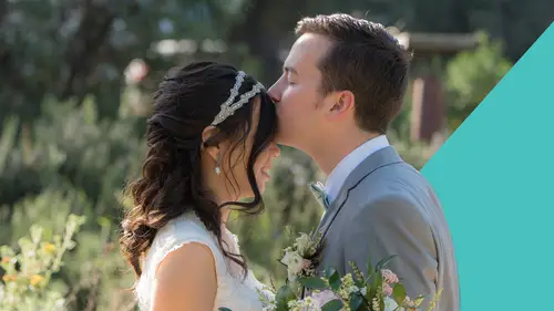
Editing detail shots
Lesson 53 from: Getting Started with Wedding PhotographyPhilip Ebiner, Will Carnahan
Lessons
Introduction
1What this course is about and how to succeed
01:48 2Why you should become a wedding photographer
01:32Starting Your Wedding Photography Business
3Business Section Intro
00:28 4Building your kit
06:00 5Where You Should Invest Your Earnings
04:30 6Will's Wedding Photography Kit
09:57Choosing Your Business name
04:50 8Action Item - Choose Your Name
00:25 9How to build your Wedding photography package
06:58 10Setting Your Wedding Photography Prices
10:16 11How to Get Your First Clients
06:54 12Talking with Clients
09:41 13The Importance of Contracts
04:27 14The Wedding business workflow
06:34 15Good Accounting Practices
02:26 16The philosophy of a well run business
03:38Wedding Day Overview
17Wedding Day Overview - Schedule of Common Events
13:32 18Taking care of Business before the shooting day
02:37 19Tips for working with a wedding coordinator
03:31 20Action item - List out the key moments - Try to memorize
00:31 21Know what you will be photographing ahead of time
02:23 22Conclusion to section/ recap
01:32How to Photograph a Wedding
23Introduction - The meat of the course
01:11 24Equipment checklist/ cleaning lenses and cameras
08:24 25Do you need an Assistant/ 2nd shooter?
05:07 26Being a second shooter
08:32 27What to wear as a photographer
05:09 28How to shoot: Getting Ready/ Hanging out
05:18 29How to Shoot: Dress/ Rings/ Bride details
10:41 30How to Shoot - Groom Portraits & Posing
09:11 31How to shoot: Groomsman
12:51 32How to shoot: Bride Portraits & Posing Interior
04:49 33How to shoot: Bride Portraits & Posing Exterior
08:14 34How to shoot Bridesmaids
12:56 35How to shoot: First Look
03:28 36How to Shoot: Posed Couples Portraits
06:34 37How to shoot: Walking down the Aisle
10:17 38How to shoot: Ceremony Coverage and vows / ring exchange
09:17 39How to shoot: First kiss and walking out
05:39 40How to shoot: Formal family and group Photos
12:26 41Action Item: Save your fav pose
01:14 42Action Item: Find inspiration
02:07 43How to shoot: Reception intro and Grand entrance
01:34 44How to shoot: Reception Details
04:55 45How to shoot: Reception Speeches and toasts
04:41 46How to shoot: Reception First Dance
06:23 47How to shoot: Reception Bouquet and Garter toss
04:46 48How to shoot: Reception Dancing and Partying
05:58 49Recap of “How to shoot”
02:47Editing Wedding Photos
50Introduction to Editing Section
01:25 51Photo applications and Profesional Apps
03:42 52Organize, rate, and cull
28:21 53Editing detail shots
31:42 54Editing bride getting ready
29:23 55Editing Demo: Editing Outdoor Ceremony
23:10 56Editing single portraits
52:10 57Editing Demo: Black and White editing
09:39 58Editing Demo: Stylized Editing/ Finding your editing Style
12:20 59Advice on how to edit hundreds of photos efficiently
06:01 60Exporting your photos for client/ portfolio/ print
10:05 61Delivering Digital images to your client
07:06Succeeding with Wedding Photography
62Intro to Succeeding in Wedding Photography
00:48 63Being happy as a wedding photographer
07:05 64Making it as a business and sticking with it
03:14 65Getting Testimonials
01:35 66Using Social Media and networking to expand business
02:08 67How to deal with unhappy or difficult clients
04:37 68Competing with mobile phones and family/ friend photographers
01:58 69Working with other wedding vendors
03:16 70Section conclusion
00:53Conclusion
71Thank you!
01:29Lesson Info
Editing detail shots
Welcome to our next lesson. We're going to be talking about editing the details. So we're going to start by getting into detail shots. I like starting here because it kind of gets you into the mood of editing and it's really kind of a fun way to get started with telling the story of the wedding. Remember, we're trying to tell a story. So devil's in the details. We want to pull out these details and we want to make them they're record keeping. So we want to make sure that they're beautiful, but we don't want to go overboard with them, right? Editing is a lot about subtlety and it also depends on your own specific style, which we'll sort of kind of get to as we go along with editing. Now, my style is a little brighter in contrast here, but it's not super saturated, it's kind of just natural but punchy. Um That's sort of how I felt that my style is aside from the black and whites, that's a whole another sort of added bonus that I normally do. So when we pull up these details, we're going ...
to go in and we're going to want to make sure that we see them. They look nice. We haven't lost any crazy amount of detail generally. Um And you know, they are creating somewhat of an emotion for our consumer, our customer, our bride and groom, right? We want to make sure that they see them and they're like, oh my gosh, I remember those. That looks amazing. Like that dress looks beautiful. Those rings look sharp, my shoes look sharp. Um All those kind of details. Oh, that's what our invitation look like. I didn't even get a chance to see those on the day of the wedding. So we wanna accurately represent what they were on the day of the wedding, but also add a little punch to them. So let's go ahead and get started. I've pulled up 10 detailed shots here that I think are very important for what we're going to be doing. Um Let's start with the dress. Now, we looked at this before when we were calling, I went ahead and reset the edits to it. Now, I like to start with just a general overall exposure. So I'm gonna go ahead and bring up the exposure just a little bit. I don't want to bring it up too much, right? Because we'll blow everything out. But I want to be able to see it a little brighter and not necessarily lose the whites in the detail. Now, my camera has already white balanced it as best as it could uh out of the box. But if we want to double check the white balance, we, I start with the exposure just so I can get a general look and then I'll click on this little eyedropper here and I'll bring it over to something that's white in frame. Now, you can see in the upper left, uh you can see in the upper left, we'll be able to see basically the image itself and see what the white, the dropper does to it. We're trying to find a good white balance. Now, if we're going to say that this is white, you can see in the upper left, the image turns totally blue because it thinks that that that is neutral or the like gray scale for white balance, like 18% gray, that's a little advanced. So we're going to try and find a neutral white. This door looks really good, typically, like, I'll look at the dress or a gentleman's collar. If he's wearing a white shirt, that's what's supposed to be white in, in nature, right? So I'm going to pick a little flower on this dress or maybe I'll pick, I'll go ahead and pick the door frame that's supposed to be white, you can tell. So we'll click on it and it did kind of make it a little bluer. I tend to like things a little warmer, just a tad. So I'm going to bring this slider over away from the blue make it tiny bit warmer, but not too much. I don't again, subtlety in editing. All right, we've done the exposure. Now. The best way to get started as you're starting with this and to be efficient is to just work your way down the line here. Now, I wouldn't say that you should do that normally for every photo um, when you're editing in photography, but in wedding photography, when you're editing a ton of photos, it's a very nice habit to just get into just moving down the line of the sliders in lightroom classic to just sort of keep yourself moving, keep yourself honest and get going. So I'm gonna go ahead and add a little contrast because I like it being a little punchier. Uh Let's see what the highlights are doing. I'll bring them all the way down just to see where the highlights are and then I'll bring them all the way up just to see where they're blowing out. This is pretty good image. So we're not going to lose any of them. So I'll just actually bring them up a little bit because I want to add to the contrast, make it more punchy, right? Just contrast, subtle, very subtle shadows. I don't necessarily see any details in the shadows here. We can bring them up just to see what they're doing, the background. We could see the couch, but I don't really need to see the couch. And in fact, I think a darker background will make our foreground pop. So I'll bring them up. Mm. Maybe just a tad, again, subtlety. I'm going to keep repeating that. I know it's going to be annoying but whites similar to the highlights but more on the tonal range. Right. If we drop it, we lose that punch in those whites. But if we bring it up, it's too much. So again, I'll probably only bring them up just a tad just to add a little bit more crunch. In contrast. Blacks are the same thing, not the actual shadows, what's behind the shadows, but the tonality and the quality of what the black is. So we're talking about the couch, probably it's gonna affect this, this uh hanger. So if we bring it up, you can see it sort of brings it up, but it's more subtle than the shadows, right? It's not affecting what's behind the shadows, it's affecting what black is and how bright it is. So I actually tend to drop my blacks uh a little bit just to make it again, more crunchy. Now, as far as texture and clarity and de haze go, I'll add just a tiny bit of texture and maybe a tiny bit of clarity when they're detail shots. This is very different when you have a person in frame, I'll actually take away texture, take away clarity to help smooth out some skin. But since we're doing details, we're going to focus on that De Hay is a good way to think about that is it's going to affect your contrast quite a bit and colors. Um, I probably wouldn't touch it until you start to get used to it. Or you actually need to de haze something you can see by sliding all the way down. It's going to make it bloomer and the other way it's going to make it crunchier and see how it affects the colors right away. It's kind of like a contrasty color sort of thing. Um What it's doing, I might, I'm probably not going to mess with this. I'm going to set it to zero because for this detailed shot, there's really no reason to have any sort of de hazier. Now you can get into tonality colors and that's what we will get into in style or what you should be getting into in an advanced editing is getting really deep into color correcting. Um Based on your style sharpening is something I do a lot. I I my cameras are already pretty sharp, but I think adding another extra detail of sharpening your photos will really make it feel real, especially uh with the detail shots. So in the detail area, the detail area for the details, I'm going to click on this little target and you can move it wherever you want over the image and it'll bring up that little zoomed in square. Um Now we want to see what's really in focus and I think the details in this is really the dress, right? That's what we're trying to show. So I'll make sure that's highlighted and then I'll bring out the sharpening till I think it looks sharp, like a nice sharp. Now, keep an eye on the bigger image and make sure it doesn't look weird because sometimes if you go too sharpening, it'll just look fake. But because it's a detail I think, I think around there is, is pretty good. Noise reduction is very self explanatory, right? If you move that slider up, I'm sure you've messed with it before. It's going to soften the picture. Get rid of the noise. I'm not seeing a ton of noise in this image. Even if we zoomed in, I guess we could see a little, maybe in the corner right here, maybe so we could see what it does. We'll bump it up quite a bit, but look how soft it gets. It becomes very, very soft and that can be good when you're shooting people and, and editing people, but we're not doing that. So let's bring it back and because we're already zoomed in, it doesn't really totally matter. I think we started at 10. Right. Yeah, that's good. We'll zoom out and maybe we'll just add a little bit. Let's go extreme and see what it does. Hard to tell. It's really hard to tell that it's softening, but it's definitely softening and you can counter that by adding texture and adding sharpness. But I don't think I need to do that here. I want to bring the sharpness out in the actual dress and the frame and we'll add, we, we'll keep it at 22. We'll add a little bit of noise reduction because there was tiny, tiny bit but not a lot. Um All right. Last thing that I want to talk to you guys about in detail shots, we can get into, you know, deep color grading and uh you know, transforming and lens corrections. And also the curve um later, I mean, the curve is really something you could do to add contrast and help create your style. Um But I don't want to get necessarily too deep, we're gonna start slow. So let's let's let's counter that. So this is a very simple edit, simple detail shot. We did the sharpening, we did the noise reduction. And the last thing that I tend to do is not extremely but adding a post crop vignette that'll add the vignette to however you cropped it. So if you were to add the vignette and then crop it again, it'll still hold the vignette around whatever image you're ending up with after the crop. So let's subtly add it and again, subtle. That's probably where I'm gonna end up having it be, it kind of helps focus the, the look of the image um or you can be extreme and have something crazy like that from like the twenties. But we're not going to be that extreme and we're not going to have it white either because, um, the whole idea behind a crop is to sort of, or have a vignette is to sort of darken the edges so that your eyes a little bit more focused because our eye is always going to go to the brightest spot of the image first. That's just how we naturally work. So having that vignette helps focus it in, I don't like necessarily seeing the vignette. I wouldn't want someone to be like, oh I put a vignette on that. I just want to subtly subtly direct your eyes in that direction. Keep in mind you can really deep dive into editing this image. If someone was like spend 30 minutes on this image, I would probably add a mask like a radiant filter to darken in the sides, maybe a little bit on both sides. Um I would also potentially, you know, brush out some stuff, maybe smooth out the wall, like you can really push each image if you want to spend the time to do that. And I want to mention that because I'm moving through these pretty quickly at a fast clip because there's a balance of editing um for your client and editing for your own style and editing for your art. But there's also a balance of how much you're getting paid and how much time you're willing to spend on every image if you're delivering 400 photos and you end up spending even just 10 minutes on every photo for 400. I mean, you can do the math. Right. That's 4000 minutes that you're going to be spending on one wedding. Now, how much did you get paid to do that? It's not efficient and it's not good. And it's part of the reason why some people actually use um LUTS or they use uh presets so they can apply it and keep moving. Generally as I was talking to you, I was doing that, I probably would have only spent 30 to 50 seconds doing that because I have 400 photos to edit and I'm not going to be spending that much time. So keep that in mind, you have to find your own balance on um you know what your time spent editing and what your time spent uh moving on throughout the photos and you can always go back edit, move on, do some other stuff, come back, check it, see how it's doing um in your mind because things will change as time goes on. Now let's move on to just another, another version of a detailed shot here are the Rings. It looks like I missed focus just a tad and that's why I wanted to show you guys this, I don't nail it all the time. But when this photo is smaller, it'd be very hard to tell that we've missed focus on the top and it's still telling a story and what we're doing. Um I picked this one just so you could see that specifically. Now, a good place to start because we've shot this in the same room as the other one is to go back to our first image and this is going to help you speed things up and hit command C and it brings up this copy settings. Now, I want to copy everything but the transformation, the crop, the healing and the masking because that is what's going to be similar to the next shot. Now, if I copy and paste these settings, it's a really good place to start and move quickly throughout photos. I don't have to go down the line and go through every single slider again. It'll just apply it. So we'll hit copy, we'll go to the next photo and we'll hit command V for paste and it see it got us to a spot, I think automatically this is too blue, but the contrast is great, right? So let's pull back the blue a little bit. So we get a little bit warmer. Very great. It's a little bright. I might bring it down a little bit and bring down the highlights just to get some more detail and that I'm generally happy with like that is fine. Again, if we go before and after, oops, that's the wrong. We're in the wrong space here. If we go before and after uh why is it doing that? Again, if we go to the reset button, that's where we came from. Z we'll go back and that's where we are. And a lot of that is just because you have been filming in the same area. And again, this goes back to me organizing your photos by section because all those are gonna kind of be the general same white balance, the general same exposure and you can copy and paste settings as you go. So for this one, I'm probably gonna up the sharpening just a little bit just to see if we can get a little bit more detail out of the rings. Let's see how I might come down on the vignette a little bit more just to really accent the center of the, of the photo. And yeah, there we go. I feel pretty good about that. The big thing with the Rings is making sure they're sharp and in focus and I have another image where they are, I think. Um but when you're taking photos zoom in uh while you're doing the detail shots and make sure what you want in focus is precisely in focus because this was with a macro shot. Let's see. I we can bring up. Exactly. Yeah. So I was using my like a Q two and I was definitely uh using, I was definitely at a closer focus than I normally would be. So, yeah, that's, you know, the rings are very important. So making sure they're sharp is good. Let's go to the shoes. So, uh, always good to ask your clients if they want their clothes shot or detailed. Um, typically it's a lot of shoes, a lot of cuffings, a lot of details in what they're wearing. Shoes are a really good place to start because, um, you know, they can be very important. Again, the problem with this one is it is uh a little I took these outside, I remember specifically. So the balance is not gonna be the same as the last ones I don't want to copy and paste. So again, let's start at the top. We'll use the little eyedropper and find a neutral spot. I manically go to this white area, but that's a little blown out. Um So there's really no detail on it. So somewhere in between, um, where you can see all the numbers are hitting in the similar range as a neutral R GB, we'll click it. It added a little bit more warmth. We're gonna bring up the brightness just a little bit. I might add a tad. Well, yeah, maybe somewhere in the middle. Again, it's good to find your style and see what you think looks good on your eye, especially with these detail shots and getting you started. I think I might go a little more blue because I know it is outdoors. I know about displays too. Apple laptops come pretty well balanced so you can't go wrong with those. I'm using an Apple studio display, which also comes balanced. Um The reason I do that is because these match and I don't have to mess with color calibrating. If you have uh a monitor or display outside of what Apple makes, you need to make sure it comes pre calibrated or you need to calibrate it yourself because every monitor is different. Um Because of the advent of iphones and so many Apple products, it sort of created that general um R GB Adobe color space that everyone is used to. Um And so that's helpful right out of the box, you don't have to think about it. But if again, you're printing or something like that, calibrating, your screen is very important to this editing. Um maybe I should do a whole lesson on that something. So anyway, let's get back to this. I'm gonna bring on the highlights and the highlights are bringing in some details which is nice, but we're losing a little bit of the ambience. So I'll bring them down a little bit and I'll counteract that by bringing up the exposure I brought the highlights down to get the details, bring up the exposure to get a little bit more ambience. Same with the whites, right? Like is it gonna bring out some details? I'm gonna actually bring it up because it just adds ambience shadows there's nothing really in the shadows that we need. Other than like continuing to have a bright photo, I'm going to bring the blacks down because I think that that adds a nice crunch and it actually to me makes the details sharper the details in the detailed shot. So yeah, let's bring that down. Great again. I don't really need to mess with texture and clarity too much in these. Maybe add a little bit just because it's a detail shot that's more sliding to the left when we're going to be having people. Sometimes I'll bring up some saturation. It depends on your camera how it acts. Um I think it's a good way to get some more punchy photos out of your camera. Um My camera actually adds a lot of saturation that I like. Um It's part of the reason I shoot on the system. We're gonna skip this for now again, we're gonna sharpen just a tad. Let's look at the sharpening where we wanna be because I really want these things to be these little diamonds to be the sharpest they can be and we'll add, see where it was and then we'll add an overall image. It's looking nice noise reduction, maybe just a tan and then add our Vignette Justice Scots. It still seems a little green to me. So let's bring in some pink. We'll do the other slider here and yeah, it's gonna look a little different probably on your monitor, it's compressed through the class and everything, but we're getting to a good spot and yeah, there we go. So let's reset and see what it looks like before and then what we've done to it, pretty drastic, pretty drastic uh Change. It still looks a little pink to me, but I would have to go in detailing into changing that out a little bit. So it just kind of depends again on your style. Now, something like this, uh We wanna straighten out again making sure your horizon lines are good. I usually will start there. Uh It's not quite, not quite there. There we go. And again, maybe a little tad exposure, but this image is already bright. Definitely adding some contrast to make it pop, bring down those highlights to get some more detail, same with the whites, same with the blacks. I'll counteract that a little bit. We'll go back to exposures to keep the ambience tiny bit of clarity. We'll add some saturation because there's not like a ton of color. Let's go back and double check our white balance. I think these are pink flowers, not necessarily white, right? Yeah, see that its green because those are actually pink flowers, not white. So let's find a more white, a suitable white thing. Yeah, that candle boom a little yellow. So we'll come back and hit blue just a little bit because it is daylight. That looks good. I still think there can be some more contrast. So we're gonna keep crushing the blacks, add some more contrast. You can get into the tonal curve for that, which I would normally do. But I don't want to get to that quite yet. Um We're gonna make sure that our sharp point is where our focus is, but those are the flowers. So we'll sharpen that tiny bit of noise reduction because there is a little bit of noise in there and our tad vignette done. So we did that super fast right? When I'm not talking, we did that in under a minute, I believe. Um And I'm looking at, we're looking at it as a big giant screen. Now, generally, it's gonna be viewed more like this on a website. Maybe they would print this photo out. Chances are they're not gonna be printing this photo out, but it's a nice detail shot to help tell the story, right? We know the room, the bouquet, the colors are natural. Um And we know what's going on. This is another good one to tell the story right off the bat. I remember that I ended up cropping this uh to be a little funkier because I thought it was fun because here are these champagne flutes and I thought it was cool just as an image like that. It would be a really fun image to put on a website or to put in their um you know, album or something like that. If they decided to have one really fun crop. It's not normal. Chances are, again, they're probably not going to print this photo out. So the cropping and aspect ratio doesn't necessarily matter. So let's again, start with our color, not a lot of bright spots, but here's a neutral ish. Oh, didn't work out so well. Right. You gotta be careful with where you decide your neutral is and sometimes like an image like this, we can't necessarily find one and we're already in a pretty neutral spot. So I'm actually just going to manually mess around with it. So I'll make it a little warmer, bring up the brightness, it's glass. So that makes it a little more difficult at a lot of contrast. Mm Bring down the highlights a little bit, the shadows don't matter as much and we'll bring down the blacks to make it pop. I'm gonna add a little bit more clarity than I normally would because we wanna see what they say and we want to see the glass tiny bit more texture and this is where de haze might get in. So we can see it might de haze the um the glass a little bit but not a ton. Again, it's adding contrast and changing color and a little too much. So I wanna counter that by bringing up the exposure just a tad. So let's go down. We'll add, we'll see where we want to sharpen. This is the most important part, I believe, sharpen that. And again, a tad little noise reduction and there you go. So here's what it looked like before and here's after quite a difference. And again, didn't spend a lot of time on it, but we added it and made it pop a little bit more. This one is a combined detail shot with a human. So he's a lot of focus, but that's because I was focusing on the Brosky. He got all his groomsmen these little fanny packs. So when you're doing a detail shot that involves a human, you got to remember about the human, not just the detail shot. So this is already pretty well balanced, but let's look at our white, we'll go to his collar which again is like a good spot. Add a little bit more warmth to him. I might take it out just a little. Yeah. So we're just a little tiny bounce again, subtlety, subtlety will bring up the exposure just a little bit to make it pop a little bit more contrast. Bring down the whites to tad. There's nothing really in the shadows. So I'll bring them up a little bit just to add the detail of the background. The white. I'm gonna add a tiny bit because the white jacket is so important. The blacks crushing just a little bit. Again, my style crunchier contrast here uh makes things pop a little bit more. Um This is where we're gonna have to be careful with the texture and the clarity, right? Because if we had too much texture, his face, we start to, we start to make look funky, right? But if we take away too much, everything looks way too soft, so subtlety, right. We'll take a little bit of texture out and we'll take a little bit of clarity out. I didn't lose our detail in the brosky, but it did soften up his face just a tad now saturation. We're looking pretty good saturating wise because again, this is what I like from my camera, we could go crazy, but again, it'll affect his face and the other products. So we can get away with detail shots when we add saturation to details that aren't humans. But the second we start to add saturation to human faces, things get things get crazy. They get, they just get so crazy. All right. Sharpening. Where do we already know his face is out of focus? And it is actually not the key to this photo. The key to this photo is the Brosky, right? So let's find a nice area there and we'll sharpen a little bit keeping in mind that we don't, it's affecting the whole photo. So we don't want a crazy go nuts to affect his face just a little bit nice little bit of noise reduction, which can go a long way with his face. Again, it's smoothing things out. And then finally our little vignette just just, just a tad, just a tad. So no one really notices, but we know that we're helping get our eye focus. So let's look at, see what we did, what it looked like before kind of dull. Not a ton going on at our corrections. It's bright, it's a little bit more saturated, it's there. Um Some advanced move for this one would be to separate our gentleman's face. Now, lightroom going over the mask on the right has now been able to detect people. If we click on the person, you can see it separates and we'll go more into detail when we get into formal photos with this face, skin body skin eyebrows, I scale. It's the white in the eyes, the Irish and pupil lips, teeth and hair and we can make masks which is just isolating those different parts and just editing that. So for this, I'm going to do face skin and body skin. So that's basically just his skin and we're going to not separate them but make them one mask. So when we edit them, they're affected together, I like to see the overlay. So I know exactly what's happening as soon as we start editing that red overlay is going to go away. So we'll know exactly what we're doing. Like if we were to just brighten up his face, that's the part that's affecting. But obviously, we're not going to do that. The only reason I did is because I feel like his face is just a little more warm and orange than the rest of the photo than it actually is in real life. So I'm subtly going to take away some of that and I'll change the temperature of his face just, just a tad. So that looks a little bit more natural, right? It's not, it's not crazy orange like it was, it's just a little more subtle, a little bit more nicer skin tone and it fits the photo naturally. And what he actually looks like in real life also, maybe add a little bit of clar, take away some clarity. I'm adding softness. So his face is a little smoother again, subtly because we don't want it to look extreme. We don't want him to look like, you know, he's had a bunch of batter on his face. So we're just, again, just very subtly because you don't want to take away who he is as a person. And there we go, that's an, a sort of an advanced thing that I'll get into when we have people in frame. Here's a really good shot. This is the box that they put a bunch of letters in and this goes for all these, I don't wanna go through each one necessarily. But um same thing, the idea is to make it pop, make it feel natural um and record. Keep it in a nice, beautiful way for your couple to see it. So right off the bat. I'm gonna go and Horizon Line, right. Make sure that it feels straight up because I was leaning for some reason and didn't do it straight. And then I'm going to, I'm, again, I'm happy with the color here, so I'm not gonna mess with it too much at all. Actually, I might bring up the ambience a little bit with the exposure add contrast. Let's see what the highlights are doing. I might bring down the highlights a little bit because you see it's bringing back some detail in the sky in the background shadows. There's nothing really in the shadows. So I'm gonna bring it up a little bit. We're getting a little bit more detail in the box. There add a little bit of white to add some contrast, bring down the blacks to make it pop a little bit more. You can see we're getting a little bit more crunchy, a little bit more poppy again with the clarity, maybe just add a little, add a little texture to add some, some feeling to it. Saturation is good on my end. Now, if I were to go too crazy with it, we'd get that which is a style, not my style necessarily. I like the saturation how it is already. It's not punchy, it's not like overly colorful but it's not black and white yet. Now, to continue with our simple editing, I'm gonna sharpen this a lot because I think it looks so cool. And I think adding some more sharpen detail make it pop even more. That's looking really nice, tiny bit of noise reduction. We're outside. I was shooting at iso 100 you can see up here. So not going to be a ton of noise. All right. So then just the tiniest of vignette. Tiny, tiny. Right. This is really cool. Right. This pops, it feels like we're there. Um, we got nice harsh sunlight, the sunlight luckily was coming from behind it. Um I got lucky with that. So this is what it was before. Dull, crooked, uh flat and then when we added all our corrections sharp, uh contrasty detailed in line, not crooked, really good. Um Again, same thing you'd want to do the same things with these. I'm just gonna move through this and, and quickly and I would bring up the brightness. I like these detail shots because I wanted to see they had these little invitations with had seeds in them which were really cool. Um And this is how fast I would normally be going through this and you would get there at some point. Um It just takes practice and I have been editing wedding detail shots and wedding photos for, you know, over 17 years. So I can be quick at this. Um You are just going to need some practice, but at a certain point that is how fast we want to be moving at these things. And I would move on to the next one. I spent less than 30 seconds on that and I was talking to you at the same time, but because I already know all our corrections from the past, I'm just going to use the same sort of style to keep moving on. Um At a certain point, you, I would then take those edits, save them as a preset or like we copied and pasted earlier and start applying them to the same areas and that'll get you going even faster and your images will still look good. Um This is the same thing. Let's try and like I said, copy these settings when we're over here paste. I did a pretty good job. The color is a little pink for me and I wanna crop it so it looks a little nicer. Um But again, I always think even though I'm in the background, you can see my reflection in the image. Maybe de hazing will get rid of that. No, it just makes it worse. Even though um you know, I'm in the background, it's important to try and get a photo of the seating chart. I know it's silly but it's a good idea and I know I said that before, but just a reminder. Um this is really cool. I like this detail shot a lot. Mostly I wanted to show you this because I love these light strips and I think contrast shafts of light. Um you know, images that have a dark area. Images of a light area are really cool and I used a close focus for this with my 28 millimeter and I can tell you right away, I'm going to just crank the contrast, maybe bring up. Uh I'll have to come down a little bit so that we can have a deeper black and brighter bright. Um I'm going to bring up the highlights, bring down the shadows. I am just contrasting this as much as possible. Bring down the darks. We're gonna add just a tiny bit of clarity and take away some texture because the card stock is actually what's throwing me off the card stock is grainy, not the image necessarily. We're at 100 iso again. So it's the card stock that looks kind of um you know that fuzziness. Um We're gonna add a little bit of sharpness even though we're already pretty sharp, we can see the ink on the thing and we'll add a little bit of vignette. Very cool. So I like that. I think it's like punchy. It's interesting. We got these shafts of light coming through, it gets that mood of the day. Um The date is on there, which I think is very important. Now, if we reset that again flat, that is what we did to it. That's great. So those are some detail shots editing. Um This is a good place to start. We're getting deep into our editing and um I'm hoping that that helps you a little bit with your detail shots again. Don't feel bad for moving slow through this. Take your time for now. It's just something to be thinking about when you start to get to the point where we're editing 4000 photos. So let's move on to the next lesson.
Class Materials
Bonus Downloads
Ratings and Reviews
Student Work
Related Classes
Wedding Photography