Demo: Surfaces for Colored Pens and Markers
Lesson 6 from: Getting Started with Pen, Ink & MarkersMary Jane Begin
Demo: Surfaces for Colored Pens and Markers
Lesson 6 from: Getting Started with Pen, Ink & MarkersMary Jane Begin
Lessons
Class Introduction
06:19 2Demo: Pen Tools
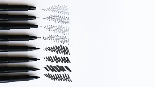
06:15 3Demo: Pen Tools & Paper Surfaces
09:56 4Demo: Scratch Tools on Scratch Board
17:53 5Demo: Color Pen & Marker Tools
06:44 6Demo: Surfaces for Colored Pens and Markers
09:36 7Demo: Marker Tonality
06:28 8Demo: Build Color With Pens & Markers
10:57Lesson Info
Demo: Surfaces for Colored Pens and Markers
I tested the vellum trace paper. Now, vellum trace paper is, it's a quality paper used for drawing, particularly, but I wanted to see what the markers would look like on it. It's a pretty hefty kind of paper, which I kinda like, but the only problem with it is that when you draw on it, you can see the wetness of the markers kind of wrinkle up the paper a little bit. I don't know if that's visible. It may not be easy to see, but it's actually causing a wrinkling because the paper is reacting to the wetness. It's shrinking in one part of the paper and expanding in another so, it particularly did that with the Posca markers, but let's just try with the Copic pens here. You have, you know, the bevel side. It becomes very transparent, very see-through, which is kind of neat, and it makes a funny sound, like a little mouse. So it reacts really differently from the paper I just showed you and that's because it's sick and it's smooth and it's also transparent. So let's just test and see if we ...
add a little yellow on top. I'm trying make sure that that's fully dry, it is. It's moving it just a little bit. So it's kind of a fun tool. You can blend with it a little bit more because it's on a smooth surface. So that color's mushing around a little bit but the bad part is you're getting some on the end of your brush. So when it's a slick surface, the color's sitting on the top, it's more malleable, moveable, but for markers, it's going to affect the marker that you're kinda blending with. You have to sort of work it out to get that green out, but you can mush the color one into the other which is a kind of a neat effect. You cannot do that on the dry, rough paper. It doesn't, it dries so fast. You can't do this. It almost has the effect of looking like water color. Now, these are the Pitt pens. Let's test one of these. I'll use a new color. So you can see there's a certain amount of blend action here but also the dry time for the Faber-Castell Pitt pens is a little bit quicker, and I am getting, I'm using yellow, so you can see that the color's coming off a little bit on the tip of the pen. So you just have to keep that in mind when you're working and then you can go to the side and pull that color off. It does eventually come off. So this surface is kind of nice, but again, I wouldn't probably make any kind of a super, you know, fancy finish on this. We'll try one of the Copic pens. It feels nice. It glides across the surface. Look at how densely opaque that is. And the reason why I can see that it's opaque is that it's thick, like the color here is so much thicker than the color over here. I'll just put it next to it. This is very transparent a green. This is very thick and dense, and if I put something underneath it, you probably won't be able to see through that green color. Let's just test it. Yeah. So you can kind of see through the window of that color to what's underneath. The Copic marker, no. It's opaque. You can't see through it. So let me just flip back over. And for blendability, we'll try that with the Copics. Let's just test this blue on this green. It doesn't really want to blend. It's kind of picking up the tooth of the paper so the blendability for the Copics is not super on this and it's causing warpage of the paper. It's just not meant to handle that much liquid and these have a lot of liquid in them. They're wetter in many ways than these other pens. If you just use a flat kind of mark, like this, you're using it more linearly, not really a problem. So I would save your vellum trace paper for pencil sketches and for work that's not supposed to be permanent. It's just for fun. You're just goofin' around. But it's not the most beautiful surface to do your ink work on. Okay. So this is also a cold press paper. Woops, I used that already. So then, let's turn it this way. This is vellum bristol paper and this is probably one of the nicest surfaces to work on. Very much like the Pitt pen, the Pitt brush pens, and the Micron pens and the pen and ink. Bristol, smooth surface. It's slicker and it's letting the color sort of sit on the surface and kind of glide, but it also has a sort of heft or weight to it. It's 100-pound paper. So this 100-pound bristol smooth paper, Blick makes it, is really a nice surface for all of these tools and I tested it because I really wanted to see, how does it feel. And so by doing that, I was kind of eliminating, well, what's not gonna be a great surface for you to work on? What's gonna be the best, nicest surface for you to work on, and I felt like this was probably one of the nicest surfaces and I tested also what I call the best is bristol smooth 100%, excuse me 100-pound. So I'm gonna use that. I have a little more area here to test on, but I wanted to get a feel for it so let's just, I just wanna show you, what does this look like on the surface and these are the opaque markers. The density of color is really fabulous. It's super clean. You get a super clean mark with this, so it's quite delightful and it feels really good. You can also, let's see, I will use a little bit of opacity on top of this. You know, you could do patterns. That opaque color is looking beautiful resting on that tone below it. I'm gonna go over here. This is the Copic and Posca markers, but you can use markers, different markers together. It's totally fine. And then because this is fully dry, I can then brush color right on top of it, create blends, kind of change the color or graze over the color and here. You can layer, but you really wanna make sure that what's underneath is probably gonna be dry. You wanna layer the color. This doesn't blend particularly well. I'm gonna show you, let's just demonstrate with the Copic marker. It's not really ideal for blending because what's happening, the color is sort of absorbing fast. Let me open up one here. You can layer, but it's not gonna mush across the surface. That ink has literally soaked into this surface so quickly that there is no opportunity for you to mush it around. But that's okay because with markers, typically, you're using a lot of layering, less blending. Some of the papers are better for blending and some of the papers, not so good. So the one other thing I wanna test on this paper is, we can check something that we haven't used that much which is the, this is also a brush pen. Really, the difference between, say this brush pen, which is called Clean Color, it's a different brand, than, we'll test a red Faber-Castell. The marker is a little more fine line for the Faber-Castell. It also absorbs less into the surface. This is sitting a little more on the surface. This gives a little bit of a bleed. It's probably really impossible for you to see, but this marker is bleeding more into the surface, it's a gorgeous color, than this one. This one's sitting more cleanly. And I don't know if you can see that mark, but this is a really clean mark and this pen, less so. So what you're, it really acts more like a brush. So if you want something that has more of a brush stroke, the Clean Color marker does that. If you want something that's more of a clean, crisp shape, that's the Faber-Castell. I do wanna test, I wanted to see what it looks like if I throw this color on top of it, yeah. So as you can see, this paper is beautiful for the cleanest of the color of the marker. It's not meant for blending and modulation. The vellum actually worked better for that, although it only takes so much of the color before it gets too saturated. This is really about layered color. So knowing the difference is gonna help you decide which papers you want. Do you wanna blend or do you want to layer your color? I personally think that this is just a beautiful surface to work on. These are really nice pens, but they're very much more brushy than the other pen. So again, depends on what you want. And it actually feels almost more like a brush. It's the tip of it's softer than the pen, the Faber-Castell pen. So they're not, all these materials aren't created exactly the same way or they're equal. The only way to know is to do a little bit of testing. I really encourage that. I'm putting my caps back on because as I've said in the classes, it's not my best habit for putting caps on pens, on paints. It's a bad habit. I don't want you to do that. I want you to do better than that. Put your caps back on because what happens is these pens will dry out. Not in a few minutes, but over the course of an afternoon, I have lost many a good pen because I forgot to put the cap on.
Class Materials
Bonus Materials with Purchase
Ratings and Reviews
Donna K. Fitch
A great overview class for those who know nothing of the variety of pens, markers and papers available. Mary Jane is an accomplished teacher, and I look forward to putting her teaching in action.
Student Work
Related Classes
Illustration