Demo: Layer Pastels on Smooth Bristol Paper
Lesson 5 from: Getting Started with PastelsMary Jane Begin
Demo: Layer Pastels on Smooth Bristol Paper
Lesson 5 from: Getting Started with PastelsMary Jane Begin
Lesson Info
5. Demo: Layer Pastels on Smooth Bristol Paper
Lessons
Class Introduction
06:15 2Colors and Types of Pastels
05:20 3Demo: Blending Pastels
12:23 4Demo: Surfaces and Papers For Pastels
10:55 5Demo: Layer Pastels on Smooth Bristol Paper
07:20 6Demo: Oil and Dry Pastels on Tracing Paper
04:29 7Demo: Colored Paper With Pastels
03:22 8Demo: Pastels on Premium Mounted Boards
05:03Lesson Info
Demo: Layer Pastels on Smooth Bristol Paper
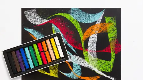
This is smooth Bristol paper, and oh, has a little charcoal in there, we won't look at that. And it's just 100 pound weight. It's a beautiful paper because it's got a little heft to it. You can see it's kind of, it's thicker than the newsprint, and it's thicker than the sketch paper that we just used. This is more for something that's, like if I were making a finish, I would probably use a Bristol paper. It's a really wonderful paper for really letting color be applied to it, layers of color, because it has weight to it. This is a very smooth surface, and that's why it's called smooth Bristol, so it's kinda slick to the touch, like if I touch it, you can't hear my finger across the surface. It feels almost like the chalks, so it's a really nice smooth surface. When you're talking about surfaces, there's the difference between a paper with a lot of tooth to it, or texture, versus something that's really, really smooth. So these papers come in varying surface textures, and it really depe...
nds on what you want that mark to look like. So Kenna, what color should we apply as our ground tone? What about doing a yellow? We haven't really done many yellows, golds. Okay, so yellow or golds, let's see if I can find a nice one. Pretty vibrant for the most part. I'm gonna try this one, this would be like a cad yellow. So I'm gonna just. And you can see it glides over this surface, like buttah, it's really, really, I feel like I'm skating. You know, it's really quite nice and easy, and papers with tooth are fabulous, it's not to say that it's not, but there's also something very pleasing, personally I just really like the feeling of the smooth paper. I'm applying a fair amount of color, and you can see, it's actually pooling up in these little patches of dust. Now I could literally spray fix, maybe not the biggest piles, but some of these smaller bits, you could spray that on and actually hold that there when you wanna, and I did that with this red one, I left it super textured, and that's just a pile of dry pigment. And you might say, oh I wouldn't want that, or wow, I love it. So it depends on if you want it to be textural or you want your ground tone to be really smooth. I'm gonna press it in. So I'm gonna try pressing it in with a paper towel, and I want you to see what that looks like. I can get a really even tonality. Now there's a patch here of color that came right off this pastel stick, which wasn't perfectly clean, so I'm just gonna clean it right now. And to get rid of that, I'm just gonna pull this eraser and pull some of that color off. I think it was a little bit of purple. I'm gonna apply again, some of this yellow, and I'm gonna push it even further, and make it really, really deep and rich. Is this the yellow that you imagined? Yes. Okay good. Now I'm gonna press it into that surface. I will have to shake this aside. I don't really wanna blow this, this is a lot of pigment. I'm just going to, well I'm not gonna do it on the really nice rug, I'll just do it on the floor over here, we'll clean it up later, but the reason why I didn't wanna go (blows) is there's a lot of powder there, and I really don't want it floating in the air for all of us to breathe in. So again, that's why the mask is a very, very handy tool. So what this towel is doing, this paper towel, and it's just a regular paper towel, you could use a rag, a soft rag, you could use a paper towel which has a little more tooth. I can make a pretty even tonality if I keep rubbing, I'm rubbing all the way to the edges here. If I didn't want to go to the edge of the paper, I might tape the edges, but with pastel I'm not as worried about that at this moment, just because I wanna show you the tonality of it. I kinda wanna put another color on top of this to show a layered ground, and how that might look. What color would you put on top of this? What about like a, I don't know if this'll be too dark, like a cardinal red type color? Ooh, cardinal red, how about, this is a pretty nice red. And again, look at what this can do. I can leave this just as it is and work on this tonality to make my picture if I chose, or if I wanna make an entire ground of our cardinal red, I'll do just what I did before. I can either leave it as a kind of textural surface, just like this, I'll do one half textural, the other half I'll smooth out. Again I'm gonna have to tip some of this powder off of the surface, just because I don't wanna breathe it in, and I don't want it all over this lovely rug that's behind me. Okay. So I'm gonna let it rest with the orange. Okay. So now I will rub one side, and not the other. And all that I'm doing when I'm rubbing this color into the surface is I'm blending the colors together, I'm making them homogeneous in a way, so it's more of a single tone, as opposed to a textural surface. And they're both really great to work on, but I wanted you to see both ways. And as you can see, this is really quick application, it didn't take me very long to make these colors. And I can keep doing this, I'm gonna grab a pink, put that on the surface. You know, you can make what are called ground colors, or sky colors, or large areas of tone in your picture. These are great for landscape by the way. Because it moves so quickly, you can get across a very large surface fast, and that's kind of a nice thing. You can also throw a dark on top of that, let's throw cobalt blue, which is the color of my shirt. Oh this is gonna be yummy. Yes I do refer to colors as yummy, because I don't know, they just look delicious to me. Alright, let's see if I can, again I'm gonna have to, maybe I'll just tip it over the side. If I rub it, it becomes more neutralized, as a color. If I leave it sitting right on the surface, and I'll try it on this textured side, it's sort of blending together, it's got a little more edge and vibrancy, mostly because I haven't pressed all that color together or swirled it around, I've let them sort of sit one on top of the other, and it's a really neat effect. Okay. Once again, pardon me while I tip the powder, back here off the rug. Okay. So you can see the difference between sort of the textural side, which is letting the colors sort of lay on top of each other, versus the area that I really rubbed in, and I just used a regular old paper towel to do that.
Class Materials
Bonus Materials with Purchase
Ratings and Reviews
Monica Pepicelli
It is so for beginners. Her You Tube video is way better and if she was able to create a course based on what she covered there - that would be worthwhile. Glad it was reasonable.
Janelle
This class is titled getting started for a reason. It tells you all the basics about material use for you to just get started and play with the medium. Enjoy the process!
Student Work
Related Classes
Illustration