Lesson Info
10. Demo: Explore With Oil Pastels
Lessons
Class Introduction
06:15 2Colors and Types of Pastels
05:20 3Demo: Blending Pastels
12:23 4Demo: Surfaces and Papers For Pastels
10:55 5Demo: Layer Pastels on Smooth Bristol Paper
07:20 6Demo: Oil and Dry Pastels on Tracing Paper
04:29 7Demo: Colored Paper With Pastels
03:22 8Demo: Pastels on Premium Mounted Boards
05:03Lesson Info
Demo: Explore With Oil Pastels
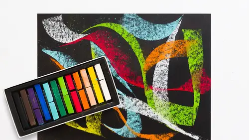
When I'm working, I start out really organized, everything's really organized, and as I'm making pictures, I'm just making a sort of chaotic mess. So, I go back, reorder, make a mess, reorder, make a mess, that's kind of my system. Everybody has a different way. Some people stay organized through the whole thing, but a lot of artists have to let it flow and not worry about, you know, oh, I just dropped a pencil on the floor. Get it later. Oh, I have powder dust behind me. Clean it later, don't stop to clean it while you're trying to do a picture. Give me a license to make a mess and leave it messy. If you have a space where you can leave it messy instead of having to clean it up all the time, like a kitchen table, it's great for the mind and it's great for making things. So, I'm just gonna cover this over quickly. And this one, we'll do the oil pastel, because I think that will be fun to see the oil pastel in a more rendered fashion. Again, I'm covering up my blue. And you can see that...
, by removing the blue, our focus is on the cube, our focus is not on the paper, and it's not on the blue edges. So, Kenna, if there are any questions, I can actually answer them while I do this, if there are indeed any questions. Cool, well, Rhiannon had asked at the beginning of the class, "How long will chalk art or pastel art last?" That's a really good question. Is it Rhianna? Rhiannon. Rhiannon, oh, that's a great name! So, Rhiannon, you know, pastels are, they are to a certain degree meant to be an active tool for doing certain gestures, and it can be a temporary medium. If you store them well, if they're well-protected, if they have glass on them, you would never leave a pastel, you know, in a gallery it would always have glass on it. Think of Degas and those pastels. They can last long, but they have to be protected from light, they have to be protected from dust or surface, you know, some activity on the surface, someone smearing it, so glass or plexi on top of a finished piece, protected well when you're storing it. I put trace paper over my pastels so they can't get smeared, and I don't leave them in a lot of light so the color will shift over time. But if you're careful and you're delicate with your stuff, they can last a long time. And I've had pastels for a decade that have not changed color, but I keep them in a flat file and I protect them with a trace paper. Or, if they're in a gallery, I'd make sure there's glass, tempered glass or regular glass, protecting that pastel. And one little trick with that, and a good gallery owner will tell you, you want to have a bevel or thickness of your mat on the pastel piece so that the glass is not directly on that pastel, 'cause that can move it around too. Good question. And what about, how long will the pastels themselves last in terms of, yes, the sticks. So, again, these are just powder pigments compressed, so they don't have any liquid like gum arabic, like the watercolors, or oil. The oil pastels have oil in them, they're compressed, so the oils are more likely, over time, to dry out eventually, they'll dry out. But it'll take a long time. Oil takes a long time to dry out. The pastel sticks, I have had pastel sticks, I don't wanna say since college, which was a really long time ago, but I have had pastel sticks that I've had forever, and they don't change. They don't change in terms of coloration and they don't change in terms of application, and they don't fall apart. So, if you keep them in your trays, that's one thing. I don't keep them all loose in a bag. They'll all crumble together and it's a big, hot mess. I would keep them in the trays so that I can see the colors and they last longer. These have only cracked because they were shipped and they cracked in the shipping. But normally, you know, unless you break them in half, this is a great way to store them. Good question. Okay, so now I'm gonna grab some oil pastels. What is the color of our ball today? Can we do like a deep purple? Ooh, yeah! I'm gonna grab the real thing. Let's see what my purple options are. I might have to make a purple because there's not, in this oil pastel kit, which has lovely color, there's not any actual, unless that's purple. Nope, that's blue. I'm gonna test to see, to make a really nice purple, so I'm gonna combine a blue, and a red. That's not bad, but it's kinda dark. I'm gonna go with this. Now, we won't bother with the ground on this one 'cause we already have the orange. That's kind of a nice purple. I'm gonna go with those two, and then maybe, for the shadowy color, try that. Yeah, that'll work, okay. So, and I can also bring in, I should have a white here, the white for highlight. Okay, so I'm just gonna go right, oh, that's yummy. Oh my god! This is like a beautiful color on this. And I'm applying it, I am barely pressing down, but the oil is so thick, it really, I know I use the term butter or buttery. It's so buttery, so cool. Okay, now, because the tip of this is fairly round, unlike the stick, I can go right to the edge of that circle with a fair amount of ease. I'll use the stump to kind of smooth it out a little bit. But I wanna make a ball that effectively has light on it. I'm gonna add a little white. And look at how easily that blends. I don't really have to do much to it. I can make a kind of impasto coloration too, and impasto just means thick, almost textured paint, like I would with acrylics or oils, simply by applying a lot of the pigment. It'll only go so far. There's a limit to how impasto you can make the oil. You can't really do it too much. It's powder, so it's only gonna get so thick. But the oil pastels, you can definitely get thicker. I'm gonna bring the color here. And what I didn't do is create a ground tone that I erased out of. I'm doing a different methodology. But I have a ground to work against. I wouldn't, again, I'm not a big fan of working against the white of the page, because then you have to work really hard to get your colors to relate to each other. If you have a ground, everything you put on top of it has a connector, what I call a family blood between the colors, which I think is really great. So, I'm a huge fan of grounds. I'm gonna put a little blue for my shadow. Don't worry, I know it looks kind of dark. I'm not pressing too hard, as you can see. You can really see the texture of the paper. I'm gonna blend it in a second. And I'm gonna bring a little bit of this color to it, our purpley color. The blue's so nice I almost don't wanna even mess with it. I wanna leave it there. I'm making a kind of warm shadow tone, a little more blue in. You can see also the stroke of the color. You know, I'm using it to blend, but you can actually see the stroke and the way that I'm twisting the color around. I can leave that or I can literally go in with my finger, which I really do love to do. I loved finger paints as a kid, so you know, this just feels natural and good. But you can see that I have a fair amount of control, even with, you know, my sizeable fingers, I'm able to get in here. I'm gonna spin this around and move this color around. I'm using a little bit of the ground. It's thinner on this end than on this end, and that's just, I'm trying to use the transparency of this color as much as I can to let that ground react to the color on top of it to create a kind of neutralization. They're opposite colors, the purpley blue against this orange, so they neutralize each other out and they create this sense of shadow. Remember that shadows are the less vibrant versions of the color in light, so they should never be really vibrant and what's in light not vibrant. That doesn't make any sense. It doesn't work that way in the world, so we don't quite, we see that and say, wait, something's wrong. So, you know, my notion is that follow what we see in life and that makes even imaginary things look believable. And try not to use black for your shadows or just dark blue, because that, it also looks unnatural. I try to just neutralize what the color is in light, create the opposite version of it, a less vibrant version of it in the shadow. And all I've used here are these colors right here. That's it. And let's see if I can get that. There, I might add a little more of this blue. And by creating really simple forms like this, it sort of, it's a nice entry point for people who haven't done a lot of work with this material or these materials. Don't try to make, you know, if you're trying to do the Sistine Chapel, you're trying to do a really complicated picture, it's too much, it's overwhelming. That's not how you learn things. Make the color chart, make a cube or a ball. Make simple marks on a surface and keep it simple for you. So, in talking about the media that I've just used, which is your chalk pastels, your dry stick, and your oil pastels, all the variety of surfaces, and the different tools that you can use for rubbing, the rag, the paper towel, the stumps, the fingers, the erasers that we used, this is a pretty, I'd say, easy material to jump into without spending, again, a huge amount of money. You can test with one box of pastels, and then as you work, bring in additional reds and additional blues, additional yellows. You can test even with a single pice of paper. Buy an orange piece of paper, buy a sketchpad. Keep it simple, and then once you start testing, if you like the feel of oils versus dry stick, then go with that. Trust your instincts about how things feel to you, because that's really subjective. But the big key here is just playing with the materials to get to know them better, and see what they can do, and enjoy the properties of one versus the other to see how it works, or rough versus smooth paper. Test it and see what you like best.
Class Materials
Bonus Materials with Purchase
Ratings and Reviews
Monica Pepicelli
It is so for beginners. Her You Tube video is way better and if she was able to create a course based on what she covered there - that would be worthwhile. Glad it was reasonable.
Janelle
This class is titled getting started for a reason. It tells you all the basics about material use for you to just get started and play with the medium. Enjoy the process!
Student Work
Related Classes
Illustration