Demo: Create Thick Impasto Oil Paint Textures
Lesson 12 from: Getting Started with Oil PaintsMary Jane Begin
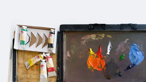
Demo: Create Thick Impasto Oil Paint Textures
Lesson 12 from: Getting Started with Oil PaintsMary Jane Begin
Lesson Info
12. Demo: Create Thick Impasto Oil Paint Textures
Lessons
Class Introduction
06:06 2Colors of Oil Paints
15:16 3Solvents and Varnishes For Oil Paints
06:19 4Demo: Oil Paint Glazing Techniques
16:05 5Oil Painting Brushes & Palette Knives
08:01 6Demo: Oil Painting Brushes
14:34 7Demo: Oil Painting Palette Knives
08:15 8Oil Paints Tools and Supplies Q&A
04:22Lesson Info
Demo: Create Thick Impasto Oil Paint Textures
Okay. So, ball and cube, we'll put these aside. I think we have time for panda. Okay, look at my hands, okay. This is the hazard of being an artist, is you get your hands dirty. I kind of love it, but ... Where's my rag, over here. But some people don't. I have known people to wear gloves when they paint. I couldn't do that. I need to touch the stuff, but again, you have to go with your comfort level, so that you do something that makes sense for you. Put this over here. So now I'm gonna do something that's a little bit of a mixed media project, simply because I want you to know that acrylics, as I said, are a really great base for oil painting. It speeds up your painting time, because I knocked this out very, very quickly. We did this in watercolor, and then I sealed it with acrylic gloss medium. And I actually have that here. This is acrylic gloss medium. It's a shiny medium that basically allows you to seal something like watercolor, and the reason why you have to do that, is that i...
f I don't seal it before I put oils on it, those oils are gonna sink right through that watercolor paper, and you'll have oil on the other side of the paper. It will be damp for a long time. So, I wouldn't do that. I sealed it to create, just like the gesso, a surface that's frozen in time. It's held here. You can't get through this layer of acrylic gloss, because it's plastic. Okay. My rag's getting a little full of paint, so I'm going to use a paper towel again. So, here we have panda. Now we can do some demos of glazing here, because this is all dry. So let's see. Let's decide on a couple of things. So Kenna, we've got our pandas sitting here, and I'm thinking that they're sitting on some sort of ground surface. What would you like to put in here? What do you think, should we do grass or something like that? Grass is always a good way to go. So maybe some greens, we've got some over on your palette. Yeah, let's use what we have here. So I'm gonna start with, I'm gonna glaze. Again, I'm going to use more of the linseed oil than the solvent, because I think it's a beautiful glaze. Now this is a very thin quantity of the glaze, and it barely changes the color. Now I can go a little thicker, and I'm using a stiff bristle brush because I could use the edge to make it feel more like grass, or I could use the flat of it, just to block in the shape of color. But, this is really a very ... It's speedy, because the oils are just, there just gliding right across the surface. Super fun. The thicker that I apply, the less the purple shows. Now that's okay. I'm trying to get it so it looks like, really, it looks like grass, but I haven't added the light of it yet. I haven't, it's the base tone. If I want it to look like there is light, like moonlight landing on that grass, then I have to add some more color. But when I paint, I always block in shapes of color first, before I go in with the noodley detail. Here's some grass. And you can see the green is reacting to that purple because they're complements. I'm trying to avoid getting the green on ... This is Po, and this is- I mean this is Pang, and this is Ping. I'm trying to avoid getting any of this green grass color onto Ping or Pang. Okay. Is that, I hope that's visible. You can see the green. I'm glazing it, but I'm trying not to go too heavily here. And again, stiff bristle brush. I'm just trying to block in the color. Now, what's fun is that I've done a quick pass with the watercolor. Subtracted out with a stiff bristle brush that had no oil in it, the lit areas, and now I'm glazing in with oil paint, water soluble oil paint, on top of two other media: watercolor and acrylics. So, watercolor first pass. Blotted with a paper towel. Subtract out the color. Seal it with acrylics. Layering on glazes here, and a glaze is a glaze when it's thinner, and you can see through to what's underneath, and it's still fairly thin right now. Okay, so this is the grass. I've added a little bit of linseed oil to thin out the color. Okay. So what about, let's see, what about the sky color? Do you like the sky color Kenna? Do you think we should leave it there? How do you feel? Feels a little dark. Mm hm. What would you want it to be? So. Let's turn it into a daytime scene. Perfect. Yeah. So, I'm gonna stop with the green. Probably gonna switch brushes. I'm gonna pull my water a little closer. I can reach it. You can see it. Okay. So there's the grass. Now I'm kind of seeing that this could be this sort of beautiful blue sky, and again, these are the deeper tonalities. I would go in after this with a lighter tonality, and I'll show you that in a minute, but let's make a beautiful blue sky, but I'm gonna make room on my palette over here, because we're running out of room in this spot. And one thing I will counsel you on is give yourself room. As I said, have a couple palettes. What I see a lot of people doing, is they're gonna try to mix a blue sky in that tiny little patch of white. Not a good idea, because all the sudden your green's gonna get mixed in with the blue, and you're making neutralized color. So give yourself some room. So I'm going to use the stiff bristle brush, but I'm, maybe I'll use a larger one. Blue sky, we've got this beautiful blue right here. We've got a lot of purple here, so we don't necessarily wanna put purple on purple. We might wanna tweak it a little bit greener. We're gonna add a little bit of white, if I can find it right here. And, I'm just gonna shift it a tiny, tiny bit, like a dite of green. Just a little, little bit, because, again, it's all about contrast, it's all about reaction. I want what's sitting on there to react. I want a blue sky, but I want it to have a little bit more green in it, so the green reacts to the purple. So I'm gonna use this brush to mix this color. It's not quite turquoise. It's gonna be a blue green kind of sky. See it still looks blue. But that green is gonna help it react to what's sitting there. Okay. So there's two ways one can paint this. I could paint it really thinly. I could thin it out with my solvent. I could thin it out with my linseed oil. The linseed oil makes it more buttery. The solvent, it's more like water. We'll start thin, and then do thick over the thin. Because we know, it's fat over lean, fat over lean. Always do your thicker colors over your thinner colors, and that's so that your color will dry. You put thin over thick color, that thick color underneath is going to crack over time, because it hasn't had a chance to dry. Oh, that was such a good choice, thank you Kenna. I love this color. So, if you look at this, look at how that blue green is reacting to what's underneath. And I'm basically gonna do like a kind of gradient wash. I think I'll shift to a bigger brush actually, to get more coverage. I am gonna use a stiff bristle brush, and I'm gonna pick up this color, and drag it right across the surface. Oh, that's yummy. Now, it's reacting to the purple. It's a little bit of resist, so I'm gonna thin it out just a little bit with the linseed oil, and a little bit with the solvent, which is acting more like water. And that's just giving it a little more movability. But this is a really lovely color, and if it was too thin, I could always just thicken it right up, to make that sky a little lighter. And I'm gonna try to avoid going over the characters, so there is a certain amount of controlling going around something that you don't wanna paint over. I could always take a rag and clean it off the character, but I'm more inclined to say, let me just try to see if I can have control, and go around Pang's ears. Now I'm using this color super thick, and you're seeing more of the brush stroke, but look at its reaction to that purple. I don't know about you, but I just think that's delicious, and I cannot emphasize enough how great it feels to paint with oil paints that have this beautiful, velvety feeling to it, and how instantly, you can have this reaction of opacity on this transparent watercolor surface. And you can really start to see Pang's ear here, because I'm mushing this color around. Now I can turn my brushstroke, I can go in any direction, but for sky, I want it to kind of be this more open gradient, so I'm tending to drag the color across this horizontal band. Let's try a really piececal, let's imagine there's a little cloud there. A happy little cloud. I'm gonna put that here, just so you can see the thickness of that, the potential thickness of that color. It's still extremely malleable. The surface is pretty smooth. I made sure that it wasn't too textured, because I wanted this color to be very, very smooth. So, how does that look on screen? Oh that looks pretty cool. Alright. If I do say so myself, that looks pretty cool. Okay, it looks like one way to me, when I'm looking at it, but I don't know what it looks like on camera, but I think it looks neat. But, you can see that green that I added, that's what makes it go like this, is it's reacting to the opposite color of the purple. Kenna, do we have any questions from the audience at this moment in time? We did have a question that came in earlier from Sunny, when you were talking about keeping your hands clean, and if there's a particular solvent that you use for washing your hands when working with oils. So, the tricky thing with ... So with water soluble oils, you don't have to worry. You can use soap and water, and I would use warm to hot soap and water to clean your hands, and it'll come right off. The same thing is true for acrylics. If you're using traditional oils, then you wanna use a terpenoid, or a similar solvent to get the pigment off your hands. You cannot get it off with just soap and water, but, once you've used the terps on your hands to get the paint off, you then wanna use soap and water to cleanse the terpenoid off of your hands. So it's a two step process. First turpentine, or terpenoid, which is a nicer solvent to, it's a little less harsh than turpentine, to clean your hands, then soap and water to wash that terpenoid away. Because it is a chemical, and you don't want it sitting on your skin forever. But that's what I would do, Sunny. There. Okay. Yeah this is really, it's a really fun process to also paint on top of this preexisting color. The hardest part for me would be, to go into Pang right now, or to Ping, is tiny modulations. I've got all this color built around, this sky pigment. I would have to be very careful, because I'm on a flat surface. This is probably where I'd put it on an easel, and paint this way, to get into my areas so that my hand is distinctly far away from a canvas. And again, you look at the shape of the brush. This is about where your hand should be. If you hold it down here, you don't have the control of that brush. It's gonna flop all over the place. If you have it down here, it's also like you're scrinching your fingers, and you're gonna get cramps by the end of the day. Right in here is the sweet spot, and I don't hold it tight. I just hold it gently. And I have plenty of control. And this is a pretty big brush too, and I'm going in a pretty small area. I do wanna show a little bit of dry brush. You can see that brush is dryly dragging across that surface. It's also a really beautiful kind of textural mark, potentially for the sky, depending on what I wanna do. I do wanna show the grass. I talked about if there is light on the grass, let's imagine this is a sunny day, hold on, maybe I'll just do a little more of the white, closer to the base. And it's very immediate. Unlike acrylics, you don't need to really layer too much to get a pretty dense amount of pigment. It's really quite, as you can see, immediate. There's a lot of color here, and it didn't take me very long to do this. And I'm trying to keep my brushstrokes consistent. Now Ping, or Pang looks purple right now, because he's still the ground color. Okay. But I wanna show you the grass blades. Right now, it's a pretty solid tone. If I wanted to also increase the darkness of the sky, I could just drag more of that beautiful turquoise color right up here. If I say, oh it's too white, I can just drag in more color. But let's see what happens when we get to the blades of grass. I really would not use the brush, it's just too big. And again, it's just logical. It's too large for this area. So I'm gonna put this brush aside. I will wash it later. And I'm gonna use a square tip brush, but I'm not going to use a large one. I'm gonna use this little bitty one. This is a number four. It's really small. If I wanna put little blades of grass, I want the mark to be pretty small. So I'm gonna use what I have here. It's already pre-mixed. Add a little bit of white to it, but I'm also gonna use not just white to define the lightness of the color. Yellow is really light, so I wanna keep the grass looking green. I don't want it to be pale. So I'm gonna use the yellow as a source of lightening the color as well. Okay. Blot that color a little bit. But this should pull right, and again, I have to watch it, because if I, on a vertical surface I wouldn't worry, but right now I'm on a flat surface. So let's just see if I can get this to look like grass. The thicker I make it, the more dense that color will be. I hope this is visible. Now, I'm using the stroke of the brush to define this sort of grass texture. And I wouldn't use a round, and I wouldn't use a soft brush, because it would make this too smooth. I want this to be the texture of grass. I can get really thick with this as well. But is it starting kind of, on screen, does it look, can you see it looking like grass? Absolutely. Okay. I can also jump in with a little bit of more opaque color. I'm not trying to show light, I'm just trying to show that it ... This color is just an underpinning blocked-in grass tone, but I want it actually to look more like the texture and tone of vibrant grass. So this is a base. I'm a firm believer in building color on top, one layer on top of another, even if it's in Pashto, because I think that creates more beautiful color reaction. And that's just my philosophy about color. Some people paint directly on the surface really thick, and they're not concerned about layering as much as I am. But that's just personal preference. And that's the grass. And again, I can go really thick with this. And I can also, I can make the mark go in a different direction. I can make it less fussy. And because it's oils, I can get a fair amount of coverage of that color. You still see a little bit of the purple underneath, but alls I have to do is build up this tonality just a little bit more, and all of the sudden that, I'm using it more in Pashto fashion. The purple is getting buried. I'm just gonna put it into that. The grass, now the grass is hitting the wetness of that blue sky, and I'm actually dragging that into the grass, to create a sense of light, and that's really fun too. So it's the malleability, the movability of this oil paint that makes this medium, I think, probably one of the most popular, historically popular mediums to be used throughout history. It was designed, oils were created in the 13th Century, and it's been a go-to medium because of this richness of color, because of this malleability, because you have this value range, because you can get saturation, because there's so much you can do with oils. So I would really strongly recommend that you don't feel intimidated by oils. Look what I've done right here, nothing here is super complicated. It's pretty straightforward. The tools are really easy. If you don't have ventilation, the water soluble oils are fabulous. The cleanup is really easy. But the color is as rich a color as imaginable, and its movability, and its velvety texture, is just really, really yummy. Whether you're doing it in Pashto, or you're doing it thinly, it's all good.
Class Materials
Bonus Materials with Purchase
Ratings and Reviews
CG
I've been a silk painter for decades and am just starting out with oils. This course was extremely helpful, especially the demos. One thing--at the very end she says that with traditional oils you'll need to clean your hands with a solvent before washing with soap. Not a great idea if you want to be healthy. I remove pigment on my hands by rubbing a clean oil on them, then washing it all away with soap.