Starting Approach to Editing
Lesson 7 from: Get The Most Out of Your Photos With Capture One Pro 12David Grover
Starting Approach to Editing
Lesson 7 from: Get The Most Out of Your Photos With Capture One Pro 12David Grover
Lesson Info
7. Starting Approach to Editing
Lessons
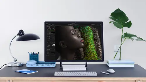
Interface Overview
04:08 2Customizing Your Workspace and Keyboard Shortcuts
15:55 3Making Your First Catalog
07:02 4Importing Your First Images
11:51 5Virtual Organization
20:21 6Basic Tool Behavior
13:32 7Starting Approach to Editing
24:02 8Next Level Editing
20:10Color Tools Overview
16:28 10Basic Copy Paste Workflow
10:40 11Basic Export
13:32 12Getting Started on an Edit
05:13 13Adding Layers to Your Toolkit
10:25 14Radial and Linear Gradients
08:21 15Luminosity Masking
10:12 16More Advanced Layers
22:44 17Removing Simple Objects and Local Adjustments
14:52 18Advanced Color Edits
05:31 19Using the Color Range to Select Just What You Need
05:45 20Editing Colors in General
03:48 21Editing Skin Tones
14:30 22Combining Color Selections with Layers
08:58 23Creating Masks From the Color Editor
10:28 24Color Grading with the Color Balance Tool
16:34 25Intro to Second Day
01:37 26Session Overview
05:47 27Tethered Basics
05:04 28Setting Up Simple Sessions and Setting Naming Conventions
10:11 29Controlling the Camera
05:08 30Handling Next Capture Adjustments
07:39 31Using Live View Focusing and Overlay
19:40 32Selecting Images and Using Smart Albums
14:55 33Saving a Session Template
03:51 34Overview of Process Recipes
05:28 35Tokens Overview
26:21 36A Simple Round Trip
14:04 37Sharpening Workflow
08:06 38Creating a Recipe for Web Output
15:50 39Selecting with a File Name List
11:46 40Using Plugins and Sharing to Clients with PRODIBI
06:06 41Image Review 1 - Sometimes Simple Works!
08:44 42Image 2 - Radial or Gradient Masks, Object Removal
07:28 43Image 3 - Keystone Tool and Aspect Ratio
09:11 44Image 4 - Using Styles in Capture One
10:04 45Image 5 - Black and White
09:13 46Image 6 - Landscape
07:22 47Image 7 - Portrait
05:06 48Image 8 - Action in Lowlight
07:46Lesson Info
Starting Approach to Editing
in this segment, we're going to be look at editing workflow, and this is just simple basic editing and work flow. And then later on in the course, we move through to the more advanced stuff. But here we're just going to concentrate on how to get started, a couple of things on how the basic tools work and how toe optimize them in the best way as well. So when we look at an image, what do we first start with? Or one of the things that you should get nailed down before you get too excited and playing around with the more advanced tools? So I've got a selection with images here, and we're going to look at, you know, a variety of different types and see how we would start the editing process. Now most of it revolves around thes tools here, so white balance levels and exposure. Let's just get rid of layers because we're not gonna look at that until later, and also to stomach some extent, high dynamic range as well. Now the exposure till I'm sure you're kind of aware with that or aware off th...
at's just making changes to exposure. Contrast, brightness and saturation, and we talk about some of the common questions which come up like, What's the difference between exposure, brightness that always comes up? How does contrast defer to curves and things like that? So we've got an image on screen. So how do we start now? My preferred thing to do generally before anything else is to try and get some kind of crop in place on. The reason for that is because the hissed a gram is dynamic, so meaning that the hissed a gram will represent what's inside the cropped area. So in this case, if we proceed for crop to get our crop tool up and then we throw on some kind of crop, let's just do this. Uh, then the levels will actually change. So if I make this sort of really small down here so you can see how the levels are jumping around because it's based what's inside our crop. So it's kind of important to get a rough idea of how we're going to crop the image because that might have some influence on you, setting your levels and so on. So let's just bring this back up, Teoh. Something sensible I mean, of course what you said the crop. It doesn't mean that you can't change it or everything's gonna be ruined, but it's, you know, a good first step. So once we got our crop in place we're thinking about is the exposure good? Is the white balance good? How can I optimize the levels? For example, now if we look at the levels tool and it's really important to get your head around how this works because it's often forgotten about and it's often not used in the correct way. So we can see here that we've got our hissed a gram, which kind of sits roughly in the middle of the Levels field, like so, which is what we want if we look at an image that is perhaps too dark. So let's take this'll one. So you can see how the hissed a gram is kind of bunched mawr over to the left hand side. So we're kind of looking for a nice hissed a gram, which sits, you know, somewhere in the middle, so like we can see on this image, for example, it's a bit too dark, so we'd want to lift up the exposure just to improve our history. Graham spread somewhat equally. If an image was too bright, then hissed. A gram would be sitting all the way over onto the right hand side. So let's go back to that first image. And what would we do with the levels, too? So exposure wise, I think it's pretty good on the step, which is often completely for gotten, is actually setting your shadow and highlight points. Now there's a couple of ways that we can do this manually. You can drag them in to the side. But the question is, at what point do I stop and you can see is I drag them in notice? How the hissed a gram readout is now nicely spreading across a whole range? Because what we're asking the levels talk to do is to take this value 2 to 4 on remap it to this value at the top 255 So imagine you're holding the ends of the hissed a gram and your word, stretching it out to those either ends. That's exactly what the levels tool is doing. So if I reset this again, you see the image, so it's quite flat But just by bringing in those points and then fixing that brings up, you know, a nice amount of contrast as well. But as I said a moment ago, at what point do you stop? And this is where we talk about clipping or women are actually removing data. Now, the way we visualize that is with the exposure warning triangle up here. So if I click this on, this will give me a colored indication of when we're starting to clip data. So that's when if we look at the history, Graham, you see, this spike is like falling off the end of the history, Ram, because we've actually cut away that data. And if I hover my mouse over in the red area here on these RGB values at the top, there will reading 255255255 Red, green and blue, which means pure white. So we've actually got no detail there whatsoever. So what we don't want to do is sort of clip that data now in capture one, the default is that your shadow warnings and not showing so you could be dragging this in thinking Why on earth cannot not see any shadow clipping because by default it's not enabled. So let's reset our levels tool once more on let's go up to preferences and we see under exposure. The first item is exposure warning, and we can see the color that is gonna that Sorry, the clipping warning color that will show and also this shadow warning color. But you can see enable Shadow warning is not ticked on. So let's take. And we can also set some values that when you first start to see the clipping appear. So by default it's to 15 0 I think that's personally a bit too low, because that's going to show the clipping really quickly, or or at 2 50 So I tend to just bump this up a little bit too. 252 or 253 so I can see when the clipping is going to start. So I know when to stop and then shadow warning Just two or three points down here is well, so now I can see when my highlights clip and now I can see when my shadows clip. So if we do a similar thing, if we bring this in, we can start to see it just sneaking in in the top right hand corner up there. And if we bring the shadows in, then if I just do it obviously a bit dramatically, you can start to see the shadows clipping a swell. So, as I said manually, you can bring these in, and that's always a good first step, and we look at a couple of examples. But to make that whole process easier, what you might as well do is click a for auto and that will just simply snap those highlight and shadow points to either side of the hissed a gram and you can see it's just showing a little bit of clipping up here. But if I remember, I have my values set to 253 So that's showing. It's just starting to clip it to 53 And if we hold the mouse just over in this section, you see my red green blue values in the highest one. Actually, that blue is on 254 so it's on the limit Now. If you're a bit worried that the auto levels might clips likely you can actually adopt the behavior of how the auto levels works. So if we go to back to preferences again, you see, we've got some clipping threshold down here. So this is how much do you want to just bite into the hissed a gram if you like. So if you feel it's a little bit too harsh, we can make this value lower. So if I change it toe 05 and like son. And if we press a for auto again, click it. Just move them out a little bit, so that kind of gives me a bit of ah, safe zone if you like. I mean, a little bit of clipping doesn't matter, but it's something you really do want to try and avoid goes something like this area up here. If that clips or blows out, especially when you compress it, you know, save it to J. Peg, put it on instagram printed or whatever. It becomes more noticeable as well. So just by in the preferences, changing those values a little bit, that will give you plenty of free space on the outside of history. Graham. So step one. Throwing a crop roughly Step two. Juggle between exposure and levels and then press auto to set those levels. Now the middle one here in the levels itself, allows you to if you like squish the whole hissed a gram over to the left or the right, so that will have some effect on the mid tones. So if we drag it this way, you see my mid tones darken. If we drag it this way, the mid tones and to some extent the whole image brightens as well. But just by using these three sliders, you can get, you know, pretty nice edit to the image. So the only thing we've done to this shop, for example, eyes the levels took. So if I hold my option key down and click on Reset, it's a lot better. It's taken that sort of flatness milking this away and given us a much better stop point. If we look at some other examples still sticking with the levels tool, let's take this guy and we're going to reset that. And if we look at the RGB composite channels and then we think about white talents, we can see the red, green and blue. They're kind of separated, so that gives me a good idea that the white balance probably isn't perfect on this image. Also, if I look at his shirt, I can see the values. If we look at the red green, blue values there, no equal, and I'm assuming his shirt is white, pretty short probably is. So a red green blue value should be pretty close. A swell. So a couple of ways to set what balance we can grab the pickup, this one here in the white parents tool itself and click on apart, which we assume to be great. So that's one method of doing it. We can also pick out various different presets as well, like so that's looking a bit cold to me. Or we could just manually use our eyes and dial it in to be something that looks pleasing and finally like the levels till we can also say a for auto as well. There's, of course, the mathematically correct perfect white balance, and there's also the one that you like the look off as well, so I wouldn't get too caught up in in trying to get the perfect mathematical white balance. No photography is all about some emotion and feeling as well, so we're in Cuba. It probably doesn't look good if it's too cold. It looks better if it's a little bit warmer, for example. But again, with this one, I would start with Let's reset. I would start with a crop because if there was some huge, you know, son reflection bouncing off the wall, that's going to give me a bad indication H on my keyboard. Because then that would show me the cropped image. And then right away we could see that the levels are not quite right, and the white balance is not quite right. So I know his shirt's white. I'm gonna balance off that and then just maybe warm up a smidge as well. So that gives me a good start point, and I can see that we don't have to make any changes to the highlights, because if I start moving that in, if we turn this and we're going to start losing the data in his shirt straight away, so you're probably fine when we hit auto levels. That highlight market is not going to move, but the shadows will pop in a little bit. As you can see down here and Finally, if you corrupt the mid tones, we could just talk on that down. So once again, we've only done two edits with this slight white balance. Tweak on levels and we can already see the difference is going in the right direction. Now, I said in the first image that what did I say in the first images? The first image I said that we're looking to, you know, improve the hissed a gram somewhat. Sometimes it's perfect. Of course, like if we take this shot, it's absolutely Let's just reset. Make sure it out to the box. You see, it's absolutely spot on exposure wise. So we've got tones all the way from shadows through toe highlights. So if we say auto on our levels, it makes a little tiny in Dent on On this case, I just might want to make sure of her chip my exposure, warning that we're not blowing anything out. And that's fine, because again, I set my values that you know, a few points for shadows on a little bit less for highlights. Now, if we look at something that is kind of shot Dhaka so we've got this image and if we look at the history, Graham. Technically, we might think, OK, it's too dark. I need toe heap in a whole bunch of exposure. But first of all, let's grab the crop and we want to get rid of this guy in the hive is jacket press H again on my keyboard and then we can look at their levels. So technically, if I wanted to bring this exposure up, Teoh, you know the correct amount. We probably end up going quite sort of hide to something like that. But it sort of ruins the emotion a little bit as well, because now it looks like it was shot much earlier on the day. I don't if the meta data is correct, but I'm willing to guess this was shot in the evening. So you have 5 30 This was taken, so that's also not very sympathetic to the image itself. So let's reset the exposure and think about this in a different way. What I would prefer to do on this is just raise up the shadows a little tiny bit, so just the shadows a bit on. This is where we bring in the high dynamic range to so high, dynamic range just literally targets on the shadows on the highlights. It's maybe not the best name for the tool, but what we're thinking about is isolating either the right hand side of the hissed, a gram or the left hand side of history. So in this case, if I bump up the shadows, then if you look at the history Graham here, we can see that Peak is just moving its way towards the center. So it's lifting the shadows. But this area here really isn't changing at all. And equally, if I bring the highlights down, you'll see these little bumps will just start creeping their way to the middle, like so. So you can see that's a really tight isolation of the highlights, which is just affecting these clouds up in the top right hand corner. So as well as having, if you like the technically correct adjustment, it should also be sympathetic. Teoh three image itself. So how I would approach this one is maybe a tiny bit of exposure, lifting the shadows a little bit and then hitting a for auto on my levels like so and that just snaps it in nicely and a quick check of the exposure warning as well. Exposure, warning. That's under the view menu. So if you wanted to short cut key that that could be a smart thing to do. A swell just to save you. Having to mouse up to this point. And I'm willing to bet it's just about blown out. So probably just a little tiny bit the highlight slider. We could actually bring that back in quite nicely, so we've perfectly optimized pretty much everything in that image, so it still looks sympathetic to when it was taken 5 30 in the evening. But we've upped the contrast a bit. We've got a bit more detail in the shadows so we can see what's going on in here, which is really important. Andi, it looks great. And once again, if we do option, click on the reset button weaken, see before and after. So just a few changes, but big benefit to the image. If we stop right there, we know that she can you know, a pretty nice result just from using the levels till exposure and hide that dynamic range. And that's it. Sometimes images look generally flat. Eso if we take a little trip to Sicily, let's reset that, commander. See, it just looks a little bit flat and slightly lifeless. And that's again because we have no information that this end of the hissed a gram. So, exposure wise, it's probably fine. So if we say a for auto instantly, you know it brightens up and comes to life because we now have a good spread from shadows away toe highlights. Now, one thing that we can do also with the levels tool, especially with the auto operation, is too. Try to remove some haze if you like, and there's a good example here. So let's bring this image up so you can see it very, very hazy. So almost like a ah blue mist, if you like. If we zoom in over back here and we just stick the cursor here to some point, you can see the blue levels much, much higher. So we've got this blue haze going on, so there is a different operation of the levels to which can help to counteract that as well. So, once again, before we do any of that, let's just get some kind of crop in place I want to straighten it. So let's use this curse it'll So we haven't looked at this one yet. It's the straight until let's just reset. So it's straight until so it means I can draw along a horizon, which I'm guessing is something like that. And then the image will just rotate about that point. See for crop. So I'm going to crop it something like this. So this is the image that we you know or at this point we want to work with. And as you can see, it's really, really flat. With this kind of blue cast in the highlights is a swell. I could try to correct that with white balance to some extent, but now the white balance is sort of off a little bit, and it still doesn't look necessarily as good as it could. So if we go back to the preferences and you'll see under the Levels tool, there's a channel mode, RGB channel or red, green and blue channels on. This describes how the auto mod work so it only effects when you hit auto by default. It's RGB channel, and that means capture. One will do exactly what we've been doing. It would just pop those shadows and highlights into either end of of the levels, too. If we switch it to this mode red, green and blue channels, it will do a different levels adjustment for each color channel. So in this case, where we see we've got this strong presence of blue in the highlights, it'll help to correct. For that, let's do a test. So I'm just going to change this back to the normal one, and I'm going Teoh clone a variant. So under the image menu, you'll find this option called Clone Variant. This makes virtual copies of the image so you can make new variants or clone. New variant will make your virtual copy with no adjustments. Clone variant will make you a copy with the adjustments that it currently applied to the image. So this is great for making like a color and a black and white, for example, or if you're not sure which direction you want the edit to go in, you can at some point clone the variant, and then you can go off on one tension and then off on a different tangent. For this case, I can show you how the two different level modes work. So we're gonna clone this and then on number two sorry, you can see the variant names here to three or variant numbers on the 1st 1 If we go back into preferences, were going to do it in the default mode. So let's say a for auto and there's my adjustment can still see. It's really kind of bluish in the highlights in the skyline at the back. If we go to the next one and we're going to change in preferences that channel mode to red, green and blue and we say auto, and then we get a levels adjustment. And if we put the two side by side, let's hide my browser. It's hard. The tools turn off the proofing, so we've got a bit more space. So the one on the left was done with standard operation, and you see, the one on the right was done with the individual channels, and you can see if we look kind of around here. This looks much better with its color toning. We've lost that sort of presence of heavy blue. If you like sitting around here now, we've still got a little bit up in the top, which is normal. We can correct that in other ways, but overall, the image looks much better. So if we look at the levels tool itself, so this is the 1st 1 and we look at red, green and blue. So there's only adjustment on the composite, like so if we look at this one and we look at red, green and blue, so if we look at the values down here. So Read has a value of 32 232 Green has 33 in 233 and Blue has 42 34 So the levels were done for each individual color channel. And just by flicking back and forth, you know, we concede quite a dramatic difference. So if you have an image which has perhaps this phenomenon of, you know, hes or it's just there's a color cast that sneaking in somewhere often that change in the Levels tour can help that go a long way. Now, would you leave it on permanently? Probably. No, I don't think it would do much arm, but it's something that you can pick up a za choice as well. So the little levels to which often gets, you know, ignored is really powerful. Can make you know a big, big difference to your image. Like one final example. Let's take this one. Reset. That super flattened muddy or we need to do is bring up the exposure a bit. White balance is probably OK. I personally would just warm it up a touch because it's a nice, sunny day just manually. By pulling the Kelvin slaughter on then, eh, water job done. Almost just those few simple corrections go a long way from this to this. So what people can often get stuck in is ignoring the levels tool and then just trying to use other different tools to pull it up to, you know, an end result when the levels told would have done all of that for you.
Class Materials
Bonus Materials with Purchase
Ratings and Reviews
Leon
This is a superb course. David is an excellent teacher. I'm coming to the end of it and have learnt so much. I've been using the software for a year, self-learning as I went along. I had watched the odd David Grover video on YouTube, but never got much further in my understanding of the software. Capture One is brilliant software and to do it justice you need to learn it properly from an expert. Highly recommend this course if you want to produce professional results.
lakiut
Excellent course and a very engaging speaker. If you are starting with Capture One 12, this is the best class to take. The lessons are presented and explained in an organized way that it shortens the learning curve. Thank you, David. Cheers!
Jino Lee
One of the best course I've purchased. Very helpful and I learned so much more with this course and in a short period of time, than all the official Capture One You Tube videos put together! Anyways David Grover is the same guy who does the Phase One C1 official YouTube videos, so there's no better person to conduct this course than him! Truly excellent and if you think you know all about C1 Pro 12 interface, wait till you watch this course.