Color Grading with the Color Balance Tool
Lesson 24 from: Get The Most Out of Your Photos With Capture One Pro 12David Grover
Color Grading with the Color Balance Tool
Lesson 24 from: Get The Most Out of Your Photos With Capture One Pro 12David Grover
Lesson Info
24. Color Grading with the Color Balance Tool
Lessons
Interface Overview
04:08 2Customizing Your Workspace and Keyboard Shortcuts
15:55 3Making Your First Catalog
07:02 4Importing Your First Images
11:51 5Virtual Organization
20:21 6Basic Tool Behavior
13:32 7Starting Approach to Editing
24:02 8Next Level Editing
20:10Color Tools Overview
16:28 10Basic Copy Paste Workflow
10:40 11Basic Export
13:32 12Getting Started on an Edit
05:13 13Adding Layers to Your Toolkit
10:25 14Radial and Linear Gradients
08:21 15Luminosity Masking
10:12 16More Advanced Layers
22:44 17Removing Simple Objects and Local Adjustments
14:52 18Advanced Color Edits
05:31 19Using the Color Range to Select Just What You Need
05:45 20Editing Colors in General
03:48 21Editing Skin Tones
14:30 22Combining Color Selections with Layers
08:58 23Creating Masks From the Color Editor
10:28 24Color Grading with the Color Balance Tool
16:34 25Intro to Second Day
01:37 26Session Overview
05:47 27Tethered Basics
05:04 28Setting Up Simple Sessions and Setting Naming Conventions
10:11 29Controlling the Camera
05:08 30Handling Next Capture Adjustments
07:39 31Using Live View Focusing and Overlay
19:40 32Selecting Images and Using Smart Albums
14:55 33Saving a Session Template
03:51 34Overview of Process Recipes
05:28 35Tokens Overview
26:21 36A Simple Round Trip
14:04 37Sharpening Workflow
08:06 38Creating a Recipe for Web Output
15:50 39Selecting with a File Name List
11:46 40Using Plugins and Sharing to Clients with PRODIBI
06:06 41Image Review 1 - Sometimes Simple Works!
08:44 42Image 2 - Radial or Gradient Masks, Object Removal
07:28 43Image 3 - Keystone Tool and Aspect Ratio
09:11 44Image 4 - Using Styles in Capture One
10:04 45Image 5 - Black and White
09:13 46Image 6 - Landscape
07:22 47Image 7 - Portrait
05:06 48Image 8 - Action in Lowlight
07:46Lesson Info
Color Grading with the Color Balance Tool
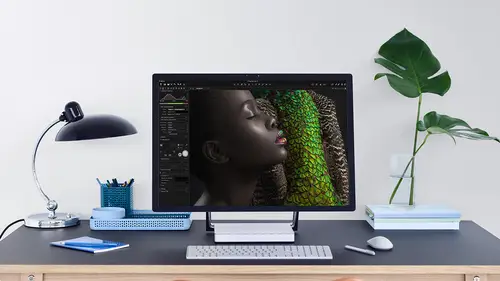
briefly, we teach you a little bit with the collarbones tool with color grading. Let's look at this going, um, the color balance stories again, one of those things that works really nicely in combination with the layer because it allows you to again moderate it with the capacity slider and also combine it with a couple of other tools as well. So let's have a look at this example, first of all. So if we go to color balance talk, let's put the whoops. Let's put the color editor away. For now, bring up the color balance to make it look bigger. So, like we had the big, scary color target for the color editor. Just a simple grayscale wedge for the Taliban. It's tool just to go in a bit more details so you can see how it works. So if we go for the master tab and I click this and drag it anywhere, that gives us a color tin over the whole image. So it's affecting everything, So let's reset that double click anywhere to reset. If we go to three Way, which is shadows, mid tones and highlights ju...
st represented, there's one, then it's gonna be targeted specifically, as you can see that to the shadows and the mid tones only affects that central part. And then the highlights just on the end, like so, so very targeted to those particular ranges. You don't have any control over those ranges. It's kind of locked down. What the shadows, what the mid tones and what the highlight. So So, let's reset that. Oh, and of course, on the side you have the sliders, which also affect the density of those different ranges so you can see pretty easily where it becomes shadows, mid tones and highlights. But it blends really nicely in between the three as well. So let's reset that and drop this quiet over here. Let's go back to our friendly pop. Where is he? Friendly pup. When we get so, I tend to like to color grade on a layer because it just gives us a bit more flexibility. So let's reset the color grade and let's make a new filled layer because we want it toe happen on the entire image. Now, before I do anything, we're going to change the A pass ity down to around 70% boy, because when we do our color grade when we look at it, and we're always indecisive, indecisive. As humans, we can either increase the strength of our color grade or weaken. Decrease it without having to go back and miss with the tool. So let's bring out the color bones tool over here so we can see what's happening. So once again, it's a bit cold in general. Now you could say, Well, let's change the white balance you could, but this works equally as well. So let's warm it up in general on then, under shadows, mid tones and highlights we can to the typical cinematic grade cooler shadows and then warmer, mid tones and perhaps highlights as well. Let's just change the contrast ever so slightly so this will boost or darken those particular zones. So the nice thing is that as this is on a layer, let's drop this back over here, weaken, turn the layer on and off, like so so we can see what the color gray does. If I want to make it stronger, I can go in this direction. If I want to make it weaker, then I can go in this direction so it's really, really nice if you start off around 70% seems to be the sweet spot. This one. Did we color great Earlier? We did. So let's reset that. And what's also nice is to combine um, the color balance, too, with perhaps other tools as well. Now what I like to do is kind of make myself color grading tool tab so we can right click here and say, Add tool tab and we're gonna make a custom to tab. So we call it color grading, and we could choose our own symbol. So let's have Let's have this son sunrise like so and say, Add tab, This gives me a whole empty tab that we can add So I will right click and add the color balance, too. And I also add the players to put that up top think, and I also add the exposure tool like So now, if I had more screen space, he had a bigger screen. I could actually add additional color balance tools, and we could have, for example, to move this one up. We could have one set to shadow one, set to mid tones and highlights. If you have the screen real estate for that. So at home, I've got enough pixels on my monitor, if you like toe have layers, shadow mid tones highlights on an exposure toe. So but for this exercise, we just stick with three way so going back to this image. There's no color grade on it right now, but again, it's really nice to experiment on the layer. So if we make a new field layer and we call it color great like so start with around 70% and then we can think about how we want to grade this'd image. The benefit of having the exposure tool in here as well is that we can also play with saturation. So what I quite like to do is drop saturation down a bit. So we're getting on almost black and white, if you like, and then using the Color Bandits tool to sort of triple tone it in a way as well. So you can get some really nice effects just by playing around with the different sliders. And once again, if it's a bit too much or know enough, we can go up with the capacity or down with the capacity so we've gone from how it came with no color grading or the way to max color grading with that lower saturation. Or, of course, we can pick any spot in between a swell again. This tall is so simple to use, it's really easy. There's no reason why any of you, you know here or watching conscious pick up and start using this straightaway. But this combination of layers, color, balance and exposure works really nicely as well. I feel so we can get super nice looks. Now this is on a field layer. But of course, if you want to, you can also go for this by brushing it on as well. If you want to put it in particular places like we saw earlier. If we returned to our problem image right at the start, this one here. So don't forget the color bands till also works nicely as a means to correct for color ships in the particular zones. So in this case, if we reset that, we had this slight issue that it was getting a little bit too cold up in the corner so we could just push that up into the highlights. Now, if you were worried about it, affecting some other part of the image. If we had some brightness elsewhere, don't forget. Once again we could make a new layer. Let's do a linear ingredient mosque, and then we could just draw this down here like so. So that's just a mosque up in the sky. I might just make the fall off a bit harder, so let's do that to straighten it. Hold down shift. So now I can target my Kalabane. It's correction, really just in that zone, so I could be completely confident. It's no messing anything up, so we go to the opposite side, so that was a bit cold. So if we warm it up, then those two colors will just cancel out quite nicely. Once again. If it's too much, we could just take capacity down. That's how it looks on. MENA calls anywhere else in between, two around something like that. So collarbones tool for creative color grading also for doing those little fixes as well. Sometimes the shadows they can end up with color casts, especially long exposures or tricky lighting conditions. Concert photography. When you've got all kinds of different light sources, you can get weird shadows and weird highlights the color balance. Tolkien really just shift the balance easily around between those alrighty. Let's dio one more example, and then we'll open up for questions. So once again, our gentlemen here, I would start with a new filled layer, so over the whole image, take the capacity down to around 70. Play with my saturation a bit on. Then there's no reason why you can't combine. Master and three wait a swell. So let's go from or cooler look in this case. So let's cool down everything to some extent and then highlights a bit. We could take saturation down even more, and then we can go full color grading or no color grading or anywhere else in between. And for good measure, why not? Let's throw in a radio mosque just to focus on him really quick and easy to do something like that. So him to see the mosque let's drop down my exposure had it right there and a bit more feathering. That's what I really like about the radio mast that you could just always go back in and keep editing it. It's super simple. Okey click on reset. So that's before and after. I only took a couple of minutes to do. Okay, so in summary, before we look at the questions, remember the cholera editor. If we go back to that Colorado eater is all about picking a color and changing its appearance. Color, balance tool for your creative color grading and so on. And on those occasions where you need to fix costs in the shadows, mid tones and highlights. Both of these become infinitely more powerful when you combine them with layers. And as you saw with examples like this one with a simple mosque just on those areas doesn't have to be super accurate. No need for all time asking. You could really isolate where the edits are. And also for this example, as you saw on this example as well, very quick and easy to do. Okay, so questions from the audience, anything you guys would like to ask. No, I will make sense, Okay? And we have a couple from, ah, the web from Day G. Can you talk a bit about the accumulative toe? Hard words say it this time, effective stacking layers. What to watch out for avoid when to use it, so there isn't really any issue. To be honest, they will. They will have this additive effect. So let's try and illustrate by. If I make a new layer which we call the light in, let's make another layer which we call darken. So if we go to the light and layer and let's, um, had say, plus one and the dark and land we do minus one something like that. If I take my brush to and let's have a nice low flow to make it a bit softer, so light and lay we just want to brighten some areas up so I could brought in his hat a little bit so we can see before and after. If I then decided okay, I wanted Darken. Then I can do so. I mean, it's all non destructive. So the combination or orders that the layers come in doesn't really matter that mathematics works out. So if we had a layer off, you know, plus one a minus one and we stuck a mosque on each one, they would cancel each other out perfectly. So the mass does make sense in that respect. But don't worry, you don't have to think about. Is this going to destroy my image or call somewhere defect? Generally, it doesn't. It's fine to just stack them on top. Um, yeah, another from Daisy or Daisy? Can you clarify when we would need to use the amount? Sliders in the skin tone tool versus the uniformity? Yes, good question. Let's go back to Ah, Skin. Let's find this fella once more. Check. Was this the one we did? Skin tone? Yep. So it's a great question, because I appreciate it can get confusing. So let's bring up our Colorado toe. Nice and big, like So So the amount. Sliders. That's changing the appearance of the color much like in the advance toe. So on this layer, we've got ah, skin turned layer. Ah, I believe. Did we have a skin tonight? Yes, So if I press m so we can see our mask, there's our mosque, like so. So the amount slide is is changing the appearance of the color eso. If I wanted to lighten my picked color, I would do so here, so that makes everything brighter or darker, but it's really subtle. It's only a smaller amount. Same for saturation. If I wanted to increase saturation or de saturate my picked color or the range I should say, then I would use this slider. Here. You see, his skin gets slightly more saturated because it's very subtle or weaken de saturated. So the uniformity, sliders is all about creating a uniformity. So in this case, we had an issue where his nose was a bit red. So what we did was bump up the uniformity sliders to correct for their. And remember the way these work. This was the color that we picked. And as we drag the huse Lloyd it to the right, anything that is in this triangle or in the color range will get transformed to the pick color. So any colors that air sort of sitting up here in the spectrum get transformed to the pick color. Any colors that sit down here get transformed to the pick color. So, for example, if I wide in this range way out and we grab our picked color on, we move over here, we can give him any skin tone that that we wanna have. So it's really about transforming that skin tone into a union uniform amount now. Generally, it's used for obviously skin tones, but you can actually use the uniformity sliders for anything else. So if you had see which had some varying colors and you want to make it uniform, boom, you can do it. I've seen it used on a studio backdrop that was a bit uneven, so they used the skin tone toe to make the backdrop even as well. So even though it's called skin tone, you can use it for other stuff as well.
Class Materials
Bonus Materials with Purchase
Ratings and Reviews
Leon
This is a superb course. David is an excellent teacher. I'm coming to the end of it and have learnt so much. I've been using the software for a year, self-learning as I went along. I had watched the odd David Grover video on YouTube, but never got much further in my understanding of the software. Capture One is brilliant software and to do it justice you need to learn it properly from an expert. Highly recommend this course if you want to produce professional results.
lakiut
Excellent course and a very engaging speaker. If you are starting with Capture One 12, this is the best class to take. The lessons are presented and explained in an organized way that it shortens the learning curve. Thank you, David. Cheers!
Jino Lee
One of the best course I've purchased. Very helpful and I learned so much more with this course and in a short period of time, than all the official Capture One You Tube videos put together! Anyways David Grover is the same guy who does the Phase One C1 official YouTube videos, so there's no better person to conduct this course than him! Truly excellent and if you think you know all about C1 Pro 12 interface, wait till you watch this course.