Lesson Info
14. Color Tools and Effects Part 1
Lessons
Day 1
1Introduction
18:50 2Optimizing Your System
11:30 3The FCP X Interface
43:20 4Importing and Organizing Media
1:05:14 5Projects/Timelines
43:06 6Working with Clips
37:22 7Editing Audio
1:00:09J and L Edits
15:49Day 2
9How to Dissect an Edit
1:24:19 10Let's Edit Something For Real
1:18:45 11Introducing Music
1:18:56 122:45 pm - Audio Mastering
1:22:18Day 3
13Introduction
05:14 14Color Tools and Effects Part 1
1:07:44 1511:00 am - Color Tools and Effects Part 2
1:07:44 16Effects and Titling
1:17:04 17Exporting
47:49Lesson Info
Color Tools and Effects Part 1
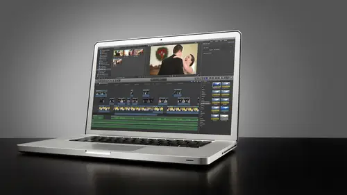
I have a key note here I want to kind of go through just to kind of explain the various parts of color grading because color grading is a multi step, multi tiered process. Overall color grading is the process of fixing and enhancing our video images, and in that term, color grating is that also the term color correcting it sort of goes hand in hand. If you're a photographer, I would almost a quick kiss two color carting her images in light room first and then color greeting would be sort of throwing actions on them later in photo shop or see your workflow might differ, but that's how I would equate that if you're primarily that really that's very relevant cause. It's called color grading for a reason it's done gradually or on a grade meaning there's multiple steps to the process in final cup is just fantastic when it comes to being able to apply different layers of color correction and grading on immediate it apples made it very intuitive to do this in a workflow that makes a lot of se...
nse, and then their latest update you are saying is helpful plug ins. Yes, the latest update, the ten point oh point eight update has solved a lot of issues that we're having with third party plug ins because I'm new blue fec's, makesem, great products but they weren't working very well on previous versions of final cut, and it wasn't due to new blue it was basically apple and I don't mean to throw them out of the bus, but there were some issues with the program that we're preventing plug ins from working properly and they've sort of iron all that out so you can pick them back up from under the bus and say thank you scream anything that really thank thanks to them for doing that because it's really I loved to use I mean, I don't go overboard with plug ins. I don't use a lot of a lot of crazy plug ins, but the ones I do use our paramount to my color workflow, so it really is helpful. So color grading has three stages. The first age of color grating is color correction this is the process of fixing exposure, normalising colors in a shot so that their true character at their given color temperature explain. So we have an image that we've shot let's say, for instance, the highlights are a little bit blown out maybe it's under exposed okay, maybe maybe skin tones a little bit too dark maybe your white balance wasn't set right color corrections the process of getting those exposures back to normal levels where they should be and we're going to use video scopes to help us achieve that in final cut and then color correcting color temperature we can actually just kelvin we can actually adjust the color tone of an image in all three areas oven images, color parameters which is highlights mid tones and shadows. We can adjust all three of these individuals we have some really powerful control there. And just to preface this, you always want to get it right in camera as much as possible because any sort of color correcting, you know, it's not going to enhance the quality of the you know, the j pay there's a little bit too greeting, depending on what kind of footage that you're working with that always trying to get it right and cameras really important. Um and then I think it's important to know and I know their questions about this in the chat room is that when rob shoots his footage usually shoots flat, meaning that the contrast levels all the way down. Um, see, you get the most data out of here trying to increase the dynamic range basically shot, but we'll get into that we have a whole thing on that, but yes of color correction really is all about exposure and color balance, and then the second stage of color grading is look building this is the process of what we were talking about before about giving your footage of very stylized look that is done by adjusting the colors and adjusting contrast and brightness to give it a look that isthe signature or or said or fits of mood. Some say that the look actually determines time of day okay, we can use exposure and a great a look grade to determine the time of day. You know, a lot of nighttime shots in movies were shot during the day on the color of the miss such to make them look like evening or twilight things like that so there's some really cool things we could do with that as well and look building is a huge part of plug ins, plug ins or great for look building and we're going to cover a lot of those as well. But it's definitely good to know the difference piece because these are the stages were actually going actually going to adjust the footage with the third and final stage of color grating to me is isolations and masks and this is where we get into adjusting individual channels or individual parts of an image that maybe one color or using masks to sort of draw our attention to one part of an image using color and masking out on ly certain areas of an image and believe it or not, with video and final cut, you can actually do this really easily easily back in the day if you want to teo with older annalise nonlinear editing systems like this if you wanted to do masking, you'd have to go outside of a program or it was very rudimentary what you could do inside the program with final cut ten it's really powerful the masking features that we're going to get into that and we're basically walking right through this order so the color grading order is important because you have to have a workflow that is consistent across all your clips if you just start take this film we edited yesterday, for instance, if we just took this right now and it started playing looks to each clip, you're gonna have really wide variations between the colors on those on those clips because we didn't color balance first, okay, and so way have three cameras at a ceremony and one camera was warmer than the other two, and we apply the same type of look to those three shots. They're not going to really match well, so we need to do a good job of color balancing everything out first, making sure exposures match across clips on dh will use what's called away for monitor to kind of match exposures and things like that will get into that but it's important to have this ordered workflow so we could do balance, look and then focus isolations and by the way, let me just preface this what I'm teaching you today as faras the scopes go in final cut is very technical it's very standard across the board for the industry of broadcast television and film and video production my method of doing it is a subjective method okay so don't feel like this is the end all be all this is not what everybody should be doing this is just what I do to get consistency in my clips I like to put that out there lord knows and same with photography and photo shop for light room there's a hundred ways to do something and everyone has their own way which is either faster for them or they think it's a better output for them same thing applies to all of this so we're going to focus on what rob does what he has found successful and then like we said in the chat rooms on the on topic chat we would love for you to just input the ways thatyou do it ways that you might have found that are better for you and they might be ones that are better for other people too or how you achieve a certain look so because some people go about it a different way and get a different result that's great I mean lookit lookit photographers across the board everybody looks so different so hundreds of my look one hundred different ways to get that same look right and I will I will you know I want consistency across all of my jobs but I do take the type of job into consideration I'm not going to use the same color looks on all of my jobs across the board if it's a a wedding that's on a mountaintop or in a field and there's lots of greenery and lush colors and were outside I'm going to use a more high contract where I might actually use them or faded look for that to give it a more vintage feel but something like the wedding we edited this in this workshop where was all indoor light lots of poppy colors and things I went with a more vibrant look so yeah, there are differences between maybe a couple of jobs but the the kids the equality of the consistency across that project is the same for every job so you know we're doing using the same method but the color tone and what we do with the final look might vary from job to job but it's still this does have a distinct look because of the storytelling brings it to think of it as well. So all right, so it's very important to have an ordered workflow we're gonna go what we're gonna walk right through that because trying to judge everything by your eye from shot to shot will get fatiguing overtime on by the end of the project you might not be as good as you were in the beginning trying to get things to match and you sort of become biased overtime to you might over the course of, like, a three year, four minute film as recalibrating toward the end, you might have found a better way to do something, and then it doesn't match, and then you have to go back and go redo the ones, so it does match across the board. I know I've done that. My photo editing it's like the first one I edited look well, my about the time we've done to the end, if I put the last one in first one together, it's completely different, and then I have to go back this's, where video scopes come in real handy, and if you don't know what video scopes mean, we're gonna get to that, but their actual, you know, readouts on screen that shows where are chroma levels are looming levels are you know, where we are exposure wise looking at an actual technical scope rather than relying on her eye to give us judgment. So we're going to definitely focus on the scopes because of that we're gonna learn, learn to use those and video scopes don't get tired waiting always count on the scopes to give us consistency across the board, so let's break down the stages of coloring. And then we'll apply it alright, so color correction has a breakdown of what we need to do with in color correction and balancing before we get to look building so color correction the first step in color correction is to set the focus exposure can we use what's called away for monitor do this the way for monitor is a read out of lumen levels across a video clip reading left to right, and we'll show you that in a minute, but basically we need to get our skin tones where they need to be brightness wise, okay, underexposed image is going to be a high contrast in high saturation in skin tones, which is bad is going to get dark tones, so we need to get skin tones elevated to a nice loom, a level all right, there's a there's a guide for that so that's our first step, then we need to focus on setting the dynamic range and increasing the dynamic range of shots it's really kind of amazing our eyes, and our analog brain sees so much dynamic range and we talk about cameras having stops of dynamic range. Our brains have almost unlimited stops of dynamic range. We can see uber bright lights and keep detail in them for the most part until our brain just can't process how bright it is anymore, and I start to hurt everyone in here is going to start looking at all the right boxes and rise and then our brains are also capable of finding very, very vory fine details and very dark shadowy areas so we see this large range of dynamic range cameras can't do that and digital processors can't do that so a lot of times we have to sort of fake it and we have the latest scene or shoot something as such to make it make details and shadows come out and make highlight areas appeared not blown out and trying to keep detail in those areas. So ah lot of times when we shoot something with the camera in order to keep dynamic range, we end up compressing an image and well, what I mean by compressing is we're just kind of just getting it to work however we can dynamic range wise in our job in as a colorist being an editor is to kind of expand that dynamic range on screen so it's more pleasing to the eye and so it matches other clips and that's that's what I mean by setting the dynamic the dynamic range it's very much like adjusting contrast in brightness you know it depends on what you wanted to look like it how much contrast and brightness you want in an image so that's key so focus exposure, dynamic range and then finally will do color balancing so once the exposure is correct then we can worry about the color tone if you adjust your color tone before your exposure your colors going change as you change your exposure so you want to get exposure set then work with color then we have to do matching we have to do shot to shot matching we have to make sure that every shot as they play through look consistent and there's not wide variations between exposure and color balance exposure is a little bit more forgiving because certain shots that are taken from different angles might generally have different exposure is based on where we're pointing if you're pointing shooting into somebody who's standing in front of a window and their silhouetted that's a totally different exposure then if I'm shooting them straight on and they're getting side light from the window so exposure as far a storytelling goes can be convey eri from shot to shot color should definitely match because somebody I'll pick up on the color difference like you guys are familiar with the matrix every time they were in the matrix in the movie everything had this green cast right? Well that was like the director's way of saying ok we're not in reality this is some sort of unreality that we're in and then when they were in the real world everything was you know, faded colors and drab and dark you said you had this very, very, very distinct look between the two worlds to do two story tell we're going to illustrate some of that in our color greeting today and how that equates to shot the shot matching as well. So that's the first stage color correction and I know we're really breaking this down into my new detail but when I explain it later I want you to kind of keep this in mind okay look, building is our second step this is the sexy part this is the fun part of color grading this is where we get to kind of make it look beautiful and cool and give it a really stylized look. S o it sets a mood okay it's going to set some sort of a mood and tone for what the visual that we're seeing it also is very good for illustrating time of day and weather okay, you can you can make a bright sunny day look drab and dreary like it's almost about to rain using color and exposure it's really kind of cool what we can do with that like we said, it gives it a stylized look so look building has many, many different applications we can use plug ins, we can do it right in final cut we can just change the simple one channel color tone of an image you can just you can just make up an image look warmer by adding some yellow red to it and that just makes it look like this is nice and warm or we could add blue and cool things they want to make you look very like dark and ominous so look building has a lot of different aspects to it we'll get into that so finally for cleanup in isolation masks these air really great we're going to use final cuts, color and shape masks tools these air really powerful simple to use and conducive really cool things on dh focus isolation is the process of let's say for example I have vanessa we're doing a dialogue over the shoulder dialogue okay? So you see my shoulder and her face is facing me and were shooting from this way on dh let's see there's a lot happening in the back of this people running around all kinds of stuff we can use a focus mask just to kind of get the viewers I tow lead right into her face by coloring her face slightly different from the background or saturating her face a little bit differently than the background will show you show you how we do that too all right, so now that we understand the breakdown of the three stages of coloring now we have to start to understand how final cut deals with all of these things so we have some homework to dio we have to look at the color board and video scopes the image on the left there is the color board the color board is broken down into three tabs if you will color saturation and exposure you'll see there the four dots going along the color board each have a different function and affected different area of the image the larger puck we call these punks called um puck's the larger puck there is the global puck if I move that one around it's going to change the overall color tone toe whatever color I tell it in that image right the black puck is for shadows the gray one is for mid tones and the white one is for highlights we're going to get into all of these in detail we can also adjust each of these individually for both saturation and exposure as well. So it's really powerful lots of cool things happening here so the color board we're going get into in a few minutes the image on the right hand side there is that is called away for a monitor and the way for monitor has a couple of different displays that will aid us in adjusting exposure and color balance the view you're seeing there is what's called the rgb parade that is giving us a visual representation of all three channels color channels in our video red, green and blue the primary color channels okay, we can adjust those individually for each highlights mid tone and shadows it's really interesting this so much we can do to change color tone and if you're familiar with photo ot how many of you were familiar with photo editing and now we have a couple of photography so if you're familiar with this stuff guys, you kind of understand what I'm talking about the exposure tab of the colored board is very much like our curves okay? There's no curves adjustment direct curves adjustment involved but we can do we can affect an s curve or producing escorted by using exposure on this so video scopes come in many, many different forms and I want to show you those in just a minute I want to show you a scale real quick and I'm gonna reference the scale a couple of times as we're trying to get skin tones toe look natural and it's called the ansel adams own system okay? And this grady in when we talk about exposure we're thinking about a grayscale grady in I'm not factoring in color yet I just want to get my exposure set to correct grey scale to correct grey scale you could say zero on this own system is black ten would be pure white skin tones tend to lie right within that five to seven range ok, so using our way for monitor which is measured in units of what's called I r e which is just luminous values from zero to one hundred very similar to our ends latam zone system the bottom will be zero the top will be ten for white and some we want to get our skin tone exposure right in here in the face somewhere between fifty and seventy I ar e on that way for monitor and it falls directly within that five to seven range on this zone system this is just a good linear representation and when you see the way for monitor and referenced this you'll understand what I'm talking about but skin tones again like I said, they lie in the five to seven ranger approximately right around sixty I r e on the way for monitor so with all that in mind let's move over to final cut and let's just look at the scopes and look at the color board in more detail just so we have a general idea of what we're looking at here so the first thing I'm going to dio I'm just going to close our video skips for a second I'm just gonna open up the video board so we can kind of see what it is we're looking at here and if I just click click on one of the clips I can come over here to our inspector window and under where it says color here we have a lot of different options for things okay color this color tab in general is our overall color affecting for that clip aiken toggle it on and off, so if I've applied effects with it on, you'll see them if I click it off, you won't see them so it's a nice way to toggle back and forth and get a sense of what it looked like before and what it looks like after we've done color correction and balancing that sort of thing. Okay final cut pro ten will actually asked, well, I should give you the option of automatically balancing the color of your images and sometimes it works great sometimes it works great, sometimes it misses the mark or makes things looked a little bit too blue or two yellow, it just depends on the native color and color temperature of the video clip, so I don't really trust it too much. I will use it for a quick fix sometimes or I'll just try it real fast to see if it actually worked where it says balance, not analyze that means that we didn't tell final cut when we imported these video clips to analyze for color balance on import, you can tell final cut too hey, take a look at all these clips and then do what you think is best this forest color balance and it will try to do its best to balance it out we can also use the magic wand tool down here and select match color and that will sometimes works and sometimes it will not for example let me go out I actually have a set of clips here that I wanted to use teo to demonstrate this we have we have some shots here that are a little bit too warm o r maybe like light was not very good in this room when we shot this we had overhead very fluorescent lighting that was giving off this sort of yellow green cast very attractive on skin tone seems so what I want to do here I can go on manually and try to adjust this but I just want to kind of kind of show you the power of the of the balance color if I just come down here to the magic wand clean balance color okay? It did what it could to try to make whites white gray's gray and darks black okay, so it's using a mathematical algorithm the only problem with this is I can't go in and now find tune that because once final cut does a balanced cover color it doesn't show up in our color board as anything having changed. All right? So it is what it is on it's fine if it works, if it doesn't I'll move on and do something more natural let's try it on this clip balance color okay, so it definitely got her skin tone a little bit less red yellow and a got our white a little bit whiter is a little bit of a blue cast here, so it kind of worked. This clip hears it will be interesting because we have a lot of blue and we have a lot of yellow, okay, and whites are generally like a grayish yellow sort of tone. So if I just go balance color, let's, see what it does helps when I have the right clubs. So I did sorry that one's coming there we go. And that when it actually worked pretty well on just to get the balance between white and grey and dark shadow areas matching so that would actually work. You still see the red on the bottom of her very expensive shoes. So that's kind of cool and we'll get it. We're gonna get into more of these clips a little later on, you could turn off the balance and toggle it as you wish, just to test to see if it works. All right, but I and I just want to show you that we're just kind of going through the effects window at this point. So if you had told final cut to balance color, it would tell you here that it had analyzed it and that the properties have been changed. Okay, we can also also match colors from clip to clip will get into that a little bit later when we actually have some color correction done but I can cop I can make I can tell final cut make this clip matched the color of this clip and let me just demonstrate in a nutshell how that would work. So if I just click on him this clip and I go to the magic wand or I could come up here to choose for match color and just quick match color it's gonna open up this second window here and ask me which clip I wantto copy the color parameters from now, I probably wouldn't want to do this in real life because this color tone is much different but want me to show you what it does, you know, it's going to copy over whatever's on the other clip now that's not a real good example there, but it just kind of shows goes to show you, let me try it on this clip here match color and we'll try it with this one that actually worked out pretty well, ok, so now they definitely matched the color is not really ideal, but they definitely match, so there are some really great ways to get things the match easily right here in front of it if I want to apply it I would just apply apply match and of course you can use keyboard shortcuts for that if you want to do a little bit more quickly yeah I'm just trying to get a visual representation of where we stand with that so okay cool so let's go through the color board a little bit and now that we've covered sort of what we needed to cover here in this color window we have this very important bar here titled correction one this is cool final cut will allow us to have a cz many different correction nodes or correction levels that we want we can do many, many different ones that we want and that's fantastic my general workflow works like this I do all of my color correcting an exposure, correcting and color balancing in correction one and then any look building which is the second stage giving the clip a stylized look I will do either by adding another correction and doing it over as a filter or than or use a plug in you don't need to add a correction layer to do to use a plug in the plug in mortis act as a filter don't let this fool you if I put a second correction underneath here whatever I put apply to this correction layer will actually go on top of what I've done on one so it actually if it made more sense he would actually go on top like that? Okay, so we can actually, you could actually arrange these two get different looks, you know, see if you wanted to put your look. You know, I'm more on the bottom or whatever, you could just move those around. Okay. But that's kind of cool. Um, each of these have several different features, all right? And we'll get to the colored board in a second. I just wanna walk through these buttons real fast over here, next to correction one. We have this little eyedropper tool with a little plus sign. That is for color masking. We're going to get into and illustrate that a little bit later on that's. More of a secondary color corrector or color correction tools. So we'll get into a little bit later on, and then we have shaped masks, which is what we were talking about. Focus isolations. And we'll get into that as well. This a little back arrow here will reset any correction. You applied to this correction. One layer. So if we decided the end, we messed it up. We did all these changes. You could cook that it will revert. This will revert all of the color grading that you've done to that video clip that back arrow right there were sent all corrections. Okay, so now we're ready now that we're familiar with the dialogue here and I'm not worried about any of these other ones we those there other functions will get to later we're just focusing right here on the color box all right, so let's go into if I click into color one this brings up our very familiar color board alright? And the color board is the crux of what we're going to be working with when he comes to balance an exposure. So like I was explaining for we have three tabs one for color we have four pucks. This is our global and I might just back out here and just kind of demonstrate if I move the global around to get the right clip selected my bad if I get if I start moving this global puck around toward the green, you'll see that we have very high green cast if I wanted to reduce green eyed pulled down from below the line this is how this works. This line right here represents the original color of our image ok, any time you want to add a color or move the color tone toward a certain range and my mouth's just died, you push up on that line but if you wanted to pull away a color, remove a color you would pull down you see those is a spectrum of color there that middle line represents the original color of the image. If you pull any one of those pucks down, remember, the large one is for global that affects the entire image itself. All three shadows highlights in mid tones, and then those individual puck's the black shadows, the greys mid tones in the white is highlight areas. If you want to remove a color from any one of those you pulled down from the line on that color, if you want to add more of that color, you could just push up. And so for example, if you want to make the image a little bit cooler, you would pull down from away from yellow. Red blue is the complimentary color, and then if you wanted to add a little bit of warmth, you'd push up into the yellow. It doesn't matter how you do it. Either way, if you do it on the blue color or the yellow color either pushing up, pushing down it's six of one half dozen of the other, they won't give you the same effect. You know, what's nice about this is, you know, her shoes, they're they're white, but because they're under a yellow light, they look a little bit yellow so you can just adjust the highlights, exactly color tone. And especially for weddings you know that is that's really important? You don't want a bride's shoes or dressed to look any different color than it should be? Do we have a question over here good when we're importing media to optimize the media is their own advantage transco two four two two right away can we do more with it then if we and it native h two six four that's a good question I tend to think so. Yes, I think there's more data to work with you're not necessarily gaining anything by doing that, but you have mohr play with the data that's on the existing image won't degrade us fast. I wouldn't say that because it depends on the issue of the image that you shot if you've already got noise introduced in your image and then you go affecting exposure, you're going to add more noise. If you have an absolutely clean image that was shot at s o one hundred and the exposure is fantastic, you'll have a little bit more play ifyou're highlight areas are not blown out and you're black not really crushed, so I think for two, two will definitely give you a little bit a little bit more to work with, but overall the image that you're capturing depending on how you shot it will ultimately determine what you have to work with this is why we shoot flat this is how this is pretty much how my images look when they come out of the camera very flat very little contrast very little saturation very little you know, in the and the reason I'm doing this is because I'm trying to get us much dynamic range is possible I want to see as much detail in the white areas as I can and I want to see is you know as much detail in the dark areas here like in her hair and stuff and this is the downside of the slr video because it is a compressed format and that's the beauty of working with ultra high def yeah and the idea behind that like rob said shooting flies you can always add contrast later that is not difficult to do but taking it away and trying to get that dynamic range get those details in the shadows and the highlight areas is much more difficult to do with not impossible in certain situations you guys will be able to see in this second that screen comes on we'll show you what these images look like but yeah I really want to shoot flat because I want to give myself a cz much to work with not shooting five red epics on my wedding you know, five red epic footage of my weddings I'm just not doing it so for dslr shoot flat we started putting it on the neutral setting but um and then now now, then we started bringing the saturation of the contrast down, even mohr so we almost have a user defined custom setting in our cameras just there's also some great third party neutral settings, one by cina style technicolor senna style is one. You can load that onto the onto your dslr, and they make one for cannon, which is fantastic nature of the work that nightgown to I wouldn't know, but it's cool because it really gives you a very flat image, and then they I also have a color plug in or color application that work specifically for the sinister I'll preset to give you an s curve that's very similar to tell us, ian, how they do tell us in color, I'm using film to cinna style is an old tell us entrance coloring the transfer method. So I have another question. Yeah, actually, that if you're working in the highlights or the shadows and you want to color corrected is a better, too bring the color is down in the highlights and up in the shadows, or does that not matter? It will depend on the image it's really gonna depend on the image and what you're trying to do again, it's so subjective as faras exposure goes, we can adjust the exposure of the highlights. And the shadows independently to kind of get that balance there when I showed you video scoops I think it will answer your question a little clear you'll be able to see a visual representation of where the dynamic range lies across the clip you're looking at on the way for him and we're getting there okay we're back so real quick this is what my footage looks like when it comes out of the camera it's very, very flat so let's play this full screens you could see not a whole lot of contrast and this image this tv monitors actually way more contracts adding contrast it's much much flatter than that actually so I like to do this I can add is almost as color information there I can boost it up I can reckon make it a saturated as I want okay but that just illustrates that for you let's get it let's go back to the color board here, let me, uh get you back into what we were talking about before the crash. Ok, so let's, open up our color board again. Okay, so you're saying but you see by pushing up into the green I'm adding a lot of green if I want to take away green which is in the opposite is magenta I'd pull down. If I wanted to do the same thing over here I could add magenta or pull down away from agenda, which is green, and it gives me the same effect. Okay? And this color board is really cool for that. We can adjust the individual so just the shadows using the black puck, you see only the darker and darker parts of the image of being affected. So if I want to cool this image down, says, reset it, aunt, take away some of these some of this yellow tone I wanna pull. Well, maybe I'm more always more concerned with skin tones and then anything else because of skin tones. Look natural, your eye will believe the shot there's a kind of a universal ruling in coloring for video and film it grass is green and skies are blue pretty much you will believe what you're seeing once we see purple grass, we no longer believe we're in reality, so just keep that in mind with skin well, alice, would you like to go back to wonderland? Well, so basically, yeah, and skin tones for me on an indoor location. Skin tones for me sort of become the basis I want to get the exposure of my skin tones, right? So they're bright and where they should be on that scale, the adam janet's latam scale, and then I wantto make sure they're not overly saturated red or you know, we're not losing too much detail, so if I want to just remove some of this yellow, I would simply take my mid tones park. Why my maid tones, puck, skin tones live in mid tones, okay? And I'd simply move us over to the yellow and just just bring it down a touch and it's adding a little bit of a blue cast, I understand that, but I'm just trying to remove some of that, and then you could also pull down some saturation and that'll help you, teo, take out some of any any harsh tones. I mean, in new jersey, brides like the over ten and I heard in that in ireland to actually it's fairly common, strange, but so rob is getting at is we d saturate the image, and particularly just the mid tone areas to get some of the orange and red out, because self tan wall might look good in person sometimes when it's captured not really flattering most of the time, shooting flat will help to alleviate some of that. But if she's next to her groom who's got really pale skin not wow, it really just notices like huge difference in the shades and that's we're getting our focus exposure and doing isolation masks will really help later on, so that's going be really kind of cool. Okay, so as far as color, the color board goes that's pretty much the way it works, and we'll get into more of this and in further detail as we move along. But don't be intimidated by what you see here. In fact, it gives you a little visual representation by the plus and minus signs here. This is pushing toward the color. This is pulling away from the color. And then these parameters down here, basically, just a numeral value based on what the pucks air doing. So we can actually drag these individually like this up and down. This put you toured a sort of you know where on the scale you want to be. And then the percentage will be adjusted by dragging that so the couple different ways to skin a cat now interesting about that. Is that the way that our editor, who was color blind, used to color? Yes, I had another editor that was color blind, believe it or not. But he used to know he'll use his video scopes, but getting it to in a minute, he would just live by the scopes. And it is long as the scopes were on. And I'm going to see there's a scope called the vector scope that has a skin tone line is loana skin tones fell along the skin tone line colors look great and he was one of the best color correct the way time really good so yeah that's the color borden nutshell for color let's move over to saturation saturation I think I just showed you a little bit of this we have again a global adjust we have a shadow's mid tones and highlights a justice well moving up higher saturation moving down his lower saturation so higher saturation lower saturation black and weight is all the way down. Okay, we can de saturate on ly parts of our image we wanted on li de saturate the shadows we can do that if we only wanted to saturate the highlights, we could do that. Okay, you corpse? Yeah, no, we don't want that the adams family okay, so no pun intended unintended way want to reset? Oh, great. That's him all over twitter. It is all right, so if you want if you want to pack one d guys one day not too yeah, my last alright, so yeah, so you just click here it always reset everything foryou exposure now this is my I mean, this is keith thiss control right here is worth its weight in gold here in final cut for me with the lack of having a curves adjustment and if there is a curves adjustment somewhere the program somebody pointed out because I want to see it um this is great I can adjust the overall exposure of my image from obviously way blown out to all the way super black so I will use that these sliders individually for the most part to get their focus exposure where it needs to be and what I actually go through the workflow in a in a few minutes we'll see exactly how I do this. Nothing else changed as far as anything else in the window it's pretty much the same. A saturation. Okay, so color saturation exposure, the three main areas of color, balance and correction. Okay, so now that we're familiar with the colored board let's talk about video scopes, video scopes are going to give us a visual readout of what we're seeing here in our image except on a scale of numeral values, okay, and and waves in what we call trace traces just the wave itself and what the value of that of that wave is for the exposure and color of an image. So access our video scopes we can either come come up here to the little trigger little switching hit videoscope so we could use command seven opens up the video scopes, depending on your system. I don't know which one is going to open up first if you drop down this dialogue here, there's a ton of different types of scopes in different parameters for those scopes. I don't know which one's gonna open first on your system sometimes it's history ram. Okay, if you're a photographer, you're familiar with what a history ram is history rams we're going to we're going to use these to help us help us set our dynamic range in our shot. Primarily though, I'm using this one called the way for monitor. All right, this goes back. I mean, back in the day and television, this is what they used to make sure exposure was good before it got broadcast because you couldn't trust tv monitors. Back then, you couldn't trust what you're seeing from the camera. He had to go buy scopes to make sure things were what we call broadcast legal. You'll see here there's a numeral scale on this way for monitor and the way the way we the way for monitor reads is you're looking at the image from left to write, just as you're looking at the image here from left to right, okay, the difference is the way form up and down, telling you the luminous values of that image from left to right so you can sort of see that we've got we've got highlights air highlight areas in her skin tones right in here. Okay that's this area of the image okay, so you can definitely see that there's some speculate highlights and things like that in there. So this is the way we read this is on a scale from zero to one hundred. Anything over one hundred is considered super white. Okay, so if one hundred is absolutely white and zero is absolutely black, anything over one hundred is super white and if you were making a video that was going to be brought, you know, aired over a tv signal or, you know, a broadcast signal, anything over one hundred is going to be completely washed out and just destroyed, and it might even cause artifacts and flickering on some of these tv set s o you know, broadcast legal is keeping your highlight areas below are at one hundred down here on the bottom in the shadow areas, you're really kind of looking at the dark areas of the image all lied down in here. Basically, the way it works is shadow areas live from zero to about twenty five, maybe maybe thirty mid tones live it like thirty to about seventy five and then a highlight areas about seventy five to one hundred and beyond okay that's how we're technically reading that so if you were to divide this scope down into threes you have shadows mid tones highlights and you can see here all of our mid tone data this is called the trace everything you're saying is also called the trace and the unique thing about final cut pro ten is that it's added in the ability to see not on ly luminant which would be measured in white and gray and blacks but you're seeing color in here old school wave form owners did not ever show you color so now you can really look at this and see oh I see I see your skin tone and when we make adjustments on the color board for exposure and I just the mid tones you can see your mid tones rising on the skull to get him up member the ansel adams own system will skin tones are supposed to lie between fifty and seventy right around here that's where skin tones for optimal exposure of skin will lie and as we adjust that we'll have to compensate you see our image gotta lot brighter in the highlight areas and shadow areas we have to compensate by bringing down our shadow areas and working with our highlight areas just to get a nice balance there of exposure and we'll get into more of that and some and other things in a minute I just wanna walk through the other scopes okay but that's sort of a uh an overview of the way for monitor another part of the way for monitor is the rgb parade and this there's a lot of others we can look at individual color channels just the blue just the green and just the red but this nifty little feature called the rgb parade will show us all three at once yeah all right and this is the this's the tool I'm going to use primarily to make sure my color balance is correct and we're applying the same principle as the way for monitor with luma values were looking down here to make sure that our shadow areas are balanced equal tones of red green and blue mid tones you can see here there's a lot more red then there is because it's higher up on the scale than there is green and blue and that's what's giving us his overall reddish yellow warm look okay highlight areas same thing they were seeing a little bit more red in the highlights maybe a little bit more green and or highlights right here then we are blue somewhat balance our job is not to get these exactly straight across the board for highlights midterms and shadows our goal is to make it look natural by balancing these okay by getting them close to making it look as natural as possible so the two primary way for monitors we're going to use our the loma and the rgb parade there are others there are there's the rgb overlay, which now I'm looking at not only my loom of values but each individual color channel on my way for monitor from zero to a hundred okay, now the question I often get asked is what happens with affordable not producing a video for broadcast and I'm just doing it to put it up online? Well, the web is very resilient white is white there's nothing beyond white there's nothing beyond black nothing that you show on a computer screen is going to read beyond that and give you problems. You're going to lose detail in those areas if you push it beyond that, you can bet that anything you pushed beyond that one hundred mark, you're gonna lose detail going to blown out and anything down below zero is what we call crushing the blacks crush your blacks, your going down below zero for the most part okay, so the question I get asked this what is it okay if I do that and honestly, if you're just producing for for the web, you're fine with going a little bit over and a lot of times speculum highlights will jump up over that one hundred mark when you, when you when you spread this way form out so that's just I know that question will probably come up that's a good one to know so that's the way for monitor and that's a really key tool that we're going to use to do all of our color grading the second one I use and this is a a way to measure color only chroma it's called a vector scope okay and back in the day you walked into an old tv studio and even some tv studios now the's scopes were based on old hardware units they were like this deep and about that thick and had a screen on the front it looked like something from like nineteen sixties moon landing nasa and this was used to measure luminous and chroma values and you had to adjust them via knobs to get your video signal where it wass well that's the same thing as we're looking at here except it's on a digital digital format so what you need to know about the vector scope is we're looking at a color wheel and imagine we're looking at a color wheel but we're looking at it from the top down so if we were to turn this on its side we'd see a cylinder with colors going around it okay the outside of that cylinder the outside here is very, very saturated images of very very saturated colors as we get closer to the centre we have less saturated damages the very very, very, very middle right there that little point that represents gray scale okay anything that goes outside of this area in any one of these directions is color so we have that dot is gray scale this is all color and as we move outward to magenta and blue and cyan and green and these are the primary colors we are moving toward that color tone so if I select a certain image it's going to tell me where my colors lie all right? So for this instance we have a lot of color in this image and it's the traces telling us where all of our colors go. We have a lot of red and the reds very saturated that's this area right here that's the speculum highlight thes red's right here the pinks you can kind of see the shift toward magenta for that pink right here then you're yellow rather I'm sorry and then you have this yellow tone in here which is more of this color so it's really kind of cool to not only see the white value moving toward the color but the actual color represented itself. This line is what we call the flesh tone line your skin tones to make them look natural should fall on that line or be as close to that line is possible now different ethnicities will fall differently along this line darker color skin will be slightly more subdued and maybe a little bit more towards the the red and caucasian skin tone colors will be more toward the yellow and maybe further up, you know, so and there's, you just have to judge by eye, but as long as you're on that skin tone line, you're in the right area. If skin tones are way over here in the blue, you know you've got problems or you're filming smurfs so that's the vector scope and we're going to use this vector scope to make sure that our skin tones primarily or falling where they need to be. And when we color balance, we can use this to tell us where gray is. Okay, let me demonstrate this for you actually it's kind of cool. We're going to show you the power of the vector scope. This is some nice four k footage that I shot with a cannon one d c I'm just going to close our color board here for a second, so I can, uh, just expand this or if I can find what issue is this? All the zoom in a little bit. So basically, you can see that we have a very green cast here. Okay? The color tone was just always over to green I just want to capture really ugly image, so basically, we want to balance this out. Well what we need to determine in order to balance this out using the vector scope is well I mean we could take all those knobs and start adjusting until our hearts content but it might take us a while to really get it right what we can do is narrow down this image to a point where we're just looking at what should be gray because grey is the basis of all color if everything is balanced by gray scale you could you always use graze a reference so if I just come over here and you'll see that I have this little crop tool which allows us to crop are images if I just grab this and drag overcomes cropping my image not permanently just for now just cropping the hopes and wanna move it sorry just cropping it down the on ly the area that I know should be gray scale which is the roof of this house just the roof of this house I know is gray because it was a gray roof all right if I go I have to open up my scoops again command seven if I look at my vector scope now you'll see that we're not gray we're moving more towards the green so we need to get this back to grey so the way we're going to do that is by using our color board right selecting our image come over here and we're gonna use our color board and now we got to just start playing around we've got to try to get that that trace this is what the part read kind of foolish just doing this stereo just trying to get that all of those color trace is right around the gray area and this bear with me sometimes it's a little tough there we go and that I could probably pull saturation down this a tush okay, now now that I've done that I've got it is close to the center gray markets possible if I just come out back to my inspector window and just released the crop by clicking this little back but you'll see that our images now balanced that was fantastic full on that yeah so now I mean in the differences pair I mean look at the difference that's a huge different skies of blue grass is green okay, you robbed you were bringing me I'm not a photographer but I've seen those great card steve over bring those on site too do the matching yeah, well, it's funny you think we should we don't use great cards we always dialling kelvin's manually on our color tone on our cameras is set for the particular environment we walk into a room and has very green fluorescent lighting or like they're giving off a green cast we'll adjust our color tone in all of our cameras over more to the magenta kind of offset that and since we're shooting flat we're not over saturating our images so therefore we're not getting too much bad color cast in there rob sorry he's used at one point or another I was going to mention the expo death the problem that arises is you know, rushing into ceremony you've got three cameras set up you're all in different corners of the room even if you all use an expo disk it's not going to read all the exact same way depending on where you are so what they do usually they've cut headpieces in and like all right we're a thirty two hundred here and you match exactly maybe adjusting little obviously depending on where you are right exactly just faster so that's the power of vector scope everybody gotta understand that any questions about how the scopes works so remember we're gonna be using our vector scope primarily just for skin tones and if we have to do some crop matt what I call that cross matching if we have to do some crop matching we'll do that we'll also use the cross matching for skin tones if I need to get in on a bride skin and just see the valley I just want to see like the loop the criminals values for just her skin here actually I can show you this is actually very good to know let's say ok this is a really under exposed image let me just make sure there's nothing else happening here is going to reset that okay good this is a pretty underexposed image if I go into my room away form here okay you can see here that her mid tones air really low they should be up here in this range okay so if I want to just see what I'm doing with her skin tones I can use my crop crop in because I don't really need to see the values for all of the image and I really just want to focus on that one part command seven open my video scopes now we're just looking at her skin tones okay now we can increase the value of the skin tones both both luna and prominence by using our color board exposure and mid tones or where the skin lies so I was going to push that up you seeing you're seeing her face their wash out a little bit we're going to bring back that saturation color I just want to get this this is called the focus exposure we're just getting the exposure of her skin tones in the right and the right spot and this is gonna look ugly when I when I undo this okay but that's the way that's the brighten her brightness of her face should be there now you're seeing her skin tone is up in this area now we compensate for that by bringing back down our shadows remember, we don't want to crunch the block to get a pay special attention to what's going on down here in our shadow area that's pretty good I don't want to lose too much detail I don't want to crunch him too much if you want to get real precise, use the arrow on your keyboard, okay? And then our highlights weaken kind of just get this right around where I need to be. Maybe not even so much around there that's fine, and now we haven't done anything with the color yet, but at least the exposures where it needs to be it's a big difference, okay? And now when we just the color of that it'll look more natural right now she looks a little washed out because we really haven't done much of the color and then after we apply color, you can always go back and tweak the exposure a little bit to get where you are want to be, but generally speaking, I would I would take that over that any day, just being this. These monitors are a little washy, but you kind of see later on how we get into that. But that's, the first step in color exposure correction is just working with the focus exposure, any questions? Yeah do have questions online way we could take some questions that's a good time one from zach purnell is color grading in color grating doesn't make a difference if you're working with proxy media or versus the original that's a great question it makes a huge difference you always want to be using with either your original or optimized media before you color grade proxy is member it's about one fourth equality so you don't want to be working with only one fourth the quality of the of your data to do your color grading you definitely want to use your optimized media? Yeah, good um it's really important to calibrate your monitor or with this tool is not really necessary I think so if you really want to see what you're doing in the right way, this is where the scopes come in handy because the scopes are going to be true no matter what on dh that's why you can't really rely on what we're looking at here that's actually really not what it looks like, but then again you can't worry about it too much because when you brought it when you put something online, everybody's monitors are different anyway wildly different and that's what always like drove me nuts about the film industry is like if I'm a director and I do a multi billion dollars for a million dollar production and show in the theater everything's calibrated looks beautiful than people buy the dvd they go home in washington looks like crap you know, and now that he's just drive me nuts. But there's, nothing we can do about it online people are gonna have their own their own monitor configurations, and they're all gonna look different. That's why calibrating is so relevant when you're printing like pictures because it's like our one time were wreaking, you'll make it right and have it displayed correctly the way we want it to be, but unfortunately, you will not be printing. Rob, do you have a certain monitor that you recommend color correcting on for the most accurate? I really honestly don't there's so many good ones, too. I mean, the apple cinnamon displays its an apple product I don't even know if there's any real truth this I'm just assuming, but apple cinema displays being that they're made by apple on final cuts made by apple in the components, maybe there's something to that I don't know we're using, you know third party monitor here and I wanted actually calibrate this before we started, but I said, you know what? We'll just leave it true to the scopes. If you stick to your scopes, they're going to be pretty good that's why their scopes to make sure that you did you see how your eye will get tired overtime if we try to do all that by eye I don't think I could get it consistent across multiple clips over a long period of time. This is no way but using the scopes just to get at least our mid tones where they should be up here that is so huge and then the highlights that the highlights you're seeing up here those you know there's some play there you khun you can really determine the time of day on something just by changing exits exposure for example if I want to make this will actually know what let's go to something that's more out in the open here let's go to let's go to this shot here if I want to make it look a little bit more gloomy little bit more like dusk and this is what our changing color tone this is just exposure. Okay, now we see clouds in the sky so that kind of gives it away that it was a nice clear day for the most part but I can kind of change the time of day by doing this and then by adding a color cast that gives us more of a feel of evening or dusk you know something later in the afternoon as opposed to something that's going to be much warmer getting mass right when we get into warmth adding warmth and stuff yeah and then brightening up your image that's more high noon okay, so yeah, just just by making minor adjustments you can make scenes look different and that's what we mean by time of day in mood and the other questions take a couple more because I'm going to move on to something uh let's see here rayburn says does rob have any suggestions for really overblown or dark footage? I received footage from a client once and was asked if there was any way to fix it um if it depends on the type of footage if it's red raw and you've got some blowing out areas you might be able to correct them for example like this everybody say howdy, jason okay, so this was shot at the fbi in a hotel room overlooking the mgm grand outside shot from the window okay, I got some really blown out white areas there on that sign that was outside ok, this was shot with a cannon c one hundred very high data rate compared to dslr and I've got a lot more to work with here just by simply taking my exposure highlights watch thes blown at areas and look look at the way for modern look at this see how messed up that is how high that is watch this watch the detail that we can recover just by pulling that down that's pretty powerful and then I you know I don't want to lose too much in his skin so I can kind of get his mid tones to where I wanted to be that is much, much, much, much better are you seeing that correctly yeah you can see an accurate representation of that that's huge but on ly cameras that capture high data rates are going to able to do that for you that that sort of raw well it's not totally raw but you know it's a lot better than dslr so if you have data that's lost in highlights and data detail that's lost in shadows it steals dslr footage you're not gonna be able to retrieve most of it yeah questions over here when you're trying to get a natural look when you're trying to natural eyes your footage that you're getting out of the camera do you use any plug ins teo a white balance just to speed up the process a little bit of that I have a whole thing on plug ins that make things a lot easier I just want to focus on what final cut could do and then I'll show you some of the plug in plug ins I I don't do I don't do any real exposure correction with my plug ins I use them for good looks basically forgiving stylized look I do all my exposure correcting just like this across my clips okay let me let's see oh okay this is great I really want to kind of walk you through correcting images that have really harsh color casts like this a plating their yeah and it's actually, that image is a little bit less accurate. This is really hank and awful. And if you look at the other shot of the speech, you know, the skin tones are a little bit more natural. This shot looks a lot nicer because the light was we had a really nice white light hitting or we have some room landing honor. We've got some nice three quarter light hitting her from the side, but this one, they were just getting light transmission from these up lights, hitting off the wall into her veil off the table and then into their faces that's ugly and I do not want to leave that like that, my client's gonna go? I look awful in that shot. She won't know why you won't realise why, but she won't like it because their skin is so colorized here. So we're going to apply some of the techniques we just kind of showed you two really fix this. Watch this. So the first thing I'm gonna do is look at my way for monitor. I'm going to notice that my skin tones are running a little bit lower than they need to be. How do we know these air skin tones will look at the color of her skin and look at the color here on the trace it's really kind of below where we needed to be. Which is that fifty to seventy I r e range right in here so let's use our crop feature just to focus in on her skin tones and let's uh let's work with this so I'm sure we can fix this and she's got a little orange going on lauren's going on so she's probably little tan which doesn't help. Ok, cool. So no, I call it de jersey he's an action called de jersey skin so if you look here at our way for monitor we can now see only her skin tones and they were getting on ly peeking around the fifty ira range you need to be a little higher than that if we actually look at our vector scope whoa, our skin tones are way off the mark that's the flesh tone line okay, we need to get that back to center. All right, so let's, go over to our way for monitor let's first do our focus exposure this is the first step in my color correcting process. I always push up by mid tones to get them to where I want them to be exposure wise so right around there is fine okay, I'm going to remove my crop just so I could get my other get my shadows of my highlights where they need to be because right now it's washed out so color board let's drop our shadows keeping on eye right here on the way for me I'm just gonna click on the shadows pocket just bring that down a little bit okay now I can crunch this a little bit I'm looking at the detail on his jacket here to make sure I'm not losing too much detail and in the dark areas here of her hair I have a little play here and because I'm not delivering this for broadcast I can kind of crunch these blacks a little bit that's fine and a nice and a reception to give a little more pop anyway little more life I'm gonna push are now now we're looking up here on our way for monterrey at the highlights I'm just going to push those up just to give it a little bit balance this is also called creating dynamic range remember how I talked about her? I see so many different levels of dynamic range well when you have a way for my image that looks like that that's a compressed way form this is amore expensive high dynamic range wait for me okay? So just by going in here and it's adjusting our highlights and shadows after we get our skin tone or focus exposure set now we're ready to start removing that color cast okay, so what I'm gonna do here is I'm gonna go back into my crop and I'm gonna go on ly to her skin tones again and I'm trying to get those those saturated areas there that's saturated hugh that's what? I'm focusing on trying to get rid of their okay and now I'm going to go to my color and where do skin tones lie? Well which one of these punks that I want to use men tones were pulling away from agenda okay, I'll probably drug just by doing that you see here that cast is really kind of diminished and then we can even reduce that slightly more by dropping the saturation of just the mid tones also and you were just eyeballing that without using the victor yeah, I could also look at the vector scope here and what would be really helpful much better it's not gonna be perfect remember the room is violent it's not going to get perfect and aiken aiken try to do that but it might end up being too green. You can see the green I don't want that I'd rather look more natural so you know the goal is to get around that skin tone line but it's not gonna be perfect I'm just tryingto find a happy medium there so now let's go back remove our crop. Okay is a little bit. I want to bring back a little bit of saturation tones. Okay, now, let's, compare the original with this ready, that is a huge difference, and the bride is going to appreciate the fact that she doesn't look like she was dipped in purple paint. Okay? And we're still getting the ambience of the room because the shadow areas still contain that color. And if I wanted to, I could go into the shadows and pull that out too, right off the bat. It matches a little bit better and I can kind of go into this image and sort of do the same thing just to kind of get a match. This is where some people go. Why not use color match let's? Try it. Match color? No. Okay, match color for me tends to wash out skin tones on. Sometimes it works great. I'm not going. I'm not going totally poop on it sometimes sometimes it does work tweet that is the price. Forget it and get it in and you can see look, the noise that that introduced we get all that noise. I don't want that. So sometimes you can't really trust one lookout to do color matching for you, it's, just like you know if you're a photographer in here and light room and you're you know adjusting one thing's previous conversion and the previous conversion yeah maybe work for the one before but not quite for the one afterwards you know it's the same sometimes you didn't start there though and then tweak from that point which might get a little bit closer faster um but again just depending on your your workflow on how that works for you right real quick before we end the segment I want to go through shot to shot matching because now we have a little work to do we've got to kind of get this up to around the same level and I can use my scopes in order to do that look at the saturation difference between this shot in the shot on the way I color matches I just kind of put my play head right between the two clips and just use my forward and backward arrows just to kind of compare the two shots so let's take this shot and let's go up here and let's see what we can do with it real quickly I'm just gonna kind of work through the workflow here let's go grab our crop and this one doesn't need is much this is actually really nice actually like the tone of this one but it has to match the other one otherwise it's not going to really look right all right so video scopes let's go into our way for monitor let's use our exposure her now her skin tones air right her skin tone exposure's right word should be it's fine I'm not gonna mess with it it's actually pretty good I'm going to look at the way form under I'm sorry the vector scope and push those skin tones to where they should be all right about there let's remove our crop and let's see where we're at exposure wise you might have to do a little bit of adjusting yep let's go in here and let's get our dynamic range set which we should have done probably first yes let's get let's get this set let's get our highlights up there let's get our mid tones just little bit poppier let's bring those shadows back down that works for me, eh? Now remember there's not as much violet in this image okay because the way of the wall to contend with behind but look at the skin tones there's similar and that's what I want I want my skin tones the match of the skin tones match the shot is believable and people look good and people are going to be happy with the way they look good and I'm going to be smiling and I got many paid no complaint emails thank you this's powerful stuff right one quick question uh from maui photo that I thought might be pertinent since we have so many different camera users or camera burn users could he show us how he matches color between different brands of cameras like nikon and can on for cannon? For example, the match color feature of final cut pro ten never seems to work right, even if I have identical framed shots from both cameras used the same method I'm showing you right here is all that you go by your scopes. It doesn't matter what camera was shot with the scopes will be true to color illuminates state based on digital format. There might be slight variations based on the kodak, but if you're shooting with cannon and nikon, you should be converting all of that footage to the same format. So if I had a cannon, d four and five deep in canada are like honey foreign cannon five mark three and they're two totally different codex and color spaces and colored profiles. I would just then convert them old apple progress for two, two and then do this method to color to color. Balance them.
Class Materials
bonus material with purchase
Ratings and Reviews
Crispino Dourado
I've been using FCP since 2013 or so I thought! Until I went through the lessons here and boy was I hooked on! I've learned a ton of stuff that I can use from this course! Really awesome course for beginners to professionals and a must for wedding cinematographers! I loved every bit of this course! Thank you.
Ryan Pierson
Rob Adams and Vanessa Joy are incredible speakers and thoughtful educators. In three days, they take you through the basics of editing theory and explain everything you need to know to dive into FCP X. Rob even details how to do advanced color grading at a pace that is clear and easy to understand. Without a doubt, this course has done more to improve my personal and professional use of FCP X than five years of experience working with video and audio. A+ great course.
Charlie
Simply brilliant! I had no idea where to start with FCP and even though I am now using an updated version... this course has been invaluable!!! Thank you Rob and Vanessa!
Student Work
Related Classes
Final Cut Pro X