Lessons
Class Introduction
07:18 2Create Backgrounds with Render Filters
28:19 3Autumn Background with Render Filters
08:56 4Create Fabric & Hair with Flame Render & Plug-in
12:08 5Using Mextures for Color Tone & Textures
15:44 6Build Water Scene
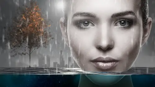
24:41 7Use Filters & Plug-in for Rain
15:16 8Gradient Maps & Motion Blur for Photographs
05:51Lens Flare with Filters
15:34 10Smart Objects Overview
12:56 11Oil Paint Filters
17:17 12Snap Art Overview
13:32 13Camera Raw Processing
13:46 14Alien Skin Software Processing
10:29 15Adding Rimlight & Glowing Edges
11:08 16Alien Skin Software Backlit Plug-in
17:07 17Filigree with Alien Skin Software
12:11 18Type with Alien Skin Software
15:04 19Create Environment with Alien Skin Software
08:46 20Logos with Alien Skin Software
06:54 21Bokeh & Details with Alien Skin Software
15:21Lesson Info
Oil Paint Filters
This section, we are going to talk about more painterly, or effecty looks some of the filters. We are also going to investigate some third-party plug-ins, because, you know, they are my favorite. Let's have some options here, and some camera raw and exposure three, and then we are going to look at glowing edges which is an effect I really enjoy using. Again, with all of this, I really want to stress that if there is a caveat. Given the limited amount of time we have to deal with this, I'm not going to be able to show you every effect and every option you can have, but hopefully it's something that will inspire you to look beyond, and keep going, and keep playing with some stuff so I like to use Simon's image for this because this is fun. What we are going to talk about is some of the artistic or painterly uses we have. I don't know if you guys have noticed, there is a bit of a trend that is ever, ever growing, which is to have more painterly, or illustrative look in our work, especiall...
y with entertainment art, and it's coming out in gaming artwork. I think you're going to find more, and more, and more, especially with things like Netflix, and streaming software, and Amazon because they are producing so much content that they are actually buying at breakneck speed, and when they are buying this content, there's not necessarily gallery shoots for the artwork, and so what happens is they have to produce artwork with nothing, or screen captures, and so this is a way to add some interest, or to, dare I say, kind of disguise some pixel issues with lo-res, JPEG files, and well, it's fun. What we are going to look at right now is in the artistic filter or under Stylized, depending on where your filters are and which ones you want to look at, I just want to point this out, I have the artistic on here because there's other things like paint ops, knife, plastic wrap. We are not going to go into those in this course because that's kind of like your mamma's filter class, but please experiment with those and check them out, but right now we are going to do is we are going to go under Filter, Stylized, Oil Paint. If your Stylized is not showing in that way like we showed at the beginning of the class, you will find it under your filter gallery, okay? Let's get out of here and go to some Photoshop. Here we have this lovely photo of Simon, and this is the original. When using a lot of the painterly effects, what you might want to do is have an already contrasting and sharp image, because I find those painterly effects do better if they have something to grab onto. If it's a soft image, it can often look a little flat, and one of those little tricks, and let me see if I can do this without getting in too much trouble. I'm going see if I can pull this out. I'm going to duplicate this. This is a little off subject, but not entirely. I'm going to pull this out and just show you a little tester that I do on some files. This file has already had this happen to it, so it's going to be a little too much, but I, on painterly images, will do this HDR toning. This is just a little extra. Use this with caution and not too much. You can change the gamut. This is not in the paperwork, I just want to stress this, and when I use this, I use this on files that in particular I'm going to apply effects to, like actually want to make it look otherworldly or painterly, so I know this looks a little crackers, and it's getting zinged out but when you're using a painterly look, I mean, imagine if you wanted to make this look like an old Norman Rockwell piece or an old magazine cover, you want it to be kind of illustrative and what this particular, I don't want to call it a filter. It's actually an adjustment called HDR toning. It will exaggerate and flatten that. It's bringing the shadows up, so just note it's a fun thing to try. What I would suggest if you're going to experiment, remember as I said, play with this stuff. Don't try to do this on a job. Maybe what you want to do is use your original image, and then if you're not quite getting the results you want, go do that HDR, and then bring that in. I do want to note that HDR has to be done on a separate file outside. You can't do it inside this because it will flatten it, so you want to do that in a separate file, and what I did is I went Image, Duplicate, and I made it a separate file, and then I worked on it, and then I would just drag and drop that into the file. Have some fun. Photoshop should be fun, and I hope you consider this section perhaps more of a fun section. Now this in particular, I definitely use a smart object because, well I like to change my mind. It's my prerogative, I can change my mind, and by using a smart filter, I can come into this object until the cows come home and make a change. This is the ubiquitous oil paint filter. It went away for a while, and then by popular demand it came back because it's fun, and what you can do is you can change the stylization. I'm going to slide this down. It's going to take a second to redraw. It might take, there we go. It might take a few more seconds. You can see it in the preview. I'm going to zoom out on the preview. Again with smart objects, your previewing can take a little while longer. Do you notice there's a little bit of a drag before it gets to the actual image, but we are patient people, aren't we? We can deal with a little drag. I kept this file size big because I want you to see the detail. As you see, as I'm increasing the stylization, it becomes more, dare I say, painterly and distorted. I'm just going to keep sliding this. I'm going to move the preview over here because actually the preview is a little faster here in the smaller window. Have some fun with this. I think people get a little uptight with these things. The cleanliness, I'm going to take it all the way down. That's zero, well it's zero, that's the idea. Now it's getting more and more. For me, and it might be just the way my brain works, the cleanliness, to me when it's clean, I think of it as the original picture, which is the exact opposite of what cleanliness in the oil painting. What it means is more smooth in the oil paintings, so for my brain, it actually is the opposite, but that doesn't matter because you've got these scrubbies, and it doesn't matter that someone like me doesn't remember which side is cleanliness because you just move your slider, and you;'l see where you are at. The scale will change how intense it looks. Now, we kind of have a rule of thumb and artwork. Generally what you want to do in digital imaging I think is you want to not change too many things too quickly because you want to see what the effect is. As I said before, play with this and change your items one at a time. Don't change everything. Change one item, see what it does, look at the bristle detail. You can take that down. Again, a little bit of a pause. I'm going to zoom in, and then I'm going to move it back up. You can find the result you like, and you can also change the lighting angle. Actually, I need to zoom out for you to see that, and you can change the amount of shine, so I'm going to up the shine a goodly amount and zoom back in. He looks a little ill now. Right? (chuckles) But I think the thing to do here is to play. Play with your bristle detail, bring it down. The shine, I have to tell you, I never have used the shine up high, ever, ever, ever. I always keep it low. It's my own personal preference, and for the most part, the angle details never mattered for me personally. It might matter for you. I'm going to go ahead and cancel out of that, and we can take a look at this. Again, it's a pretty basic tool. Occasionally what you'll find is people, especially if you use it on a smart object, is you can paint out different areas on the smart filter. Let me change my brush here for just a minute. As I've said before, there are a gazillion brushes now available in Photoshop, which is the good news and the bad news, because it gets a little overwhelming. I want to make sure I'm painting with black, all right, so I'm painting with black to paint out an area. Again with the painting tool, eh, are you actually going to do this? Probably not too much. Occasionally what you'll find is you'll paint with a lower opacity. You see how I'm changing the opacity of the brush? I might paint out some of the area if you want to just a little bit of the regular detail to come in, and I find that some folks with the filters, like the paint filters and whatnot, we tend to be all or nothing kind of people, so maybe consider masking in and changing filter settings as you like. All right, now in addition to that, some of the painting filters, and we are going to investigate some other ones here, they will give you color choices. This one doesn't, so I like to add color choices on top, and we talked about file size before with adjustment layers. Let me see if I can get my preview up. Here we go, properties. All right. Here is my crazy, crazy adjustment layer. It's a curve. I love to use curves for colors. All I did was I added some red to the highlights, (clacking) and I love the sound effects. The sound effects are nice. I added some warmth by taking the blues out. Just a simple curve. I love curves. I use them for a ton of things. In addition, I like to use patterns and textures over the top of painting, and I think with filters, a lot of folks think that out of the can is what you're going to get, and in this case, I'm just going to suggest you go into your patterns, and in fact, let me load up something. Bear with me for one second here gang. I'm going to load up another window. All right, here we go. What I'm going to do is I'm going to go to patterns. I know that we talked a little bit about this before in making patterns. What we are going to do is go to the adjustment layer called Pattern, and inside here, you have a gazillion lovely patterns depending on what you've loaded. I'm going to cancel that here for just a second, and this is not in your handouts, so I wanted to let you know this. You guys know under the Edit menu, Edit, Presets, Preset Manager. You have Patterns, and under your patterns you can see what you have loaded. I'm going to guess, dollars to donuts, I have more patterns loaded than your average bear. You can load patterns that already come with Photoshop by hitting the load button and navigating your way to your icons here. You can pick different patterns, different gauze, different colors, and a little later on we are going to talk more about this different colors. Now do you remember we talked about mextures? mextures papers? Mextures is a way of getting patterns, only they are flat files, and here with Pattern now I am once again at the adjustment layer, Pattern. I can pick these patterns here. Kyle munch canvas, buff textured, and I can put these on modes like soft light, and that will allow me to get a color fill if I like. I can put it on hard light. I can put it on color. You can put it on all sorts of stuff, and then that will give you a look, and then to top that off, you still have your oil painting look. In this file here, I happen to have something called old yellow paper. It's a pattern, like a texture file. Texture file, I don't think we've talked about this yet in this class. I have an whole image library of paper files. They are not patterns. They are not what I would call seamless tile pattern. They are just random textures, paper, and I like to fly them into give effects, and this one happens to be on the mode called multiply. We've talked about modes before in this class. This one, I'm going to put up to 50%. It literally is paper. It's a file of paper. Now, it's not tileable. That means it's going to only fit in what it is. If I tile it, I will get a seam line, but I think this just kind of adds a nice effect. It's on multiply, 20%. It adds a little je ne sais quoi. You're not going to see those lines, but somehow the variegation in the piece I think adds a little something to it. In addition to this, I want to show you. We just talked about the pattern fill. I'm going to double click on this pattern here. What I did is I had already made these patterns. See that little icon? That means pattern, then double-click on it. When you click here, that's where you get, once again, your same access to patterns. Have you guys noticed that in Photoshop there is 1000 different ways to get the same thing? It's all the same. We are all just getting to it at a different zone. You can change the scale, and what this pattern is, is on soft light, and I'm putting it back on normal mode for a minute. This is going to give it a canvas look. Do see how that looks on canvas? It's soft light. Do see how that makes it look like a canvas? Then I've got another one on top in this one. I'm going to switch it to Kyle gesso canvas. I'm taking a moment to pause here. For those of you in 2017, you are not going to have this. This file, Kyle gesso canvas, when you buy the new brushes. Actually, let me rephrase that. When you get Photoshop 2018, Kyle's brushes come free. You can download them. They come with a bunch of patterns and you actually don't know that they come with a bunch of patterns because they are hidden in the brushes settings. We will talk about that in the brush class, but they are actually in there and you can grab them and put them in on your file. He's got great canvases, because this guy is an illustrator. I do want to call attention to the fact that it's lightening the whole piece. You see that? The reason it is lightening the whole piece is on that mode called overlay, we talked about this earlier. The color, 50% gray, is neutral, is 100% neutral. Well if you put this on normal, what you are going to notice is it's not neutral. It's not 50% gray. That has a value to it, but I kind of like it. You can put it on screen, you can put on overlay, you can put it on whatever you want. I think it's just kind of, I don't know, adds a little je ne sais quoi to the piece. I don't mind that it's light. I think that kind of adds to it. All right, now I want to talk about something slightly off-topic, but only slightly because it fits with painting and that is what you would call an impasto effect. Impasto is kind of that raised look that beveling that you can get, and I did a little tear, aww, like you are crying. Aww, a little beveled effect. What this is, this is a layer style. That is all this is. It is a layer style, so I'm going to turn that layer style off, and you've got to pay attention to me right here for just a second. The fill of this layer is zero. I'm going to put the fill layer to 100%. Okay, 100%. I'm going to pull this out, and I'm going to turn this off because I want you to be able to see. That fill layer is at 100%, and I'm just painting. I'm going to paint on it, that's with black. If I take that fill layer to zero, the black will disappear. Do you see? Then we you put the layer affect, see if you guys can follow this, when you put to the layer affect on, what will happen is the paint that you are painting disappears, but the embossing does not. Let's talk about this for a second. What is it? It's beveling. It's this little beveling that happens through a layer style. That's all this is. It's a contour and a texture. What I have is, and again I want to be really clear because it can be a little confusing. I have a paint layer that the fill is set to zero. Do you see that? The fill is set to zero on the paint layer above, and so what you are getting is simply a beveling, and you change it by how much up or down, and what angle you put it at. Can you guys see that? Excellent, so this is a way you can paint some impasto effect on top of your piece if you want to add some texture to it.
Class Materials
Bonus Materials with Purchase
Free Bonus Material
Bonus Materials with RSVP
Ratings and Reviews
user-3b9448
Oh my word! this must be the best money I have spent in years on my photoshop education. This class is amazing, just so very informative and I have only watched 2 lessons! Finally understand what the jargon around brushes means and how to adjust the settings to get what the gurus can do with brushes. Love this class - thank you Lisa and love: "Don't panic" :-). If you like photoshop and spend loads of money on other people's actions and overlays and "stuff", you need this class. Brilliant.
Pat Saizan
This is one of the best courses I have taken on Creative Live. Just amazing. This is geared towards intermediate to advanced Photoshop users. So happy to see an advanced class!! Very happy to see Alien Skin being used as a part of this course. Highly recommend this course.
a Creativelive Student
I can't say enough about this class. I am looking forward to watching this again and applying all I have learned at my leisure. Lisa Carney is am amazing instructor and I loved Simon as well, they did an awesome job! Just the handouts alone are well worth the price of the class. Thanks for another class filled with excellent content and lots of laughter. I own all of her classes and will certainly purchase any other's she instructs. Way to go Lisa! Well done and Exceptional!