Lessons
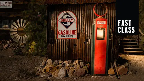
Class Introduction: What is Light Painting?
03:45 2Camera Considerations
16:18 3Camera Settings and Initial Exposures
09:26 4Light Painting Accessories
04:05 5The Color of Light
05:21 6Focusing in the Dark
03:13 7Light Painting Techniques
08:30 8Lightroom: Basic Panel
14:14Lightroom: Presence Panel Adjustments
06:05 10Lightroom: Hue, Saturation, Luminance
05:17 11Lightroom: Local Adjustments
16:46 12From Lightroom to Photoshop
11:55 13Photoshop: Lighten Blending Mode
04:31 14Photoshop: Star Stacking
03:17 15Photoshop: Layer Opacity
03:25 16Photoshop: Selection and Masks
05:55 17Photoshop: Mask Adjustments
05:46Lesson Info
Lightroom: Basic Panel
I want to go over some post processing azi mentioned pretty important part of the process every bit as important as being out in the field and getting the right information is coming back and processing that. So what we're gonna do is we're gonna talk a little bit about light room on, and they were gonna move into some more advanced Photoshopped techniques, all of which I use on a regular basis for all of my photography and especially late painting. All right, so in the develop module, on the right hand side, you're going to see most of our panels that we're gonna work with. We're not gonna go through all of this today. Gosh, we could spend We could spend a whole day just talking about this panel right here. But what I want to do is I want to cover the high points of this. Um, now we talked about picture styles out in the field that's setting her camera to a picture style of camera neutral or camera standard of camera landscape. Let's really get a good idea how this plays out here all ...
the way at the bottom of your panels. You'll see camera calibration. And when you hit that reveal arrow, you are going to see that it's set to Adobe Standard Now. What's happening here, folks, is that no matter what you have shot in your camera, if you are photographing in raw when it comes over here, Adobe doesn't recognize that Adobe can't recognize its proprietary information within the file for whether it's Nikon or Canon. So basically what we're looking at is adobes interpretation of what this file should look like. That's the adobe standard. That's what we're seeing right here. So at this point, we can say to ourselves, Well, gosh, you know, I really wanted to shoot this in camera neutral, which is indeed what I did. Shoot this on out in the field on. And then there's all of our other choices. You can ignore this V two. This is Ah, second generation G four s, and so it's popped up with ease. These new versions, but typically most cameras will say camera, landscape camera, neutral camera, portrait camera, standard camera, vivid without the's V twos. But what I'm gonna do here right now is just give you an extreme example. Let's go right to camera landscape and I want you to see how much darker this image gets and how much more rich those colors get. So let's now return to Adobe Standard and you could see it brighten up again. Now, let's go to camera neutral and watch how much the shadows they're gonna open up here and watch how much, Uh, the highlights are gonna come under control and the colors get less saturated. Camera neutrals gonna be typically my most common camera calibration. Now, if we could take a look at some other images, you can see how how these air gonna play out in other examples and where they might be important. So here we're in Zion National Park. Um, and what I did here was set the ambient exposure for a moonlit night kind of an overcast sky. And once I got the camera set up, put it on a self timer and literally got my car and just drove it up the road to get the car trails in there. So Adobe Standard gives us this nice view. We go to camera landscape, much more saturated. But also look what happens here. And this is why I brought this image up is that the way color can be rendered or the transition of color can really change? Going from, let's say, camera vivid, you can see there's almost like these hard breaks in the color. Here, let me just open this up so I can see that little better. Um, these heartbreaks in the color compared to Adobe Standard, which is in this case, really, I think the worst of them all. Let's see what camera neutral looks like. Not so bad, but I'm still getting a little bit of a hard break. And so once again, we'll go back. Teoh Camera standard. And actually, I think that looks about the nicest. So in this case, I would opt for camera standard because it's giving us the least artifact in these really bright areas. So camera calibration. Typically my first stop when I'm working on images begin there that's going to set the tone that sets the overall flavor of the image. All right, next up, we've got white balance, and we've talked about setting the white balance in the field and how important that is. But remember, you can change it when you're back here in light room as Well, there's been a lot of talk about all turn white balance and how much that affects your image, especially amongst me and my friends and in Pan. But I think the idea is we want to get our white balance as close as we can out in the field, so that were not drastically shifting back on the computer. So a lot of people say, Oh, well, you can change your way pounds because it's a raw image And yes, you can. Uh, so the real question remains, is how much damage or you're doing to your file? If you do, go ahead and change your white bounce back here. And what we've kind of come up with is that listen, if you're just making small little shifts, no big deal, but we want to avoid going from 7000 K all the way down to 2000 K because that just may affect your file. So we want to be close. Um, each one of these things is simply a preset setting of these sliders down below. So by going here and changing it to tungsten, you see how the sliders have just moved. That's no different than me going down and manually moving these sliders so you can do either one. Some people feel comfortable just using, you know, just going with the words and knowing where they want to go. But I encourage you guys to play with this to get some subtle shifts as well. Here you can change your you know, your blue yellow access just in the most minute, Uh, degrees now, while we're in here changing these things in my new degrees, one thing you can think about is you know, if you tend to be a little bit over caffeinated, these sliders can be somewhat rough. Eso what I typically dio is I usually DoubleClick in this field right here and use my up and down arrow keys to change it 10 points at a time. And that's gonna give you a little bit more control if you're looking to just make a small general shift in your image rather than big gross large shifts. So ultimately what? My point here is that we don't want to take scenes and remove so much of the color cast that we remove a little bit of the ambience or the for the flavor of the image. One way to do that would be just, you know, crank down this blue until this area becomes white. And if you really wanted to make something truly neutral in tonality, you can use this little eyedropper here when I click on this eyedropper and bring it over and hover it over a tone that should be white. I can click now. Once I click, What's gonna happen is it's gonna take that and exactly neutralize thes RGB numbers. You can see our asses 95 Green is 93 B is 82 when I click on that, that should pretty much neutralized those numbers back to almost an even setting. Now those numbers will be a lot closer, 90 to 90 to 92. What that saying is this is a perfectly even in neutral white, but look at the photograph. It's completely sterile. This looks nothing like reality, not saying that you have to stick to reality. But, um, it just is too sterile. Sterile is the best word I can come up with. So weight balance in the field or white balance in late room. Yes, both started off in the field get as close as you can. Then when we get back to late room, we confined to knit by either using these drop downs or actually using the blue, yellow and the green magenta as sliders. So let's go to our next item here. Basic tonal processing. This is where, um, in the basic panel where we're gonna do really most of our heavy lifting. Let me just hide the system. Ran for a second. Um, let's point our attention here. We've got our tone section of what's called the basic panel. You guys can see that up here. Um, and rating. Here's where we're gonna do most of the they said heavy lifting. This is going to alter our file in ways that it's impossible to do just out in the field with the exposure. So exposure contrast highlights shadows, whites and blacks. Let's let's take a peek at how they look and I think keeps him continuity. Here. Let's go back to that same image that we started with, which is right here, and this is our first image of the night and uh, will begin by setting our camera calibration, and I think we set that to camera neutral, so that's good. Excellent. Next thing, we'll set our white balance. All right, now out in the field, we started off on daylight and we kept getting cooler and cooler and cooler until we finally got down to I thought I had put in 3600. But it still feels a little bit orange to me and actually feels a little green, too. So I'm gonna come in here and I'm gonna double click in my field to highlight the number and use my down arrow keys as I am looking at the color of the sky, appear not so overly concerned about my where my flashlight has been painted. But mainly I'm looking for the ambient, so we'll just drop that down a little bit more. That's starting to look somewhat neutral. If I get that perfectly neutral folks, this will turn into a nab salute. Gray, Um and that won't really be appealing either. So having a little bit of color and there is fine. All right, so we've said our overall white bounce. Now it's time to start dealing with our basic panel down in here. But notice that when I put my mouse over the field of the history Ram. I get this, this area and that area relates directly to the's sliders down here. So now what I want you to do is watch these sliders as I move here. That's my whites. So this is the area that the whites slider effects. This is the area that the highlights slider effects. This is the area where the mid tones or the exposure is affecting. And then we moved down to shadows and then blacks, and you could do the same thing in reverse. You could put your mouse over these sliders and you'll see highlights here, and you'll see up in the top that gray field appear. So the more that we know are hissed a gram, the better. We're going to be able to number one, make good exposures out in the field. But also number two come back here in late Roman and adjusted in just the right ways. So, for example, in this image, we could say, Gosh, you know those highlights. They seem a little bit bright to me. Were start to get a little smudging in here. They're not really well defined. So what I could do is move my highlight side and pull that down. I could look at my shadows and say, Oh, there's a little too dark and I could pull that up so it kind of gives us an idea as to where to go. But before we get down to the highlights, whites and blacks, um, let's talk about our exposure slider. This is the one that affects the midtown areas, and we say it effects the mid tones, but it really affects the mid tones and then a little bit kind of going out on each side. So the exposure slider is gonna be our first stop. So, as you can see is I grabbed my highlight slider and I start to pull it up. Ultimately, some of these whites are getting brighter as well. All right, so it is affecting outside of this range. This range is just saying where it's being most affected. All right, so ultimately, the most realistic look that we're going to get from either brightening or dark ing image is going to be by moving the exposure slider. Now, let's just go ahead and reset all this and I go to resettle this you guys just by simply double clicking on the word tone, bringing that back to zero. All right, now, in this image, we did set our camera calibration to neutral, so we don't really have any deep blacks. Even though we look at this image, you say, Oh, yeah, you know, it's really dark in here. If we look at the history Ram, it's not quite yet to that corner. So that's where we would, uh, actually take our blacks slider and bring that down a little bit. Now, once this image information reaches, the corner there is going to there will appear a dark black somewhere in the image. So along with the idea of bringing up your exposure first to brighten the image and then bringing her highlights down a little bit, there's also the idea that if you wanna, um, brighten up your shadows, you should bring your blacks down a little bit until they hit that edge and then bring your shadow slider up a little bit. That is also going to give you a more realistic brightening effect for your image. So in this case, I think these blacks are just a little heavy for me. So what I'll do is I'll start with, uh, resetting this to where it was. I start with my exposure and bring that up. Just a touch. All right, That looks good. Now, my highlights are a little bright, so I'm gonna go to my white slider, and I'm gonna pull that down. I'm sorry. Rather my highlight slider, And that's giving us better separation in here. It's not so, uh, uh, blocked up. And then next, What we're going to Dio is perhaps open up the shadows just a little bit, but then always anchor those blacks. You see, when I brought my shadows up, look at where my blacks are way off that corner and something more like that, and I think that's gonna do for that image. So the basic panel folks really, really important. Remember, we're thinking about adjusting the image visually as we're seeing it. We're thinking about adjusting our images, uh, scientifically with the history, thinking about how these sliders were late to the history and how the hissed a grandma relates to the image. And you just want to work all of those things together to create the basis of the beginning of our work because ultimately we're gonna get into local adjustments. Ultimately, we're gonna get into changing individual colors or even the brightness and darkness of individual colors. So there's a lot left to do. But this is this is the big start.
Class Materials
Bonus Materials with Purchase