Lessons
Techniques to Create Painterly Photographs
11:09 2Selective Focus & Extension Tubes
14:12 3Shooting Through Natural Materials
07:12 4Shooting Through Non-Natural Materials
13:32 5Painterly Backgrounds
06:35 6In Camera Multiple & Double Exposure
07:08 7Exploring Creative Blur Through Subject Movement
06:30 8Vertical/Horizontal Panning in Photoshop
09:26Lesson Info
Painterly Backgrounds
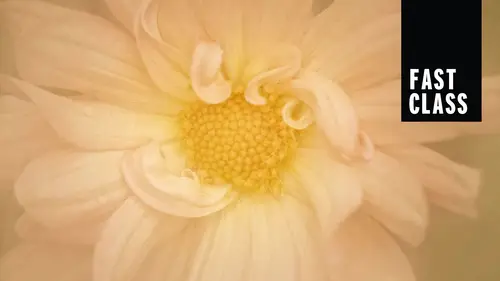
so I want to talk about painterly backgrounds and background choices. You know, some backgrounds are just really painterly. This is due really early in the morning on grass, on my neighbors lawn on, I shot a queen. Anne's lace painterly look usually involves a blur of colors, but when you're when you're shooting inside, you have a little more control over that. This is just a scarf behind this fire when I was beta testing the lens baby Velvet 56. But I prefer a natural background, so there's some things you can do if you don't like the background of your flower. I found this wind flower last year in Portland, Oregon, and the flower was beautiful, but the background was sort of plain. So I walked all around the edges of this plant and tried toe line that flower up with something else in the background. So think about that. If you don't like the background as is, try a different point of view, shoot up, shoot down, shoot from a different side angle, uh, to try and find a more pleasing, p...
ainterly background. You can also shoot it a larger aperture to create Marbler. But if There's nothing that you can do with the background you have. You can substitute the background. This is something that I'm doing. Ah, lot off lately. I shot this calla lily in my garden. My Kalas aren't growing yet, so I bought it at the Farmer's Market and just stuck it a little vase and used a paper towel to make it stand straight. There's nothing fancy about my studio work on attached a plant clamp to my tripod. And then I took some of my favorite textures and I printed them on Matt paper, and I glued them to a small piece of foam core. So there's two per piece of foam core. It weighs nothing, and I could easily clamp that on and place it behind my subject. And because there's two with a flick of the wrist, I can change it. Um, I started with fabric this spring. Um, I went to the fabric store and tried to find some very simple prints that would look natural, and that worked great. And then, um, and one of my students even said you should have some of your photos printed on fabric into it. Help us a great idea. One of my Santa Fe students. Sally came up with that, and I thought that was great. But then I started thinking textures. So some of these air, my textures and some are just my favorite textures. But I use Matt paper so that you don't get any glare on. Uh, I'll pass things around so that you guys can have a look at them and see how lightweight they are. I'm such an easy way to substitute the background. So here is a P any with a nasty background. There was nothing I could dio. So I used one of the ones that you have right in front of you to simplify the background. So I end up with a painterly look in camera, so you're not adding the texture later on, you're adding it right at the time. The first on the left has fabric behind it, and the flower on the right has one of those backgrounds. So here's what, before and after without the background added with the background added, and here's ah, fissile type plant from done gardens and let me show you how I dealt with reducing that dizziness. So let's talk about what you can do if you have a subject that has a less than painterly background. First thing that you could try doing is moving in closer, eliminating as much of that background as you can. You could also try a different point of view, a different angle lower, higher, more from the side. Maybe the subject has a better background on the right than the left. Work with what you have. If you just cannot eliminate a displeasing background, then you can substitute something else. And my favorite thing for that is textures. And I don't mean textures added in post processing, although you certainly can do that. But I always like to do as much in camera as I can. So I've taken some textures and I printed them on Matt paper and glued them onto foam core. And I'm using this a lot lately and finding it's a beautiful in camera effects that requires very little post processing. So I've chosen as my subject to this thistle type plant. As you can see, it's quite compact, and the background flowers are pretty close. So to get any detail in my subject, I'd have to stop down and that's going to bring my background into focus, and I don't want that. I want a soft, painterly background. So all I need to do and I have my texture with the clamp attached to my tripod so that I can shoot by myself. I'm gonna move that behind my chosen flower. Let's see, let's try this one. I have two textures per board so that I always have a texture to texture choices. With every board, I'm gonna try a slightly different angle. I also want to flip the board around and try the other background while I'm right here. Do that with just a twist. This one has bluer tones. Think it might be a better match and strong brushstrokes? That's what I look for in my textures. It's a simple is that And the beauty of that board is that if you want to stop down form or detail in your subject and you, if you bring the background into focus, you're breaking brush strokes and the focus. So you're increasing the amount of the painterly look, which is, uh, very simple, and I wanted to just show you the one. This is another one of the one on blue and the one on green. So you can see why I said the blue was better because that, uh, not crazy about about that one and all.
Ratings and Reviews
Krystyna
I really liked it, it was inspiring and clear. I need more courses like this...
Phillip Ziegler
Wonderful teacher and a well presented course--both this short version and the long one