Image Salon Post-Processing Demos
Lesson 25 from: Family Photography: Creating a Successful BusinessKirsten Lewis
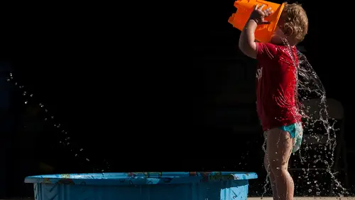
Image Salon Post-Processing Demos
Lesson 25 from: Family Photography: Creating a Successful BusinessKirsten Lewis
Lessons
Class Introduction
12:53 2What Makes a Picture Successful?
05:34 3Technical Tips: ISO
15:37 4Technical Tips: Aperture
12:00 5Technical Tips: Shutter Speed
11:10 6Technical Tips: Focus
13:07 7Using Light to Tell a Story
07:49 8Using Composition to Tell a Story
09:06Filling Your Frame
05:41 10Capturing Emotion: Identify the Muse
16:05 11Shoot What It Feels Like, Not What It Looks Like
19:53 12Action Vs Moment
03:39 13The Psychology of Photographing Families
15:55 14Q&A
15:35 15Working a Scene
10:22 16Identify What You Shoot Well
11:58 17Look For the Cleanest Composition
04:34 18Know the POV
03:13 19Patience and Anticipation While Shooting
05:25 20Shooting Deliberately
28:57 21Case Study - Sarah's Contact Sheet
25:01 22Challenging Subjects: A Family With One Small Child
1:04:17 23Challenging Subjects: Photographing Teenagers
08:39 24Image Salon Post-Processing Overview
10:37 25Image Salon Post-Processing Demos
45:38 26The Importance of Relationships
11:47 27Getting Clients Hooked
10:05 28Your Business Model
23:25 29Stay in Contact!
17:50 30Why Aren't You Booking Sessions?
12:51 31Your Website
06:57 32Direct Marketing
08:32 33Slide Shows, Albums and Prints
10:12 34In-Person Sales Work
03:51 35Website Critique: Alyssa Kellert
39:34 36Website Critique: Amy Thelen
21:02 37Website Critique: Margaret Albaugh
19:42 38Business Q&A
34:12 39Build Community and Find a Mentor
10:04 40Keep Shooting: Personal Projects
08:39 41Who Inspires Me
07:29 42Why Do I Love It So?
15:35Lesson Info
Image Salon Post-Processing Demos
So yeah, so it was fun that we actually had this job in our queue at the moment. You had just sent it in last week. Yeah. So, I just pulled it out and then I you know for the purpose of the class today I just selected my favorite 29 photos, which happen to be I think a lot of your favorites as well. So we're just gonna go through them one by one, and try to talk a little bit through the process. Right away on this image, like the colors to me they don't really add anything. I think it's a solid moment. So that's sort of the thought process that an editor will go through. Do the colors really add anything? If they don't usually we're gonna go black and white. So for the sake of speeding up our work flow we obviously have starting as, starter presets that we can use. This one for black and white. Can I ask you-- Absolutely. Do you make your own black and white, or all your own presets yourself? So we have our own standardized presets that we use when a client kind of is unsur...
e about what they wanna do. Yup. But a lot of clients already come with their own you know-- Oh! Style and we cater to that, so we'll take their presets-- Yeah, so will the editor save presets per client? Oh yeah absolutely. That's great. Yeah, yeah. And then do you suggest they make starter presets for their own work flow as well? Not necessarily. It really varies, you know. Some photographers they're just kind of starting out and they don't know a ton about post production. So they rely on us to guide them a little bit. Others come with a really set style and they know exactly what they need and what they want, and they, they are the ones who guide us a little bit more. Okay. You know, we usually land somewhere in between. So on this black and white contrast goes up, because it doesn't affect the color. So we can boost out contrast a little bit. For Kerstin's work we often pull the highlights and push the shadows. What that does is that it expands the range that the camera's able to capture. So it gives us a nice dynamic range in the image. For the whites our default at the studio, we like to pull the whites and then push the exposure. It just gives a nicer balance. But for Kerstin's work we're actually gonna push the whites and pull the blacks because that's gonna give us really nice white points and black points. So let's start by pushing the whites up to the forties, blacks around 50 is good. The next thing we're gonna do is we're gonna control the exposure for the highlights. So I'm just looking at the window, which is gonna remain blown out. There's no way to save this. So the next available highlight is gonna be sort of the couch. So we'll control the exposures so that it's bright but not too bright, and we're gonna kind of stop right there, and then the last step is gonna be to brush, do an adjustment brush on the subject. So we're gonna go into our brush. It's set on a dodge, and we're just gonna brush our subject. Sorry, I grabbed the mouse. And if one is not enough we'll reset our brush and do it a second time, and we're always using a big brush. We're not trying to go in and trace the face or anything like that. We want the light fall off to be as natural as possible. That's the best way to use the adjustment brush and on this image we kind of stop right there. Yeah. You do, there's different options in their service. Okay. For basic, basic plus, and-- Best. And best, and I do a basic plus. So they will also dodge and burn for you along with the other adjustments, and I think you can elect for a crop. I always like-- Yeah exactly. For cleaning up the edges if they need to be, so. Yeah on this image we can talk about that. Yeah. But I'll maybe just crop it in a little bit just to get rid of those little pesky highlights at the top-- And that's what had reminded me. My editor I know now would just take those out, take those little, that, those, that edge out. Let's go to the next image. This one has pretty decent color. So we'll just start with a color base. Same idea, contrast is set lower, because we, when you boost your contrast it's gonna really affect the color. So we definitely don't wanna do that. So it's set around 10, 20 usually. Highlights, a starting point is -10 but in this case we could maybe pull them down just a little bit. It's gonna affect especially the sleeve here which we don't want it to be too, too much in our face. Shadows are pulled out but we can pull out a little bit more detail as well. Whites we'll bring, oops, what happened? Sorry about that. Whites we'll bring a little closer to zero, or even in the plus 10, 20 range. Blacks, what we're looking for is just a nice, black point. So in the darkest shadows, so over here where the rope is or in the mom's hair where we kind of lose the detail just a little bit and we'll stop right there. And then the rest of the work is managing the exposure, doing an adjustment brush on the boy, and all the way around him, and then we'll adjust the white balance which here in camera was pretty good. The way to find the right white balance is to go warmer, go colder, and just fine tune and it's a really visual exercise where we're trying to find what looks best. So I go warmer, go colder, find my neutral which is somewhere around here. Maybe go a smidge warmer. Same with the tint, go more green, go more pink, find my neutral, stop around there. There you go, just a tad brighter. Pull the blacks a little more. Next image, again, we can go with a color. On this one I'm just gonna do upright auto. So that's gonna straighten out our lines, give us a much more striking image instead of the lines being a little bit crooked. Not Kerstin's fault. We'll bring the exposure down for the sky. We can try to bring the highlights down, see how much detail we can recover from you know the background. But there isn't too much. It's not like we have crazy clouds and anything we wanna bring to life. So we'll keep it closer to zero just so it doesn't you know give us muddy skin tones 'cause that's what bringing highlights will often do. Bring our whites a little bit higher. Push the shadows to get a bit of that dynamic range and also the boy here is you know the tones on his face are in the shadows. So just by increasing those he really brightens up a little bit. It's a fine line between going too HDR and having that right balance. So that's something that we're always looking at. Once the general settings are good, take our adjustment brush, give the mom a little bit more light. We'll give the boy a bit more as well. And then I can go in and adjust our white balance. Here we can go a little bit warmer. This would be a really nice image in black and white too. Yeah. Yeah, it's just like the visual graphic elements come out a little bit more. I like it better, do you? Yes. Yes. I think-- Yeah. Yeah, I think the one I toned similar to this that in delivery was black and white. Yeah, so in this case, so now that I'm in black and white I brought up the contrast. I can push the settings a little bit more 'cause the colors aren't as affected. You can even give it a little bit of clarity which in black and white helps bring the image to life a little bit. And I use quite a bit of clarity for those who have watched me tone in my black and whites, I do. And we'll kind of stop right there. Next image, I love that one, and I love this kind of mixed lighting situation because you have your tungsten light, you have your window light. So your blues and yellows are really gonna come out. So we'll start with the preset, but the first thing we're gonna do is bring the exposure down for the highlight because yeah, it's such a strong highlight. Was he looking at coffee? Mmm-hmm. Yeah, I have a three year old son, too. Yeah. (laughing) We'll definitely, we do look at, Rinna had brought it up because I wanted everybody to see all the settings 'cause we're zoomed in a little bit, but yeah we do look at the histogram as we edit because we wanna make sure we don't you know clip our blacks or whites, make sure that everything is in the right range. All right, so we brought the exposure down. I'm just gonna do a quick upright to straighten out the lines. Maybe crop in right from the get go so I'm not working on parts of the image that are irrelevant. We'll either center or respect the rule of thirds. I think centering here is probably gonna be our best bet. Yeah, so we'll go there, and bring the white balance down really for the boy's face and that's where the blues and yellows come out a little bit. Give it a little bit more contrast which brings out the colors. Pull all our highlights down, shadows up, and blacks further down. There's almost no adjustment brushing really needed here. Maybe just ever so slightly on the boy a little bit so we can see him a little bit better. A quick question while he's adjusting. I want you to look at that photo, and tell me how I could have made it better. Covering the window? Good girl, yes. Yeah, so Horte said covering the window. Horte, if you grab the mic for one second, how do I cover the window? By moving yourself so that that wall covers the window-- Yes. And you don't have that highlight in the back. Yes, the highlight isn't that big a deal but I should have known better. If I move to the right I will cover the window and now it's no longer a distraction, and the only bright white light source that I have is coming from the ambient light from over the coffee maker. Does that make sense? Margaret, you have a question real quick? But if you move over, would you lose his face too much? No, no, I won't lose his face if I move to the right. Okay. I'll still have his face. I'm just gonna see more of the coffee maker, which maybe would even have been better for storytelling. Yes? So, we can always make every photo better, including I do this, I pick apart my photos all the time. So-- Sarah? Just a question on the adjustment brush. Yes. What are your flow and feather settings? Yeah so we keep our flow right around 50, just so we're applying it gradually. It's not too like bam, like as soon as you do one click. So yeah sometimes we'll send a job back and a client sees that you know it's had a plus one or some other settings, and they're like oh my God these settings are too crazy for the brush, but you have to keep in mind that we use a lower flow which doesn't necessarily apply it at 100% right away. The feather we adjust depending on the situation, yeah. Go ahead honey. You said you did one similar in the last image of the black and white and when you did the gallery, so then would you intentionally add the color one to the other gallery that you give? Well-- Or would you keep both black and white 'cause you think it's a better image or give them variety? I let Image Salon decide. I let my editor decide which photos work best in black and white and color. I trust him now, so he makes that decision for me. You can, you can select that as one of the options for the service and for me if I, if I deliver two that are similar the reason why I am is it's usually if mom is involved, and I might really love the photo where mom's making a funny face but then I might think that she would like one where she's a little bit happier, quote unquote prettier, you know. All my moms are beautiful at all times, but that is the occasions when I'll send two that are similar but if they're both black and white because they work best in black and white then I'm fine with that. I don't worry about if they're getting nitty gritty over black and white and color. I think that is more of an issue in other genres of photography. I don't ever find this being an issue-- Right In documentary wedding work, in documentary family work, as long as you're showing a variety on your website that represents what you deliver. You're managing their expectations. If your whole website is black and white, and you give them a bunch of color, they're gonna be super confused and vice versa. If all your work is color and then you deliver all black and white they're gonna be confused. The balance on your site should mirror the balance of delivery in my opinion. Do you think, Daniel? Yeah absolutely I agree, and I think to be more specific within the context of outsourcing to us, yeah, you can tell us no, no black and whites. You can ask us to convert all the images in black and white so it's a blanket conversion at a small fixed rate, or without a fee tell us yes convert 10, 20, 30, 50% of the images you know to black and white, and then it becomes at the editor's discretion. Then beyond that you can guide them and tell them yes, you know, if you see a sequence of five similar images put some in black and white in there, or just do what's best for the images. So if all five images are better in black and white, then he'll do that. There's always that conversation to be had with your editor which is good 'cause you're always working with the same person, so they'll get to know your preferences and see what's best for you. The funny thing is is when I first started with Image Salon my, my rule was about 50 black and white and color and after my workshop I was like so that's gonna be 70 30 black and white. (laughing) Because I'm going back to more black and whites now. Quick question from online, when you were showing us the presets for auto straighten-- Yeah. Was that a preset that you created or one that was automatically there-- So you can create it yourself. I mean, the easiest way is you would go and you would set it on auto upright, and then create a new preset that just saves the, the transform, and then-- I didn't even know about this. But we do use Motibodo which is a plugin for Lightroom. It's a set of shortcuts which we've then customized to our own work flows and our process is constantly evolving. I have two questions Yeah. One, how long does it take to, for you to like, what is the turn around time? And then number two, just my technical brain, how does the actual, how do you actually get my images-- Sure. And is connectivity ever an issue et cetera, et cetera? For sure, so the standard turn around is five to 10 business days. There's rush options available as well if ever you need something a little bit faster and smaller jobs will usually get turned around in you know under five days. I will usually get mine in about three. 'Cause it's pretty small, two-- Yeah, like 250, 300 is considered fairly small. Yeah. So if we can squeeze it in you know in a half day then you know we'll do that. To get the images to us our preferred method right now is the Lightroom catalog with smart previews. We have tutorials that guide you through the steps. The catalog with smart previews is about 10% of file size compared to RAW files. So instead of sending us like 10 gigs of RAW files you would just send us a gig. So that's a lot easier to send over the Internet. You can send us RAW files, although it's a little bit slower and a little more challenging to transfer sometimes. If you send us a catalog we send you back the catalog as well. So you just replace the one sent us and you get to see all of your edits. Yeah, I was gonna say the other thing about, the nice thing about getting your edits or your catalog back and I haven't had to do this but it preserves all the adjustments, right? So if you wanted to tweak anything back, you can do that on your own. You can see all of them. It's the best way, it's the best way to do it. Yeah. Go ahead. Following up on her question, if she wanted to keep one can, can she ask for edit, or like I have a similar photo, can you keep the other one in color because mine is in black and white? Can, can you do that? Yeah, absolutely. As the client places an order, we have a special instructions box. So you can you know add any instructions in there. That sort of connects to something else which is really great is to leave your edits in the catalog as well, and as you place your order you can say that you've pre-edited some photos and especially at the beginning as you get started and your editor gets to know you a little bit better, they'll see exactly how you've toned your images and they'll match it as closely as possible. That is by far the best tool that you know you can give your editor and get things on track as quickly as possible. And if for some reason something happened like what happened to Kerstin when she only has the JPEGs do you do that as well? Yeah, yeah, we do, we can edit on JPEG. JPEGs are pretty good nowadays. The only limitation really is when it comes to white balance there's only so much we can do but the rest of the settings as far as I know and experienced it's, it's almost on par with the RAW file, not quite, but almost. And remember, the better you shoot in camera-- Yeah. The less adjustments that even need to be made. Yeah. It just needs to be fine tuned. So you really wanna get your, your technical down and be you know making great files already, so that it's not as much work on you to fix it. All right, so let's move on with the editing. So again for first question, color, black and white, I like the colors. And that's me especially, like I'm OCD with the color wheel. So opposites, blues and yellows, reds and greens, I love keeping those images in color. But here we have reds and greens and blues and yellows. It's kind of a mish mash of color, and I think in black and white we could probably bring out a little bit more out of the image. So let's go in black and white. And I've many times when I'm teaching, for those of you that have been in group mentoring or individual mentoring, when a water photo comes up what do I say? I'm like, let's just try it in black and white-- Yeah. Even though you're more inclined to leave it in color 'cause it's blue and you know when they're especially in the pool or whatever and it's blue, but a lot of times water just pops if there's any sort of light especially or spraying or splashing, it really pops in black and white. So I always suggest to try it in black and white. Yeah, so you know without doing any other adjustment just bring up the whites and bring up the clarity and look at what happens at the water. It really comes to life and you just see it so much more. I think in color it gets lost a little bit against the green background and in black and white it's just like bam, in your face. The color is distracting from what I think is most important which is the splashing. If he switches it back to color for a minute you'll see that your eyes are gonna immediately go where? Red and then the yellow boots, right? And I don't think those are that important. If it was a repetition of color, those, the red sign, red boots, red scooter, dog wearing a red scarf coming by then I would maybe keep it in color. But that's not-- That's a stylish dog there. (laughing) But that's not the case. It's, for me it's the splashing, right? Look at my composition is terrible because I've got that tree coming out of his head, but it's less distracting if it's in black and white versus color right? Yeah. So, next thing we'll just do a upright, which for some reason decided not to constrain the crop. But we'll adjust that. So now at least our background line is straight. We'll pull the highlights down just a little bit. Give it a little bit more in the shadows. Then we'll take our adjustment brush. So here the dodge brush, what I'm afraid it would do is it would keep blowing out the highlight on his head which I don't wanna do. So I'm just gonna switch it to what we call a shadow contrast brush. What that does is lowers the contrast, pulls up the shadows and by doing that it's not gonna touch the highlights at all. So I can safely brush on his face and clipping his hair but that it's gonna remain completely unaffected. Okay, I have no idea how to do this, but go ahead. This is why Daniel's here. It's a fine line. You don't wanna do over do it 'cause then it'll make the face look a little bit too HDR, but as a first step it does a really nice job 'cause I can go loosely with my brush without really affecting the hair, then we'll do a quick second brush and for now on we'll do the regular dodge and go in a little bit closer to his face, just bring him out a little bit, and bring a little bit more attention to the puddle of water as well, so that the viewer, when you're looking at the image you're really focused on everything that's happening here. Last thing, we'll just maybe burn down, oh, did it get it? We'll do a quick burn just on the sidewalk or the white highlight over here, just so it's a little bit less distracting. Yeah, just a quick question. If the photographer has played with composition and tilted with purpose, do they, does the editor develop an instinct on when they wanna keep that or when they wanna straighten it out? Yeah, for sure, well, one thing that helps is that all our editors are photographers too, so they understand you know the basics of composition and straight lines and reverses you know when it's meant on purpose. I think when it's a horizon line it's, it's more important to keep it straight. If you shoot weddings and you shoot formals and all the lines are like this, we know that it's not on purpose, 'cause it happened that way. So we'll straighten those for you. But if there's a compositional play where you know you have foreground, background and you went a little bit tilted to fit everything in as well as possible usually we're not gonna try to straighten those 'cause then you'd be cropping out parts of the subject that you don't wanna crop, yeah. I love this photo by the way. Thank you. So here the colors are beautiful. I think it would make a very fine art black and white as well, which I really like. Just bump up the exposure so we can see it a little bit better. So here I think there's gonna be a bit of a debate, you know, do we keep it in color? I'm gonna let you decide. Yeah, I like it better in color so far. Let's edit-- They're different, it's a different mood, all right, and remember that. When you wanna go black and white versus color there's a different mood. I had meant to pull a photo from my advanced mentoring class that just happened. I think there's a couple of you in there. Really awesome photo with a mom having a struggling moment with her kids and the minute we turn it to black and white it just had completely different feel to it. So that's something to keep in mind. The color, color or lack thereof will change the mood of the image as well. I'll start in color here, but I have a feeling we might end up in black and white in the end. So, again, controlling my exposure for the highlights. What are the highlights here? Well, they're in the reflection of the water and also the tip of the leaves. It's like the idea is we don't want the highlight here on the tip of the leaf to compete with the boy once we've done our adjustment brushing. You want when you're a viewer and you go to this photo your eye goes straight to the boy not to this leaf and then to the boy. So that's why we're controlling our exposure. Let's do our adjustment brushing. All right, we'll set it to, to, to, to, to our regular dodge. So we'll dodge the boy and the general area that he's in. Okay, so now he's generally brighter than the rest of the photo. Maybe play with the shadows. Try to give the image a little bit more texture. Pull the highlights down. Again, just expand that dynamic range a little bit. Give it even a bit of clarity which is gonna bring out the texture and it looks good but I think in black and white it's you know-- So put it back to color for just a second. Yeah. This is how I feel about it in color. It's perfect for the album. Black and white, it belongs on the wall. Do you see the difference? Absolutely. One is a fine art image, and one is a story, part of the story. That in my opinion, and these are the images that I'm starting to make because I want my photos on people's walls, and I think it took a long time for me to realize that some images belong on the walls and some belong in album, and this one in black and white that I think could really look lovely large with a large mat on a wall. Yeah. All right, let's start in color again. This one here, the lighting is you know not the easiest 'cause they're really in the shadow. So we'll just try to pull the highlights down a little bit more, push the shadows. As we push the shadows we also pull the blacks to kind of, so the shadow slider really gives us that range in the shadow tones, but pulling the blacks really gives it that black point. So it's a combination of adjusting the two at the same time and here doing our shadow contrast brush is gonna be really helpful because we can brush the mom and the boy and I can go loosely again but it's not gonna affect the sky, it's not gonna affect the highlight on her arm. But as you can see, it's giving a bit of that HDR look, you know on the jeans and on the hair. So we'll go back and adjust our shadows a little bit afterwards. We'll do the same on the dad in the back. Close our brush, go a little bit brighter, pull all our shadows back down a little bit. Pull our blacks down and if needed just give it one more just regular dodge where it's just the exposure. Close that and adjust our white balance. Go a little bit warmer so everybody has a more flattering skin tone. Gonna stop right there. Here the colors are really tricky. I can just see it from the get go, they're in fluorescent light. It's very green and then that creates a purple cast from the outs and, not even gonna bother trying to do it in color. Let's just go black and white. (laughing) We'll pull our highlights down. Push our shadows, really give it that dynamic range. Give it some clarity, so things really stand out. Bring our exposure back down. I'm ignoring the bright window 'cause there's nothing to do there but really the highlights on the frames here. Stop, as dark as we need to go, and then dodge the boy a little bit. And the way I did it here is a little bit more accurate to real life speed, like when we're editing, here I'm talking a lot through the process, but this image really didn't need you know that much adjustment. So it would be just a few seconds on an image. I think we have two questions. Margaret had one and yes? Yeah. Go ahead honey. When you do your black and whites, are you concerned about bumping up the midtone colors and the highlight colors first? Somebody once told me you know you pull it into Photoshop and then do black and white a totally different way. It's really a long process. Totally. And does that just depend on the artist and their style or-- I think there are levels of technical, like rather technical levels when it comes to post production and I don't discredit and I know that there are you know extremely technical techniques where you can get it like extremely precise black and whites. If we're in the context of doing a museum exhibition and everything needs to be 100% perfect that would be one way to edit. Here we're talking about images that are generally gonna live online. Maybe some are gonna get printed where your client is not you know an art collector or a photographer. They're not really gonna know the difference, so, you know, is it lacking a bit of detail in the midtone because we didn't adjust the color? Do we wanna spend 10 minutes on this edit, or like a few a seconds? Yeah, so. Jen interest in post process similar to what you're describing but they're really fast to edit in Photoshop. I think if you are proficient at it go ahead and do it but I don't think it's necessary. In another segment I'm gonna actually show you prints from my printer both black and white and color and this is how they're toned so that you can see what it looks like printed and if you feel like it would be necessary to take it to that level or if you feel like it's beautiful on its own. Yeah as a photographer myself, I've always been visual. To me if it looks good on the screen, and it looks good when it's printed, when I deliver it to my clients in an album then I don't have a problem. Yeah. If there's an issue when I print it in an album and I give it to my clients and they're like, this doesn't look right, then I'll go back to my post production, kind of reevaluate things. But if things are looking good, then they're looking good. Margaret? I was just curious Kerstin I think I remember you always did ACR in Photoshop, and I was wondering if you switched to Lightroom after working with Image Salon. Yes, I, after Creative Live, the first Creative Live I started working in Lightroom more, and then, oh, this is the, this is the number one tip I can give you. One of the reasons I was always working in Photoshop was, one reason was because of Daniel. Sorry. Because they had, you guys had put out the post processing. Right. They had a little workshop for post processing. Is it still available? Yeah. Yeah. Maybe we can get that and somehow add that in so people could have information, 'cause they have like a tutorial on post processing in both Photoshop and Lightroom, and that is how I learned how to use Photoshop to tone with layers, right? But one of the main reasons I didn't wanna use Lightroom for toning is I couldn't dodge and burn. It kept getting pixelated. Has this ever happened to anyone? When I would dodge and burn and it felt like it was getting pixelated. Your auto mask was on? Yeah. No one ever told me about auto mask. So any, I know there's people out there, 'cause I get this question all the time, and it's like that is the best gift you've ever given me is to tell me about auto mask. So yes, if you are dodging and burning with your brush tool and it feels like it's, the color, or the, it's getting grainy or separated, it's that auto mask, you have to turn that off, and once, once someone was like here's the best gift I can give you, the auto mask. Then I just use Lightroom from now on, 'cause it's, it's just easier. It's more efficient for me in terms of speed. I just could never work in Photoshop really quickly, so. Yeah, camera RAW has limitations in terms of work flow and going quickly through the images. So Lightroom is you know a better tool for editing hundreds of photos, you know, within a day, yeah. What does auto mask do? So auto mask will only apply the brush on the, on the tone that you're on. So if I take like a dodge brush and I turn the auto mask on, and let's zoom in-- Watch what happens. You're not gonna allow me to move? Sorry. Yeah, so what it'll do is as I'm clicking on the highlight-- Here I'll do-- It's only gonna affect the highlights. I don't know if it's doing, yeah, and then as I click on the shadows it only applies it on the shadow and it can work in some instances where you have very defined tones but when there's a lot of in between from shadow to highlight, we don't wanna have the auto mask on 'cause it, yeah, it's not gonna pick up on all the tones, and it's gonna mess things up. And that's why it looks blotchy, 'cause it'll only be dodging or burning parts of the image and it was really frustrating for me. I just thought that there was something wrong with my program, but no, just me, it was a user error. As it usually is. All right so same thing here. What we'll do is usually we'll copy our settings from the previous photo you know so that we have a consistent work flow. So I'll uncheck some of the settings that can be more image specific. So our adjustment brushing, so yeah. That's why we don't wanna paste from one image to another. So when we hit paste, all of the settings are already the same on contrast, the same shadows, highlights, whites, blacks. Everything remains the same. We'll just make a quick adjustment on the exposure. I'm looking at the highlight here on the mom's shirt. Maybe bring the shadows down a little bit and the dodging here is gonna be very minimal. Just make sure my auto mask is off. (laughing) And then-- Remember, the eye goes to the brightest part-- Yeah. In the picture. That's a universal rule of photography, or any art for that matter. Yeah. So, you have to pay attention to where your highlights are because you're telling the viewer where you want the eye to go first, okay? We'll stop there. Love this image, just like a very quiet moment. Even though you can't see the boy's face you can feel that he's having a quiet moment. So let's go in color. We'll straighten it. Bring the exposure up a little bit. Here in this image we're gonna bring the shadows down because we don't wanna reveal, we don't wanna undo the silhouette that Kerstin went for. So we're gonna keep the shadows and the negatives. We can bring the highlights up even which will allow us to decrease the exposure. Give it just a little bit of clarity which defines the background a little bit. Adjust the white balance. Colors again are not really adding anything, so let's go black and white. Here we're gonna crop a little bit. Respect the rule of thirds, and the last thing, we're just gonna dodge the background just a tiny bit where it's really dark just to give it a little bit more context. Is this helping you guys, to see this? Okay. Question, Kenna? Yeah, somebody had asked if you were, it said Daniel keeps talking about switching his brush from dodging and shadow mask. Where, how is he making that change? Yeah. And I don't know if it was just that you're quickly getting to the, the dodge. So I have shortcuts and then you can save a brush as a preset. What you would do is you would set your settings that you like and then you would scroll down and you would do save current settings as a new preset. It would allow you to save them. So we have one just for our regular dodge, and the other one that we switch to is this one here which is our shadow contrast brush. Then we also have a burn brush. So just minus one on our settings, and we have a punch brush which gives it a lot of contrast and clarity. Those we use more for our best level of editing. So more for the portfolio blog images. For those ones you know we'll spend a few minutes per edit, and we'll do an additional adjustment brushing on those and along those lines too we have a skin softening brush which is a minus clarity which again we'll use at the best level. And then was it the Motibodo that you're using for those shortcuts? It is yeah. Okay. Yeah. Great thank you. All right, let's go to this photo, love it too. You're so good. Oh. Oh I love this photo. All right, we'll crop it a little bit. Just try to really respect the balance, you know? I don't think, if we center the dad completely we're gonna lose a little bit too much, but we can still bring it just a little bit closer, so it has more of that really balanced feel. Let's start in color, go a little bit brighter, pull the highlights down, push our shadows a little bit. Bring the blacks. Go a little bit warmer. Again, color is not so much. I like Kerstin gives us like, you know, just do as many black and whites as you want. (laughing) Well, if color is not adding anything to the story, if there's nothing in color that we need to understand what's happening, more than likely it's gonna be better in black and white, especially 'cause we're storytelling in terms of capturing emotion and how it feels to be there. So a lot of times black and white is really gonna be the better choice. Yeah. I'm reminding myself of that over and over again. And as we come to the next sequence, I'll come back to that image, but as we get to this sequence in the arcade, here the colors do tell a story. They say we're at the arcade. This is a crazy place. We're gonna keep a lot of those images in color. Right. Let's go a little bit brighter. Give it a little bit of clarity, and then, again just do our adjustment brushing, oops. Not skin soften. Let me just reset that brush, and we'll do our dodge. One on this guy, one on this guy, and a little bit on the dad as well. We don't want the dad to be as you know important as the boys here. I mean, he is important, I mean like visually not as important. (laughing) So we'll keep a little bit more light on the, on the boys. All right, let's go here. So we'll go in color, and here as I bring my exposure down I'm looking at the highlight here. I'm looking at the highlight here. Those are the ones that tell the story, and then the, you know, the boy's face as well. So we're gonna bring the exposure down, maybe even pull the highlights a little bit more. And I wanna note while he's toning there, it was intentional why is submitted, I chose this frame, because notice how her finger there's a tiny bit of separation with that button. That causes tension and so the tension matched with his face waiting for her to push it is everything in terms of the story. It's very conscious why I chose that one out of the sequence. And that is why you shoot thousands of photos. Yes. Because you can't aim for that one photo. You need to shoot the five before and the five after to get that one in the middle. There's just no way around it. I know a lot of people question the amount of photos-- I know, we addressed that yesterday. Okay. (laughing) So we'll actually copy our settings from this image, and we'll paste them here, and right away the colors come to life. Bring the exposure down for the highlights, which is the screen and the neon. Take our dodge and just brush the boys a little bit. The main subject here is this boy here 'cause he has a bit more light and he's really you know in the moment. Not sure how he's driving without touching the pedals but-- (laughing) Another question, and do we crop a little bit? I think so, maybe just to get rid of that green square which doesn't add too much. Well the funny thing is they don't have quarters in there yet, so they're just like-- Oh okay. Driving that empty pedal-- That's the advantage of having young boys. I know. They like don't know, yeah. I do that with Max all the time. Yeah. See mom again? She's just amazing. Okay, exposure down. Here we can try to keep it in color, even though it's not, you know, super flattering, but let's bring up the temperature, bring up the tint. And it's okay if it has crazy coloring to it. Like, you know that they're in an arcade, and it just suits the feel. Crop, bring the exposure down, give it more contrast, 'cause we do want more of that color to come to life. The brush, the mom here, brush the boy ever so slightly and see if clarity does anything. Yeah, just a tiny bit, just defines the edges a little bit more. Again, great use of color here. I think we're gonna stick to a color edit. You wanna know a secret? Yes. I didn't take this photo. (laughing) Who took this? My husband took this photo. Oh. So and this was a bit ago, but when I'm nursing, my husband's a photographer. So when I'm nursing, I let him come and shoot while I'm nursing. Otherwise it's hands off my shoots. He's not allowed to shoot. Well, good job Greg. So yeah, this one's Greg's. So, so far all I've done is just apply the preset. I did an upright auto, so it straightens out the lines. It still needs a bit of a crop. So we're gonna try to center the action. Do we crop out the bottom? I think it's worth it to you know make it more visually striking. Even if we're losing out the tip here, it's still you know about the board itself. Bring our exposure down, give it a little bit more contrast so the colors come out. Warmth, a little bit of tint so it's not as green. A little bit of clarity, and then dodge up at the top so that our eye goes more to where the action is happening. Again, that like tension and decisive moment aspect of that photo is up here. That's everything and when I'm teaching I talk a lot about tension. I'm talking about physical exertion or tension. Something's about to happen. The anticipation of something. The body gestures reveal some sort of tension. It's something you're looking for to add the image, add to the image to make it feel more-- Yeah. Yeah, it's great. The red of the Gatorade bottle definitely adds. I'm not gonna spot color this photo. Don't ask. I'm not gonna do black and white just with the red bottle. But yeah, I think it's gonna read better in black and white. I think the colors are just a bit too distracting. So let's bring the exposure down, highlights down. I'm really trying to you know avoid the distraction that is more in foreground here. Bring our shadows up, give it more clarity, and then the rest of the work comes in the adjustment brush. One thing you can do in Lightroom is after you've applied the brush if you don't like the settings that were on it just change them and it will apply it on the adjustment brush that was already applied. If I worded that correctly. So I basically changed it to be a shadow contrast brush. So we are bringing out the shadows a little bit more, rather than the entire, all of the tones. We need just a little bit more. This one needs a few additional adjustment brushes. I was thinking, Tammy hasn't seen these photos, so I'm wondering if she's watching going, oh, I like that photo. (laughing) Oh, that one's nice. (laughing) Next, all right, that's a great photo. So you guys saw the other one, right? So I delivered to her a few of them. I show on my website and my blog the one that I think is best but I'm still giving her a few, okay? Yeah, so far I just did apply again the color preset and the upright auto. So I just straightened things out a little bit, then we'll go in and crop. If you look at the, you know, how tight we are here and it's just a little bit looser on that side. So, try to be a little bit more OCD about it, make sure that it's perfectly balanced, and then we'll do our other adjustments. So pull the highlights down a little bit, push our shadows, give it more contrast. Here we can get away with more contrast, 'cause the light is coming in from the back, which gives a bit of that fade and haze, you know on the image itself, which means you can counter it with more contrast. And then take our shadow contrast brush and that's gonna work really well in this case because the mom is in the shadows, and she has a bright background behind her. But if we use a regular dodge with a plus one it's gonna create a bit of that halo around her. So I wanna make sure that we avoid that and the shadow contrast brush is really great for that. Yeah, and just make sure we don't go too HDR which you know is always a risk with those settings. So if that happened, just bring our shadows back down a little bit, give it a bit of clarity. Gonna stop right there. So since it's a very similar image, we'll just copy all of the settings, paste them on here, and then do our crop-- You see, it was hard to pick one, right? Yeah. I mean, that one's so great. That belongs on the wall. So I cropped out the car which was a bit of a distraction. Made sure that everything was well balanced on the edges. Not, no need to really adjust a lot of the settings, maybe just the white balance a little bit, and then again we'll just give it a quick shadow contrast brush. That's it. Keep it very simple. The lighting's already great. It's all about the moment. It doesn't need to be over edited or anything like that. Are there any others in the back end that are difficult to tone that would be beneficial? 'Cause we only have like a few minutes. Not really. I mean there's more interesting situations. I think there was one with a strong highlight, like here. Skip that one. Skip. Maybe this, this is really dark. So, maybe have you tone that one. So, I love color photography, and I love David Alan Harvey and just like those really bold, bold colors. So my inkling is to go with color and bring up the contrast so we really get you know almost like nightclub colors even though the setting is far from that, but it just really gives a lot-- Costco parking lot, nightclub, you know. Same thing. But as I do that, as I bump up the exposure, I realized that there was a tear here on his face and that for me alters you know my perception of that photo. Instead of being a cool graphic image, now it's really about the moment of that tear there leaving the hospital. So black and white is gonna make that image I think a lot stronger. So to bring it out you know there's only so much we can do. If it's there it's gonna be visible but it's not gonna be super highly defined. I'll just pull the highlights down a little bit, shadows up, and the clarity is gonna help with that. So we're going as high as plus 70 on our clarity. Again and I'm very visual. If it starts looking bad then I'm not gonna you know push the clarity so high. But so far it looks fine. So we'll keep pushing it. Take our shadow contrast brush. Try to bring out the boy's face a little bit. Question Kenna. And then dodge it a little bit more. I think you might be using a shortcut, but could you explain how you're copying the edits over to a similar photo-- I was wondering. For people who don't have the shortcuts. Yeah for sure. And there's two ways to do it. He, you're doing a copying and paste, right? Yeah. You can also select to and sync, right? Yeah which is more time consuming, like it's more mouse control. So if you're not using shortcuts, just down here in the bottom left corner, you can just hit copy and you can select all of the settings. The ones you don't wanna copy is usually white balance, exposure 'cause they're very image specific. Same with the local adjustments. You wanna make sure that that's checked off. The transform which is the straightening. Spot removal or a crop, all of the settings that are very image specific we don't wanna copy those over but otherwise you want that saved, and then when you get to another photo, all you have to do is hit paste and it'll put the settings that were basically in your history, yeah. Does that help, Kenna? Absolutely. Yeah. Just one more I think is important for people. Sandra had asked so these, these images where it is inside or dark, what are you doing with noise reduction and sharpening-- Aperture, so those are filled out by the client when they either when they start their account, or if they haven't given it to us during an on boarding call or directly to their editor, and they'll tell us what their preferred you know noise reduction, sharpening values are and we'll always respect those. In this case, I mean grain is good. I think it's fine as it is. I don't think this is one where it needs noise reduction. For me personally, I'm more inclined to let it be grainy if it's in black and white. Yeah. If it's in color and it's grainy then I'm gonna be more inclined to apply a little bit of noise reduction. Yeah. I don't know about you guys. Yeah our default is usually somewhere around 20, 30 on the luminance while keeping the detail above the luminance which doesn't you know wash out any of the tones. So it's a nice combination. Some clients, we'll do this on request. We'll say okay all images above ISO 1600 apply this setting and the rest of the time just keep it at zero so we can respect that as well. Our default sharpening is 75 radius one which is just like a very standard, simple sharpening. But it also depends on your work flow after, you know? Are you taking the images through Photoshop? Are you doing any other kind of work? So it's, it's really a conversation to be had with your editor. It's hard, like I don't have a default or a standard answer. It's really on a per photographer basis.
Class Materials
Bonus Materials with Purchase
Ratings and Reviews
chantal
I own Kirsten's 3 classes. And they are ALL amazing, inspiring and refreshing. She is not only a super talented photographer but an amazing teacher and person as well. I have learned so much from each one of her classes. I have never met a photographer so willing to share and see their students succeed. I highly recommend people not only to buy this class, but all 3! I would not be the photographer I am today if it wasn’t for her. After following her advise for the last 3 years I am finally engaging with the audience I want and I feel true to myself in the way I shoot. This makes a huge difference in my everyday. I am am truly grateful to this photo wizard lady. ps: warning, make sure you are on birth control. These classes might make you want to have children, just to get amazing images like the ones she takes LOL (joking) #not
Carrie Littauer
This workshop was by far the best photography workshop I have ever been a part of. Kirsten's work, her humor, her authenticity, her expertise and perspective will forever change the way I work with families and go about documentary photography. I am so motivated and inspired to dig deeper into my role as a photographer, and as a person, to make a real difference in the lives of those that I photograph and with my art. I'm thrilled to have been in the LIVE studio and am so grateful for Creative Live for giving phenomenal artists like Kirsten this exposure and opportunity to teach other creatives like myself! Thank you.
Johanne Lila
In the very minutes Kirsten Lewis' first class (first of three) for cL aired, I realized I needed in on this awesomeness. I became a 1 Year Mentorship student with her right away, and now I have been so incredibly fortunate to be in the studio audience for the live taping of her final class (or the third of the three, who knows what the future might hold!). For me as a 'Kirsten Lewis alumni' taking this class was perfect. I was reminded of things I knew, but had forgotten. I learned a ton of new stuff. But most of all, I remembered why we do this work in the first place: The love that is right there in the reality of life. How much this work matters to real families out there. And how much it matters to keep getting better at this, to give our families better work. I will be forever greatful that I chose the best mentor, Kirsten is such a gift to all of us. And if you're still in doubt: This class is AMAZING! If you're new, if you've at it for a while, if you're alumni: Gold is HERE!