Pulling it All Together: Telling a Story with Color
Lesson 8 from: Exploring Color and CompositionMary Jane Begin
Pulling it All Together: Telling a Story with Color
Lesson 8 from: Exploring Color and CompositionMary Jane Begin
Lesson Info
8. Pulling it All Together: Telling a Story with Color
Lessons
Class Introduction
01:45 2Color as Meaning
02:35 3Grounds and Their Purpose
22:26 4The Power and Illusion of Light
15:27 5Creating Color Studies
19:47 6Creating Harmony and Color Hierarchy in a Limited Palette
07:38 7How to Choose a Palette
10:46 8Pulling it All Together: Telling a Story with Color
15:15Lesson Info
Pulling it All Together: Telling a Story with Color
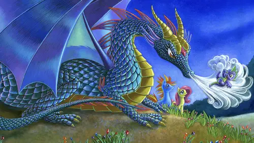
Now composition, telling a story with color. There are some key elements that I want you to think about because it's a little more challenging to tell a complex illustration, a story with a complex illustration than it is for the landscape. I pared down the equation. For illustrations it can be much more complex, so I want to kind of go through some of the things that I'm looking for and thinking about when I'm analyzing my own work, or I'm looking at a student's work. We've talked about color hierarchy, you know, what's the most important, most vibrant, most saturated, most darkest or lightest color in the scene so we can focus our eye? What is the hierarchy of those color decisions? Contrasting size relationship for dramatic effect, big shapes against small. It doesn't mean that the small thing can't be a focal point, but you want a balance, you don't want everything to be the same size, shape of color in a scene, it's very boring. Using light to explore composition and frame the act...
ion. Well we've talked about how light creates a sense of form and how using light can really make an emotional space. So light is a critical piece to analyze, it's not always present, we know that, but when it is you wanna see if it's working for creating interesting color. Contrasting textures for visual interest, I've mentioned this as a key element for variation, very much like contrasting size relationships, if there are varying textures of color in a scene, it's more interesting for us, for the viewer. Dramatic diagonal for drama or symmetry, balance for sense of calm. So I'll show you some examples of all these things in the upcoming illustrations, but the dramatic diagonal, when you look at a scene, if something's on an angle, we as humans tend to see things going up it or down it. So it creates motion, it creates action. If you have diagonal shapes of color in your scene, you're instantly creating a sense of motion rather than if it's vertical and it's parallel to the edge of your vertical line, or if it's horizontal and perfectly parallel to say, the bottom edge of a picture, it feels safer, quieter, and more, just dull. So the next thing I want you to think about is POV or point of view and depth of field. Point of view is literally where am I viewing the scene from? Think about it like a firefly, like, where am I? Am I below? Am I above it? Bird's eye view. Am I at the horizon line? So we'll go through some images and talk about that, and finally movement and motion. I think the biggest issue for color isn't so much that people don't always understand how to use it, they use it in a way that they keep everything rigid in a scene, and their shapes are not, and their characters, and their objects don't feel like there's motion or action. And so you wanna keep that in mind when you're trying to create an interesting illustration or an image. So this is a graduate from RISD who did some really beautiful work for my portfolio class, and this series is often the same story. And I'm just gonna walk through some of the things I just talked about because I think it's pretty effectively achieved here. So I'm gonna ask you again, where is your eye kind of going first in this scene? And this is a harder one. (laughter) My eye actually, well my eye first went to the purple, to the purple horse. Yep. Yes, where'd it go after that I wonder? After that, well what's interesting is that I'm kind of, my eyes are sticking around on the right hand side with the lighter sky, but it also jumps through to the purple tail as well. Yes, yeah. So that was a conscious decision, when she first made this, the tail didn't land back here, and my thought was that I feel like I'm caught too much here and it's bisecting, I feel like it's separate, the softness of this and the hardness of this is not connecting. So then this student created, the graduate, this purple shape to create a horizontal band that this vertical series of shapes would intersect with. So that intersection creates interest, visual interest. And the purple through the window keeps it. Yeah, your eye, and then you're landing on the people Right. That you're supposed to be looking at. But interestingly, most of the time, we read things from left to right. So typically when people compose things, we're often landing over here, then moving across because it's how in the west we read. But this person decided to go from the opposite side, which creates a sense of sort of magic and mystery and theater. If something's entering from stage right instead of stage left, something weird's gonna happen, so it's, I don't think she was thinking about that, but that kind of use is harder to control because our eye's naturally gonna wanna go to the left if you're reading images like you read text from left to right. So by starting here, she had to literally use that tail to pull you across and land at what is kind of the secondary focus here, which is the characters. This is an important element, she gets you there, and then you start to read through all the different characters. Which character do you think is the main character? I think the main character is the woman who's got the veil inside. Actually that's the main character. Oh. Oh. And that, the reason why I would know that visually is that, look at the red and the green, this relationship, look at the level of contrast. She's our heroine here, these characters are important, but she has so much contrast that you might look in here, but this is really where the eye is supposed to land to know that, okay, she's important in this scene. This character clearly is not as important in the scene Right. Because he's sort of hidden in the shadows. Her use of light, even though it's fantasy scene, she's relying on what she understands about how light should function in this scene and she did a bunch of little studies before she landed on this to understand how does the light land across these forms? How is that shadow cast and how should we create some kind of shape that we can still see this character? So there's a little bit of light tipping through the window so that we can still see the face of that character. So there's some really beautiful. It's on the horizon line, it's not dramatic point of view, but there's a lot of motion and movement. There's also a lot of contrast of textures. We've got this ground texture, the smooth of the horse, all these patterns. When people do costumes and they leave them just like a solid shape of color, I'm always disturbed because it's like, tell us more about who are they and where are they from? You're inventing it, but pull from things we might recognize, and so that's what she did, and so I think it's a really strong image. Another one from that same story, and this is kind of a fun one because again, she's kind of messing with us because where it's kind of landing where the vibrant color is, and we might even land somewhere in here, and then look, we tend to look at faces, we're looking across these organic, beautiful shapes, the highest level of value contrast, saturation is all in this front zone. We figure out we're on a boat, but it's not the first thing we see. But then, you might spot this character who's trying to sneak onto the boat. You shouldn't see that character first because in storytelling, it's almost like if you were panning across the scene, we're seeing, oh, they're doing this thing and wait a minute, there's somebody about to sneak on the boat. It's really beautiful storytelling with color because she gets us to this, but it's not the first place we land and it's orchestrated where this sort of framing, this tiny shape, he's very little, but because he's green, we go from the orange to the green and we see the contrast, and we tend to, we find him. And if he were too soft or two blue, we might miss him entirely. Just enough contrast to see him. She also uses the motion of the flame, the swirling of the hair to move the organic shapes of color, and that's why I talked about the movement and the motion. Things aren't straight and stiff. There's a swirl here, which makes it feel like things are active, so that has to do with a brushstroke, has to do with the forms in the scene. And this is also the same student. Now this is from two different stories and what I like about this is she used a vertical format to frame the action, but there's two very different moments here. This is an exquisitely done scene, and what I like about it is that she's utilizing the light that you would find like, under the ocean. She studied that to figure out how it would hit this imaginary form. She looked at the creatures that had scales and textures and things like that to create a sense of believability for an invented character and she utilized the contrast of these little warm notes in this cool field so that we would know we're supposed to look at these characters as important as this character here, and there's a relationship. We look at the eye, we focus on these characters. If they were too cool and too blue, and they were initially, she had to increase the saturation that helped to create a beautiful sense of contrast between the two of them. The other thing that she did was she created this lovely sort of shape that draws your eye into the space, this diagonal of this form, and again, large against small and small against large. It's much more symmetrical, so it's the littlest dynamic, but she chose this sort of shape of color sense of a little bit more drama. Ooh. And finally, again, another vertical scene. A real contrast between a peaceful moment, a quiet moment, the palette tells you that, the symmetry of the forms feels even and peaceful, and here's the opposite, absolute opposite. The green is light we don't expect to see naturally. It feels otherworldly and there's all these diagonal shapes of color to lead your eye through the scene. And finally, this has to do with depth and space. We really can move into this space and feel that there's depth partly because of the point of view. We're sort of above this looking down and in. The concentrated color is in the foreground and we're released from that as we move to the background. So creating depth of field comes from recognizing things that are far away from us become less saturated and become softer in terms of value contrast, and that's why these very complex scenes are effective and make it believable for us. Now this is a different student who worked in really flat shapes, but still used light to kind of tell us the story, and she did the reverse of what you'd expect, which is she used this beautiful red color, pretty saturated into the scene, not in the front, which gets your eye directly there, but she also brings your eye back with this light because we have this glowing red over here. So we talked about color relationships. This connects to that and our eye might start here, we see the form, and we're gonna notice this and maybe follow these vertical shapes back. So color connection is really important and also understanding perspective. Part of the strength of this is not just color, but the drawing. Now there's text appearing on this page, so that's why it might feel a little imbalanced without the text, but she utilized the light in a way just to capture the attention of who we're supposed to be looking at. The color's very de-saturated, it's framed in a way that we barely see that second character, but we understand that there's a relationship between them and again, the palette's dialed back, the use of light is really important for understanding who we're supposed to be looking at. And again, this is all part of the same series. Just pay attention to how your eye sort of flows through the scene. Here we kind of move across the vibrant color, the most vibrant color in the scene to the back of the scene and we find the character sort of in the middle. So it's a wonderful use of a sort of unexpected palette, and it's a little different than here where we're almost shot right up to the top of this building, but what anchors us, which saves us, is the highest level of contrast is right here where the two figures are. So we tend to look up and then come back and imagine them entering that space. So it's two verticals designed really differently, but both really effectively. And this scene is really interesting because she kind of messes with us here. It's meant to be very, very peaceful. We probably notice this camel character, this shape, we look at the contrast of the tree. It's green against purple. And then we find the people under the tree. So we're not supposed to focus on the characters here, we're supposed to focus on the moment and that was really her intent for this scene. And here, this is very dramatic use of light. It's dialed into blue because it's a rainy scene, it's nighttime, and she frames this beastly creature who's probably about to battle with her in sort of this shape right here. So most of the picture is taken up by the figure and the form. You also have these dramatic, diagonal raindrops, which I think really helps to create interest and drama in the scene. So there's a lot of diagonal action, the framing of this creature, pushing it into the blue realm in a place that we might feel a little uncomfortable because it's cold to create this sense of danger and drama. And this is pulled right from films and animations that she had seen. She looked at them, studied them, and then made her illustration. And the same thing, this is the same student, used light as a diagonal shape to lead you to the characters and then hold your attention along these horizontal bands until you find these sort of soft, glowing lights in the foreground that tell us a little bit about who these characters are and where they might be. But it's a beautiful use of light for directing your eye. And notice again, it's on this gorgeous diagonal which increases the sort of dramatic tension and action, even in a still scene with a lot of vertical and horizontal sort of rigid architectural shapes. And you can't miss the drama here. She decided to have the scene not be visible. It's like, happening not off stage, but in a spot where we can't see it, but we know what's happening. My only recommendation was the splatter should go off the page. It's a little too safely contained in here, but otherwise I think it's a really beautiful use of shape, flat shape, limited palette, and emphasizing the red of the blood by making everything else a little more green. And the final scene is, I think, brilliant use of these strong, diagonal shapes, point of view. We're looking up at the phoenix. She gets you to look there because she's finding these flecks of red that get your eye to that. There's a relationship between these spots and that sort of glowing form. And again, it's that same idea of connecting colors so you're using it in different concentrations to move our eye around the piece. And this value of silhouette of these characters, we look where they're looking because that's what humans do, we tend to look where people are looking and it's very, it's also lots of pointers, the trees are paralleling that same point of view or angle of direction. So even though it's a more flat use of color, there's a lot of dimension and use of light, point of view, hierarchical color, really beautifully done.
Class Materials
Bonus Materials with Purchase
Ratings and Reviews
MikeD
I have to say, this class and the companion class were very humbling. I assume I am not like most people who would watch this class in that I have no such artistic talent. I cannot draw at all (limited to "Spike" from TED Talks), but I had no idea such thought, imagination or ideology went into creating these designs. Professor Begin has an amazing presentation style, she is clear, concise and thoughtful. The subject matter was amazing and I can only see it helping me in evaluating my own work and taking a whole new perspective on art, light and evaluation. I highly recommend this class whatever no matter your creative bent. Thank you Creative Live for hosting this wonderful speaker.
Cassandra Bailey
Outstanding course from an engaging, skilled instructor. Mary Jane explains color and composition in a very clear, accessible way. She also puts theory into practice by analyzing a wide variety of illustrations and pointing out what works, what doesn't, the reasons why, and -- for the critique portion at the end -- ways to fix it. Highly recommend!
PETE
What an honor to be able to study anything Begin teaches. The depth and breath of knowledge she shares is astonishing, and she puts it in terms easily understood without diminishing it. How refreshing to be able to watch a brilliant professional, especially after seeing so many who show quick easy ways to fake art.
Student Work
Related Classes
Illustration