Critique of Audience-Submitted Illustrations
Lesson 9 from: Exploring Color and CompositionMary Jane Begin
Critique of Audience-Submitted Illustrations
Lesson 9 from: Exploring Color and CompositionMary Jane Begin
Lesson Info
9. Critique of Audience-Submitted Illustrations
Lessons
Class Introduction
01:45 2Color as Meaning
02:35 3Grounds and Their Purpose
22:26 4The Power and Illusion of Light
15:27 5Creating Color Studies
19:47 6Creating Harmony and Color Hierarchy in a Limited Palette
07:38 7How to Choose a Palette
10:46 8Pulling it All Together: Telling a Story with Color
15:15Lesson Info
Critique of Audience-Submitted Illustrations
So the critique, otherwise known as the crit, is a really critical piece of understanding your own work, because you're being assessed by others in terms of what they see. In this case it'll be just me talking about the work, but in a critique at RISD typically you have a room full of students adding what they perceive when they see the image. And it's not just subjective about like, well I like this or I don't like that, it's a construction of what are we seeing? And how are we seeing these elements of color or form or composition? What's the story being told? What's the idea being expressed? Are all the pieces of your image exploring that? So in the critique and with this critique I'll try to deconstruct the work, explain some of the strengths, what's really work, and then talk about some of the things that could be changed to tweak it and make it maybe a stronger piece. And we will review the elements that I've talked about just in the previous session, which is we'll talk about col...
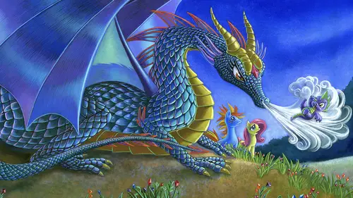
or composition, we'll talk about intent, form, light, et cetera. So we're going to start now with Melanie's image, and she has two. And this I think, in terms of technique it's beautifully articulated with what I'm imagining is probably pastels. I don't know the technique, but it has the feel of pastel, it may have some oil in it as well. But it's definitely geared towards trying to create a sense of dimension and form, utilizing light to tell us that story. It's also a narrative image. You have this character of a dragonfly and it's either just something landing near her or something that she's communicating with. It's hard to know that. But the picture construction I think is really nice, because you have, we look at the first thing, we look at her eyes, we look at faces, we look at what she's looking at, the high level of contrast of the contour of her face is almost like a landscape, so we're gonna tend to hit this spot. It's the red of her lips, the blue of the eyes, the orangy-yellow of the hair, these things in varying saturations make you focus on that area too. And, of course, we're humans, so we'd look where she's looking. And again, there's a lot of high level contrast with this tiny object in terms of light and shadow. So there's a high contrast of value, the light's hitting in a really powerful way. Even the wings are highly lit. So we tend to look here. Now the biggest issue for me isn't so much the beauty of the basic construction of the picture or the exquisite use of the material, which is rendered so lovingly and wonderfully, is that I have a tendency when I look at this is I look at the creature and the creature's looking up and out, and so I tend to go there too. And instead of entering this portion of the picture I'm leaving the picture. So it would've been interesting to see if either the change of where the light is hitting the eyeball of this thing or even if this thing is tipping and maybe it's coming in a slightly different direction or something over here colorwise, maybe it's a gradation, helps pull our eye in that direction. So Melanie, one of my recommendations would be to, and the simplest one, you always try to find, if this is done traditionally you don't wanna have to mess with changing this creature unless you can do it in Photoshop, and that's always an option, but if it's a traditional piece that you're hanging in a show and you wanna make a change that helps the composition, but you don't have to change things dramatically, I would probably create a gradation of light to deeper value, maybe it's a little lighter here, for two reasons. So that our eye will tend to be drawn over, it's very solid color right now, but there'd be a variation that would pull our eye in this section, that's one thing. And the second thing is that this edge is almost as high level contrast as this edge, and so this also tends to make me want to look out of the picture, because the level of contrast of value is really, really the same. So if this area were lighter in tonality it'd create less contrast in this area, soften this zone to keep us more focused on the action. We'd move over there, but we won't stay there, and then maybe exit the page. And that comes to just one other thing that I wanna talk about, which is the picture has, and this is, I'll accuse myself of the same thing, I do this all the time and I know that I do this, so I can speak from personal experience, I wanna make everything pop and have crispness and detail and I want detail in like all these places in a scene, but if you do that it's harder to know where you're supposed to be looking or focusing. So I would tend to soften the contrast relationship, so the level, in the areas that are not as important and let us focus more fully on this exquisite looking face. And it can just be marginal, just a little softening, if this is pastel, the light that's on this form of the chest and the shoulder, just so that it's not pulling it out of the scene, higher contrast, so much detail. There's equal detail everywhere through the picture, so I feel like for the dragonfly, totally makes sense, the face, got it, the hair, which frames the face, yes, but this zone, maybe we don't have to focus on that sort of equally as the face. I hope that makes sense. Does that make sense to you, Kenna? Yeah, absolutely. Okay, and I also love the palette, that's one last thing about it, is that you have this beautiful, cool light and it's kind of a cool overall tonality, but she saved the warm note to frame the face. If this was dark hair or a cold, like a darker color I don't think it would be as effective and it would disappear into the scene. So this is a really smart choice. Gorgeously done, nice, nice work. Now the next one, which is also by Melanie, is, I imagine it's the same technique again. I believe that this is done in pastels, possibly on a toned paper. What she's done that I think is just, it's really smart and it's what I talked about before, is the contrast of textures. You feel the texture of this blanket, this shiny, sort of shimmering note of this shape right here, the warmth of that thing, whatever it is, it's like something decorative, connects to the skin and the form and contrasts the coolness of the water and the blanket, so we tend to focus on it, we follow it up to the form with the face. The water, again, has a different texture. Even though it's all done in the same material there's a variety of soft and textured, textured, and soft, and something with horizontal shapes of color, versus shapes of color that go in this direction. So the direction of the mark making is something I haven't talked a lot about previous, I just mentioned it, but here you really start to pay attention to how that helps move the eye throughout the form. If all the lines, when you're stroking that color across a form, they're all in the same direction it tends to be boring and it also tends to make all of the forms feel homogeneous in texture. And we don't want that. So she has really, really smooth, tiny lines or strokes through the face, 'cause it's smooth, she has more contrasting lines and shapes through the hair, because that has a different texture, same for the towel and also the water. Different directional line direction for the way that she's using the pastel. So those have to do with texture. In terms of color, she's kind of dialed back, it's more in the neutral zone, she's more in that neutral area. But she uses the blue of the eyes and the blue of the water, it's sort of like a triangle, and some of that blue is appearing in the shadows of this, reflected into the shadows and into the skin you see some of that blue light. That helps cohese the fact the boy is in the water. If she didn't do that you wouldn't have the sense of the context, this boy is in water and the water's reflecting back into the shadow areas of his face. So it's a really smart choice. I'm gonna guess that this is based on photography, she had a lot of reference to work from, that would be my assumption, because the focus of light and shadow to create a very realistic looking form is consistent and really strong. If I were to point out anything that seems like it's not quite up to the level of everything else and it's super small, but I spot it, it's the way that the color is handled on this thumb right here. And I keep noticing it I think because it's central in the picture, it's pointing north to the boy's face, and there's a lot of contrast with the sort of blue color all around the thumb. The color of the thumb is also really cold and gray by comparison to the warmth in a lot of other areas in the picture and it's the same light. So I'm like why is the thumb lit in a cool light when everything else is lit with this warm light? Why is there such a ridged shape of shadow? The thumb almost looks like it's an older thumb, like a thumb of a 15 year old, as apposed to a little boy. Now it's possible that the artist had to change the direction of the thumb and used her own thumb, but that little piece of information right there, it's small, but my eye is going to it. So my recommendation would be, everything is really beautifully arranged and orchestrated, the balance of this shape of color to this, they're not perfectly symmetrical, even though he's mostly in the center, it still keeps that sort of asymmetry, the color palette's beautiful, technique is beautiful, but that drawing and coloration of the thumb in terms of light and shadow and form, it's a little detail, but I'm noodly, so I notice, when something is this good, it's like, okay, I wanna just go back and in and look at the thumb and assess whether it's the right length for a child of that age, for that hand, is it chubby enough? Is it the thumb drawn in the same way both in color and anatomy? But in terms of the color usage and the technique, this construction, even where he's looking, even though he's looking out of the scene with this so pensive look on his face, I do, I'm drawn back by these beautiful diagonal shapes and textures and the blue of the water. So she pulls us back to that space and I think it's really smart. So very, very nicely done. Now our next one, this is a former student of mine from RISD and I'm also working with her in Masters in children's book literature program at Hollins University. This is Rebecca. Hi, Rebecca. So I've never critiqued this work. She does these duck stamps for the state of Maine. And this is not like the work she does for the children's book class that we're working in, so it's really different, and I haven't assessed any of this before. But what's interesting to me to see this also, a large version of it, is I get to start to see not just the forms of the birds, which is a critical piece for this. It has to be accurate and it has to be dimensional and well-realized, that's part of the criteria of this kind of painting. So in terms of the construction of these creatures I feel like the forms are well understood, I feel like the painting and the shape making makes it really interesting. I love the fact that the water is almost graphic in nature and yet I still read it as water. And it creates a strong horizontal contrast to both of the birds. And the other thing that I like about it is that, we talked about the diagonal, the birds are not perfectly parallel to the edge of what we presume is the page or the design. If they were it would be dead boring, I know Rebecca knows this. So she shifted so they're on an angle, which makes me feel like their moving and it makes me feel like they could be moving off the page, which you might not want that to happen, except that this bird is kind of close to the edge of the page, so there is a little danger of feeling like directionally we're pulling that way. I almost feel like I wish there were a little more space on that side, so that we didn't feel so close to the edge and possibly looking out of the scene. I probably have given just a little more, or give just a little more of that blue coloration on the right hand side. Not a huge amount, but just enough so we don't break too close to the face and leave the page. The second thing is I love the tail and the shapes, these negative shapes of water that are created by these characters. They're not really characters, I know, they're realistically done ducks. But I feel like the way they're articulated is really solid and it breaks up the space in a very interesting way. If there was anything that I would call attention to it has to do more with temperature of color. Now the piece, there may have been a requirement that the whole thing feel really, really cool or really cold, and when I look on my monitor versus this it's a little bit less vibrant in color, so it's hard to know what's perfectly accurate. But I feel even with that I would've recommended, if it's still possible, you could test it in Photoshop, bringing some of these warm notes that make you focus on the character into a few more spots, like you did right here, into bits of the water that are reflecting the bird. And the reason why is this, two reasons, we would expect that, you've got this bird, the shadow shapes are gonna be a reflection of the colors around it. The bird has a lot of red on the side of it. The second thing is visually it starts to make the red not on an isolated note, but connected to other versions of the red in the scene. So again, you're trying, like you've got some of the red in this bird relates to this red, but I would've done a little bit more in this reflections of the water. The last thing I wanna take note of and that has to do with the volume of the form. I feel as though this bird has more volume than this bird and I think the reason why is because the values throughout this bird are really consistent, they're really very much the same throughout, and so because of that it starts to make this bird feel a little bit flatter and a little less dimensional. So the one thing I'd probably consider doing, even though there's not a lot of focused light, there's still a little bit of a sense that the light is coming this way, I probably would have maybe through this zone shown that volume of the body, so that there's more of a variation from light to dark, so we feel that form turning. As apposed to right now it feels more like a flat texture. And that's a small thing. These are beautifully painted, but that's just the one thing I take note of. And I know Rebecca is, she's amazing at crit. She listens, she tries things, then she does something else, and it's amazing. And I can't wait to work with her again this summer. I think we have another image, yep, by Rebecca. And this is more like the stuff that I usually see, which is imagery done, this may or may not be for a children's book, but this is more of the style that she uses. And again, it's the same artist varying her style from sort of very rendered to something that's more loose and gestural. But she's still relying on reality to kind of capture the essence of what she's seeing. What I love about this is the use of the white, of the page, even though we can't see where the edges are, the shapes fall in an interesting way, like I start here and look at these shapes, I come up, this sort of dripping down, then I come back. It again plays on that diagonal. It's not ridged, no matter where those crop marks are, it's still on a diagonal and creates visual interest. The other thing that I really like is that she has this beautiful saturation of color, which is a passion. And you can understand why that bird is trying to, that hummingbird is trying to get inside to get the nectar, which I think is really pleasing. The use of the pencil marks with transparent color, it's loose, it's gestural, it's fluid, and it's a beautiful variation for her. It's really the opposite style that she worked in in the previous image. So I think this is a great exploration and fun to see. I like that these textural marks almost feel like the wings are moving, so it creates a sense of motion. I think the one thing that I probably would recommend has to do with, again, it's like taking colors and sort of isolating them in a particular spot, this is pink, this is green, this is blue. Merging those colors and using them in more than one spot, but in varying amounts. I would have taken this pink, and you can still do that, and throw a little bit of that into the shadow areas of your green leaves. Maybe some of that purple lands a little more distinctly, very desaturated, it's not pure, but to relate it back to the flower. So it's creating a hierarchy of saturation of a color that you're using in more than one place. And they call this, it's local color, where something is like, is it green, is it blue? What is the color? It's a blue shirt, it's black pants. We know we have to deal with local color, but we also have to think about integration or harmonization or harmonizing of colors. So I see there's a little bit of that, like this pink is a little bit in these areas. I'd push that a little bit more, so there's a little more integration. But style is beautiful, diagonal gorgeous, and the openness is a real departure and an excellent exercise and a great way to go for Rebecca. Now this is Wendy and Wendy also has a phenomenal facility for detail and I think world building. I feel like when I look at this I really want to figure out where I am, who are these characters? Of course, I'm a mother, so I'm drawn to the mother character holding up the little baby. But there's a lot of things to look at here and so I'm tracking, okay, how am I seeing this? And am I seeing all the things the way that I should? Well, Kenna, I'm gonna turn to you, because I wanna see how you read this image. Where your eye goes and what you think is happening here and maybe a little assessment about the color. So I do love the color palette in terms of it being vibrant and bold and based on what we learned earlier that makes it feel very alive to me. So my eye first goes to the moon, which has a face on it, so I like that, because the face is looking back at that main character, so that drives me back down there. And it does lead me to the feet, 'cause of that bright spot, so then I see the little foxes beneath. And I do love the touch of the little characters up in the tree too. So I think because of the composition as well my eyes do keep moving around and then I can see the background too. And I think it maintains, the edges maintain you in the image. Yep, and all those things are absolutely accurate and I think it gives me a good jumping off point for talking about what's really working and what could be tweaked. So I love the fact that we have this beautiful direction, we follow things through. This horizontal band of information is like a texture or pattern that is perpendicular to the main action and that creates a nice contrast to get you to focus here. So that works really well. The light is believable on the forms, really strong. I think what, and I like the trees up here. It softly falls into the sky, so we don't pay attention too much to the trees. They sort of, we believe them, it's a dark space, but she lets those go, which I like. And I think what my recommendation would be, Wendy, is, again, you're like me, I wanna bring everything to a level of detail and attention and like, look at this, look at this. Then I can have a tendency to make things in the background almost as contrasty as things in the foreground. And letting things get soft and letting them go is really hard. But for my eye, these trees back here, if they were softer in the value range of what's behind them they would sit back in space. Kind of like the imagery we looked at earlier. It's really far away, the contrast is lower, of saturation, of value, of everything, so this tree starts to attach to this one and it brings that tree forward. So I feel like it's breaking the illusion of space. So I really want this to be just a bit softer, like the leaves are in the tree. The other issue is this is in light, all this textural tree, this is supposed to be in shadow, but the things that shadow would not have is that textural contrast. They're falling into shadow. So these textural marks on the, quote unquote, dark side of the tree if they were softened more and less grainy then we would really see the things in the light and we would see that form a little more clearly. It would also release our eye from the tension of there's a lot of detail and there's so much to look at that it's almost overwhelming. So for you, your thing is to know when to step back to find those quiet notes, those softer areas that are usually in the shadows or back in space, further back in the way background and the middle ground, and let the detail and the focus be on these things, your characters, the light on this part of the tree, even these little guys right here in the grass that's close to us, we expect that to have detail. Not so much what's back here in shadow or way back in the scene. Having said that, this reminds of Jan Brett, it reminds me of Scott Gustafson, some very famous illustrators. You are in good company, 'cause your work is really amazing. I also like, one more thing I wanna say, is the warmth of the characters pop in this otherwise cool night scene, so I think that's really smart. But if you can, you can go back into the scene, but maybe it's just for future work try to dial into those things to strengthen the work, I think that would be really cool. So Wendy's work dials into a different direction here, even though it's detailed, it's clearly a historic western piece. It looks to be something that is meant to replicate some actual real people, it's not fantasy. And clearly based on some photography. So I think what she does well here is she utilizes her references to give a sense of place and time, to make sure the costume is authentic, and to create a sense of time period based on the palette. It's pushed all to the warm, all to the neutral, which I think for the most part is really strong. I think that the texture of the wall, the use of watercolor, is quite lovely, and I think the articulation in the costume is even more potent than maybe even the articulation of the faces. So one of the things I wanna mention here is you have these two forms and I suspect they're meant to be believable, like their sitting in the space. You wanna remember to cast a shadow. If there's light hitting these forms they have to case some kind of a shadow on the floor, so we believe their grounded, that they're sitting there. And that just seems like something that might have been under articulated or maybe just not considered. The second thing is my feeling is that the heads were done almost separately from the body, because there's more conscious awareness of light, form, and texture on the clothing and the faces feel a little flatter. Now that could be, and this happens a lot in illustration, you're pulling from different references, you've got a face, you gonna match it to this, and the lighting situation's different. So suddenly you have to try to figure out, wait, the light in the picture's this way, but it's not the same as the light in some other element that I'm trying to bring together. So these are things you have to, in a sense you're cheating a little, you have to then imagine how would the light hit that form to make sure it integrates with the outfit that they're wearing. The other thing that I feel like is just something that I would dial back for compositional sake, you have this wonderful vertical shape and horizontal band that creates this perpendicular relationship, which is fine, they're very centralized, but there maybe a reason for that, but this right here, these dark bands, they're so dark I keep looking at them even though I wanna be focused on the main characters. So I would soften those, so they become a less heavy sort of note to the whole picture. You wouldn't expect them to be that dark and I almost feel the ink drawing there instead of letting the illusion of this space convince me that it's real. So that would be just the last thing I would talk about. What I love about the image though is it's a really different direction than the previous piece and so that's why I didn't even recognize it was the same person. So I applaud you for like stretching your palettes and playing with different subject matter. And even stylistically this is really different than the other one. And this is also Wendy's. Now again, this looks more like the first piece and I think some of the same issues are at play here and that has to do with it's complex. When you look at this, Kenna, is it easy to decern where our eyes are supposed to be looking or what you're supposed to be looking at? For me, again, the colors are that vibrantness, which does feel alive, but I think that the, I don't know who the main character is and the snowman is kind of looking the other direction, and so then my eyes don't know where to go. There is a lot going on and so based on your critique of the earlier one, maybe the background is not as busy, then our focus would come more to the foreground. And I love all the little details, but I think there's a lot of competing things. That's it, it's a party with a lot of people talking at the same time. And so that's the challenge here is to figure out what do I dial back? And the reason why is because you wanna focus on, that's adorable, I mean that's just the sweetest thing, so I wanna see that, but I'm struggling to see it. So the first thing I think is softening the relationship with the trees. And again, if it's traditional material throw it in Photoshop, throw some layers over it, so that you can soften, dial by the value of just this area back here. And it doesn't even have to be color, it could just be value. Maybe it's a little cooler, just because if you have things in front that have a lot of heat that might help push it back as well. The second thing is, I agree, that this character sort of looking out of the scene is almost, it's almost split in two. You have this side of the picture, there's a big space in the middle, and then this side of the picture. So you kind of wanna emphasize something that goes horizontally to connect left side and right side. And to a certain degree the fence does that, but maybe the birds could do that a little bit more effectively. And the way to do that perhaps would be if the birds were all the same color we would start to follow, like if it was all bluebirds, we would follow the bluebirds all around the picture and it would become like, think a cluster of grapes, you're following, follow the bouncing ball. You're following that texture. Right now they're all different colors, so they sort of blend into the things around them. The other thing that I'm thinking about, which has to do with hierarchy of saturation, this red and that red and that red and even this and these are all the same red and all the same saturation. So I want this to be my highest saturation, the reddest thing in here. Dial these back. Maybe they're purply-blue, maybe they're just a more neutralized version. They might have red in them, but not this vibrant. So everything else that isn't your main focus those things could have red in them, but maybe they're plum colored or maybe that one over there is paler, but you can't have them all equal, it makes it really hard to read the picture. So again, stylistically, technique-wise, the drawing, the charm of this piece, fantastic. But these are things just to make I think the picture a little easier to read. And finally, this one's a little bit off focus, so it's a little harder to read, but what's cool about that is that then you start to see more than the details, you start to see the construction or the overall shape of the composition. And I think it's pretty interesting, 'cause it starts to tell me a few things in terms of what we talked about before, which was the composition and shape. So when you look at this, Kenna, I'm gonna call on you to figure this out, when you look at the shapes here what's the most dominant shape in the whole scene? For me, the dominant shape is the white on the left. And so I'm a little bit confused as to what's supposed to be there or if there was a character in there maybe then I know more of what was going on. You'd see the reason. Yep, it's this shape right here is the whitest, brightest, lightest, bluish thing in this otherwise kind of warmer scene. And if there were something on the horizon that we would be drawn to we'd say, oh, there's a reason why, but there isn't. And so that becomes a kind of barrier to looking at the things we're probably supposed to be looking at. If this whole area were cast back into kind of a minty green, deeper value zone we wouldn't look at that first. We would look at the warm notes of these characters in the foreground or the cake. So you've gotta be careful about what you make the focal point unintentionally. And at this moment you see it's almost like a gumdrop shape right here and it's very ridged, because you've got this dark shape all around it. So they become kind of secondary information for this shape. We wanna reverse that, because we want that to be something we find, so we look through, and we spot these guys first. So the easiest solution, it's in the background, it's soft, which you have, but maybe instead of a contrasting color, it's more of the color of this world, the kind of minty tonality, it sits back a space, or maybe it's bluer, softer, and is in contrast to what we have in the foreground. Then mister fox over here, we would see that white shape, it's the first thing we would notice, because it isn't competing with that. Does that make sense? Yep, for sure. Okay. And then our next one. This is from another former student, this is Jackie. Jackie showed me this before she sent it in and we talked a little bit about some of the things going on here. And this is also an issue of hierarchy for visibility, 'cause there's a lot of detail, a lot of texture here. So I'm gonna ask you, Kenna, what do you think we're supposed to be looking at? What's the focal point? So for me the focal point is the tiger's face, which is really cool, especially once you get down to the paws at the bottom, but there's, and it's beautiful, the colors and everything, but there's so much to look at with your eyes. So what we have now, even though, now this is a more decorative treatment, this isn't like highly rendered, it's flat shapes of color, but there's still the same kinds of issues. They're similar issues in a sense of a hierarchy of the space. And I want to look at this element here. It's a very symmetrical design. It becomes more decorative than say narrative. And there's nothing wrong with that. Sometimes there's a lot of poo-pooing of like, oh, it's only decorative. Well, decorative elements can also tell story, but be based on their beauty and shape construction. So I see this as both decorative and symbolic of a kind of a mystical, magical space. And she did share that, there's a lot of symbology here. But I believe that these elements that are centrally formed are the most important thing. So I would pump the saturation in those parts, so that we can focus on them, make them warmer, make that tiger more orange, make this a little more golden. And reduce the vibrancy of the color of these elements all around, make them softer as a mark, less crisp, and also less saturated. You have to push the saturation here with something and we know what it should be, which is this area here. These marks also I feel like this is done with a kind of drawing style that has a lot of line work and texture and she actually pulled some of the line out that was in here before, and that's fine, but it's competing with all of these lines. So I would probably play with the size and weight of these, it's almost like light energy, they look like this would be, soften them, so they feel more like light and less like strings of color. And I think when she does that this will become the more dominant element and this the secondary element. So the hierarchy is more saturation, strong use of contrast, of value, so we focus on flowers, tiger, and the owl, and some of these details. Softer elements that are secondary around. Softer in texture and shape, maybe they're varying in size and weight of these lines. And also, if they're supposed to feel like light maybe we'd look at beams of colored light and see what does a beam of moving colored light look like? There's shapes that can happen if you've got something that's lit and you're moving it, what does that look like? It varies from what you're holding to something coming off of it. So like tubes of light moving, what would that look like? I think right now they feel like flat strings, so I think the next level is to push that aspect of it. And we actually email back and forth and I think that's part of her intention. But what I celebrate about this is it's so evocative of something that she cares about, symbols that matter to her, and I think the symbology in the birds and the tiger and the beauty on the whole is really, really stunning. So I know she's gonna work more on this, she told me she is, and I look forward to seeing it. This is Catherine. And Catherine, oh, I know Catherine. She's someone that I taught in a continuing ed class and a portfolio class. And what's interesting here is that I've seen work that she's done that looks really different than this. This is more presentational than some of the other work she's done, so it's really cool to see. So I'm assuming that this is based on, probably on a photograph, just because of the construction and the realism of the faces. And what I think works really well, kind of like Rebecca did, she uses the line and the texture of her pencil to become a part of the color. And so that makes some beautiful motion and movement. The lines of the hair, it changes direction, and it's really appealing. I know what she wants to draw and what she's interested in is the faces. She's focusing a lot of energy and beauty on these faces. And I think that works, I think it's really strong. I think what the part is that she's less interested in and it shows is all this soft area that's probably their shirts, their clothing, but because it's so soft and so unresolved it makes particular this head like it's floating in space. And so you've got some consciousness, Catherine, of light hitting these forms, you wanna make sure you have a little bit of that hitting on their shirts to see, A, they're two separate forms, and that there's some consciousness of light hitting on this form that might be different than this one. 'Cause I feel like the floating aspect of the head and even this hand makes it feel a little less believable. It works in a photograph, 'cause we believe it, it's a photograph, but when we see it in a picture it doesn't always translate well. So that's one thing I would recommend. Maybe the tones are a little deeper, so there's value contrast from face to the color of those shirts. That would help to anchor those forms. And then the third thing is watch the outlining of things like hands and the ear. It draws attention to those areas, we wanna be focused in here. Let the line go where it doesn't need to be. Maybe you have a little indication of line, but then it falls away. Maybe there's a little line around the ear, but then it falls away. We want the lines to be in key points on the face, but not surrounding ears and fingers. And the reason why is it starts to flatten the form, like a coloring book, it flattens out the shapes, and that's not the style that you're establishing through the face and those are the most beautiful part of the picture. Really nice to see the work, 'cause it's been a few years since I saw some of Catherine's other work. But push the contrast of values, watch your line weight, release the line where it doesn't need to be, and make sure your light is consistent on the faces and what would be the body form. Nicely done. And this is also Catherine. This is more in the realm of things that I've seen from her before. She is also someone who works in the children's book realm and this is clearly a narrative scene, which is, I'm not sure what the narrative is, but there's definitely some story going on here. So, Kenna, I'm gonna toss this to you. Based on the things that I've talked about already what comes to mind? Just anything, first thoughts as you look at this picture. So, first thoughts, I'm thinking about that diagonal, 'cause we talked about that earlier, and that it definitely helps me move through the picture. I am thinking about dimensionality and I feel like I see that in the girl, the main subject, but maybe less so in the water with those characters down there. Do you feel like you want them to have that same level of dimensionality? Yes, yes. Yeah, it breaks the magic of the moment, because these feel unfinished and maybe, this could be an unfinished piece, I don't know, it's possible. This is so beautifully understood, these soft marks and this volume of this form, even though it's just softly lit, that I kind of expect the legs and these other characters in the water to be similar in treatment and that keeps the consistency of the world. So I think that's spot on and really smart. I also love the diagonal action and this mirrors her, so I don't know what this story is, but I'm like, there's something magical going on here, I wanna know what it is. I'm gonna have to ask you when I see you next. But what I do think is besides the consistency of a style or method of coloration, I also wanna pay attention to the shapes and the organization. I like that I can see this form, but I'm a little bothered that these guys are kind of cut off at the bottom. I wish they were into the scene a little bit more, because when you cut things off at the neck, the waist, anywhere, a ridged spot, it tends to make it harder to imagine the rest of that form. So I probably, this guy is fine, but maybe pull these guys up a little bit more into the scene. The second thing is this creature right here is kind of getting in the way in the composition, 'cause I'm looking at this creature, I'm following these creatures and I'm looking at her and I'm looking up. I almost want something to pull my eye back down here, but this competes with the girl, it's sort of in the way, and I don't know where it is in space. Because of the coloration I'm thinking, oh, maybe it's really far away, but it's so perfectly vertical it has, she has all this action, and the creature's going like straight up out of the water, it feels a little unnatural. I would probably remove this little guy here. And do you see how, even if I put my hand over it, it starts to have a little bit more dynamic action without that creature there. So if there's a way, even in Photoshop, to take him out, test it, see what it looks like, that would be great. And maybe resolve the coloration. But just keep going, just keep doing what you're doing with the girl and maybe have the contrast, she's the warmest thing, maybe the most poppy thing in it, but these things can be cooler, but make sure they relate back to the colors in her. The other thing is I would watch the lines in the clouds. I would release from that, I would just let go of that line. They're back in space, they're softer, we don't need to pay attention to those. So yeah, if this is unfinished I wanna see where you go with this, 'cause I think this is a really beautiful piece. Thank you, Catherine. And then this is Jim. Now it's interesting, because we've seen a, the images so far have focused on more characters or people, and this is really more focused on an environment and landscape, so I'm glad that we have this to talk about. Now what I think is the strongest aspect of this in terms of color and world building and a sense of believability is the perspective of all of this space. I really believe this is a space I could walk through. I'm like, oh, that seems convincing, I believe this town. The architecture is invented, but it's also based on some real things and the perspective is solid. So this whole aspect of the illustration is, looks like to my mind, Jim, if you're watching, you were totally into all of this. This was really, this is your jam, this is where you live. And your use of color is really smart, 'cause you've limited the palette to the greens and the reds and warm tones. And so it's within a kind of palette range and value-wise and in terms of color that's fairly limited. So that works really well. Where it's not as strong is the characters, like I was mentioning before, they're outlined with a really hard ridged line, which flattens them to be almost like a coloring book. They don't feel like the belong in this world. And this one is integrated a little bit more, but I feel like these, and that works as well, but these, which are probably the main characters, are drawn in such a flat outlined style that they don't quite integrate with this world. So I would try to treat the character stylistically in the same way that this is, this house, with the kind of modulation of watercolor and line. And pay attention to maybe releasing from the heavy line. You could even use a colored line and keep it going from fat to thin, fat to thin, so it's not all one weight all the way around the piece. And that's true of back here as well. You have this beautiful sense of space, we're going back, receding, but, Kenna, to your eyes, do they look like they're coming forward in space because of the line, is that illusion, do you see that there with some of these elements? Think that the main little group feels like they're coming forward, but I'm not, the dragon in the back looks like it's going the other way. I'm not really, the other one's look like they're coming towards this way. Was that what you were? It's more that in space the line work around this, like this feels and this feels, this is supposed to be behind that mountain, but it's really heavily outlined, almost as thick as that, so to my eye it starts to look like it's coming literally closer to us in space visually than any of these things, or that little creature sits in space beautifully. I believe he's in that lake, the Loch Ness. This element here and this don't feel like they're back there in space the way the rest of this stuff is. You have to keep a consistency or you're breaking the illusion in the piece. There's one more thing I wanna call attention to, Jim, just because when you're constructing the illustration you kind of wanna think about how you're placing the elements and how they should integrate to make a more interesting composition. And it has to do with you have these things kind of almost equidistant from each other and I assume this is where the focal point is, but these are also almost on the same line, like you could draw one, two, three, four, five, six. You wanna keep more asymmetry and maybe remove some, maybe this is important, but is that also important? Is that important? If we remove this it would be more interesting, because this becomes too equidistant and equidistant elements are just not as interesting. So you wanna create less equalness. If I took that out suddenly I would look at this and then move to the key moment. This kind of stops me. It's bright, it's red, and it's almost halfway between this element and this element. That's just a little about how you're arranging and organizing elements in your composition and space. But I am so intrigued by all of this world. I suspect that this is a person who likes to build environments and what you do find sometimes is sometimes people that's their strength. Environments are harder, because it's, to build a world like this is very complex, so if you can start to bring the characters up to that same level of exquisiteness you're gonna be rocking it out, because I'm super impressed with the drawing in here as well, it's just really cool. Look at this little guy down here. And I wanna know the story too, it looks really fun. Little guy right here. So this is Cassandra and Cassandra, I think it's digital, but it almost has a kind of cut paper feel, which is really cool. Cassie, yeah, Cassandra. So what I think is really appealing about this is we have this kind of world that it's intimate, it's a girl pretending and playing, maybe she's a fairy, maybe she's the big sister of this baby here. Hard to know. And they have the audience of the toys. So the arrangement is interesting and compelling through the lower part of the picture, like I really believe what's happening here. I can focus on the color, the contrast is where it needs to be, which is this focal point here, then we move down to these areas. The colors look all related, there's a relationship there between the reds and the blues. I worry that that fox is almost the same color as her shirt. I would maybe make that more saturated to make sure she's the focus, just a little thing. But I think it's mostly this area is convincing and believable, it's this zone of the picture that I find isn't helping the composition. It almost feels like she felt a necessity to build this room and make this look like, okay, there's the ceiling, there's the light. But I almost wanna come in, I wanna like crop the picture, so that I'm seeing a lot less of this, what we call a dead zone. It's like there's nothing going on here and it's very symmetrical and there's a lot of action through here, this is symmetrical, but you have all this beautiful organic information. So this is where I feel like less attention should also be paid to all of this stuff here, because it's drawing my attention right up here and out of the picture. So, Kenna, any thoughts about what you would do to make the focus really stay here and maybe remove that kind of quiet or sort of boring space at the top? Well, I feel like the light is of equal brightness up at that chandelier as down below, so maybe you could make that darker to kind of keep the focus down below. It could be warmer, softer, and these areas. Or warmer. You know when you have a warm light it gets darker fast, what's around it. So this could be all deeper in shadow with just a soft sort of warmer light that's cast, so you're following the direction down to where you want us to look. You could also increase the warmth of the light, which I kept thinking the piece feels a little cold for the sentiment. It's this super sweet beautiful moment and yet the colors are all kind of a little cool, so I would take and make your light source warmer and cast that warm light, like the light on the floor, bits on the faces where we see the light. It doesn't have to be super dimensional, but just heat up the light and maybe there's more shadow in these areas. And it doesn't have to be gray. Used a lot of gray here. Tweak it maybe to your more purply-plum tone, so it's cooler, it's darker, but it's not going to black. That I think will help keep the focus where you want the focus to be. It's a really sweet piece, I really like it. The other thing I wanna call attention to is the color of this ground is very close to this character and this character. And again, hierarchy. You might wanna shift that tone, so it's related, but not the same color as fox or the girl. She's starting to disappear a little bit on this color and the background. So I would push her tights and her shirt to be more vibrant red, so we really spot her. And this is also by Cassandra. And this is really sweet. I like the interaction between the characters, I believe the space, I like the lighting, and the sense that we're underwater. It's a beautiful palette actually and I think it's more successful than the last piece in terms of this hierarchy. Do you go to octopus first? Do you look at octopus? How could we not, right? We don't have a choice. Although we might be drawn to this dark shape, so maybe the value of this could be a little bit softer, so it's not competing with octopus. But the warmth of that really draws us in, we look at its eyes, we look at his companion, who's bringing something to the other character. So this is really beautiful. Then the bubbles lead us up. This is where that repetition of the yellow texture really moves your eye along, super smart use of that. And this shape kind of mirrors some of the action down here. And this shape is almost the same size as that, so again, it's kind of repeating the notion of that shape. This is all I think is perfectly done, I love it, I think it's spot on. The only area that for me is really a little imbalanced is this zone over here, 'cause it's drawing too much attention to itself. It could be softer. The other thing I wanna mention that I think is wonderful is that this, I don't know if this is traditional or digital, I really don't know, and that's a good thing, because she used textural mark making to make this. If it's digital she used a different brush, she used some kind of dry looking gouache-like brush. And you have to play with those things in Photoshop or you're gonna have this homogenous, really boring looking painting. So I think this is terrific, Cassandra. I think it's spot on, it's sweet, and the focus is where it should be, the atmosphere feels sweet and soft and light, not predictable, it's not pure blue. You used warmth to keep it warm in terms of the spirit and the emotion. And then finally, this is the last piece. And what I think is interesting about this is that Cassandra's taking the risk to dial this into a really phantasmic work palette. You have all this pink and all this red and then contrasting is sort of baby blue, which is risky, this is a really limited palette. So let's talk about this and I want your help, Kenna, on this one. The scene is organized with a lot of elements and characters. You can probably figure out that the girl is the main character. But as you're looking at this what is helping the composition and what's distracting you in your mind? So, like you said, there is a little bit of that white on her cape does bring me to her and I think in terms of the composition there are some similar shapes that keep me moving. So the circular shapes keep me moving around. Most of the animals are looking at her, whereas it looks like the bear is kind of looking the other way, but he's looking up at the little owl up in the corner. But I don't know if the tones are too similar to know which one is supposed to be kind of the strongest. And that's really the key point. And I think you zoomed in on the biggest issue with this, has nothing to do with the style, or the storyline, or the elements, it has to do with the similarity of the value and the color. You have this pink color, this one is repeated many, many times, and this one, so we're seeing that same pink at the same value and same saturation again and again, again. Because of that we aren't sure where our eyes are supposed to go. We sort of spot the darker, more vibrant color. But if you took this and desaturated it completely, went all to black and white, and I do this with my work all the time, I desaturate and say, is my value system working? It would not work here, because what you'd see is it's mostly the same value, a light 40% gray or 30% gray. You don't want that, because then we can't find things in the scene. You want a hierarchy from your darks to your middle grays to your, or your darker grays, middle grays to lights to white, even in color. So my recommendation is that I would do two things, I would start to play with the value arrangement. Maybe the trees up here are all a deeper value consistently than any of the stuff that's down here. That would help to sort of frame these elements. Maybe all the saturation, and not just the red saturation, maybe that blue could be dialed up to get us to focus on a spot. Maybe it's more in her little cloak here, so it really pops more, 'cause that white sort of blends into the background, the values are very close. So maybe that's another thing to push is the saturation, the playing with the saturation in your focal areas. But even these, look at how close the value is of this really important character to everything around it. The value of this to her, her dress. You've gotta play with those value variations to get things to work, play with the saturation, and the last thing is you've got a blue, you've got a red, and you've got a yellow. You've gotta figure out those beautiful colors in between them. What are the purples, the greens, and oranges. Now it wouldn't be very orange, it's a very pale yellow, but if you dialed the yellow up a little bit you would see that variation of saturation, of all the colors you can get from your blue, your red, and your yellow, and your value variation to frame the most important part, which is your characters on the lower part of the picture. What I love about this is I could almost isolate this section of the picture here, if I could crop in I would look at this section right here, and you've got almost a complete illustration, which really works well on its own, because it, from here to let's say here, we'll cut off the tail of that deer, the value variation and color variation, what's in the background is really cool, what's in the foreground is really warm, is quite strong. I would actually, Cassandra, I would take this image and crop into that zone and then analyze what's working about that and then apply that sensibility and knowledge for this whole, much more complex picture. The style is fabulous, the storytelling is really interesting, I'm curious about this fantasy world, and I wanna thank you. You were the first person to submit for CreativeLive and I really appreciate it.
Class Materials
Bonus Materials with Purchase
Ratings and Reviews
MikeD
I have to say, this class and the companion class were very humbling. I assume I am not like most people who would watch this class in that I have no such artistic talent. I cannot draw at all (limited to "Spike" from TED Talks), but I had no idea such thought, imagination or ideology went into creating these designs. Professor Begin has an amazing presentation style, she is clear, concise and thoughtful. The subject matter was amazing and I can only see it helping me in evaluating my own work and taking a whole new perspective on art, light and evaluation. I highly recommend this class whatever no matter your creative bent. Thank you Creative Live for hosting this wonderful speaker.
Cassandra Bailey
Outstanding course from an engaging, skilled instructor. Mary Jane explains color and composition in a very clear, accessible way. She also puts theory into practice by analyzing a wide variety of illustrations and pointing out what works, what doesn't, the reasons why, and -- for the critique portion at the end -- ways to fix it. Highly recommend!
PETE
What an honor to be able to study anything Begin teaches. The depth and breath of knowledge she shares is astonishing, and she puts it in terms easily understood without diminishing it. How refreshing to be able to watch a brilliant professional, especially after seeing so many who show quick easy ways to fake art.
Student Work
Related Classes
Illustration