Lessons
Day 1
1The Basics of Microsoft Excel: Customization
35:43 2Anatomy of Microsoft Excel
43:09 3Formatting: Making it User Friendly
39:05 411:30 am - Building a Document from Scratch
31:22 512:45 pm - Advanced Formating + Styles
43:30 61:30 pm - More Formatting, Transpose, & Alignments
38:34 72:30 pm - Basic Formulas
31:383:00 pm - Auto Sums & Inserting Rows
19:46 93:30 pm - Advanced Auto Fills
28:42Day 2
109:00 am - Working with Large Worksheets
39:16 119:45 am - Hiding Columns
41:50 1210:50 am - Tips and Tricks on Printing
31:53 1311:20 AM - Titles, Headers, Footers and More
35:37 1412:50 pm - Q & A
09:16 151:00 pm - The Magic of Sorting & Filtering
29:41 161:30 pm - Conditional Formatting
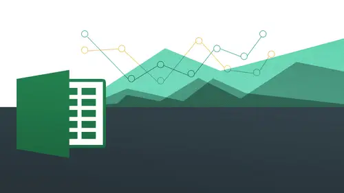
33:23 172:30 pm - Communicating with Charts
30:42 183:00 pm - Making Your Chart Pop
37:19Day 3
199:00 am - Working With Tables
36:01 209:45 am - PivotTables, PivotCharts & Subtotals
40:22 2110:45 am - Graphics: Shapes
30:45 2211:15 am - Graphics: Pictures
20:27 2311:45 am - SmartArt
14:31 241:00 pm - Text to Columns, Data Validation
41:14 251:30 pm - Data Validation: Date
20:59 262:30 pm - Working Between Programs
26:24 27Templates in Microsoft Excel
14:13Lesson Info
3:00 pm - Making Your Chart Pop
So now let's go into some mork kind of more graphic designing stuff. This is where it gets a little more fun and this is all going to be another preview for what we're going to do tomorrow when we start working on our images, graphics and all kinds of other stuff here. So I want to make this look a little bit mohr interesting, okay? Because this is the title of the whole chart, so green and twenty four points or eighty point twenty eight point font is pretty cool, but maybe I want to go a little bit further than that. I'm going to select this text box and we go to format and notice how you have this section called word art styles, word art styles and that's pretty awesome because they have all these great stiles just fresh off the shelf for you to work with. So what are we talking about here I click on this will drop down notice I have all of these options for me to work with. Okay, so let me just go on and choose the first one and you'll see it does something like that. We kind of hav...
e, like a cool little outline a factor I can choose that one just in time for the holidays. I do that when I have a little grady in a little more of a metallic thing whenever you want to d'oh okay but also notice that I could come over here to my text phil and then make some changes to them as well and just do it that way where'd you go text phil hey and it doesn't just like that you can change the text outline to be a different color you know, things like that so we're now making it a little bit more designing something a little bit more interesting to look at okay, so these parts here or just basically what they give you on off the shelf and this part is where you can really customize it you can start off with these and say, you know what, I'd actually like to change the phil color I want to change the outline color I liked it actually make the outline a little bit thicker or thinner or whatever you wanted to be and seeing what gives me a little preview on the pc side alright, we could do that all right and go from there now we also have text effects on top of that this text effects are very cool we're gonna get into all these things a little bit more tomorrow we're with images as well, but notice that I can actually put a shadow on it I could put a reflection on there I could do a glow, I'd do all kinds of things, you're going to see how great. These are special and we'll start working with kind of an open more bigger a bigger canvas for us to work with someone going to do like a cool reflection. First of all, it was going to choose reflection over here and choose that and you see how I have kind of this cool little reflection is if it's sort of like a ripple effect on top of you know well later something like that and that's kind of needed just as mohr visual interest that's another kind of visual thing again it's like it's like okay, that's kind of fancy. So just some third certain things to think about, you know, certain things. There's no, that a right your disposal entirely up to you, how you want to use these things but know that there is this word art styles and there are all these other effects that she could work with a cz well, ditte, if asked a question, it actually came in a couple minutes ago. We just caught it if you add or modify the worksheet where the chart came from room a chart update on absolutely well everything I linked up it's totally linked up. Yeah, great question and that that's really one of the benefits of it changing the chart make the chart shoes be changing the data later the data set from the chart we'll change the chart itself. Okay, so that that's a great question and it's nice that it works that way. Ok very good yes ask why the function three d doesn't work that case on the text effects s so where are you right now? Okay, from these guys yeah, well, normally you're gonna have this kind of thing but not in charts so if you had, like, normal text where you drew out a text box, you'll be able to do that but in short the reason why? Because they're just there for normal um text effects themselves so they added them on here but when you're doing text inside of charts, they don't have them there because it would kind of fly off of the sort of parameters of that chart framework, so they just don't have them there. So any of these that's that's a good question for noticing that but these guys are not so is invasive as the other ones might be okay, but but tomorrow we're going to get to the images and graphics and stuff and be able to see how we can actually work with those. Okay, great. Okay, so now let's now jump away from here? Actually, no, we'll come back into to our axes and then we're going to go ahead and show you how you khun change the axes numbers as well okay, so you can change the numbers here in terms. I want to make this, like, twenty thousand or something like that on dh. Then we're going over to the max side and play around with those and we're gonna finish off with the pie charts. Okay? So let's, go ahead. And now, uh, go and back into our layout mode and you remember how we had our axes right here, axes and we have our primary vertical axes, and then you notice I have way down here. Is this mohr primary vertical access option? So that's something I always encourage people to do always look for the more options because the people who designed these things came over the zillion ideas and the implement of them. So we want to take advantage of them because there are so many so many options in here, like it's, almost limitless in terms of things you can do, so always look for them or options whenever you're working with these things. And I will talk about that when we're talking about graphics tomorrow the same idea. So let's, go ahead and go to more primary vertical axis options, and now we're kind of like, really, you know, sort of in the control center. Of the whole operation here where we can really kind of cooked this thing up and make it but we want it to be and really make our chart something we want to be seen going to move this over a little bit to the right you can see the chart as I make the changes to it so notice here I have access options I have minimum which is fixed zero and I have maximum which is also a ten thousand okay you can see here is ten thousand they've automatically put that there but I don't want it to be there so I'm going to say maximum I'm going to say fixed I'm gonna make that twenty thousand to make that change and then hit tab and then you'll notice how it changes right there so this is really good because at first those guys look like big hitters like well you know what that's not your quota but your quotas twenty thousand so we get a lot more to go so it's really communicating something very very different now when you bring that up it like the numbers of the same but the kind of communication we're working with when you change the access drastically changes because now we're saying hey twenty thousand is really what we're shooting for or one hundred thousand whatever it's going to be so this one little number changes everything in terms of how this is being visually communicated okay, so some things to think about it we're gonna actually come back to us when we work with the pie chart as well but I want you to police know about the extra options also because you can come into here and you could just have a field day with all these different options for you to be able to work with and just play around with it. So if those of you who are a little more advanced out there I want to get more advanced I would definitely experiment with not only this access options window but also the other options whenever you get to them whenever you see them okay, so continue looking for him and then you will not be disappointed, okay? Somebody go and get out of this and you'll see here okay? Great looks good or actually it looks worse than it did before because these poor people work so hard and then we just we brought him down a couple of notches. Okay, very good you're going to see a lot of the same stuff on the max side. So when we come back over here and again, since we've already done some of this stuff, we're gonna go a little bit faster than we do in this last time, so I'm just gonna go ahead and highlight all my content discovered here and then notice I have this chart section okay, so same idea charts and we go to column and then I'm going to go ahead and just choose one. So it's gonna go ahead and say three d clustered column, all right? And then that comes in. All right, now, the main difference you don't number one you're going to see we have our contextual tabs that appear here, I've charts chart layout and I have format see that so basically the same thing. We have three different charts here. This is also known as a contextual attack, because when I click away, those go away, you see how that works? This is a contextual tab. We haven't actually seen the contextual tabs on the mac side yet, because when we're working on the header and footer on ly, a new toolbar popped up, but now we're working with our first contextual tab when I click on the he actually going to see the contextual tab appears right there, these three items, so we didn't actually see those before we start working with images, we're going to see them a lot more than we did before. Now you'll notice something glaringly absent, and I don't think it's here, but if you want to move the chart, there is no move chart option here, as it was in the p c okay, so we see it let's see? Is that here? It's no it's not here format no it's not here so they did not actually put that inside the mack version so the best way to do it it's a simply right click and then she was moved chart so it's not actually on the toolbar to be able to do it that's probably the one main difference that's really? I think probably the only difference is you're going to see here so again I just write clicked on it I say move chart and I say new chart I'm going to sit just havin column this time new sheets and say okay and then there we are essentially the same thing okay, so that's really the main difference against if you want to move the chart maybe some of you are on the mac side wall was doing the pc side. We're scrambling for that again it's just a right click and she was moved all right and then we have all of our same oceans chart quick layouts and we have all these options don't want to use these I might quick style that I want to use these all right, you see all that kind of stuff I could do very quickly and easily I can change the colors I want teo I goto my purple I can do that nice, nice and easy alright come back to my that one okay? So very similar what we were doing already I can also do the switch plot all right, so that's basically the same thing where we just kind of rotate this is our kind of a transpose or switching the columns on the rose this is where we're gonna go teo change change the chart data just like I did before. Okay, so a lot of this stuff if not all of it is exactly the same maybe it's going to be different icon we're going to using different terms but the ideas are exactly the same with enough poking around you'll find it all right so our chart layout also exactly the same way you never chart title all those options right? Do we want it? Where do we want it access title all those things where we want it or not what do we do? We want it yes or no all those things legend is where do we want it it's going to bring this down to the bottom and then there it is down at the bottom. Okay, so all this stuff is exactly same a lot of overlap between both programs again so this is really beneficial if you know one you can transfer all this knowledge over to the other so if you want if you're already familiar with the mac but someone's making you work with the pc so yes I know that version the pc also because there really is a lot of overlap and you're learning it today but little did you know you probably already knew a little bit more than you thought okay all right. Question here from romney forty four get this in before we move away from column thank you rodney field questions up I have to spell it out step by step so rodney has items listed in column b and he has calculations in column c d and e he has a per unit cost in column g now he only needs to chart columns being julie stuff in between he doesn't need a is there a quick way to do this? He's been editing the column selection in the function window of the chart but is there a quicker way I'm from understanding correctly so he only wants tio he has a whole bunch of data in a table but he wants to be able to on ly chart out parts of the data yet b and g the stuff in the middle of the right and that's what if he's on a mac is just going hold on the command key and select and then and then select the next part do the command key fantastic um so look, I only want to do this part and then I hold on the command key and I'm now selecting independently he's this one and this one I could never do a chart of just those two okay, so I do that okay? You see now I'll have to have their yes a quarter one into right? You can see that there I think I miss one part that we can see a quarter two and quarter for can't we do that one more time? Okay, so I missed that last one here so I'm gonna go ahead and highlight all these over here and then come down right now I have everything there I'll do one more time do there and then bam there you go. So I've highlighted a quarter two and four and then I have all these guys right there as well. Okay, so I've now got it I think so. Okay, good closer. I'm sure that's not right he'll be telling us. Okay, so um okay, good. So, uh all right, good. So all this should be very similar format should also be the same. So again, I select one I selected again. Okay, you see that now I have this one isolated and I have my fill that we're talking about and I'm going to go ahead and make this a different color it's kind of like light orange right there if I want to select it want to do all of them I select just once I'll go and make that kind of bright yellow you see ban there we have it there. Okay, so everything is exactly the same in terms of those things. Okay um and our word art going to see the text there they call them textiles we have it over here and we have the different effects that we can work with k exactly the same we have all these other, um kind of off the charts kind of like off the shelf I should say different effects case pretty much everything is the same in this case. Okay, so it's niceness ways to kind of make your chart customized nice toe look at easy to interact with waste just really make it so it's just user friendly and communicative that's really what we want to do because their numbers I cannot actually communicate on their own so much because it kind of kind of dizzying and busying so we want to be able to use our charts to do that we want to make our charts also easy to read and very straightforward and just pretty to look at so let's come over now to yes cat I couldn't find the legend on the mark side howto tex I couldn't find the legend had to find text then type it say I wanna type yeah okay, so what you want to do something with the legend yeah, piper, type some text on the side off the like you did on the other side on the pieces side. If you want it quarter say you want a quarter on the bottom, ok? Yeah. So that's going to be our our access let's, come over here to our chart layout and that's going to be our access title. Horizontal axis title below on then I could just type out quarter, and it comes in automatically on the mac side. You make everything so easy. Thank you. Okay, so gets there. We have it there. All right, so those we'd get out the first time. Okay. So access and then horizontal axis title and basil say title below the actors. So yes. So anything wasn't clear? Definitely definitely asked. And of course, I could go ahead and make this a little bit bigger by bumping it up and see. Same thing. Bam, bam, bam! Just like that. Okay, so now let's do a different type of chart. We're going to go to pie charts and pie charges. You understand? It's going to be a little bit different. Purpose. Okay. Pie chart is going to be like, if you have kind of percentage, because you're really trying to look at, you know, what's this sort of, like a piece of the pie and percentage or doesn't always have to be that way, but it really is a good usage for because it's going to give you sort of a general idea as faras how much of a space something has taken and the grand scheme of things on one hundred percent, okay, so we're going to be looking for here, you see this actually all that's, two hundred percent, and this is actually going to be an example that this person asked about right where we're actually going to be highlighting one part skipping over this part and then going over to here, ok, so this is good timing, so we can see here we have this here, and I'm going to just stand the max side. I'm gonna do command and then go out and select and drag see that there. Okay, so we have all that stuff, all that stuff ready to work with if you're on the pf, your pc side it's going to be control, okay, so what we're going to do now is just highlight all these things, then go over to our charts, and this time we're gonna go to our pie chart. So good bye and then notice how we have a different set of layouts here we have pie a pie we have exploded pie we have borrowed pie all delicious sounding charts okay, but we're just going over exploding pie that's amazing all right, so we're going to snow go two three deep I we're going to make it explode on our own actually all right, we're gonna go ahead and just say three d pie and beautiful pie just appears on our screen amazing. So now I want to move this to it own sheets so very easily and is going right click if you're on the pc you could just go and go the right hand side and say move chart I was gonna go ahead and say right click I'm going to say move chart and and I call this one hmm hi. Okay, wait go now we have our pie chart any by itself it looks pretty great but we're going to go ahead and make some changes to this. All right? We want to add on certain things to this that's going to allow it to just kind of just really stand out in terms of what we want to communicate all right? So you're going to see also the fact that a lot of these things are the same where as I you know I have my different charge you can change the chart type write all that stuff here I can change the format, all those different things here I can add on all my different numbers and should be about data labels and everything like that, so let's, just say, for example, I on ly want to do, um data label for this blue on, so when I click on it once the entire chart gets elected, you can probably guess if I only want to do for the blue, I just select that one one more time, you'll notice I now only have three little circles here to indicate that on ly that one has now chosen. Okay, so I'm gonna have this one here and that's great and then go to my format and let's say, I want a number one I want to change the color of that and the number two, I'm gonna add a data label to just that particular one format is now going to allow me to them to go in and change that color. I'm going to make this a little bit of a brighter yellow he do that, and after I've done that, I'm gonna go back to my chart layout, they're from the peace you just going to lay out, I'm going to say data label and notice I have a bunch of different options here, I have the value and I also have percentage because that might be there's gonna be two different things right depending on what you're working with here, so I'm actually gonna say percentage in this case and do that and then that appears and you see a kind of shrunk some things down a little bit because of the placement of this, so we're going to be working with that a little bit in terms of where we want things to be placed, so we have that there and then also noticed that I can click on that individually also just like I did with my data level before if that's too small don't worry about it, I can always increase the size just by coming back over to my home and then just bumping it up a little bit and see that I'm going to make a bigger much easier to work with there okay, so let's come back again let's go in and click twice on that thirty percent pie and then let's go back to chart layout and then click on the drop down for data labels and you see down below I have the ability to best fit outside end inside and and center do you see that? So I'm actually gonna say outside end, okay, do you see that he gives me a little preview of it do that and then okay, I like that a little bit better let's do the same thing for this red piece of pie here. All right, click once on it and make sure that's all just isolated that particular one let's add on data labels okay and let's go ahead do percentage and let's make it outside and okay, now what we're gonna do is we're going to make this pie ex glued all right? We want to be able to isolate a few different things in here all right? And you could probably already guess how we're going to do it it's a simple as just click and drag that's it so I'm going to make this sales just explode out so I'm going to do is simply click and drag on like oh see that now we have a really slick looking kind of an infographic right there just by simply clicking and dragging and then like wow three dimensional and everything it's like you can see the inside of the pie has a little bit of a shadow on the outside and underneath it and everything and it looks really, really slick and I can do that with any of these guys. You know, a lot of times you don't want to do more than one but let's just take a look going to go back to my yellow one here click and drag that one and now I can see all right both of these are going to be things that we want to have an import right but notice what happens because I clicked on one like it kind of breaks apart everything so it's kind of hard to isolate what we're trying to look at now because we've done to so it's a little bit too much space but I want you to know in case you ever want to do it that you can in fact you can't even separate all these out if you wanted to ok any questions on that but he seems to be pretty clear on everything I do have a person do it do we know the extra short comments to cut the pie or do it faster than clicking on a picture like control z control x or any like short shorts comments like a shortcut yes you're able t be able to cut the pie or to cut the pie I don't think you can actually cut this pie out I don't think you want to just remove it altogether let me see I don't think you can actually cut it out because it's part of a whole unit together so I don't think that you can actually do that um yeah, I was what I would do is I would probably make it white is probably what I would dio and I just make it kind of disappear yeah uh thank you yeah um now, let's. See who is going to show you one other thing here in terms of working with this one let's? See? Okay. Any other questions? Looking everybody's? Looking good. Okay, good. Um now, let's, see where we're going to go with this? We go to my it's under formats say one last thing. Um, see, this is going to allow you if we now go to our chart, lay out, you're going to see I have this this perspective. This is gonna allow me to work with the three d rotation. This gives you a little bit more control over these things all so interesting how you want things to rotate in terms of the three d and I'll show you how we do this on the pc side, you might be a little bit different and so you can change the x and y value as well. So with this with this x value does if you can see my screen, you can see this is actually rotating the whole thing. So I'm actually gonna change this teo, to say one hundred eighty and see that flips the whole thing. So it's, like you are now able to communicate how you want to communicate like what's in the forefront whoa, okay, now my eyes go right to that thirty percent everything is kind of in the background that's like, okay and move that back to where it wass now, I can actually see a little bit better because it also the data didn't come unnecessarily the way I wanted to, I could go out and do that. I'm pretty easily let me come back to the pc side and it's a little bit different terms of working with that. So let me come over here and hopefully it's gonna let me select ce all control, okay, so I have that there in search and then we're gonna go to pai same thing, do that same thing and then I'm gonna move the chart. Same thing I'll just keep the same name. All right? And there we go. And then all this stuff is exactly the same here. You're working with all these, all right? And if I wanted to make this pie explode, I could do that very easily. Same idea. I have all that stuff right there. Okay. Um oh, I know what I was going to do, actually. Okay, so we're going to show you something kind of funny you can actually put you can put pictures inside these things. Actually, if you wanted to be a little more fancy let's, just say, for example, you had four call five clients and you wanted to actually put their logo's inside they're actually kind of a fun thing and this is going to be an introduction to what we're gonna be doing tomorrow also we start working with images is let's say I want to put an image inside of this so I have my images folder to work with I'm going to my shape phil and so far we've only been working with colors but guess what I can put a picture in there I could put a great and I can put some of these really ridiculous textures in there like a fish you want okay and then you go to pictures picture and then I'm going to go teo let's just go to crazy sky click on that and that's pretty cool and then bam I've got a nice framed image of that something that one more time again click on my image seems like my my pie go to shape phil go to picture and then this time will do my logo so that's going to look right and then that's pretty cool so you had a nice logo on there we'll frame it nicely and I could be with anything that you want to dio so when we start working with images you'll see we're gonna have a lot of that similar similar stuff okay? So just some things to think about how we're kind of ah hybrid of both our images and also our charts first ableto work with different things, even though we're working with, we'll bring the south you can actually see some of the picture love it better so we're working with the chart and images tools together, all in one space how that kind of overlap in terms of the process howto work with these things even though this is a chart, we can still do some of the images stuff that are best built into the program the same way as well. Learn tomorrow. Okay, so just some things to think about. Yes. If I wanted to ask you the question, what is the worst with it? To transfer that file when you finally done to the like column chart? How? How you could drinks for your restage my playbook. Very good. So let me just finish up this part here. What? We talked about the three d rotation. Okay, so remember, we should sell that on the pc. I'm seizing on the max side here's your three d rotation and this is going to allow you to then rotate things a little bit. See that how you could do that so that on the pc satyrs just or you gonna lay out, and then you go to three d rotation. And don't ever create anything that looks like that, but you want to choose wisely when you're working with your images, ok, very good and you can have all those things right there for to work with and just play around with us. So this is actually going to be in your format chat format chart options for you to work with um nice, nice and more more advanced for you to work with in terms of what you're looking for. Okay, so click on that. Okay? Very good. So now, good question about let's say, I have my this chart right here and I want to be able to copy this and put this into let's say a power point tak or even there's something else. If I right click on this, you're going to see now it gives me the option to copy right there. I just simply write clicked on it and I chose copy just right there, ok? And I'm gonna go into power point, right click again and then I have a bunch of different options here is they actually give me some of these options keep source for that comes in right there. This is used destination theme. This is used source formatting and a lot of this it's the same with the exception of this last one which is pacing is a picture all right? Where is actually not going to be linked in per se? So I just now say keep source formatting and in bed workbook versus used destination theme in link data. So these air very two very important distinctions to make. What are we talking about here? Keep source for money and bed workbooks number one that keeps source formatting essentially means that we're going to keep it look exactly how it looked in the source, right? Just how it was. I'm not going to absorb any of the formatting that is on this particular power point, for example, because they all have their own formatting and themes. But now this bed workbook basically means that it's just going to be embedded in there and not linked. Linking means that if there's a change done and the excel file, it actually changes here on the chart, which is incredible. So great. So I click on this guy and this says use destination and link data. Okay, so you click on that let me actually make this so it's a little bit cleaner. Let me just do a blank slide. Ok, good. So I have this there, and then when I click on it notice I get this option here I have my chart tool so I can actually edit my chart right here on the fly within power point okay I've brought all I do is copy and paste right but excel and powerpoint come from the same dna so it allows us to kind of cross the aisle really nicely easily so then I go to here back to my design and then I can say edit data or guess what refreshed the data because the original has been changed so I can actually refresh it so it's going to be changing here let me just show you how edit data works like looking at data and look what it does like magic it has both the xl side and also the power point side available right here so now if I come over to this side I can actually make the changes we'll just make this really really big for bill bixby and see here just give him fifteen thousand do that and look what happens in the left hand side see that totally linked up so not all you copying something but you're making it live that's what's so cool about it you're may it's a live data and your date is there and it's linked up to your chart so it's very very with living organism feud be ableto work with its not lost you don't have to do it again and keep repeating it so really really very cool and then I can come back to this I can close this aiken aiken save it whatever I want to do but this is still going to be here as a live power point that's gonna link up to my data anytime I want and again I could make the change on the other side and do and do the same thing by refreshing it okay I make the change in the excel file I come back here and refresh and automatically do that did you ever question yeah thanks so much. Okay. It's like if pull files on separate computers it's works immediately as well, right? Like for example both are in a separate computer. Yeah. Um well because you would be able to copy and paste his supper computer though I mean if I write you would be copying this file and pacing in another computer if you editing online like document like a schedule for example from other computer is going to change immediately also? Well, if you were to down if it was from another computer it was e mailed to you and then you downloaded yeah, it would be linking up you'd have to still have you because you would have the excel file. Yeah, I would because you have the excel file as downloads will be the same exact thing. Okay, now it's neat about this also is that member before we were shot at talking about how you can um you can paste it as an image within power point you can actually save individual slides as images too, because if you didn't cases, if you still wanted to be linked, you want this to be an image let's say in power point I mean, we've been photoshopped, you can do that, okay? So within power point, individual slides can be saved as image files. So you do that? I know this is an excel class, but I I would be remiss to show you this you just do save as and then one of your choice is going to be j paige, png tiff give anything you want, all right, so this will actually be saved as such. So if you want your beautiful, beautiful charts to be used inside of a newsletter or online or anything like that, you could bring it into power point and then save the slide as a jpeg png gift. Whatever it's going to be so really, really slick how all these things just sort of amount to whatever you want them to be. You know, we have a question from eric that before we go out, could you explain the difference between lincoln in bed again? Yes, of course they're good questions. So the difference between link blinking and embedding so let me just actually show you how about that rather than so I'm just gonna go ahead and copy this and let me actually come back to you since we were here already uh let me just go ahead and um let's go to where were we for this one maximize this okay so I'm gonna go ahead and uh where did it go you were here I don't want to touch that one okay let me just go ahead and do this one all over again take two seconds I'm just gonna go ahead and choose this one and I was going to copy this all right so copy come back to power point and only just dio eh a new one okay and then when I can have the option to either embed it or tow link it so watch when I am bet it okay I'm gonna have these options here which is pretty cool and I actually have chart options and everything but it's not going to have the ability to refresh the data notice how that's that's actually like great out I can certainly access the data if I want to but it's not going to be embedded where if I make the changes on the external file I could go ahead and refresh it right here automatically okay so it's there but it's not linked up sofa change happens to the original excel file it doesn't automatically get updated here from you've able to refresh it however it does give me the option to come back to here to edit the data the same way so it doesn't it's not you're not totally in the dark because if I brought in it is a picture then I'd be in the dark so I come back to this again and let me just go ahead and do another all right? And then I right click and if I bring is a picture it's just gonna be a static image that's it and notice that comes in his picture tools all right, so we have linking which gives you a lot more control in terms of working with the original file the excel file making changes to it and then I can refresh the data on the power points side okay on that short and then I also have the embed which I cannot do that but I can still access the the data set if I want to. Okay, but it's not gonna be necessary linked up with each other and then this one is going to be just just just a picture and that's it there's there's no interactivity or anything like that it's just a image. Yes, I just tried it on ward. It works there too works on word to us because we're all part of the same dna. Same thing exactly um detail to question for the chart there was copied to both programs have to be open to update the changes there will it update when you access if you're linking it, you can. They don't need to be open. So when you're linking it, you just you work on it on three original file, save it and go over and say, refresh data. Yeah, and one other thing I want to show you, actually, which is pretty neat, is that if you, if you pay something, it is a picture you can actually, right. Click on the picture and there's, actually a save as picture option right there. Because before I was talking about saving the whole slide and power point, to be able to save the slide of the png, you can actually save this particular image as its own picture file. I work with it that way. That's. One of the things you can do. So, really, they've really upped their game with these last few versions.
Class Materials
bonus material with purchase
Ratings and Reviews
Arlene Baratta
Even though it's 2021, this course is still amazing. I followed along just fine using the latest version (365). I watched thinking it was just going to be another "basic" overview of Excel. It's not. I learned a lot that could really help me keep track of my business, not just financial aspects either. I HIGHLY recommend this course.
a Creativelive Student
Great class and highly recommended but now out of date. Surely an update is planned?
Przemek Janus
This is Excel for Mac. I think real Excel work is done in Excel for PC as that version offer much more compared to Mac version. Apart from that shortcuts are quite different between versions. Just a note.