Lessons
Day 1
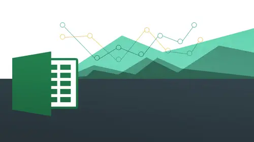
1The Basics of Microsoft Excel: Customization
35:43 2Anatomy of Microsoft Excel
43:09 3Formatting: Making it User Friendly
39:05 411:30 am - Building a Document from Scratch
31:22 512:45 pm - Advanced Formating + Styles
43:30 61:30 pm - More Formatting, Transpose, & Alignments
38:34 72:30 pm - Basic Formulas
31:383:00 pm - Auto Sums & Inserting Rows
19:46 93:30 pm - Advanced Auto Fills
28:42Day 2
109:00 am - Working with Large Worksheets
39:16 119:45 am - Hiding Columns
41:50 1210:50 am - Tips and Tricks on Printing
31:53 1311:20 AM - Titles, Headers, Footers and More
35:37 1412:50 pm - Q & A
09:16 151:00 pm - The Magic of Sorting & Filtering
29:41 161:30 pm - Conditional Formatting
33:23 172:30 pm - Communicating with Charts
30:42 183:00 pm - Making Your Chart Pop
37:19Day 3
199:00 am - Working With Tables
36:01 209:45 am - PivotTables, PivotCharts & Subtotals
40:22 2110:45 am - Graphics: Shapes
30:45 2211:15 am - Graphics: Pictures
20:27 2311:45 am - SmartArt
14:31 241:00 pm - Text to Columns, Data Validation
41:14 251:30 pm - Data Validation: Date
20:59 262:30 pm - Working Between Programs
26:24 27Templates in Microsoft Excel
14:13Lesson Info
2:30 pm - Communicating with Charts
Char's very, very excited. So like I said earlier charter a great way to visually communicate and we appreciate your appreciation of how great that khun b also when we worked with our conditional formatting and everything to visually communicate our data but then charge is going to be a way to really, really do it and it's nice actually integrate that into you're working with power point or keynote or something like that or you're putting something into it a photoshopped file to really nicely put that there for you to be able to see what your data is without actually having to look at numbers. So we're gonna be looking at a number of different charge looking at bar charts, column charts, pie charts, being able to customize the colors of these charge well, data labels on there or who we call axes primary access the bird, oh, axis and then changed numbers and to all kinds of fun stuff with that doesn't make any sense to you very all that will change very soon. Ok, so let's, just jump rig...
ht into it you're going to see we have ah, folder shoot me our file here called day too session for charts so it's just going to open that one up now you'll notice here I've been very, very a simple set of data for me to work with I noticed this is known as column chart. We have another one down below called pi chart, so we'll be working with all those for us to be able to create charts from this data. So how do we create a chart? It couldn't be any more simple. All we're going to do is simply highlight the content we want to work with. I'm going to simply go from a four to e eight, okay, and again, this is on the mat on the pc side. We're going to go to the max side momentarily, and it might be a little bit different for you, but we are going to be going to that soon enough. All right, so we're all going to do is highlight a four through eight have that highlighted, and what we're gonna do is we're gonna go into an area we have not gone to yet within this class, we're going to go to the insert menu, and we're going to exploring a lot of this stuff tomorrow when we get into images and a few other things and smart aren't some of these other fun things, but we're now inserting a sharp, so we're gonna go to insert and then notice how we have a group here called charts. If you're on the mac, you're trying this I think that you actually have a ribbon item called charts, you go directly to it that way and we will of course be showing that so we go to insert you're going to see now I have all of these charts I can work with and where you should be exploring column charts, bar charge and also pie charts in this segment so firstly, I'm just going to click on colum and notice I gotta drop down that shows me all the charts that are available to me really, really amazing just right off the bat they have all these things to me too. D column charged three d column chart cylinder charts chloe koen and pyramid really depending on how fancy you want to get how you want to actually be able to communicate and really just kind of your own design aesthetic and design so you can go ahead and choose what when you want but what in this class we're going to choose three d columns was going to go and choose that you'll see bam immediately we have a chart, you can end it right there if you want to write, we actually have a chart immediately all we did was highlight and click click a couple of times and then we have a beautiful looking chart that has all the content that we've selected all right, pretty amazing. So what we're going to do now is we're going to basically move this chart around. We're going to customize this chart. We're going to add some things, possibly take some things away. Well, basically, to make this chart are very, very own. Okay, so what we're going to do first for the sake of this exercise is I want to move this chart so it's no longer here because I can keep this here and it's my business, you might want to dio because you can move it around and do that. I can come to the corners and I can let's go ahead to come to the corner. Where are you in a little bit? I didn't select it. Come to the corner and we have this double sided arrow here double sided arrow so I could do that, okay? And you see, you have a much nicer chart, but now I'd liketo have this chart on my own sheet because right now I have my column chart sheet I my pie chart sheet, but I like to do is actually move it to another sheet all together. So it's not here and it's nice and big for me to work with, okay, so how do I do that on the pc side you're going to see? I have now a new contextual tab called chart tools and I talked about in the last segment what a contextual tab was when I would talk about headers and I promise you that we would see ah lot of different types of contextual shark contextual tabs including the head and footer but now we have something called sharp tools with three new tabs here, so just as a reminder what a contextual tabas if I move click away from this they those all go away when I clicked back on it they were turned okay, so this is again a contextual tab basin thing you click on you're going to get, um, new options here in this case we have chart tools and three sub tabs right there, so what I'd like to do is come on the far right and shoes move charm so I click on that and you're going to see that a new box opens up it's gonna say okay, choose where you want the chart to replace I need you to do in a new sheet or you can do it an object in this current sheet which is basically not gonna make any sense because it's already here we're going to say new objects and I'm going to go ahead and say column chart and click okay um knew she comes in because I called that same thing already, okay, sorry all right, we're going to say column charge new, okay don't don't write type in the same name because it basically we're done and what I had and it said, no, you can't do that. So then it's here column chart knew the first part is the column chart with the content this is the kind the one with the actual chart in it. So now that that's nice and big for me to work with, I think I've got a better preview of it, it's not interfering with my data, all that kind of stuff all right now notice, even though I'm away from the main spreadsheet, I still have my chart tools tab with all my different sub tabs in there, okay, so let's, play around with this here we're going to start working on this chart and see what kind of things we can do on this chart so let's, start off with this design tab and we'll come all the way the left hand side and we'll see that there's certain things that we can do everyone we can change the charts right away we can changes to a different type if we want to, so we decided we do not want to do ah column chart, we can do a different type of shark very quickly and easily I'm gonna go ahead and click on that and you'll see here it comes up with another type of dialogue box that shows me all the different charts that are available to me. And also the ones on the right hand side are showing me the sub options within all those categories you can see arrive column, and then this has a little kind of orange glow around it, which is indicating to me that this is the one that we're actually working with. But I can easily change into any one of these, and I can also change it to let's just try it for now. Let's try. I'm gonna try this three d bar char I want to see what that one does. Click it that she's okay? And then I have something totally different, but the same data. Do you see how easy that is to make those changes? And it still looks really slick and we can do it really quick. Let's come back and let's, just change it back to the other way. I just want you to see how we can do this something click on change chart type way back over here. Come back over that one, and in your own time, I'd suggest just kind of playing around with some of these were going to get into high charts and a little bit as well. But some of these you want to just try to experiment with many you can some of these won't actually work for all data, so you have to want to kind of pick and choose, but I was encourage experimentation. There's no question about that look, look, okay? And now we're back to where we were, okay, so this simple is that so we're going to jump over here to this switch, roan collin. So that's, essentially, if you were tuned in for our transposing of our data, this is going to be the same thing when we transposed our data when we flipped a rosen columns, this is the same thing we can actually switch our rows and columns, so it's a swap the data over the axis. So, in other words, we have all of our people over here. We have all of our quarters over here if we want to flip it to make a look a little bit differently, we can easily easily do that. All right? So what we're talking about here is the data is going to be the same, but what the data pertains to as we're looking at, it is going to change so let's, just take a look at that also another powerful way of just kind of flipping your data and also another way that we're going to be having a initial introduction to pivot tables believe it or not, so you click on that and then it flips around and you see, now I have all my people down here instead of my quarters and my quarters are over here. So it's indicating to me that my quarters are this high for this person and etcetera, etcetera, etcetera. Okay, so really, really cool, because you want to just if we do that again and it's okay, you know what, bill bixby for all four of his quarters. There it is. Okay, great. And fourth quarter was his best and the nancy drew that was her forced her best quarter was quarter too, but when I switch it, I'm now trying to figure out well, who was the best one per quarter? You see that? So you're asking kind of different questions. Really? And then you're getting answers in a very quick and easy way because you can say, ok, who's the best right there just for quarter one. Okay. Wow. Alan arkin did great, all right? And who was the worst? Okay down. Alan arkin didn't do too good in the fourth quarter, so you can see how we can ask questions very quickly and easily, okay, so we'll keep it. Is this or we have it here I understand really understand the value of that now this select data this is going to allow you to change the data range included in the chart okay so what are we talking about here? We're not going to do but I want you to least know where to go for this if I click on this right now you're going to see how it actually takes me back to the original place that I started and I can change it to say you know what I changed my mind I like I'd rather only do it for quarter one two and three for these or just bill bixby and nancy drew for quarter one two three and four and I could easily just highlight them and then it would change back on the chart okay so it's essentially just asking you if you decided you only want to do a chart for something else you can do that you don't want to do the chart on this particular one that you chose initially you can then do it for the ones that you now choose instead I'm gonna cancel out of this but I want you to at least know what weaken dio cancel I go back to where I started from okay very good so now you going to see we have following the select data we have this chart layouts that chart layouts essentially what these are are these kind of like presets they're preset kind of designs of charts that allow us to kind of have maybe a grid line in the background when we have data at the bottom, things like that. So what I'm going to encourage you to do right now is just watch me and don't necessarily do anything because it could get a little bit confusing and you'll have to decide what you want because they just kind of some throw some stuff out there, so I'm just gonna go ahead and click on one and you'll see how subtle things kind of change, okay, I do that and settle things kind of changed, it actually adds on numbers, as on a grid line, it puts my my legend down on the bottom and have a few these other things, they just want to kind of just give you a couple of examples of how these certain layouts might help you and again, what these air about is essentially just giving you a quick, predefined type of lay out for you, and we can we can do all these things on our own if we want to, but this just does it in a way that's very quick and automatic, so I'm going to undo these so we can go back to where we were initially, and I can kind of join you, but these chart layouts can be helpful if you find a layout that you really really like you can always go back to and say okay great that's the one I don't have to go hunting for it I don't have to go clicking all over the place and just bam it's right there you've got tend to choose from okay excellent. Now let's go to our charts styles so our charge stiles is basically going to be all of these different options for us to work with in terms of colors and we also colors and we also have kind of more of a cylindrical thing that we could be working with us well, so we have all these different colors of the same but let's go take a look at some of these different ones I click on that one this gives me a neat little kind of white outline like that click on that this was going to give me more of ah kind of ah curved edge and like all this other stuff more of a grady in look okay, this was going to give me kind of ah wall that's going to be a little more three dimensional now you'll notice some other ones that are just going to be the same exact thing but we're just different colors so click on that that's going to be those colors look on that's gonna be those colors so make it nice and easy for you to be able to access all of these styles very quickly and easily. So then you're just going to go and pick one you like. Now what we're going to get into it a little bit is how to do each individual one of your own shows in color because what these are these charts styles, these are essentially just ones that they've chosen and their purse basically off the shelf cookie cut it more or less, but then you'll be able to change them on your own to show you later on, okay, but still pretty cool nonetheless, I'm gonna come back to the first colored option and we're going to jump away from here now, okay, so this is where we were before we went to move chart initially, and we're going over here to lay out, all right, so the way, I like to think that I think about what we've been doing up until this point. The design is sort of like the design that you do internally for your house, where you kind of make it look pretty all that kind of stuff you put paintings on the wall, you put carpet on the ground, you put, you know, drapes or whatever you got to do to make it look pretty, whereas your layout is like where the construction comes in where the architecture comes in with the engineering part comes in for your chart because this is kind of the nuts and bolts park this is kind of like the glamorous part the more artistic part but the next part the layout is where we're going to put in some of the nuts and bolts essentially we're going to put in numbers we're going to put in a title and we're going to side our axes information grid lines all that kind of stuff all right so again were to come back over here and we're going to start off with this group here called labels and we're gonna go axes and then potentially will go into the background part here just to kind of see what kind of things we can do so charge title is going to be very straightforward either you don't want one at all you wanted to be centered and over laid or you wanted to be above the chart so essentially it's like do you want it and if you do want it where do you want it that's essentially what is asking you ok again do you want it and if you do want it where do you want it? All right so I'm just gonna go ahead and just say above chart now what's happening now is that just appears here and kind of a weird thing that works with excel is that all you do in order to actually get that chart title put in there you start typing okay? You don't have to click on anything I know it seems a little bit undercount intuitive but you actually just start typing when you want to do that so I'm going to do now is just type in sales two thousand thirteen widgets okay and then all you do afterward just hit enter and then automatically goes in there it's a little bit counterintuitive because we're not clicking on anything we start way start typing not a whole lot actually comes in so all we have to do just are typing and hit enter and then automatically goes in there so that might not necessarily register at first but more time to do it the better will get okay and again I can go back to my chart title and I could say centered overlay and it uses the same boards that we put in there but it puts it in a different location I'm gonna go back to above chart and I like that okay so we also have axes titles so they make a nice and simple primary horizontal axis title primary vertical axis title so I'ma fly out and essentially it's like okay yes or no right? Do you want it to be there or do you not want to be there? So we're gonna go ahead and just say titled below access and again, all you do is start typing and we're going to go ahead and to say quarter and you see that at the bottom there's quarter to the same thing access idol primary vertical axis title we have a few different options here we have none as you'd expect we have rotated title and we also have vertical title and we have horizontal title so really all going depend on what you want to do so I'm going to start off with vertical title I click on that and I'm just gonna go ahead and just say sales and dollars and hit enter and that comes in and I'm not a big fan of that you can see how I can very easily change that by going back again to access titles and this time instead of vertical title I'm going to say rotate a title and a little bit easier to read and don't worry I'm gonna show you how we can change the size of that as well okay, very good now legend legend is this part right here alright, we have four legends sitting right there inside of our legend doing okay so basically we're going to say where is the legend goingto live okay again it's about location and also it's about do we want it or not also so click on legend we have none and we also have to wee one on the right the top left bottom right left all these things here, right? So I actually like to have it at the bottom let's just try out bottom we do that because that way I can actually refer back to these colors pretty quickly so this legend is now at the bottom for me to work with. All right? So that part is really just about location really what a lot of these things were about you know, again, this is kind of our nuts and bolts it's like okay, well where's the where's the room going to go where how where's the bedroom going tio how big is going to be all those kind of things right that's going to be our kind of engineering architecture part kind of basic construction of things all right now data labels is essentially do you want the data labels or don't you what's it going to be yes or no yes or no we're gonna look at them at first but I'm going to suggest we say no but let's just go and take a look at it I'm going to see here they do come up and you can sort of read them ok, but it could be a little bit busy you may want to just have data labels for one or two of them and I'll show you how you could do that as well let's, come back to date a lay of the table, sees me data labels again and to say none. Okay, then we also have this data table. So what are we talking about here? All right, so the data table is the table that we started with to begin with. All right, the one that we actually had inside of our column chart tab, we have that there, but do we want them to be? I wanted to be there sort of in mesh with are sharp so we can look at the numbers and look at the chart of the same time. So we're really getting the best of both worlds, if you will. So we're actually be able to see our chart looking really pretty. But then we could all say, well, what exactly? Numbers that so my preferences, if you wanted to do it, maybe to have those numbers might be better to have the numbers right there, away from the charts so it doesn't take away from the aesthetics in the flow lets go out a new data table, and then we're gonna have two options here showed the data table and show the data table with legend key let's, just try the first one, so I do that, and you see here, okay? The quarter one and all the numbers and all the people. Okay, that's. Pretty cool. I like that. I like that. But would make it better is if I could actually have the legend key here, if you ask me. Because then I could actually no, that way. What's what's bill bixby then I don't know which one he is. It was it left to right, right to left. I don't really know. So that's. Why? They thought of the great idea to say show data labels with legend keys and do that. Okay, cool. Now I can see everything, and it all kind of makes a little more sense to me. Okay, so we'll keep this here for right now, but we also have the legend here. Well, if we want to will be able to work with all these things here. Okay. How we doing? Any questions so far? Good one from being humor, I think. That's how you said, can the child be copied without the spreadsheet to another file? Well, kinda chart be exported to itself. That word or power your we're way ahead of me. They were going to do that towards the end. Yeah, absolutely, we're gonna be already have power point. And we could even go to other document to show you how we can do that already have that ready on cue for us to do that toward the end of the segment. Good question, all right, very good. So we have this year, and then we also have this section called axes. Okay, so these are our axes right here and there's certain things that we can actually work with to go a little bit deeper, so we have a primary horizontal axis. Do you want it? And you wanted to be left and right and all that kind of stuff you can actually say, if I say none right now over the horizontal axis, actually let's teo, vertical access, I say none can notice how that goes away there because that's going to be our access right there. So I'm going to get into some more advanced stuff towards the end where we can actually specify we come back to what we can specify these numbers because sometimes we don't want the numbers to be just sort of on an even spread. We might want the numbers to actually go upto like twenty thousand because that's, our goal that's our quota and you guys were only a ten thousand right now, these look really powerful, but we might want to adjust it so they don't look quite as big and we want to communicate something so I'm going to go into some of these options lee in iran as we as we move on to more advanced stuff grid lines is essentially yes or no do you want major grid lines? Minor grid lines things like that so right now we have our horizontal grid lines do you see that we could go ahead and just do that? We can say let's do minor grid lines and see that it gives you a little more minutia okay, you can actually see, you know, what's what in terms of what's going on in terms of like, all the hundreds of dollars in between each of these things you can specify those things and for some of us it might be just more of ah how would you call it unauthentic thing you know, we might like prefer that for whatever reason okay? All right very good, eh? So we're going to leave it at that for right now will come back to some of these more advanced things later on. But I want to show you how we can work with some of these little text items here this text item here because some of these if you ask me you're a little bit too small, okay, so I'm looking at this and like, well, you know what? I can't really read that so well I like to read that maybe I want to change the color maybe I want to change the location of me won't change the fun all these different things okay so all you do very simply is just selected the text box the detective box itself I'm going to see here on the pc side I have this kind of like four circles going on there that means the whole text boxes so chosen you do not need to shek collect all of the individual text inside of it you just go ahead and select the box itself and the box speaks for all the content inside of it okay so I'm going to do now is go to home because remember home is where I do all my basic formatting anyway so he's gonna bump that up remember I have this big a and this little way she was gonna go bam bam bam and I just grows and grows and grows and now just that easy I have the total control to make that whatever size I want whatever font I want all right we'll just use that guy right there and then whatever color I want to make that red or let's make it green we're talking about dollars okay we have that there and then bam there you have it that gives you total control to be able to do this okay and also notice that you can also move it where you want to I'm just clicking and dragging on the box and see that I can move this box by clicking and dragging over I want to so just because they give you a suggestion of where to put things does not actually mean you need to take it so you can put it wherever you want at the same time all right so just starts off one place but you can go ahead and change the font font color the font size and also the placement of the text box all right so let's not talk about these other ones let's come down a quarter just do the same thing with quarter unless it bumped out when I wanted you to do anything fancy with that let's go out and make that a little bigger let's do our title make that bigger and just for fun let's make that green and then last but not least let's look at our our legend down here so our legend can also be made bigger let's come back over to our home and we should bump that up and not only did the words get bigger but also the little shaped colors get bigger so it's a lot more easy to use right? I mean that's really the key because we were basically wanted to be where people do not have to try so hard to interact with these things we want to be able to when they look at it it just jumps out of them it communicates really that's what it's all about it's about visual communication and this communicate it's actually going to show you things very very quickly you do not have to hunt for things you don't have to squint your eyes to find it you have a right there and it's just super super easy and very straightforward and streamline in terms of the communication of the content. Okay are we good how're we doing questions? Okay, good. All right, grit all right now let's work on part two of our kind of design and format, so so far we've done our kind of design under design, but we also have a third tab called format and again, if you're on the mac it's going to be it might be called format also chart format. All right, so if we're going to click on format now, this is going to give me the option to do all kinds of different things with my shapes inside of here. Okay? So I can work with all kinds of different things in terms of let's say, for example, I want all of bill bix ease to be bill bixby should be green because he was the hulk, okay, so we're gonna make that green so and I could do that I don't actually need to listen to excel in terms of what it's saying and what I should be doing according tto what other kind of standard they have? I can choose whatever one I want because maybe that's my company colors or whatever it is so I can go ahead and do that very easily. So watch me as I do this I'm just gonna go and click on this blue ale notice when you click once on all of them, you get every single one of them in the serious chosen. You see that's when you choose one, they all get selected. Ok, so let's, go ahead and now make the change so I have one selected. They all have these little kind of bounding boxes around them and I'm gonna go to this area called shape. Phil, click on the drop down and I'm going to choose this kind of like deep color green and they all change. See that now, let's? Say, for example, there's one that I really want to make stand out. Okay, this is like the lowest one of all. I'm gonna go to that one. But guess what? Instead of clicking once, I'm gonna click twice, but make sure you do it kind of doing a little bit slower, so watch me click once they all get selected I said elected again then on ly that one gets isolated. You see that? So this particular one now gets isolated, see? That's. So then whatever I do next is goingto on lee do with that particular thing. Really, really cool. So then I want to get my shape, phil, I want to make that kind of a glaring red. Hey, buddy, you got to pick it up so we can see that right there. It's red, bright red. So it's going to really stand out? I'm going to make some changes to these other ones. A little more contrast. So this one is going to select once go shape. Phil, I'm gonna just make that kind of ah, yellow color, all right, and then the green. Thanks to make that kind of an orange color. Okay, so, it's really nice to give you that kind of control now, keeping in the same vein of just selecting one isolated part of the siri's let's, say there's on ly one that you want to have the numbers on member before how I should have the data labels and you can actually do the data label where you just click on it. And then all the data labels appear I'm going to show you how you can actually just do a data label for one at a time so again it's the same idea but it looked once on this one and then click again so that one's isolated you see that that I'm going to go to uh my layouts go to data label I'm going to say we did a label I'm going to a show I noticed on lee shows for that particular one do you see that? Because only that one was chosen okay, so again it's about selection it all comes back to select an x l want you to tell it what you want to do through the thing too so now I only have that one let's do it again for this purple one so I click on the purple one once then I do it again see that I do it one more time okay, so I do it twice I'm going to say data labels I'm going to simply say show I got both of these yoga these were the clear winners very nice. Okay, something happened my red I gotta come back to this guy so it's come back to here and then make him read one more time because I might have overrode him before I get there he's so this red one is now standing up that's what I wanted to do before to make sure that yours is red just like that you could make that one stand out and on top of that, I want to make that particular red have a data label, okay? And now guess what? I can't really see that, and I really, you know, so I really want to be able to see it. I want to move it around. I want to do all this thing, just like we did with these guys. I want to go over to home and then just blasted up, okay? And then I just go in and drag that so it's, just a little bit, kind of more visible, maybe the same thing with those guys, too. So everything is isolated, ble, that's, a word I just made out. Ok, so you can really just pinpoint whatever you want, okay, just go right to it and then just remember, click once and then click again just to go right to it. Okay? And you're gonna be isolating it from the rest of the series.
Class Materials
bonus material with purchase
Ratings and Reviews
Arlene Baratta
Even though it's 2021, this course is still amazing. I followed along just fine using the latest version (365). I watched thinking it was just going to be another "basic" overview of Excel. It's not. I learned a lot that could really help me keep track of my business, not just financial aspects either. I HIGHLY recommend this course.
a Creativelive Student
Great class and highly recommended but now out of date. Surely an update is planned?
Przemek Janus
This is Excel for Mac. I think real Excel work is done in Excel for PC as that version offer much more compared to Mac version. Apart from that shortcuts are quite different between versions. Just a note.
Student Work
Related Classes
Business Basics