Matching Saturation in a Composite
Lesson 6 from: Essential Compositing Tips & Techniques In Photoshop 2021Jesús Ramirez
Matching Saturation in a Composite
Lesson 6 from: Essential Compositing Tips & Techniques In Photoshop 2021Jesús Ramirez
Lesson Info
6. Matching Saturation in a Composite
Lessons
Class Introduction
01:14 2The Importance Perspective
05:35 3Examples of Perspective in Compositing
08:56 4Creating Depth with Atmospheric Perspective
09:39 5Matching Brightness in a Composite
05:59 6Matching Saturation in a Composite
04:06 7Matching Ambient Color in a Composite
08:01 8Making Selections and Masks for Better Composites
11:06Lesson Info
Matching Saturation in a Composite
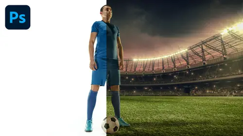
next, I'm going to show you how to match saturation. We're going to use a very similar example. The subjects are the same, but the layers are a bit different. We still have our background of Venice, and we have our model here. And if you really pay attention to the background, you will notice that it's much more saturated in the foreground. And that may not be easy to see, so we're gonna create another check layer so that we could actually see the saturation in the image. And how do we do that? Well, we can do that by creating a saturation map. You can create a saturation map by going into the selective color adjustment layer, and just place that above your composite. Make sure that absolute is selected, and you can go into all the different colors from red all the way down to Magenta and make sure that you bring down the black to negative 100%. Do that for all the colors, and I'll do it quickly. Here, make sure that you get them all go all the way down to magenta as once you have your...
magenta set to negative 100 you can go into the whites, neutrals and blacks, and you can set those 2 100%. That's positive 100% in other words, the opposite of what we were doing to the other colors. And once you complete that process, you'll see a black and white image. Now, before we continue, I would like to point out that you can actually save a preset of this adjustment. That way you don't always have to create it from scratch every time you're compositing, and you can do so by clicking on this fly out menu and selecting safe, selective color preset and you can give it a name. I'll call mine saturation map and click on Save. So now I have a saturation map presets or any time that I come back into Photoshop and create a selective color adjustment layer. I will always have my saturation map preset here, and it applies the saturation map. I will include the saturation mapas, a downloadable for this course, so you can also install it. If you don't want to create it from scratch, you can just go into your fly out menu and select load selective color, preset and the file that I will provide in the downloadable. But anyway, once you have your saturation map active, you should see a black and white image. And what this black and white image represents is saturation. Anything that has a lot of saturation will be bright, and anything that has low saturation will be dark. If I create a hue and saturation adjustment layer and increase the saturation, you'll notice that the image will get brighter. See that, and if I decrease the saturation, the image will become black, which is a black and white photo. So what we can do now is select this human saturation adjustment layer, reset it and clip it to the layer below, which is the model layer. If you really pay attention, the models much darker than the background, which means that she has less saturation so we can select this year's saturation adjustment layer. And since it's on Lee clip to our model, any adjustments that we make in saturation will Onley affect her so I can brighten her up so that the black and white image matches now. In this case, matching her saturation to the background may not be the best move because the background is really highly saturated, so you can either decrease the saturation in the background or work with both layers independently, which is what I will do. In this case. I will create another hue saturation adjustment layer. Clip it to the layer below, even though we don't need to sense, the Venice layer is the last layer in the layer stack, but it's a good habit to get into. So, with my human saturation adjustment layer clipped to the Venice layer, I can now decrease the saturation just a little bit right about here. And I can disable my saturation map and you can see my result. This is before and this is after. I think it looks much better. And, of course, you can always find Tune any adjustments that you make. I think I might have been a little heavy handed on the saturation for this layer, so I will bring it down just a tad
Class Materials
Bonus Materials with Purchase
Ratings and Reviews
David
This course teaches what you need to know about creating composites. As alway Jesus delivers in a clear, precise and fun way. You can just tell this guy has a great personality and he loves what he does. I greatly enjoyed the course and would strongly recommend it. A big thumbs up!!!
a Creativelive Student
One of the best courses I've done on CreativeLive and that's a high bar! An incredible mix of in depth guidance but also some simple photoshop tips along the way, I had so many 'wow' moments, learning things I had no idea you could do in Photoshop. Really a good pace too. Quite a short course but so many good lessons to revisit. Great work!
Jorge Perez-Martinez
I think this is a wonderful course. It goes into the key aspects that one needs to know to make a good composite. Jesus does not go into needles details and assumes a basic knowledge of photoshop; this make the course very manageable as far a its length. Highly recommended!