Adjusting Images: The Effects Panel
Lesson 14 from: Editing and Organizing your Photography in LightroomJared Platt
Adjusting Images: The Effects Panel
Lesson 14 from: Editing and Organizing your Photography in LightroomJared Platt
Lesson Info
14. Adjusting Images: The Effects Panel
Lessons
The Lightroom Ecosystem
08:33 2The Tour de Lightroom
07:49 3Image Organization
05:20 4Finding Your Images in Lightroom
14:28 5Lightroom's Right Hand Panel
13:43 6Lightroom's Lower Panel
13:03 7Setting Lightroom Preferences
18:57 8Adding Images in Lightroom
06:46Adding Metadata to Your Images
06:32 10Lightroom Cloud vs Local File Management
11:35 11Selecting Images in Lightroom
16:49 12Adjusting Images: The Light Panel
23:09 13Adjusting Images: The Color Panel
17:30 14Adjusting Images: The Effects Panel
12:47 15Adjusting Images: The Details Panel
09:50 16Adjusting Images: The Optics Panel
10:16 17Adjusting Images: The Lens Blur Panel
15:16 18Adjusting Images: The Point Curve Tool
09:17 19Image Enhance: Noise Reduction
16:31 20Image Enhance: Details and Super Resolution
05:05 21Image Merge: HDR
11:50 22Local Adjustments
10:47 23The Crop Tool
09:51 24Image Merge: Panorama + Full Image Edit
16:25 25Masking and Retouching
11:54 26Range Masks
07:46 27Creating Adaptive Presets with AI Masks
10:24 28Importing Presets
04:34 29Retouching Brush: Clone, Heal, Remove
09:53 30Sharing Your Images
13:05 31Customizing Sharing Web Pages
08:44 32Conclusion
01:25Lesson Info
Adjusting Images: The Effects Panel
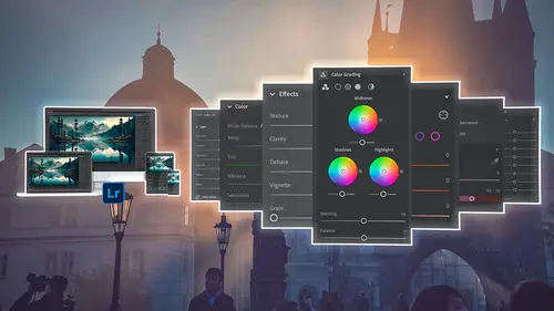
1 Our next panel is the Effects panel, 2 and it has a very limited number of tools in it. 3 And these tools kind of get put 4 in different places in different versions of Lightroom. 5 So in Lightroom Classic, the Texture tool, 6 which is at the top, 7 and the Clarity, Texture, Clarity, Dehaze, 8 all of these are actually up in the basics 9 inside of Lightroom Classic in the moment. 10 I think they'll probably end up kind of putting some parity 11 between Classic and Lightroom and Lightroom Mobile 12 so that they all kind of are the same, 13 but it'll take a while for 'em all to become the same. 14 So this is where they want it to be, 15 which is in your visual effects 16 is texture, clarity, dehaze. 17 Then there's gonna be vignette options 18 as well as your grain options. 19 And notice that there are two little chevrons here. 20 So you can click on that and it opens up the vignette 21 so you can change the vignette a little bit more 22 and then the grain opens up as well 23 so that...
you can kind of play with more effects on the grain. 24 So let's start by looking at the texture itself. 25 And I'm gonna zoom in a little bit more 26 because there's some really good texture in my beard. 27 So I'm gonna grab the texture and I'm gonna increase it. 28 And you can see how the beard 29 is kind of getting more texture in it, see that, 30 but also my skin 31 is getting a little bit more texture as well. 32 And so there's a danger in going to the right on texture 33 because you're adding kind of roughness to someone's skin. 34 If you want someone to look softer, 35 so like a woman's skin or a child's skin 36 or somebody just wants to get rid of their wrinkles, 37 this is a great way to do it. 38 Take the texture down 39 and it still allows the hair and the eyes 40 and stuff like that to look pretty good, 41 but it takes the texture of the skin down. 42 So it's actually a really great way to soften skin. 43 And somewhere in the neighborhood of 30 to 25, 44 negative 30 to 25 is a good place. 45 I don't necessarily need to smooth my skin, 46 so I'm going to double click that and put it at zero. 47 And later on we're gonna make some presets 48 that will actually use these texture elements as well. 49 And you're gonna love that, 50 but just let's just wait on that. 51 I wanna apply that selectively to someone's face 52 and not to mine, but to somebody else's. 53 Then there's clarity. 54 Now clarity is simply just contrast in the midtones. 55 And so we used to use that to smooth skin 56 because basically wrinkles are shadows and highlights. 57 And so by taking out the contrast 58 in the shadows and highlights, 59 we end up with smoother skin, 60 but it also see how it softens everything else as well? 61 So it's kind of a bad tool for that. 62 So I don't use clarity in the negative 63 because it kind of muddies everything up. 64 So texture is a good thing to bring down to smooth skin. 65 Clarity is not a super great tool for smoothing skin. 66 And so I usually will leave it, if anything, 67 I'll actually bring clarity up a little bit 68 so that the eyes get a little punchier, 69 the eyebrows get a little punchier, 70 the beard gets a little punchier. 71 And then you take the texture down 72 and that smooths the smaller parts of the skin. 73 So like the pores 74 and the little wrinkles and things like that. 75 That's actually a nice way to go, 76 a little bit up on, not too much, 77 but a little bit up on the clarity 78 and quite a bit down on the texture. 79 That's a pretty good way to go. 80 Alright, I'm gonna double click both of those. 81 And then there's dehaze. 82 And dehaze is basically clarity on steroids. 83 So it's going to take your, when you do dehaze, 84 it just increases the contrast so much 85 that it can actually see through fog. 86 And we'll show that to you when we do some landscape stuff 87 so that you can actually see how dehaze can work. 88 If you want to create a foggy look, 89 then you would go the opposite direction 90 and it starts to look like fog. 91 So when you are in a situation where you either have fog 92 or smog or a lot of dust in the air, 93 that's a great time to use dehaze. 94 Then there's vignette. 95 Vignette, I'm gonna zoom out so that we can see 96 what vignette's gonna do. 97 So watch vignette and this, 98 I can't believe that vignette is still a tool 99 and it's still around because it's so old school. 100 But basically I take a vignette 101 and I'm going to create a big vignette. 102 So we're gonna go white. 103 So I created a white vignette which makes it look 104 like I'm making a photograph from the '80s 105 or I don't know, the 1890s or something. 106 So I'm going to increase the vignette. 107 That's basically what decides black is to the left, 108 white is to the right. 109 And then the midpoint 110 allows me to choose how far it goes into the middle 111 or how far it goes out to the side. 112 So if I go like, let's go like right there 113 and then the roundness allows me to decide whether or not 114 it just kind of goes around the edges like this 115 or whether it goes more round like that 116 so that it's just a circle. 117 And then of course there's the feather, 118 more feather, less feather. 119 And that is the sum total of what this tool does. 120 And unless you're trying to create 121 like a specific vignette that looks like maybe 122 the burned edges of a photograph 123 or maybe like a lens vignette 124 that you're trying to manufacture, 125 that's the only reason to use this tool 126 or to create a silly frame effect like this. 127 But otherwise this is kind of a silly tool 128 because there are far better ways to create a vignette 129 that give you specific abilities to change 130 where the vignette happens 131 instead of always trained right into the middle 132 and always trained right on the side. 133 I don't want a vignette that always pushes you 134 right into the center of the photograph 135 because maybe the person's 136 not in the center of the photograph. 137 Happens to be pretty close 138 to the center here on this photograph, 139 but not necessarily in all photographs. 140 And so I'm not a fan of the vignette option, 141 so I'm gonna close that down and almost never use it. 142 In fact, I don't think I've used it in 10 years. 143 So vignette is a no for me. 144 Okay, and then there's grain. 145 Grain I love, I absolutely love grain. 146 So I'm gonna zoom in a little bit here 147 so you can see what I do with the grain. 148 I love the grain. 149 And by the way, if you want to zoom in and out 150 instead of the Z key, 151 which you would use back in Lightroom Classic, 152 just use the space bar. 153 So space bar takes you out to the full size 154 and then zooms 155 into whatever you're zoomed into at the moment. 156 I'm gonna zoom out one there 157 and then I'm gonna increase the grain amount. 158 So there are three tools in the grain. 159 There is the amount, there's the size, 160 and then there's the roughness. 161 So I'm going to increase the grain amount 162 and I'm gonna increase it quite a bit 163 so that you can really see it 164 because I know that's a small area on a video, 165 but I'm increasing it so you can see it. 166 And then I'm gonna take the size up 167 so you can see what happens. 168 Now notice how blurry it gets when the size gets bigger. 169 And that's simply because the grain pieces 170 are kind of going over the top of lines. 171 And when you start crossing over the top of lines, 172 you end up creating less sharpness in those lines 173 because your eye is basically getting scattered. 174 And so all of the lines that were creating 175 those sharp edges are now kind of blurred 176 by these big chunks of grain and so it gets blurry. 177 So like putting a bunch of pebbles over the top, 178 like clear pebbles over the top of a photograph, 179 it just kind of blurs all the lines. 180 So what we're gonna do 181 is we're gonna increase the size just a little bit. 182 I don't like to increase the size too much 183 'cause it does introduce blur, 184 but I don't like the size to be really small 185 because then it just looks like noise. 186 See how it just looks like, it almost looks like sandpaper 187 and I don't necessarily want to see that. 188 So I like just kind of a normal size down here 189 in the 20 or 10 or 15 areas, something like that. 190 So 23 looks pretty good, 24, that looks pretty good. 191 So I like that grain. 192 And then I can take the roughness down or up. 193 Now too far down 194 and it looks a little bit computerized. 195 Let me zoom in a little bit more. 196 So you can see it looks very computery. 197 Computery, that's not a real word is it? 198 But it looks like a computer's creating this. 199 But if I take the roughness up, 200 it starts to scatter a bit 201 and it starts to become more random. 202 So I prefer the roughness to be somewhere in the middle 203 or higher even. 204 So if I'm gonna, if I want something to look really gritty 205 and really grainy, 206 I'm gonna do most of that work in the roughness area. 207 So right in the middle or maybe like 70%, 60%, 208 something like that. 209 So that's where I'm gonna prefer the grain to sit. 210 And then you can take the size down a little bit 211 and you can take the grain amount down 212 until you like exactly how much is in there. 213 There. 214 Now notice again, 215 the roughness is kind of high and the size is really low 216 and the grain can somewhere, 217 it can be anywhere in between. 218 So usually somewhere from like 25 to 75 219 is the right amount. 220 So I like it right there in the middle. 221 This is a little bit higher than the middle 222 and this is pretty low. 223 Now let's zoom out. 224 You don't really see it when you zoom way out, 225 but if we zoom into about there, 226 you can see that it's a really nice grain 227 and it creates a lot of depth in the photograph, 228 especially when it's printed. 229 So I love grain, 230 it helps to soften up inconsistencies in skin. 231 And so if I'm shooting a senior portrait 232 or a portrait of somebody that might be 233 a little worried about their skin, if you shoot boudoir, 234 if you shoot little baby photographs 235 right after they're born 236 where their skin is a little splotchy, 237 if you add grain to that skin, 238 it actually unifies the skin really nicely 239 and makes it look really, really pretty. 240 So grain is great for skin, great for smoothing out skin, 241 which you would think that's a little off, 242 but it's not, it smooths out the skin 243 and you don't see things. 244 Watch what happens when I zoom in 245 'cause I have some inconsistencies in my skin 246 right up here, over here. 247 And if I turn off this effect, 248 see how you can see those little inconsistencies in my skin? 249 And then when I turn it back on, watch 'em, 250 they just kind of disappear 251 'cause they get broken up by the grain, they get scattered. 252 You can really see it right over here. 253 There's a couple little inconsistencies there 254 and if I click on the turn it off, you can see 'em. 255 And then when I turn it back on, 256 they kind of disappear as do some of the wrinkles. 257 And so even the shadows under the eyes 258 kind of fall away a bit too. 259 So grain is really helpful for skin, don't forget it. 260 You'll love it. 261 And that is the Effects panel.
Class Materials
Bonus Materials
Ratings and Reviews
Ross Copperman
Jared really does have a fantastic style. His pace and articulation are perfect for following along and the detailed editing of the videos, themselves, makes it really easy to absorb. Well worth the clams, for sure.
Tim Byrne
Great job, Jared! You have delivered a master class for anyone beginning a journey into Lightroom, presented in absolutely clear and relaxed style. And for those with more experience with the program, every old dog can learn a few more new tricks. Teaching software is tough. Jared does it by breaking down each function and including not only the what, but the how and why as well. And each step is amplified by crystal clear photos which are manipulated with the function at hand. Bring a pad of paper, some snacks, and a cup (or two) of coffee. He is relentless in his presentation. You might watch this course as a freebie, but buy it to be able to refer to it for specific steps and processes. I've been using Adobe products since the mid 1990s and this is the best instructional presentation I've taken. ABSOLUTE WINNER1 Thanks, Jared
Caroline Faure
Really good class!! A lot of classes I've taken thus far have gone too fast or had an instructor that just tells you everything without you being able to actually follow along with your hands on the software. I learn best by doing... not just listening. With this class, it was easy for me to split the screen and do everything the instructor did - and really learn in the process. I will definitely watch for more classes from Jared Platt!