Adjusting Images: The Color Panel
Lesson 13 from: Editing and Organizing your Photography in LightroomJared Platt
Adjusting Images: The Color Panel
Lesson 13 from: Editing and Organizing your Photography in LightroomJared Platt
Lesson Info
13. Adjusting Images: The Color Panel
Lessons
The Lightroom Ecosystem
08:33 2The Tour de Lightroom
07:49 3Image Organization
05:20 4Finding Your Images in Lightroom
14:28 5Lightroom's Right Hand Panel
13:43 6Lightroom's Lower Panel
13:03 7Setting Lightroom Preferences
18:57 8Adding Images in Lightroom
06:46Adding Metadata to Your Images
06:32 10Lightroom Cloud vs Local File Management
11:35 11Selecting Images in Lightroom
16:49 12Adjusting Images: The Light Panel
23:09 13Adjusting Images: The Color Panel
17:30 14Adjusting Images: The Effects Panel
12:47 15Adjusting Images: The Details Panel
09:50 16Adjusting Images: The Optics Panel
10:16 17Adjusting Images: The Lens Blur Panel
15:16 18Adjusting Images: The Point Curve Tool
09:17 19Image Enhance: Noise Reduction
16:31 20Image Enhance: Details and Super Resolution
05:05 21Image Merge: HDR
11:50 22Local Adjustments
10:47 23The Crop Tool
09:51 24Image Merge: Panorama + Full Image Edit
16:25 25Masking and Retouching
11:54 26Range Masks
07:46 27Creating Adaptive Presets with AI Masks
10:24 28Importing Presets
04:34 29Retouching Brush: Clone, Heal, Remove
09:53 30Sharing Your Images
13:05 31Customizing Sharing Web Pages
08:44 32Conclusion
01:25Lesson Info
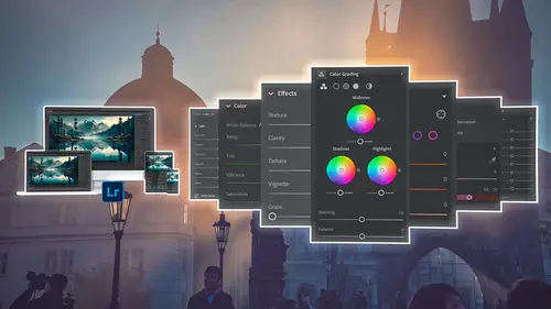
Adjusting Images: The Color Panel
1 The next tool that we're going to discuss inside 2 of the adjustments area is the color tool. 3 So we're gonna go to the color panel, which is right 4 below the light panel. 5 So in the color panel, when I drop that down, you notice 6 that it closed up the light panel. 7 And that's because in the triple dot button here, 8 we have it in single panel mode. 9 So when you're in single panel mode, 10 it collapses any panel you're not using. 11 So we're using the color panel right now 12 and that's why the light panel closed up on us. 13 So let me show you what we have as a control option here 14 inside of the color panel. 15 First off, we have the white balance. 16 Notice that as it was shot. 17 I could choose a specific 18 type of color balance, so daylight, flash, et cetera. 19 But I'm not gonna choose that because as shot was great. 20 If I want to, I can also choose the color dropper. 21 And if I click on the color dropper, I can come over here 22 and choose a specific white area. 2...
3 And when I click on that, it's going to automatically adjust 24 for that specific white point, 25 which actually did a pretty good job. 26 It's about the right color. 27 And then I want to take the temperature up 28 just a little bit. 29 That looks good. 30 I'm gonna take the tint up 31 just a little bit as well. 32 That looks good as well. 33 Okay, so now I have my temperature and tint set. 34 I have vibrance and saturation. 35 Saturation is kind of a... 36 It just takes every color 37 and increases the saturation of those colors 38 or decreases them altogether. 39 So as a result, when you go really hot on the saturation, 40 you can see that it gets really quite ugly 41 in the skin tones. 42 But if I double click that and reset, 43 and anywhere you are in Lightroom, 44 if you double click one of these sliders, 45 it will reset the slider back to its default. 46 So if I take the vibrance up, notice that it protects 47 that skin tone, and now I would never want to go 48 to a hundred percent on the vibrance either 49 because that also looks bad, 50 but at least you can see 51 that it protects the skin tone unlike the saturation. 52 So I prefer to use vibrance in the positive 53 and saturation in the negative. 54 So that's generally my rule of thumb. 55 In this case, I'm actually pretty happy with most 56 of the way this photograph looks. 57 I like the general look of it, 58 but I'm gonna actually take the vibrance up just 59 a little bit so that we get a little bit more color 60 in the skin. 61 And then I have what's called the color mixer. 62 The color mixer allows you to choose very specific 63 color areas of the photograph. 64 When I say color areas, 65 I'm not talking about a localized area, 66 like say this area of my face. 67 And that's all it's gonna control. 68 What I'm saying is that an area of color, 69 like the orange is all across the photograph. 70 So wherever orange is employed in this photograph, 71 I can change that color. 72 So I can click on orange 73 and then I can change the hue of orange. 74 And since my face kind of falls in orange, 75 see how I can change it from green all the way to magenta. 76 I can play around with the actual hue of 77 that particular channel of color. 78 I can play around with yellow, 79 but the problem is is that red, orange, 80 and yellow, all of those are in my face tones. 81 So if I wanted to play with my face tones, the best thing 82 for me to do would be to go 83 to the target adjustment tool again. 84 So if I click on target 85 and then I go over here, 86 I'm going to choose a specific color. 87 There you go. 88 I've chosen that specific color, 89 and that's actually going to employ two different colors. 90 And if you look over on the right, you'll see that the red 91 and the orange are both employed. 92 So both of 'em have a dot next to 'em. 93 And so as I slide this from magenta to green, 94 it's actually affecting more colors in the face 95 than just one, which is exactly 96 what we want if we're sliding something. 97 So I'm taking it from, it's too green, 98 I'm taking it to a little bit more warm, not too much, 99 but a little bit. 100 That looks better to me. 101 So now I can go down 102 and play around with the saturation of that specific color. 103 I can play around with the luminance of that specific color. 104 Now I want you to see something when I zoom out of here, 105 there's a little tool that pops up when you start working 106 inside of the target adjustment tool. 107 And that is right here. 108 So that tool allows you to work on the curve, which we did 109 before or on the color itself. 110 And you can work on hue, saturation or luminance 111 and just simply click on saturation, click on hue, 112 click on luminance. 113 So if I was to work on luminance, now when I click on this 114 and I brighten it up. 115 I'm brightening up and darkening down the luminance of 116 that particular color 117 as opposed to working on the the color shift itself. 118 And I can do the same thing with the adjustment 119 of the saturation, which I don't necessarily need to do. 120 So let me show you where we were before. 121 If I take the color mixer out, so I'm gonna click on 122 that little eyeball. 123 That's where we were before. 124 And this is where we are now. 125 Before, after. 126 And I think I like that better. 127 I mean it seems a little green, 128 but notice that I haven't changed 129 the rest of the photograph. 130 I've just changed that particular color area. 131 So a little bit of red, a little bit of orange. 132 Okay, the next area inside of your color panel, 133 which is a really cool area, is the point color. 134 So point color is a new thing inside of Lightroom, 135 and I love it. 136 It's super cool. 137 So what we do. 138 Oh, I need to cancel out of that. 139 So as soon as you click on 140 that target adjustment tool, it stays active. 141 So then when you start clicking around, 142 you end up doing stuff like that, which is not good. 143 So I need to come down here and turn it off. 144 So just hit this little X button and that gets rid of it. 145 So we're no longer playing around 146 with the target adjustment. 147 So below the color mixer is something called point color. 148 And the point color is a brand new option inside 149 of Lightroom, which is really actually quite fantastic, 150 but this is not the photo to work on it. 151 So we'll come back 152 to this a little bit later in the workshop. 153 And then there's color grading. 154 Color grading is a great place 155 to do some interesting color effects, especially if you want 156 to do some more of that kind of cross process look. 157 Or if you want to do a black and white, it's a great place. 158 So if I were to go back up here and turn this image 159 to black and white and then I were 160 to come into the color gradating area, 161 this is where I can add a color to the shadow. 162 So I'm gonna grab the... 163 Let me zoom in here a little bit again. 164 I'm gonna grab the center of the shadow area. 165 So there's shadows, there's mid tones, 166 and there's highlights. 167 And I'm gonna grab the shadows, 168 and I'm just gonna drag it all the way 169 and see, I dragged it all the way to the right. 170 And then I can grab this outside circle 171 and just kind of move it back 172 and forth until I find the right amount of kind 173 of a sepia tone there. 174 Once I have that, if I hit the shift key 175 that holds this in line with whatever I've done, 176 so it keeps that particular color that I've chosen, 177 and now I can just drag this up and down there. 178 So that's zero. 179 And then I'm adding a little bit more of 180 that warmth into the shadows, 181 but notice that it's not adding it to the highlights. 182 Okay, so now I've got a little bit of warmth in there, 183 I don't want to add too much. 184 So I like that kind of soft amount of sepia in the shadows. 185 Then what I'm gonna do, I can go to the mid tones 186 and do the same thing. 187 So I can grab onto the mid tone, drag that over 188 and kind of shift the color until I get the right mid tone, 189 which is about the same kind of tone. 190 And I'm gonna bring this to zero. 191 And now I'm gonna take that 192 and I'm just gonna bring it up a little bit so that 193 the mid tones have a little bit of that sepia tone in it 194 as well, not too much, just a little bit. 195 And then the highlights, 196 I can kind of grab a completely different tone. 197 Let's say I want to add a little bit of a blue, 198 so it's a cooler highlight tone. 199 And then again, hit the shift key 200 and drag that down to zero. 201 And then I can just drag it up just a little bit 202 so that it's kind of cool there. 203 Okay, I'm gonna zoom out of this a little bit 204 so that you can see what this looks like. 205 So that's the image. 206 I like it; it looks pretty good, 207 but now I want to readjust everything that I've done, 208 and I can do two things. 209 I can change the balance, or I can change the blending. 210 So if I change the balance, I'm actually saying, 211 do I want more sepia tone 212 or do I want more of that blue tone? 213 Do you see how that happens? 214 So I'm adding more, 215 I'm kind of favoring the sepia, 216 letting it spill into the highlights a little bit more. 217 I'm kind of changing the balance of power between the sepia 218 and the blue tones back and forth. 219 This is just a way of finessing. 220 It's almost like choosing a profile 221 and then changing the amount of that profile. 222 Same thing's true here, I'm just changing the balance 223 of power and I'm gonna move back and forth until I like it. 224 I don't want to go way too blue like that. 225 So I'm gonna bring it down 226 to right about there. 227 Okay, so there's very little of that blue in there. 228 Now the blending option is a little bit different. 229 So if I click on the blending option, 230 and I kind of move it back 231 and forth like that, you can see 232 that what's happening is it's saying, 233 how much am I willing to blend the sepia 234 into the highlights or the blue into the shadows? 235 So let me zoom in on it so you can actually see 236 what this looks like. 237 I just hit the Z zoom key, 238 which Lightroom classic is Z for zoom. 239 Whereas here it's the pick key. 240 And so sometimes I get those confused. 241 So command plus, lemme move in there, 242 and then let's do some blending. 243 So I'm gonna go back and forth on the blending. 244 This is all the way to the left 245 and this is all the way to the right. 246 Do you see how the blue blends into the rest of the photo 247 a little bit? 248 And then if I go to the right, 249 the sepia blends into the highlights a little bit. 250 So it kind of goes, 251 it's like pushes further than you want it to go. 252 And I could play around with that. 253 And I like this kind of like it in the middle little bit 254 to the right there. 255 So that's just me finessing the sepia tones 256 and the blue tones that I created in the first place, 257 because a lot of the times we kind 258 of go overboard on something on an effect, 259 and it's nice to be able to take 260 that effect back a little bit. 261 Okay. 262 And then of course there is a final tab here called 263 color calibration. 264 If you don't see this tab here, this color calibration, 265 as I said earlier in the workshop, 266 it's this triple dot button here that applies it. 267 So if you click on that triple dot button, 268 you can show or not show the color calibration. 269 And color calibration is simply an old school way 270 of working out the kinks of a chip 271 that is a little bit too magenta 272 or a little bit too green in the shadows. 273 Maybe the red is off a little bit. 274 And so this is a way for you 275 to adjust your camera's chip 276 if it's a little bit, you know, skewed one way 277 or another on the color. 278 So you really, 279 this is not something you should use on a daily basis. 280 It's something you should use for your camera, 281 that specific camera that has an issue, 282 fix the issue here and that's all you need to do with it. 283 And then from then on out, just apply 284 that same color calibration to all the images 285 that come in from that camera. 286 It's not something to create effects with. 287 It's a really bad place to create effects. 288 And unfortunately, there's a lot of people 289 who create presets and profiles with the calibration tool, 290 and they're really bad presets. 291 So if you find presets that do that, don't use 'em 292 or change 'em. 293 Get rid of that part of the preset. 294 And if you're someone who actually uses 295 the color calibration in your presets, you shouldn't. 296 It's not the way to go. 297 It's just a really bad tool for making presets 298 because every camera is different. 299 And so even the same camera. 300 So I have a 5D and then my assistant has a five, 301 or sorry, not a 5D and an R5. 302 And if my R5 and his R5 were produced at different times 303 on the same line, but maybe a year 304 or two apart, their chips might be a little bit 305 different in the color. 306 And so if you have shifted the color calibration 307 in your preset for say your Nikon camera 308 and then I use it on a Sony camera, 309 it's gonna totally jack up my images, 310 and it's gonna make my images look like trash. 311 Even those yours seem to look really good. 312 So don't use it. 313 There are some AI programs out there 314 that you send your images off to the AI program 315 and the AI uses like some super good professional 316 photographers photographs and their adjustments 317 so that you can feel like you're adjusting your images 318 like so and so. 319 But the problem is, 320 is if so and so uses the color calibration tool 321 in their AI training, then the AI thinks 322 that you should use color calibration to do things 323 because it was taught poorly. 324 And so then it starts adjusting your images 325 with color calibration and you're shooting 326 with a Sony and this person is shooting with an Nikon 327 and it jacks up your Sony images. 328 So if you see something using color calibration 329 for presets and for AI, that's doing it wrong. 330 Okay, that's just kind of a tirade that I went off on. 331 But I need you to understand 332 that color calibration is specifically for fixing problems 333 with a camera's chip. 334 That's it. 335 So the sensor has a skew in the color. 336 You fix it with that, but you don't create like cool effects 337 from the color calibration. 338 There are so many more better tools. 339 So like color grading is an awesome tool for color effects. 340 And the black and white mixer is an awesome 341 tool for color effects. 342 By the way, when you turn something to black 343 and white, that color adjustment area turns 344 into a black and white mixer because now you're just looking 345 at a bunch of colors that are making up the 346 tones in the black and white. 347 And so now I would go in and say, 348 I want the orange to be brighter 349 and so see how my face is getting a little bit brighter 350 or darker so I can kind of play around with it. 351 I really like this black and white, 352 so I think we're gonna keep it that way. 353 So I'm kind of playing around with that. 354 I can take the reds down just a little bit as well. 355 And the yellows just a little bit. 356 So that is the black and white mixer becomes active only 357 when you have changed your image to black and white. 358 And that about does it for the color panel 359 inside of Lightroom.
Class Materials
Bonus Materials
Ratings and Reviews
Ross Copperman
Jared really does have a fantastic style. His pace and articulation are perfect for following along and the detailed editing of the videos, themselves, makes it really easy to absorb. Well worth the clams, for sure.
Tim Byrne
Great job, Jared! You have delivered a master class for anyone beginning a journey into Lightroom, presented in absolutely clear and relaxed style. And for those with more experience with the program, every old dog can learn a few more new tricks. Teaching software is tough. Jared does it by breaking down each function and including not only the what, but the how and why as well. And each step is amplified by crystal clear photos which are manipulated with the function at hand. Bring a pad of paper, some snacks, and a cup (or two) of coffee. He is relentless in his presentation. You might watch this course as a freebie, but buy it to be able to refer to it for specific steps and processes. I've been using Adobe products since the mid 1990s and this is the best instructional presentation I've taken. ABSOLUTE WINNER1 Thanks, Jared
Caroline Faure
Really good class!! A lot of classes I've taken thus far have gone too fast or had an instructor that just tells you everything without you being able to actually follow along with your hands on the software. I learn best by doing... not just listening. With this class, it was easy for me to split the screen and do everything the instructor did - and really learn in the process. I will definitely watch for more classes from Jared Platt!