LRC Adjustments: Grain in the Effects Panel
Lesson 16 from: Editing and Organizing your Photography in Lightroom ClassicJared Platt
LRC Adjustments: Grain in the Effects Panel
Lesson 16 from: Editing and Organizing your Photography in Lightroom ClassicJared Platt
Lesson Info
16. LRC Adjustments: Grain in the Effects Panel
Lessons
Introduction
05:51 2A Tour of Lightroom Classic
28:03 3Importing Images into Lightroom Classic
23:14 4Selecting Images in Lightroom Classic
19:32 5Importing Metadata and Catalogs into A Catalog
03:01 6Organizing Images in Lightroom Classic
10:13 7Adding Metadata to Your Images in Lightroom Classic
09:21 8Bonus: Impossible Things AI Plugin
10:26Adjusting Images in Lightroom Classic with Synchronization
14:15 10LRC Adjustments: The Histogram and The Basic Panel
14:54 11LRC Adjustments: Profiles
07:39 12LRC Adjustments: The Transform Panel
05:38 13LRC Adjustments: The Crop Tool
04:25 14LRC Local Adjustments: Masking
12:35 15LRC Adjustments: The B&W Panel
06:02 16LRC Adjustments: Grain in the Effects Panel
08:17 17LRC Adjustments: The Point Color Tool
05:24 18LRC Adjustments: The Color Mixer Panel
01:15 19LRC Adjustments: The Tone Curve Panel
05:29 20LRC Adjustments: The Lens Blur Tool
07:59 21LRC Adjustments: More Masking
10:10 22LRC Adjustments: More Masking with Color Effects
05:14 23LRC Adjustments: Color Grading
15:42 24LRC Adjustments: Complex Masking
15:39 25LRC Adjustments: Masking and Retouching People
06:55 26LRC Adjustments: Creating AI Presets
11:39 27LRC Adjustments: Sharing, Installing, and Managing Presets
02:15 28LRC Adjustments: The Details Panel
16:20 29LRC Adjustments: The Lens Correction Panel
09:44 30LRC Adjustments: Retouching a Family Portrait
08:20 31LRC Enhance: Super Resolution
05:58 32LRC Merge: HDR
29:23 33LRC Round Trip to Photoshop Beta
11:36 34LRC Merge: Making Panoramic Images
13:59 35LRC Cleanup and Archive Workflow
20:20 36LRC Workflow Overview
02:47 37Finding Your Images from Lightroom Classic
13:35 38Conclusion
01:45Lesson Info
LRC Adjustments: Grain in the Effects Panel
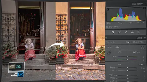
1 Before I finish with this image, 2 I wanna do one more thing, 3 and that is, I wanna play with the grain on this image 4 because I like black and white, 5 but I like black and white 6 to have a little bit more grain to it. 7 So, let me zoom in on this so you can see 8 what this looks like right now. 9 It doesn't have a lot of grain to it. 10 There's some grain kind of back here 11 in the softer areas you can see, 12 but I want it to have a little bit more grain to it, 13 so that it's a little rougher. 14 So, I'm gonna go down to the effects panel here. 15 And inside the effects panel, there are two things. 16 There's post crop vignette, 17 which is kind of like an old antiquated tool 18 that we don't necessarily need to use anymore 19 because now we have the radial vignette 20 or the radial gradient, which turns into a vignette 21 that you can move around anywhere you want. 22 So, it's a much more elegant vignette. 23 Whereas, this is a very rudimentary 24 and almost laughable vign...
ette, 25 'cause it's always stuck to the edge of the frame. 26 So, I almost don't even wanna show you this, 27 but I'm going to. 28 So, let me zoom out here. 29 So, this is what the vignette does. 30 If I take the amount slider up all the way, it's white, 31 which this looks very 1980s. 32 If I take it all the way down, it's black, 33 which looks very 1990s. 34 So, eighties, nineties. 35 If I take it down like this, 36 I can take the midpoint in or out, 37 but I can't change where that midpoint hits. 38 And then I can also say, is it gonna be really round? 39 Or is it gonna be square? 40 So, you see how I've got the square look to it. 41 And if I take the midpoint in, 42 see how I've got like, it rounds at the edges, 43 but it stays really close to the edge. 44 So, you can make it almost look like a... 45 like a negative carrier look. 46 So, if you have ever worked in the dark room 47 and you had a negative carrier 48 that was filed out a little bit bigger 49 than the actual frame, you got kind of this look. 50 So, you can create a negative carrier effect on this, 51 which is kind of nice. 52 And I can either feather it or not feather it. 53 And now, it just looks like I've got 54 some kind of a frame around it. 55 So, these are the things 56 that the post crop vignette can do, 57 but it's kind of a laughable tool 58 because there's so many better tools than this now. 59 So, anyway, 60 I'm gonna double click the amount so that it resets 61 so that I'm not using it. 62 But what I wanted to do is go down to the grain. 63 So I'm gonna go to grain, I'm gonna zoom in 64 so I can see what I'm doing with the grain. 65 I'm gonna take the grain up to say, 44. 66 That's really pretty. 67 Like, the grain looks really nice there. 68 And as a benefit, look at this. 69 When I add grain, do you see those? 70 There's like 1, 2, 3 blemishes on his face there. 71 Watch what happens when I throw grain on it. 72 See how they kind of almost disappear? 73 So, a person that has a little bit of wrinkles, 74 or maybe some kind of skin 75 that's a little bit too bright, 76 maybe there's oil on the skin, 77 maybe there's a blemish somewhere 78 or an inconsistent patch of skin. 79 This helps to unify the skin 80 because it breaks up all those lines. 81 So, I love grain for that reason, 82 but I also love grain for the fact 83 that it just creates depth to the photograph. 84 So, I've got this at 48. 85 The size does not need to change all that much. 86 If it goes too small, 87 it gets a little bit too much like pixels. 88 And if it goes too large, it kind of fuzzes out the image 89 because, again, the grain is going 90 and breaking up the lines in the image. 91 So, I'm gonna go somewhere right down here 92 in the 30 range or something like that. 93 So, right now I'm 28. 94 Yeah, 28. 95 And then roughness is something 96 that I often will take up higher 97 because it kind of gives it 98 a more random and kind of gritty look. 99 So, I like that kind rough. 100 I wouldn't go low because then the grains get too soft 101 and then they look like, 102 they look like pebbles. 103 So, they're not good when they're, 104 you don't want to take the roughness down too much. 105 I would say that like the lowest 106 you'd want to go on roughness is in the thirties, probably. 107 So, I kind of like it at about 50ish. 108 So, I'm at 45. 109 So, this is a good amount of grain here, 110 and that is what it looked like originally. 111 That's what it looks like now, which I think 112 is far superior as a black and white image. 113 I have an image that I want to take us through 114 several different tools with this image. 115 So, we're just gonna start at the very beginning 116 with a exposure adjustment. 117 So, I really like the fog. 118 I want to make this kind of even darker and more brooding. 119 I don't necessarily like the trees that are focused 120 and that I can see up front 121 because obviously they're closer to me so they don't 122 get blocked out by the fog as much. 123 But, I'm gonna work on this image. 124 The first thing I'm gonna do here 125 is I'm gonna work on the crop 126 because it's tilted just a little bit. 127 So, I'm just going like this, 128 just grabbing outside the crop 129 and negotiating the crop itself. 130 That looks pretty good. 131 And done. 132 All right, so now I've got my crop the way I want it. 133 And now what I'm gonna do is I'm gonna start playing around 134 with the actual image adjustments. 135 I don't like it warm. 136 I don't want it to be a warm fog. 137 I kind of feel like fog is cold. 138 And so, I'm gonna just take the temperature down a bit. 139 Temp the tint. 140 Obviously, green and magenta are both not good colors, 141 so I just wanna make sure 142 that I get the right tint. 143 Okay, so now I've got a fairly neutral, 144 this is I think kind of how it felt at the time. 145 So, I'm ready to move forward. 146 And I got the exposure pretty right. 147 Now, t's just a question of how I'm gonna deal with 148 some of the highlights and the shadows. 149 So, the first thing I'm gonna do is, 150 I don't need to take the black point down 151 'cause that just doesn't help my circumstance at all. 152 Fog is a result of very little black so, 153 or, I guess very little black is a result of the fog. 154 And so, we don't want to add black 155 because then it negates our fog. 156 So, I'm going to take my highlights down just a little bit. 157 See how I'm, 158 I want those highlights in the clouds to come down. 159 So, I'm pulling those down just a little bit. 160 And I'm gonna take the white down just a little bit as well. 161 So, that even helps the fog look more foggy. 162 Then, another thing that'll help the fog look more foggy 163 is taking the shadows up just a little bit. 164 That way everything is a little bit more equal. 165 Then if I want to put some clarity on this castle, 166 just a little bit to kind of add some pop 167 in these mid-tones here. 168 And again, I told you that clarity 169 is contrast in the mid-tones. 170 And so, if I take the clarity up just a little bit, 171 you'll start to see in the castle, 172 just a little bit of more definition in it. 173 And I don't want a lot 174 because I don't want to ruin the fog effect, 175 but just a little bit more helps us to see 176 some of the details of the castle. 177 Okay. 178 So, that is a pretty good start. 179 I like the basics on this. 180 So, now we're gonna go into the tone curve.
Class Materials
Bonus Materials
Ratings and Reviews
Maarten Barckhof
Wonderful. I am a (very curious) amateur photographer and for me this was all really interesting. Clearly spoken, nice examples, very educational indeed. Some doubts about making (too?) many changes in photos with generative AI, changing color, etc.: where does editing of a real word picture change into painting and creating something non-existent? And in some lessons the transcript (and subtitles) are missing. For people not having english as their mother language they are sometimes quite helpful. All in all: very recommended!
Sicily Dickenson
Great class to help you establish and understand workflow in Lightroom Classic. I also loved the presets that accompanied the class.