Creating a Color Palette in Illustrator
Lesson 5 from: Drawing with Illustrator: Color and TextureStewart Scott-Curran
Creating a Color Palette in Illustrator
Lesson 5 from: Drawing with Illustrator: Color and TextureStewart Scott-Curran
Lesson Info
5. Creating a Color Palette in Illustrator
Lessons
Intro to Color & Texture
10:34 2Setting Up for Color & Basic Tools in Illustrator
06:35 3Efficiency of Workflow & Prepping for Live Painting
11:04 4The Live Paint Tool in Illustrator
11:05 5Creating a Color Palette in Illustrator
11:08 6Creating Dimension with Gradients in Illustrator
11:21 7Exploring Other Color Options in Illustrator
14:11 8Compound Paths in Illustrator
06:50Lesson Info
Creating a Color Palette in Illustrator
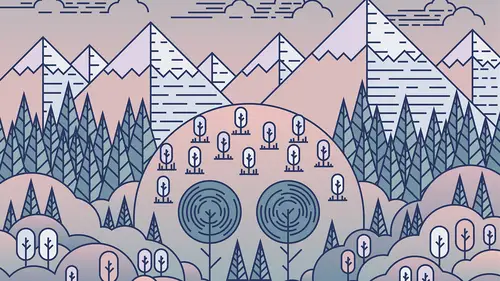
the next fees is thinking about color pilot. Okay, Uh, how many colors we're gonna use? Are there gonna be complementary? That couldn't be contrast. It's a couple of different ways that I do that. The first thing I do is I just, like, save a lot of reference imagery. You know, like you can feigned all sorts of photography on lane. Other designers work. Other illustration, Um, anything that's got like a restrained color palette. You know, if you think about the color palette of this desk, we have Lake Hayes and lawyers. We have dogs and Leight's. We have dark grease lay grease. Why you started some contrast, the wood behaviors has like a really nice complimentary color palette again. Think about it in terms of your highs, which is your your contrast and your lace your lawyers, which you can also give contrast from from a dark point of view. And then what the mid twins were the war, the twins that bring those lays in those darks together and to something that fuel was like pretty cohesiv...
e. Um, and there's a couple of ways to do that. I have, like, Pinterest boards that I see like a ton of stuff is just like visual color inspiration. Um, the other way is to just think about it in terms off do want, like a super bright color palette. Do I want, like, something that's really natural? Do I want something that's maybe a little bit more Stuttle and passed early on? You can start to think of it in terms of, like, color concepts, but illustrator actually has, like, quite an ace to that can help us with that. Um, you know, perhaps I want to think. Okay, I wanna have like, uh, in this case, maybe wanted toe have, like, a like a bluish color palette. Okay, so what I'll do is I'll just take my rectangle to Drollet was square, and then start to think about the war. One nice color may, maybe for that. Okay, so if I go into a window and color, I can start to play with the Slater's. Now, this is gonna be printed as a poster. So we're keeping it in the C m I K. Um, Collingwood's. I can start to move these around that saying, 100% pretty saturated, so I may start to pill without back a little bit and you can see who. When you do that, the color in this changes and you can see a live move around. Okay, so I can't quite lake something that's on perhaps only the lilac and are slightly more passed early here. You know, I think that looks looks pretty nice. Um, what illustrator can actually do if you look, look color? There's a poor perry called color Gate. And what this does is that it takes the base color that you've just selected, and it will build it something, uh, some complementary colors. The goal without, And you can see and hear all of the colors that would set naturally, quite nicely. But say that and we have all sorts of options in here. You know, we can go through and we can choose, um, something that is really all within, like, the seam. A total value. We can have shades of that same color. So just like a moto tune. But then highs and lows within that, or we can have high contrast. We can have low contrast. We can have, and every time just select one of these. We're going to get even Mawr shades intents within that. Okay. So we can edit individual colors. Um, and then we can save that color group. Uh, swatch panel. So say, for example, I wanted to go with, um I didn't see we wanted to go with this color pilot here, which is O Connolly within the same total value. I can actually, um, I conceive that, and it will automatically drop a selection of swatches into my swatch color palette, which you can access from the window menu. Um, and going into swore cheese. Um and so then you can see if I copy and paste a couple of teams that automatically has brought in some color chips that I can use to color up in this complimentary color pilot. Okay, Now, I think that looks nothing that even starts to look pretty nice, right? The other way that I use to feign sometimes some tense within the same color family is, um, like something's you feigned. Start with three or four colors you're gonna need occasionally you need one or two mawr, just like add a little bit contrast or a little bit depth as you as you work through. So a real nice trick to do that is See, for example, like I had Ah, dark blue on and copy in Peace Star on. I had a late blue No. How do we figure out the tool or values there in the middle of this range? Yeah, sure. We could make another box and we could go into a color And we could try and figure out. You know, what's something? That that maybe looks a little bit darker, but it's pretty tough. Tilly. Keep it within the same, like tonal range. There's a way that we can use illustrator to again help us do some of the heavy lifting. Right? We can use our blend too, which we used in the previous statement. Tilly blend lanes together and to give us Lee evenly spaced Victor Victor Curves and Victor lanes. We can also do that with color. Right? So what I'm gonna do is I'm gonna select both of those. He was in my group selection. Gonna click on the blend too. I'm gonna click on the first square where we see the little star and then we're gonna move over and we see that change to a little plus ST I'm gonna click there. You can see what happens. It's gonna give me the number of steps that I decide to go between that. Okay, If I select all of that, double click my blend too. You can see that I can specify the number of steps that become that come in between. Like, I can keep that super simple with only two steps or I can make it a little bit more complicated. And you can see him and gives you, like, every single color step in between those. Okay, So what I can then do is go object on expand click OK. And they all become individual color chips that I can start pull out and say, OK, that's gonna be the law. That's gonna be the high. And then maybe I want, like, two or three in the middle. Okay, I can get rid of will lose. And that's gonna give me, like, a really nice complimentary color power that I know. Oh, set within the same value. Okay, That's like a pretty nice way to build a boat. A color palette. Okay, No, there's just all about preference. And sometimes you're gonna warn, like a super high contrast palette. Sometimes you're gonna want something that's oh, within seem within the same range. Um, I actually have one, Which is which is they already go here? No, If I wanted to, um, if I had another. If I went to this guy to be one of these colors, Okay. Now, I could use the A drop or two and come around and click on any of these individual boxes, and that will take the color value from that. It can get a little bit complicated when I want to select, like, multiple options. So what probably want to do Mr Create my own, uh, color group in this war? Cheese. Right. So I will click the little arrow on the state of the sport Pilot, uh, click. New color group. You can call it anything you want. And then when I click on the, um, when the color box, you can see that my, um, Phil selection here changes too much, sir. Why can do as I can click and drag across, and that is going to come in and give me that. I can use any time. So I'm gonna click, and I'm gonna drag all of those across, and that is going to help me create the little color route that I can then access at any point I want. Okay, so there we have, like, a little color group that I've created. And that means that I can no go in on select invidious different elements. And the color values are already here. Everything's already selected.
Class Materials
bonus material with purchase
Ratings and Reviews
Anita
This is one of my favorite classes ever! I watched Stewart's first class on Drawing with Illustrator and loved this second part on working with color and texture. As soon as I saw the artwork he created for his classes, I knew I had to take them...his artwork resonated so strongly with me, I HAD to learn how he did it...I learned so much from this course...I work mostly in Photoshop, and work with gradients more than half the time, and had no idea I could do so much more with gradients in Illustrator. Stewart did a wonderful job of explaining each tool and setting he used, and I loved how he explained his creative process as he worked through each step...I'm excited to put to use all that I've learned...I highly recommend this course!
Robert Mathas
This is my first real project in Illustrator, having taken a different Creative Live bootcamp and then Stewart's classes. Yes, as some commented, some of it is slow and repetitive. However, I liked the the idea that it was a simple enough drawing that I could customize and eventually finish. I learned most from the mistakes I made, not exactly following Stewart's directions, and having to figure out how to fix them. I was pretty happy with my final result. Interesting enough, watching a lot of TV during Covid, I actually saw a commercial (can't remember what...maybe medical center or health group) of a white outline city and rounded trees and clouds so I was able to see this technique in the real world. :)
EKerger
This was such an amazing class! The instructor did not move too fast and was very specific and clear throughout. I learned so much and would recommend it to anyone.
Student Work
Related Classes
Design Projects