Lessons
Lesson Info
Demo: Creating Tonal Range
So right here I have a graphite pencil which relates to this top row here. I have an oil-based sort of colored pencil, a black once, which relates to this. And then I have a sanguine pencil that relates to this. So I've made these five part sort of graphs, or grids, and I've labeled them one, two, three, four, five, five being my darkest dark, and what we wanna try to do is establish your brightest bright, where you put no pigment at all, and then try to establish, like, even stepping stones to the darkest dark, and I'm gonna show you what I mean by that with one of these. So, but before we get into that I just want you to notice one thing. The reason I went in and filled in the darkest darks for you and I really did try to push them as dark as I could, is that, just check this out. The graphite, this is as dark as this graphite's gonna go. It's pretty dark, but graphite has a little sheen to it, it's got a little gray to it, a little silvery quality to it, which is really beautiful. B...
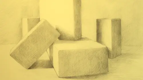
ut it does reflect some light. The black, black here is a waxy pencil, it doesn't really reflect the light, it creates this velvety, saturated dark which is, sort of resembles charcoal in a way without the smudginess of charcoal. And then this red sanguine pencil, that's about as dark as it's gonna get and if you took a black and white photograph of this and filtered it into monochrome this red might resemble this gray a little bit more, and that talks about value and how color relates to tonality, and that's something for a future lesson more or less because we're keeping it simple with monochromatic shapes to draw. But what you choose to use can really influence, like, how dramatic the drawing could ultimately get. So what I wanna do is I'm just, I'm not gonna work up all of these, but I am gonna work up two. I'm gonna work up one in full, and then I'm gonna work up another to an extent, just so you can see what this gradation feels like. Then when you go to try it out then you can see how that goes. So I'm gonna work into this black center one, and one of the things, you know I've got a couple of these black pencils. I actually have one that's super tiny because I keep my pencils as badges of honor, like I never throw a tiny pencil out, I let 'em get super tiny and then I have a little jar that I store my little badges of honor in. So this is almost about to go into the badge of honor jar, because it's tiny, it's almost not usable anymore. But it's a record of the fact that I've done a lot of mark making with this pencil, so that's just a little tip that you might wanna leave, you know, save your materials as sort of a remnant of your process and your practice. And the other thing I wanted to mention is I have a bunch of these pencils. Sometimes before I start a drawing project I'll sharpen up a bunch of them, because then I'll have them on the side and I don't have to keep replacing them and stopping and starting and sharpening, so I have a few sharpened up black pencils here and I'm gonna just choose one of them to use to start working this up. So, I've built this dark, and I'm just gonna go to the next one. So this is my darkest dark, this is my five. I'm gonna go into four, and I'm gonna start making some hatch marks, up and down, vertically, and I'm gonna start making some hatch marks going horizontally, so that's a cross hatch. Then I'm gonna start to make some on a diagonal. This is how I built the dark one, too, but they sort of disappeared 'cause it's so dark. Then I'm gonna build some on an opposite diagonal. And I feel like that will probably go a little darker in the end, I'm gonna just built it just with a bit more darkness. And then before I make a complete decision about that on the spectrum of lightest light to darkest dark, I'm gonna go in and build up my mid-tone in a similar way, I'm gonna make some vertical marks, I'm gonna make some horizontal marks, I'm gonna make a little bit of a diagonal here. And I'm not pressing very hard, I'm not doing it like this, right. I'm actually building it kinda gradually with a softness, because I want these to relate to each other. I wanna build it gradually so I can adjust them along the way. I know this one here is not gonna have any pigment, so I don't want the jump to be too great between the white one and the second one in. So we wanna have even steps in between, so I'm just gonna build this a little bit. And then I often just squint my eyes down at it, so squinting is a really key exercise, being an artist, especially when you're working with tonality. When you squint down at your subject or you squint down at what you're drawing, the discrepancies or the contrasts become much clearer, much more evident. So I'm squinting down at this, and I'm noticing that there's two parts that seem to jump a lot. One of the jumps that seems kind of extreme is between four and five. Three and four seem pretty close, and two and three also sort of have a jump. So I'm gonna just darken up four a little bit, 'cause I know five is just gonna stay where it is. So I'm gonna darken up four so there isn't a super huge jump between those two. Okay. So now the jump from here to here feels a little more subtle the jump from here's a little bigger. I'm not minding it, I feel like this could maybe go a little darker and this might also go just a little darker. So you could spend a lot of time with this, it's time well spent, but in the end you don't wanna have two sections that jump too much. With only five, the gradation is gonna be pretty immediate. Okay, building this up a little more. So I could work with some more subtlety there, but right now I'm just gonna let it be where it is. You could add on two blocks, you could add on two more and make more subtle variations in between. So let's say that I wanted to just play a little bit with the red one in contrast to that. Let's take out the red sanguine pencil. And the same rules apply, but you know that this darkest dark of the red is never gonna be as dark as this is in terms of a dramatic contrast, 'cause we're using a different color and this value of this red is nowhere near the darkness of that. But we can still play with it, building it up. And I encourage you to try this, like, try it with ballpoint pen, try it with charcoal, try it with stippling, like little dots with a sharpie. You know, there's lots of marks you can make that will help you experiment and also help you find the material that you really love, and part of finding that is experimenting with the possibilities, it's really important to experiment and it's really important to take risks. So you might think to yourself, well never in a million years would I really wanna draw with a ballpoint pen because it's pen, it's scary, it's permanent, but you might decide I'm just gonna try it, 'cause Amy suggested it, why not? And if you try it, you might be surprised. So notice your preferences or notice your assumptions around the types of materials you might think you like to use for this sort of thing, and try it all. Go to the art store and get a bunch of things, download our practice grids, and just try them. So you can see how working with another material just briefly we can still kinda play with a similar idea, right? But it has a different feeling, it has a different effect. So I've made dozens and dozens of these over the years. When I start a drawing and I have a new material, I'll do one of these on the side and we'll look at that later. But this idea of making a tonal gradient, and this graphite one, of course, would have a similar idea, this tonal gradient is a super way to warm up, and is a super way to just understand the possibilities and the potential of your drawing material, okay? So let's talk a little bit about mark making. So I did a bit of cross hatching here, and I wanna talk a little bit about how the marks that one might make for drawing an egg like this might be really different than the marks you might make drawing blocks like this, okay, so these are two drawings I've worked up, and we're gonna see some more of this. But an egg is gonna ask a different kind of mark than a block, and I wanna be able to show you the variations and show you some possibilities in that, okay? So an egg is a round form, and wrapping your lines around an egg might create a sense of, you know, roundness if they're put in a particular direction. Blocks, on the other hand, have more straight lines and that's gonna be something that will help their structure. So comparing these drawings to each other is useful, but let's just see what happens when we break it down a little bit, and then we're gonna get into drawing some objects tonally. So breaking it down a little bit, we can see how maybe we might approach a rectilinear 3D form versus a rounded organic form. So I'm just gonna talk about that a little bit, and then we're gonna move into actually developing some of those. So, a rectilinear form like this I've shown right up here the stages that might start to build that. The lines are straight, and because this is an object with straight edges I'm always inspired to maybe use lines like this. So I'm gonna just build this up briefly to show you what I mean. So there's a vertical side to this form, and so not too different from what we just did with our tonal range, we can start to imply tonal marks on this block. It's almost like if I was drawing on the block, like drawing on the side of the block. If I took a block, and I'm not gonna draw on it, but you know, like (mimics scratching), like I'm echoing the shape of the block in a tangible way. So if the light's coming down from this direction and there's a shadow on this side, I'm making marks that go up and down. I could also make marks that cross over to start to build the tonality a little bit, but I'm not really inspired to make curved marks, definitely not, because there's no, I don't see any curves here. The other thing that can happen in this case is straight lines, if the shadow's being cast to the right which we talked a bit about earlier, straight lines that aren't curved can splay out to the side. And notice, too, with this when I make a mark and I start it at a dark area, I start it at the dark edge of something and then I let it feather out. So if you can look at this mark, if I start here and I start with the pencil here and I feather out, the left edge of the mark is heavy and sharp and as I lighten up with the pencil as it goes to the right it gets lighter and just sort of fades out. So that's something to practice too, like put the pencil down, make a mark, let it fade out, make a mark, let it fade out, make a mark, let it fade out. That way when you come into a shadow area like this, you wouldn't start the shadow over here and go in, because then you get a hard edge on one side. You'd want the shadow to come off the block, often shadows are darker right at the edge of the form 'cause that's where most of the light is being blocked, but then they feather out and they often get soft at the edge. It's rare that a shadow's like super stark and you also wanna make sure your shadows have luminosity to them, have light in them. So it's just a quick view of the types of marks I might be inspired to make with a block-like shape. Alternatively, like if you had an egg, I don't think I'd be so inspired to make straight marks with an egg. So, you know, if you look again at this egg drawing, you know, this egg drawing has a lot of rounded marks that overlap each other again and again to create this sort of softness. So if I was gonna work with this I would remember, which we talked about in our second course, ellipsis and cross contour, I would remember that ultimately if I wrapped a line around this egg and if I wrapped a string around the egg what would be the arc of that mark, and then, then, and you can see it curves around and that helps create 3-dimensionality, which is really beautiful, then you could say, well, you know what? If I was gonna make tonality if the light's coming from this direction, I could start down at this lower edge and then my tonal lines could wrap around, and wrap around, and wrap around, again and again, and that echoing the shape of that cross contour line you're not only creating darkness where you want the darkness, but you're also helping to sculpt the form by having a really mindful direction to the way that your marks are put down. So this idea of making, here's sort of a diagram of curved marks versus straight marks, this idea of practicing curved marks and taking the curve, right, and then doing like an overlay of a slightly different curve that's where these sort of cross hatched curve marks become really beautiful, and very effective for this sort of tonal rendering which we'll build up in a bit later. So this, and then this would contrast again to maybe the kind of cast shadow that would be happening off this egg, which might end up being straighter lines. So you could have both curved lines and straighter lines in one drawing. All right, so I really encourage you to practice with mark making, think about the types of marks that might be most beneficial, depending on the subject you're drawing, whether it's straight or curved, or whatever it might be, and go with that. And notice how different artists treat those ideas. All right, so we're gonna work into a couple shapes, time permitting, we're gonna see what we can cover, just so you can see how I might build up a drawing of an egg, or a drawing of a block, or whatever that might be.
Class Materials
Bonus Materials with Purchase
Ratings and Reviews
user-7963ec
The package of four drawing basics courses by Amy Wynne are very well organized. Each section builds on the other. By the end, she has given us a technical understanding of how to use marks and tonality and shadows and highlights to develop a beautiful drawing of anything. The illustrations of important points were very helpful. HIGHLY recommend.
Ariana Graf
Amy teaches a straight-forward approach to tonal rendering and mark-making that builds on her previous courses on building basic line drawings. She makes beautiful and believable tonal shading attainable. Loved it!
Student Work
Related Classes
Illustration