Masking Tips & Tricks
Lesson 10 from: Dramatically Improved Masking In Lightroom ClassicBen Willmore
Masking Tips & Tricks
Lesson 10 from: Dramatically Improved Masking In Lightroom ClassicBen Willmore
Lesson Info
10. Masking Tips & Tricks
Lessons
Lesson Info
Masking Tips & Tricks
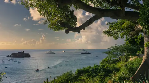
at this point you should start getting a little bit comfortable with the features that are available in the masking panel and now it's time to kind of bring it up a notch and show you some real world examples. In fact let's just concentrate on a single complex image. This is an image where when I originally process that, I know I ended up with at least a dozen masks and I'm going to create pretty much all of them from scratch so you can get an idea of how I truly work an image and in the process hopefully you'll also learn a little bit about my processing mindset. So let's dive in and get going. If you open this image into the develop module and lightroom and you go to the left side of your screen, there's an area called snapshots which can record all the settings that are applied to an image and allow you to go back to previous versions. The snapshots I have set up in this document are the top most one is what it looked like when it was first imported into Lightroom. That means this i...
s what it looked like straight out of Canberra with default settings and it's an interesting composition. I like the line coming through the middle, I like this stuff coming around here but it just doesn't have a lot of magic to it. Then below that is one that's a starting point with cropping and that just crops the image and applies any kind of distortion correction like leveling the horizon and things and the reason why I have that in there is just so you can compare that to the other snapshots that are in here without having the image suddenly jump to a different size or position or anything. So then here is what it looked like when I adjusted althea general adjustment sliders to make the image look good. But I didn't start isolating things yet at this point I thought I got the most out of the image that I could hear without going to masking yet. And then the final choice here is what it looked like after I was done masking the image in applying adjustments to isolated areas and that's all the stuff I'm gonna do right now. So over here in the snapshots, I'm gonna start off with number three and we're gonna make all of those masks. So let's go to the masking tool over here and when I first look at the image at this point, I think the sky is looking pretty good. It's everything else that I'd really like to work on. So let's start with select sky because I know right after choosing select sky, there's a checkbox up here called invert which should give me the opposite of the sky. But the problem is when I had the sky selected if I turned invert off, it might be more obvious. You noticed that it didn't get all the sky, it didn't get the blue areas that were up in here. So after I choose invert, I'm going to add those blue areas in so that they end up not being worked on. So I shouldn't say add, I'm gonna actually come up here and choose subtract because it has the green overlay on them right now and I'm gonna choose color range. Therefore I should be able to click right here and drag just a little bit to define an area and then I can adjust the refined slider on the right side of my screen and find what's the lowest setting that really gets most of that blue stuff and probably somewhere up in here because if I go any higher you see the water start to change and it's not that I need things to be absolutely precise. I just need to get a pretty good isolation of that area. And I could always come in and hold shift and click on other areas, but I think that's going to be okay for now, then I'm gonna start adjusting the image. What I'm gonna do is I'm gonna start by lowering contrast and so that means contrast controls. How big of a difference is there between bright areas in dark areas. If I lower it, there'll be less of a difference and therefore will be easier to see what's in those areas. So let's get that down a bit. And then the other thing that's going to help me brighten this up is I'm gonna bring up my whites whites works on the brightest portion of the image and makes it even brighter. And so I'm going to bring that up a bit. So I'm starting to like the way that looks, although we could bring out more detail in the deep shadows. So let's go to the shadow slider and pump up up as well. Then I think what I want to do color wise is just to get this a little bit away from yellow, it feels a little too yellow. So I'm gonna slide this away from yellow just a little bit. It's not that I wanted to look blue, I think there's just an excess of yellow in there. And so I think that's overall what I'd like. So if you want to see what that's doing, I'll come up here to my mask panel, I'll click this little eyeball that's here and I'll hold the mouse down, There's before, here's after. Do you see how much brighter it is and easier it is to see the detail in those various areas now at this point, I think I want to work further on the greens that are over here, on the right side and on the tree that's there. But I don't need to work on the water anymore. So I would like to further refine this now instead of starting over again with a brand new mask. What I'm gonna do is instead take the mask, I already have because it's already isolated uh and gotten rid of our sky and I'll just click on the little three dots that are here and I'm gonna choose duplicate. But when I choose duplicate, I'll get a second copy of that mask and all these adjustments are gonna still be dialed into it. So that means it's gonna double up in strength of the adjustment. So let's go over here and duplicate mask one and you'll see that I it's overdone now. But then over here with my adjustment sliders, if I just double click on the word effect, that should zero out all the sliders. So now we don't have any adjustment in there at all. And anytime you don't have an adjustment in there, if you've gone to these three little dots and you've turned this on, it will automatically toggle that overlaid to be turned on again. So anytime you don't have an adjustment applying, you'll have the overlay visible. And anytime you do have an adjustment applying, you won't see the overlap, you'll see the adjustment instead. The other thing you might want to consider is there's a checkbox down here called reset sliders automatically. I usually have that turned on and that means if I make a brand new mask, start off with these sliders zeroed out, don't remember the settings from the last thing I adjusted. So now at this point I want to get just the trees and the greens. That means they need to get rid of the water that's here, we've already duplicated that one and we've zeroed out now. All I need to do is come over here and say I'd like to further subtract and let's do a range of colors and I'll come down here to where the water is and I'll drag across it to see if I can get it to remove that general range of colors and I can come over here and dial this little higher or lower to work on that transition. And in this case we still have a few other areas, like some boats and a little bit of an island. So I'm going to say let's further subtract and let's do it using our brush. I'm not going to have auto mask turned on because I just want to be able to freely paint and now I'll just come over here and paint over the island in these boats that didn't need to be adjusted. So now I think we pretty much have the trees and the greenery that's here. So let's suggest it. I don't think it's useful to see the overlay at the moment. So I'll just type the letter o to hide it and therefore I can guess at what I'd like to do here. So what I'm gonna do in this case is I still think it looks too yellow in that area. So I'm gonna bring my temperature over here to make it look a little less yellow. The other thing I might do is adjust my clarity. If I bring clarity up, it's going to have more contrast. If I bring it down, it'll be a little bit less and I think a little bit less, but actually not changing it all that much. And at this point I'd like to just work on the water so let's mask that, but I don't want to start from scratch. I already have a mask right here, which is done a lot of the work for me. What I really want is I hover over this, you see that it works on the trees and the greenery and all I want is the exact opposite of that and then subtract the sky. So let's see how we can duplicate this and then get the opposite of it. So what I'll do is go to the triple dot, I'm gonna choose duplicate, and when I duplicate it's going to double up the adjustment and I'll just double click on the word effect to zero out all of those sliders that will give me my overlay as well and now let's get the exact opposite of this. How do we do it? Well, we go to the bottom most part of our mask, click on it and over here right now we have it inverted and I'm just gonna turn that off meaning give me the opposite of the base that we have. Then above that, I'm going to click on the next piece and that's taking away from what we originally had. I needed to add instead. That's going to give me the opposite. So I'll click on the little triple dots and I'll choose not invert because that would still take away, I need this to add and then I go to the next one it was taking away earlier and I'm gonna now have it add, I'll go to the next one it was taking away, I'm gonna tell it to add. Then finally I'm going to say, well I would like to work only on the water and therefore I want to subtract the sky out of that. So now we primarily have the water. I might need to touch it up a little because I do see quite a bit of green over in here. So I'm just gonna say further, let's subtract using a brush so I can clean things up. And I think the original time I did this image, I did go through those steps because I did write them down and I was just referring to my notes, but I think I was a little more precise so I didn't need to paint quite as much as what I'm doing right now. It was the same ideas. It's just where I was clicking, I was able to be a little bit more precise. So now we primarily have the water and now I might as well make an adjustment to that water. What I would like to do in this case is I'm going to come in and brighten up my water, I'll do that, bringing bringing up the whites and therefore those highlights in the water should become more prominent. Would you help your eye be drawn to that area? I think I'm also going to make the water more blue by bringing that temperature towards the left, but I don't want it to be too colorful. So I'm gonna bring my saturation down just a little bit and then I'm gonna come in here and I think I want a little bit more density in the dark part of the image. So I'm gonna bring my blacks down that's gonna darken the dark areas. But I don't want that to cost too much of the shadow detail to go away. So I might bring this a little bit of that in. I'm actually not doing much there. Let's see what that's doing. I'll go over here to the eyeball before you see how there's a lot more yellowish in that water. Whereas afterwards we have much more blue but not overly blue. But now at this point there's an area on the right side of the water that I don't like. My eye is drawn to this area right here because it feels like it's overly bright and colorful. And so I want to tone that down. Well, we've already isolated the water so we might as well not repeat ourselves here is our water. Why not just go to the triple dots and say we'd like to duplicate that and after duplicating it, let's intersect it. So it only shows up where I paint with a brush. There's two ways to intersect. I could go to the triple dots and there's a choice called intersect and I could say intersect with a brush or the other way of doing it is down here. If you hold down option or you'll find the word, intersect does the exact same thing and I'll say intersect with the brush then I don't want to apply the adjustment that we were doing to the water. So let's double click on the word effect zero everything out. That will also give us our overlay. And I'll probably go with a brush that's got a softer edge. And now I'm just gonna paint this in wherever I think the water was a little too much now that I have that water area isolated, I'm gonna darken it. I could bring down exposure but I'm more in the habit of adjusting whites. Somewhere around there so the brightness is getting to be okay but it's still rather colorful. So let's grab saturation and bring it down a bit somewhere in there. I'm starting to make it so my eye is no longer drawn there might just want to extend how far it goes with my brush. Maybe do that. Alright if you want to see what's happening? I'll click on the eyeball before my eye was drawn to that area after it's not, I might be able to get away with just slightly higher saturation. There we go. Cool. Now at this point, what I'd like to do is just work on the sky. Well we have the choice up here to say new mask, select sky, so there's no need to be duplicating stuff like we did before and in this case, what I'd like to do is I can't tell what I want to do to this because the overlays in the way, so I'll just type the letter O which means overlay and now we can start adjusting the image. And what I think I'd like to do is this area right here to me is distracting. It feels like it's blown out, like it doesn't look natural. So what I'd like to do there is either bring down my highlights or my whites. In my case. I just happen to think about the whites that is going to take the absolute brightest part of the image along with the rest of the image and darken it. And after doing so I think what I'd like is to see just a little bit more shadow detail, like over in here. So I'm gonna bring up my shadows and I'm thinking I'm gonna make this image a little bit more colorful in this area, nice colorful sky, but don't overdo it, but it's just feeling a little artificially yellow. So I think I'll bring my temperature down a little bit a little bit further away from yellow about their feel a little more natural. But at this point I'm starting to not mind the brightness of this area, but I find that I think by bringing down that brightness this area here is becoming too dull. So what I want to do now is work on this portion of the inventions, just ignore the left side of the sky to do. So I'll make a brand new mask, I'll tell it to do the sky and then I'm going to tell it one to select that to subtract, using a linear gradient that's gonna allow me to click and drag and I'm gonna click. Well, it's hard to tell with this overlay. So I'll type the letter O to turn off the overlay and I'm just saying the sky looks fine to right about there and then it's over here, that it doesn't look quite bright enough. So I'm gonna start right about here. That's where I'll click and then I'm gonna stop right about there because that's to the right of that. I'd like it to apply and therefore I have that little area and all I'm gonna do is I think bring the whites back up to kind of bring that area back closer to the way it used to be. Yeah, now that's starting to look, I think a little bit better now after doing that, I still, my eye is being drawn over here. I want to go and mess with that area more but I don't want it to affect the whole sky. That's what we ended up isolating before when we adjusted that. So let's just get the left side of the sky. I'll come over here again, choose select sky and again, I'll choose subtract and I'll use a linear gradient this time I'm gonna tell it to remove the right side rag over maybe about to here. So this is the side we're going to apply and in this case I think I'm gonna bring my highlights down probably what I should have done originally there until really that doesn't feel too bright. Okay now, at this point, if I look at the image as a whole, my eye is being drawn to the blue sky that is inside the tree area. So I want to tone that down in order to tone that down. Let's make a new mask and let's do a color range. I'm going to end up going right in here. I'll click and drag to get that color range and then I'll adjust my refined slider to make sure it doesn't get the gray parts of the clouds, maybe somewhere around there. But at that point I have this left side over here selected. I also have parts of the water. So I'm going to tell it to intersect that using a brush and then I'll just use my brush and paint over where I think it was a little much which was that And now that I have that area selected, I'm probably gonna darken it just a little bit and I'm going to make it less colorful, a lot less colorful. But I think I'm gonna probably make it a little more bluish. So I'm gonna bring this little temperature a little further towards blue and I see a little hint of magenta in there. So I'll also bring this down to pull it away from magenta. If I further want to shift that, I could come down here to this area called Hugh and that would also allow me to shift it and I might read adjust my saturation until it feels just about right. It still feels a little bit too magenta they hate about there. I think now my eyes not being drawn to that area anymore. Now at this point when I look at the image my eye is being drawn over here and the reason why it is, I think I see a hint of kind of magenta magenta within this yellow. I'm gonna hit the space bar and then click that should zoom up. If it zooms up too much. I can type command minus, command minus that's control minus and windows. And I can just see some kind of magenta ish lines in here that I just don't feel like they belong. So let's try to fix those. So I'm gonna come over here and do my brush and I'll just come in here with a soft edge brush. I'm gonna paint over the area where I see those hints of kind of magenta ish lines that don't feel like they belong. And then over here on the right there's a setting called moray and that gets rid of weird patterns of color and so I'm just gonna bring that up and see yeah, when I bring that up, I no longer see a distracting kind of area. So now I'm gonna zoom out, I'll just hit the space bar and click. That's one way of zooming out. And at this point I'm just gonna start getting picky kind of like I was getting picky over there with the color variation when I look at where the sky ends and other things began like right up here, I just get a general feeling that it's too bright. It almost feels like it's glowing in between the branches and I'm gonna see if I can fix that to do that, I'm going to do an edge mask that means I'll come up here and say I want to select the sky and then right after doing so I'm going to tell it to subtract this guy and that is going to give me just the transition area. So if you look at what we have up in here, you might be able to see a more accurate version if I come down here and say white on black instead of that colored overlay. But do you see how it's just that area that felt kind of like it was glowy. It's the transition between the sky and other areas. Let's set that overlay back to color. And then all I'm gonna do is darken that up a bit. So I'm just going to change my exposure. If I brightened it you'd see it more obviously the little glow. And if I move it the other way you can see me darkening it. I'm just gonna bring it down actually quite a bit somewhere in that general range if you want to see before and after I'll turn off this eyeball before after look in the upper left where I first noticed it and you can see how I turned that down. But at this point I can still see a hint of a glow and it's where the blue touches the tree. Over here, where the blue touches the tree. Uh It just I see a hint of a glow. I wanna see if I can get rid of it. So to do. So what I'm gonna do is select the sky. So let's go over here, select sky. There we go. And then I'm going to intersect that with the brush. So it's only this where I paint. So I'll hold down the option key and hit intersect. I'll tell to intersect with a brush and I'm going to choose a small brush that's got a medium softness edge to it. And all I'm gonna do is with that small brush is I'm gonna paint where I try to keep my brush on the tree primarily and I let only the littlest hint of that circle go beyond the tree and here it goes about like that. Then I'll do the same thing over here. But I need a smaller brush so I don't overlap the sky up there because we're intersecting a sky selection. Come on. I'll open it up here all the way over there just letting it overlap the tiniest bit cause I only need the tiniest bit of an area to change now that I have that area highlighted. I'm going to come over here and adjust my exposure and I'm gonna have to bring it down a bit, not that far somewhere in here. If you want to see what that's doing again, turn off the eyeball before after you got to stare at the area. But there's a slight clo there that I'm toning down. Getting kind of picky with it. Then at this point I'm liking the image as a whole. But I'm gonna find you in the small bits and my eye looks over here and just doesn't get excited. So let's zoom up on that, my space bar and click to zoom up and to me. This feels rather dull and I think I see some kind of magenta ish and greenish and stuff that doesn't feel like it quite belongs there. So I'm gonna create a new mask just using a brush and I'm gonna see if auto mask can help because I hope that that um island is different enough from its surroundings that auto mask and isolated. I'll just get the center of my brush to hit the island, click and hope it doesn't get too much of the water and I'll do the same thing in other areas. Just not letting my brush overlap the water all that much just in case it does decide to select some of the water. And I'm doing this in sections so that if it messes up and I choose undo that um that I don't have to redo the entirety of it instead, I only have to undo the little section that it messed up on, go through that middle portion up there and then the miniature part. Then I don't want the bottom portion where it's kind of the shadow of the island in the water to be adjusted. So I'm going to take that away. But I'm not gonna take it away the way I could, which is to just hold down the option key or go over here and click on the word of race and erase it away because if I mess up, I don't wanna have to redo what I've already done. So I'm just going to do another addition to the mask subtract with a brush and therefore I could always throw away that part and I'd get back what I have right now and I'll come over here, get a okay brush I'm gonna hit oh for overlay. So I turn off the overlay and I'm just gonna paint like this, although I'm gonna turn auto mask off so I'm just freely painting and I'm going to just paint so that little um circle gets just a little bit into the bottom of the island. Therefore it can fade out in that area and I'm taking away my mask. I'll hit the letter O to show you the mask so you can see the result and hopefully that will be sufficient. Then what I'm gonna do is brighten up the island by bringing my whites up, that's going to bring the brightest part of the island brighter and I'll crank it as high as I can get it to go. Uh Then in here I'll bring up clarity which should help some of the detail pop out. But really what we need is density in the dark portion, it just feels rather light in there. There are two ways I can do that. One is to lower the black slider which would make the darkest part of the image darker and the other is to adjust. D haze and just increase it, that's going to do something similar but it's usually more aggressive and it's it's usually a little easier to get detail in those shadows using d haze. Uh then what else I'd like to do? And here is I still see a hint of magenta and green. So I'm gonna bring my saturation down a bit. So it's just harder to see what color is in there because I don't think we need a lot of color in there and I could adjust the overall um color that's there to get that to look a little different than the blue water that surrounds it. So what I'm gonna do is make it look a little bit more yellow by bringing up my temperature and make it look a little bit more magenta by bringing up my tint, therefore it just has a color that's slightly different than the water. And then I noticed noise in there so I'll bring up noise reduction a bit to lessen the noise if you want to see what that's doing, let's just turn on the eyeball here, click and hold it. It looked rather dull before in hazy and I see like almost stripes, some magenta and green that are kind of blurry stripes afterwards, it has density, it feels different than the water and I like it. So I'll go with it next, I'm gonna start adjusting some of these boats because what I don't like is these yachts here in this cruise ship feel so similar to the water and that's because we shifted the color of the water towards blue and that made these ships look bluish. So I'm gonna go over to this guy, I'll just type command plus, command plus in windows, that would be control plus. And I see some noise, I could do some overall noise reduction to the whole image, but I'm gonna ignore that for now and just concentrate on these boats. I'm gonna come over here and do a brand new mask with my brush. I'll see if auto mask will be enough to separate the boat from its background. So I'm going to get the center of my brush to touch the yacht, click and yes, auto mask seems to help. Uh and I'm gonna again do this in small sections because if it messes up, I want to be able to choose undo and not have to start over. So I think it's going to be consistently the same across there. But when I get over here, I'm not sure. So I just click and let go click and let go. When I get to there, it's getting the water as well. So auto mask isn't really helping. So I'll choose undo up here where we have dark windows that should be different enough from the water to be able to separate it with auto mask as long as I keep that little cross hair on the dark stuff because that's what it's comparing things to up here where the tower is not able to do it. So I might go here. Um see, well I'm gonna have to fine tune those areas. I'm going to turn auto mask off by typing the letter A and I'll get a smaller brush and I'll just come in here and fill in these middle parts where it's obvious that missed stuff. And down here on the water line, I'll click right about here. I'll hold shift and I'll click way down here. Get a smaller brush. I'm just using two fingers on my trackpad to change my brush size. That's the same as using the scroll wheel on a mouse. I'll get an even smaller part for the little swim platform that's there. There we go. And I might get this little deck that's here. I'd usually zoom up a little bit further, but I'm being lazy at the moment. I could click here. I can hold shift and click there to get a straight line shift, click straight lines. I'm going to get the towers, click shift, click shift, click come up in there. Sometimes it's just manual work. This does not have to look perfect. Nobody else is going to see my mask. It's just wherever it doesn't look perfect is where I'm gonna need to evaluate the image and decide if it needs to be more precise. Uh and so let's just adjust the image and see if this is good enough. It might be. Uh so the first thing I'm thinking about adjusting in this case, it's just brightening this up. I'm gonna grab whites, I'm gonna bring it up and as I do, we should see it get brighter, Yes, much brighter. I see a lot of noise in there so I can bring up the noise slider if I want to lessen the amount of noise and then at this point I'm going to adjust contrast and bringing it up. Word versus down down is going to make it a little easier to see what's in there. But then I think it still feels a little blue, so I'm going to shift this away from blue just a little. And what else should I do in here? Maybe a little bit of clarity? I just don't want it to look unrealistic with clarity and I think it just looks a little too colorful. And so let's end up bringing saturation down there. Now, I can see where my masking wasn't accurate, I can see right here where it looks glowy, I can see right in here. So I'm gonna touch those areas up also over in here, so I'm gonna zoom up with a little command plus I'm gonna go over here and I'm just gonna take away from this mask, I can do that by holding down the option key and I'll go down to the waterline and right about here, I can see, I think the waterline changing in a way, I don't want it to I see some of that coming up this direction, I'll just get rid of that. I'll get a smaller brush. I'm most moving down straight down on my trackpad with two fingers and I'll carve out a few of these areas between our decks. I can click and hold shift and click somewhere else and get a straight line, click called shift and click again straight lines again, click. It's hard to tell where I need to be here. I can always add things back shift. I'm not holding shift up there, I'm just freely painting. It's starting to look okay on the back, although right there, it might be still too much Okay that's looking okay. Not too bad, a little bit away from the sides and then in here I can't decide what to do. I'll first try to take away so I'm still holding the option with which is all the windows take away to see if that's appropriate. I actually kinda like it when I take away so I'll choose undo and I'm just gonna get a bigger, softer brush, whatever that is I wanted to fade in but I'd usually be a little bit more critical. I'm not going to be here just because it would be a waste of your time. I mean when you're not gonna save and frame this image now at this point we still have a few other boats that I'd like to work on but I don't want to take the time to do. So. So what I'm gonna do is actually load in the original end result that I had and then we can look at what I did on the other boats before I do. So I'm going to create a snapshot so I can get right back to where we are right now. I'm just gonna hit this plus button and I'll call this now so I can get back to that and I'm gonna go to my end result, watch the cruise ship, this big yacht in that tiny little boat when I click on Ben's end result, do you see how they changed? So let's go and look at them. Mhm I'll hit command plus to Zuma and space bar and click allows me to um scroll around and let's take a look in here. Here's cruise ship separation. I'll turn off its eyeball, that's just me painting just like I did on the other yacht that's there. If I click on this, you can see the adjustment that I dialed in and mainly I brought up the whites to Brighton. I brought up clarity which added some contrast to it made the detailed pop. I made it less colorful and that separated it from the background and finally I made it a little bit less blue. Those are the exact same kind of adjustments that I applied to this yacht and this little bitty boat. So if I come up to this one, you can see that yacht look to blue before and afterwards I got a little brighter, a little less blue, less colorful. And watch the little boat see how blue it looked. But if I do that to a few of the objects in there, then that makes it less noticeable. That I made all of the water more blue and more colorful. Um in there. Now let me show you one final thing in here. And that is there was some stuff over here on the left that was in our image when we were working it. I don't know if you've noticed it or not, but there was some little twigs over here, but in this final version that's been retouched out, let's go back to the version that we actually made, which is this one. And when I come back, you'll see right here are those little twigs. I want to retouch out. So let's go to a retouching tool here. I'm gonna set this up to hell with feathering, turned all the way down and opacity all the way up. And I've already used this on the image to get rid of some sensor dust specks up here. But now let's see if I can use this to get rid of these areas here because I think we're gonna run into an issue. Yeah, let me zoom up on that and scroll over there, look at it, it still has an outline of that thing that got rid of, I'll get rid of this other little speck that's here too. And when it removes it, I still see it. The reason for that is that those twigs were there at the time that we used a choice that selected the sky. And so that that twig was not considered to be part of our sky. And so we have probably about six or 7 masks that use the select sky step. Every single one of those masks has that little twig inside the mask because the twig should not have been selected when you told it to select the sky, just like the tree shouldn't have been selected. So now if we want our retouching to actually be usable, we need to fine tune those masks. And so let's do so all I'm gonna do is I'll zoom out of my image because I don't think I need to to see the fine detail. It's there. Let's go back to our masking And this is something I usually do at the end of working a complex image, especially if I plan on making any kind of a large print. And that is, I'll click on my bottom most mask. Then I'll go to the three little dots down here at the bottom of the masking panel and I'll choose white and black. That will give you the most precise view of that mask. And then I'll be critical of the mask. But when I just change the setting that's not going to automatically turn on the masks. I'll turn on my show mask check box and that's where I can see that little twig over there and I can also see down here where this was not very accurate. So that means I could be critical of these areas and decide if I want to spend the time right now to clean up those areas. For now, I'm just gonna clean up this area over here. So if it's an area that should be black when you're done, then choose subtract over here and I'm just going to see a subtract using a brush. I'll make sure auto mask is turned off so I can just blatantly paint and I'm going to paint over there. Then I'm gonna go to the next mask up and see if it also has that in it. If I go one mask up, it looks like that one doesn't. So let's go one more up. I do see it there, it's an area that should be black. So I'm going to tell it to subtract using my brush and I'm going to touch that up. Then I'll go to the next mask up and the next one until I see it again. In this case it's an area that should be white. So I'm gonna instead choose add because AD makes things white in a mask and then I can paint over there. I might want to touch this up more because I think that would be an issue with that little boat. So I could say subtract with a brush and maybe I'd come in here with a relatively hard edge and click maybe around here, hold shift, click over there. Just take that away. But it's hard to tell how much that would truly affect the image if it was worth spending the time. But I'm gonna keep going, keep going to each one of my masks until I find the twig again. In this case it should be white. So I'll choose add, I'll use my brush, add that in, keep going to see if it's in any of the other masks. It's only when I get it out of all other masks where there's no hint of it. In this case I need to subtract to make it black that my retouching will blend in with the rest of the image because it won't be isolated and adjusted with one of my masks. I think we got it cleaned out out of all of the other masks. So let's turn off the show mask choice and I'll also set our little thing back to color overlay in case we need to use it. And now if you look at where the twig is by retouching is successful or I might need to tweak the retouching. But the main thing is my mask is no longer getting in the way. And if I go to my final version that's up here, that is where I spent more time with Retouch and you can see that there's no twig in there and that's why that was successful. I also retouched out if I remember correctly, a cloud that was slightly coming into the image and that was again where I needed to clean up the mask on each one in order to make it look appropriate. So in this case, if you look at all of the masks that are in here, if I remember right, there's something like, I don't know, 15, or 17 of them in their uh now I knew you might end up looking at this image. So after I was done, I went to each mask and I renamed them and I put the general area that I was isolating on the left. I put a colon and then to the right of it, I gave you a general idea of what I was attempting to do. So if you happen to open this image, know that up here at the top of the masks panel, you can turn off the little switch to see what it looks like with no masks. Then you can turn the switch back on to see it with all the masks. You can hover over the thumbnails and as long as you have this set to color overlay, then you're just going to see a color highlight of wherever it's isolating within the image, which makes it easier to kind of review these then if you want to see what was done, actually click on the mask and then the sliders over here will appear and over here you're going to see what that mask was made out of. Just know that these little pieces can be collapsed or expanded. So if I click on the mask, it collapses them, click on the mask again, it expands and if you double click, you rename it so you can go through these, then you can turn off each individual mask by clicking the eyeball to see what it's doing to the image. And if you think that really wasn't necessary, you can go to the triple dots and just choose hide and what Hyde will do is it'll turn off the eyeball and leave it off. And so that disables that and only if you go back and turn hide off wouldn't let that one go back on. So now after going through an image that has this many masks, I hope you're starting to get really comfortable with the masking panel in the overall concept of combining masks and also not wasting your time by always starting from scratch. You notice that oftentimes I duplicated one mask to create another and that can be a big time saver
Class Materials
Bonus Materials with Purchase
Ratings and Reviews
Steve61861
I have taken almost every course Ben has done for CL and he is an amazing teacher, Ben always starts easy and moves to more advanced concepts - usually ramping things up over one or even several courses. In this course he takes you from easy to advanced concepts very quickly. I loved this course because I can use it to become a much better photographer ultimately reaching (or trying to reach) the advanced levels Ben presents by the end of the course. It is a terrific course from a real master of the photographic editing skill.
Gary Hook
Once again Ben has hit it out of the park. I truly enjoy his instructional technique. By that I mean he explains the point and then demonstrates it talking about what he did. The visual combined with the instruction is highly effective at enhancing the learning. Short, sharp and to the point on this amazing update to LR. Highly recommend this workshop
Christine Stockwell
Adobe’s new masking engine is a real game-changer and Ben does a fantastic job of showing what can be done and how. Thank you Ben! Now I want to go back through my image archive and reprocess many of them.