Lessons
One Light Outdoor Portrait
17:01 2Focus Umbrella Outdoor Portrait
09:49 3Outdoor Athlete Hero Image
10:17 4Cross Light Outdoor Portrait
04:37 5Edge Light Outdoor Action Image
10:21 6Clamshell Light Outdoor Portrait
17:50 7Mid-Air Basketball Action Poses
13:24 8Refine Mid-Air Basketball Action Image
06:44Dynamic Mid-Air Basketball Image
16:02 10Natural Light Indoor Portrait
12:18 11Action Image With Shadows
18:30 12Stroboscopic Action Image
21:11 13Backlit Indoor Portrait
07:39 14Environmental Portrait
06:11 15Incorporate Architecture Into a Portrait
09:30 16Mixed Light Athletic Portrait
10:12 17Cyclist Action Image
17:45 18Adding Motion to
09:47 19Environmental Light for Runner Action Image
17:19 20Add Haze to Runner Action Image
11:11 21Create Your Own Environment
14:50 22Swim Outdoor Portrait Poses
05:18 23Action Images in Water
11:40 24Freeze Motion in Water
06:45 25Selection Process: Basketball
23:49 26Camera Raw Post Production: Basketball
11:47 27Finalize Images in Photoshop CC: Basketball
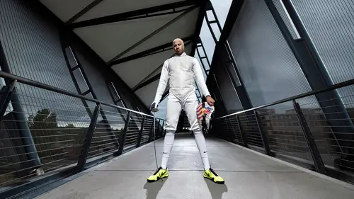
13:15 28Selection Process: Fencing
13:17 29Capture One Post Production: Fencing
07:05 30Finalize Images in Photoshop CC: Fencing
15:13 31Selection Process: Triathlete
13:43 32Camera Raw Post Production: Triathlete
07:47 33Finalize Images in Photoshop CC: Triathlete
27:42Lesson Info
Selection Process: Basketball
We just did the shoot. All the shoots and now I'm gonna take you through how I would edit some of these images. Usually I would start with a lot of images and narrow it down to some selects. So this is kind of like just a rough select I made right now, just something that caught my eye. Usually I'll do this pretty quickly. I'll take down these images really fast, something that I'm like ah that looks okay, that looks okay, without trying to think about it too much so I can kind of just get through it. Otherwise you can linger too much on some pictures and mess with your head. I also sometimes, when I'm going through these I'll see something that was maybe a test shot or something that was a little more overexposed or something and something about it just grabs me. And if grabs me right away again I won't think about it too much, I'll just mark it and when I come back to it if it still speaks to me that same way, I'll pull it in and see if I can fix it a little bit. Because again talkin...
g before about what we were talking about the emotion, the connection and just the impact of the action and everything. Sometimes that's what matters more than the technical part of it and we really just want to sell an image that way. So with that said, here we go. The first image right here, I just grabbed it cause I liked that light on his face. I don't even like this picture at all. It just was a quick first off thing. You got a question? What program are you in and why? Good question. Currently I'm in Photo Mechanic. This is a crossover from my photo journalism days. A lot of photo journalists use this because it's a very lightweight program. And I say that in that it's very speedy so you can go through it really quick. You can do a lot of captioning info. And it has the multi-markers. I know it really, really well and I used to edit live in events and things like that. You can push pictures through really fast. I don't use this for everything. I use it a lot when I'm dumping cards later cause it's just I'm used to and what I know. But usually when I'm shooting tethered I'll use Capture One and go through it this exact same way. Just going through making my selection process. And then I also use Lightroom 2 sometimes. It really depends on the shoot. For this one in particular I felt like it was a lot more editorial and again dumping images. So I picked Photo Mechanic because I'm faster in it. If I'm using Capture One I'll go through it and I'll select my images and then I'll kind of do my raw edits in there as well and same with Lightroom. If I'm cataloging or something like that I'll use Lightroom or something else but it's just like different lighting and everything else, it all has the same sort of outcome just slightly different mechanics of it. So, let's go through these. There's like a progression here too. So again, this isn't a picture I would actually edit. I just liked his face, I just wanted to see it. This is one of those images I'm like ah, maybe there's something there. I could see crops and stuff like that. I'm starting to go through them, starting to feel it a little bit more on these. See I'm kind of going back and forth there. Kind of like the body language on this. I like this one a little bit better now. I feel like he's coming at me more I just don't like his body language too much. He's opened up a lot more there, I think I like that. I like this that he's coming at me a little bit more. It feels like I'm in the shot. Same thing with this. He looks a little bit more posy in this. (chuckles) Boom, boom. Again, it feels very posy. I kind of like the face on this one honestly. I know he was kind of a character. I feel like he was hamming it up for the camera. And I feel like if I was showing his personality I would either go with something like this or something like this one right here. But I like the body language a little bit on this one. I'm gonna mark that up to a two. So I use a multiple code system. I'll use one, two, three, four, five. And you can see at the bottom there were some color changes. Pink is one, red two, orange is three. And then five usually I'll save for like, this is my picture. This is my final. So this is a two now. I like it a little bit more. Like this one more than this one even though I kind of like his eyes a little bit better. But I like the light on his leg right here. I wish his arm on his left side was a little bit more out. Feels a little weird but I'm gonna leave it in for now. I like this one a little bit. I like this one more actually so I'm gonna mark that one back down to a one. I still like this one. I actually already did a little edit on it but I'm not sure if that was my favorite. It was more just going through my images right afterwards. Sometimes I need a little bit of time to step away from it and not really be too invested in one of those shots. So I'll just do a quick little scan over it, not looking at every image. And I'll just sort of pick out ones that I kind of remember. So that was one of those. I just sort of remembered it and I was like yeah let me see what it looks like. Cause I can get a feel for what these other shots are gonna look like as well. This was one of our second locations here. This was just starting out with the lighting. I kind of liked these a little bit. Obviously you can see the beauty dish up top, overhead. I like this one a little bit more. He looks more engaged. I think it shows a little bit more personality. I like the light on it. I like the gradient. The light on the left side of his body looks really nice. Right side of your screen. This one I like too. I think the framing's a little off on it. I wish I had a little bit more room on the bottom. There we go. I did not know that was coming, but I just answered my own question. So I like that one a little bit more. I like this one, he's looking at the camera. I think it's nice. I like this light a little bit more. You can see there's a slight difference, in the face. Although I don't like the ball as much but I do like his face a little bit more in that one so I'm gonna mark it up. Bring this one back down in terms of my rating. Go back around. I think I moved over. I'm thinking like I'm thinking the day of the shoot. I don't necessarily like that line in his head so I framed him within those instead. But I still like the light better in this one. So again, sometime technical proficiency is outweighed by your emotion and other aspects of the photo. I'm still gonna mark up both of those. Don't really care for that one too much. I feel like the background draws a little bit of focus away from me. It feels a little posy. I feel like I'm shooting something else that I'm not. I think the hair's a little hot on this. I could probably bring it down but still not my favorite image. I like his eyes in this image but I think I would pass on it. If this was a profile on him I think it's an okay picture. I don't really care for the left side of this frame, so I think I'm gonna keep going. Now we're on to our third part with some action. This is the start of our action stuff. We didn't have a net on this hoop. It was just a middle school park, or middle school playground. Is it a playground? Yeah, I think it would be. A middle school basketball court and we just kind of used what was there. And sometimes when you're on a location for a shoot you just get what you get. So we didn't add any nets or anything to it. I kind of cropped this one already. I think I like this one a little bit more. We used a trampoline, you could see that in the bottom of the frame. I shoot these all a little lose because I don't want to lose any of the athlete. I don't want to lose any of the image and I want to be able to kind of crop it how I want to and make sure the framing is a little bit better. Some of these more action oriented ones are a little looser than I would send it in to final. I would usually give a nice crop to one of these. I kind of like this image just cause I could see his face a little bit better. Although this one it feels like he's traveling up more than this one. This one looks like he's never gonna make it. And that's not necessarily the idea when I'm choosing images, especially pictures of athletes doing their thing. I'm looking for a couple of other things as well. Something that shows off the athlete. Something that makes just a cool dynamic image. But something that represents the sport well and a lot of times that goes back to communicating with your athlete making sure that this looks like a real image or it could happen. So yeah, I like his angle of his legs on this one. But the lighting on his face is a little darker than some of the other ones. It looks like the pop didn't really hit, hit the right side as much. This one's okay as well. I think the body language isn't right for me on it. I like that he was trying this right here. But it doesn't feel very real either. So I think I would skip that one as well. We go there now. I think this is our first setup actually. We had one light on this. We were kind of trying blend it in with natural light there. I think we have it over on the left-hand side. He was just sitting there. We were kind of getting to know each other. It was starting very simple. I think this, we added the light and then I immediately started turning. There we go. I think I was going for the symmetry on this one. I kind of dig this. Everything looks very balanced. I think I'll add that, yup. I like that one. I like the light on this one. It's very dramatic. You still get to see that grade. It doesn't take away too much. I'm trying to use the grade as framing for his face and his body right there. I think looking off is a little bit nicer. He does look a little posed in this, but I'll still mark it up. Actually this one looking off even more. Maybe I like more. They're very similar. But I feel like I catch his eye more. Let me see. Nah, I think this one is the one I like. I think I'll stay with that one for now. A little wider scene but I feel like this is weighted oddly in this picture and I can't really find out which way I want to crop. I feel like I should have opened up a little more. I can see I cropped over here because that's where the light is and it was a pretty overcast day but it was really bright in the background. It was kind of hard to overpower that light so we had to keep that light pretty close to him. Ah, let me see here. I kind of like his chin up in this but again he feels very posy. This one feels a little bit better just because we're adding in sort of the emotion with the light. This one I don't really like too much. It doesn't really add to image by just closing in on this. It's not my favorite picture. This one's a little bit better but the top is kind of overexposed. It looks the light was pretty high. I think we were trying to get a shadow under his chin. We can always take that down possibly in post if we really like the image. The shadow on the hoop doesn't bother me incredibly. I think with a net on this it would have looked a little nicer. Let's see the next one. Yeah, this one feels better to me. I think I like his head going up into the background basket. I feel like it frames it nice. I don't know, hm. I'm kind of shooting up at him more. I think I like this one a little bit better. We're gonna keep that one up at three. Looking off looks nice too but I don't know. We'll choose between those later. Sometimes again, you don't want to really think about it too much. It'll just kill your head. You want to take fresh eyes at it in a minute. We'll go back and narrow that down even further. A lot of the same shot here. We're just sort of honing it in and trying to fix everything. My framing, the lighting. It's a little hot on the ground. When I say hot, I'm talking about overexposed. This one feels better. I like pulling him forward. This was nice down here cause it's showing the location but not necessarily making our player the star. It's using the location as a framing object. But I feel like the crop in the composition is a little wonky so we're gonna move on. This one's nice right here. I like this one. Do, do, do. And then I think I really like these ones a lot more. I just felt, yeah, him looking back over his shoulder. There we go. Yeah, that one right there. I like that one. Maybe one of these too. I think I like this one more than this one although I don't really mind losing his chin too much on this. I feel like it gives him a little bit more power. The only thing I don't really care for is the angle of that hoop in the background. And then if I try to straighten that out we're gonna loose a little bit more hoop too. I still might edit it just to look at it cause sometimes I might be wrong. This one's nice but I feel like he's squinting a little bit too much. The light's a little hard. I don't hate it entirely but not my first choice. We softened up the light I think we brought it around. Yeah, there we go. And then we added a little bit more to it. So we have a front and a side light. There about the same power on those. This one's nice. I like the full length but his socks kind of draw me to him. I don't think we need his legs in this picture. I think we could just get away with cropping in if I wanted to use this one. It'll look very similar. I think I like that one. Yep. And then I pull in. You could see with and without backlight too. Adds a lot more shadow and draws you into his face a lot. But, might like this. I don't like that his shirt's a little wrinkled back there. It draws attention to it a lot. Maybe we will try this one too. Let me see. So we have another action one. Doesn't look too great, I'm just gonna push past it. I like this guys face a lot. I feel like everything he did he just was thinking about it. I think I told him a few times, I feel like you were just sitting there after the game or you're getting tired. I want them to feel something. Let's see here. I think if I was gonna choose one of these I'd probably, probably his arm up. I feel like it's a little weird down there. Yeah, I think this one looks nice. Let's pull that up to a three. I like this random little smile. This is an off moment. I think he was just laughing at something. We were doing a lot of very serious shots. And just a nice little moment of laughter. Sometimes that's nice especially if you're trying to fill out content. Nice personality photo. That's an assistant shot right there. Real fun. This is just what the back light is doing right in those same scenarios. I think a front light didn't trigger on it. Think I marked it because I was wondering if I was gonna choose something about that later. Yeah, we added in our bottom fill. I don't think I was caring for it too much. So I wanted him to sit down. Yeah, I like the ball separated from his body a little bit on these. I like this one, I think I'm gonna correct the legs are a little hot from the spill on the bottom. Probably should have gridded it. Sometimes you're limited to the gear you have and we only had one grid and we used I for the top. I like the body language on this I just don't like his tongue kind of sticking out too much. I draws too much attention. I think also his leg is a little bit foreshortened. If he was a little bit turned it would've looked a little it better. Still he looks like he is just jumping straight up, which isn't the worst deal. I think if he was in the sky totally on this one I would like this one a lot more. I like his face in it but don't really care for the bottom too much. This one's kind of, ah, this one. I like this one. I like that one. His body language is nice. I wish his foot wasn't up so high. I still like the fact that, I pre-cropped this one and you could see I was just going for in the sky moment right there. But yeah, those are the basketball pictures I selected. So let's go back and narrow them down even further. So I went from my original take which was couple of hundred down to 97 which was my sort of overall selects. Now I'm down to, oopsie, 34. This would be what I probably would send over to my client at this point if wasn't making the final selections. And then I would go back in myself, probably select a few that I like a lot and then send those over to be like, hey, what about these? Those are mostly just so I can get my ideas in there and heard. But at the end of the day when you're working for somebody else they really want their ideas to be heard as well. It's all about matching your vision with theirs and try to recreate or create something that they want in your eyes. Let's look through here again. Again, I like the body language on this. I think I'm gonna keep it and mark it up again. We're up at a four now. I think I'm gonna keep that one at a four. He's got a goofy face on it but I still like it. Something about it, something about the balance in it. I still like it, so we're gonna keep it. I like this picture. I like the falloff on the left hand side of the frame. I like the gold sort of glowy side on the grate. I like that it's kind of hitting right behind his head. I think I'm gonna mark that one up to a four. This one's nice but I still don't really dig the wall right in the middle of his face. I'm gonna pull that out. This one the light doesn't look as nice as some of the other ones. I think I'm not gonna do that. Again, I like the eyes on these but I still don't really care for the overhead overexposed top there. Just not really enough for me there. In terms of action pictures I think this one's just fun. I wish his legs were a little bit more separated. These are really hard shots. Action shots always take forever to do. And they're really hard especially with athletes that are not used to just doing the same thing over and over. Or they think of it as just as let's do it all fun and games and I'm trying to be like let's make it realistic. Let's make it look authentic. I think, maybe he plays with his tongue out like he's the Michael Jordan of the street ball league. But, I don't know. And the hand also getting lost in the background. I don't mind it too much but I wish it was there. I wish I could see it. I like to see limbs. I like to make sure that everybody knows that he's holding the ball and it's not just attached to his arm. So I'm gonna mark it up anyway. Again, I like the light on his face a little bit more. I like that his eyes pop in this. But I feel like he's just, I'm not feeling it too much. He's pretty low. These guys were not, they're not dunking guys but we wanted to show like them doing some action. I think if I were to choose one I would probably go in and, ewe, hm. I don't know, I'm not feeling either of these, really. I think his arm going up makes it believe that he might be still going up in this one. I think I'm gonna choose this one. This is an okay portrait. I think just a quick shot if we had a couple of minutes I would send it in but it wouldn't be my end all. It was nice just to get in there and communicate with our athlete and then try to figure out what we're gonna do. So a nice little fast portrait right there was okay but I think there's better stuff in here. I feel like he's more comfortable in his hooded sweatshirt but he doesn't really pop out of the scene as much. So I liked his blue shirt more but he looks very posy in these shots right here. So that was a little hard. I'm gonna mark this up but I wonder if I'm actually gonna use it or not. Again, I like this one a little bit more because of the framing I think. Every time I go by these two I get drawn to this one. And I think it's cause I'm bringing my camera in more. You could see I'm back straight up and down. I like seeing his feet in this but I don't think it's necessary for this shot. So I just cropped it in and use that one instead. Oh, I do like the look off again but I think I'm gonna go with the straight one on this one. I might see what this looks like but it feels a little heavy. I don't really like the framing. I think I talked about that a minute ago. This one's okay, it's a good standard portrait. I think this could be a really quick edit. Again, if your just kind of giving samples to clients it's nice to show some things if they want something simpler but it's not my favorite portrait. This one's a little stronger. I think I have better one later on but I'm gonna mark it up. Again, his socks draw my attention too much so I think cropping out of that is not necessary. I like the look over and I like this one better. Mark it up. The drama on this one's nice. I think that one's gonna be our winner. And I'm gonna probably end up editing that one. Oh, never mind. This one instead. I like his hand on the right. He's kind of tensed out. Let's mark that one back to a three and this one back up to a four. I do still like the dark right there. I think we're gonna go with... Ewe, these two. I like seeing a lot of the scene usually when I'm on location. So I'm kind of torn in between these images right here. Again, I don't like is arm hanging in the middle but I like his facial expression just a little bit more. So I think I'm gonna go with this one with his hand on the side. I think it's a better placement. And then we're gonna go in here. I don't really care for this. The light is really off. It's one of those quick moves and if I cropped in a little bit and take his legs out of there it might be okay but I think there's stronger stuff. Again, I like the body language on this. I wish his leg was a little lower. I probably would have selected this one instead of the other shot. So let's see what we got now. We just went through and killed out a lot of photos. We have 13 images now. There are four images that look very similar right here, five. So we're gonna get rid of some of them really fast. I think I like the more eye contacts so we're gonna take this one out of here, mark it down to a three. I think I like the more sky in this one, so we're gonna take out that one. I think I like, it's between these three. Yeah, that one, that one and this one. Let's go between these two first. Hm, it's a tough one. I think this one also helps give the ball a little bit more light but I don't think that's necessary. They're basically exactly the same. Sometimes the strobe doesn't fire and you're like ah, why didn't I just do that to begin with. I think I'm gonna go with the strobe cause it was intentional. Mark that up. I'm gonna take, I do like his face still in that one. We're gonna skip it. I think I'm gonna do this one and this one. Let's see here. What do we got here. So I think I'm gonna edit this one. Pull this one in. I'm gonna pull both these in right now. Pull this one in. Pull this one in. Pull this one in. And I'm gonna pull both these in.
Ratings and Reviews
awynterphotos
Loved all the ideas and why he's positioned his athletes the way he did, and positioned the lighting. I met Dustin a few years ago at and NPAC conference. It's nice to see him doing these teaching videos. His work is very inspiring to me.
a Creativelive Student
Less talk and all action.. This is the best no mumbo jumbo talks and straight to practical work..
Alexandra Schaede
I really enjoyed the multiple exposure video, the pity is that they are no videos to talk about the post processing of this image.