Lesson Info
29. Capture One Post Production: Fencing
Lessons
One Light Outdoor Portrait
17:01 2Focus Umbrella Outdoor Portrait
09:49 3Outdoor Athlete Hero Image
10:17 4Cross Light Outdoor Portrait
04:37 5Edge Light Outdoor Action Image
10:21 6Clamshell Light Outdoor Portrait
17:50 7Mid-Air Basketball Action Poses
13:24 8Refine Mid-Air Basketball Action Image
06:44Dynamic Mid-Air Basketball Image
16:02 10Natural Light Indoor Portrait
12:18 11Action Image With Shadows
18:30 12Stroboscopic Action Image
21:11 13Backlit Indoor Portrait
07:39 14Environmental Portrait
06:11 15Incorporate Architecture Into a Portrait
09:30 16Mixed Light Athletic Portrait
10:12 17Cyclist Action Image
17:45 18Adding Motion to
09:47 19Environmental Light for Runner Action Image
17:19 20Add Haze to Runner Action Image
11:11 21Create Your Own Environment
14:50 22Swim Outdoor Portrait Poses
05:18 23Action Images in Water
11:40 24Freeze Motion in Water
06:45 25Selection Process: Basketball
23:49 26Camera Raw Post Production: Basketball
11:47 27Finalize Images in Photoshop CC: Basketball
13:15 28Selection Process: Fencing
13:17 29Capture One Post Production: Fencing
07:05 30Finalize Images in Photoshop CC: Fencing
15:13 31Selection Process: Triathlete
13:43 32Camera Raw Post Production: Triathlete
07:47 33Finalize Images in Photoshop CC: Triathlete
27:42Lesson Info
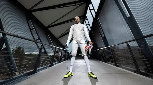
Capture One Post Production: Fencing
Looking at this right now, a little hot on the side there, I don't mind it right now. Again, the personality is there, and that's what I like about it. We are going to see, we're putting on just Adobe color, that's fine. I'm gonna pull the warmth up just a little bit, again I like warm skin. Let's take down some of the contrast a little bit on that. I'll probably put it back in in a second. I'll put some clarity, just a small amount, maybe ten. Bring it down there. Highlights are a little hot, so I'm gonna bring those down. I might go in with my brush, take this down a little bit on the side of the hair, zoom in. Again, I don't mind the shadow on his face, I feel like it's just a nice moment. It's not even the most sharp picture. I think it's actually focused on his arm? No, it's on his hand, yeah right here. So it's a little front-focus, but again, I like the moment so we're going to keep it. A lot of times when that happens, if the focus is just a little off, I will try to correct it...
by going into my adjustment brush. Then I'll go into sharpness, I'll pump it up just a little bit, maybe 50, we'll zoom in so we can see it. Put it at 50%. I'm gonna go in here, make my brush bigger with brackets, sharpen this up. I might also use a little clarity in the face too, just so it gets a little more detail in it. There we go, just a little bit pops out those highlights. And then I'm gonna do the same thing to that sharp spot right here. This isn't necessarily him or me, he was just moving, I lost focus, it's okay. So I'll pull down sharpness on this. I'm gonna take away a little bit of that. Nobody's probably going to see it, but I see it right now so I'm gonna take it out. Not completely blurring it, I just wanna make it so it's more in line with rest of the image. It's a little bit on his knee right there too, so I'm gonna take that off. And, I feel pretty good about that now. Let's see here. I'm gonna go in and see what the corrective lens does. Nothin', really, it take a little bit of this vignette around here out, so I'm gonna do that. So I'm gonna leave this now until I get to Photoshop. Again, this is a very similar image, I'm just gonna copy settings, push in on that. Similar, but I'm gettin' a little bit hot over here, so I'm gonna grab my highlights, bring it down, gonna leave it as is for now. I'm gonna try it a little cooler, actually, see what it looks like. I'm gonna add a little bit more contrast punch, bring the shadows in just a little bit more. Shouldn't be afraid to just play with your image a little bit. Crop, that looks good for now. This image is going to be fun. It's got a little green tone to it, I think I might take some of that out. Punch in little bit more magenta, in my color temperature. Again, these images are pretty similar. This one at the bottom is dark, but I'm just gonna copy those adjustments to every one of them. This nice, still. It's a fun add-on, maybe it would work as like a table of contents, or like a add-on for the online edition, if we were doing a story on this guy. I'm gonna crop this right now. I would probably leave it fairly wide, for now, and then I'll see it again in Photoshop. Just leave it like this, I don't really care for that, maybe we'll correct that, let's do that. So I'm gonna go into my transform, and then I'm going to see what it does auto. And it did a great job. So, sometimes auto is all you need, Photoshop is an amazing tool. And again it's a tool, you should utilize it for the right things. Fixing horizons and everything like that in lines are great, again, I might be taking that line out later anyway, but for now I like that it's corrected. I was shooting it pretty low, so having that little bit of correction is nice. Ah, it's pretty dark, because I just copied the stuff over from the last one, but it turns out they were not exactly shot the same. So, I'm gonna pull up that, it's a little green again, so I'm gonna put in a little bit more magenta. It's a little, it's got a weird funky color. Let me just try the white balance tool, see what it's got. I don't really care for that too much, but let's punch it around, see what we can get. Maybe the ground will give us a nice color. I think that one may be the most, I like the blue tone. Maybe the warm, we'll go with the warm, and I'll pull back just a little bit. The hard shadow is kind of a fun look. It's a quick shot, you can get it done very quickly. And it just has a unique look to it, to the hard shadow. You won't use it for everything. So, that's good for now. I think maybe we would take a little bit of the highlights down, and then we'll finish it off in Photoshop. So this one I like cool. I kinda did this a little bit already, this is one of those sample images that I like to go with. I think I even would get a little bit more brighter on the highlights, really make really contrasty. But I think for now, for bringing into Photoshop it's great. This one, the exposure went a little bit bright on his suit, it's kind of a little reflective. So, we're going to bring that down right away. Bring up the clarity a little bit, 'cuz I really like that the clarity will help out with these metal lines, and give a little bit more tone to the suit here. So we're gonna add in the contrast, we're gonna pull down some shadows, I am really really extra, like, vibrant on the skin tone there, so I'm gonna bring that down as well. It's kind of a moody shot, too, or interesting, interesting-looking shot at least. We only have really these punches of color. So I do that, and I think I like it blue more than a yellow tone, so we're gonna keep it at that. This looks pretty good for me right now, let's move on to the next image. So in this one, so I like the warmth on this one, it's kind of a bright shining moment. I think maybe I wanna open up that a little bit. Again, these are, the way I was lighting was for more serious moments, but when you have those little pops of personality, you want to show those. So I'm gonna open that up just a tad bit, so I can at least see his eyes. So I'm selecting my shadows brush here in my adjustment. And then I don't mind about this hot spot over here, but I'm gonna bring it down just a little bit. It's a little over, it's very reflective. Let's see what else I would do. I think that's pretty good, I brought up the clarity about 26, brought down my blacks, my shadows. I can even put that back in, but I like the darkness right here. Again, this is a very graphic bridge, so I wanna still keep that. Turn down the warmth a little bit. Let's see, maybe. Let's go right about there. So same thing, I think the image is pretty good. We just basically, I basically copied it from this last one. So let's open up all these images in Photoshop now, and finish them off.
Ratings and Reviews
awynterphotos
Loved all the ideas and why he's positioned his athletes the way he did, and positioned the lighting. I met Dustin a few years ago at and NPAC conference. It's nice to see him doing these teaching videos. His work is very inspiring to me.
a Creativelive Student
Less talk and all action.. This is the best no mumbo jumbo talks and straight to practical work..
Alexandra Schaede
I really enjoyed the multiple exposure video, the pity is that they are no videos to talk about the post processing of this image.