Working Creatively with Brushes
Lesson 20 from: Digital Scrapbooking with Photoshop ElementsMichelle Stelling
Working Creatively with Brushes
Lesson 20 from: Digital Scrapbooking with Photoshop ElementsMichelle Stelling
Lessons
Day 1
1Day 1 Pre-Show
05:43 2PSE for Photographers and Scrapbookers
37:32 3Editing Photos in Photoshop Elements
45:20 4Favorite Features
39:30 5Typography
23:24 6Creating Textures
33:57 7Making Patterns
45:25More Typography and Simple Backgrounds
19:54 9Tools and Techniques
31:41 10Creating Layouts with Digikits
27:43 11Day 1 Wrap Up
01:28Day 2
12Day 2 Pre-Show
11:08 13Using Thumbnails, Templates & Masks
18:38 14Designing a 2 Page Spread
38:57 15Photo Composition 101
22:04 16Poster Creation
27:19 17Card Creation
37:18 18Custom Brush Creation
26:23 19Layout Creation
15:28 20Working Creatively with Brushes
38:01 21Social Cover Templates
45:56 22Create a 10 by 10 Layout
30:54 23Day 2 Wrap-Up
02:33 24Thanks + Credits
03:55Lesson Info
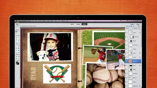
Working Creatively with Brushes
I was asking about watercolor russia's last night you okay? I'm going to skip number two I'm going to go right to number three because I was thinking about that last night I thought hmm how can I answer that question for her tomorrow though I happen to have this with me and I was it's because I was going to show you this side but at home I was playing with some chalk and I was going to make some chalk brushes and I thought, you know what I thought if I put some water on that it's going to kind of look like paint so I smeared that I took a picture of it with my phone and we're going to make a lot of color brush out of it for you. So um it's not it's a little shiny, but I thought, you know, it doesn't matter it's going to be fine, so the first thing I did was change the background to a layer so we can work with that um I don't need all of this extra so let's crops some of that out and that's just about all we want now what we need to do is go to our favorite tool convert to black and whi...
te, my favorite told today and we're going to see what the best black and white is we can get and it looks like it might be village landscape it might even be able to bring the contrast up a little bit. And for this, we definitely want some transparent areas, so I think that looks just fine. Let's change. Check the image size, I think it's going to be okay is seventy two pixels by twenty seven inches in width. So let's, go ahead and make that three hundred and now our height is we're going to have to change to twenty, five hundred in order to be able to make the brush work and photoshopped l it's okay, make sure you have your constrained proportions check down here so that that stays perfectly sized, so that should work for us. I'd like to go ahead and see if I can get some of that. Um, get more white, so by layer, new layer adjustment and levels let's, we should get a pretty good result by using the black and white hear that looks pretty good. I might even move that up just a little bit more to get rid of some of those edges, but I don't want to get rid of too much of that transparent blobby edge there. So I think that's going to be okay and I want to make sure emerged those down, so I'm working with just one document, um let's, go ahead and make the brush and then clean it up a little bit because I think you might need to know how to do that when you're working with something like this, so we'll go to add edit to find brush and this is watercolor brush just close that out of the way and open up a new document to work with ah, we want a new layer and we want to work in black, so click on the brush tool and that watercolor brush should be right at the bottom and just click on your layer and now you have here brush but its prey ricky messy and we can take care of that and put a mask on that. And remember, she said that black conceals and white reveals, so I want to get rid of this extra stuff around here, so I'm going to grab a soft edge brush, make it a little bit bigger click on the white mask, make sure your four grown color is black and when we paint over this you know what to begin with. I'm going to make this a little bless opaque little harder brush to begin with little be a little bit faster, we'll paint over this and get rid of these harsh edges you make sure that you don't get too much gone because you want that nice bleed on the edge can make your brush a little bit smaller when you get into these areas and just get rid of that was harsh edges there you could usually razor brush to do this you know? I had my I was wondering why that wasn't working very well I had my opacity said at sixty, sixty percent there's so many little tools and when you're working sometimes you just have to go back and check all those little ones but um make sure that if you want to go back and have the capability of adding some of this back in if you think you have too much if you're erasing it you've worked in a destructive manner you're not going to be able to go back, but if you are using a mask, you can go back and paint in anything if you think oh, you know, I should have left that little mark there even go back and do that so I'm just gonna go back over here and make sure this looks pretty good and that looks pretty decent so now I'm going to emerge it down again. I will crop it as close as I can without losing that transparency or the ah nice edge I mean check the size make sure we're okay and we're under twenty five hundred so that's good and now we'll go ahead and to find it as a brush um what color rush to and now we should get a pretty nice damp of collar there let's choose a nice great read go back a select the brush and that is the second one right there and there is your water color fresh you know if you want to really make it a little bit actually that's not too bad I was going to say that edge up there and it wasn't real happy with but I'd probably leave them it's got a lot of texture on it because it's a heavily textured paper if you want to use any if you wanted to be smoother use watercolor paper it look more realistic than this does but for a cell phone it's not too bad that's great thank you you're welcome your questions so for simple now you could make rushes out of anything. All right let's go on and see what's next I promised somebody that I would go back to the builder gallery so let's take a quick look at how we can use brushes to make really awesome papers using the filter gallery. So this is a different um letter and I'm going to make up brush out of this really quickly. What I'm looking for right now is I want a lot of the black and white I want a lot of I want more black in these folds and in these creases that's what I want right now so actually that looks pretty good in if I bump up the contrast is going to make that block even a little bit better that's pretty good let's check the size real quickly and seventy two pixels are seventy two d p I and that a resolution that's going to be fine the width and height there going to be fine so add it defined brush and this is going to be on paper very creative there on document file and like to open a twelve by twelve and I'd like to stamp this in black so click back to my hugh grab black click ok create a new layer and go find out rush again right there it doesn't matter that it's not going to fit the paper and I'm going to stretch it and that goes against everything that you've been told and I agree with we don't normally do that but it's okay in this in this case so I'm just going to stretch it the size of the paper I actually had to make notes on this because I was playing with it so much that I couldn't remember all of the steps that I did so I want to bring up this piece paper hair and put it behind this checks that we'll just move that up um I'm going to turn off this paper the color paper and I'm I like to use just the text it's not transparent and that's okay and yesterday we did this or in my last segment about papers and textures we wanted to sort of like m boss our paper with our pattern and so what we're going to do today is the same thing it's the same technique, but we're doing it with something that's solid and not trent doesn't have any transparency in it, so just as a quick review will go, we need to save this as a psd in order to use it in the filter gallery. So with the paper turned off on lee, the white paper visible we'll go to file save as and it's going to put out on my desktop and say it is for paper make sure it's a ps defile and save it and now we want to work with the paper because that's what we want to him boss with that with that print, so turn the repent off, turn the paper back on, click on it to make sure it's active go over to the filter the filter gallery and you remember that whatever filter was last used will be applied. But it's, nondestructive aiken turn it off and there's my paper, but actually this is the one that I used, so I'm going to leave it on, but I want to load actually I need to load the texture first I will click on text a riser and then we need toe load that brush that texture that we just created so to the right of texture is a down pointing arrow and if we click on that it'll say load texture click on load texture and go navigate to where that texture is we named it for paper and we'll click on that and click open and now that is applied to that paper bring it up one hundred percent and you can see what it looks like nice and loss it's a little dark because we use the black but for what we're going to do it's going to be fine if you didn't want that you could print in a different color are you know stamp in a different color now remember yesterday we talked about um adding filters on top of each other what I want is the base relief and that is under sketch and it's number one and so now this looks really pretty actually looks pretty ugly right now but if if I put a different um layer on this tow lighten it up it will look more like a ten ah ten look which is well, actually what I'm going for a new one adjustment layer and layers and I'd liketo lightness up and actually when I did this before it looked more cold and then it does now so I'm not really sure why it didn't maybe because I, um stacked those filters but the point is you can make it look like metal you can make it look like in grief concrete whatever it is you want this kind of looks like somebody wrote in a sidewalk and it's just a very very fun technique you can play around with it and get a lot of different looks but I promised I would revisit the filter gallery so that was my purpose for that all right, so let's go on to the next we did the watercolor brushes um do you want to know how to make the water color edges ok it's the same technique and I'm not going to go through it again because I have a lot of other material to cover but I do want to show you just a couple couple real fast way to do this um two ways you can this is just a piece of art work our paper that I got and I took some acrylic black paint with a brush and just smeared along the edge I scanned it and I created a brush out of it like you all know how to do right now and this is the brush that I made with that so you can see it's pretty recently exactly the same actually and now you can load that brush, turn it and make pretty edges around the paper you can also if you like um purchase those and sometimes it's easier to d'oh of that than it is to make them I think it's really fun and really creative to make them but if it's not your thing you can purchase them I want to show you I don't want to take the time to actually make one because you saw me do it you just change the angle but this is something that once you have it done you can do with um you can put them you've probably seen scrapbook papers that have darker edges you can put your scrapbook picker paper behind this change your blending most and look like a really nice darker edge and that draws your attention to the center of the paper and that's where you want it to be where you're loud or your julian is but you can also use these in a different way as almost like a mask and that's what I'd like to show you right now it's really kind of fun this is a picture of my newest grandson and he was on ly about six days old there his name is owen and I get to see him tomorrow because he only lives about forty five minutes from here so that's really going to be a fun thing so let's put this mask right on top of here or I'm calling it a mask but the brush edges right on top of here and it's okay to resize thiss it's not going to ruin it at all and if you want to change that photo to a layer so it's workable if you want what you could do is click control, click on the thumbnail to select just the frame and then click on your photo and hit delete and that would delete the photo um the pixels in the photograph that's a destructive way to do it and I don't like working destructively because I changed my mind a lot so I'm going to put a mask on that and now I will click on thumbnail of the edge to select it then I will click on the mask to make it active make sure my foreground color is black if I click on ault backspace that will fill that selection on on that mask and if I turn it off and de selected now thief frame is gone but it's still there it's was not visible that I'm going to put it on a piece of paper so you can see it well let's just open up piece of paper I'll just put it on this so you can see it it's not gonna look great but it'll be okay so now you can see that you have gotten rid of those edges and you have a really nice fun and around your photo I know michelle and a segment showed you how to use I think it was a cookie cutter tool to do that but if you have special edges that you really like, then you can use this tool as well why I like thiss is now because this is on a mask if I wanted tio type in his name if I wanted to add more brushwork to it, I could do anything I wanted on that mask to adjust these edges so again I just gives you more versatility and questions on that just super fun way to do it I own you tomorrow, okay? Um brush edges rushed title work there I said there are a lot of things that you can do with brushes and this is something really super simple we talk about journaling, we talk about titling our page is giving them titles or subtitles and sometimes using a brush can make that really super easy. So I'm going to show you how to do that create that little title with that I'm leaving a gray background and I believe I need to go load that brush that I just was using safe brushes no desktop see it I'm sorry I have to keep going back and forth but photoshopped won't let me keep that brush there and this is the one I would like to use and I want to be on my own layer and I don't want it going vertically I wanted going horizontally so this is a good time to use my angle tool here and stamp that right there. You know what? That change that darker gray and we'll change. Get a nice shade of gray by going and using that slighter ok, that's. Really cute. But where's, our title russia's, you can just do anything with going to grab the marquis tool because lice that right in half. And I'm gonna move it down. Get my v tool to select the move tool and like using the down pointing arrows just going. Move that down right there. Control. D to do select now. That's. Nice. But I don't like the fact that these air big here and there's nothing over here. So let's flip that she's your marquee tool selected again image. Ah, rotate. And I hope I do this right. I always always confuses. Rotate it. Are here rotates election, right. Four hundred eighty. Thank you. I can't tell you how many times I'll do that, like five times before I get it right. You think I would learn? Eventually? We did end up being. Was it flip horse on foot. Vertical. Thank you. Okay, so now to me, that looks better. I'm going to put another layer. I would put another layer on here and put my type in there. I'm not going to take the time to do it but then you would just go ahead and put your text in there and it's just a really easy way to use something that you have in your in your brushes or the brushes you can you do that with shapes as well? So just something that's decorative and you could just make it use it in a really different way I like sayings I like quotes there's something about them that it just takes a thought or emotion it makes it so succinct and it's so easy to remember and so I actually have printed out things quotes and things that I've put on the walls I have a bunch just off on my computer they're not nice like this they might be in little stickies but they're still quotes and nice things that I can look at it just as quick reminders of something that I have as a goal or a motivation that I want to remember for that day. So this is something that you could create in print if you wanted and hang if you like um it's got a couple techniques couple things that we've used today so let's see what we can do with that any all these things start with this very simple people paper background and um I want to stamp something on it so I want to make sure of this size and that is an eight by eight eight twenty five by eight twenty five if I'm going to make something to print I will make it about a quarter inch bigger so if you want to matt it then you've got a little bit of extra room around there so that's a twenty five by eight twenty five that's perfect just what I wanted and I need to install another brush so we'll click on the brash again and load and I believe this is the one I want this is a set of journaling brushes and I think I want this one I want it stamped in brown so I'm gonna sample that brown again and shoes and nice around looks a little gray but I need this brush to be a little smaller for this one and here's where your brackets come in handy because it's really easy to just go up and down and create a new layer before you stamp and stamp that on there right in the middle and then just as a reminder something we talked about in our last segment when the highlight both of those click on the selection tool, click on the center and click on the middle in a line because I want that perfectly in the middle I actually printed out the text because I didn't want to fuss around with doing it while we're here so here is the text you know just resize out a little bit tio make it fit, man that looks pretty good might move it down a tad and here's something else that you can do with edges if you know about clipping masks perfect a spring this over and make it a little bit smaller I should've resized it it would have made this little easier. Okay, you could change the blending mode on this if you wanted it like that, but I want to put this paper on top of it. Actually, if I had gone to this paper and put place, I think it would have put it right on there for me I'm not in the habit of using place I should get in the habit of it because it's really great tools going to smack right there in the middle doesn't look like it went right to the edge there so let's move it up a little bit and I'd like tio clip it to the the edge so if I hit ault and hover in between those and quick my mouth now this is just the papers just on the mat keep calling it a mat on the edging and then you have a nice blended edge decorative edge around that and that would be really cute if that was a quote that you wanted to remember something that you could print and put on your wall being nice card front anything like that? Very easy but just to give you an idea of ways that you can use brushes any questions from the audience yeah this one you may have touched on this before but this is coming from steph in san diego and they say how did karen get to the water color edge frame into the clipping mask with the photo the water color edge frame into the clipping them it was a little it's a little delayed sometimes but questions have been delayed into the photo yeah into the photo I think maybe we were talking about your grandson e I think that may have the what their friend I don't think I used the watercolor brush there are used this and I use the same technique of the masking and the clipping okay, maybe they were confused about what it was the third question so I'm going to show you a very special trick and I think it was either you or michelle that mentioned that the shadows are actually a critical part of digital scrapbooking because it's what takes what was a flat image and helps that have dimension exactly this is awesome and it and like somebody said in here is very different so something that is really close to the table is going to have a short hard edge and something that's far away the shadows going further away it's going to be more diffused so it's really important not to put the same type of shadow on every single element on the page because unless they're all equal in how they're set apart but I want you to look at this and tell me which shadow you think looks most realistic it depends where the little clock is ok if the funds coming from here or the lights coming on and is this on a page or is this in a room next to a wall if you were going to put this on your scrapbook page first one some is coming from there from kind of the but ok let's go this way I was going that way then it would be um well it can't be the middle one because of the handle you've got the shadow coming down under one side and up over at the other well yeah that one's not arrive you look at the colors the any of the color strike you as looking better than the other see how this one is with yeah this one yeah this's really ah harsh shadow this is shadow with black and this is a shadow with the color of the paper let me show you the difference say I thought the one the left one if it were like a sticker this one you know on the page it would almost be a little too wide but you're right if it were thicker then the last the right one because I see what you mean by the color okay, so let's let's look at that we have people in the chat room charming on their opinion on that video you bev to says I like the first one saffron and query chime in me to safran says I can't even see the other two so the first one was really coming through through the video screen I think good and I think that's true I think for me I think it's too harsh um I personally don't like black shadows I think that gray or the color of the paper is a little bit more realistic I could see how on the screen it definitely looked darker though it was more visible so let's see if we can make it visible here. Ok, here is the little adorable clock and let's put this on this color in them background so a nice little yellow color. Okay? In photo shop elements you don't have a whole lot of options with drop shadows as far as being able to manipulate them, they are pretty much there. So what we want to do is duplicate we want to make us of those shadow on its own layer and what we can and you can't do that in elements except doing it manually this way so we want to make a duplicate of that clock minutes so turn that first one off just so that we can see that we're working with a second one clicker on your control click on your time now layer to select the clock at it phil there and choose a former in color let's just choose a color and that will make that darker and now that whole layer is filled with that color now that shadow is on its own layer and weaken manipulated as we want, so I'm just to go real quickly I'm going to just choose the move tool and here's where you would make your decision about where the lights coming from in the coming from the top the side underneath or whatever let's assume is coming from the top, so I'd like to move this over a little bit and down a little bit and I'm just using I'm just nudging that with my arrow keys so now looks a little more realistic as faras if the sun were coming from this of top right angle it's really harsh we can lower the opacity of that and changed the mod tio linear burn and that's going to going to look more pick up the color of the paper a little bit and then because it saved is far away from the wall we don't want it to be a sharp, harsh shadow so we can go to filter, blur, gauzy and blur and let's just play that a little bit this is no blur and it's nice it's you know kind of sharp so if we bring that up you know that's a really nice soft color and I know it's probably not as quite as visible on this screen but it's a nice soft blur and on a scrapbook page it would be really realistic looking might bring in their passing up a little bit because it's on its own layer you can also transform it warp it whatever you want to do with it that's what you're going to say you know then you could make it look like the shadow was on the ground like kristen was coming from the top yeah you could nudge that into the fission interesting but if you hit control t and that will bring up your transform tool click on right and now you have all these options of things that you khun d'oh he was perspective to do what you were talking about or you can use distort or skew if you um have some say you have a character a person and you're going to put that person on a wall or a chair you don't want to shadow under them because there's not a shadow under you when you're sitting so this is when you would use that especially that distort tool so you grab these handles and you can move this shadow around however you want could bring it out a little bit more. You can move this up so that it's not underneath somebody that's standing. You can just move it however you want, because in the key is that it's on its own layer. Okay, so super simple. If you go to photo shop elements and you look in the drop shadows, this is what you get, and you can't do a whole lot with it. If you click on the layer style and bring up the dialog box, you can change the color, the size, the distance in the opacity. But you can't manipulate it, um, any in any other way.
Class Materials
bonus material with purchase
bonus material with enrollment
Ratings and Reviews
Prairie Chicken
I found this an excellent course on the use of PSE--not just for scrape booking but for any use. And of course the scrape booking ideas and methodology was great. I enjoyed Michelle's approach very much, and also liked Karens.