Lessons
Day 1
1Day 1 Pre-Show
05:43 2PSE for Photographers and Scrapbookers
37:32 3Editing Photos in Photoshop Elements
45:20 4Favorite Features
39:30 5Typography
23:24 6Creating Textures
33:57 7Making Patterns
45:25More Typography and Simple Backgrounds
19:54 9Tools and Techniques
31:41 10Creating Layouts with Digikits
27:43 11Day 1 Wrap Up
01:28Day 2
12Day 2 Pre-Show
11:08 13Using Thumbnails, Templates & Masks
18:38 14Designing a 2 Page Spread
38:57 15Photo Composition 101
22:04 16Poster Creation
27:19 17Card Creation
37:18 18Custom Brush Creation
26:23 19Layout Creation
15:28 20Working Creatively with Brushes
38:01 21Social Cover Templates
45:56 22Create a 10 by 10 Layout
30:54 23Day 2 Wrap-Up
02:33 24Thanks + Credits
03:55Lesson Info
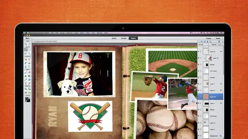
Poster Creation
We're going to go ahead and talk about poster creation and we're going to get a little bit into the blending mode so we don't use them often in photo shop in scrapbooking that we're going to go ahead and talk a little bit about them just in case you ever want tio apply some of them to your layout so let's go ahead and pull up the poster that we're going to create here we're keeping with the theme of the beach theme here since we're coming up on summertime here let's kind of dissect this a little bit we have a frame around here I'm gonna bring up the photo shop documents if we have it all right so if you look over here on your own the layers panel you will see there's a bunch of different layers of course we have the text mostly on the top air in the top area and then we have all of these level different levels that we're going to work with and different modes so when I'm talking about modes I'm talking about this area right appear where it says normal these are the different modes that...
you can work with the blending modes people calm modes or blending modes and they kind of do a little bit of a different thing to the photo as you go down and toggle through them if I were to hit the arrow key while I have that mode selected we'll see if it's even yeah, there we go. Sometimes it does a big difference to the photo, and sometimes that makes a small difference, so if you click through them and sometimes it lightens it too much or darkens it, in fact, let me do it this way here, let's, create a duplicate layer let's go through there, okay, but what what I was saying is that sometimes it will go ahead and give you a big difference in the photo, and sometimes it will just make a really slight change, so you had to go through them individually, check him out, but we're going to create, we're going to use those while we're creating that poster, so let's, go ahead and think about what size this is poster need to be now. Brenda does a lot of eight and a half by eleven, so thinking eight and a half by eleven would be a good ten type of proportionate picture, so we're going to go ahead with an eight and a half by eleven, but you can do it a lot bigger if you wanted to, but since we're working with, I'm going to try and work with brenda on the eight and a half by eleven since she mentioned she does that a lot, but you can make it whatever size that you want to be I'm gonna go into file and new and the first thing I'm gonna do is on the say it needs to be eight and a half by eleven if you have your set two pixels make sure that you change it to inches because sometimes you will not look in this direction and you'll put in eight and a half pixels and it's going to be very, very small I've done this before if for instance let's just go toe to put that in I don't even know if it'll give us eight point five yeah, it also want between that so if I put in ten by let's say it was a ten by ten and you forget to change it two inches, you're going to get something like this and you're going to say, why is my photos so small? Yeah, there is a custom drop down that's paper? Yes, there is, so if you if you were to forget to put that inches in there, make sure you go back in there and change it because you're going to see a lot of pixels when he when you zoom in there, okay, because you're going to go on like this, I've had people do this, they're like what's really blurry, so you change it, make sure that you go in the right way, so if you go file blank there is also a brennan was mentioning it's in here you have u s paper and you have international and scrapbooking paper as well so you can go straight that way so I'm gonna go to the u s paper if you didn't know that it was up there you can go ahead and punch in eight and a half by eleven make sure it's what you wanted to be just in case and it does that it's set to three hundred resolution because that is the good quality outcome now I happen to have my rulers up and running right off the bat but if you don't you just go into view and rulers or shift control our or shift command are on the keyboard if you have a mac so I like to kind of have my rulers up just that I know that I'm definitely making the size that I wanted to be if it bothers you you can go ahead and go back into view and then turn them off you do I want to have the rulers up when you are pulling in guides when we pulling guide you go and you click inside the ruler and then you pull it out into your page and I think I mentioned this yesterday if you wanted to change the color you go into preferences general and then you go into guides and grids and you can change the color of that guide at that point, because if you're going to be working with something in the background that's going to be sayin you won't be able to see that guide so you can change it by clicking and then picking out a different color it'll change it in there if you don't want that guy to be there, all you have to do is drag it you just click it and drag it off the page and just push it back into the ruler you can bring it in on both sides you could bring him in from the left or you can bring it in in from the top if you need him to all be in there, you can also pull in your grid, which works well with people who are really, really precise. You can go to view and grid you can change the grid as well, so you could go back into the preferences area control kay is the shortcake command to get there if you wanted to get in there quicker and again, you can click on the zoom scroll wheel, which we talked about yesterday and allow floating boxes those usually are not checked. I usually have to go in there and check him if you are clearing your preferences so just know where to find things you don't have to memorize where they are usually in the preferences you just click inside of these menu bars on the left hand side and then you can get to where you need to go I did have aa member call me are email me one time and said that they lost their cursor it doesn't look right on their page, so I said check your preferences in the display in cursors and make sure it's set to normal brush trip tip and then also standards so every once in a while it's possible that you do a short key command I don't know what it is maybe the cap locks is on and you don't see where your cursor is go into your displaying cursors if all else fails and you can't figure out why you're sick system is acting really weird reset preferences on next launch that'll clear it all up you may have to go back and re set some of the things, but at least you don't have to sit on hold with adobe or wherever you're you're trying to get your information from, but I will go ahead and reset preferences ninety nine percent of the time it'll fix whatever was happening that I wasn't liking so much there's really not a whole lot of things inside photoshopped elements that go wrong um, but when they do you just go ahead and change the preferences are reset the preferences all right? So what we were talking about was the um guides and grits so you can change the color of the grid as well the guides air on the top the grids on the bottom here and I'm gonna click here they're normally gray well let's just say we want him to be a green color you can also change it from style to dash lines or dots I myself kind of just like the lines it's easier to see for me and then you can change the subdivision so if I wanted to be three instead of four which might work better for my layout see down here how it changed let's just go with two you can see how it changes down there the higher the number you get the more precise it's going to be ok you can go on seven really really small little blocks down there I'm just going to go with three I think that's going to be fine and then click on okay so that's where you find the grids and guides gonna pull them off because we don't really need them for this maybe we will for our card creation but it's going to go ahead and turn off the rulers and again you can go control plus there's always the sharky commands all right I'm going to find my folder that I have all my stuff inside of first of all so I've got this folder here called pollster poster design and we have the photo we also have two different photos and I wasn't sure which one I wanted to use for my poster but I ended up using this one right here see I think that's the one pull that in and I'm just going to drag it and drop it and in this case because I drag and drop it it's not a smart object so this was probably not a smart move for me to dio because what I would want to do is I want to enlarge it um but like we did yesterday if you do shrink it down and then you enlarge it what's going to happen is you're going to see something like this it's going to be pretty pixelated it doesn't look that bad now but if we do file and place and I place this and we've compare them side by side the one below it is going to be a little bit more pixelated um so just just be aware of that someone to go ahead and delete that layer and place it in properly and I'm gonna enlarge it just a bit because I wanted to bleed off the page I don't like I'm gonna make my adjustments here I don't like this lamp because it's kind of distracting to me so I'm gonna go in and I'm gonna use my spot healing brush and I make it a little bit bigger than what the object is that we want tio the race and when you click on a smart objects it's going to tell you that you're gonna have to simplify it before you use that, start our before you use that tool, so I'm going to go ahead and say, ok, I'm going to go ahead and make it a simplified object and know it's no longer a smart object. Now I can go in there and take away that if they hold the shift key down, you should be able to do it all at one time by clicking and dragging or just clicking at the very top and then holding the shifty down and clicking at the very bottom there's a little bit of a shadow here, so I'm gonna go ahead and take that shadow away. I don't really like this big shadow here either, so we can use a bunch of different tools we could use the clone stand till we can clone this all the way across, we could try it, see if it'll work. I hold down my right bracket when I want to enlarge the brush size, so I'm going to go over here and don't know if this is going to work perfectly, but let's just try it, we're gonna have a frame around it, so we're not that particular about this, but I do want to get rid of that shadow. So I'm gonna hold down the all the key that will give me the target, never release it never come over here, and I'm a start painting away that shadow, and I might have to go over it a couple times, but I know that we're going to break your be bringing in a frame over the top, so I'm not worried about that corner now, let's, just look at the blending most I'm gonna go back, teo, the layer on the right hand side and if you wanted tio let's, go through some of these multiply we want to do to do yes, do you know the short cut for the math to go through the blending modes for that went for the power macintosh over the macintosh does when you click inside the blending mode and then you press the arrow key, does it not go through them? Who? I don't know, but I bet we could google it. I'm not sure all right, so let's, bring in that frame, it's. Good question, though, because I thought it would just automatically do it. Does it not do it for the text? Either? It does do for the text, but not for the blending moments, maybe somebody in the chat rooms would know, so the question was how do you go through those blending modes without having to go up each time and pull it down? Is there like a short he command because the arrow keys don't work, so we'll see if somebody out there knows for the mac all right, what we're going to do is we're going place this photo and here are this frame now with this frame it's probably not going toe work perfectly, but we have a few different things that we can do with this frame that we can make it work there's always a way around it, so if I were to do is drag this and drop it in here, I could potentially should go ahead and pull it from all sides, which could work, but you just don't know about the picks elation, but most of these designers they have really nice frames or if I wanted tio this is coming and he'll pull it back I could enlarge it and I could start piecing pieces together so and I don't know if this is going to work they didn't do this before, but I just thought of this right now you could possibly cut this and then blended together to pull it this way so we're going to going to try it I'm going to go come come in, see command v and it's cut there, but I'm going to appear it's gonna try quickly first and then see if it works and then I'll explain it okay, it might be ok, so what I did was I went in there and I took a slice out of it right here. This top layer is where I took the slice out. I will probably just move this down a little bit more. I want to put it on different layer it's let's say let's, go to this layer here I'm going to cut it off of that layer, I'm going to put it on another layer when a paste it now we have lots of pieces to work with when it pulled us down here and then I'm gonna open this and pull this up and I've got this little slice and here we're kind of just like piecing it together, but I'm just kind of giving you guys ideas of if it doesn't work perfectly for your layout there's usually a way around it, okay, I was kind of like toe make sure that there are options, so what I did was like hot cut pieces out of that frame and just made it longer. Now if I wanted to, I could stretch all these or I could do the same thing let me just get this down here, make sure probably should've cut a little bit more out of there and we could get real picky and zoom in and blend it all together, but for now we're just going to go ahead and keep it as is, we have all these three layers that are all different pieces and I'm gonna right click and going to merge them together so merge layers and a large just a bit and then I would do the same thing with wise to go in there and make a little slice out of it a little bit, maybe just about that much, because we don't need a whole lot. I'm going to cut no, I'm gonna copy and paste and then I'm gonna come in here, go that layer, get my rectangle tool and just kind of pulled us one over kind of that makes sense, and now I go to this top layer because I know that I can move it over hips and hope that it kind of aligns with that, okay instead of stretching it and stretching those pixels, I kind of pieced it together to make it fit my dimensions aa lot of times didyou scrappers will excuse me will make twelve by twelve and this is for you for your and a half by eleven so you can take those pieces, slice it up the reason why it was square is probably because it was going to be on a twelve by twelve another thing you can do if you don't like that to be that thick, you can take that and you can enlarge it and make it a thinner one I needed to emerge those first uh, getting ahead of myself merging together, right click and merge and then you can enlarge that so if you want a thinner border, all you gotta do is bleed it off the side. All right, that looks pretty good. If we were picky, we would bring in those guys and we would line it up to make sure because it looks like it's a little hair off we make sure that it's exactly perfect now let's, go to that top layer let's, just double click on that and call this frame haven't been talking a whole lot about making sure that you name your layers and and all that, but if you if you don't and you have a ton of layers, you can kind of get confused with what layer you're on and sometimes you naming them will help you remember what which layer you're on. So I just double clicked on the actual name itself and then that will give you that little box that you can go ahead and type in the name of that layer if you don't name your layers it's not it's, not a big deal, but it is nice to have that there a lot of times when I dio big frames or thick frames, I will take the opacity down a little bit so you can kind of play around with that, and that kind of lets that background shine through that's an option that you, khun dio let's see, now we're going through the different modes, so if you're on a mac, what you're going to do is you're gonna click on this and you're going to see this drop down and there's a few different types of modes that most of them I don't use there's maybe a couple of them that I will use I use the multiply every once in a while because it kind of gives it a cool, darker effect. The color burn sometimes works good let me go zoom in there so you could see a difference here so it's on ly focusing on the frame so on ly be watching the frame that's the only thing that's really going to change so normal is this that's dissolved, which didn't really do a whole lot. This is darken. This is multiply, which I looks okay color burn gives a little bit more pop linear burn that doesn't really do much the darker the screen color dodge linear dodge lytton overlay it just gives it a different look. Normally I would say ninety eight to ninety nine percent of time I don't even mess with the modes, but sometimes when you get it want to give it a good graphic look, you can go through them and see what it's going to do the difference sometimes does some cool stuff exclusion, hugh saturation color, you get the idea. So did anybody like one of those in particular? I like stuff that makes it look a lot difference. Let's go with maybe the one slips that this happens to whenever you do this. I was trying to zoom in, zoom out, but my color wheel are my wheel on here goes through it just like it does with the text. So just remember that because I was what's going on here is changing. All right? I'm gonna close out of this one because we don't need it anymore. Where did it go? And we're closing out of this one. All right, so let's, go down and put in the next item let's go to our top layer and go file and place. Go ahead and place these in the bottom left hand corner and these look kind of faint there a little bit too light, so I think I'm gonna put a multiply on, there may be no that doesn't look that good let's go with color, burn let's go through some of them. I wanted to pop a little bit more and if I can't find anything in the color modes, I can always go into my hugh saturation or into my levels and change it up a bit. I'm not really like in any of the ones that are in here, so what? I'll do that's not too bad, but I don't really like it that much. So what I'll do is I'll just go back to the normal and I'll go up into my adjustment layer and go toe levels because I wanted to be a little bit darker. I'm just going to push that push the darkness upon my layer that I need to have see here, there we go was on the right layer, ok? So it's doing it to all the layers because I have it all those layers are below that layer, but I'm going to show you howto on lee do it to those flowers because I'm really looking just the flowers so I'm gonna come in here, right? Click actually, I'm gonna hold down my all key I'm gonna show you the quickly quick way to do it and click on the altar and the in between and now on ly apply then to the one that's directly below it. If I hold down the altar and do it again, it will go and apply it to all of them so the same thing with um with them asking okay? So right now it's applying it to just the one directly below it and if I go back in there it's supplying it to all of them which I don't want okay, so if I turn that off, you're going to see that these flowers are now a little bit more congruent with the photo because they were a little bit too bright before this is a little bit too dim and I wanted it to match a little bit more so if those modes don't work, you always have the adjustment layers which is there really nice all right let's go back in there, click on open and I don't know if there's anything else well actually let's bring in this let's bring in some textures soma pulling a texture maybe I want some texture over the top of this someone is gonna go ahead and drag it and drop it on the top and let's just see what we can come up with playing around with the different capacities is kind of fun and if you don't want it to apply to everything, we can mask it out like we don't want it to apply to the photo in the in the middle there we don't have to have it so now we have a little bit texture on that frame as well as on the photo a couple ways you can do it if you if you forget how to do masking all you have to do is go in there and get your rectangle marquis tool and kind of select what you want to delete and then hit the delete key and then it won't go ahead, not apply it to that I didn't get it all because I wasn't all the way down there but let's go in there, you would just go in there and help it out, okay? So now I only applied that to the frame if I wanted to, I could go a step further and play around with all the different, um, modes and it takes a lot of time to work with ease because you don't know exactly what it's going to d'oh until you actually do it because it's what it's messing around with kind of the layer below it it's also messing around with the color schemes and mixing them together so it gives it some texture but sometimes it's kind of a pain because you have to go through it and kind of truck it's kind of trial here now we're gonna go ahead and add some text on the top and then we will I'm going to show you another layout that we did with different blending mode so you can kind of get a feel for that we go the very top layer click once what I have on their sisters are forever okay and on large it find some fun fought pull us up close out of this one kevin what fun I use is kind of more of a script he font you guys have your favorite fonts yeah I need to really brush up on my father's have had these so long and I'm kind of getting tired of them so I need toe I kind of do a revamp of my fonts put it over here in the bottom corner and then we have ah a nice layout that uses some blending mode so I didn't want to spend too much time on blending most cause you can kind of like overuse them sometimes but I think sometimes is throwing in a little bit maybe with a with a border or photo if it looks really good kind of play around with those people forget about them because it's always said to normal and I wanted to kind of bring that to everybody's attention when you're done with the layout you just save it as psd because you want those layers and then you can save it as a peace a j peg if you wanted tio upload it to a printer here's another layout that has a lot of blending modes to it and this one's more so to this just one photo back here. So let me discuss piece it together for you. Here, turn these layers off so you can see how this was built. Not a tough layout to do. It's got a lot of pieces to it, though, because I did want to use each layer for the text was different. So here is the main photo and I thought this was perfect to have photos go down on the right hand side of it and then just adding these photos with a border that was a premade border. So I just pulled him in think it was used with the quick page area with the frames and just adding and rotating them a bit. And then just putting the name and a fund fought came in with this fault. Wass you see, if I even have that anymore, he I don't have are her men are harmon thought so when you don't have it in your system anymore, sometimes that can cause problems. So just be careful when you know you are going to be using a certain bond, and if you delete it from your system, it could do something like that.
Class Materials
bonus material with purchase
bonus material with enrollment
Ratings and Reviews
Prairie Chicken
I found this an excellent course on the use of PSE--not just for scrape booking but for any use. And of course the scrape booking ideas and methodology was great. I enjoyed Michelle's approach very much, and also liked Karens.