Lessons
Day 1
1Day 1 Pre-Show
05:43 2PSE for Photographers and Scrapbookers
37:32 3Editing Photos in Photoshop Elements
45:20 4Favorite Features
39:30 5Typography
23:24 6Creating Textures
33:57 7Making Patterns
45:25More Typography and Simple Backgrounds
19:54 9Tools and Techniques
31:41 10Creating Layouts with Digikits
27:43 11Day 1 Wrap Up
01:28Day 2
12Day 2 Pre-Show
11:08 13Using Thumbnails, Templates & Masks
18:38 14Designing a 2 Page Spread
38:57 15Photo Composition 101
22:04 16Poster Creation
27:19 17Card Creation
37:18 18Custom Brush Creation
26:23 19Layout Creation
15:28 20Working Creatively with Brushes
38:01 21Social Cover Templates
45:56 22Create a 10 by 10 Layout
30:54 23Day 2 Wrap-Up
02:33 24Thanks + Credits
03:55Lesson Info
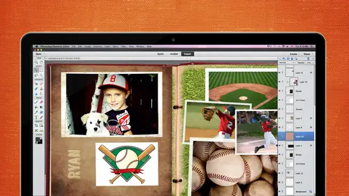
Favorite Features
we're gonna be doing a few of my favorite things and then a lot of typography. So the first few minutes I'm gonna cover some of my favorite features in Photoshopped Elements. And then also, we're gonna focus a little bit heavily on typography, and I focus on typography a lot because my background is graphic design. So I I kind of have a little bit of the typography background, Um, for that reason, But let's go ahead and jump back into Photoshopped elements. So I'm gonna go ahead and launch and you notice here that I do have elements 11 in there as well. I'm kind of a freak about that. I'll keep that later version in there until the next version comes out. And then once 13 comes out, all throw away the version 11. Just because I'm always afraid there might be glitches in the new version, and I have to have that as back up because I couldn't go without it. So I do have 11 up there, and sometimes I teach it and that if there's a bunch of people that do still have version 11 so that's why ...
I have that available. Okay, go on in here. We talked about adjustment layers, but there's a lot of reasons why I use adjustment layers. Now, Um, Karen's gonna talk a little bit more about digit kits and such, but she's the one that creates these gorgeous pieces. I just can't believe how intricate and detailed some of these pieces are. And these are just a couple right here. Would if you get this paper, you purchase this paper and you don't really want purple as your paper. What do you dio anybody? No adjustment layers. Yeah, So you can go in there, see how that nice texture on that, Um, all these papers, you zoom in really, really close. You can find this nice texture paper, But if you don't like purple and maybe you have a girl or a boy maybe wanted to return it to green, I just go into my adjustment layer. So I go into, um, in my layers panel. I select the layer I want to change, and then I go in to create a new Phil or adjustment layer, and it gives you this pop up. Now, usually I go directly to hue saturation because that's where you're gonna get the color change. Now. Some people go in here and they say, Michelle, my, it didn't change. When you have to click this colorized box, make sure you click that and then you can change the color to that notice on the right hand side, it gives you another layer. It's not hurting the layer below it, which is really nice. It's It doesn't damage that layer below, and you can always throw away that adjustment layer. You can always go back in there and adjust it later, Um, but now is the chance to get to a different color. Let's just say we wanted it to be green or blues. You just take the slider here, slide it on through, and once you get that shade, then you can go in there and you can change the saturation. Maybe you want to dim down the color. Or maybe you want to go crazy and do it really, really bright. So just remember, just because you purchase all these kits, you could be purchased a boy kit and change it kind of into a girl kid by just changing the color of those pieces. Now the paper is really easy to change as faras um, the color goes, but let's just say you wanted to change an embellishment color. You can go in here. Here's this. It's a PNG file, but this will allow the digit kit designers to design pieces that do not have a white background. See the the checkerboard behind there. That means it's transparent, so you can see through that. So when you drag this around, you'll be able to see through here, and you could drag and drop it into a another kid or another page. But let's just say you don't like these colors. You can go back in to the adjustments and hue saturation. We're gonna kind of play around with the other ones, too. But now we're just kind of talking about this, and you can go ahead and colorize it. If you don't press colorize, you can always go back in there and change this as well. So this is kind of a cool thing to you. Don't always have to check that colorize box, but now you have a bunch of different color schemes going on. So that's a really cool thing that you could do with all these kids that maybe some of them are not the color, not the right color scheme that she wanted to be. You could go in there and change it all to be your own color scheme. All right? Yes, Karen. Okay, so I really like the purple on that, but I don't like the green. Do you take your black with a brush and painted? And yes, you can. You can dio what's called masking, which is what we were talking about before, right? And, um, let me just see. I'm going to get into this more later, but let me to see if I could go in there. Yeah, let me do it to another one later, okay? Because I want to get more into, like, a whole segment of masking, but yeah, you don't have to do the entire thing. You can go in there and you could math pieces out and change that. Just those pieces. All right, Another thing that's kind of cool. Is the this invert threshold poster effect. So this one is a picture I took. I think it was called the Wildlife Reserve and Kingsburg, Colorado, which we only live about 20 miles from this place. I had no idea it was there. And I'm a big tiger girl. I love taking pictures of Tiger. So this little guy, Well, he's not so little would not look at me. So I was standing there. I'm like, Come on, dude, I need to get a picture of you just looking straight at me. But it took about 20 minutes, and he finally looked up at me. So I got a good snapshot of him. He was way far away, so I had to zoom in really kind of tight. So it's not the perfect picture. But I thought it was good enough for someone like me who's not a professional photographer, but I kind of wanted to do some fun stuff with it. You know, I wanted to go in there, and I wanted Teoh check out some of these. So I think it's invert. That was kind of fun, You know, you could go into invert not doing any harm to its. I can turn that layer off if I want to and revisit it later. If I want, I'm gonna go back into that layer. Come in here. And what's this photo filter thing. I don't know. Let's check it out. So I'm gonna go in there. I've never you actually never uses. I tried to play around that last night, but you can kind of do a little bit. It's more of like when you were in a dark room or something. Maybe you maybe all of these terms would be familiar to you, but it chest the color. You can try it out and see if you like it. You can change the density. You can bring it way high, are way low. And again. This is an adjustment layer. So it is not affecting that layer below it. I can turn layers on and off. That's interesting. Uh, you know that one going and that one going. So if I have this one and you can combine all these layers turning them on and off, find out what you really want for that layer When you turn on both off now and go back to this background layer, I'm gonna go in here. I think the what was it? Posterized threshold. I thought this was kind of cool because I like black and whites a lot. And you just scroll this through to find the perfect black and white. This is more of a bit map. If you've ever heard a bit map and some photos that works really good. Some photos may not work so good, but if you want to turn something into not just black and white but a bit map piece, this is where you would go into your threshold and just slide it back and forth to see which is the best way to to set it. Turn that one off and let's go back into it was the other one in vert threshold posterized. So this one's kind of interesting. Don't use it very often, but you see that you have different levels of this four. Maybe I want it to be, too. That gives it a different effect. Three. And then you can go from there. I kind of like it when it's down here. It's a you know, more artsy, Um, but whatever your outcome is, you can go ahead and save it off that way. So let's say, for instance, I want to say this one off. I don't really care for it, but I want to save it off I'm gonna go file save as depending on what you're gonna use it for. If you're gonna go ahead and print it, you can save it as a JP because that's what I send it. Teoh persnickety or Costco or whatever, if you're going to be doing a bunch of different layers psd you guys, you guys are probably familiar with that, so I probably don't have to keep mentioning it, but I sometimes want to keep mentioning it because I remember when I first didn't understand it and I would forget to save it as a PSD and I go back in there and they would all be flattened. Gosh, in which someone would have told me about this. But embedding that into your brain, PSD is gonna give you those layers. And J Peg is not going Teoh. So I'm just gonna go ahead and pretend I'm gonna get this printed off. I'm gonna choose J pay for my list of format options. You've got all kinds of options down here. Normally you're going to be working with J pegs, maybe pdf. So everyone still lost my says, Can you send me a pdf of that? You can bring it up into photo shop and save it off if you don't have that format. But there is that PdF that you can choose gifts. And then there's PNG's, which will keep that transparency. If you are gonna become a DJ scrapped designer, you're gonna be doing a lot of P and G's because they want that transparency and that is an option as well. So I would go ahead and choose J Peg for my list of drop downs and maybe I just call this purple Purple tiger, and it's going to save that as its own individual. I always bump up the quality to the highest that I can get, and it is going to give me a big file size. But it's gonna be also a nice quality as well. So I take that all the way to the right. Sometimes it'll bounce down here, usually minds already set over here but just kind of pay attention, Teoh. What? That is if you're gonna only be using it to maybe upload to Facebook or email it to somebody somebody. Some e mail boxes don't accept files over a certain size, like maybe two megs or form eggs or whatever. So if they say, send me the email and you try to send it to him and it doesn't go, it's like Skoda. Then go back in there and re save it down, save it down to maybe, um, 130 k or whatever. So that's pretty important. Pay attention to that. It depends on what the outcome is going to be. You wanna work with that? There some is gonna click on. OK, And then if I wanted to save off another one, I could go ahead and turn on and off different layers and save it off as such J. Peg. Maybe this would be black and white Tiger or something. Okay, yes, the key. Michelle. If you wanted to save it as a PNG because you wanted a transparent background for some reason, do you lose any of the quality or the resolution of the picture? Or that I'm aware of? That might be a good one for Karen. She's coming after lunch. She works with PNG's a lot. I don't work with PNG's a whole lot, but I would guess it wouldn't lose quality. But I'm not positive. Yes, and what about saving it is a T I f f vial because it's still edita ble but takes up less space. Yeah, so basically, tests were a big thing a few years ago, and I think people still do save as tips. I don't hear that as much anymore, but a tiff is going to be a pretty good quality as well. So if, for instance, we have, let's say this is a tip. Let's go file save as and it's the very bottom one and it has a t I f as the um format. And then it's gonna give you more options here. So I remember when I was a graphic designer, these options were very important when I was working for an ad agency assed faras. Duty scrapping. It's not as important. But if you are working with the printer, sometimes they'll say, Save it is a tiff as an L V W or in early interweaves, and then you'll have to pay attention to all of these. But I haven't worked with this for years and years, so I don't know for sure. Looks like you can choose between PC or Macintosh right here, so maybe you would have to, you know, choose Macintosh at this point. Um, and then I would click on OK, and including layers within will increase file so you can include those layers with the tiff. So it'll keep those, and then you can go back into that tiff, and those layers should be there. So either you can say including layers with will include increased file size. Okay, that's fine. And let's just pretend we close out of it, and let's open it back up just to make sure that it saved those layers. And it does say the layers. Okay. Yeah. I haven't had her tiff in a long time. For some reason, I just haven't had to use that for a while. Okay? Levels. I talked to you a lot about levels. I use this all the time. This was, um, Moab. And, uh, it looks familiar, huh? And so when we were there, just look gorgeous. But then when I got home, I'm like, the pictures look horrible. So how am I gonna work on this? But the levels I just keep going back to levels. Let's zoom. And so you can kind of see the difference. Really? so all of these deep crevices, I mean, this almost looks like it's like this deep, but it was major deep. So let's go into enhance and adjust lighting and levels. Phyllis on over and let's pull this on into the left and I take this to the right and notice how it's just making it pops so much more. I should have done it before and after. Let's do that right click duplicate layer. Okay, go back into enhance. Go back to adjust lighting levels. Control L which is the shortcake command. Start getting used to that. I usually go up to the menu just so people can see where it visually is. So I'm over exaggerating right now, but notice back in here, you can see this detail much more. So let's look at the before and after. So here's the before very hazy looking. It's just not popping. And then the after. So just with two or three clicks, you can get your photo look really good. All right, so that's one of my favorite things levels, adjustment layers, levels. Um, back in here. I like clusters a lot. They're so easy to use. This is created by Karen and sporty SAS Cluster one. And I'm just gonna go ahead and open this up. Do you guys all know what clusters are? Does anybody not know what a cluster is? You guys all work with clusters. Okay, so basically, it will help you. If you're not having the most creative day and you don't want to spend a whole lot of time creating something like this, you can use this on a postcard on your did you scrap page? You can add anything to it. You can change colors. We just did a few minutes ago. But I like this color, and I want to add my photos to this. Easy as pie. You go into file, you could either place your photos behind there, so I'm gonna go ahead in place. Uh, you know what? I'm gonna open up. I'm gonna open it. Let's open up this photo. I want to take a square from this. This is why I like to have them side by side. I'm gonna take what's called my rectangle marquee tool. I press the m on the keyboard to get to it shortcake coming, and I'm gonna hold down my shift key while I create this square because it will create a perfect square. When I hold out, shift you down. I could hold down the shift and the all key and then go from the center as well. So let me do that. Click hold and go from the center. And if I didn't get it right perfectly, I can use my little arrow keys again. I can use the shift arrow to bounce up faster. Ah, five pixels at a time as opposed to one picks. Little time. I need to move this with my move tool So I can click on the V on the keyboard. Or I can just go ahead and select it. Drag it, drop it into my page. It is not supposed to be on the top, so we just need Teoh. Take it, move it to the bottom layer, and then we're set with that photo, so I'm just gonna drag it and drop it. This, um, this was a PNG file, so it is transparent. So you will see the checkerboard in the background. That kind of indicates that it's transparent and you just move it into place, and you can you know. Shrink it down. If you need a shrink it down a little bit and click on the will Check Mark Teoh commit and then let's go file and open. I'm gonna bring in the other photo. Same thing. I'm just gonna get my rectangle marquee tool, Hold down my shift and all key and release. And then go get my move tool, Drag it, drop it into my page. And it went behind there, so that's good. And position it right. And how easy is that? Yes. Difference in the way you mentioned placing it versus opening it. And I usually open the files, but I do too, but it depends. Um, placing it. You're going to get a smart object, which I'm gonna show you. I think it's in this segment. We see me cheat a little bit here. Smart object feature I'm talk to and about five minutes on that one, because this is pretty cool. And I think it started inversion 11. But I could be wrong with the smart object. There's a difference between placing sometimes and dragging and dropping and opening. Yeah, I'm just running into this smart object and I'm Yes, we're gonna talk about that. Yeah, It's one of my favorite things. Okay, so now we have the cluster, and, you know, what are we gonna do with this? Well, we can pull this and drag it onto another 12 by 12 page or 10 by 10. Do you guys have preference on what size you guys use? Do you know? What do you like? Oh, care. Um, I like to use a 12 by 12 because I like to print the pages and slipped the menace. An actual scrap book, because it's kind of an ongoing thing as opposed to making a book. Yeah, but if I make a book like from one of the printer places, I like to do an eight by eight. Yeah, but I like square. Did you know there's a 10 by 10 now? No, I didn't I didn't really started the 10 by 10. And I really like that site. That's kind of a nice compromise. There's a 12 by 12 gets kind of way. I wish they had sleeves for 10 by 10. Yeah. Yeah, and I teach school. Everything's 8/2 by 11. I started out and 1/2 by 11. I switched 12 by 12. Now I'm going back and forth between 10 by you know? And I always so curious to know what everybody out there is doing. It is a wide range of Philip. What do you use? I use the 12 by 12. I like the large pages, but I love the compromise of the 10 by 10. I think that's gonna be great, because I bet they'll start coming out with leave soon. Yeah, The 88 is a little small for me. I like more space. It gets small when you put a lot of journaling in there. Especially for me now. Like, for instance, that when I was talking to you about the favorite things and I did the lyrics to Brad Paisley song, I have to get my glasses out to actually even read that And and that's a 12 by 12. So if I shrunk that down, you have to be really careful of your text. I don't know how many times, and I don't know how many times you guys have gone through this. You think it's gonna be readable and then you get home. You're like, I can't even read that I've had that happen before. So you get what size do you usually started out? by 12 but now it's more project oriented. So I'm doing a little cookbook for my granddaughter now, and I'm doing an eight by eight. At least it started out that way. So we'll see what it is up to be. Odio dimensions people like to use. And this is T. W. Bev to they say I do. All my pages is 12 by 12. Books is eight by eight. I have one book 10 by 10. So I love that size as well. Variety variety is important. That's the cool thing about this. So, Vicky, I time ago, where you printed on a 12 by 18. So you have your 12 by 12 on the top, and then I sin 16 by six to my grandkids, other grand parents, and I keep 16 by six. So we basically get three scrapbooks out of you guys. Ever hear about that one little trick by Dixon so frugal Costco does 12 by eighteens for to 99 I believe, and so I would go ahead and do a 12 by 12 top and I would make my size 12 by 18 and then shrink those that one down. And I would have to worry about the text sometimes, because you want to make sure with its six by six. And I do have a little books that you can buy their six by six. So if you have, like three kids or two kids, then they can get a copy of it. And then you you either save the 12 but well, for yourself Or, you know, for the grand parents I gave the six by six is so for $3 it's a dollar or shoot. You can't go wrong with that. So it's a little good little tip. Yes, care. I scrap everything in a 12 on a 12 by because it's so easy that print it smaller if you want an eight by eight started by swelled by 12 is a great way that I always start out with a 12. And then I do what I want, because if you go eight by eight and you say, Oh, I think I want this 12 by you don't really want to do that because it's gonna stretch those pixels. And so, yeah, if you don't know for sure what size you're gonna end up with unless it's innate, you can even go. I did a class a few years ago on how do you change your 12 by 12 to 8. by 11? Cause there was a lot of people like you that wanted to do that size, so I did a class on how you can do that. It's not really easy because you can't just shrink it this way because everything is gonna be condensed. So you have to kind of have those layers so that you can move them around. But it is doable. Anything's doable in this program. So if you have the patience, all right, cool. It's good to know. I mean, everybody's answer is a lot different. It used to always be just 12 by 12 and then I started getting the 10 by tens in the eight by eight in the six by six is in the halfway 11. So that's the cool thing about it now if I wanted to, since this is the PNG, if I were to print this, this background would just go automatically to white. But if I wanted to do maybe pull a color from here I can add a layer a background layer by just cooking on create a new layer and dragging it to the bottom. And we covered a lot about layers in that intro class. So if I'm going too fast on this layer business just kind of slow me down. But in that intro class, we talked a lot about how to move layers, how to position the pecking order of the layers and things like that. So let me know if you need me to go through that, this is going to be a different color than black. I'm gonna click on set foreground color, and I'm gonna come out to my page because that's what I always dio and I get my little eyedropper tool and I'm gonna do a blue background. So I'm gonna pull a blue from my, um from my cluster and notice over here you can change the blue shade in this area as well. I like that color blue. So I'm gonna click on OK and I can go get my paint bucket tool click and pull in that color for the background, and it kind of pops a little bit. Or if I wanted Teoh, go ahead and right. Click and click on all these layers and right. Click on that. And shoes merge layers. I then can take this whole thing and move it over into my 12 by 12 or 8.5 by 11. So you can do these in little chunks if it's easier for you. Um, but, you know, or you could just do this on a 12 by 12. Starting out, and we're gonna do a 12 by 12 at the end of the day today, I'm gonna be doing one tomorrow. So we're going to be getting Mawr into actually putting all the stuff we learned today into different projects tomorrow and this afternoon, actually. So All right. Any questions on clusters? Those are fun. The next thing I'm gonna do is I'm gonna go ahead and talk a little bit about the O photo emerged style match. I love this thing. Okay, so this is this is found in version 11 and I believe 10. I don't know if a ghost Bacchus Forest timber for sure. 11. This style match thing I really like happened to just stumble upon. It's in a weird location. It's under enhanced photo emerge and then photo merge style match. Okay. And it gives you all these pre made styles. And we were up in Idaho Springs a couple of years ago and I saw this old truck and I'm like, pull over, pull over. This is a great photo opportunity in my poor son. I'm like, get out. You're gonna see some fun pictures of him later where he's not so happy. So and I'm gonna take his face where he's smiling and put it on his not so happy face. So anyway, to get went out there, took a couple pictures. Now I didn't I didn't really care for the photo when I got home, but I thought, you know, this would be kind of cool. This one here lets drag and drop this in here. Let's see what it does. It does good for the for the truck, but for him, not so much. However, if we zoom in here and we go into intensity and we don't, we bring down the intensity cause it's a little bit much we can take this style eraser and come in here. Let's make those bigger and take that style away from his face. Hopefully, you can see that. Let's do the intensity way up so you can see the difference. Okay, so now his face does not have that crazy style on it. Zoom back out. But I did like the effect that it gave it to that that truck. So it made it really, really rusty. So I can go in there and let's just make this a little bit bigger and maybe you, that's way big, smaller, and I didn't want it to be to his jacket, either. Let's just say we don't want it to apply to his jacket, so I go in there and erase that away. Click on done, and then it goes ahead and it shoots it back into the expert mode. And here is what you call a mask without even knowing it. And that's usually the way I like it, because it's easier. So we've got a mask going on here. So if we wanted Teoh, we can come back in here and we can go back, and I'm just gonna go with black and white I wish is with more obvious. But, um, let's go with this. We can paint it back in and look over here. How that paints it back in over there. His his outfit. Let's just do the whole thing. I can go back there. I can switch it back to black conceals, white reveals. Probably hear that all the time. So there's another way you can do it inside the expert mode. All right, so I really like that style match. It's pretty cool. There's other ones in there to that work pretty well. Let me just open up that 11 more time. Go back into enhance photo merge. Ah, photo style match. Let's just look at this one. Drag and drop it from there now. It didn't do a big difference, but I think, Oh, here it is where it says, transferred tones. You can click on that in the very bottom right hand corner. You can click on transfer tones. It will take those tones to it, and again, you can take that. I believe you can style painter. Let's just try this in a while. Um, I don't It's not erasing, so I make me doing something wrong there, but should be able to let me just go back into expert and see if it creates a mask for it. You can always do it in that mode. Two. It does. So you can go to that mask and we can mask it back in. Oh, it's because it's so close. Oh, yeah. Thank you. Vicki Grey will do like a opacity. So if you choose the gray, it's gonna be, like a 50% or something like that. So it depends on what shade of gray you have. Thanks for catching that. So now you can see that if I go back to black, it's gonna be full blown 100%. I'm just gonna go up in the sky so you can see it. And over here, that's our mask. Okay. All right. See? 11. 15. Move on. Told you I was gonna cover a lot of stuff. All right, The guided then. Yet? Okay. So if you wanted to have a different color vignette like a white vignette instead, as opposed to a black vignette, we can do that. So there's my puppy. He's way over £20. Was they said it was only gonna be £20. He's about 30 now, and I love that course. And I think there's a course coming up and you guys might have to correct me of a pet photography course coming up. I want to see that one. That looks really good. So anyway, um, I kind a few tricks from the one you did previously last year where you make these little noises and then they tilt their head. It's amazing how that that happens, because I think you are a cot did one, and I watched part of that. I just love, um, taking pictures of animals. And so if you make a really weird noise like, they'll go like this and that's when you take a snapshot. So that's what I captured there. I thought, You know, it's kind of playing. It's kind of simple. I don't really like it that much, but let's put a vignette on it and see what happens. So I think this is where it's in the guided section and then yet effect and pretty straightforward. If you wanted to do black, you can click on black. If you want to do what you click on White I think white looked OK, and then you can change the refined the shape. So if you want a feather that alive So I clicked on refined shape, you can change the intensity. If you want to take it down a little bit, you can change the roundness. So if you want to pull it in really, really tight, it gets a little bit banding. If you guys have heard that term before this, it doesn't work perfectly. But it's it's OK. You'll see a little bit of banding going on right in here. I can see it on my screen, but you may not be able to see it on yours. You see that? Um, now, when I take it into the expert mode, I can't remember if it helps it out much at all, but could go into the expert mode and take that opacity on. I think so. Let's go ahead and click done and let's see what it gives us due to do expert mode. So I'm bouncing between now and here's my I can go and point of play around. That's not the one I want to play around with their okay, that's it. So that takes down the opacity just a little bit now, as far as the color. You wanted it to be pink or something. Have to think about that one. But I know we can do White on black. We can do pink too. But it might take me a little while. We probably might be able to do an adjustment layer on top of that. Bring in that hue and saturation. So All right. So I like that vignette. Quick vignettes thing. Go in to the next most ships. Motion blur. I'd already covered the pet I so we don't have to cover that one. Oh, this is pretty cool. Um, all right. So, again, I'm not a photographer. You can see. But I wanted to do, like, a little cool thing for my son. He I think he was, like, four years old at this point, and I'm gonna go ahead and crop it down a little bit. I'm gonna crop it really close. And I like to put a little blur motion blur on this to make it look like he's running really, really fast. It's gonna catch that ball so a couple different ways you could do it. I'm gonna do it a quick way because I want to get through the typography section as well. I'm going to select him. So I'm using what's called my quick selection tool. If you click on the A on the keyboard, you get it quickly. I'm going to select him really quick. Don't have to be perfect. And you might even put a feather on this just to make it not look so perfect. But let's just pretend we have a perfect selection here. If you hold down this, um, all key, it will give you the negative. So if you pick too much, So if you come out Here you go. Oh, gosh. I picked away too much. Hold down that all key, and then you can, um, uh, minus it. Okay, Just by holding that all key down, get rid of all of this stuff. We don't need any of that selected. And what I'm gonna do now is I'm gonna select the inverse of that, cause I don't want him to be blurry. I want everything on the outskirts of him to be blurry, so I have to go up to select and in verse shift control well. And now we can go into the filter into a blur and motion blur, and it gives you a little preview. Let's kind of go down a little bit in the preview and you can do the distance. Ah, lots or a little. So I'm gonna produced it way, way up, just so you can see the difference there. And now it kind of looks like he's running. Hopefully, you could do this with cars, whatever you want to show some some motion with. And again, I would have made a much better selection, but I want to get through that one. I wanted to show you that. I think I created a postcard on that are sorry, little. This was my final result. There was 2010 while it was four years ago. Crazy, crazy, crazy time flies Another reason to keep doing this. I'm behind a few years, So usually the teacher is always the one is behind there. They're not practicing what they preach. Pet, I we cover quick effects frames we actually covered, so I'm not gonna worry about that smart object. Phyllis was talking about this earlier. What is the difference between a placing and copying and pasting. So I'm going to go in here and let's kind of talk about smart object and what it really is. I pulled us off the Internet at B J a n g o dot com. Smart objects. Let me get this in 100%. So it's really clear. Smart objects are layers that contain image data from raster or vector images. So if you've ever used illustrator files before, vector based images are really smooth and mathematical and where, as opposed to raster, they're made up of pixels. So when you take a vector based image and you blow it up, it doesn't hurt the quality because it's lines and mathematical, whereas when you take a raster and you blow it up, if you're working on eight by eight and you blow it up to 12 by 12 it's not gonna look that good, and I'm gonna show you a big difference here. So, um, smart objects preserve and images source content with all its original characteristics, enabling you to perform nondestructive editing to the layer. So that's what that means. And basically, when you bring in a smart object and you enlarge it. It's not gonna hurt the quality of that photo, which is pretty interesting. Oh, shoot. I was gonna show you this thing that was underneath there. So here's the difference. Uh, turn this one off. Can tell a big difference there. Okay, so the one on the right was one that was placed. It became a smart object. I shrunk it down, I shrunk it back up, and it still looks pretty good. So let's just prove that works. Keep that same biologist. So here's the blank file from Tracy and OK, Oklahoma, Right. She said, Do you try to always work non destructively or try to when I can? But it depends on how much of a hurry I'm in if I remember, you know, um but I'm sure that most photographers would Yeah, and sometimes I forget because it is somewhat new to photo shop elements. Um, And in photo shop, that's another Oprah. But, um, you conduce. What did they call him? Smart. I'm somebody in the chat. When spring is screaming at me. I'm telling you what it is smart object filters or something like that, where it doesn't destruct. That photo a swell. So but that we don't have it in in this program just yet. But we're usually maybe you're behind, so we'll probably get So here's what we're gonna do. We're gonna place an object in a place of this object here, and it is It comes in, if you notice On the right hand side, there is a little weird thing that's going on, and that is known as that's a smart object. If you roll over the top of it, it will tell you smart object thumbnail when you place it. Now, if I were to go file and open and do what I know sometimes always do is just drag and drop it. If I'm not gonna be shrinking it down, a whole lot of this is a big red file. The smart object will go ahead and automatically put it in there. I'm hoping I'm not destructing this I think I just did. But well, this is shrink it down. Love it. I did. I should be holding my shift key down, But for the sake of time, I'm just gonna You know what? I'm gonna do it the right way. Let's not do it the wrong way still eat that. Go back open and drag and drop. It is gonna be big. I'm gonna shrink it down. I'm gonna hold my shift key down to constrain proportions. You know, that's hold on one second. Don't apply. All right. I need to make sure that my constrain proportions is checked. For some reason, it wasn't checked, but now it is checked. So now I'm gonna go ahead and shrink it down. Those little things just all right. So we have one on the left that is not a smart object. And the one on the right is a smart object. Here's the big difference when I go in here and I shrink this down and I go ahead and click on check and then I shrink it back up. What happens? Not good. If I go in here to my smart object, shrink it down. Go ahead and apply it. Go ahead and shrink it up. Our bring it back up. It looks like it's not gonna work, but it's OK in that. Weird. So that's fairly new. And I don't know if that's in 11 or not. I I could probably pull it up. Break time. I have 11 on the machine. It might be OK. So I think it happened in may. Be either 10 or 11 with some smart objects. So just remember that if you place it, if you are gonna be shrinking it and, you know, usually we don't do that, but you can always do it that way.
Class Materials
bonus material with purchase
bonus material with enrollment
Ratings and Reviews
Prairie Chicken
I found this an excellent course on the use of PSE--not just for scrape booking but for any use. And of course the scrape booking ideas and methodology was great. I enjoyed Michelle's approach very much, and also liked Karens.