Putting it All Together
Lesson 9 from: Digital Guides, Products and ePDFs with Adobe InDesignKhara Plicanic
Putting it All Together
Lesson 9 from: Digital Guides, Products and ePDFs with Adobe InDesignKhara Plicanic
Lessons
Class Introduction: Project Overview
12:01 2Before You Start: Preferences and Document Setup
23:52 3Creating a Cover Page
19:06 4Building a Spread and Table of Contents
11:55 5Multi-Spread Story
16:11 6Pull Quotes
05:17 7Text Wrap with Shapes
13:48 8Overriding the Master Page
02:57Lesson Info
Putting it All Together
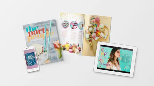
So now let's put this all together into a full beautiful layout with images and type. Coming together to make something really pretty dang cute. Okay, we'll place a couple of graphics first, and then we'll create some type columns. So first, we're gonna place a star, glittery, confetti image across here at the top of this. So we'll press F for the frame tool and click and drag to just draw out a frame. I don't know how big I want it exactly, and we can edit it so something like this to start with. So I click it if I wanna adjust it quickly. I press V to get the move tool, and I can do that. Let's drop in our image by pressing command or control D. And what we want is this confetti image right here, so I'm gonna select it and click open. Now, of course, the image is bigger than the box. The box is too narrow for this image, so what I wanna do is drag the image down and then tuck up the bottom of the box so we only see the top half of the image. So I'm gonna click on the contents grabber...
, so I can grab the contents within the frame and drag it down here. Now, I'm being mindful, if I get out of wonderful mode, I'm being mindful of the bleed, so this box needs to go from bleed to bleed. Otherwise, it might just get cut, and you won't see it in your digital document but when it's printed on paper, you might have a weird little white sliver of paper up here. So we don't want that. We want it to go all the way, and if I get out of wonderful mode, the image is going all the way but the frame is not so I need to click with my selection tool to get the frame. And I need to extend that frame so that the image actually goes all the way to the bleed. The frame and the image within it. Okay, so we want the stars to be about something like this. And we can adjust it later more if we need to. Let's put another image down here at the bottom. So I'll press F for the frame tool again. W to get out of wonderful mode and then click and drag another box. And command or control D to place it. And this time it's gonna be this image, of all this fun candy on the white background. So we'll click open, and it just kinda drops right in there. And maybe I'm gonna move it up. So I'll grab my move tool, my selection tool, and bump this up a little bit. Conveniently, it's on a white background, so it should be seamless down at the bottom. If not, we can do some editing on this. But I think that looks pretty good just like that. Alright, now we're gonna add three images into these columns that we have here. So I need to see my columns. I'll press W to get back to seeing all that stuff. Get out of wonderful mode, and this time we're gonna place them into circles. So how do we do that? This is a rectangle, obviously, but if we click and hold on the rectangle frame tool, we get the ellipse frame tool. So with that selected, I can come up here now and click and drag, and I'm gonna hold shift so I get a perfect circle, and we'll put it right in this column. And when I let go, I get the circle, and I'll keep this one, I'll show you a new trick. So we've got one circle. Let's duplicate it by grabbing the move tool or selection tool, press V, and then hold down option and shift drag it over to each of these columns. There we go. Okay, now we're gonna fill these three images with one swoop, so I'm going to press command or control D. We'll see if it'll take it like this. Do a little experiment. And now to select more than one image, I'm going to click to select the first and then I'll hold down command or control. We're gonna get these cupcakes, the donuts flying through the air, and this other thing called donuts two. And I'll click open, and what it has done now we have three images selected, so I have three images loaded in my cursor. And we see the thumbnail of the first image that's loaded. We see a parenthesis with a number three that tells me three images are loaded, and then if I already forgot what images I got, I can use my left and right arrow keys to actually scroll through the previews. Which, that is such a great feature. 'Cause it's really easy to grab nine images at once and you forget what you got. And also, now I can look at this and think about, "Okay, which ones gonna look best in which spot?" So I'll put the flying donuts over here, so I just click to place it. Put this one in here. Oops, and this is what I call a misfire. Sometimes I have a habit of doing that. When it happens, I press command or control Z and I just do it again. Sometimes if you, instead of just clean click, if you click and then drag even a smidge, that's what happens. There we are. Okay, so now we have those three images. And we're gonna add some text. I think we might need to move this down. Let's move that down. We're gonna add some columns for text right here, so I'm going to grab my type tool and click and drag to make a little column right here. And I think these are actually, well, we'll just place one. And then do some more. Alright, let's place the text into this one. So we'll draw the column, press command or control D again to drop in. This time, we're gonna navigate up one folder and go to the, one of these recipes. Nifty nibbles, oh no, cupcakes. Crescent cakes, I guess. I don't know. I don't think this is a real recipe. (laughter) Don't get too excited. It's just gibberish. Crescent cakes. Alright, so now we have this text right here, and guess what? We are going to style it. We'll get our paragraph styles box open and we'll hit body. And now we've got it styled with the fonts we want, but I actually want to break away from what we've been doing so far and we're gonna center align this text. Instead of left align, we'll center it. So I'm going to grab our type tool and come up to the paragraph formatting and just hit center. Okay. And then, we can adjust this column if we want, so I'll grab my selection tool. Maybe this needs to only be a little bit narrower. You can kind of play with it. This might be one case where we break the grid and go sort of in between column sizes a little bit. Okay, we're gonna make this right here bold, so I'll go back to our formatting and change it from regular to actually black. Black, which is not the color. It's not the color, it's just the treatment. Black is a treatment that is bolder than bold. So this is a treatment called black. It happens to actually also be black, too, but. Then we're going to make it in all caps. And let's go over to our swatches, and I'll make it this purple color. Okay. Let's duplicate this type box. I'll hold down alt or option and drag it over. If I move it around here, you'll see this purple line up here. That's showing me that I've lined it up in the center. So now we've got crescent cakes, but we need to replace the article that's in here. And we have a third one, so let's duplicate this and we'll replace these both at once. So I'll hold down alt or option, drag this over. And we'll load our cursor with two word doc files, so command or control D, and now we're gonna get dainty donuts and I'll hold down the command key and choose nifty nibbles. And click okay. I don't know what I do with this stuff sometimes. Alright, let's see if it's gonna replace those. Oh, it's putting it inside of it. We may have to clear this first. I'm just gonna put my cursor in and delete it. I thought I could get a way with that. Alright, so we'll clear out that text, and then do that again. Command or control D. Dainty donuts and hold down the command or control key to also select nifty nibbles. Click open and now we can let's see. Dainty donuts, I'm not sure which is which. But those look like definite donuts, and these must be nifty nibbles. Alright, and here's what's cool is we can click and shift click to select both type frames at once. We'll get the type tool and come over into the paragraph styles and we'll make this body and we'll center it. So you can come up to your control panel and either grab it if you can find it on your character formatting or you can click the paragraph and find it to center that. So now we've centered both text columns at once. And we'll put our cursor in here, and here's something that I like to do but it doesn't always work. So I'm gonna show you, 'cause it's really great when it works. And hopefully, it'll cooperate. But I'm gonna use my type tool and actually before that. Before we grab the type tool, come back down to this eye dropper. We used this when we used the color theme tool, but now we're gonna click and just hold and get the regular eye dropper. I hope this works. (laughter) It's really finicky, and I can't figure out why sometimes it does and it sometimes doesn't. So we've got the eye dropper there. I'm gonna highlight, it's very picky. I'm highlighting nifty nibbles, and instead of me saying, "Okay, make it all caps. "Make it purple." 'Cause I didn't create a style for it. So those are all things we could do. Manually do it. We could have already made a style, and we could have applied it. But you can also sometimes when InDesign cooperates grab the regular eye dropper tool, and then if I click carefully on crescent cakes. Oh, it did it. I tried. It didn't get it. Let me try again. Maybe if I click. There it did it. I'm not sure what the difference was. I undid it and redid it and it worked. But what you can do with the eye dropper is not only sample colors and sample treatments, but you can sample the attributes. So it knew that this text was styled not only purple but it was made all caps and then it did the same thing here. So let's try it one more time. See if we can get lucky twice in a row with the eye dropper tool. So I'm highlighting the text I wanna change, and then we're gonna sample nifty nibbles. And it did it again. Yes. I love that little trick, but honestly, it's a real toss up if it's worth it or not. 'Cause mostly it somehow gets screwed up. But it's neat when it works. Alright. And I'm actually gonna expand these to their full column size. I don't know why I was making them smaller. That's just silly. We'll make use of our grid. Okay, so these are a full column wide, and they're lined up right here along this grid line. Okay, so we've got that all set in there, and we've got it formatted. We'll come back to those hyperlinks later. Let's press W to see how that's looking. Very pretty. Very pretty indeed. Okay. Let's go down here to our back page, and we'll just place our cover file, or the back cover. So we'll press F for the frame tool. We wanna make sure, of course, that our frame is going from bleed to bleed, so you kinda have to be in not wonderful mode so you can see all that stuff. So we've got that there, and then we'll place another graphic. So command or control D to place. Go into this folders folder. You can also drag and drop from Bridge or Explorer or Finder or whatever file browser you choose. But this is a direct approach. And what we're gonna do is find this poster here, select that and click open. So what Vanessa, the party planning extraordinaire likes to do in her little guides is she likes to have some kind of fun freebie on the back and then there's a link where you can download it. In this case, it's a free little printable that you could print and make a little poster or something. And it says, "Life is too short to have boring parties." That's very cute. So we've got this placed in here, but how would people know what to do? Where would they click? What are they? I mean, right now, that's just like, "Well, that's a pretty back cover." But how do we make this useful? Well it turns out, she's already got the URL here, but we can't see it because we haven't talked about the stacking order of things. Just like we did at the beginning, we jump to page two I guess. And I did that by pressing command or control J to jump, and I pressed two and enter. And I got to jump to page two. The trick is, you have to know what page it is that you want. Otherwise, go to your page panel and double click wherever it is you wanna go. And now I'm on page two, we did that with this box right here. We made this box on top of the text, and then we pushed it back. And that's what we need to do on this back page. So we've got this image, and now we wanna push it to the back because there's something that's hidden underneath it. So with that selected, I can control click or right click and say where are you arrange? I know it's here somewhere. Okay, or we won't do it this way. 'Cause I apparently can't read it when I'm sure it's right in front of my face. We can also come up to object arrange, or not at all. Am I on the wrong layer? No. I am, it's on a different layer. That's why. Alright, well let's talk about layers. This document has a few multiple layers, and this is why I recommend, honestly, not using the layers unless you have another reason to do so. In this case, I have the text on a separate layer than the master elements, which are the different guide pieces and such and graphics, et cetera. But the text is on a separate layer, and so, it's not letting me shift something between layers. So my choices are to either copy this and paste it on top of the picture. Or I could drag things here. If I take the text layer and drag it on top, I'm gonna screw up the whole layout. So what I would probably otherwise do is let's see if we can reach through. I don't know if it'll let me do that either. Sometimes you can reach through and ah ha, it did let me do it. So we can't just click and select that little text frame that's down here, because it's behind our graphic. And we can't just rearrange it, because they're actually on separate layers. But what we can do is if we hold down the command or control key and click, we can actually reach through the photo into the background and grab the text box. And then, I'm just gonna cut it, and I'll come up here in the master elements and paste it. Now, it'll just be on top. That's one way to do it. The other thing we could do, if I back out of that, is with it selected down here once you reach through and grab it, we can move it from the text layer to the elements layer by clicking and dragging that little dot. And then maybe we wanna reposition it. So there's a little link here that says, "Download, download your free printable "at partypeople.com freebies, slash freebies." And then of course, we should style this. Let's go to our paragraph styles, and we'll make this as a caption. So we wanna be consistent. Maybe we put it down here in the corner, like that. Within the margins of course.
Class Materials
Bonus Materials with Purchase
Ratings and Reviews
lisa
Love love love all of Khara's courses! She's explains things clearly and really makes the process fun and less daunting!
Céline
I so wish that Ms. Plikanic would make a new course to push this further and learn how to make ''books'' and tables etc., for those who have done this course.
Mariya Haberberger
This course really helped me understand how to make printable PDFs. I took four pages of notes. :)
Student Work
Related Classes
Adobe InDesign