Creating a Cover Page
Lesson 3 from: Digital Guides, Products and ePDFs with Adobe InDesignKhara Plicanic
Creating a Cover Page
Lesson 3 from: Digital Guides, Products and ePDFs with Adobe InDesignKhara Plicanic
Lessons
Class Introduction: Project Overview
12:01 2Before You Start: Preferences and Document Setup
23:52 3Creating a Cover Page
19:06 4Building a Spread and Table of Contents
11:55 5Multi-Spread Story
16:11 6Pull Quotes
05:17 7Text Wrap with Shapes
13:48 8Overriding the Master Page
02:57Lesson Info
Creating a Cover Page
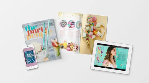
Our cover is gonna feature a beautiful party photo. So, to place photos, we need to create a frame for them. InDesign is different, if you're familiar with Photoshop, you know that you can just like take one photo and drag and drop it over into your Photoshop and it just comes over. But in InDesign, photos need to be placed into something, so just like the photos you have at home are in a frame, possibly, in InDesign all of the photos have frames. So we're gonna create that frame, by using this tool right here, called the Rectangle Frame Tool. So the keyboard shortcut is the letter F. And then we'll just put our cursor right here and click and drag out a nice big frame. Now it's waiting for us to drop an image into it, so let's just place that file by choosing File, Place. And the keyboard shortcut is Command or Control + D, for drop, drop in a file. So, we'll do that and then we're gonna navigate to the course file folder and find the photos folder. And the image that goes on the cove...
r is this one called beverage, so I'm gonna select that and click Open. And we'll get this placed in. Now we can see that this frame has a green box around it. That's the edge of the frame that's holding the photo, but the photo itself actually goes beyond that, and we can manipulate them separately. So if I grab the selection tool, I can grab the corner points and I can just adjust the frame. Right, so I can move the frame here or I can make it really narrow. That's because I'm moving the frame and the content's coming with it. We wanna make sure that we put the frame to cover the whole document, including all the way to the bleed. So the bleed is this red outline here. The actual document ends here, but for printing, we wanna make sure everything goes to the bleed. And then when they trim it, they cut right here. The best way I can think of really explaining it is if you've ever, like if you buy stickers, especially circle stickers on like a sheet of stickers and they're circle, right? The stickers always are bigger printed on the piece than when you peel it off. You peel off the sticker that's die cut and it's smaller than the part that's printed. So that's exactly what this is. Alright, so we wanted to make sure that the frame fills that whole space, but now the content is something separate. And to access the content, in this case, this photo of these beverages, we have two choices, we can switch to a different tool, the direct selection tool, the keyboard shortcut is A, I like to think of it as adjust, you use this to adjust. We can switch to that and then click and we see that our frame changes color and now it's around the photo not the container. So that's one option, we can drag that over. Or, if I undo that and go back to this tool, if I hover over here, by default, there's this thing called the Content Grabber, and this is like a special little handle for just grabbing the content. And then you can move the content around within the frame, okay. And that means that we can also scale this content. If I want to drag it down, 'cause I would like the top of the straws to not be off the page, so I would drag that down, but you could also scale it. If I select the content, I can hold down the Shift key and drag the content from a corner and I can scale it within the graphic frame that we have. So I might even scale that up and then do something like this. Maybe even make it bigger. So I'm holding Shift to keep it proportional, and then repositioning it like that, okay? So the key thing here is one, we have a frame for the image, and two, once we get the image in the frame, we can manipulate them separately and we have two separate tools for that. This one does the object, or the container, and this one does the contents. Alright, okay so we've got our image placed, let's just also talk, for a moment, we'll come back to this later, but for a moment let's talk about the links and the way that InDesign is handling all of the images that we're gonna be working with. So if I click with the selection tool to select this image, we should see that it highlights here in the links panel. So that's letting me know that this is called beverage.jpg, the number here shows me it's on page one. So this is really handy, 'cause I might be like what is this dino picture and I can click on it and then if I click on page seven, it jumps right to it. So it's helpful to find your images. This is where InDesign keeps track of everything. If you ever have problems with images, if I take this image on my hard drive, maybe I'm cleaning up my files, maybe I placed this image from my desktop and then I went wild one day and decided to clean my desktop and I threw away that file, or I renamed it, or I moved it to actually put it away somewhere where it belongs, instead of my desktop. InDesign's gonna notice and it's gonna let you know about it. It's kind of like your mom that might be like you need to clean your room, it's a mess, you're missing things. Next time you launch the software, it's gonna pop up and say, "You have missing files." And that's because you went and sort of changed things behind InDesign's back, that's what I call it. You sort of went outside of InDesign and rearranged your hard drive. And it's easy to fix, and we'll look at that later, but just know for right now that InDesign is keeping track of everything you do, and where all of your images are coming from, and that's a good thing. So I'll show you how to work with that later. For now, let's add some type onto our cover. So we're gonna go back to the type tool and click and drag to draw out a nice big text box. And I'll just type, we'll just change the font up here, 'cause I know what I want it to be. So we're gonna change this font to a font called Magnel, and there's links to this in the resource guide. Magnel, we want it to be 150 points, now how do I know this? Because I messed around with this and decided that. But normally, you would just draw your box and you'd be experimenting. You would type something up and then style it. So we're gonna type the, oops, gotta get my cursor back into the box here. We're gonna type the party people. And it's all on top of itself, because I have my letting set to zero. Let's change that to auto, there we are. Okay, we'll talk about this in a minute. So here's our type, where's the other word? The party people, people is missing. Because the box is too small for everything that I just typed into it with the current settings. So we know that because we're missing part of the text, but also because we have this little box right here with the red plus that's like, hey you have overset type. That's what InDesign calls this, so our solutions are make the box bigger, or make the text smaller or less or just somehow take up less space. So we're gonna tweak this here and adjust a few things to clean this up. So I'll press T to get my type tool back. And swoop back in here and I think this is actually gonna be too big, so I'll use the arrow keys here to reduce the type size, so we'll say 140 points. And what I would like to do is I would like to have the text kind of overlapping itself. So, when you buy a font or install a free font, it comes with all kinds of attributes. So the person who designed that font also designed all kinds of things about the font that you may have never thought about. Including things like letting. So letting is also known as line space. It's the space between lines of type. And the necessary line space can vary depending on the type itself and the design of that type. So you have an auto setting for letting, which is usually what's on by default. When you see the number in parenthesis here, that's the auto setting, so it will change as you change the size of the type, the letting will also adjust. If you have smaller type, you have smaller letting. So, the parenthesis means auto and what I want is to actually override the auto letting and scrunch the type up a little bit so it's kind of overlapping itself. So I'm gonna select all of it and I'm gonna come in here, and I can just use the arrows and I can hit this over and over again. And it can go point by point, or if I hold the Shift key and I hit the arrow, it moves in 10 point increments. So that speeds it up a lot, some of the other Adobe applications, like in Photoshop, you can scrub, which is great, you can just click and drag like a slider, you can't do that in InDesign yet, maybe someday we will get that option. But I'm gonna reduce this letting to something far smaller like maybe 60 or, yeah 50 seems too small, maybe what I need is 55. (laughing) So I'll make this 55 point letting. You can sprinkle to taste, and see what you want that to be. But I'm gonna make this 55 points and now it's all kind of on top of itself, which is kind of fun. But we're gonna create some separation in two ways, I'm gonna click to put my cursor here on the second line to the left of the P in party, and I'll just hit space. So now I've just sort of offset the type a little bit. There's other ways we could have created a little indent here, but for now, we'll just keep it really simple and use your space bar. So I created a little bit of an offset and now I wanna distinguish this even more by changing the colors, so let's talk about color. We find our color in our swatches panel, the icon for it looks like this, we can also find it by choosing Window, Color, Swatches. Now here are the swatches that I've already put into this document. And honestly, it's kind of just a rehash of a bunch of other things. So it's not really like organized and nicely labeled. This is like real-world what happens. Let me show you how you make these new swatches. If you don't already see them here or have them here. You come up to the Swatches panel menu, and you click New Color Swatch. And then you can just like dial in any color you want, you can like, mix it up yourself. My son always makes brown and he's so proud. Because he just mixes every color together and you get brown and then he says, "I made brown, mama!" And he's really happy, so he would love this. But you can dial in colors like that. You can type in your numbers if you know the RGB or LEB values in this case. We can also switch to work in RGB, or CMYK. And you don't have to worry about this as much as you might with some other applications, because InDesign can handle a document with CMYK images as well as RGB, and it'll just kinda wash it all out in the end. Depending on your export options. So you don't have to be so freaked out, it still might yell at you and be like, hey you have RGB and CMYK images here, but it's okay. Especially if we're just putting this on a screen. So, we're not gonna worry about any of that. But you can pick a color, pick what you wanna work with. But if you're gonna be doing screen, you can just stick with RGB. And you would just click Okay, and that would add that color swatch. Or you can load the swatches that I've created, if you for some reason, don't have them here, or you wanna load them into another document, you can just click the panel menu and choose Load Swatches. And the file you are looking for is right here, it's called Guide eBook Swatches.ase, which stands for Adobe Swatch Exchange. So you just load that and those colors will pop up here, okay? There's loads of other ways to get colors, probably one of my easy ways to just show you quickly is using the Color Theme Tool, so if you're starting from scratch and working with your own images at home, and you're like, I want fun, cool colors, you can just like place a photo and then grab this Color Theme Tool and when you click on it, on something that you want to, oh how cool is that? That is like, a gorgeous, I'm gonna add that to my swatches right now. You'd click on part of your image, using the tool right here. It looks like an eye dropper, not the same as just everyday eye dropper tool. Okay, you want the one that's got the eye dropper and then it's got the swatches next to it. And just click on part of your photo and it will just like, suck good colors out of it. And then you can even be like, okay that's a bright remix, what if I want like, muted colors? You can actually tweak those settings. Of course, I love bright ones. So to add them to my swatches panel, I would just click this little button right here. And there we go, pretty awesome. Alright, we'll get that off the screen. So we're gonna change the color of this type. So I'm gonna press T for the type tool. And I'm gonna swoop in and highlight the word, the. And I want to make that actually the color that it is right now already, so that happens to be Forever Vintage and I know that because that's what's highlighted when I select this and I look in my swatches, that's what shows up. So I'll select, now, the middle line of type, party. And I'm gonna make that one this red color, Swatch 5. And the bottom line of type, I'm going to make this gold down here, and I have lots of different golds, but I'm gonna go with this bottom kind of gold color, okay. So you can see now what this looks like. And now it's much easier to read with the three different colors. If I decide, you know what, maybe the letting really is better at 60, I can just highlight it and go back to get the type tool, highlight it and tweak that letting one more time. So that's looking pretty good, let's go back to our master page and colorize the type that we placed there. So to get there, I'll go back to my pages panel, it's this icon right here, and we need to get out of our document and jump back up into the clouds of the master page. So I'm gonna double click, here we are, and I'll zoom in and we're gonna keep those same colors right here. So party, we'll make this Swatch 5 color and people, we'll make that gold color again. And celebration guide, maybe we make purple, I don't know, it's up to you. Maybe we make this little color bar, what haven't we used? We're just doing the whole rainbow, green. Alright, okay and then our page numbers really shouldn't be this, I'm scrolling way over here, it really shouldn't be this color because it's not gonna show up on a lot of spreads. So here's what we can do to get both of these at once. So I'm gonna use my selection tool to click this and then I'm gonna scroll over and shift click this one to get them both selected. Now if I pop over to my swatches panel and I just think like, okay I want this to be this gray color, I haven't actually changed, it's hard to see, but I haven't changed the color of the text, I've actually just added a gray outline to the box, which is not what I want. So we have to pay attention when we're in the swatches panel, how does Adobe know, how does InDesign know, if we're trying to change the fill of the box, the stroke of the box or the color of the text that's in the box. Well we have to tell it and we do that right up here. So right now it's set to the object or the container. The frame and the frame has two choices; Outline or Fill. Outline is another word for Stroke, so Stroke or Fill. So when it has a line through it like this, that means none, so this has no fill right now and we also want it to have none for the outline. What I do want to affect, is the type. So because I've got two boxes selected at once, and I haven't clicked and highlighted the type, I have to tell InDesign I want the type color to change. And now I can say okay, I'm gonna make this gray or maybe even black so you can really read it easily. We'll see if we can get away with gray, I think it maybe should just go with black. We can tweak it if we can later. Alright, so now when we back out of here, remember this is the master page, so if I zoom out, I can't scroll down to my document, I'm sort of in the fifth dimension here. So I have to get back to the rest of my document by double clicking one of the spreads. And to hide all of the gook that's on our page, all of these grids and margin lines, you just simply press W. And you say, "Isn't that wonderful?" Now it's clear, we've hidden all of that and I can zoom in and see, oh hey here is the header up here and if we scroll down, we see the page numbers, okay? So we have some clean up to do on some of these pages but that's how that works, you'll notice that we don't have that appearing on our cover page and that is because we don't have the master page applied, you can see all of these pages have the A's, but the cover page does not. It has none applied and that means we won't see any of those page numbers or that little header that we put up here.
Class Materials
Bonus Materials with Purchase
Ratings and Reviews
lisa
Love love love all of Khara's courses! She's explains things clearly and really makes the process fun and less daunting!
Céline
I so wish that Ms. Plikanic would make a new course to push this further and learn how to make ''books'' and tables etc., for those who have done this course.
Mariya Haberberger
This course really helped me understand how to make printable PDFs. I took four pages of notes. :)
Student Work
Related Classes
Adobe InDesign