Consideration of Light, Stylization and Overall Pacing
Lesson 11 from: Developing Characters, Environments, and Story BoardsMary Jane Begin
Consideration of Light, Stylization and Overall Pacing
Lesson 11 from: Developing Characters, Environments, and Story BoardsMary Jane Begin
Lesson Info
11. Consideration of Light, Stylization and Overall Pacing
Lessons
Class Introduction
01:21 2Start with Words and Ideas
10:58 3Drawing it Out: Creating Character Shape and Gesture
09:28 4Exploring Movement, Facial Expression and Costume Design
24:50 5Developing a Cast of Characters with Style
11:26 6Color Scripts
10:17 7Developing a Style
09:49 8Creating Compositions with Perspective and Dramatic POV
16:15Lesson Info
Consideration of Light, Stylization and Overall Pacing
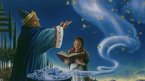
Now this next story board is a little bit different because what I was trying to do here, was translate a story that's really... It's like a graphic novel, or a comic book. It has many scenes within one page. And doing that is a much more complex way of telling a story in a picture book. And for children, this is a children's book, I really had to try to organize this in a way that was immensely readable. So the story board is critical, because if you don't land that right, it'll be very hard to read, it'll become very... Like too much information, hard for a child to assess. And you want to balance out the complex scenes with more simple scenes, otherwise, again, it's like sensory overload. This is called "Splash, the Duck Explorer." And it was a really fun exercise for me, because I've never worked this way, so I studied a lot of comic books. And I did look at Scott McCloud's "Making Comics" and "Understanding Comics," to figure out my pacing for each of these pages. And some of thes...
e, I would revise to say oh there's too much information here, it's really too complex. And I tried to balance it with these bigger, broader, dramatic scenes. So this was a fun exercise, and it's still in progress. It's a book that I've pitched, and I don't know if it'll be accepted. But when I'm working on books, you never know if it will go to finished book form or not. I did want to show you for this "Splash," I felt it was necessary to blow these little tiny pictures up, so that if I were going to do this as a picture book, I would pitch it as a really big book. Because then, it's easier for a child to see all of these different parts, and to follow that character through... this would be a double page spread. So that helped me a lot, and I think it would be helpful for a publisher to see as well. So that's something that I do. And I just literally took my little tiny sketches, I blew them up on a copy machine at Kinko's, and then outlined with a clean black ink line to make it a little bit crisper to see. So another book that I'd like to show you is "The Sorcerer's Apprentice." And this one I wanted to share because again, it's a different kind of formatting. And what it has to do with, is in each of the scenes... Well if you know "The Sorcerer's Apprentice" story, the apprentice tries to learn magic, but it doesn't work out, it really goes haywire. So I wanted the scenes to expand... let me just get this in the right order... everything is contained, and then as the magic is not working out for her, things explode out of the picture. They expand into, and crowd the text, to the point where the text is shoved off to the corner. And almost the whole world is taken over by this chaos. It's something that I borrowed from Maurice Sendak's "Outside Over there," a very famous book. Because format wise, I wanted the chaos to tumble from scene to scene. And then eventually, when the chaos comes back, the sorcerer comes back and contains the energy, things come back into the square of the picture. So your formatting when you're doing picture books, is critical to the story telling. It tells so much about what's happening from scene to scene, and how it's happening. And you're making those choices, no one else does it for you. So as an illustrator, you've gotta choose wisely for what is the format that's gonna tell this story well. And I just wanted you to see, once I do my... let me just bring this over... once I do my sketches and get approved, I do a finished painting in traditional material, this is watercolor acrylics, and before that of course I do a sketch, but thing's still change in the sketch. If you see this, I flipped it the other direction. I didn't like this because I felt like, uh, the girl is pointing in the opposite direction that we read things. I should flop this scene and get rid of these little buckets because they're kind of in the way visually. And maybe come in closer on her facial expressions. So those are the changes I made from sketch to finish. And I think that's the beauty of doing sketches, not jumping right into the final, is that you're able to make those kinds of changes. And this is the scene also from the cover, which I'll show you here. And again, I did some decision making in terms of telling a classic tale, this is usually a boy learning magic from the sorcerer. But I wanted it to be about a girl, because even though in the Renaissance that might not have necessarily happened, it should have happened. And so I'm the controller of the fate in my story telling, and so as an illustrator, I can make those decisions and impart things that I care about, think are meaningful, and so I did. And this again, is a classic story. It's not some...I retold it, but it was already established in the world. And then I just want to show a couple of sketches and finishes for different stylistic treatment. And again, I try to keep things varied in illustrating books. It doesn't mean everything you do has to look the same. I'll just show you...oh, this one is actually wrong sketch. This is a sketch for this finished painting. This is done in watercolor and a little bit of pastel. And basically I changed the temperament because these books are much younger, for a much younger audience, it's a very small book. And it's meant to feel like the turn of the century. And it's based on "The Wind and the Willow" characters. So I dialed the direction really different than "The Sorcerer's Apprentice" and for me, the reason that you do that, is that you're trying to establish the feeling of the illustrations, the format, all of it is really about serving the text. If you aren't using your story as a springboard and the reasoning for why you make the choices you do, you're not being true to the essence of the text. The text is the guide, the text is the spirit of the story. It should tell you everything you need to know, and I try to follow that really, I say closely, as closely as I can, I try to be true to that spirit. So in this I felt like it needed to be something using the white of the page. I wanted it to feel like, sort of turn of the century, sort of aged. And I did a lot of costume research, to understand who these characters were and what they would looked like, based on that time period. And these are called willow buds, I'll show you these books in a minute. And just a couple more here, this is from "Little Mouse's Painting," another book that I'll show you. Again, I always use real people to design my characters. The character of little mouse is me. She's an artist, so I made the mouse from myself. And this character is based on my stepfather. And so I borrowed from his costumes, to like what he would wear, so I dressed the bear very much like he would be dressed. So I think about those things because it infuses a sense of realism in the characters and believability for me, and hopefully for the audience as well. And I just want you to pay attention too, to the size relationship. You have this huge bear and this tiny mouse. My first attempt at this scene, was I pulled really far back and the mouse became so small, that you couldn't see their relationship. They're friends, you couldn't see the relationship between them, or connection. So the decision making was based on, really thinking about, what's gonna serve that story well. And this is acrylic in watercolor. And then finally, you might recognize, this is "My Little Pony, Under the Sparkling Sea." And again, my sketch is much smaller than my finish in this case, because this was quite a large book, and we wanted wiggle room. So I did my entire sketch in pencil, and then blew it up a little bit larger to transfer it onto, this is pastel paper. It's actually, the color of the paper is pink under here. And I decided to do that because I knew this would be a very vibrant world, and I wanted there to be strong color reaction. So this is all done in watercolor. This probably took me about two weeks to do, but the publisher approved all the sketches, the pony translations, before I started this finish. So the stage is always, thumbnail sketches, finished sketches, and then finished paintings. And my final picture that I want to show you, is one of my favorite characters from "My Little Pony, Under the Sparkling Sea." And that's Narwhal, or Narwhally as we call him. Sketch and finish. Now this character really needs to be blue, and the whole world has to be blue because they're underwater. So I had to sort of focus on, this is a turquoise colored piece of canson paper, pastel paper, underneath this picture. And the rendering is the same style as I did before, but I wanted there to be a lot of drama. So I shifted my point of view, and dialed the color and the direction of something very cool, so that we would see that we're under water. So this was a fun piece to make, but also, trying to keep the focus on the character's. You can see that I used color contrast to get you there. And the eye connection between the character's. So that we would follow the forms, swirl around, but we really made sure that we stayed in that spot. I established it with the pencil drawing, you can see that. But the color, and the stylistic treatment, and the light, really helped dial that up. So it's even more clear where our eyes are supposed to look, and how we're supposed to look at this picture.
Class Materials
Bonus Materials with Purchase
Ratings and Reviews
MikeD
I have to say, this class and the companion class were very humbling. I assume I am not like most people who would watch this class in that I have no such artistic talent. I cannot draw at all (limited to "Spike" from TED Talks), but I had no idea such thought, imagination or ideology went into creating these designs. Professor Begin has an amazing presentation style, she is clear, concise and thoughtful. The subject matter was amazing and I can only see it helping me in evaluating my own work and taking a whole new perspective on art, light and evaluation. I highly recommend this class whatever no matter your creative bent. Thank you Creative Live for hosting this wonderful speaker.
a Creativelive Student
This course is well organized, very informative and goes into great detail regarding the best way to develop character(s) and how they should relate to their environment. Mary Jane articulates her points through art fundamentals, color theory and the power of strong research - as well as her extensive experience in the creative industry. I highly recommend this course for anyone interested in advancing their career or pursuing a career in animation, game design, or children's book publishing.
Nancy Morrison
Excellent!! This is a course that I will review over and over for there are so many great bits of information extremely well explained embedded in the broad concepts of composition and detailed illustration both in her own pieces and that of constructive critiquing her student's work. MJ is an excellent teacher! I am looking forward to her other classes! Nancy
Student Work
Related Classes
Design Inspiration