Traditional Flat 5x7 Invitation
Lesson 3 from: Designing Wedding Invitations and moreKhara Plicanic
Traditional Flat 5x7 Invitation
Lesson 3 from: Designing Wedding Invitations and moreKhara Plicanic
Lessons
Lesson Info
Traditional Flat 5x7 Invitation
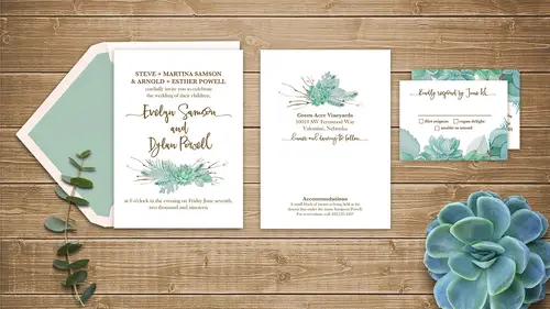
Well, I think we're ready to jump into Photoshop, so I just have one little graphic here that I wanted to show because a lot of times people will be curious how to install fonts, and if you've never done that, I want to be able to show you. So here's those resources one more time. And then installing fonts I really easy if you've never done it, you just go download the font from wherever it is you got it, and if you are on a PC, you drop that into your fonts folder. That's within your Windows folder on your C drive, and for Mac people, it's in your user library in the Fonts folder, so just in case there's anyone out there who's like, "Oh, I'm so excited, but I've never "done that," it's really easy. And on a lot of systems, you can actually just double click the font and it'll self-install, but that's an option too if you need it. All right. So here we are in Photoshop and we're gonna start with that five-by-seven, simple, flat invitation. So I happen to have the template files. So thi...
s is where you really wanna know what lab or whatever kind of vendor you're gonna work with, you want to know first because otherwise, if you just design something with your own just total imagination (laughs) as far as file size and specs and all of that, then you'll probably have to do some tweaking before you send it off, and that can just be a bummer and it's best to just know what you're doing before you start so you can set up your design appropriately. So this collection of templates happens to be from mpixpro.com. They are a lab based in the Kansas City area and they do great stuff, and if you download their template files, they have a number of different categories, including what we're gonna be working with is what they call their press, so we'll open that (laughs) and you can see a lot of different things. I just downloaded the whole caboodle. So, because this is what you get when you do that, so I wanted to show people really, how you find this stuff so we have a lot of different types of templates for all kinds of different things, and what we're gonna be working with is the flat cards. So within the flat cards, of course, there's different sizes and we'll be doing the five-by-seven flat card. So I'm gonna just open this file and let's take a peek. So template files are great because they show you where everything needs to go and what it is. If you've never worked with it before, it's probably gonna have some type like this, so there's some text that's not gonna be part of the design, so that is all on this layer here and they call that the Guide Layer, and this is them saying delete this layer, don't include it in your design. So they tell you how to use it over here, and they're marking this area here. We're gonna just talk about for a second. They're marking several different guidelines, so you see the side end guides right here. This inner guide is marking what they call the live area, so that's like your inner margin. You want to make sure that all your important detail stuff is well within this line. So you would never want to set text all the way out to this edge, that's gonna be uncomfortably close to the edge, so they're letting you know that, and then there's another line here, and this is what they call the trim line. So this is where the document actually gets cut, and what people don't realize is whenever you design something like for the press where you want it to go all the way to the edge of the document, the piece itself is actually printed a little bit bigger. So even though the finished card will be five-by-seven, if we look at the document size here and we put it in inches, we see that it's five, basically, and a quarter, by seven-and-a-quarter just about. That's because of what's called the bleed area. So this area beyond that second line is called the bleed. You can see they've marked it in here with gray. And I remember when I was new to design, I could not wrap my mind around what a bleed was. I just did not (laughs), I did not understand it until I saw some guy in a coffee shop working on a bleed, and then it made perfect sense. And I don't know why it was so confusing at first, but all it is is that extra area that's gonna get cut after printing. So if you guys ever printed something on a home printer, like, maybe you make a little card design and it's got a graphic that's supposed to "bleed," so maybe you put in a red background and you want it to go all the way to the edge, and then you print it out on your machine (laughs) and you get your scissors and you're trying to cut perfectly along that edge, maybe it's just me, but I never get a straight line when I'm cutting, and also, you will never have it perfectly. You'll always have like, a little sliver of white where you cut too far away. So to avoid that in the print world, that's why I have this bleed, and it just gives them that margin so they make it bigger than they need, and then they cut it down. So your graphics always, or your background, or any color piece or anything that you want to go over the edge of the document, you have to make sure you actually send it all the way to this edge, past this little gray zone. So that's what they mean here when they say bleed. Okay, so we can hide this layer because I think it's kinda tricky to design with that on. And let's go get our little design element that we're gonna add here. So I also have this collection of these little succulents and this is some stuff that I got from Creative Market. They have all kinds of amazing design elements available and this is from their succulent collection, one of their succulent collections, and I link to this in that guide, and I don't know which one we ended up going with, I think it was this. So I'm just gonna open this and this is a little watercolor succulent piece. So if I want to add it to the design, I can drag it and drop it, or I can just get this open and I'm gonna press Command or Control + A to select the whole thing, and I'll press Command or Control + C to copy it, and then I'm just gonna close it and get it off my screen, and I'll come over here and paste it in. And we see that it's too large for the design, so that's a good thing because we have plenty of pixels to work with. So before I do anything else, I'll probably come over here and it's a good idea to Control + click and convert that to a smart object. The reason that's handy is 'cause I'm gonna scale this down because I mean, look how big it is. So I'm just gonna scale it down, but I want to be able to adjust it possibly later 'cause who knows? I might scale it down and then decide uh, I went too far and I want to change it, so by making it a smart object, I leave myself that flexibility. So I'm pressing Control + or Control T to get this transformation box around it, and then I can hold Shift and drag from the corner to scale it to the size that I want. And since I don't have the rest of the design in place yet, I can really only guess. So I'm just gonna go with something like this and I'll click the check mark to commit it, but now that it's here, it'll help do the rest of the design so it kind of just gives it an anchor point, and then because it's a smart object, we can change it if we need to. Okay, so another thing that I like to do once I'm, when working on this, once I put in an anchor piece like this is I like to go for what I call the hero type, or the hero piece, which in this case, we're gonna have some really nice topography right here for the couple's names. So I usually get that done before I would add all the extra details about time and place and all those things. So we're gonna be using a typeface called TheSofy, and it's also available from Creative Market, and I'm just gonna type out our couple's names, Evelyn Sampson, Sampson. They're our fictitious people. And Dylan Powell. All right, so I'm gonna scale this up with Command or Control + T about like so, and let's get the color. To blend this nicely with this graphic, I'm gonna sampler he color right from the twigs in the graphic, just to tie it all together. So press I to get the eyedropper, and then I'll just come down and click somewhere over here. That might be too light. There we go. So I have this nice brown color and now I can just come up here and because this is my foreground swatch, there's a keyboard shortcut I can use to apply it to this layer. And on a Mac, it's gonna be an Option + Delete. On a PC, I would be Control + Delete because it's actually the reverse of the Mac, but gets me every time. And now we've recolored that and it it goes nicely with our graphic. And now we get to do my favorite part. I'm really into typefaces and typography if you've ever taken any of my other classes, I always like to have fun with glyphs, and swashes, and alternate characters, and all of that. And this particular font has a bunch of them, and so if I click and highlight this E in Evelyn, for example, we see that there are three different E's here that we can choose from, and one of them, conveniently, has a little swashy line coming off to the left. So if I click that one, Photoshop will replace the sort of just generic E, the regular default E with this fancy one that has a little swiggle coming off to the side. So that just takes us to a whole new level. Same with this N here. There's a number of different N's, even there might be two different right leanings. Let's see, oh yeah, there's two different versions of the actual character and then they both have a little swash coming off of it. So we can go through here and actually tweak some of these. For example, this O right here has a number of different options, including just a smaller O. So that's fun because Powell down here also has an O, and so it's really nice in the same font if we can have, there's multiple O's, but they can be different characters, actually. Then it really adds to that hand drawn look where you might not be super consistent and making all of your letters all of the same, so it just adds a little touch that can be really nice. Same with this, like a Y, I think, we can also change up. So I'd want to have a different Y here for Evelyn than in Dylan. Any other letters? I think that was all that I ended up changing. So we'll stick with this one. Okay, and if we come down to Dylan, we can also change the L's, like, we have a double L right here and of course, they're the same 'cause this is a font, not actually hand written, but what we can do is actually if I select this L, there's a tall version that I could switch it to. So if we look at that, we just get a little bit more variety so that this hand written font actually looks a little more handwritten. So we have a question? What version of Photoshop are you using and does this work with a different? Very good question. So this is the current version of Photoshop, CC 2017. This was introduced into Photoshop, something in CC. I forget exactly when, but Photoshop added, it's been a couple years now, I would say. They added the glyphs panel. The glyphs panel you can find under, I think it's under Type. Nope, I lied, it's under Window. Glyphs. So the nice little highlight and replace like this thing, this little popup box, that, I think, is newer. I don't remember seeing that in other versions, but the glyph panel's been around since longer than this, so if you don't see this coming up, first of all, it could because of the typeface that you're using, so when you buy types or when you shop for types, typefaces, there is a difference between free ones and the ones that you pay for, like anything in life, right? So there are some really great free fonts. It's not to knock free fonts, and I use 'em all the time, they're great, but if you are really a fan of these, they're called stylistic alternates, so they're different styles of like, a lowercase Y for example. If that's something that really excites you, then you're probably gonna wanna check out fonts that cost money because they will tend to include more of those things. And this font, I don't remember what I paid for it, but like most of them, and you can get fonts for like, 10 bucks, 20, 30 bucks on Creative Market. You can also find fonts that are $100 (laughs), but it's all across the board. And this is a nice font that falls into the more affordable category and it still gives you a lot of options. So if you don't see this pop up, it could be your font, it could be that you maybe need to update your Photoshop, but if you don't see that, you can also check that you might still have a glyphs panel, and the glyph panel is gonna let you do the same thing. So I if I highlight the Y over here, I can also see it in the glyphs panel. You might just have to, it just isn't organized quite as nicely, so you might have to scroll to find, like, there's one Y we see highlighted right there. If I want to find another Y, I'm gonna have to manually scroll until I find the other Y's, which I'm not gonna do on camera because it just takes a while. But I don't know, anyway (laughs). You just scroll and find it, so it's just a little bit more labor-intensive, but this feature's really nice and I wish that InDesign would add this, if anyone's listening from Adobe (laughs). This is really handy. So this thing is a newer feature and I am so glad to see it. So good question. All right, so I think that was all. I explored this when I was putting this piece together and I was like ooh, I could put a little swash on Dylan and also, this L too, but I kind of preferred, it was just me, but I liked just having it up here and not repeating it down below. It just seemed like that was maybe a little too much. So I was practicing a little self-restraint there. But then when we're happy with the type, we can just go ahead and set it, and then of course, we have the other language that needs to be on here. So traditionally when you have a wedding invitation, the parents' names are also mentioned. Of course, I say traditionally because all of these rules that are applied in the wedding world are totally flexible. You can not include your parents' names if that makes sense to you or whatever, or there's a number of ways that you can do it. So in this case, we are gonna type, and I'm gonna change the font already 'cause I know what I want it to be. We're gonna make it Baskerville SemiBold. And the language that we're going to use is going to say Steve and Martina Sampson and Arnold and Esther Powell, and I think I'll style this first. So we're gonna have to do some adjusting. That's not gonna be quite 20 points. We'll change that down a little bit. This might need to shrink. We'll move it out of the way for now, and we'll add the rest of this text. So the language that I went with is that they cordially invite you to celebrate, oh boy, let's turn off the Caps lock, cordially invite you to celebrate the wedding of their children. All right, and that is also gonna be not in this scripty font. That's gonna be Baskerville Old Face, 60 points. Now you just have to experiment with the size of things. You also want to make sure that you are communicating some hierarchy in the design. So that's why I have the couple's names in the script font because it's their wedding, they're the couple, and the parents are in something else, so we can see that contrast, but we also want the hierarchy here, so we have the parents' names, and I put them in all caps, and then underneath is the invitation language to just sort of separate that and have it be a little bit different. For the other information, I'm just gonna duplicate this type layer right here, so I'm gonna hold down the Alt or Option key and that gives me this double-headed arrow, which is gonna let me just click and drag it straight, oops, that's the wrong one. This layer is the one I want. And that way I don't have to recreate the type. And I'll just come in here and their wedding is going to be at six o'clock in the evening on Friday, the 7th of June, two thousand and nineteen. So you also have to think about how you want this language to be and how formal you want it to be. Are you gonna write out two thousand and nineteen, or you could put the actual numbers for the date. There's a lot of different ways you can do it. This tends to be a little more formal, so that's what we're gonna go with in this case. And if you are designing for a Friday wedding, I highly, highly recommend adding the word Friday into the design somewhere because at least where I'm from, people are still pretty programmed to think that all weddings are on a Saturday. And so any time, my own wedding included, I got married on a Friday, and I made sure to note that in the invitations because people just need that little help. I've seen and heard of people missing weddings because they just assumed it was Saturday and they looked at the date, looked at the calendar, and just thought, "Okay, it's that weekend," and they mentally thought Saturday, so that's just a little tip there. All right, so let's rearrange this. I'm gonna brig the couple's names up a little bit and I'll bring our succulent up, and maybe we downsize that just a smidge so we have a little more space here. And also, you want to keep in mind that just because this guide is called their safe guide or whatever this inner guide is, it's still really gonna be close to the edge, so I never would put type all the way up here. So usually when I'm designing a piece like this, I'm even going inset quite a bit further. So my own margins where the actual type information is gonna be, probably more like a half inch or an inch even inside, just so you don't have uncomfortable space. Like, if we take this and move it really close to the bottom, if I set it right on that line, it's not gonna be cut off, but it would be close. I mean, that's probably an eight-of-an-inch from the edge and it's just uncomfortable, visually, to have type that close to the edge of a piece. So that is something to look out for. All right, so if we wanted to fill this in with a different background color other than just white, I happen to like this little yellow right here, just kind of. We could do that, maybe even something a little lighter. A little bit of a cream. So there's a lot of ways you can change this up. Then of course, we would want to save this file. So we save it as a PSD. So I'm gonna put that on my desktop. We'll just make a folder and call it our 5x7 folder, and this would be, I would say 5x7 Front so we can distinguish it separately from the other pieces that we're gonna do and I'd hit save. And of course, you don't send the PSD to the lab, or to the vendor, or whoever you're sending this to. So the PSD file, it would be yours to do the editing on, so if this was something you're designing for a client, you would save your PSD and then you would make a JPEG to send as a proof. So if you want to make the JPEG, we can do that, Save As, and we'll call it JPEG, 5x7 Front, and I probably actually would resize it down. So maybe I'd make it only like, 800 pixels wide or something and then save that in that same folder, but this time as a JPEG. Question? Yeah, we do have a question. It's from Tammy. She says, "I have a question about Creative Market. "I'm always hesitant to use any graphics "because of copyright issues. "They're specific about how you use it and don't use it." That's a great question. Yeah, how do you figure that out? Yeah, so that's why you don't take graphics from just like, anywhere. (laughter) That's why you also own a lot of the "free" graphics that you get. They will be free for personal use, but not commercial use, so you always want to check that, but Creative Market exists for, I mean, most everything on their site that I've ever seen exists for commercial use because it's a market, it's a marketplace for creative elements and design elements. Okay. So they usually will be for that purpose. They might have limitations on like, the number of "impressions," they're called that you could use. So for example, if you were designing, let's say a T-shirt and you want to put a design piece on it, they may say, "Well, you can't put that on "more than like, 10,000 shirts." Sure. Without paying for an extended license. So they might have a limit like that, but for most of the type of work that a lot of freelancers are doing, you're probably not gonna exceed those regular commercial license limitations. But yeah, something to always check, so that's a really good question. Okay, now we're gonna make the back side. So I'm gonna undo the size adjustment that we did and before we do anything else, I'm gonna save this file as the back, so it's still the front but I want to make sure I don't accidentally save it over the front later, so I would just go to File, Save As, and change it from Front. I would say Back, and that way I can do whatever I want now and the front file will stay good. All right, so we are going to add the venue information and stuff on the back. So I might leave some of these type layers. I'll get rid of, I guess, a couple of these, and we'll get rid of our succulent. So an easy way to get rid of multiple layers at once, this is what I like to do, is I just hide them to clear out my space, and then if you go to the panel menu for the layers panel, you can just choose Delete Hidden Layers, and then they're just all go. And I love that because when you're trying to click and drag them to the trash, sometimes you can't tell which one's which, and if you just hide them then you can confirm, okay, I'm not throwing away anything important and then get rid of 'em all at once, so that's kinda nice. All right, so we'll come back over here and this time, we're gonna get a different succulent. We'll et this one, and again, I'll Control or Control + A, copy in this, and then I'll come over here and paste it. I'll make it a smart object, just in case we want to reuse it somehow later. Ooh, didn't go. There it is. And I'll press Command or Control + T to transform this, and so now I want to do it a little bit different. I don't want to use this in the same kind of way as we did on the front, so I'm gonna put it up here on the top, make it a little bit bigger, about maybe like that, and we'll move these type layers down, and I'll reset the type in here to be the name of the venue. So we're gonna go with Green Acre Vineyards. Sounds like a great place, Green Acre Vineyards. And we would want to of course include the address. Move this out of the way. So we'll add another line of type here. I do a lot of copying and pasting of type rather than styling it 'cause I don't know, I like to think it's efficient, maybe I'm just lazy, I don't know. If you guys do that too, then I'll feel better about it 'cause we'll just call it efficient, right? So now we're gonna type in the address, whatever this is, southwest something, Orchard Way, I don't know. Zip code, whatever it is. (laughs) Okay. All right, so now we have that. So that looks good. And then we want to make sure that we explain what is happening on a wedding day. People will probably assume that you're gonna have a dinner or something at the wedding, but, so maybe that is to be expected, but it's always nice to just say, especially if you're doing something non-traditional. Like, if you're not gonna serve a dinner, you should probably say like, light hors d'oeuvres or, so people don't come hungry and then get angry (laughs) that they're there and you're not feeding them. So people are weird about weddings. You really just have to tell them. So what I had added here is dinner and dancing to follow. And I actually had went ahead and made this back in that fun font, TheSofy. Dinner and dancing to follow. Oh, and also, I guess I can point out because of the way that TheSofy typeface is set up, if you are in an older version of Photoshop, you'll notice when I clicked on this and selected TheSofy and I was typing it, there were a number of different variations, so you see here? They have Alt1, Alt2, Alt3, and Alt4, or there's just regular Alt and then one, two, three, four, so there's actually six different versions and this is nice that they did it this way because I you don't have a glyphs panel, you can still access those different characters. So what you would do is set the whole type in the regular typeface, so we'll do this. And then if you want this D to be the little squiggly D, and if this isn't popping up for you, then you can just come up and choose the Alt1 for just the D. Does that make sense? So like, all the squiggle left characters are part of the Alt1 font set or whatever, so that's the way that this type designer built the font, so they're all a little bit different. Not every font does that, but it's really great for people who don't have a glyphs panel or don't have this little fancy fly out option. Of course, now that I do that, I don't know that it will, now if I select the D because it's just in the alternate font, it's not gonna show me those examples anymore. So if I have a glyphs panel, then I just want to set the whole thing in the regular fonts and then manually place these files. Oop. Come on! There we go. So dinner and dancing to follow. And of course, we'll make the W fancy too. There we go, and maybe we'll scale this up a little bit and put it here. Okay. And then if you want to, I had also put down here some information on accommodations. So again, just really using hierarchy to separate different types of information. So this would be like, a small block of rooms is at such and such hotel. For reservations, please call blah, blah, blah, blah, blah, blah, blah, right? So something like that. And we have that separated, so the information is organized. A lot of design is really just about communicating, communicating and communication, and that really is more easily done when things are organized, so hierarchy is a big part of that.
Class Materials
Bonus Materials
Ratings and Reviews
Lt. Cmnd. Data
Not only was this class very approachable and fun to watch, it is going to save me a ton of money designing my own wedding invitation. Highly recommend the purchase. Thank you so much Khara!
Bardha
Amazing class! thank you so much for teaching me a few new tricks. * I cannot find the templates on the mixpro website. Can someone help or guide me in how to download them?
Sherry Fish
Thank you so much. Really excited to play around with the glitter idea and also learned a few things about Photoshop that I didn't know before. Thank you!