Understanding the "Responsive" Web Today
Lesson 1 from: Designing Websites in Illustrator: Effective WorkflowBrian Wood
Understanding the "Responsive" Web Today
Lesson 1 from: Designing Websites in Illustrator: Effective WorkflowBrian Wood
Lessons
Understanding the "Responsive" Web Today
15:26 2Getting Started
08:03 3Set up your Design Document and Layout Grid
11:58 4Setting up Artboards to Mock up Device Sizes
05:51 5Work with the Pixel Grid, Live Shapes, Pixel Precision
10:44 6Design with Web Fonts
21:47 7Using Styles and Symbols to Make your Life Easier
22:46 8Mocking up Dynamic Buttons
12:09Lesson Info
Understanding the "Responsive" Web Today
So we are gonna like I said, Dive in and start with a little bit of background information on responsive design in general, because I do a lot of sites, build sites, work with designers and design as well a little bit. And I actually the the whole. I guess you could say workflow of building sites has kind of been tossed on its here just because of responsive design. And I don't know how many of you know responsive design and how it works, that type of thing. But I wanted to give some background info just because it's super important. And when we go to get into, like an illustrator or a foot of shop or whatever would happen to be using as a tool to design or however we do it, we're gonna need to know how things are built and how they react. So I want to start from way back. This is actually a website here called a list apart, and it's an awesome sight that has a lot of great topics on Web and things around web. And this is the article. I guess you could say that kind of started it all a...
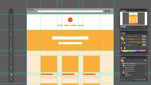
nd it talks about responsive Web design. And what's crazy to me is I talked a lot of people, and, you know, this is a least maybe a year ago or so in a lot of people would say, Well, you know, I'm so behind the ball I don't know responsive design. I don't implement into my workflow design, create etcetera. But if you look at the date on this site, it's 2010 which is not that long ago. It's just that the Web moves at warp speed. I mean, there's constantly changing, etcetera, etcetera, and one of the things I think that a lot of us do these days is when we look at a site way, try and see if it is actually responsive. Now we'll take a look at what that means, but if I don't know how many of you do this, but you take the browser and you make it smaller, okay? And by the way, the international symbol for responsive design is this. So if you ever talking to someone, you do that, that's it. I mean, that's what's happening. But I love this site just because they added a nice little kick here. If you watch the camera and the people, the camera's gonna turn portrait landscape and it's gonna change the number of people in the stack. And I'll like anything pretty cool. The whole idea behind building in sight these days is that we're trying to take our content and make it look good across all devices. That's really what it boils down to. Okay, if we're talking mobile and we're talking desktop and mobile covers of a broad category of devices, right, we're actually talking also about download, download speed networks that we're working across etcetera. And those are things I think that designers, I'm not going to say, you know, like a bad mouth it, But a lot of us will. I tend to think of second or not think of Okay, except when it comes down to the actual death cycle, another site that I would suggest designers, developers, everybody that's starting out with this kind of thing with response to design. Go take a look at this is the Google Developer website and they did a great job with putting together a whole bunch information on creating a multi device layout, and this is moron the generics of like navigation, responsive Web, etcetera. And they talk about design principles and what you need to think about as you're designing as you're going through and creating this masterpiece you're gonna put together, Um, one of the other things, one of the other sites rather than I have people go to all the time, and this is probably the ugliest site in the world. It's called liquid app Civ dot com. And if I just zoom in a little bit to see that liquid apse of dot com, The idea behind this site is that it shows us two different ways that were creating websites today. And responsive design is not the only game in town. Okay, as matter fact, a lot of people will use kind of a mix of things. What's crazy is if you look in the upper right corner up here, whips upper right corner up here, you're going to see that it's set to responsive To begin with. I'm gonna I'm gonna roll back time a little here and set it back to what's called static. And this is what we used to do, you know, back in the day, like five years ago. Uh, it's crazy. Five years ago, we're still building the tables. So it back in a day, I don't know how many of you of, like, coded html little, but it's, you know, we used to build the tables to make layouts, and we used to go in illustrator other programs and build these pixel perfect designs. Cut him up, J mile done right. And we used to complain about three browsers we had in two operating systems. Well, these days we have, like, 50 browsers and the operating system, etcetera. But we used to create what I called static designs, and you were probably the coolest thing in the world. If you could take the table and center it in the browser, that was like, that was the magic. You know, you could call yourselves about developer. Then if you look up here, though, things started to happen. The IPhone came out. We realized, you know, look, these the site is minuscule on that device. That's what they used to do. They the phone used to actually, and it still does. It lies to you. It tells the the actual server that there 10 24 or 1300 when it's actually only this big, you know. So somebody come up, came up and said, You know what? Let's make things liquid. So if you take a look, this is what's called a liquid layout. This is a really important part of responsive design because the idea behind liquid is that things are set at percentages or some kind of what's called a relative unit. Okay, and if you look there are problems with liquid layouts, I go to smaller, you're gonna see. Okay, bam screws up right now. Somebody then said, Well, what if we do this? What if we throw something else in the mix? What if we make it responsive? It's called, but Responsive has two major features. It's got a liquid layout or a liquid component, if you will. So it's it's kind of set toe like percentages or things like that, but it also has what it called break points. So if you watch, you're going to see that this is gonna be it's gonna be liquid. So it's gonna kind of be fluid, stretchy squish, but suddenly at one point it's gonna just kind of like make a major shift right. These major design shifts or even small ones are called break points, and a break point is technically something called a media query. So they're kind of the same term to the same thing. A media queries technical and it's part of CSS. So it's a style sheet thing and styling. We go in and say, Hey, if you're smaller than this or bigger than this, we have a lot of ways to do it. Use this styling. Okay, So Responsive has fluid and media queries. Those are the two big features. Part of it. Now we have another kind called adaptive. Okay, And let me switch over to adaptive here, and people will actually kind of mish mosh or put these two together responsive, adaptive, etcetera. But adaptive has these break points, but it just doesn't have the fluidity. It's not fluid, so if you watch, it's gonna go. Chunk, chunk, chunk. Okay. Adaptive kin to me, as far as I'm concerned, connection be easier to develop and even to design. Because if you get this design, let's say we're going for tablet. We don't have to think about tablet this big this big vs that big. We just think tablet and there is white space and it floats and does its thing. OK, and this is this is something that's gonna help us or something we need to think about when we design. So this is this is a responsive design. This is kind of it in a nutshell. If you're looking for and this is gonna be huge for designing in general, because if you're trying to set up your design and you're trying to think, OK, I've got a design, I'm starting from something and I need to make sure that looks good and all these devices, right. That's we're gonna dio uh, you're trying to figure out Well, okay, I've got a form. Well, how did I go from a form that's, yea bid to a form that's like this wide? Okay, a lot of these sites do that really well, so you can kind of see design examples and this is called media query dot es. So that's, you know, all put together there. Now, one thing I want to talk about a little bit in general here is just designing in general because as we go to design for the web, I already said that responsive design has kind of thrown things for a loop because there's a lot going on. If we get into and let me do this, I'm gonna switch over, flip over to Illustrator, and I'm gonna be using Illustrator CC today and the latest version because that's what we have. And what I want to do is I want to open up a web compa final Web comp that I've got here kind of that we're gonna use today and let me ignore most of us Ignore everything we see, and I'll open this up and I'm gonna hide some things. Now forget about what you see on the right over here. But you're going to see that when we designed something. A lot of times, if we're gonna sit in illustrator photo shop, you know any other program out there, we have to pick a starting point. We have to say, Okay, well, what size do we start with? That's huge thing, and a lot of us struggle with that. Okay? There's two main ways to start a design. Okay, You can either go desktop first or you can go mobile first. Now we're gonna talk about some different things like wire framing and stuff like this. We'll get to that. But this is This is kind of a generic starting. I want to go to a website here and just show you that if you haven't, I'm sure most of us have heard of what's called Mobile First before Mobile First is essentially and I always ask people what is mobile first. And they all look at me like I'm crazy because it makes perfect sense. You start with mobile, right? Okay, So the idea with Mobile First is that we are gonna concentrate on the mobile device first, which means a smaller layout, which essentially means that we're looking at content as King, So content is gonna come first. That's the idea, of course, the user interface. How people get around, how people work, etcetera is also paramount. But we also have to consider download time download speeds, cause a lot of devices may not be going across, you know, wireless that might be going across their actual network's OK, So with mobile First Mobile first came out and a lot of people jumped on it. It makes sense, because if you look at stats for mobile devices looking at it. I mean, at some point, I don't know if it already has in light of, but it's going to surpass desktop, right? I think I might have already done it, but it depends on area. So we focus on this. This is something we can do. And if we get into illustrator photo shop, we then need to start with that form factor, that design form. OK, but But the issue comes in then. Okay, Well, yeah, we're gonna design for that's awesome. But then what happens to tablet? What happens to desktop? How do we portray that? How do we show that? Okay, that responsive nature. That's what we're gonna talk about today. So mobile first is really big. It's actually a really big deal. And one thing I wanted to draw your attention to, and this is gonna lead us into as we start to talk about creating this thing when we're about to do that a few minutes here, what size do we start with? That's really struggles with this. I can tell you how many people I ask. I'll go to big conferences and I'll talk to a bunch of people and I'll ask the audience. I'll say. Okay, well, we're gonna start with with Mobile. What size do type in when you say file? New and illustrator of photo shop? I get different answers. I mean, and it makes sense because there's all of these devices. Right? Stack counters. Awesome. On there's 50 others out there. It's actually gs dot stand counter dot com. I'm gonna jump in. Brian, if you bought this course, you can download a pdf with all the links to these websites in it. So you don't have to tryto grab these. Brian's talking about him. So go to the course page, click on the pdf, download it. And all the links to all these websites are right in there. Yeah. Good. Good call. Yeah, because I usually tell people at the end, and then they get upset with a good idea. All right, save me. So So anyway, So, stat counter is a great site because it shows us both global statistics and statistics for your geographic area and check this out. I always ask people I'm like, what is the most widely used desktop resolution today? And a lot of people say, Well, 10 24 68. Or, you know, even had some people say 806 100 which six years and eight years ago check it out. You're going to see that the most widely used globally is 13 66 by 7 68 Which kind of makes sense, if you think about it. The people that have bought monitors and laptops, if you crank it opens fired up the first time, it's not gonna be 10 24 anymore. So that's kind of what's leading the charge, if you will, you're gonna see 10 24 way, way down to the bottom of the barrel. 9 20 is next. So good information. The thing I love about this, too, is that you can go in and I can do something like this. I can say You know what? Let's take a look at a different platform like mobile. Let's see what sizes we have for mobile or even this is when I love to browser, version or browser so I can say what browsers Air leading the charge on desktop tablet console. Sometimes the site gets a little funky. It takes a few minutes for the load and Sometimes it doesn't load it all, but you can see the stats for That's a good thing. Now, just another thing that we're gonna talk about as we go through today is we're gonna talk about designing to a grid. This is huge. This is something that a lot of us are going to do now When I say designing to a grid on a lot of us know this. I'm gonna skip this. If you think that's okay, I don't think Oh, there it is, Actually came up, OK, so you can see Chrome and III or kind of battling head to head. All right, Anyway, I go back over now when we go to start an illustrator, and we're gonna kind of take a you know, our time doing this. But when we start in, Illustrator, we gotta pick a size and then what we do is we're gonna go in and say, OK, we're gonna design, but we're gonna designed to It's called a grid, right. Designing to a great Does anyone know why we designed to a grid? What's the reasoning behind for that? I mean, it's one of those things where we just know we do it right. The reason why we designed to a grid is when I need a grid again. I'm gonna do this really dumb. I'm just gonna, like, let me throw out a guide here, Let me put out a bunch of guides and initially a faster way to do this. But we've got a lot of guys out here. We set up columns, maybe 12 columns, eight counts. Whatever we want when we say designed to grade. The reason why we're doing this is because we're going in and we're gonna use usually a framework, some kind of starting points in html. CSS, that type of thing. Ah, fluid. Great, if you will. And we're gonna take our design and actually match her Fit it to that grid. Okay, Now, just to give you an idea, I've got ah, site. This is one that I use Ah, fair amount for for simpler sites. It's called a responsive grid system, and it just kind of gives you an idea. If you use something like a few heard of Twitter, bootstrap or, um, there's a 1,000,000 of them out there. If I scroll down here and take a look, you'll see Okay, Code, code, stuff, stuff. But check this out. Every time you go to some kind of framework or greed or starting point, they're gonna actually show you the grid system right down here. You can see when I first looked at one of these years ago, I remember seeing one of these. I used to look at it and say, Well, why are you showing me 12 columns? I know what 12 columns looks like. You know what I mean? It's not that big a deal. What they're doing is they're actually telling you that the code we give you can be separated or divided into these numbers of columns. Okay. Now, the reason why we actually designed to a grid is because we want to build to take that nice need design, have everything lying up neat night pixel perfect. However we want it. We're just gonna take that content and be able to translate it right into this grid right into this fluid grid, if you will. And that's why we do it. So I have I worked with designers in the past and I would tell them I'm starting with Twitter. Twitter, Bootstrap, for instance, to create the site, the actual development. And I tell them, Here's the great Go take a look at it. They would go into illustrator footage up etcetera, set up a grid that was completely different. Like maybe another column or, you know, divided by three or some crazy thing. And I'd look at him and say you're just making more work for me. Okay? That's kind of the idea. That's the thing. So So we have to We have to think about that. We have to consider it. Okay. All right. So here's what I'm gonna do. We've kind of got some background information there. That is understanding, responsive design and just some of the things we need to think about.
Class Materials
Bonus Materials with Purchase
Ratings and Reviews
user-ef521b
Quick introduction to Illustrator's website prototyping use. What I needed for better understanding of designing for retina screens, designing at pixel level, smart guides, and wireframes. I like the real-world suggestions for how to show website plan to clients efficiently. Hope to find the next course on best practices in exporting website from AI.
a Creativelive Student
wonderful thank you
DaVita Lynette
I haven't been able to catch the whole class yet but I've heard lots of good information with some new resources I hadn't used before. Thanks!