Lessons
Lesson Info
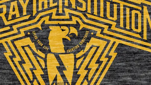
Importance of the T-Shirt Sketch
I have another class on lettering, and in that class we talk about the importance of sketching. So the idea is that you're going to think up right now, um are gonna happen a lot quicker, and you're gonna be ableto record those much quicker in a sketchbook. Then you can when you create them all in Illustrator. So I want to take you through my whole process and, um, we'll design a graphic t So my first step is sketching. So what are we gonna make a T shirt out of today? Let's stick to Ah, let's do a word design around the word and, um well, let that be the You know, the main thing that sets us off. So, you know, we and other courses we've used the word rave in in our lettering course we used wash away in our letter. In course, we also used word fantasy. So let's create another T shirt. Let's create another graphic and let's let's have ah, let's have a word. A word that has something burden. Okay, let's do burden. Okay, so first of all, let's just use the word burden. And in this case, th...
e band hasn't provided me a logo. This man doesn't exist to imagine abandon burden. So I'm gonna start by the first thing that popped in my head with this type of arched. I think that is a good way to show. Now, what could happen after this is we could start kind of finding little things that we could, you know, little elements that we could put inside of burden. You know, if I do want to go to that upside down triangle well, then I could start doing something like that. Maybe a circle would work better. I don't know yet. So that's one idea. So burden, um, if we want to fill up the space, maybe we could have some blocks, and then we could just knock out. So if you guys want go ahead and sketch for burden together, we will come up with a great idea for this tea. And sometimes it really just starts as easy as how I want to. Right afterward. It starts with lettering and we can dive way deeper into lettering with my lettering course. But for right now, we're just focused on the process of the graphic T. Okay, so I've got three ideas so far to accompany this little bold shape here. I'm gonna put a little ring around it because I just like the idea of lockups. I like the idea of locking something up, encapsulating onto a badge or a seal. Something like that. I'm a big fan of established in whatever year. I like all that sort of thing because as much as it's been done, it still remains the classic T shirt. And I think it would be a disservice if you don't show the basic ideas in the basic ways we can go about the T shirt. Sure, you can try some more off the wall type of stuff, but I think it's important to also do the basics. So if you don't hit the basics than then, maybe we'll you know, you're kind of missing out on the obvious. So what I'm thinking of here is you do some of that punk rock lettering again. You watch the whole way that whole go. That whole thing goes in the lettering course. Now, as far as an illustration goes, that could be an illustration that could represent burden. But the idea here is that we're sketching out on paper and we're not trying to do it on illustrator waste a whole lot of time. And if you want to make it in the industry that I'm in, you have to be fast. So I've challenged myself to be extremely fast, and also, I don't put any value and, uh, great sketches. I just There's no point. You're only the longer you try to spend getting that line perfect on your sketches time, you could be spending on the computer actually building the thing. So here's just like five ideas that I've come up with and these, you know, it seems like this is a little bit more for something like a brand on. And sometimes what happens with brands, it is really just figuring out other ways to do. Um, Teoh just make the word look neat and, um, and sometimes it's about putting, getting color all over the shirt. You know, if a lot of people are really just buy T shirts based on color, so if you get the color right on that person, love teal and red and yellow, then they're gonna buy the shirt based on the color. So there's always this balance of Well, you mean, if I could design something poorly but put good color and it people are going to buy it? Yeah, they might. They probably will. Well, what if I designed something really well, but it has lame color. Well, if they don't like that color, they're not gonna buy it, cause the end of the day, these people want color. So So you always have to think about that. You always have to think about the wearer and what the what you think the wearer's favorite color is? So I find that one of things I always tell myself is when we're doing when I'm dealing with a band is how does this band perceived themselves, Right. So do they think they're really, totally awesome? Maybe they're not a very good band, but they think they're awesome. Okay, so that's valuable. How do they want to be perceived? While we used to be a real corny band that we want to be a cool band. Okay, So you want to read? You know, um, we wanna give yourself a whole new image. Okay, Um, how did the fans view the ban? Because the fans want to get what they expect out of the band because of the one spending the money on the merchandise. So there's all of those things to think about the band's view of themselves, the bands, the desire the band has for people to view them. You know, they want to interview him in a different way and how the where will will perceive the client. So there's so many different relationships and psychology to think about between it all. And, um, and I think it's important toe over think all those things I think it is important to, you know, just at least run through in your brain all those little, um, relationships and how that's gonna work out best. The fans need to get what they want, but the band approves it. So that's a hard thing to manage. Yeah, yeah, Usually is this something that you research? Or is this something that the band will tell you from the beginning? That's great question. So what? I usually dio, um, I'll get direction most of the time, and the more direction, the more of a bummer it is. But I it's up to me to find my motivator and to stay excited about the project. So whatever the deadline would over the direction, I got to do that. But outside of their direction, I have this belief that they don't always know exactly what they want. They may be able to write out what they think they want, but they don't always know exactly what they want. So what I got to do with my responsibility as being a good designer for them, I'm gonna research them. I'm gonna get on their instagram account. I'm gonna get on their Facebook page. I'm gonna get on the website and look at photos. I'm going to see what they wear themselves because they're drawn to that anyway. And I know that so and so tends to really like this brand. The singer, The band likes this brand. So why don't I get more in that world of that brand in this silly thing that they requested, but probably with the best idea is to find the balance of the thing they requested versus the thing that you think they're actually gonna like. Um, what's hard is most of the time there's one degree of separation. So there's a person between you and the decision maker. So let's say a singer of the band is the decision maker. But first I have to get through the art director that saying, I think they want this. And sometimes I have to say But I think you're wrong. Course I never say that. So I have to figure out a way to get around that, because the fight there of I think you're wrong and I think I'm right is an ego battle that's unnecessary. And there's some designers that we'll go ahead and fight that ego battle because they think they're standing up for themselves or something they're not. They're just fighting in an unnecessary fight. Let's go beyond that stupid little fight and just designed something good that pleases everybody involved. So if you need to stray from their direction just a tad because you think this is really gonna hit the decision maker better than go for it and you know what I do a lot of times is if I'm asked for, you know, five concepts. Well, then I'll just do like seven or eight concepts to make sure that well, here's three more that you didn't ask for, but just throw these in show that I'm not going to charge you extra for doing more, whatever, but yeah, just just send him this and see if they happen to like this. There's been plenty of times where I'll do some that's their direction and a few more. That's not their direction. And guess what? The stuff that wasn't their direction and stuff that I came up myself was the stuff that hit. And so that's really rewarding, because my goal in all of this is to get it. You know what I mean is toe like for Mumford and Sons I designed for them a few years ago, and, uh, they love the T shirt graphics so much that they started using for a whole bunch of posters and all this stuff. And at the time, Mumford was the coolest band around, so it was really need to take this ban that was on top of everybody at the moment, and I totally understood what they were trying to dio. I totally understood divide. They were trying to go, and you'll be surprised how particular they are inside that old timey little moustache wax like vibe. You'll be surprised how particular they are about If it is correct to the era, you know, if it is appropriate for the little time period there really influenced by So, um so that was really fun thing toe like get it. So I looked much more into Mumford and sons than the art director asked me to. So I dug in further than the little paragraph of direction that they gave me. Because my goal isn't to just please the art director. It's to please all the parties involved. I want to be this well oiled machine for everybody that works with me. They want to know that I want them to know that I'm reliable, and then I'm smart and that I care more than everybody else cares. And and I've had a career for a long time, and I think I've accomplished that. So my goal now is to continue accomplished accomplishing that. So now we have these sketches. I want to see what you guys you guys have sketched out. See if you guys got better ideas of me, which is very possible. So he represent. He took a chain illustration for a burden which totally makes sense well, but it could be. You know what? That chain, If that chain was turned on its side, it could be a B. You know, what I'm saying is this If those links turned to their sides, that could be a B. And then So the whole thing is like this chain that is kind of if you just three links of a chain. Yeah. So this is the This becomes a great T shirt, and anything with a skull is totally awesome, in my opinion. But these are all really simple ideas, but they're simple ideas that need to be explored, you know? So you need to sit here and explore this. You're on your own. Even you don't take to the things like is this? Does this need to be a skull shirt? You know, and again with the vintage e, you know, both underline. It's so cool. So this is a great example of a graphic element. I actually think the vintage California license plates does that sort of that vibe that I could see there almost could see this being a son and these being repeated repeated lines. So we're going back to like a Miami vice type of vibe for that. So that could be a really, really great shirt. Yeah, and I love this. I think this could be great as a hand drawn thing. You know, so known. You don't even need to use fonts. There's these, uh, you know, just a simple little box with diagonal line and filling in the space. You know, it's really you know, it's really simple stuff, but it's simple stuff that needs to get explored. And here's that retro thing that kind of remind me of the California license plate or Miami Vice. Here's skulls, which I always love punk rock shirt. And here's that chain that we were talking about so we could, you know, if this chain, if we turned it around, which chained perfectly represents bird. And really well, if we turn that around, these links around make a B, that could be really cool. And then we could kind of start playing off that make that the central point and start going around it. This is great. So again, he's got so he's got the script and he wants to put it. Put more text inside the tail. He's splitting. He's stacking the word on top of each other just toe. Give it more of a graphical element. He's using the trying to again. He's putting a big underlying across the triangle again. That's sort of ah, you know, the vintage retro vibe. So these are all great explorations. I decide The simple thing needs to be explored. You can't You can't jump over the simple thing just to get your really complicated idea done out on your way to that complicated idea that popped in your head. Do those little simple ones really quick that also pop in your head?
Class Materials
Bonus Materials with Purchase
Ratings and Reviews
Andrew Shim
Excellent teaching. Best of all, he took a random word from a participant and built a truly awesome band logo for tshirt right before your eyes, going from sketch to final artwork in something like 15 minutes. Of course, his vast experience and skill must surely help him speedily come up with inspiring ideas, but nevertheless, he is truly inspiring. Much, much , MUCH better trainer than most others I have had the misfortune of watching.
Hilary Slaughter
Great class! His work is top notch and he shows a lot of integrity in his designs and how he communicates with clients. I do believe he combs thoroughly through shirt design elements and how to apply it in Illustrator and Photoshop. I think you should already have some working knowledge of the software to follow the last portion, otherwise take good notes and rewatch if necessary!
ARNK
Excellent stuff, I'm no pro but I found the course useful. It's good to see what can be done so you have the idea filed as you work towards the ideal.
Student Work
Related Classes
Design Projects